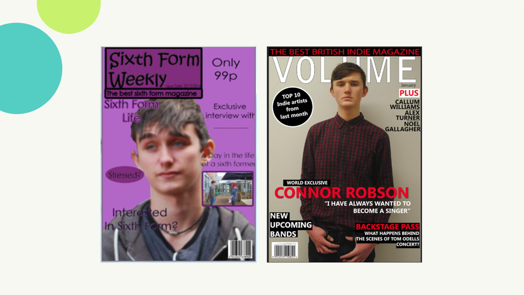
course. These are my final School Magazine and final Music Magazine front covers. I compared my preliminary task of a school magazine front cover to my main task of a music magazine front cover, to see how I have progressed throughout the course.
front cover magazine. From the first magazine that I created, I did not use the codes and conventions effectively, which resulted to it not looking like a professional magazine. With my music magazine, I made sure to refer to the codes and conventions, to make it look more professional, and have an overall better look to it.
the image wasn’t in focus, which gave the magazine a bad look to it. But in my music magazine, the image through my camera skills improved, as it is clear to see the image, and it looks bolder, and gives a much better look overall to the magazine, by making it look sophisticated and professional. I also adapted my creative skills such as making my music magazine have boxes around the words to frame them, and make them stand out, which I also think gives a better look to the overall look of the magazine whereas on my school magazine, the coverlines where not very clear and the subheading was not clear and did not standout as the colour around the text was the same colour as my background, so it blended it and was not eye catching. Moreover, the masthead on my school magazine does not stand out as the background colour is the text, so it makes it not as noticeable whereas on my music magazine the background colour is white and the text is black so you can easily see the masthead, and it is bold and eye catching. This then makes it more memorable. The layout is much
software. I had limited skills when I started using it. I feel that throughout the time of me getting used to Photoshop, I have learned new tools to use to make my product look better, look professional and to catch the reader’s attention. I started with very basic skills to start with, and little knowledge of what the tools are used for, and how to use them effectively. I can now confidently use the more advanced tools of Photoshop and developed skills to make my product look more professional and sophisticated. For example, I used the lasso tool to go around all of my images, so I could change the colour of the background.
very basic, and did not make the magazine stand out. The coverlines were in different colours and the coverlines were not placed in a way in which it looks professional, such as the words going over the main image, which makes it look messy and not sophisticated, which does not give it an appealing look. With my music magazine, I created the layout to frame the image so it does not look unappealing. I developed the basic skills that I already knew from the preliminary task, and used them to help create my music magazine, this then made my music magazine look more professional, with the combination of my skills that I developed, and the new ones that I had learnt throughout the process of using Photoshop. I used a graphic feature in both my school magazine and my music magazine.
was basic, and did not look professional. Graphic features are usually made up of circles and stars, not an oval shape so it gave the magazine an unprofessional look to it. Also, I did not pay attention to the codes and conventions of a front cover, as I included a separate picture on the front of the magazine, which is not a regular thing music magazines do. I did not include any other images on my music magazine as it would make it look unprofessional. On my music magazine, I put the positioning statement at the top of the page, which is a regular feature that magazines include. However, for my school magazine I did not use a positioning statement effectively, as I placed it underneath the masthead, which draws attention away from the positioning statement, and also makes it look unprofessional, as it is not something professional magazines include.
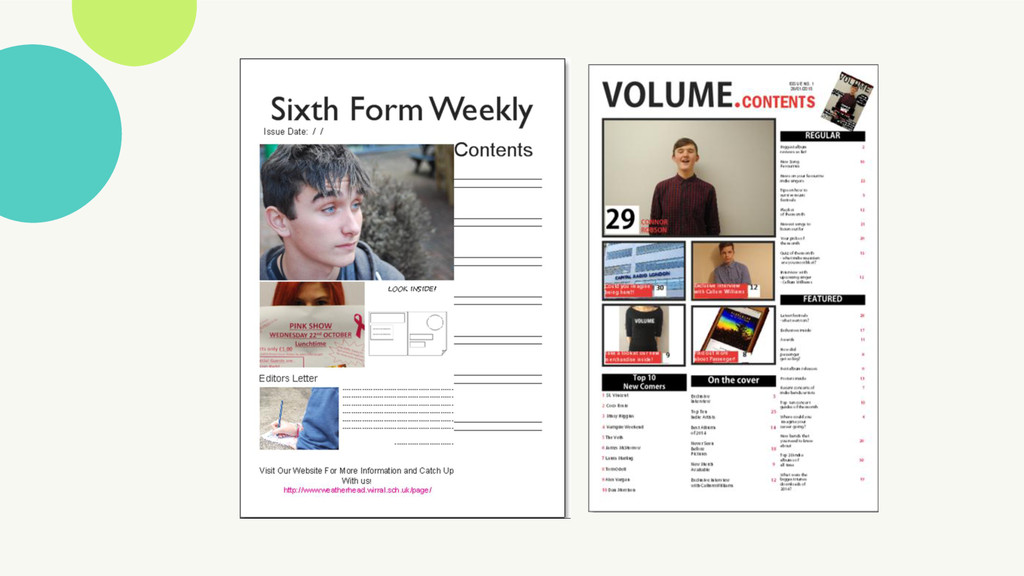
had no experience before starting my contents pages. I feel I have progressed and developed my skills with Quark x Press, to make my magazine look professional and similar to real music magazines. This then makes it eye catching as if my magazine did not look professional, my target audience would not want to pick it up. I used different tools such as learning how to use a drop cap for my double page spread and learning how to insert images onto my contents page and how to make them fit the box.
I feel that the layout of my school magazine is very basic and unappealing to the audience whereas my music magazine looks more interesting to look at. I placed the images in the same way, so they would be eye catching however on my school magazine I only included 2 photos this makes it look bland and unappealing, as it would not catch the reader’s attention. Also, this goes against the codes and conventions of magazines, as it is between 4-6 images which I did not follow. This then makes it look even more unlike a professional magazine, which would make it unappealing to my target audience. With my music magazine, I included 5 images which makes it interesting and would make the reader want to find out more about the articles.
include anything about what would be included in the magazine on my school magazine, so it looks very bland and unappealing. Alternatively, I included eye catching coverlines on my music magazine in which I made the colour black, with red page numbers. This complies with my colour scheme and makes them stand out, which would make the reader want to look at the articles. There was no colour scheme to my school magazine, and the front cover and contents page did not connect and look similar in style or colour which made it look unprofessional, confusing and unmemorable.
will be relevant and interesting. This made me think about camera angles, and what images look the best. I used a HD and SLR camera for each of the different images, to make them stand out and not difficult to see or make out what the image s as this could ruin the image, and the overall look of the magazine.