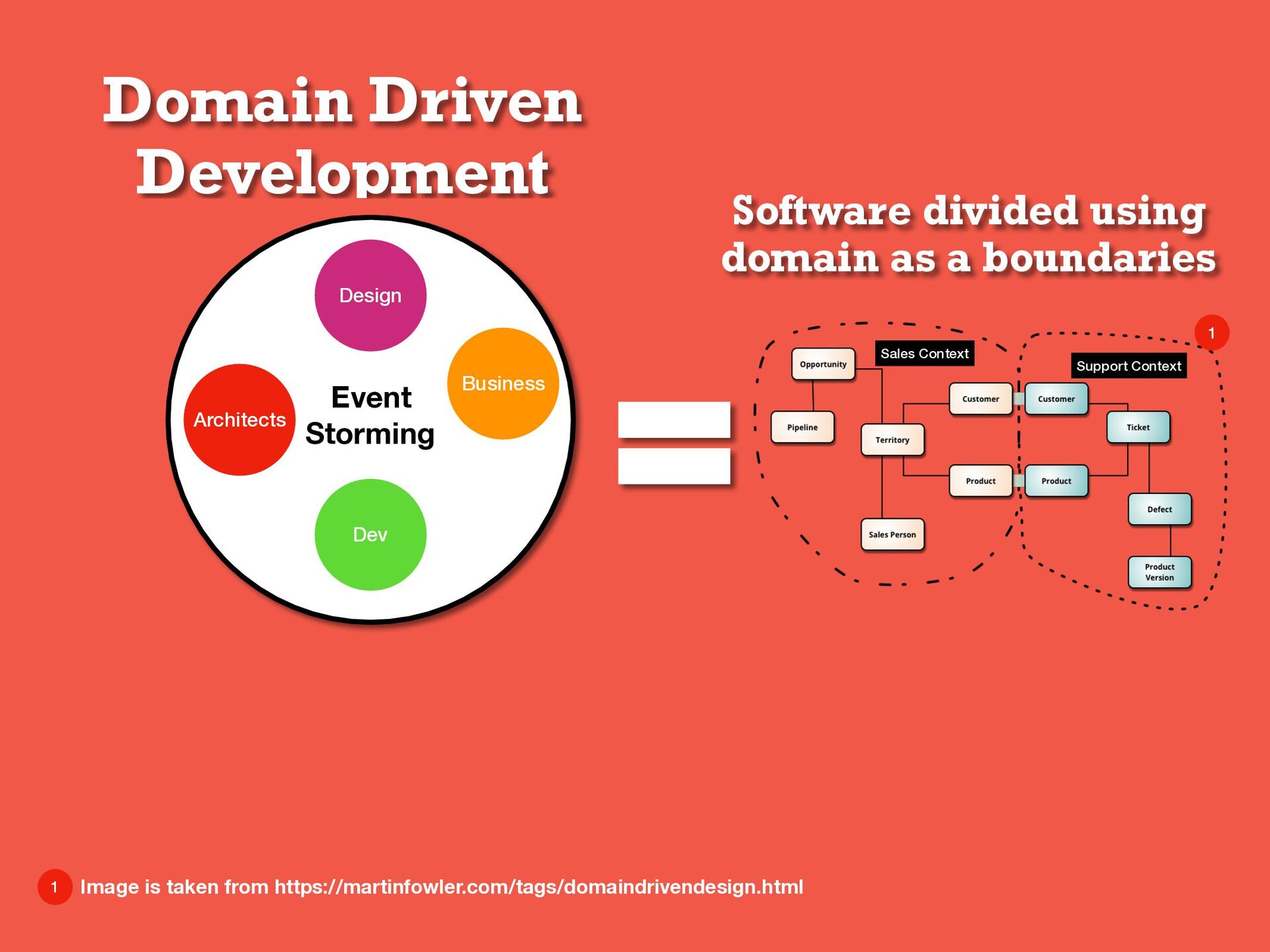
Dev Design Business Sales Context Support Context 1 1 Image is taken from https://martinfowler.com/tags/domaindrivendesign.html Domain Driven Development
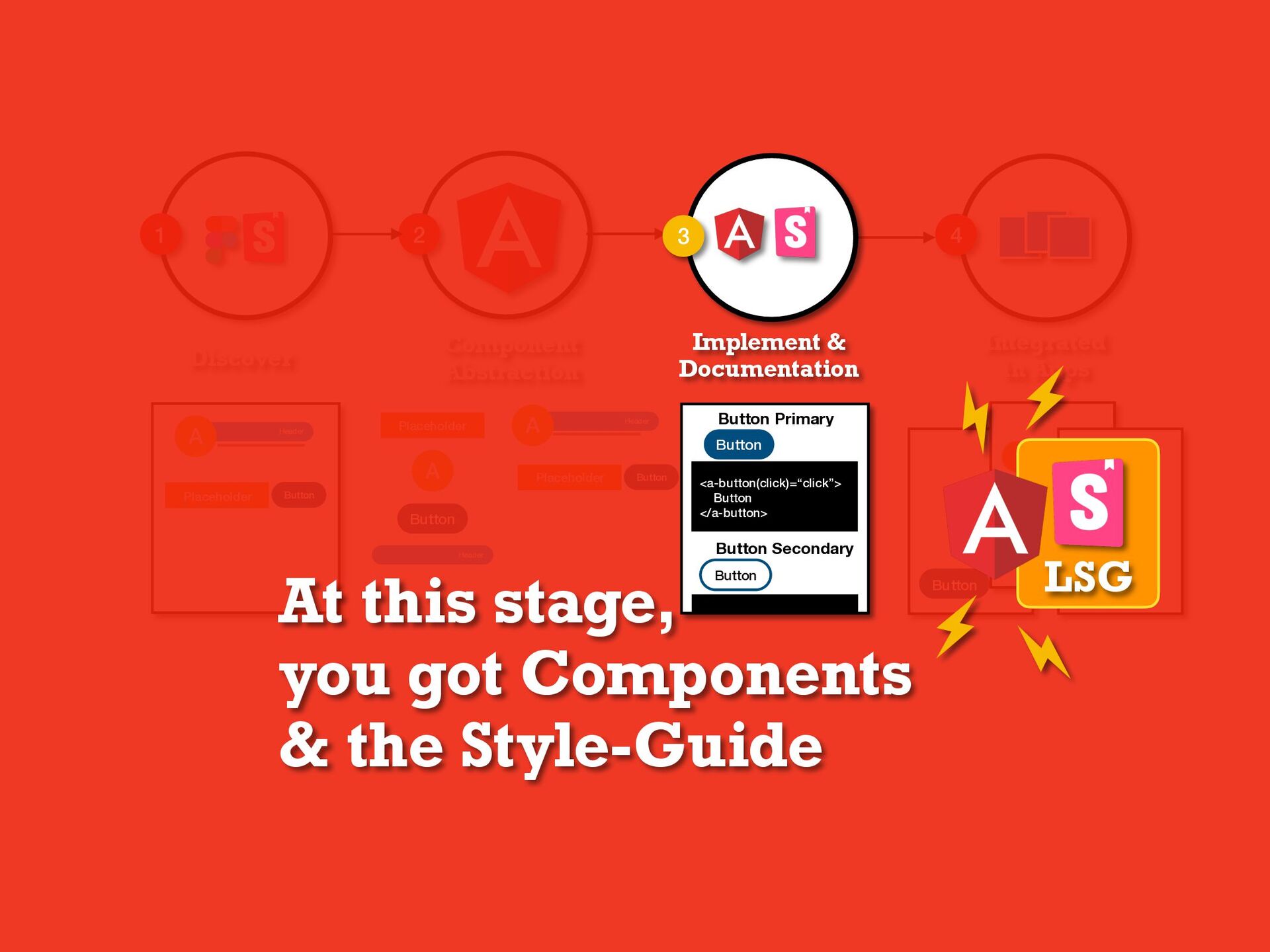
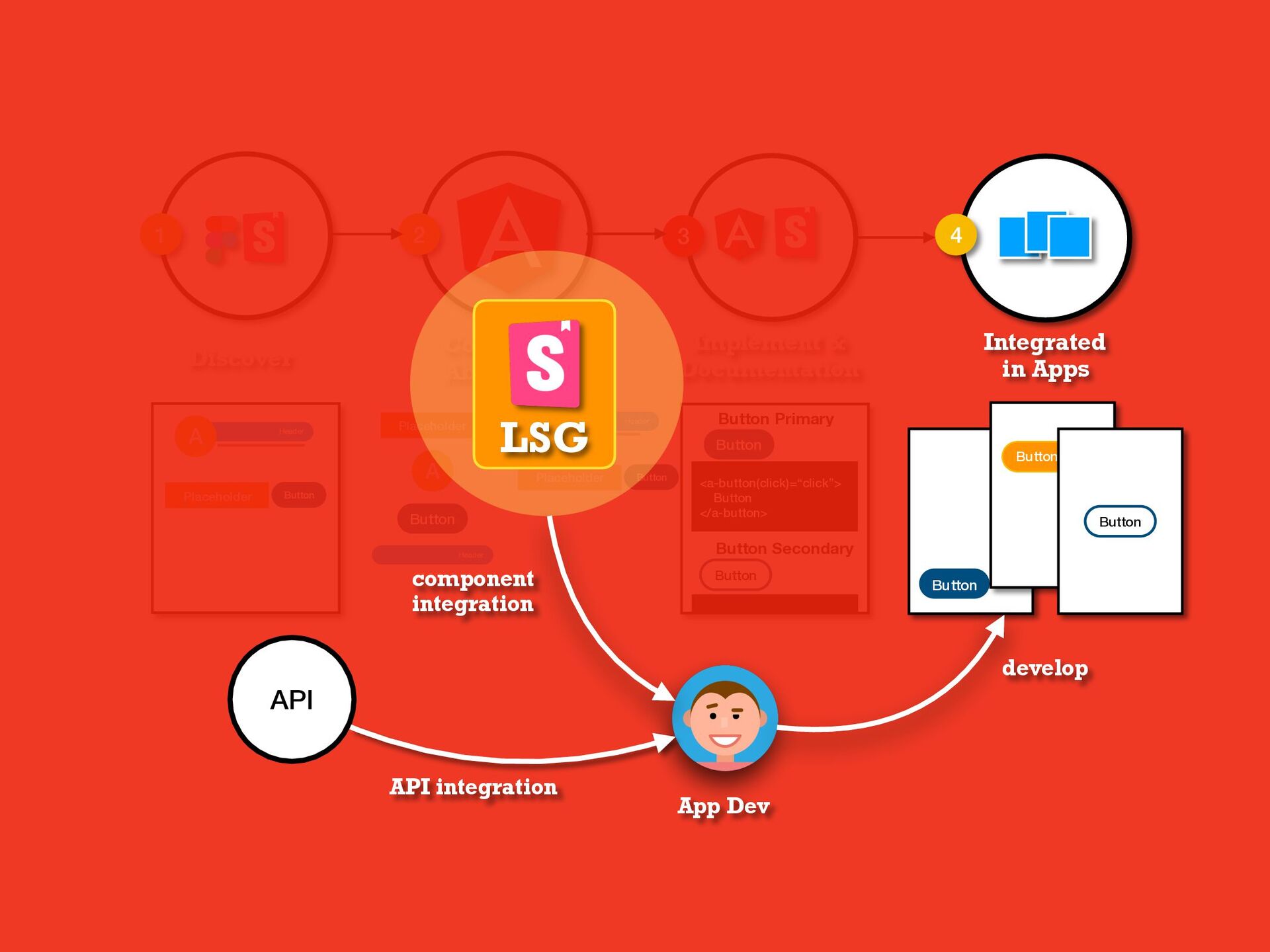
Documentation 3 4 Placeholder Button Header A Placeholder A Button Header Header A Placeholder Button Button Button Primary <a-button(click)=“click”> Button </a-button> Button Button Secondary Button Button Button Integrated in Apps What’s interesting about SGDD is that it both provides a playground and a framework for development, isolated from the application’s implementation. This isolation encourages creating components in an abstract way, making them more reusable.
weeks Planning Development Daily Scrum Review LSG LSG Story point Story estimation Component Dev to update about component progress App LSG Component lib consumers DoD App LSG Product Owner
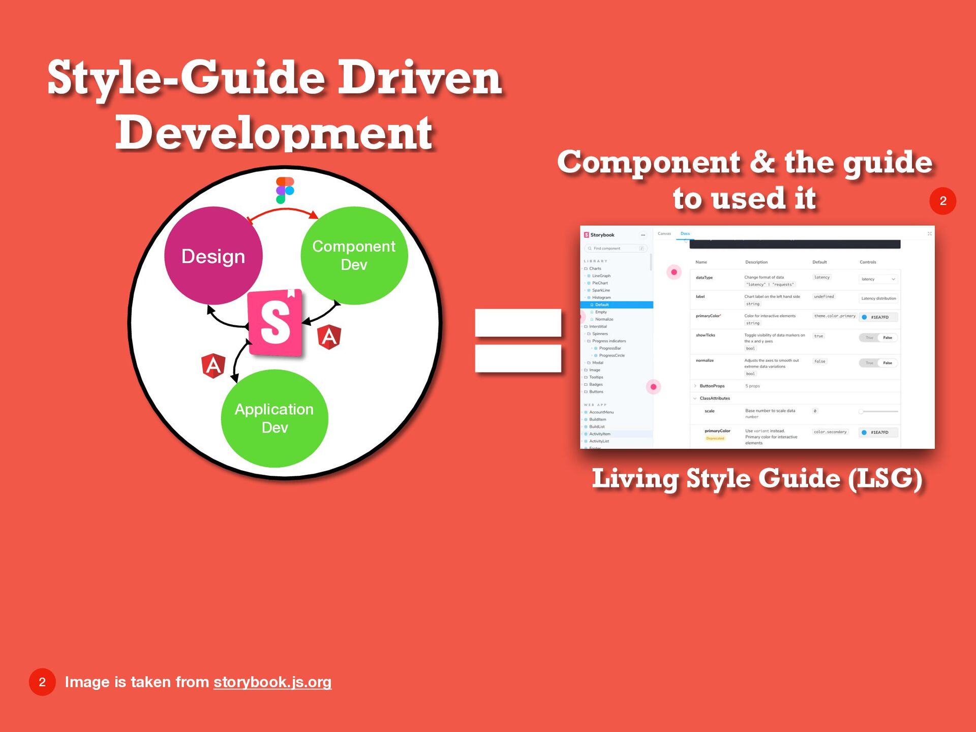
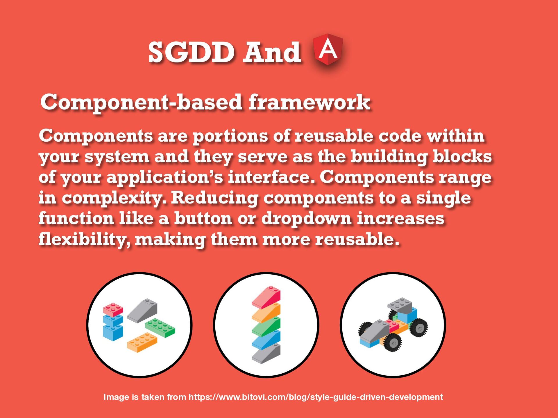
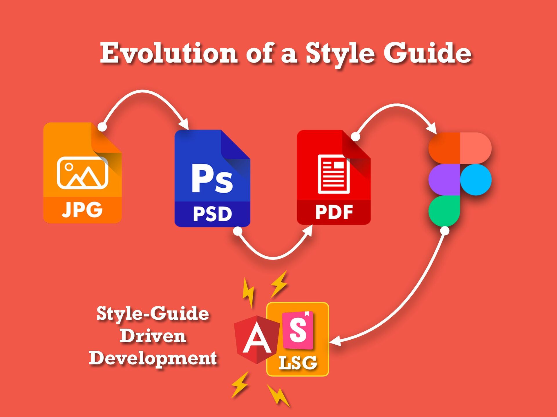
within your system and they serve as the building blocks of your application’s interface. Components range in complexity. Reducing components to a single function like a button or dropdown increases flexibility, making them more reusable. Image is taken from https://www.bitovi.com/blog/style-guide-driven-development
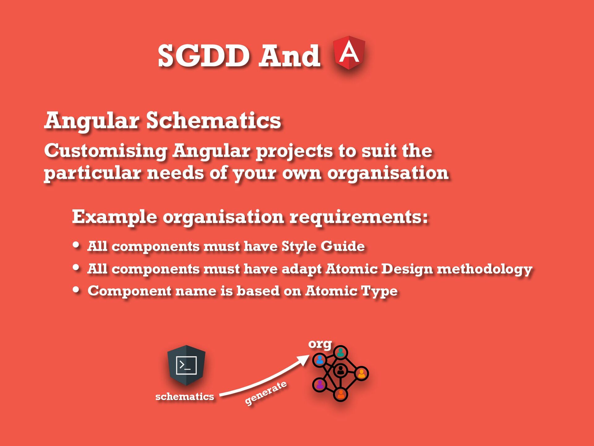
particular needs of your own organisation Example organisation requirements: • All components must have Style Guide • All components must have adapt Atomic Design methodology • Component name is based on Atomic Type org schematics generate
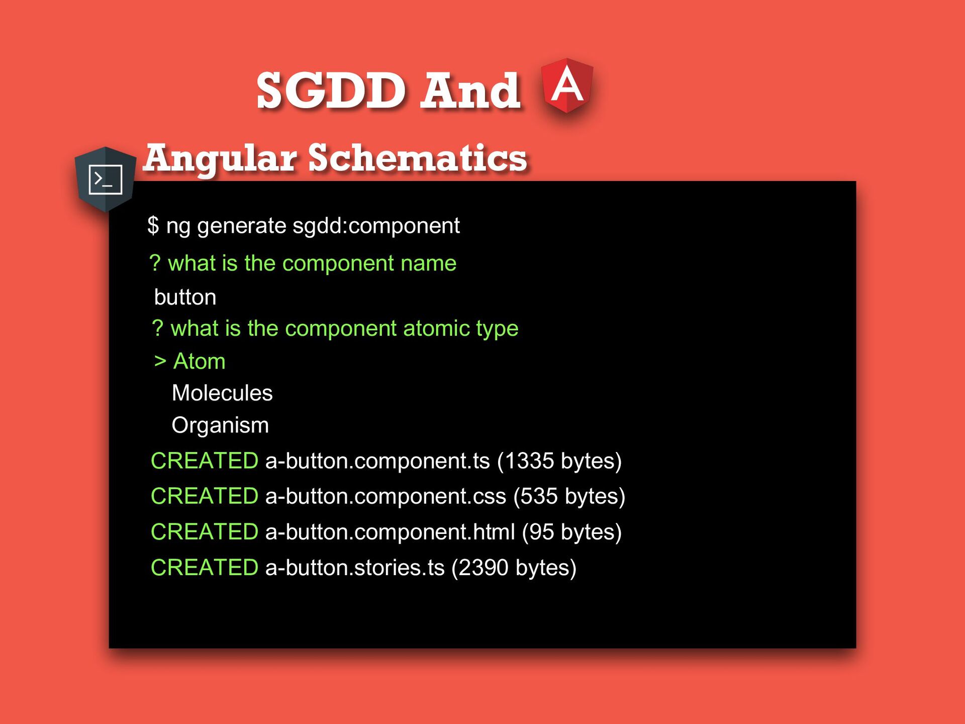
is the component name ? what is the component atomic type button > Atom Molecules Organism CREATED a-button.component.ts (1335 bytes) CREATED a-button.component.css (535 bytes) CREATED a-button.component.html (95 bytes) CREATED a-button.stories.ts (2390 bytes)
or modifying commands. For example, you could supply a builder to perform an entirely new task, or to change which third-party tool is used by an existing command. builder deploy
 aziziyazit
 akiraasano
 magnolia
 masakat0
 stardy
 yatabe
.png) codeforeveryone
codeforeveryone
 masakiokuda
 koheihasebe
 cm_manaus
 sciencetokyo
 szymonslowik
 destraynor
 garrettdimon
 chriscoyier
 watany
 mkilby
 livdayseo
 addyosmani
 reverentgeek
 baasie
 427marketing
 jacobian