Upgrade to Pro — share decks privately, control downloads, hide ads and more …

Design System 101

Design System 101

Design System 101

Azizi Yazit

March 07, 2023
Tweet

More Decks by Azizi Yazit

Other Decks in Research

Transcript

  1. Style-guide Frontend UI Developer creates visual representations of concepts and

    ideas in Figma (static Style-guide) preparing UI assets UI | UX | Graphic Designer
  2. Style-guide Frontend Designer A component developer focuses on developing UI

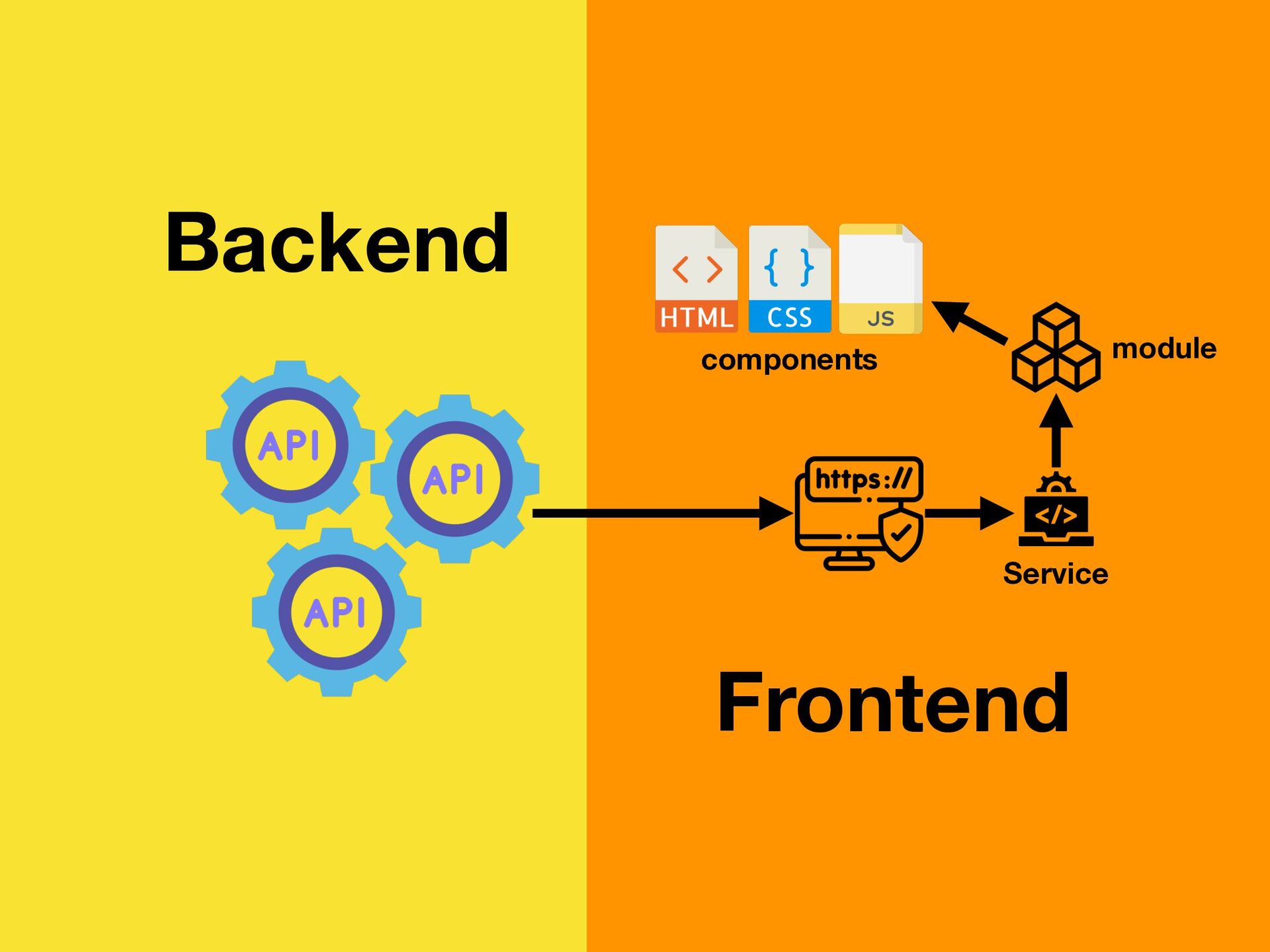
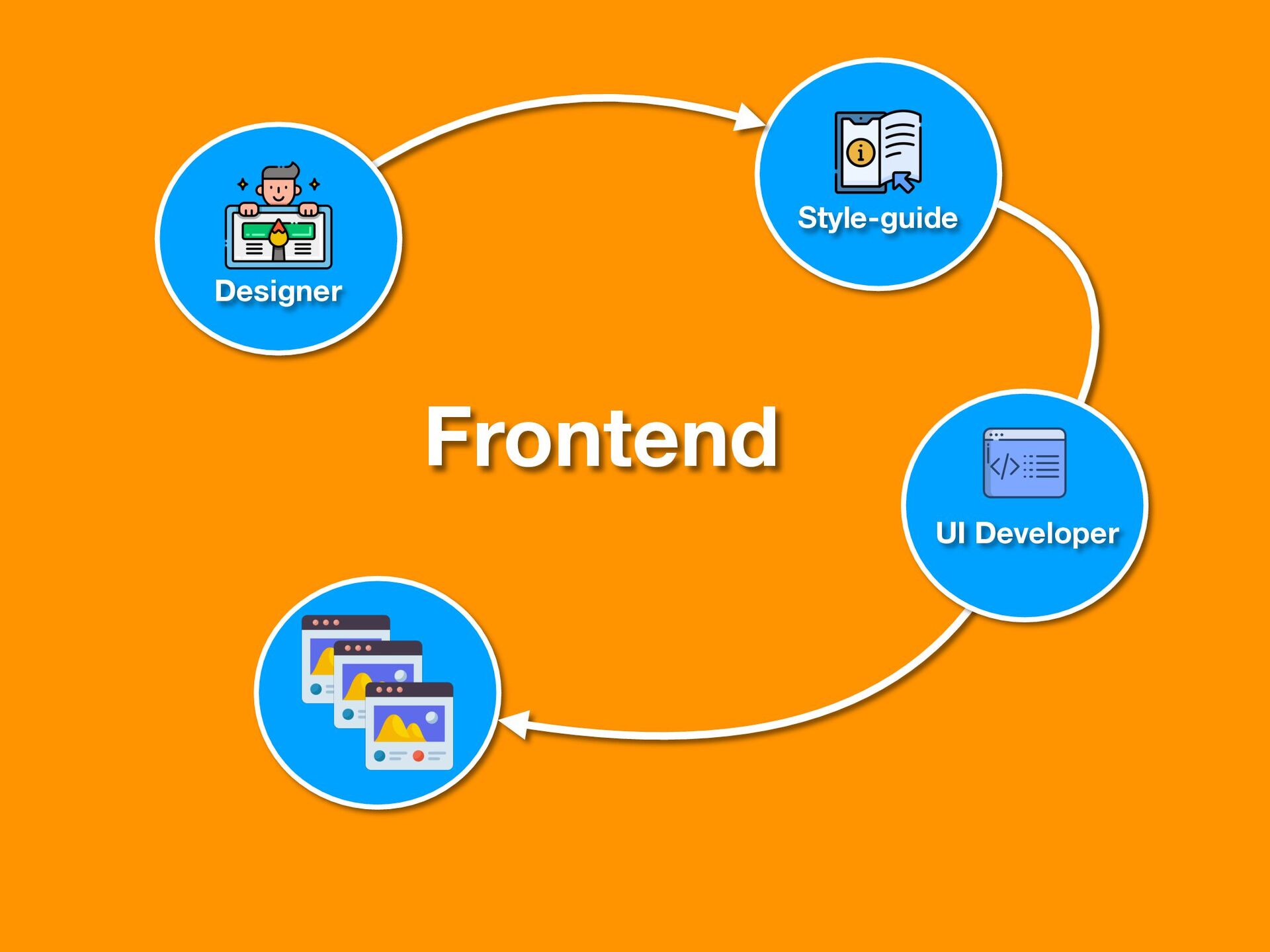
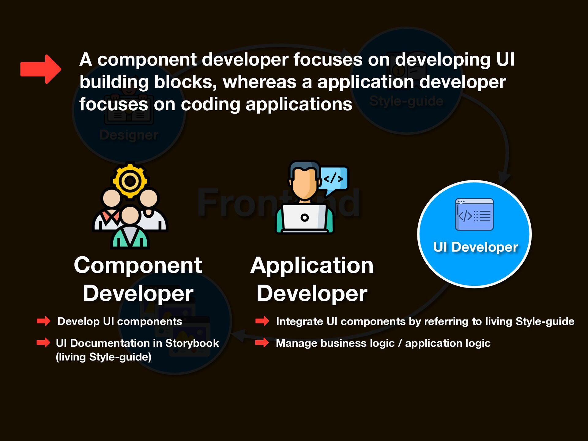
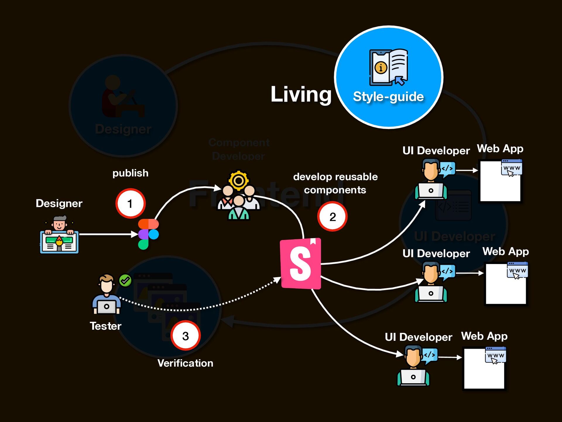
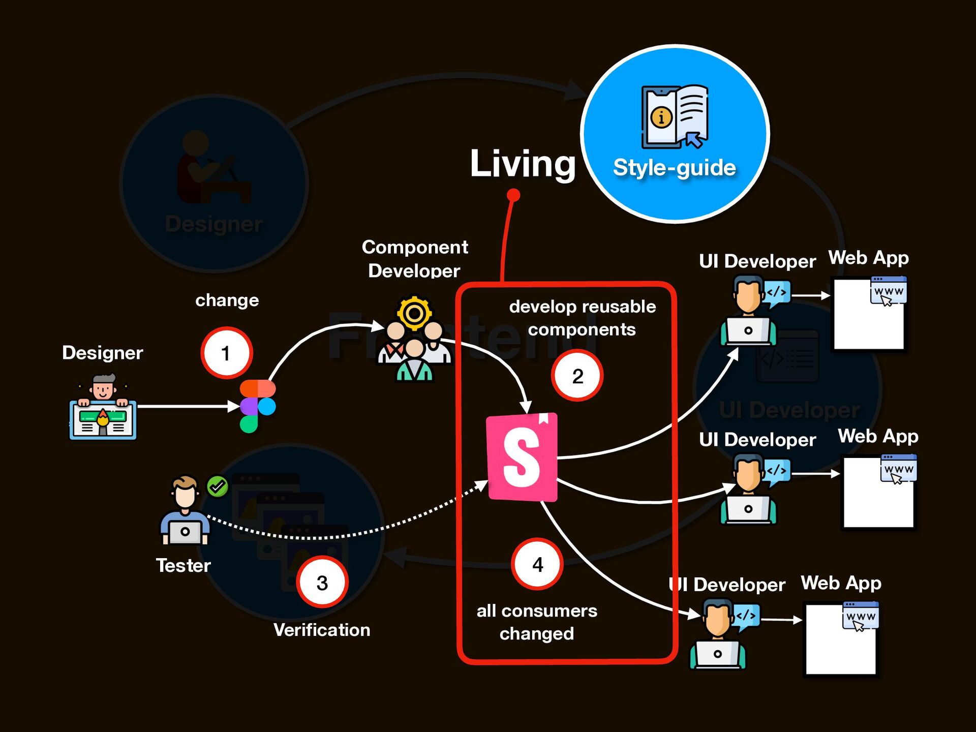
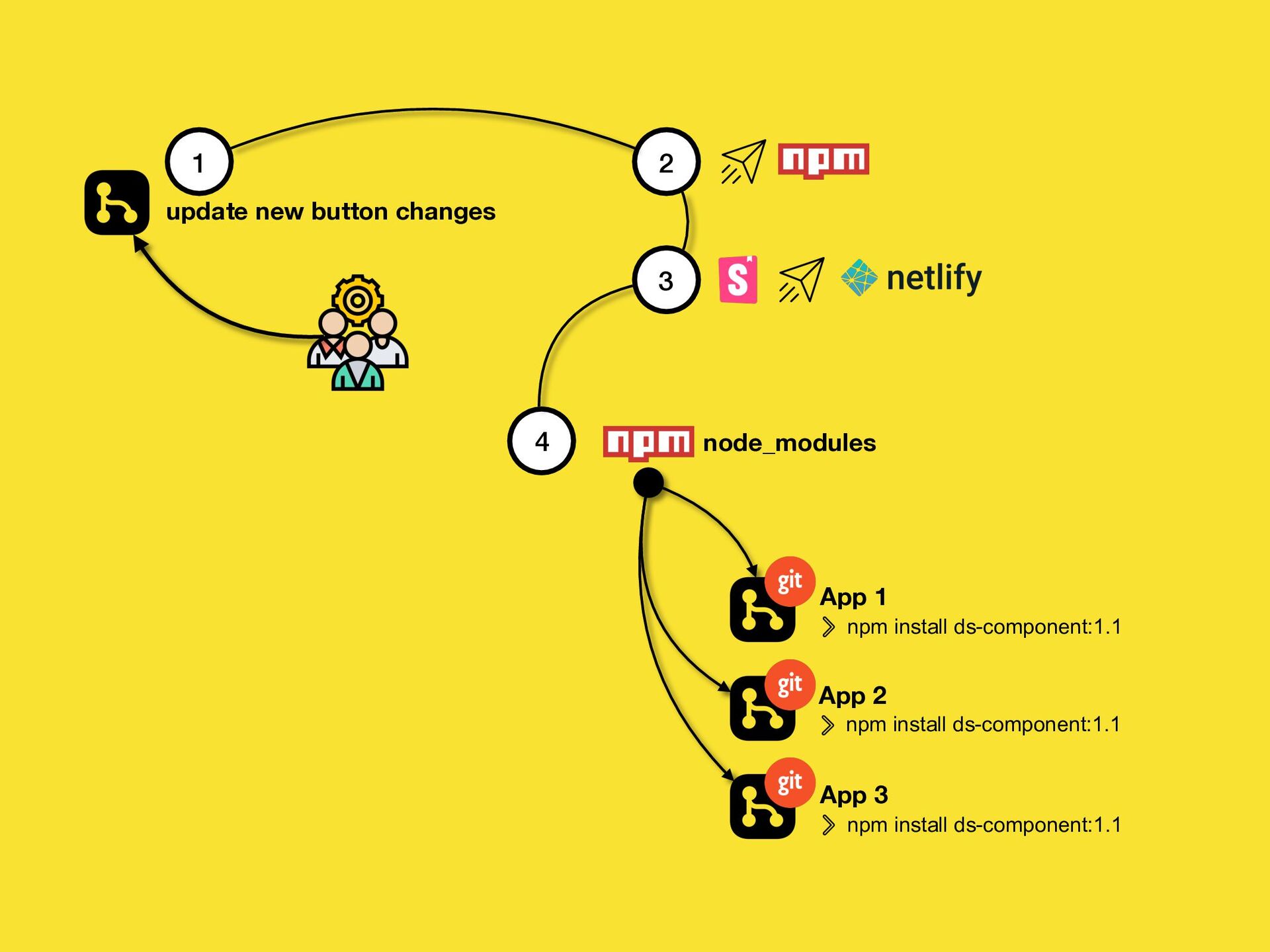
    building blocks, whereas a application developer focuses on coding applications UI Developer Component Developer Application Developer Develop UI components UI Documentation in Storybook (living Style-guide) Integrate UI components by referring to living Style-guide Manage business logic / application logic
  3. Designer Frontend UI Developer Style-guide a document that contains design

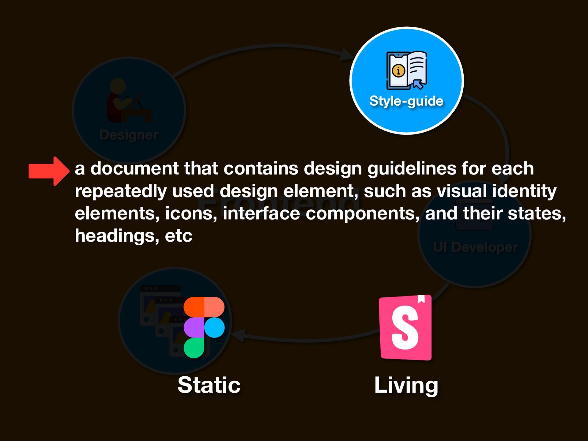
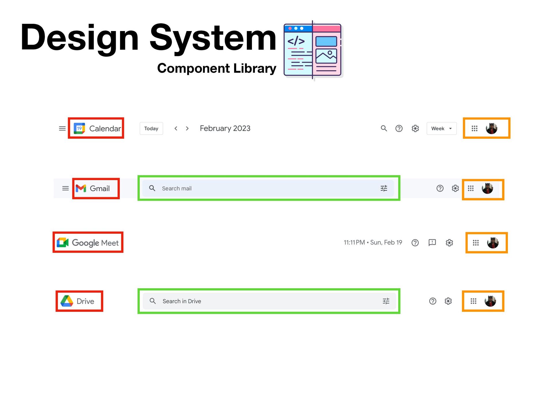
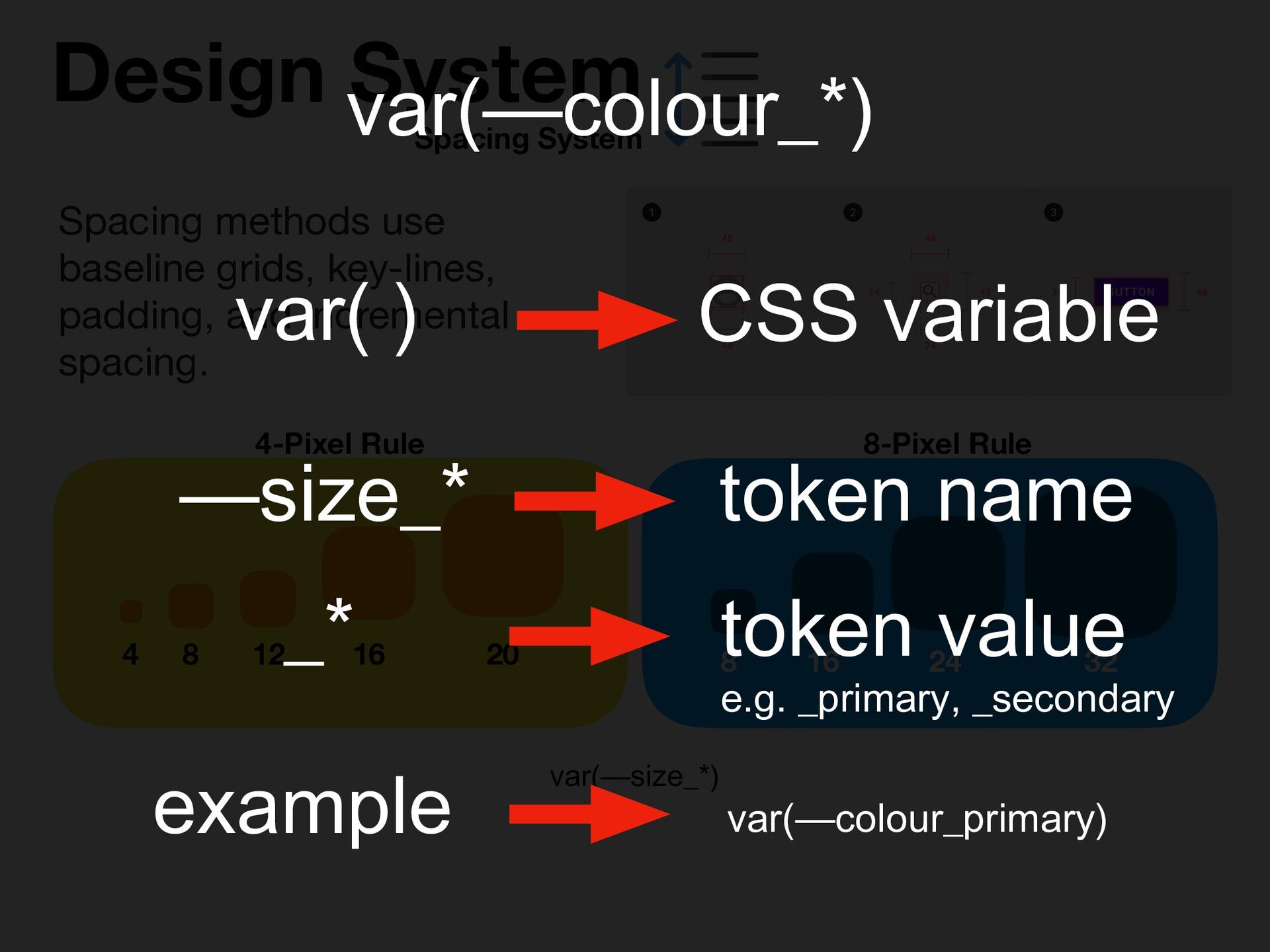
    guidelines for each repeatedly used design element, such as visual identity elements, icons, interface components, and their states, headings, etc Static Living
  4. Designer Frontend UI Developer Static Style-guide Figma is a powerful

    web-based design tool that helps you create anything, websites, applications, logos, and much more.
  5. Designer Frontend Pixel Perfect UI Developer Static Style-guide 1 3

    4 Verification Designer UI Developer Web App 2 width, height, border, colours, sizing, spacing, CSS etc publish
  6. Designer Frontend UI Developer 2 3 developer efforts Static Style-guide

    1 Designer Web App UI Developer UI Developer UI Developer Web App Web App change design
  7. Designer Frontend UI Developer Living Style-guide Storybook is a frontend

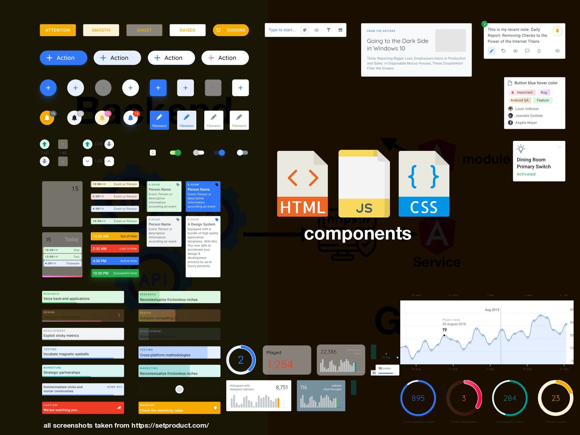
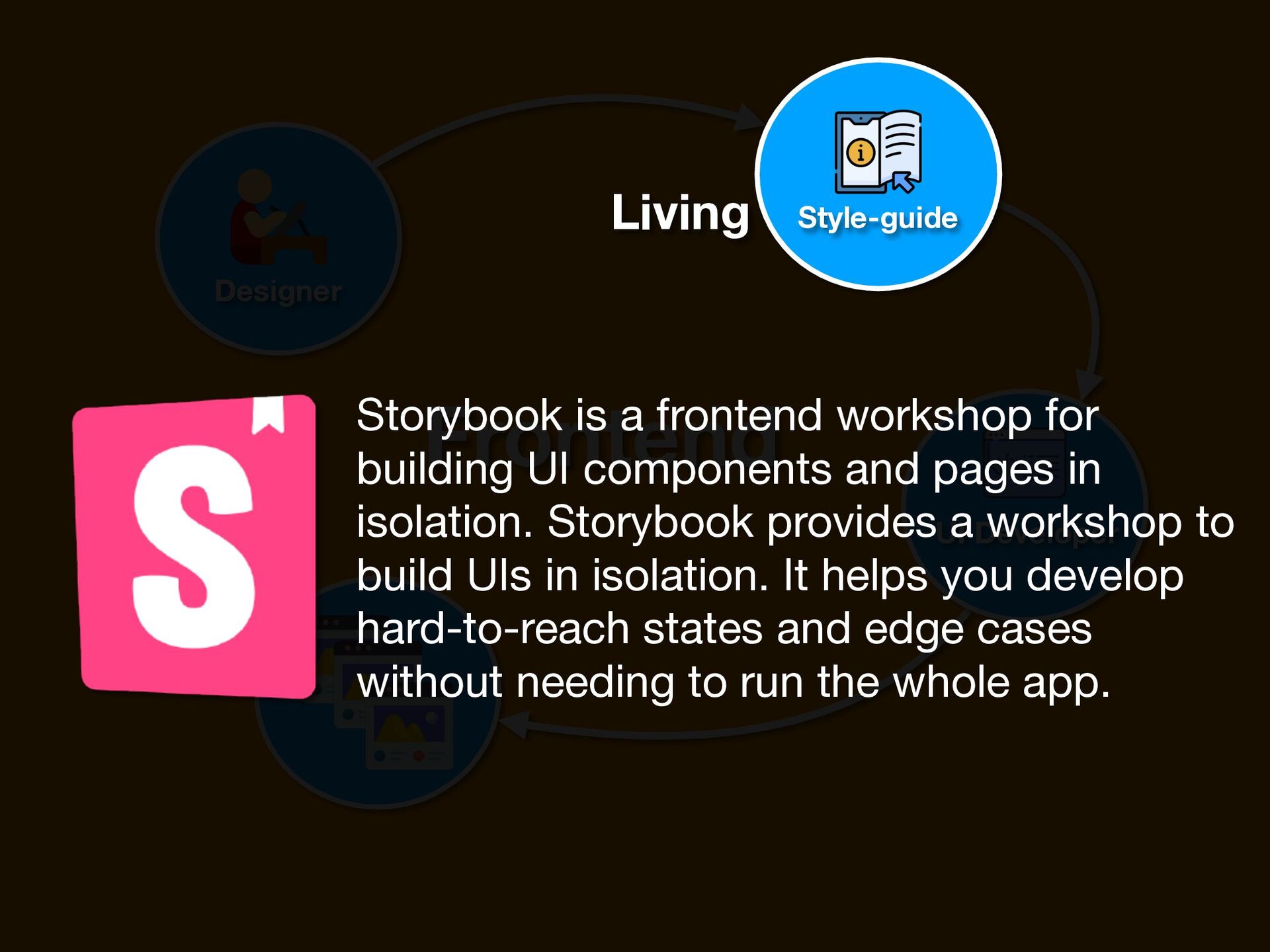
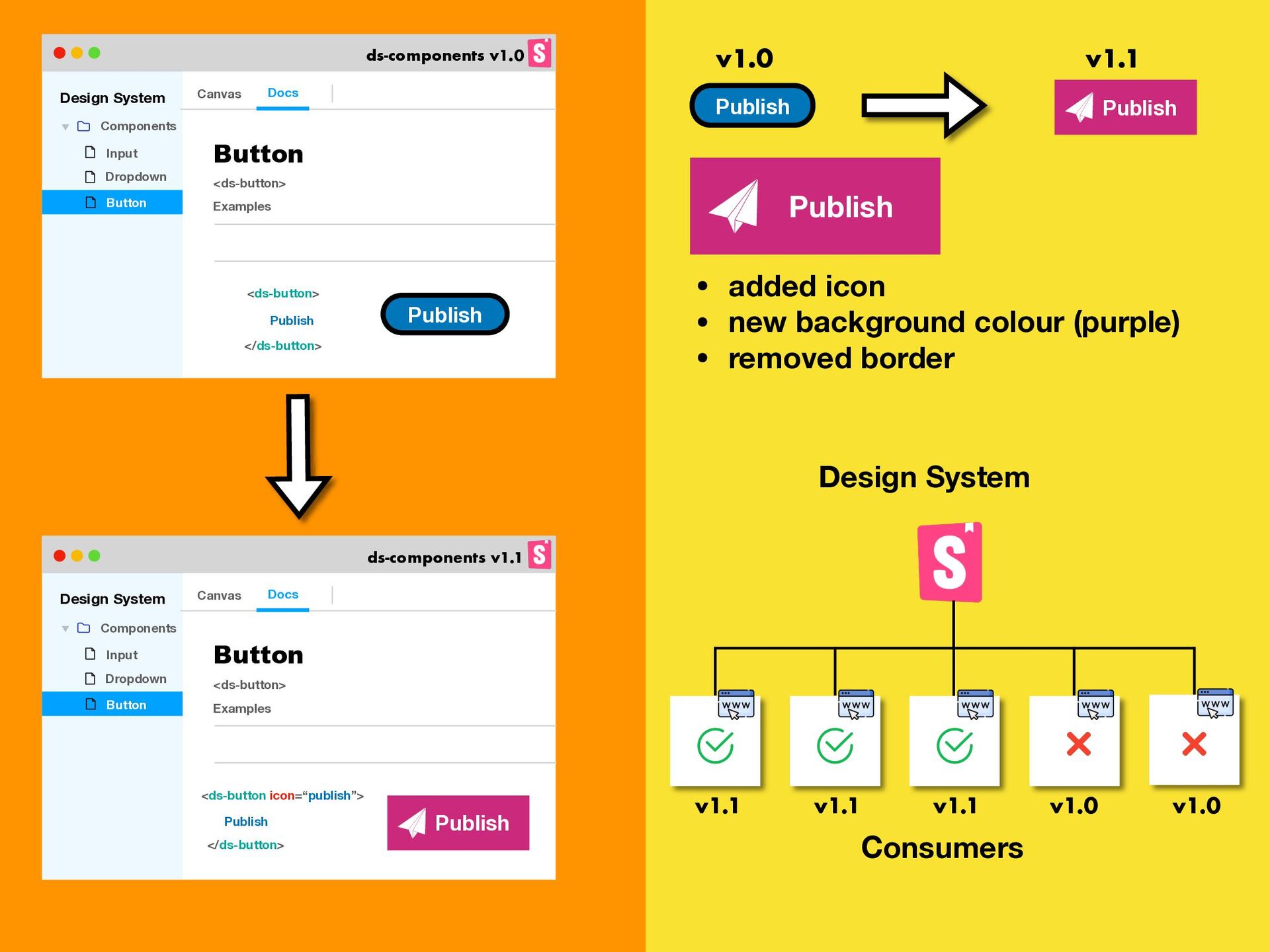
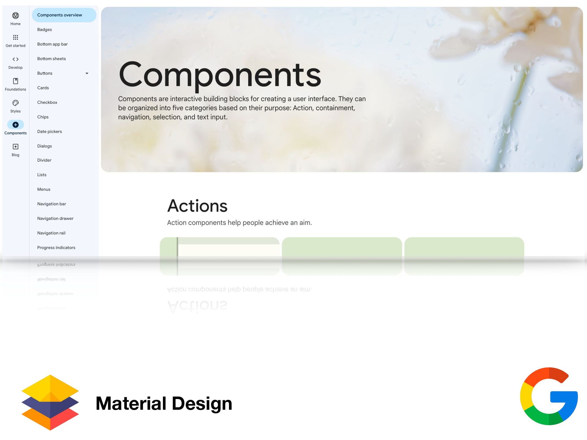
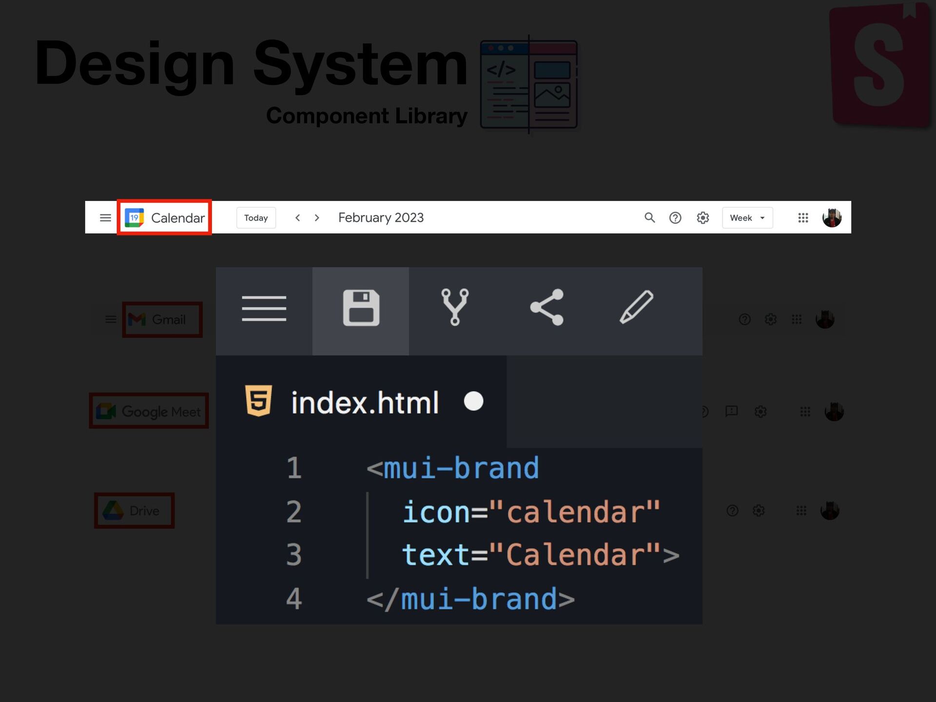
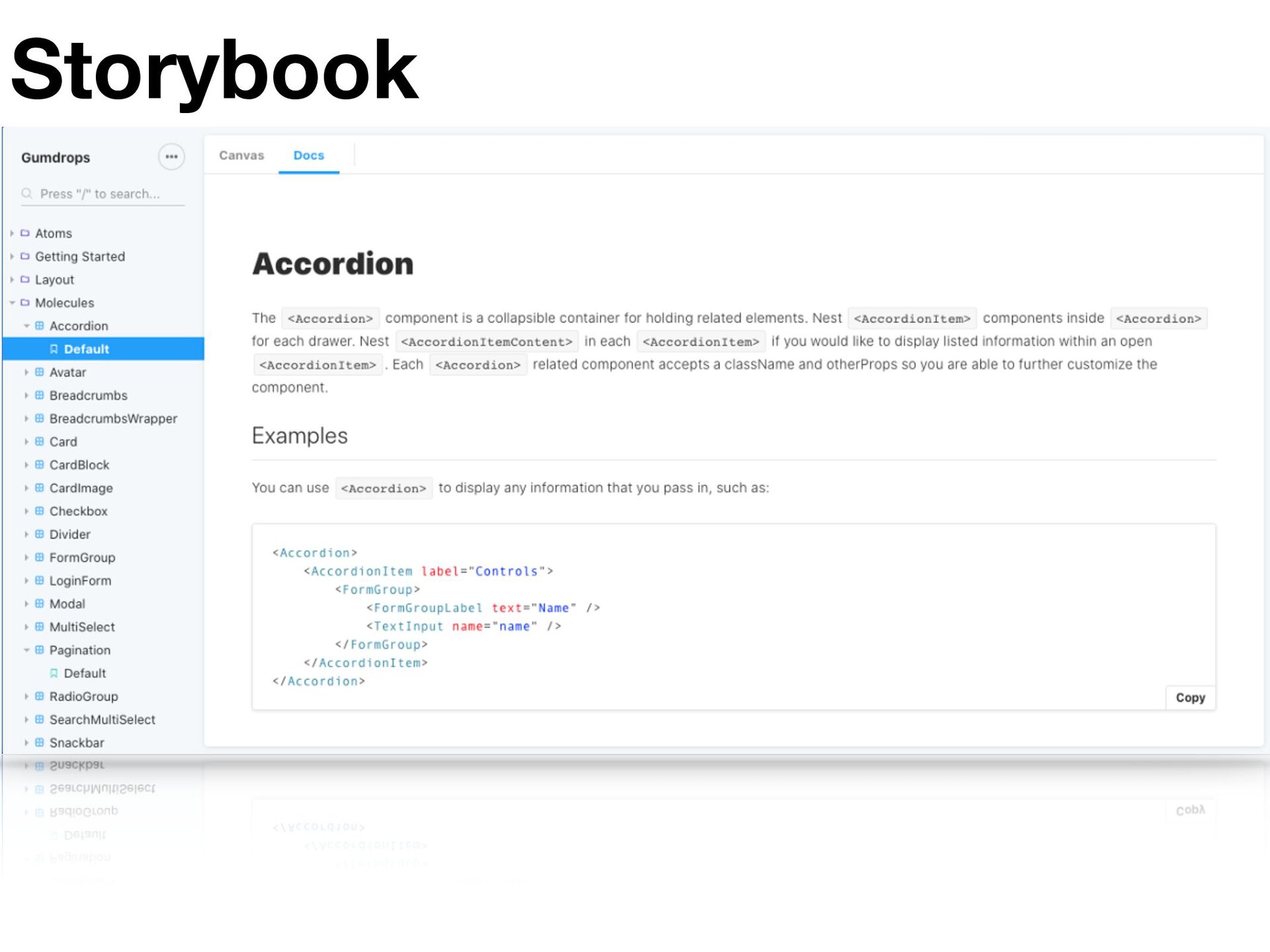
    workshop for building UI components and pages in isolation. Storybook provides a workshop to build UIs in isolation. It helps you develop hard-to-reach states and edge cases without needing to run the whole app.
  8. Designer Frontend Component Developer UI Developer Living Style-guide 1 Designer

    2 3 Tester Web App UI Developer Web App UI Developer Web App UI Developer publish develop reusable components Verification
  9. Designer Frontend UI Developer Living Style-guide 1 Designer Component Developer

    2 3 Tester Web App UI Developer Web App UI Developer Web App UI Developer change develop reusable components Verification 4 all consumers changed
  10. Design System Components Input Dropdown Button Canvas Docs Button Examples

    <ds-button> <ds-button> </ds-button> Publish Publish Publish Publish Publish • added icon • new background colour (purple) • removed border Design System Components Input Dropdown Button Canvas Docs Button Examples <ds-button> <ds-button icon=“publish”> </ds-button> Publish Publish Design System v1.0 v1.1 v1.0 v1.1 v1.1 v1.1 v1.0 Consumers ds-components v1.0 ds-components v1.1
  11. App 1 npm install ds-component:1.1 App 2 npm install ds-component:1.1

    App 3 npm install ds-component:1.1 node_modules update new button changes 1 2 3 4
  12. Style-guide Frontend Designer UI Developer mail calendar meet drive Org

    Product A Product B Product C • GUI standards • Shareable components • Spacing system • Color system • …
  13. Style-guide Frontend Designer UI Developer material.mail Calendar Team Meet Team

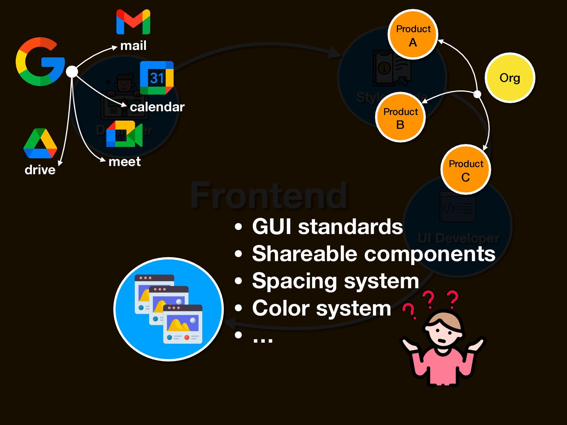
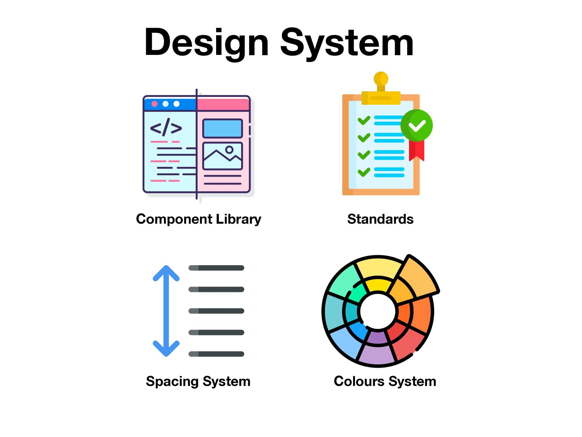
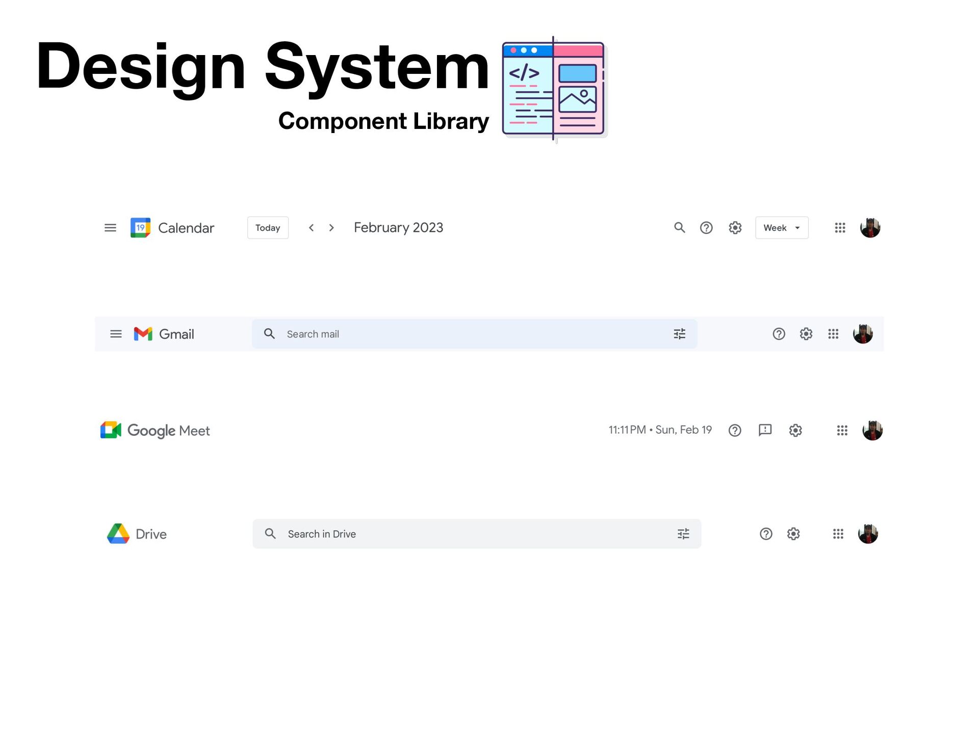
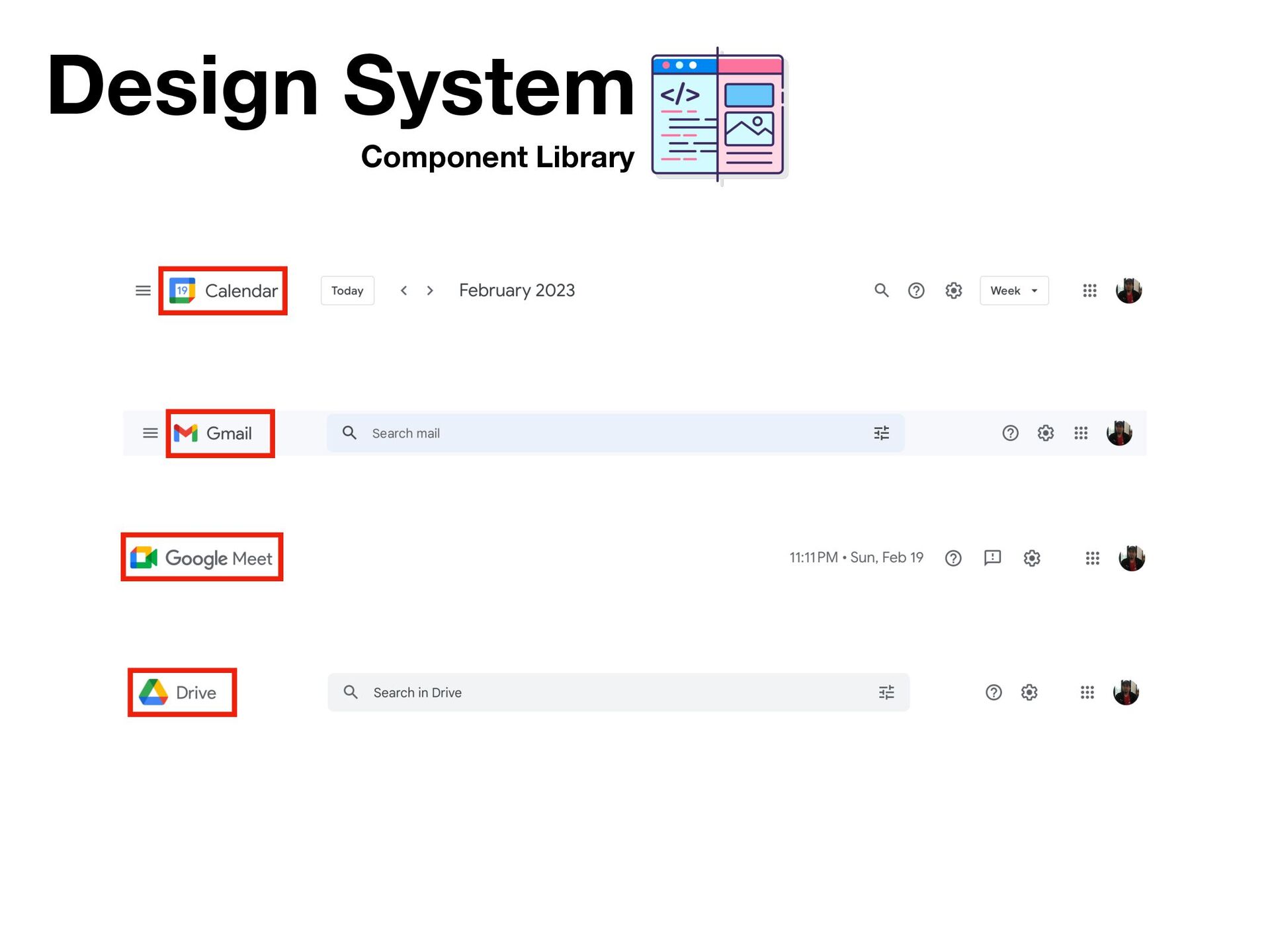
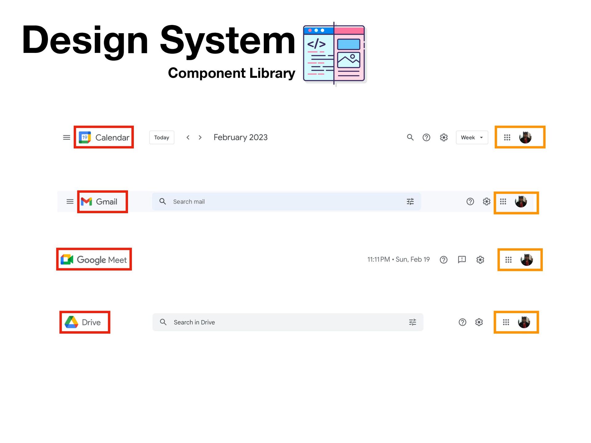
    Drive Team Material Design material.calendar material.meet material.drive Mail Team Design system • GUI standards • Shareable components • Spacing system • Color system • …
  14. Component Library Design System Components are interactive building blocks for

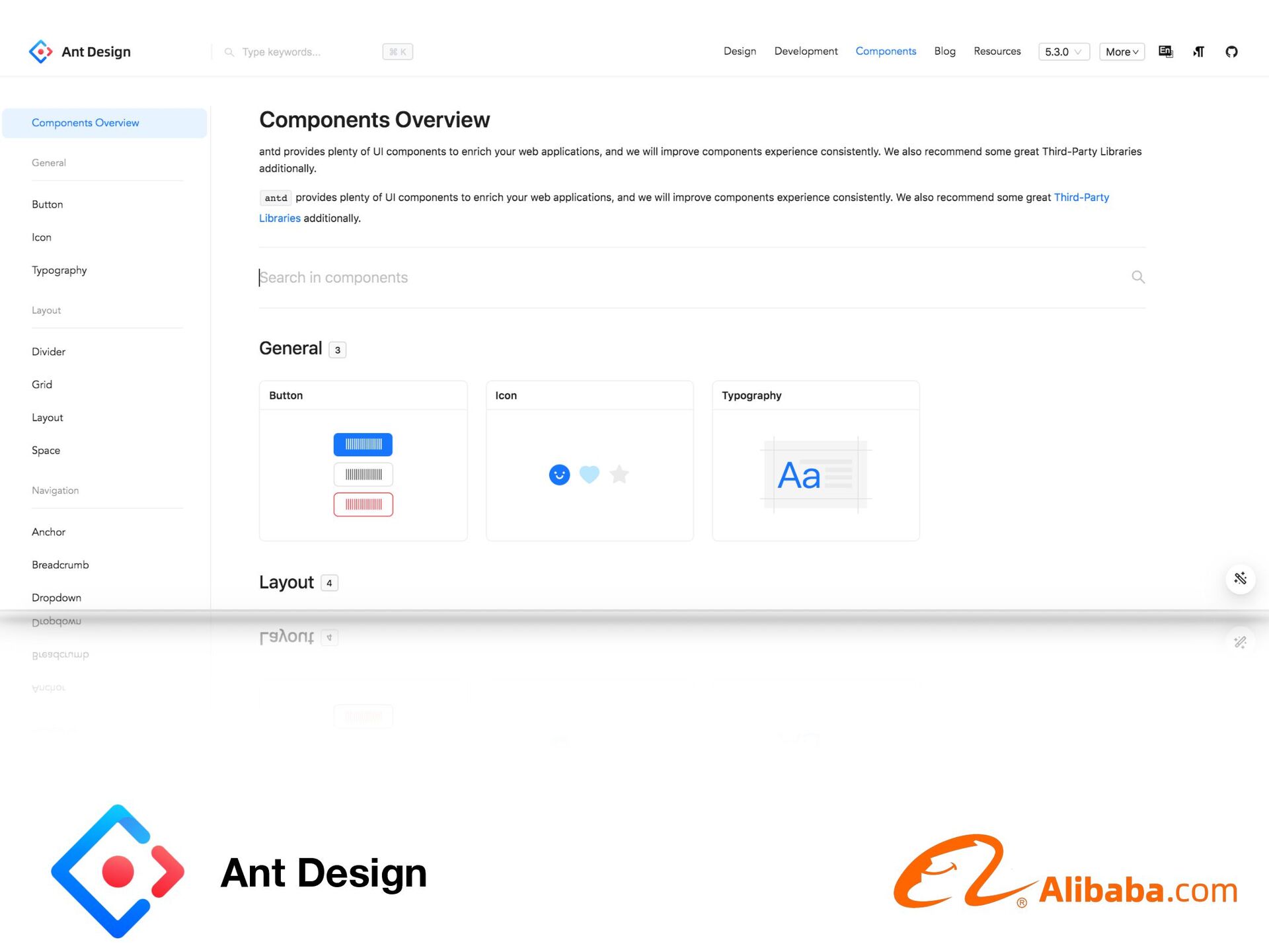
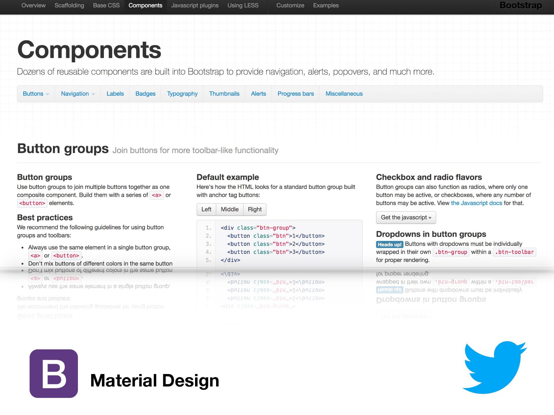
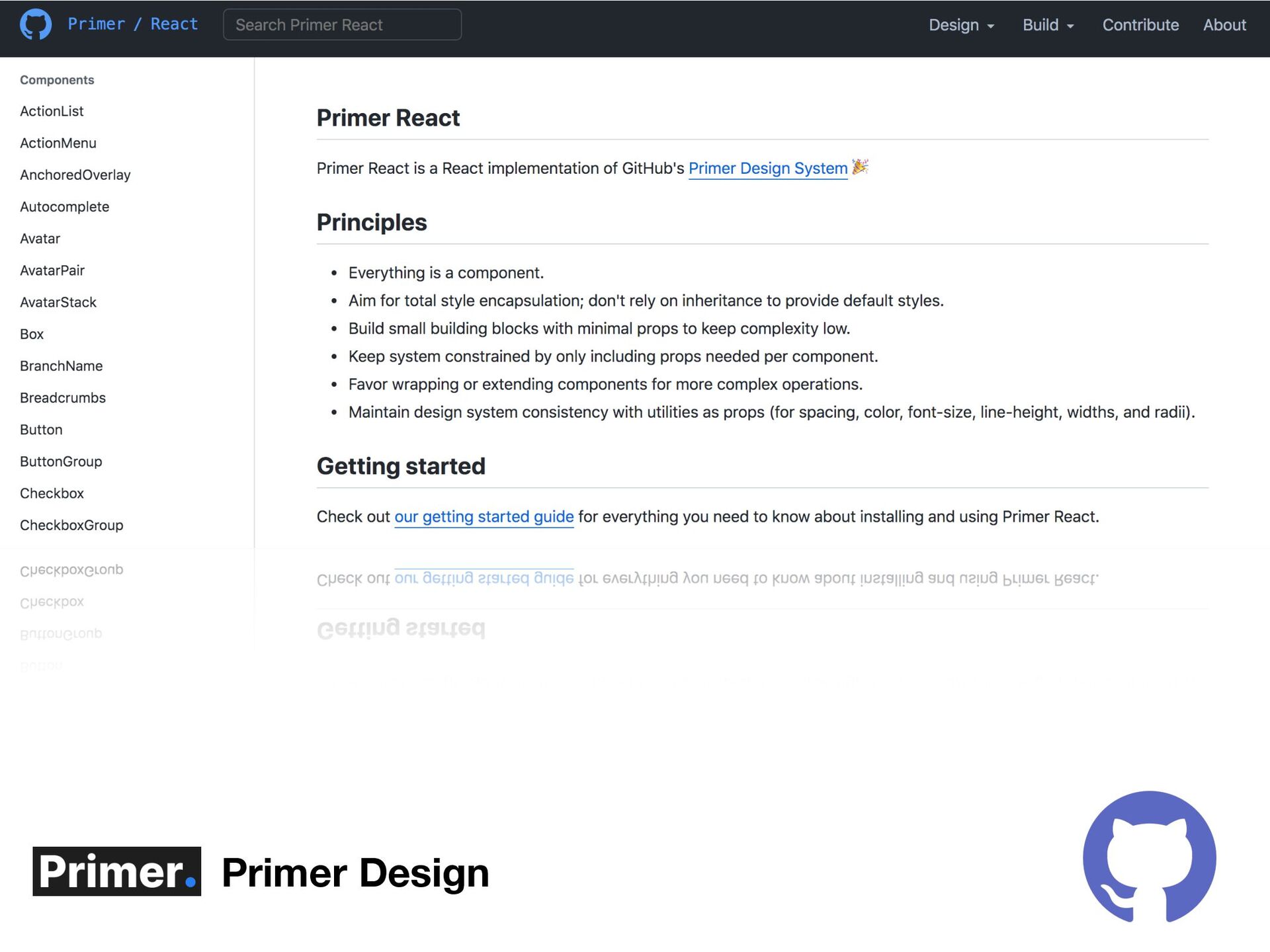
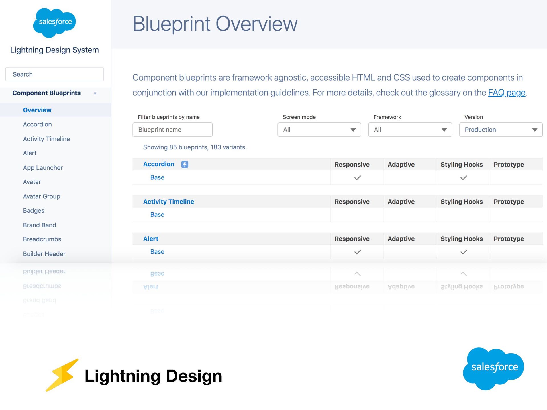
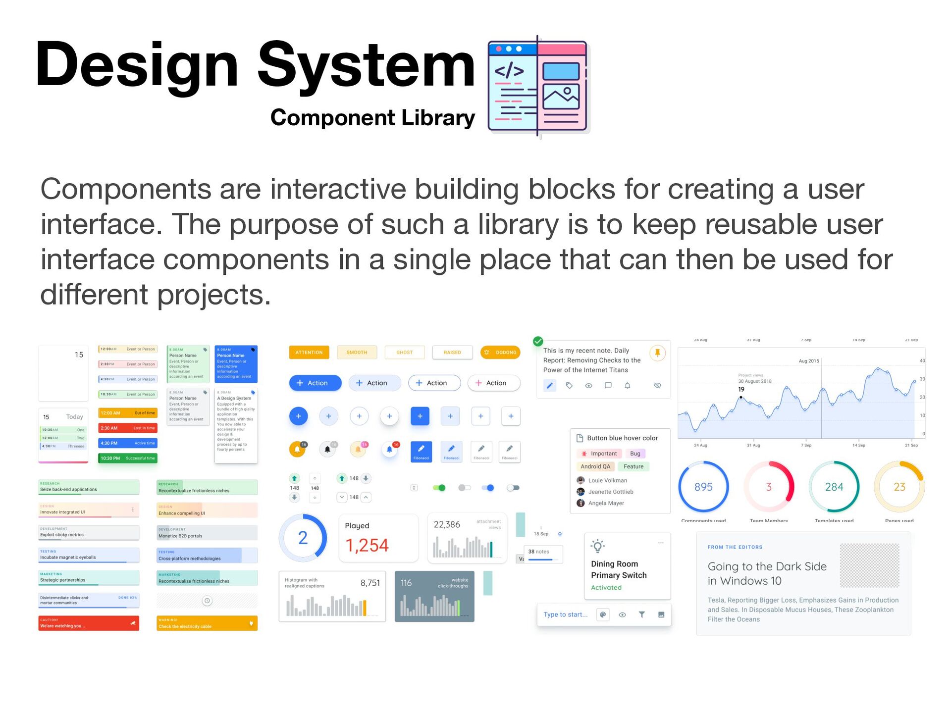
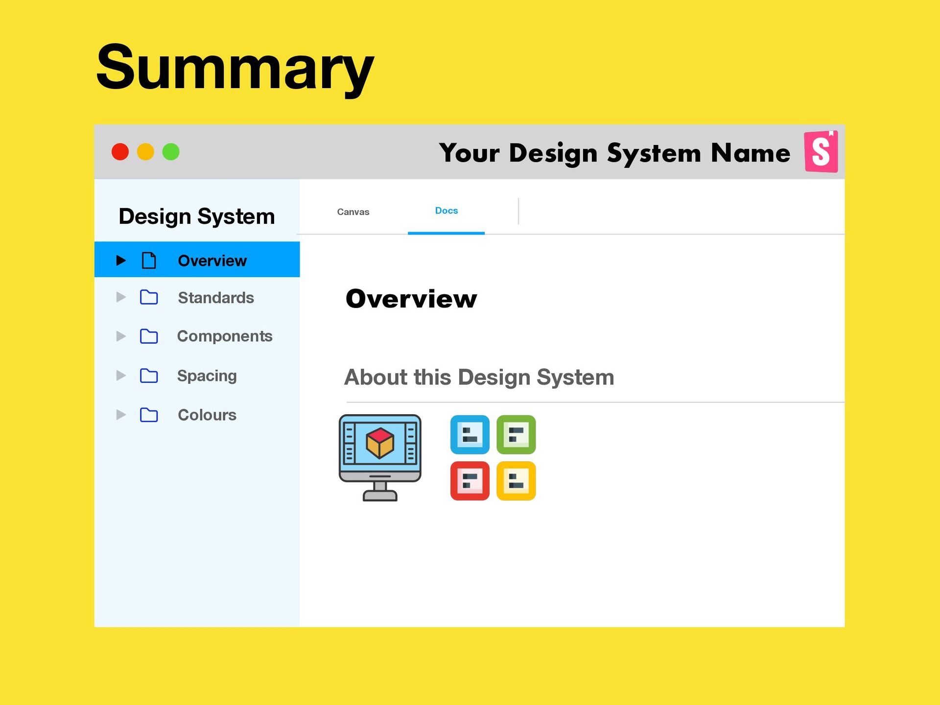
    creating a user interface. The purpose of such a library is to keep reusable user interface components in a single place that can then be used for different projects.
  15. Design System Standards Design guidance, specs, and tools to streamline

    the work of getting from Designer to finished products. Colours Motion Icons Shape Font
  16. Design System Spacing System Spacing methods use baseline grids, key-lines,

    padding, and incremental spacing. 4-Pixel Rule 8-Pixel Rule 4 8 12 16 20 8 16 24 32 var(—size_*)
  17. Design System Spacing System Spacing methods use baseline grids, key-lines,

    padding, and incremental spacing. 4-Pixel Rule 8-Pixel Rule 4 8 12 16 20 8 16 24 32 var(—size_*) var(—size_*) —size_* token name var( ) CSS variable _* token value e.g. _1, _2 example var(—size_1)
  18. Design System Colours System Colours system helps you apply colour

    to your UI in a meaningful way. var(—colour_*)
  19. Design System Spacing System Spacing methods use baseline grids, key-lines,

    padding, and incremental spacing. 4-Pixel Rule 8-Pixel Rule 4 8 12 16 20 8 16 24 32 var(—size_*) var(—colour_*) —size_* token name var( ) CSS variable _* token value e.g. _primary, _secondary example var(—colour_primary)
  20. Summary Design System Standards Canvas Docs Overview About this Design

    System Your Design System Name Overview Components Spacing Colours