Upgrade to Pro — share decks privately, control downloads, hide ads and more …

Displaying Data

Bipul
January 30, 2015

Displaying Data

When it comes to displaying data in your presentation, use the five principles to present your data in the clearest possible way.

Bipul

January 30, 2015
Tweet

More Decks by Bipul

Other Decks in Education

Transcript

  1. “Data slides are not really about the data. They are

    about the meaning of the data.” Nancy Duarte.
  2. Which graph makes is easier to determine R&D’s travel expense?

    This 3D chart or the charts below? Expenses by Department in Millions Data and Image Source: Slideology
  3. You need to draw some kind of meaning from the

    data so that you can effectively express that meaning to your audience.
  4. On this chart show sales growth and recovery. This chart

    was for Management to draw attention to the April.
  5. You’ll need to choose the most appropriate tool for displaying

    your data. The most frequently used graphs for business communications are pie, bar, and line graphs.
  6. Pie charts work only for showing large differences in proportion,

    especially percentages. Image by André Oliveira
  7. Bar charts are visually more precise than pie charts, and

    can accommodate larger data sets. Image by Alex Pankratov
  8. Line graphs are used to track changes over short and

    long periods of time. Image by Kean Richmond
  9. Sometimes though, the best chart is no chart at all.

    If you only have one key message for your slide or the big message is just a number.
  10. Keep in mind that the purpose of slides is not

    to show all the data, but to communicate conclusions and insights.
  11. Think of a data chart in three layers The background

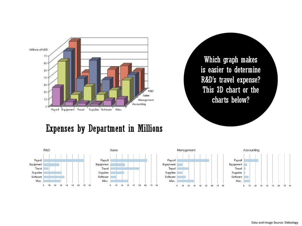
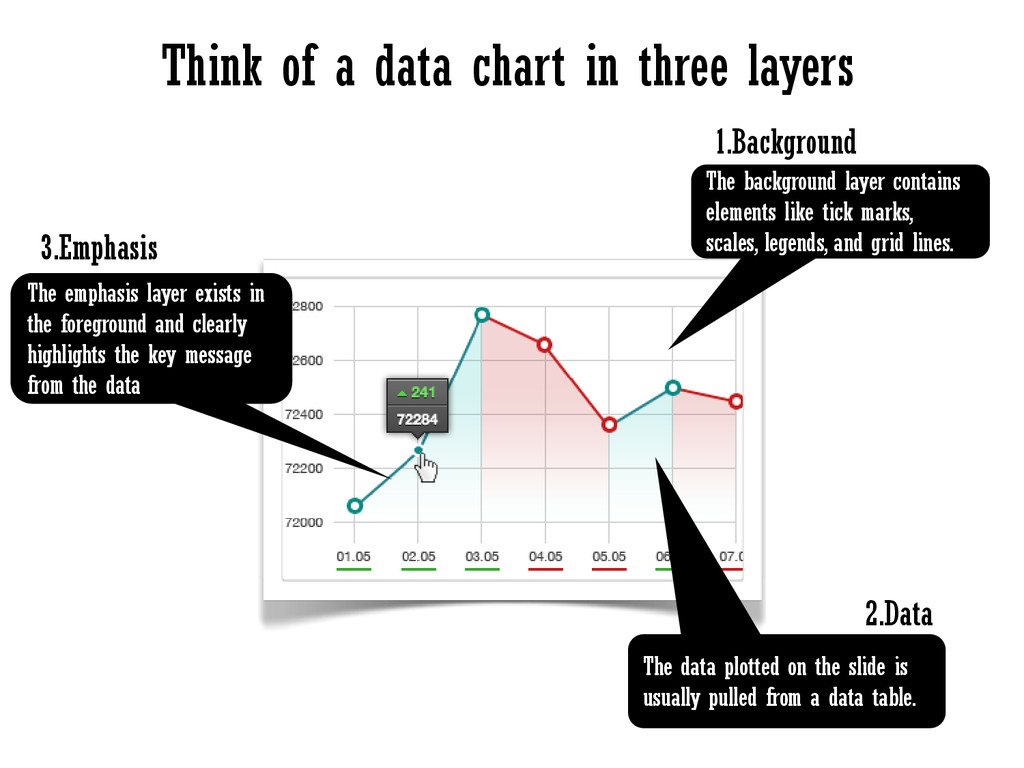
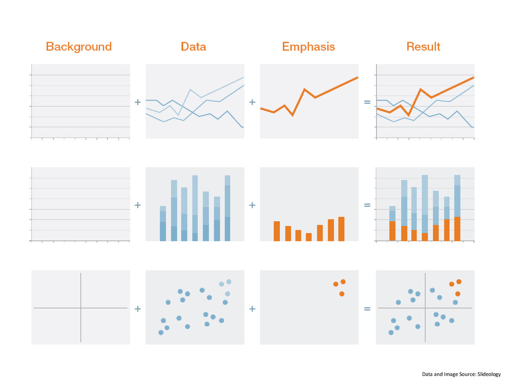
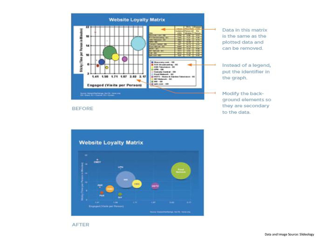
    layer contains elements like tick marks, scales, legends, and grid lines. The data plotted on the slide is usually pulled from a data table. The emphasis layer exists in the foreground and clearly highlights the key message from the data 1.Background 2.Data 3.Emphasis
  12. Do your best to avoid all unnecessary visual distractions and

    the message will come through much clearer.
  13. Tell the Truth Get to the Point Keep It Simple

    Highlight What’s Important Pick the Right Tool
  14. I would be happy to help you with your next

    presentation. www.bipulnath.wordpress.com [email protected]