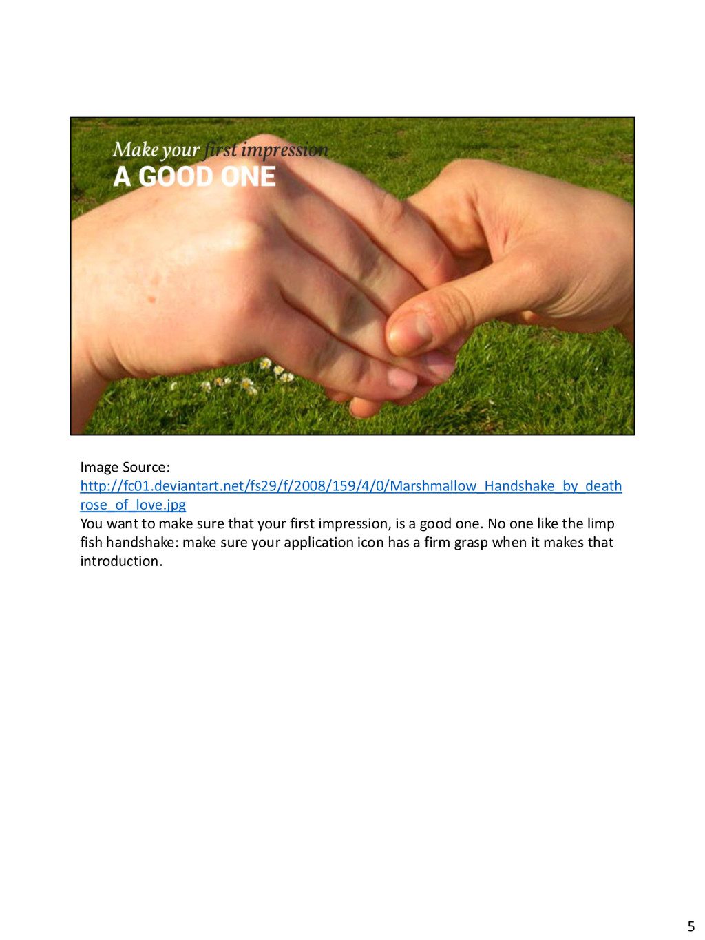
your first impression, is a good one. No one like the limp fish handshake: make sure your application icon has a firm grasp when it makes that introduction. 5
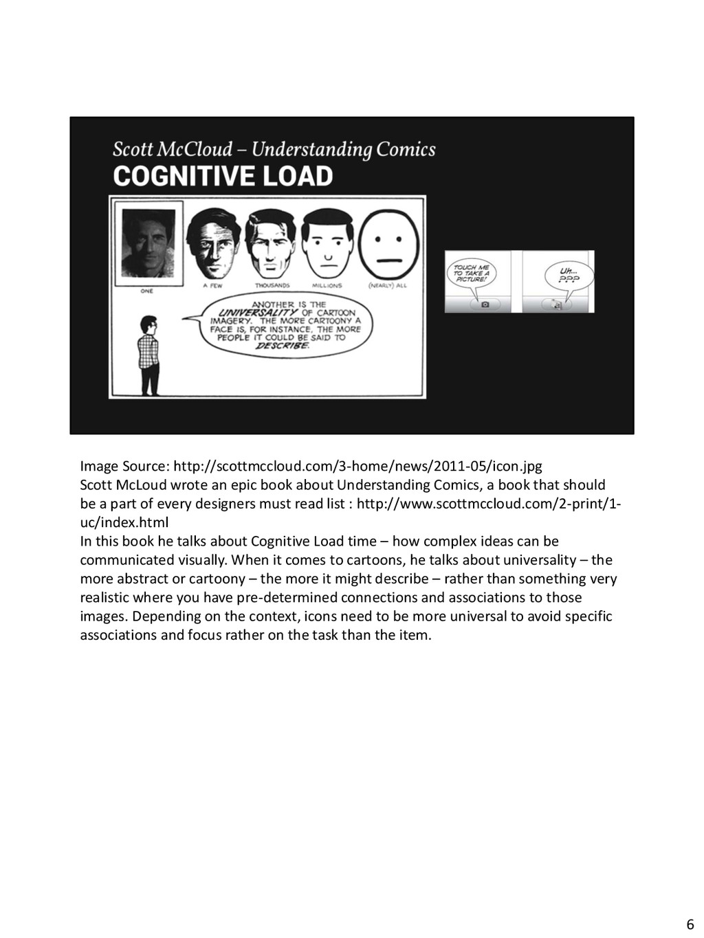
Understanding Comics, a book that should be a part of every designers must read list : http://www.scottmccloud.com/2-print/1- uc/index.html In this book he talks about Cognitive Load time – how complex ideas can be communicated visually. When it comes to cartoons, he talks about universality – the more abstract or cartoony – the more it might describe – rather than something very realistic where you have pre-determined connections and associations to those images. Depending on the context, icons need to be more universal to avoid specific associations and focus rather on the task than the item. 6
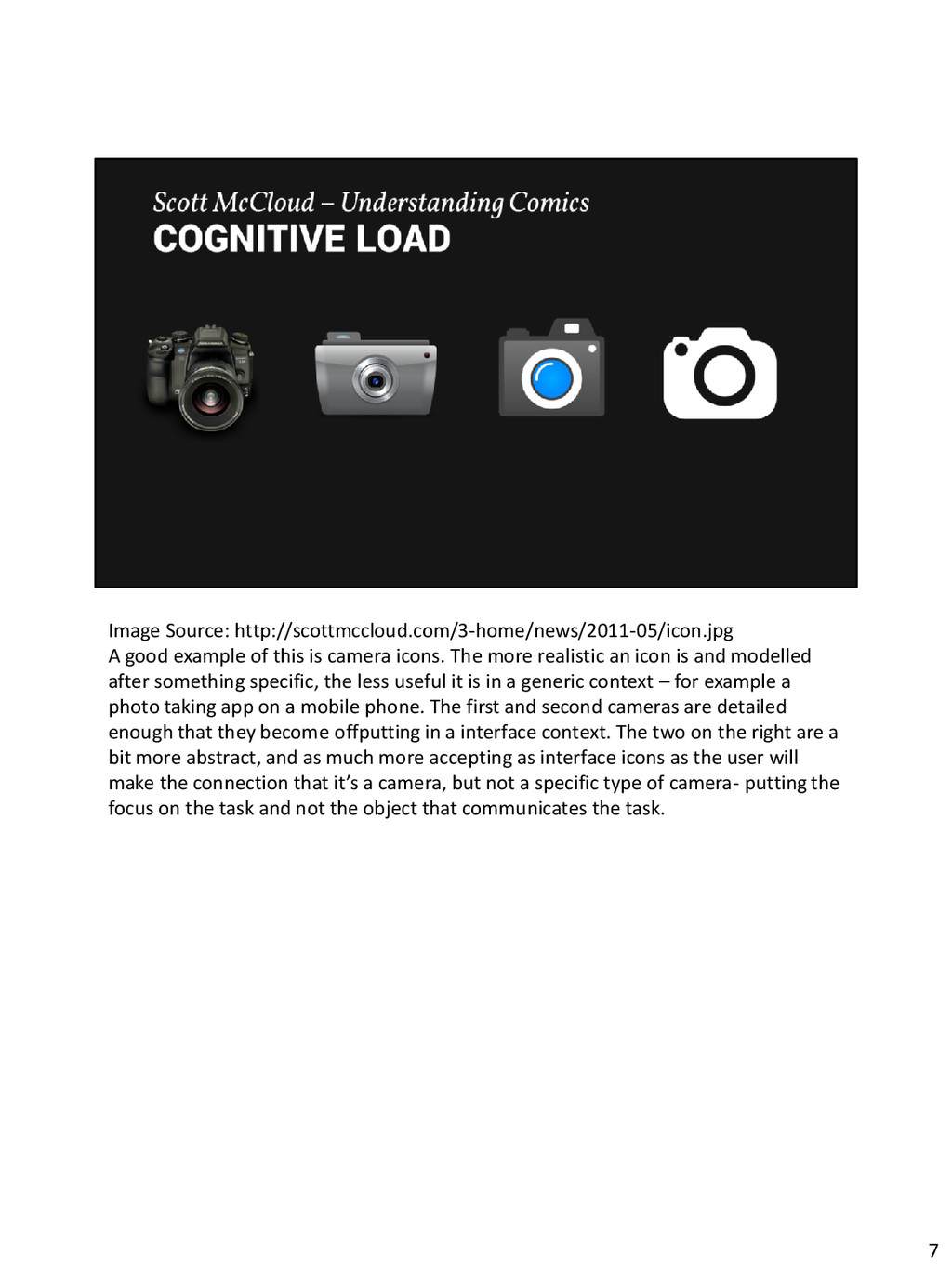
icons. The more realistic an icon is and modelled after something specific, the less useful it is in a generic context – for example a photo taking app on a mobile phone. The first and second cameras are detailed enough that they become offputting in a interface context. The two on the right are a bit more abstract, and as much more accepting as interface icons as the user will make the connection that it’s a camera, but not a specific type of camera- putting the focus on the task and not the object that communicates the task. 7
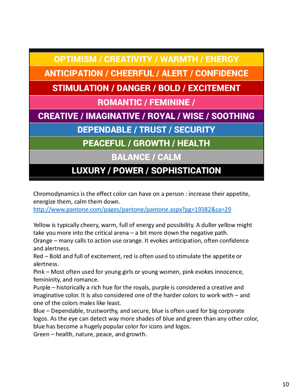
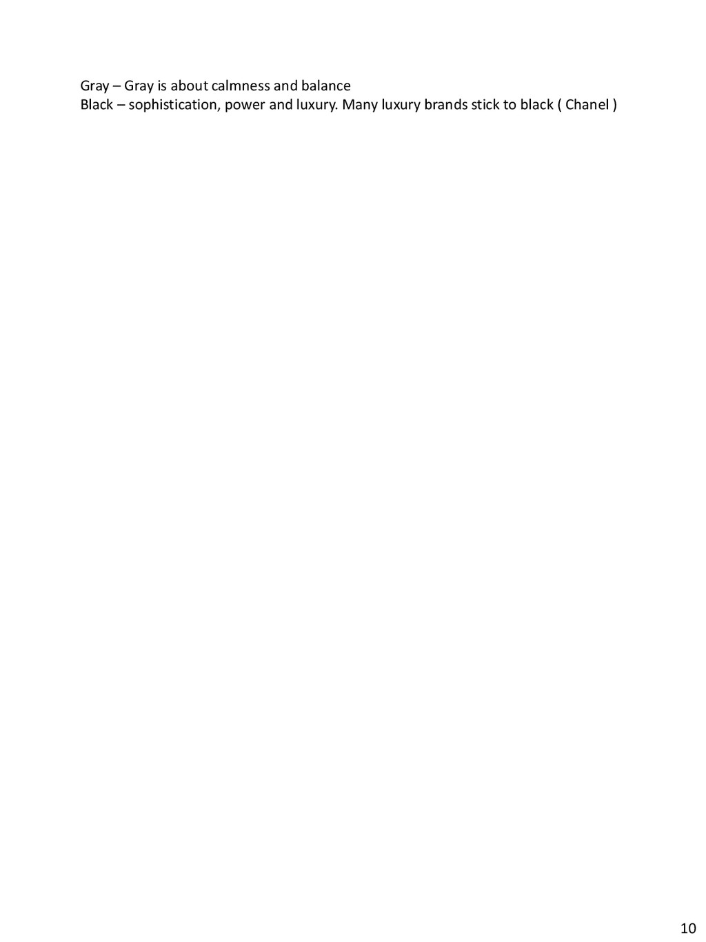
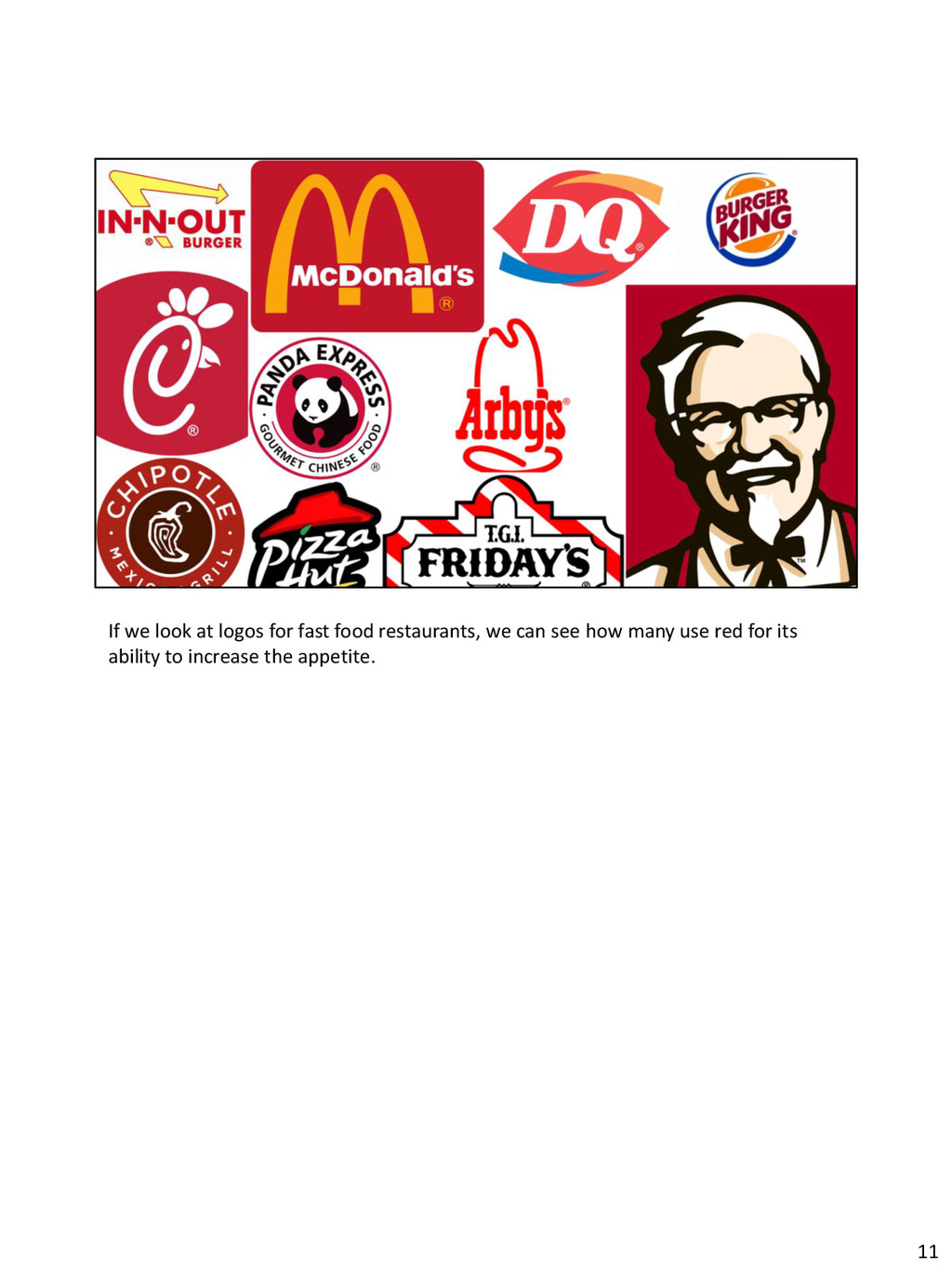
: increase their appetite, energize them, calm them down. http://www.pantone.com/pages/pantone/pantone.aspx?pg=19382&ca=29 Yellow is typically cheery, warm, full of energy and possibility. A duller yellow might take you more into the critical arena – a bit more down the negative path. Orange – many calls to action use orange. It evokes anticipation, often confidence and alertness. Red – Bold and full of excitement, red is often used to stimulate the appetite or alertness. Pink – Most often used for young girls or young women, pink evokes innocence, femininity, and romance. Purple – historically a rich hue for the royals, purple is considered a creative and imaginative color. It is also considered one of the harder colors to work with – and one of the colors males like least. Blue – Dependable, trustworthy, and secure, blue is often used for big corporate logos. As the eye can detect way more shades of blue and green than any other color, blue has become a hugely popular color for icons and logos. Green – health, nature, peace, and growth. 10
where its competition is, is another story. You need to consider the app store and look there to see or imagine what your icon will look like amongst all the rest. Take a snapshot of the app store and super impose your icon and see if it draws attention or interest from the user. Try a/b testing this with people – switching colors or shades to help your icon rise above the rest. 13
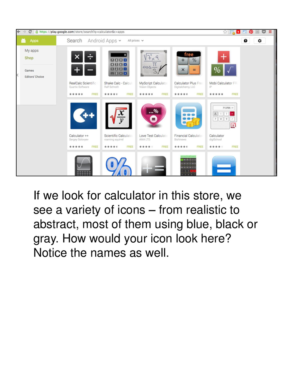
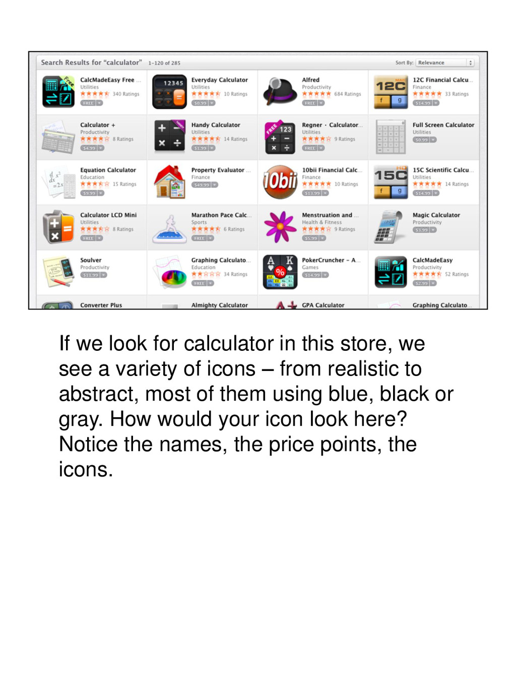
a variety of icons – from realistic to abstract, most of them using blue, black or gray. How would your icon look here? Notice the names, the price points, the icons.
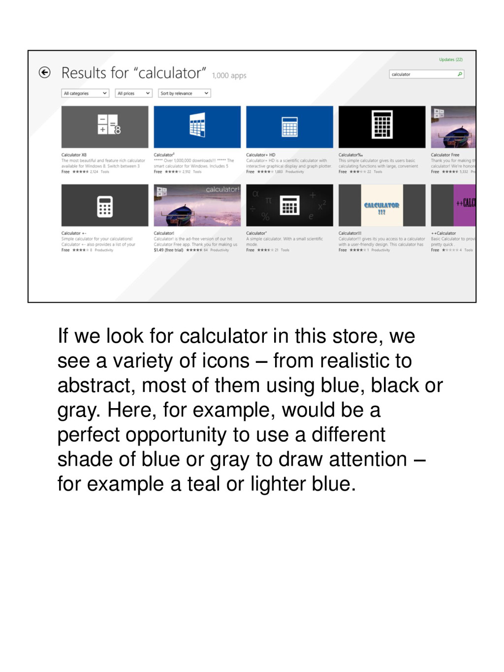
a variety of icons – from realistic to abstract, most of them using blue, black or gray. Here, for example, would be a perfect opportunity to use a different shade of blue or gray to draw attention – for example a teal or lighter blue.
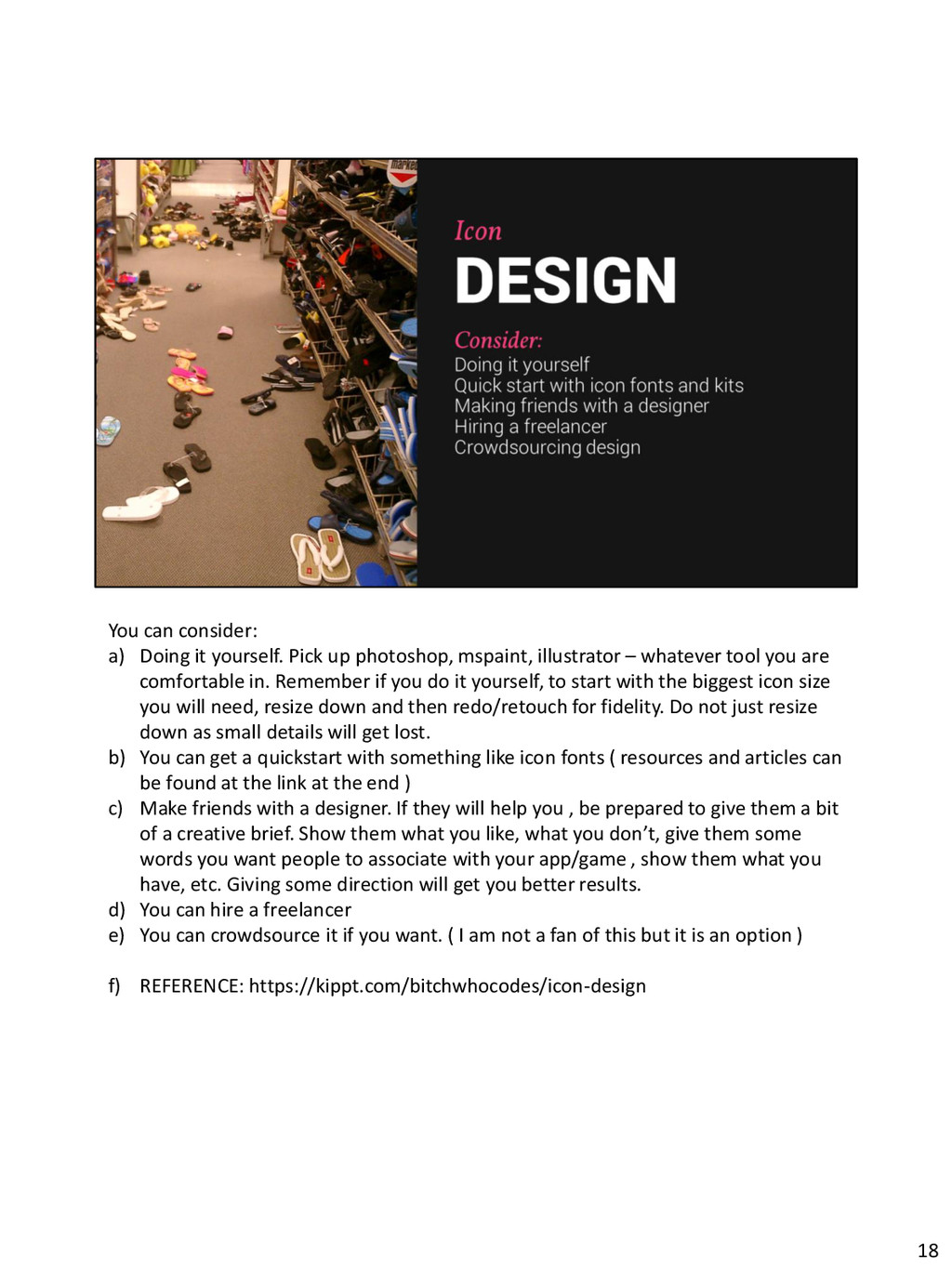
mspaint, illustrator – whatever tool you are comfortable in. Remember if you do it yourself, to start with the biggest icon size you will need, resize down and then redo/retouch for fidelity. Do not just resize down as small details will get lost. b) You can get a quickstart with something like icon fonts ( resources and articles can be found at the link at the end ) c) Make friends with a designer. If they will help you , be prepared to give them a bit of a creative brief. Show them what you like, what you don’t, give them some words you want people to associate with your app/game , show them what you have, etc. Giving some direction will get you better results. d) You can hire a freelancer e) You can crowdsource it if you want. ( I am not a fan of this but it is an option ) f) REFERENCE: https://kippt.com/bitchwhocodes/icon-design 18