Upgrade to Pro
— share decks privately, control downloads, hide ads and more …
Speaker Deck
Features
Speaker Deck
PRO
Sign in
Sign up for free
Search
Search
Responsive Web Design @ UC San Diego: Sharecase...
Search
bpollak
August 29, 2012
Technology
190
2
Share
Embed
Copy iframe code
Copy JS code
Copy link
Start on current slide
Responsive Web Design @ UC San Diego: Sharecase 2012
bpollak
August 29, 2012
More Decks by bpollak
See All by bpollak
Guidelines for a Campus Website Refresh
bpollak
0
90
UC San Diego Lync and OneDrive for Business Rollout
bpollak
0
140
Take Your CMS to the Cloud to Lighten the Load
bpollak
0
120
Web Accessibility at UC San Diego
bpollak
0
90
Campus Web Steering Committee (November meeting)
bpollak
0
130
Mobile optimizing your legacy applications
bpollak
0
79
Website Refresh Tips & Strategies
bpollak
0
610
This mobile thing will never catch on
bpollak
0
88
Responsive Design UCSD System Administrator Meeting
bpollak
2
150
Other Decks in Technology
See All in Technology
SRE Next 2026 何でも屋からの脱却
bto
0
890
Amazon EVS で VCF 9.0 / 9.1 のサポート開始まとめ
mtoyoda
0
310
Data + AI Summit 2026 イベントレポート: 「AIがビジネスで意思決定するデータ基盤」へ
nek0128
0
250
カードゲーム作りが教えてくれた プロダクトオーナーシップ
moritamasami
0
110
公式ドキュメントの歩き方etc
coco_se
1
120
人を動かすのは時間ではなく、納得感 〜新任EMが入社3ヶ月、組織を2回変えた話〜
kakehashi
PRO
3
270
はじめてのWDM
miyukichi_ospf
1
150
OPENLOGI Company Profile for engineer
hr01
1
74k
AmplifyHostingConstructからSSRフレームワークのためのホスティング設計を考察する/amplify-hosting-construct
fossamagna
1
200
ボーイスカウトルールでメモリやスキルを改善しよう
azukiazusa1
4
1.4k
AI Agent SaaS を支える自社仮想化基盤への挑戦と実運用 / ai-agent-saas-virtualization
flatt_security
3
4.1k
AIレビューはどこまで任せられるのか?自動化と人が背負うレビューの境界
sansantech
PRO
3
1k
Featured
See All Featured
Sam Torres - BigQuery for SEOs
techseoconnect
PRO
0
300
[RailsConf 2023] Rails as a piece of cake
palkan
59
6.7k
CSS Pre-Processors: Stylus, Less & Sass
bermonpainter
360
30k
Ethics towards AI in product and experience design
skipperchong
2
330
Jamie Indigo - Trashchat’s Guide to Black Boxes: Technical SEO Tactics for LLMs
techseoconnect
PRO
0
360
Why Mistakes Are the Best Teachers: Turning Failure into a Pathway for Growth
auna
0
180
Taking LLMs out of the black box: A practical guide to human-in-the-loop distillation
inesmontani
PRO
3
2.3k
How to Ace a Technical Interview
jacobian
281
24k
The State of eCommerce SEO: How to Win in Today's Products SERPs - #SEOweek
aleyda
2
11k
Bootstrapping a Software Product
garrettdimon
PRO
307
120k
Reflections from 52 weeks, 52 projects
jeffersonlam
356
21k
Lightning Talk: Beautiful Slides for Beginners
inesmontani
PRO
2
610
Transcript
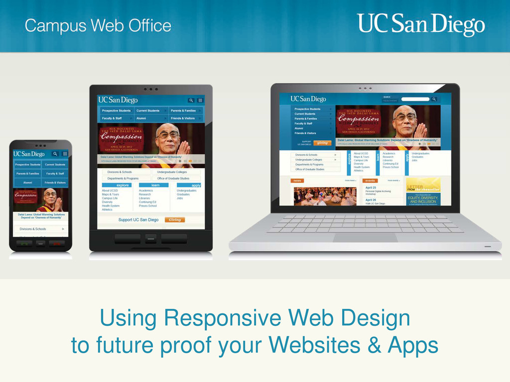
Using Responsive Web Design to future proof your Websites &
Apps
Brett Pollak Cristian Horta @brettcpollak @cristian_horta #sharecase12 @campusweboffice
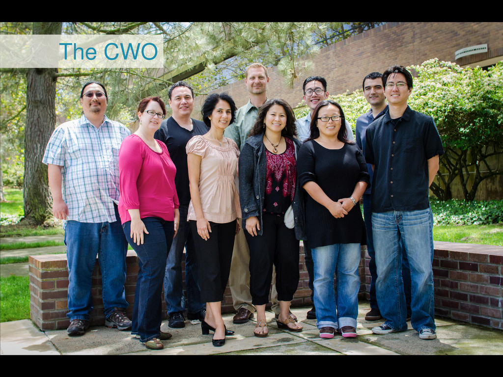
The CWO
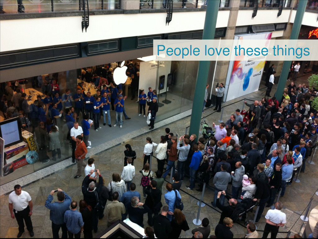
People love these things
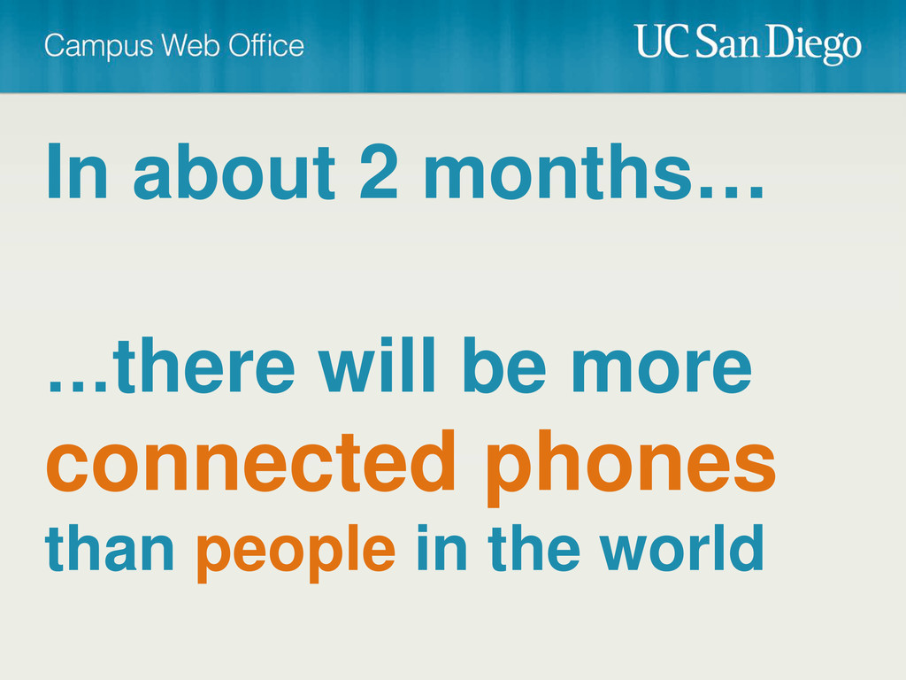
In about 2 months… …there will be more connected phones
than people in the world
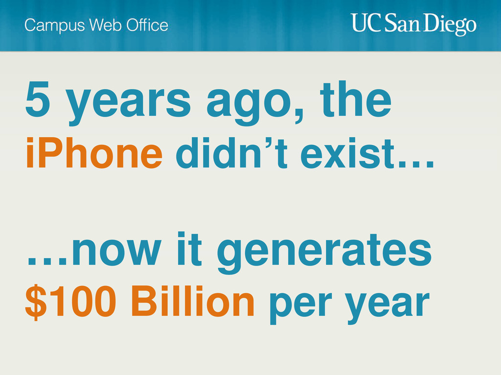
5 years ago, the iPhone didn’t exist… …now it generates
$100 Billion per year
The iPhone is bigger than Microsoft
By the fall of 2013 more tablets will be sold
than PC’s
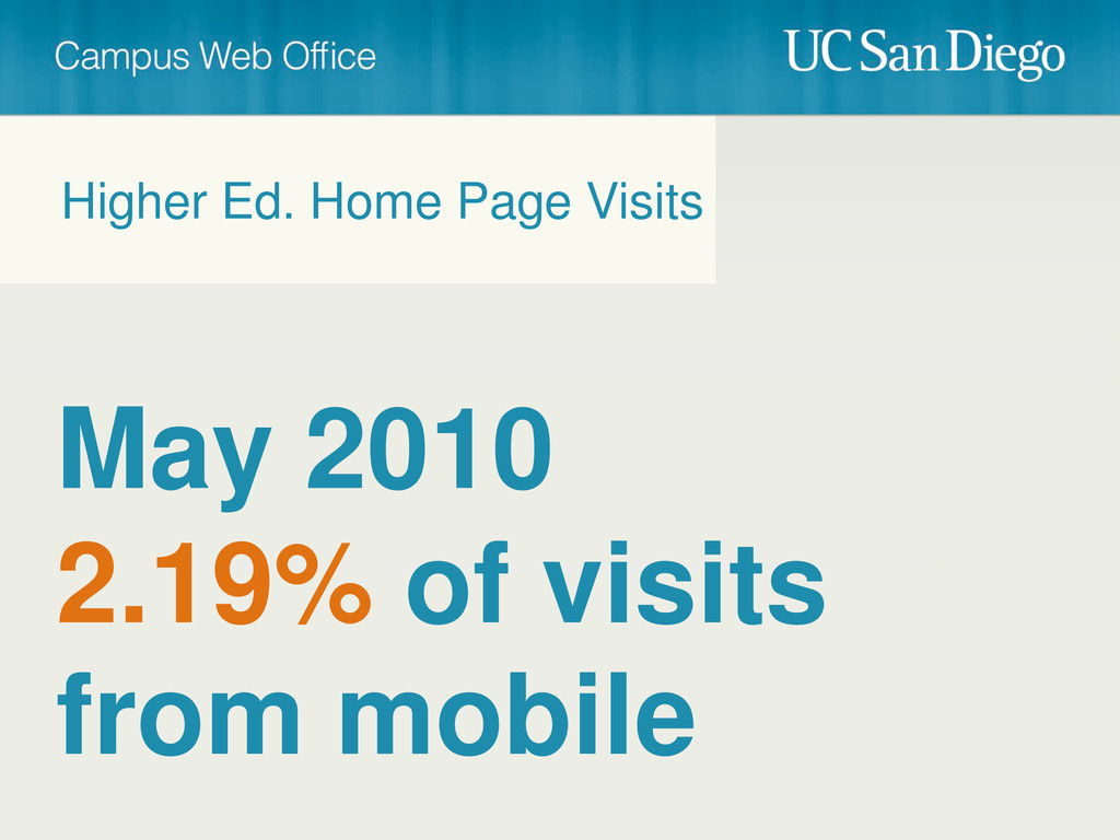
May 2010 2.19% of visits from mobile Higher Ed. Home
Page Visits
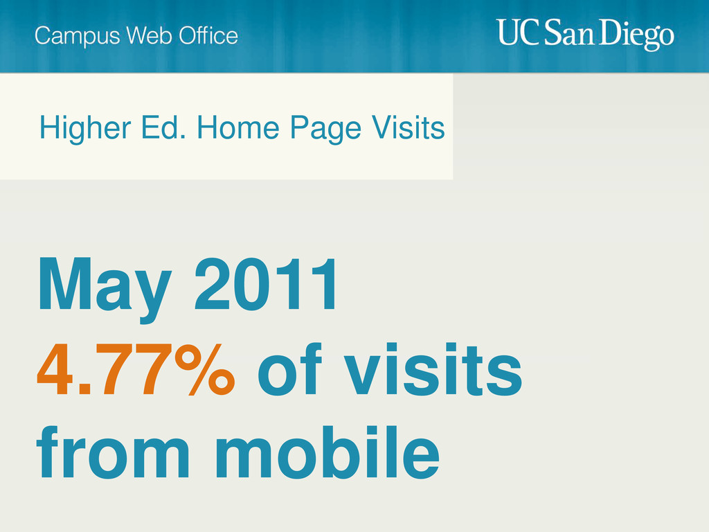
May 2011 4.77% of visits from mobile Higher Ed. Home
Page Visits
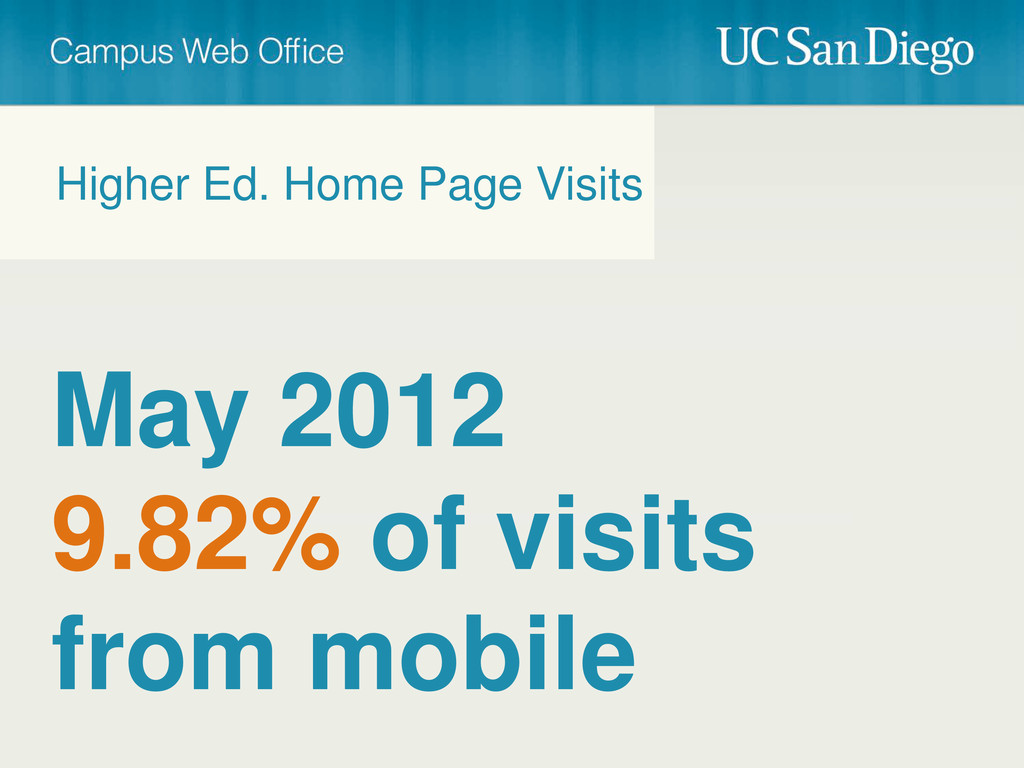
May 2012 9.82% of visits from mobile Higher Ed. Home
Page Visits
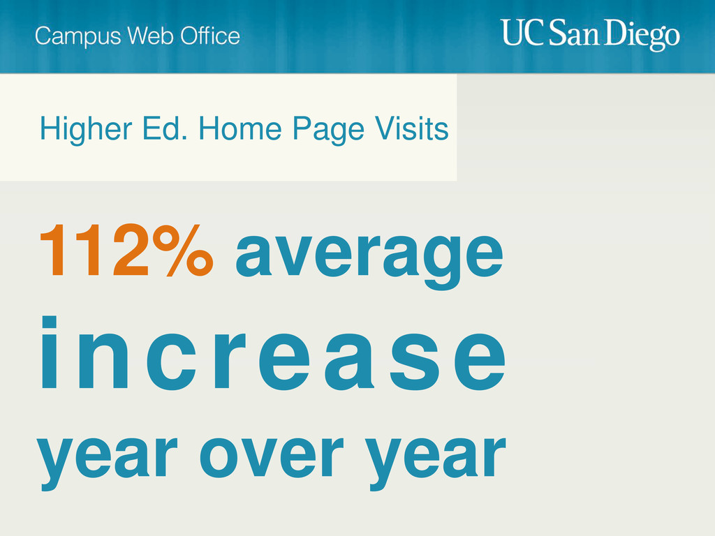
112% average increase year over year Higher Ed. Home Page
Visits
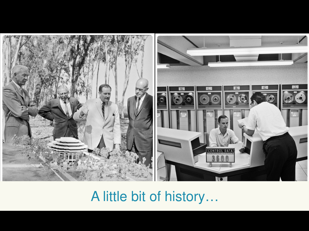
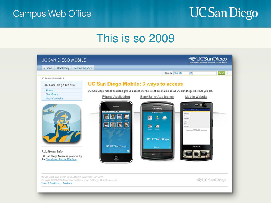
A little bit of history…
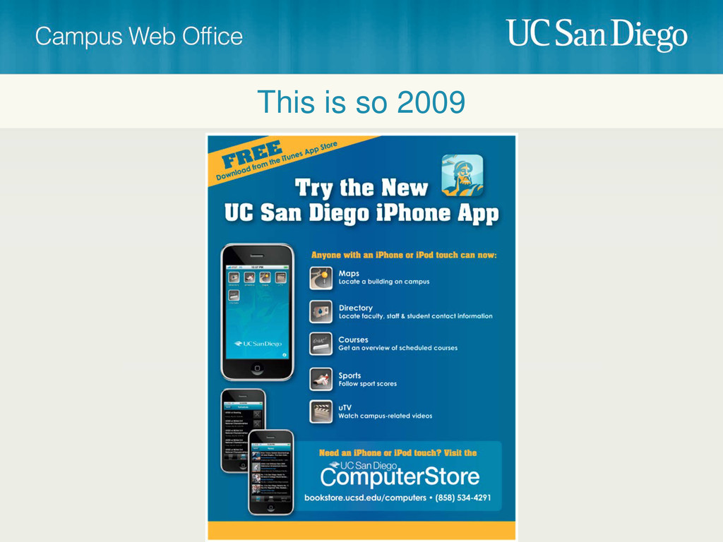
This is so 2009
This is so 2009
None
None
None
None
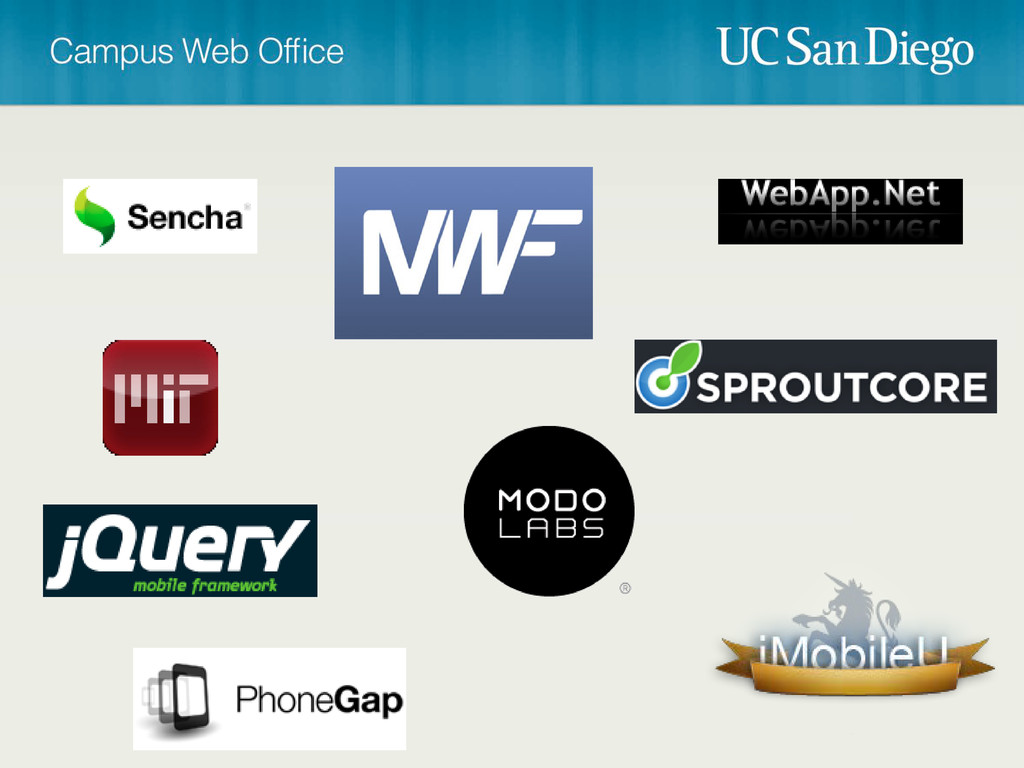
Find a framework Step 1
None
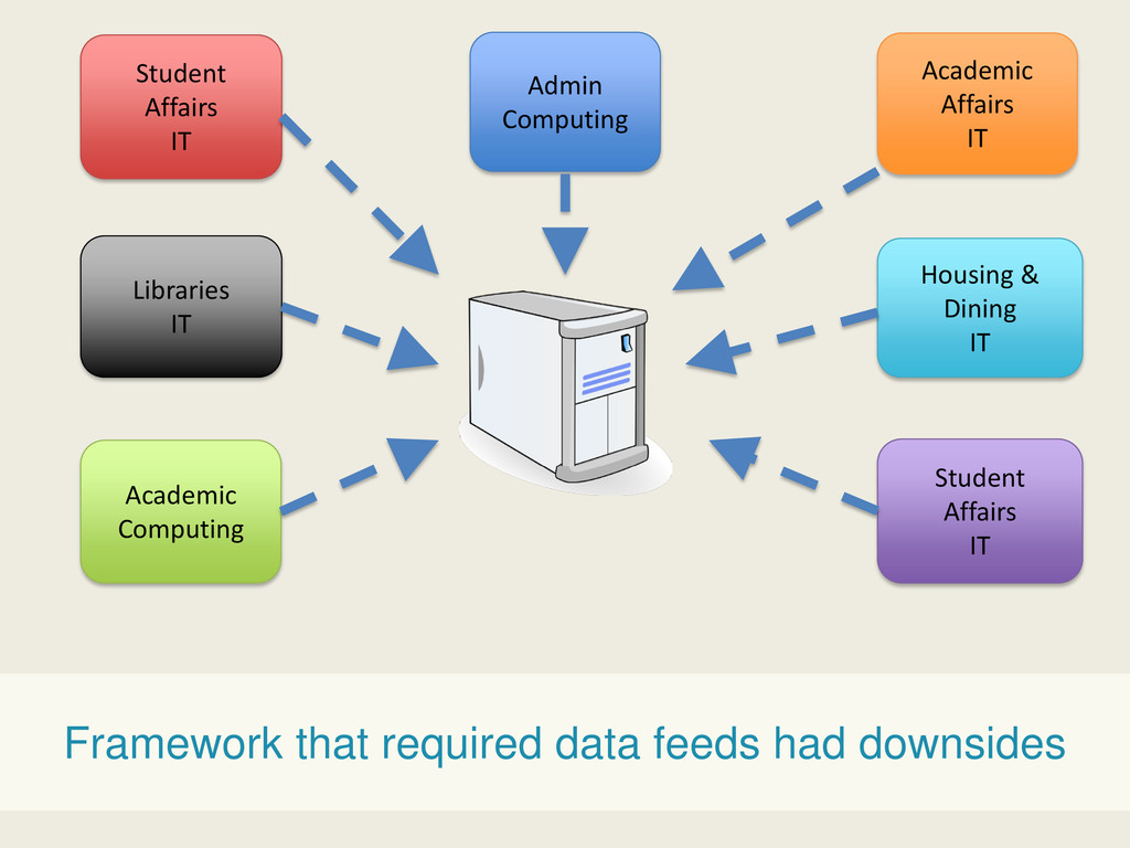
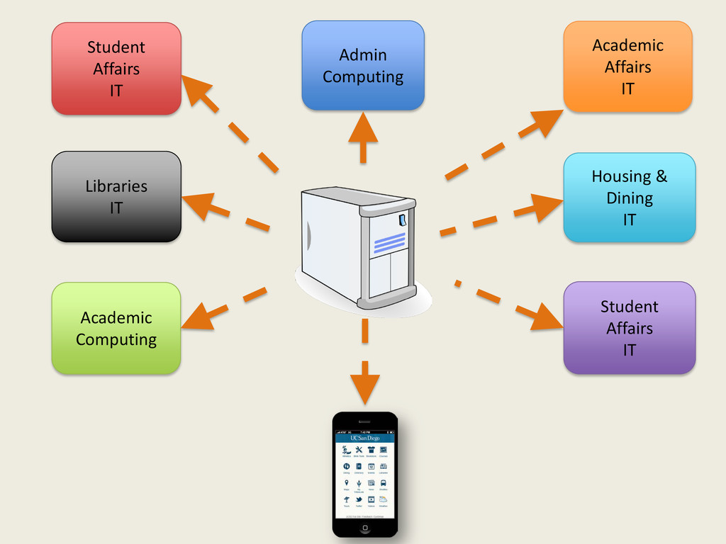
Student Affairs IT Academic Affairs IT Housing & Dining IT
Libraries IT Admin Computing Academic Computing Student Affairs IT Framework that required data feeds had downsides
Student Affairs IT Academic Affairs IT Housing & Dining IT
Libraries IT Admin Computing Academic Computing Student Affairs IT
None
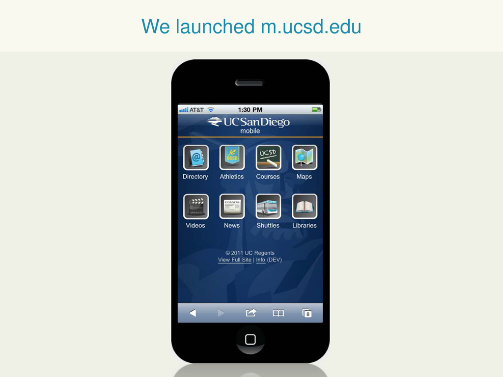
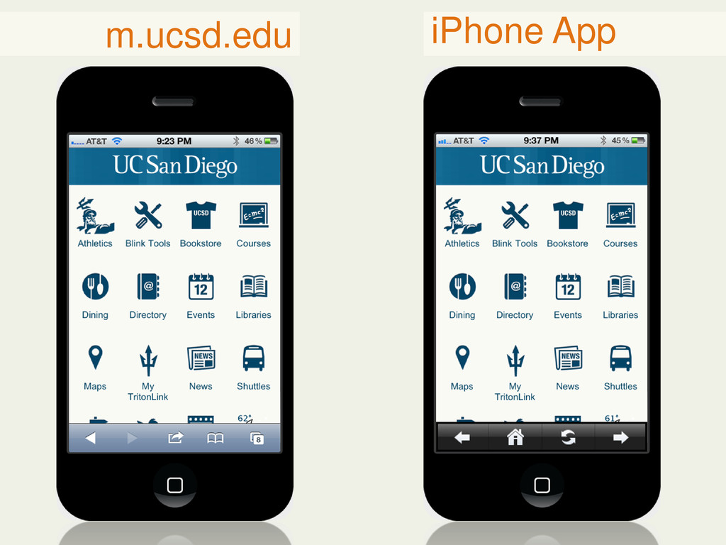
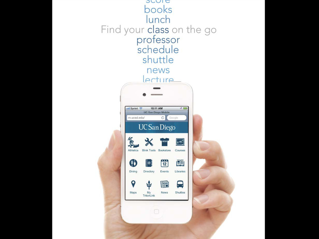
We launched m.ucsd.edu
Replace the App Step 2
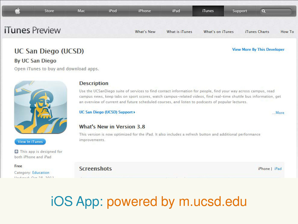
iOS App: powered by m.ucsd.edu
m.ucsd.edu iPhone App
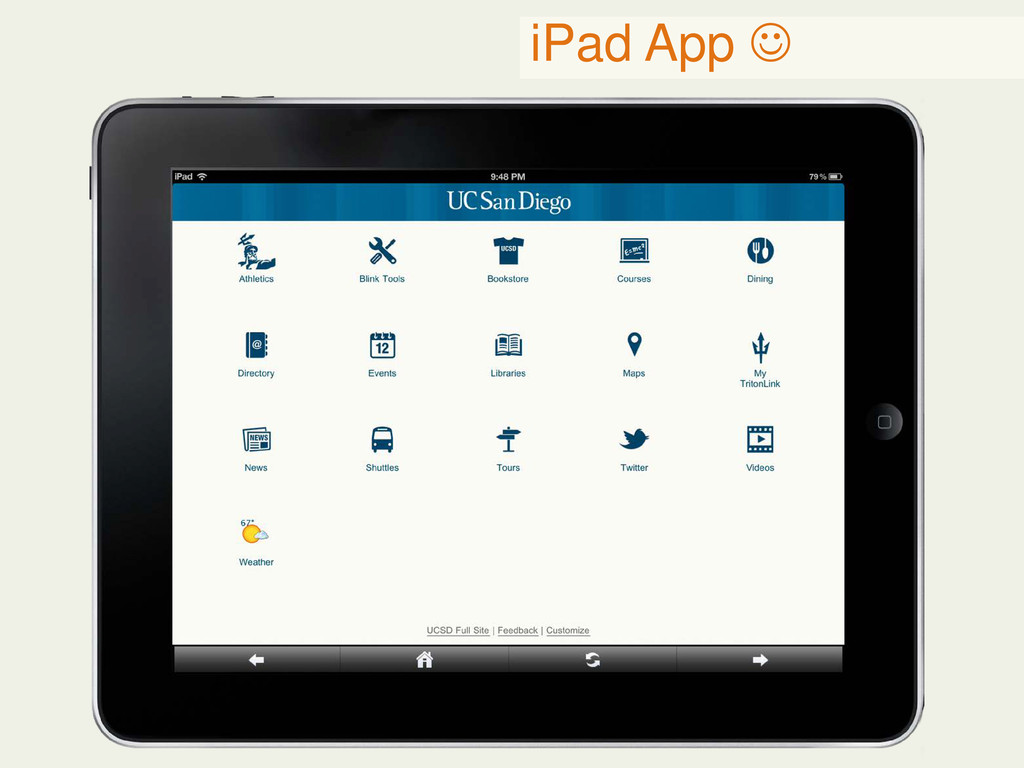
iPad App
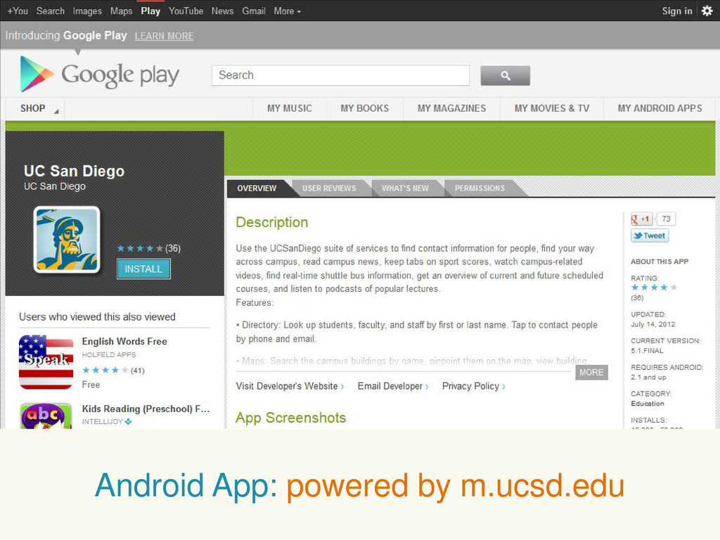
Android App: powered by m.ucsd.edu
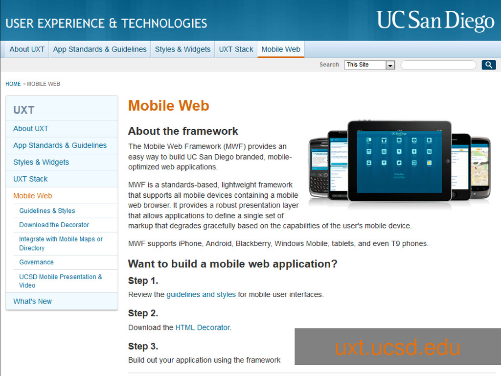
uxt.ucsd.edu
None
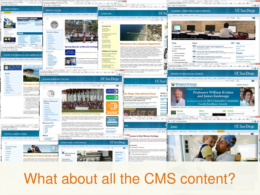
What about all the CMS content?
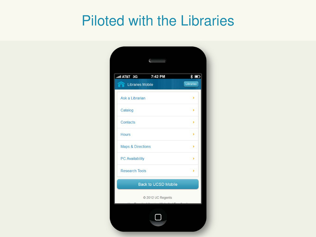
Piloted with the Libraries
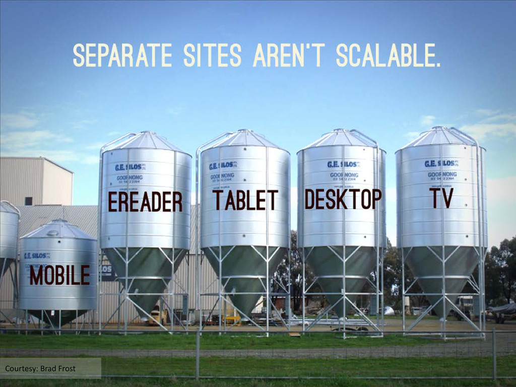
Courtesy: Brad Frost
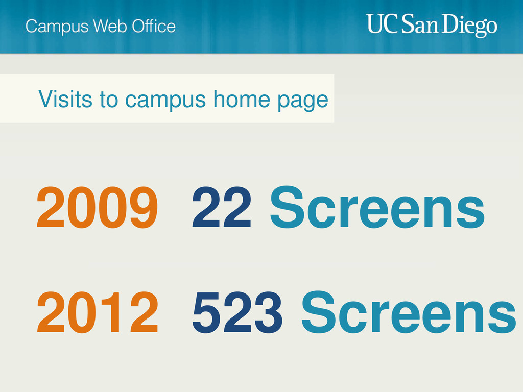
2009 22 Screens Visits to campus home page 2012 523
Screens
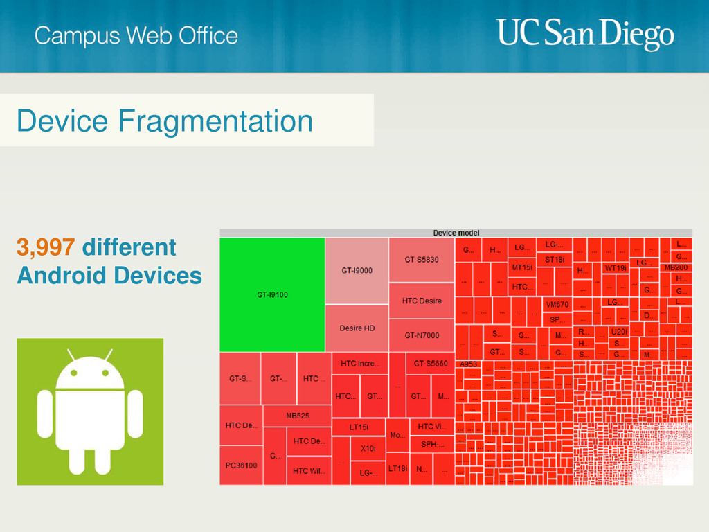
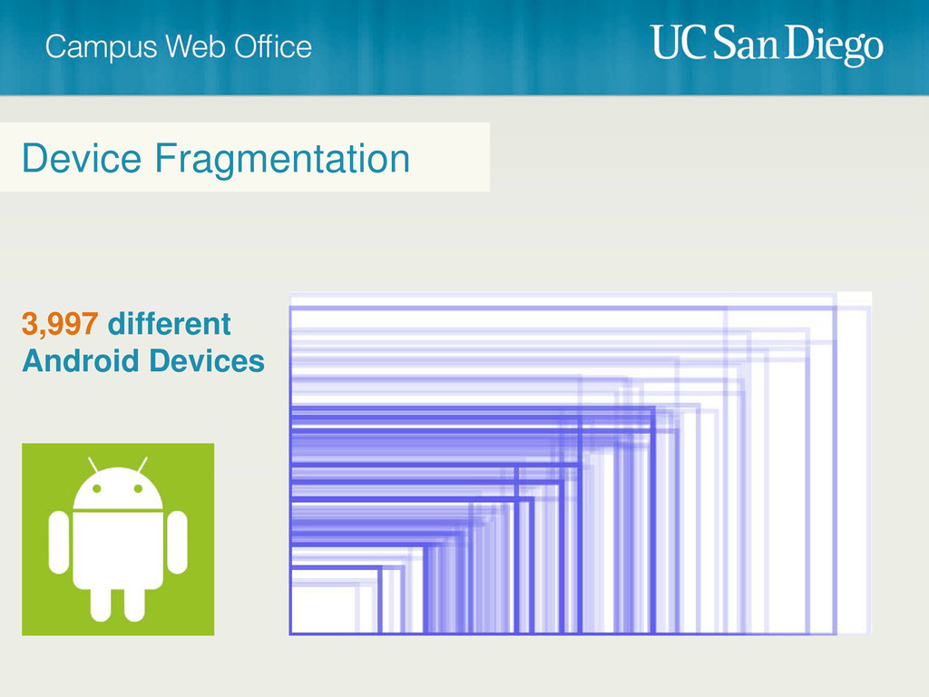
Device Fragmentation 3,997 different Android Devices
Device Fragmentation 3,997 different Android Devices
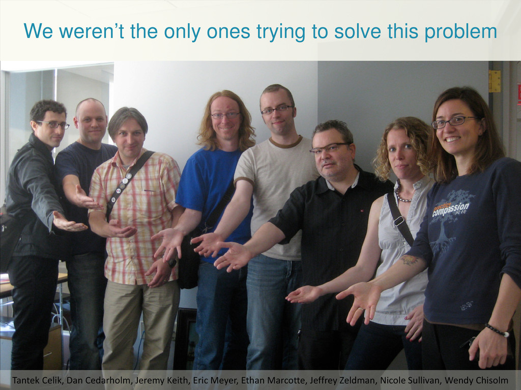
We weren’t the only ones trying to solve this problem
Tantek Celik, Dan Cedarholm, Jeremy Keith, Eric Meyer, Ethan Marcotte, Jeffrey Zeldman, Nicole Sullivan, Wendy Chisolm
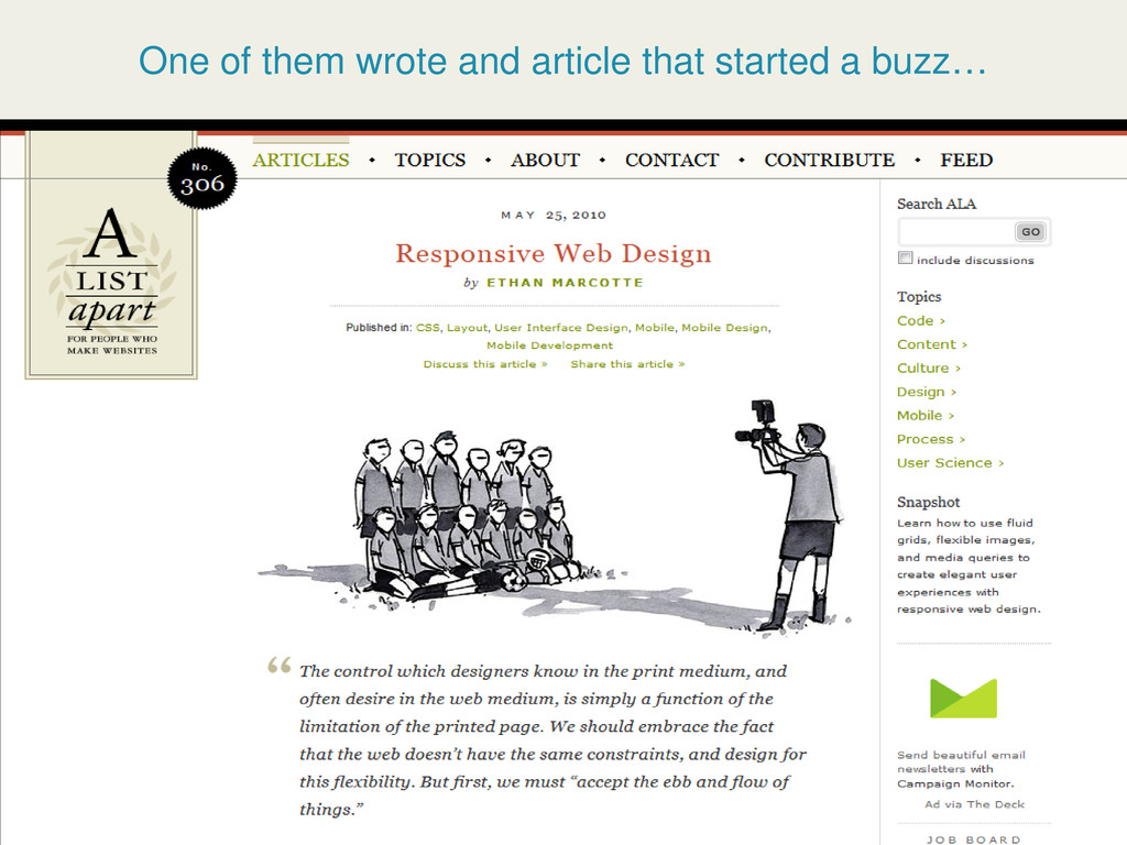
One of them wrote and article that started a buzz…
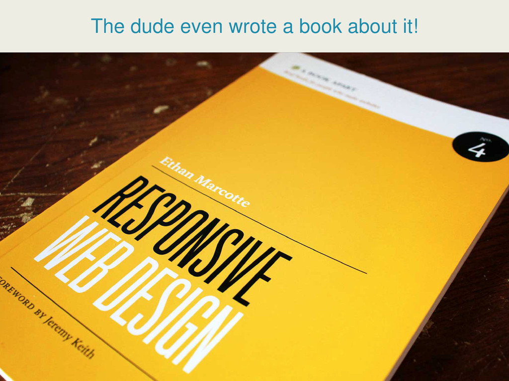
The dude even wrote a book about it!
None
Cristian Horta Web Project/Operations Manager, CWO
[email protected]
• RWD, how
does it work? (media queries) • Do’s and Don’ts • How to get started
RESPONSIVE WEB DESIGN AWESOME IS
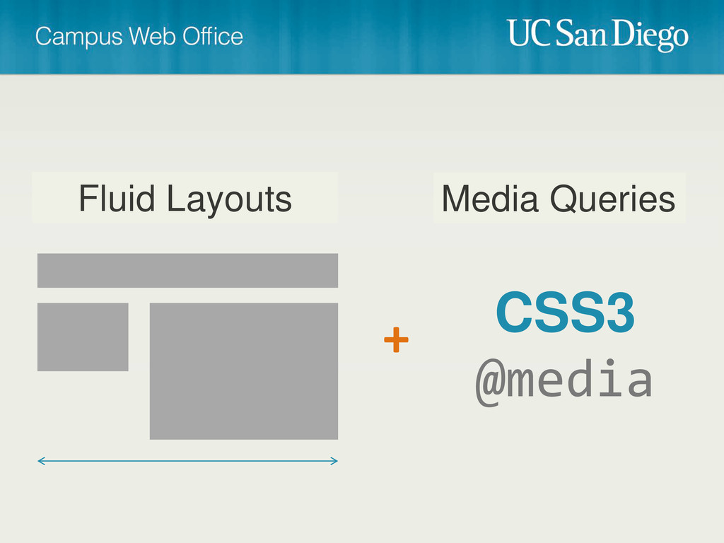
But, How does it work?
Media Queries CSS3 @media Fluid Layouts +
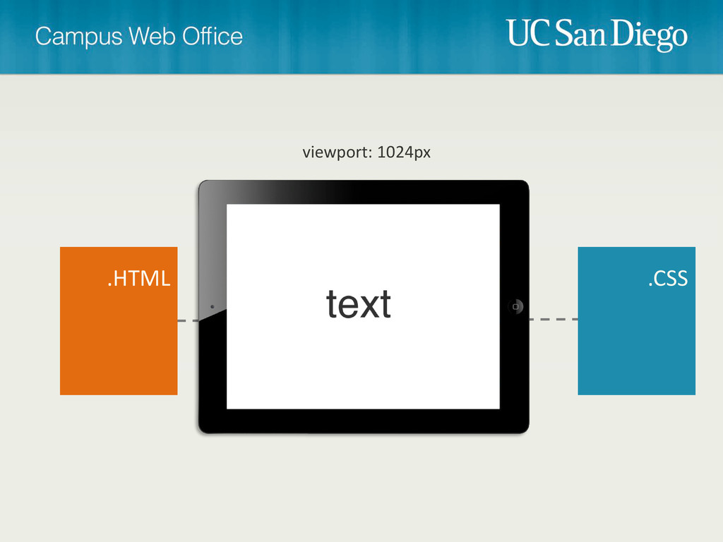
.HTML .CSS viewport: 1024px
.HTML .CSS viewport: 768px
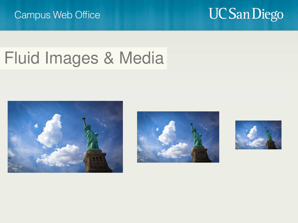
Fluid Images & Media
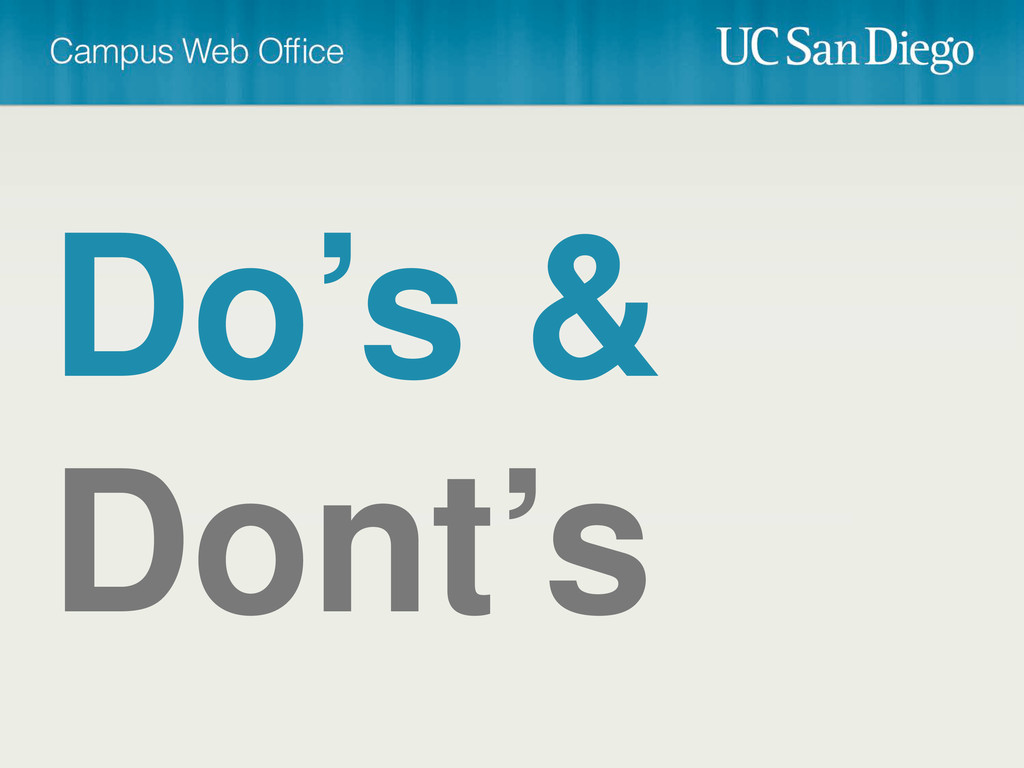
Do’s & Dont’s
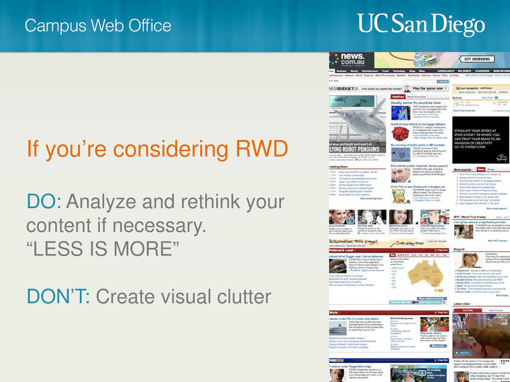
If you’re considering RWD DO: Analyze and rethink your content
if necessary. “LESS IS MORE” DON’T: Create visual clutter
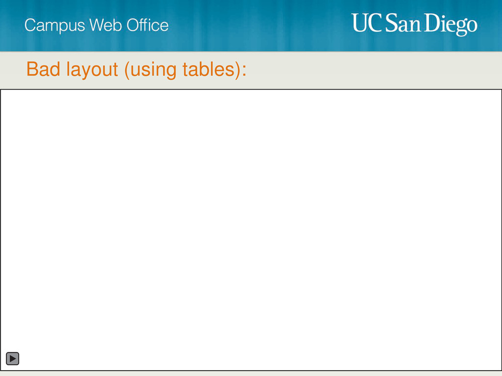
DON’T AVOID: The use of tables. Especially for layout! DO:
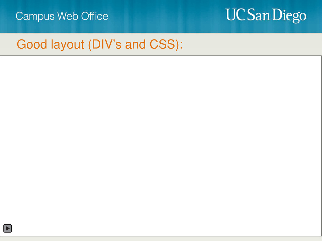
Use DIV’s and CSS instead. IF YOU MUST: Make sure they’re capable of flexing. Use tables for what they were intended to do, tabular data!
Bad layout (using tables):
Good layout (DIV’s and CSS):
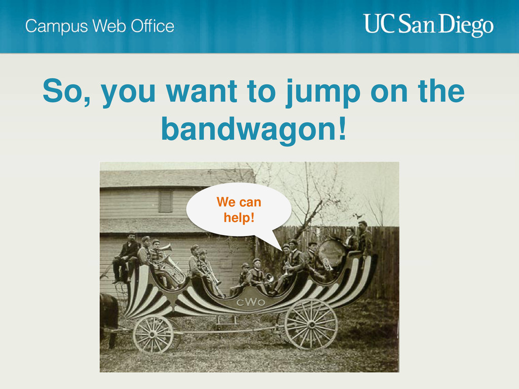
So, you want to jump on the bandwagon! We can
help!
CMS + HTML Toolkit Toolkit (HTML Templates) Cost Availability Dynamic
Content Hosted Solution Yes Partially CMS (Content Management System) Help Desk Yes No No Yes Restricted Available for Download $0 ?
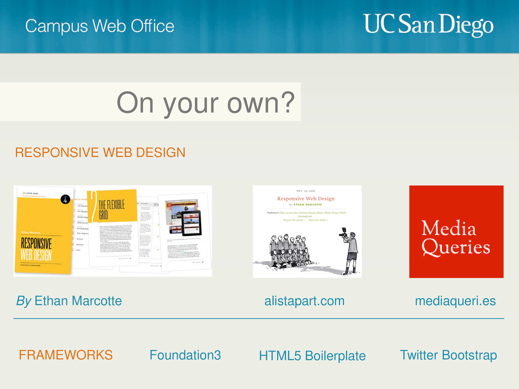
On your own? RESPONSIVE WEB DESIGN By Ethan Marcotte alistapart.com
mediaqueri.es FRAMEWORKS Foundation3 Twitter Bootstrap HTML5 Boilerplate
Thank You! Contact us:
[email protected]
 bpollak
 bto
bto
 mtoyoda
 nek0128
 moritamasami
 coco_se
 kakehashi
 miyukichi_ospf
 hr01
hr01
 fossamagna
 azukiazusa1
 flatt_security
 sansantech
 techseoconnect
 palkan
 bermonpainter
 skipperchong
 auna
auna
 inesmontani
 jacobian
 aleyda
 garrettdimon
 jeffersonlam
![Cristian Horta Web Project/Operations Manager, CWO [email protected] • RWD, how](https://files.speakerdeck.com/presentations/503f9f84a5952a000205b10f/slide_42.jpg)
![Thank You! Contact us: [email protected]](https://files.speakerdeck.com/presentations/503f9f84a5952a000205b10f/slide_57.jpg)