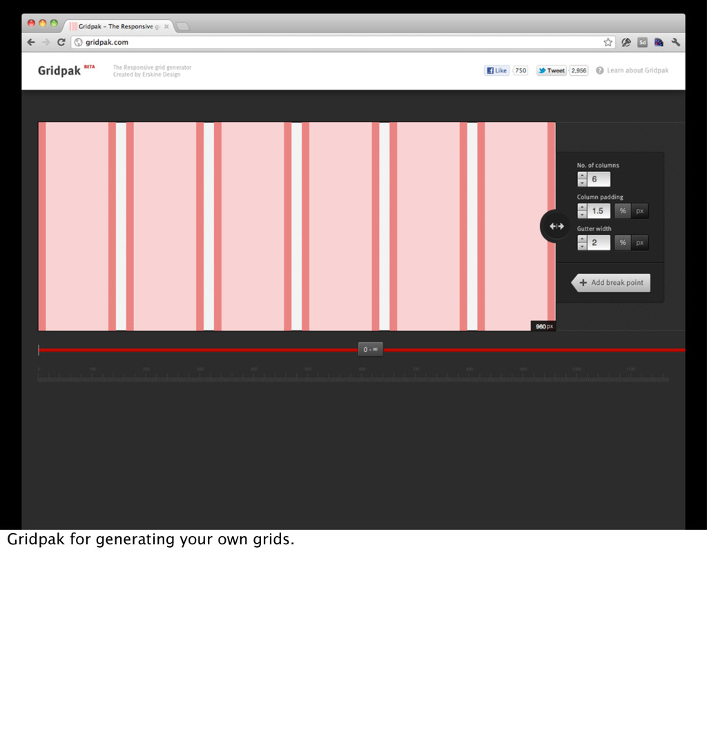
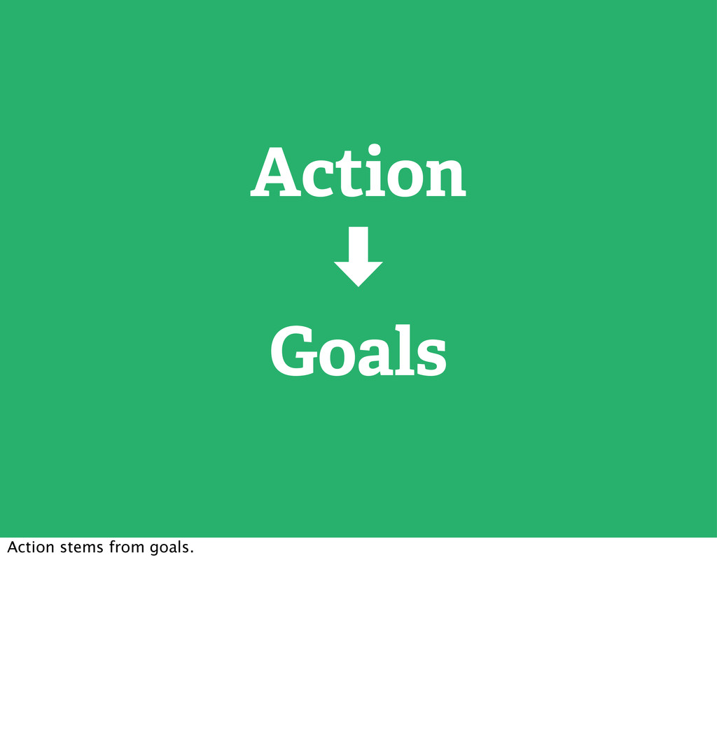
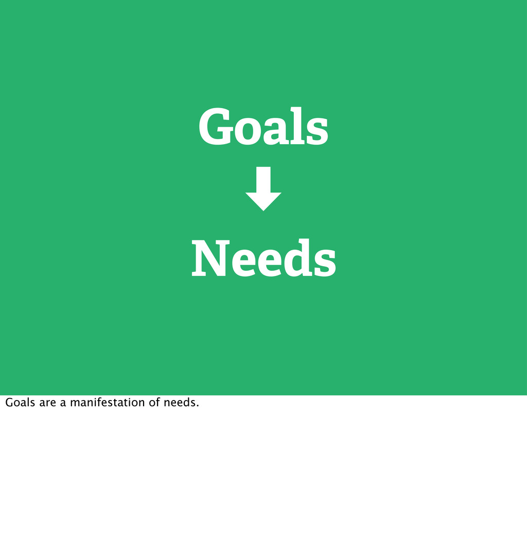
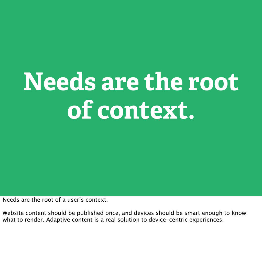
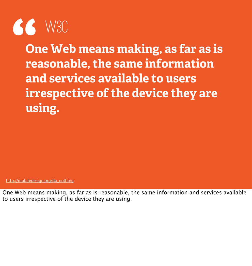
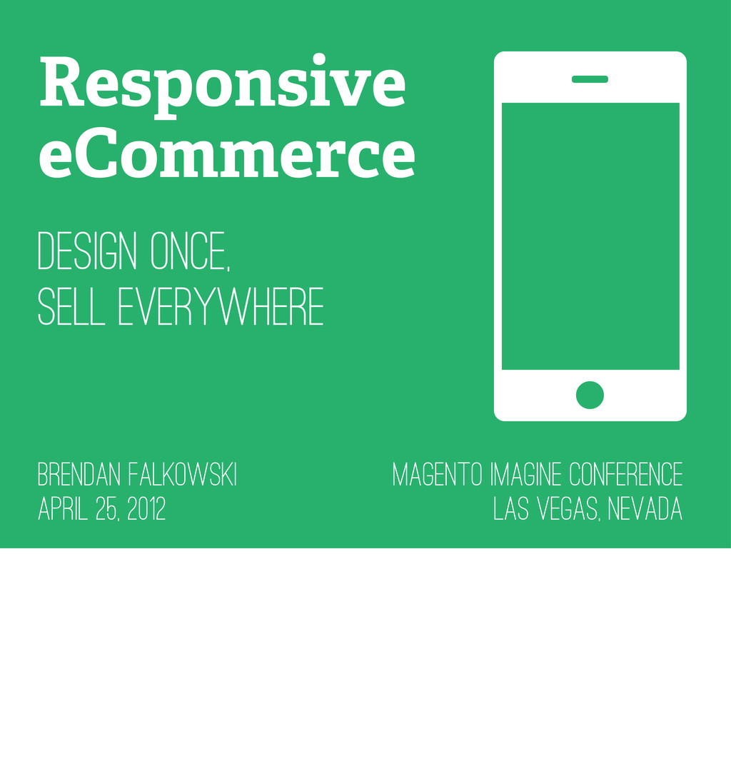
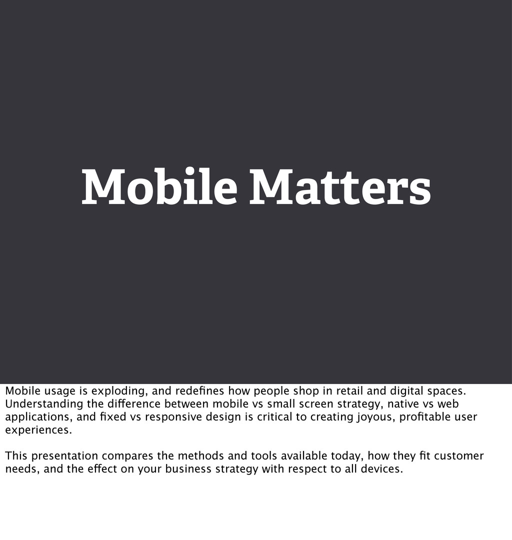
Mobile usage is exploding, and redefines how people shop in retail and digital spaces. Understanding the difference between mobile vs small screen strategy, native vs web applications, and fixed vs responsive design is critical to creating joyous, profitable user experiences.
This presentation compares the methods and tools available today, how they fit customer needs, and the effect on your business strategy with respect to all devices.
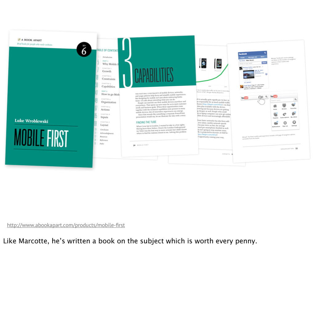
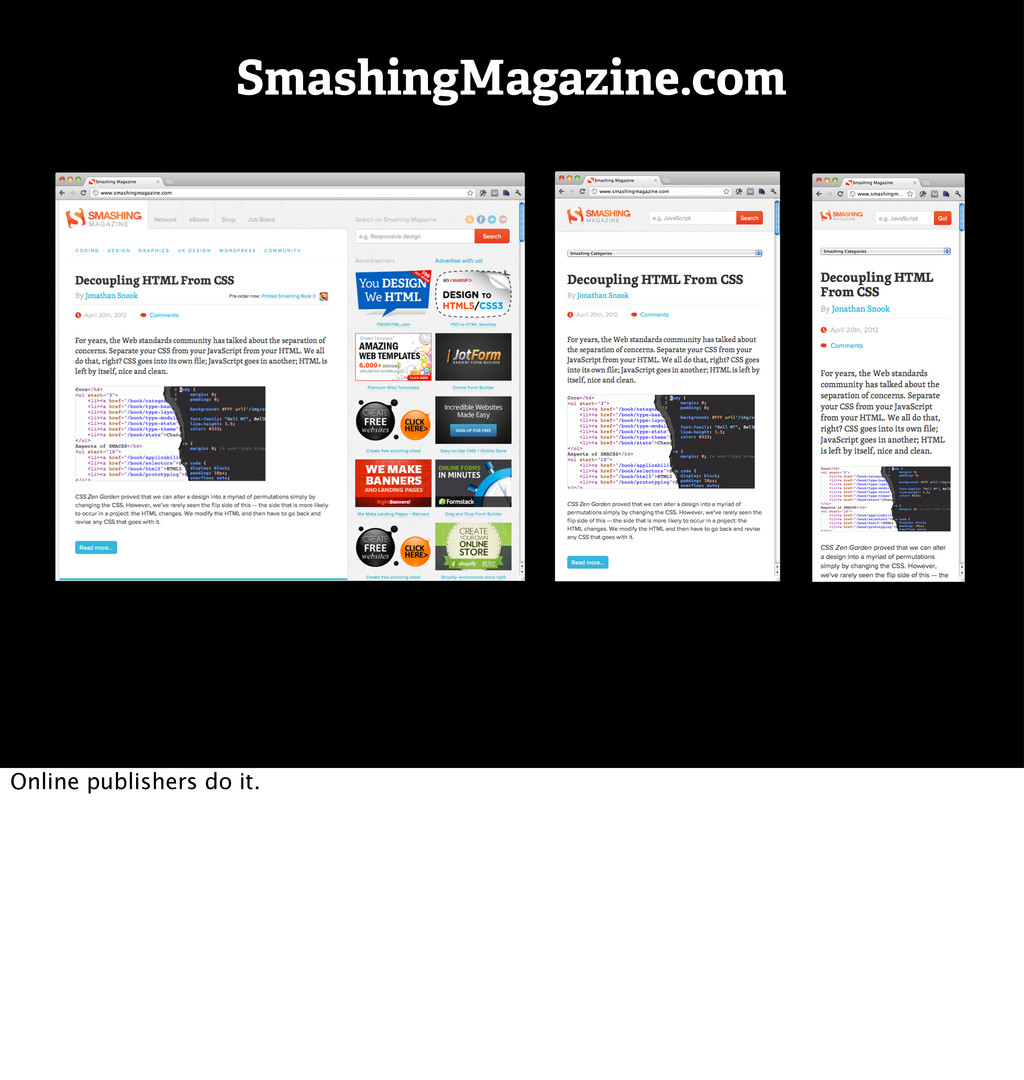
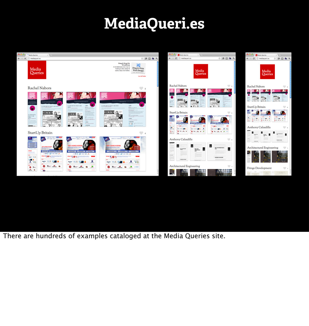
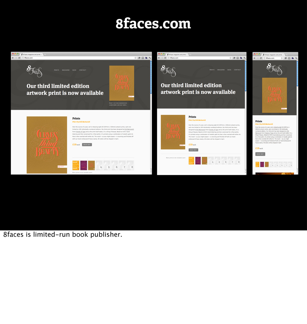
More info: http://gravitydept.com/blog/responsive-ecommerce/
Conference: Magento Imagine 2012
Speaker: Brendan Falkowski @ http://gravitydept.com
Location: Las Vegas, USA
Date: April 25, 2012
 brendanfalkowski
 mhand01
 kenichiota0711
 takaikanako
 toshihidemurata
 kspace
 ranyfardiany
 ukaoli
 teba_eleven
 centou
 mottox2
 rezaline
.jpg) rwang05
rwang05
 kristinabergwall1
 gurzu
gurzu
 letsgokoyo
 kneath
 helmedeiros
 destraynor
 eileencodes
 lauravandoore
 trishagee
 aki_iinuma
 livdayseo
 bermonpainter
![“Businesses should stop thinking about [mobile] as a small Web](https://files.speakerdeck.com/presentations/4f9edef7590eda001f00cb90/slide_58.jpg)
![Get in touch. ๏ Web: GravityDept.com ๏ Email: [email protected] ๏](https://files.speakerdeck.com/presentations/4f9edef7590eda001f00cb90/slide_229.jpg)