Upgrade to Pro — share decks privately, control downloads, hide ads and more …

Two Approaches to RWD: Pure and Hybrid (Meet Magento NY 2014)

Brendan Falkowski
September 22, 2014

Two Approaches to RWD: Pure and Hybrid (Meet Magento NY 2014)

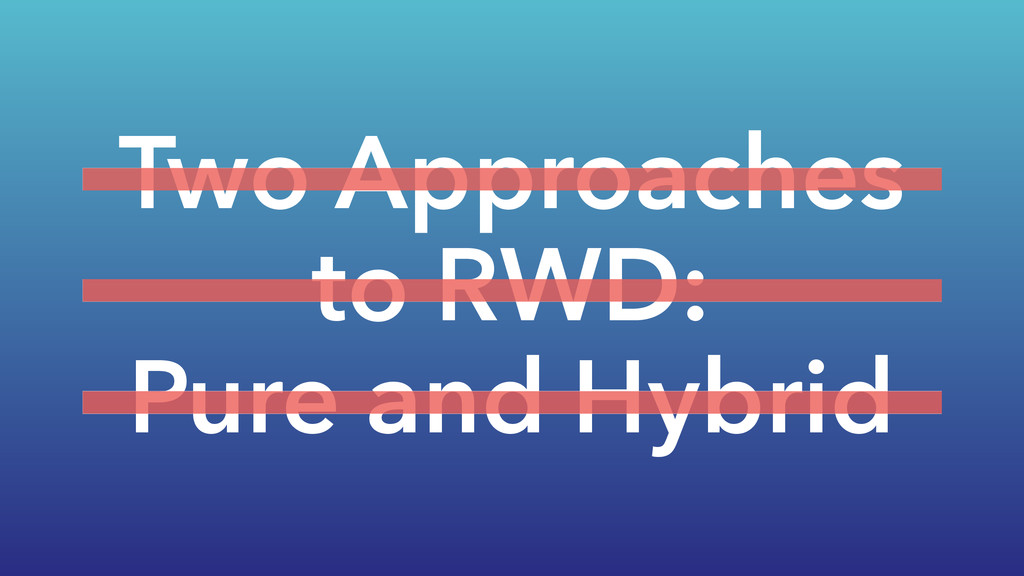
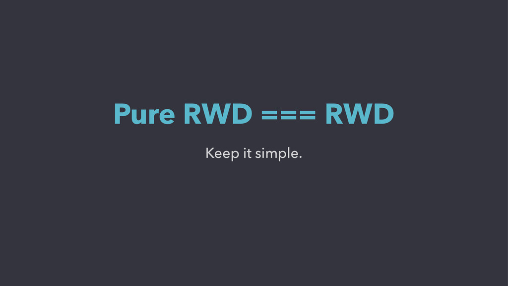
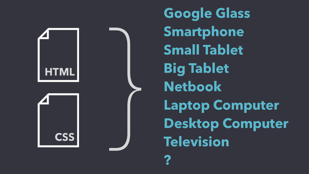
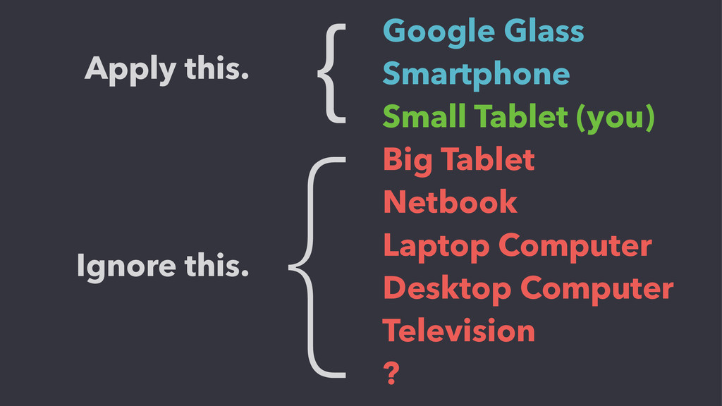
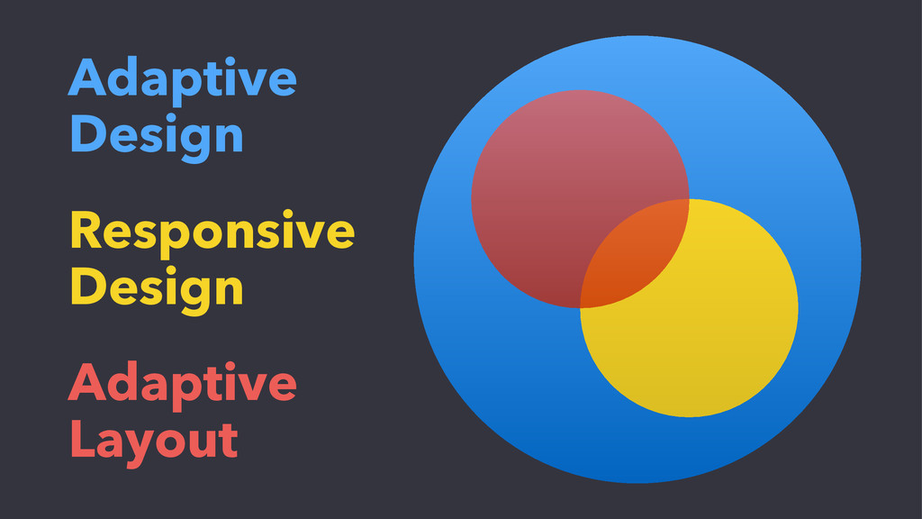
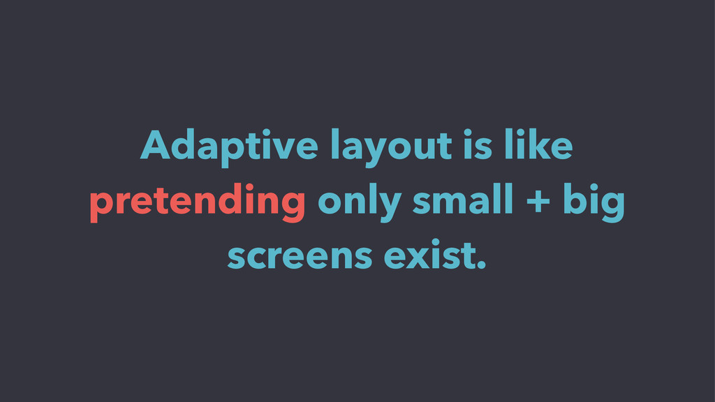
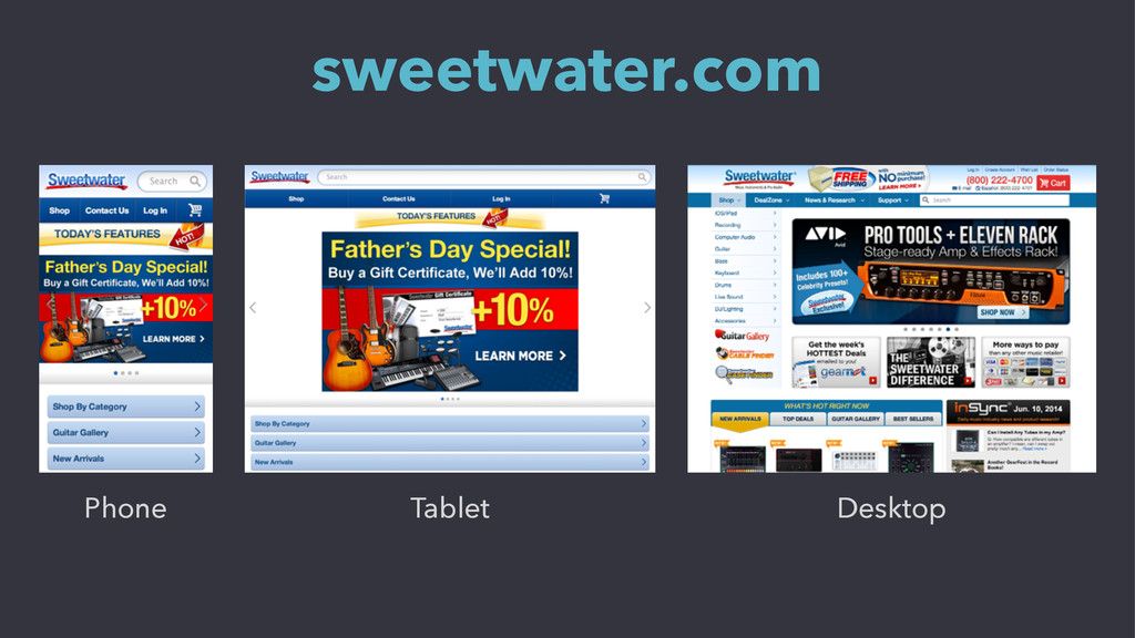
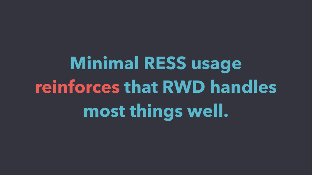
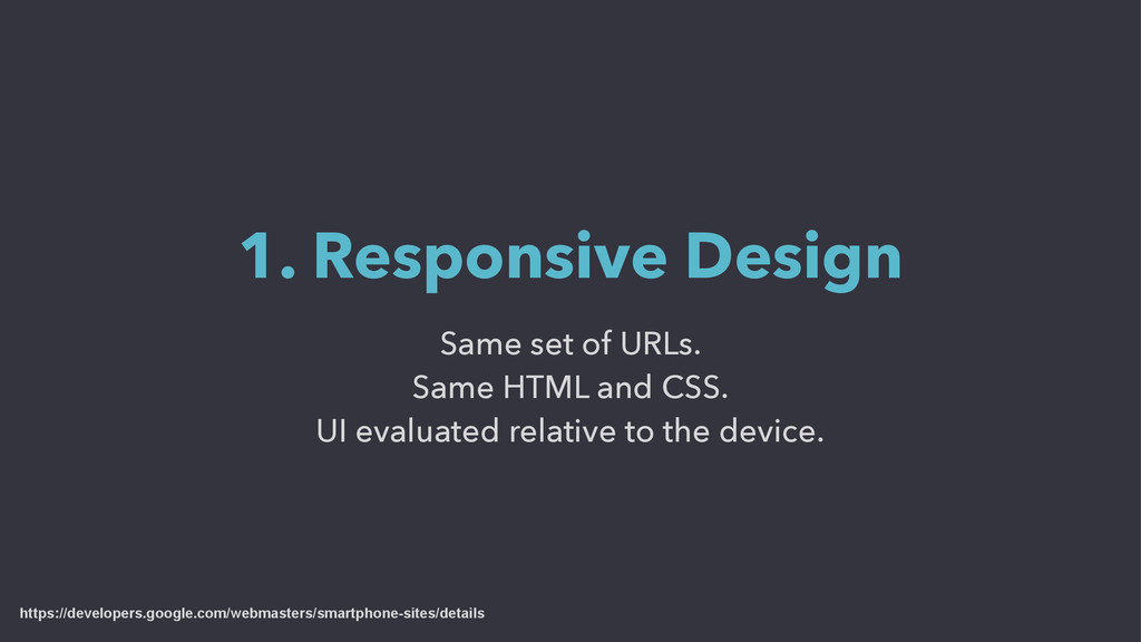
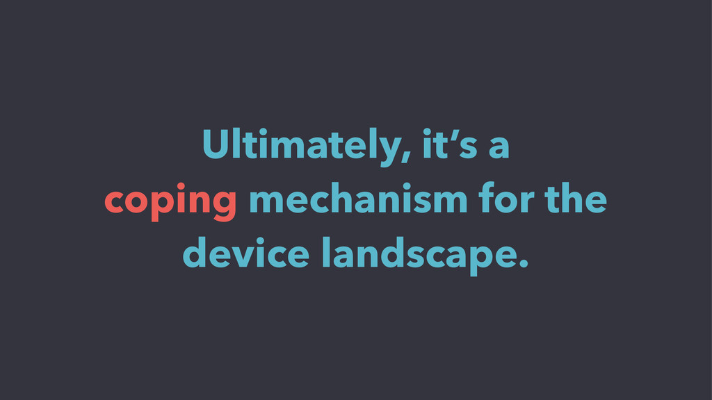
The first retailers to deploy responsive web design sites used what today is sometimes called pure responsive design. Here, a retailer creates a single web site, which uses a single set of web content and a single code base that automatically render differently to exactly fit the size of the screen on a device accessing the site.

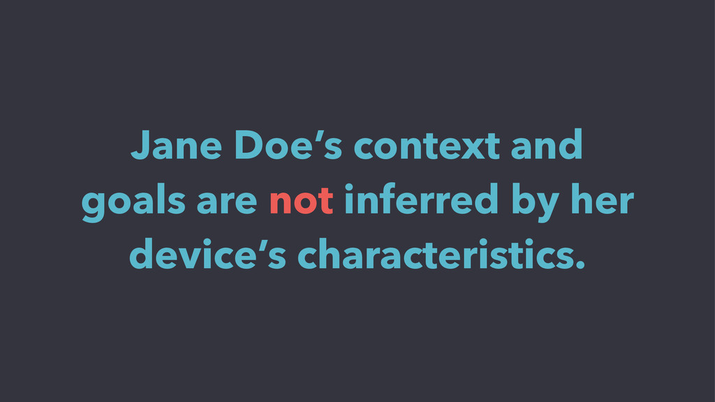
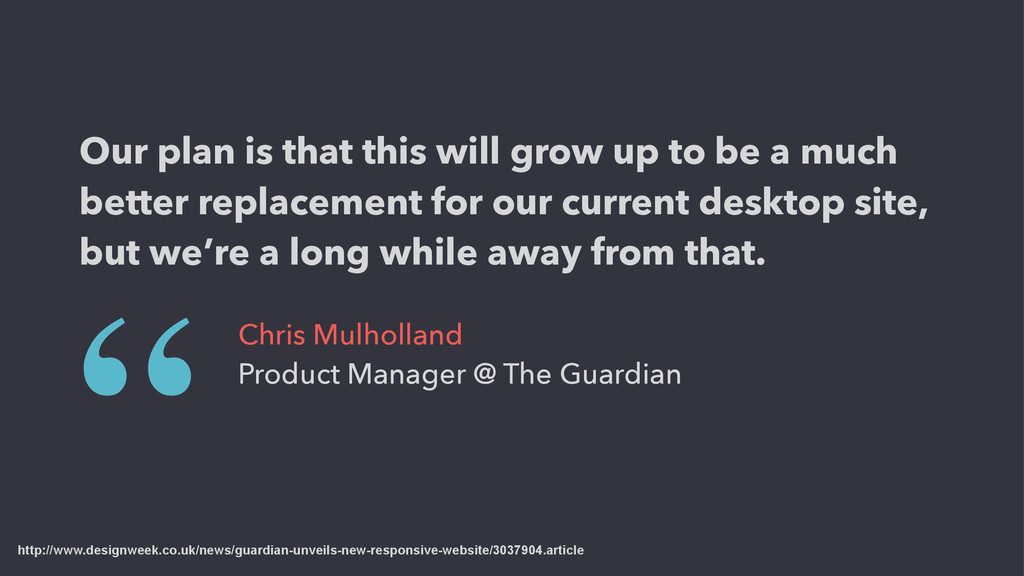
Then, some vendors that launched responsive offerings created what became known as a hybrid approach in which a retailer creates a responsive site only for mobile devices (smartphones and tablets), leaving the desktop e-commerce site untouched.

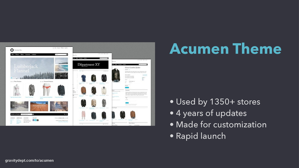
Gain an understanding of the different types of responsive design sites and their pros and cons in this session.

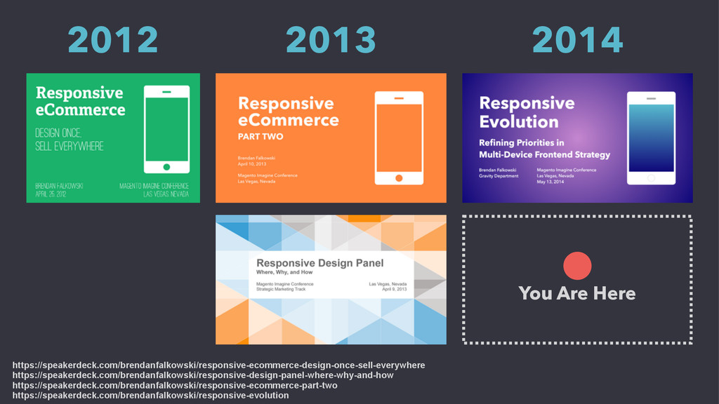
Conference: Meet Magento NY 2014
Speaker: Brendan Falkowski @ http://gravitydept.com
Location: New York City, USA
Date: September 22, 2014

Brendan Falkowski

September 22, 2014
Tweet

More Decks by Brendan Falkowski

Other Decks in Design

Transcript

  1. Two Approaches to RWD: Pure & Hybrid Brendan Falkowski Gravity

    Department Meet Magento NYC New York, New York September 22, 2014
  2. 2014 Hot 100 List 2014 Mobile 10 List Internet Retailer

    Brilliant Newcomer Nominee Top 25 Responsive Designs Net Magazine Practical eCommerce eBay Blog Moz Web Performance Today Featured Across the Web KISSmetrics Conversion XL Smashing Magazine eConsultancy Mobify Creative Bloq Yahoo! Small Business Media Queries
  3. • Used by 1350+ stores • 4 years of updates

    • Made for customization • Rapid launch Acumen Theme gravitydept.com/to/acumen
  4. Responsive Design Adaptive Design Adaptive Layout Proxy Sites M-DOT Sites

    Hybrids Retrofitting Dynamic Serving RESS …?
  5. CSS HTML }Google Glass Smartphone Small Tablet Big Tablet Netbook

    Laptop Computer Desktop Computer Television ?
  6. { Google Glass Smartphone Small Tablet (you) Big Tablet Netbook

    Laptop Computer Desktop Computer Television ? Ignore this. { Apply this.
  7. Designing for the highest constraints makes you prioritize. Mobile First

    http://www.abookapart.com/products/mobile-first
  8. Selecting a smart default and layering on capabilities if the

    task supports them. Adaptive Design as Progressive Enhancement
  9. 3” Screen Size Phone Layout 5” 7” 9” 13” 15”

    24” 30” 42” 11” Tablet / Desktop Layout Retrofit for one breakpoint Fixed desktop site
  10. 1. Not ready to modify desktop site. 2. No experience

    designing for non-fixed layouts. 3. Much faster than responsive design. Who chooses Adaptive Layout?
  11. 1. Expensive and annoying to implement code three times. 2.

    Discrepancies create a bad user experience. 3. Three codebases?
  12. 1. Expensive and annoying to implement code three times. 2.

    Discrepancies create a bad user experience. 3. Broad changes incur massive technical debt. Three codebases?
  13. http://www.designweek.co.uk/news/guardian-unveils-new-responsive-website/3037904.article Our plan is that this will grow up to

    be a much better replacement for our current desktop site, but we’re a long while away from that. “ Chris Mulholland Product Manager @ The Guardian
  14. 1. Survey is self-reported. 2. No platforms have RESS built-in.

    3. Custom work is proprietary. Why so few responses?
  15. Micah Davis, http://ovenbits.com John Tornow, http://ovenbits.com Marc Rinderknecht, http://kobebeef.ch Aaron

    T. Grogg, http://aarontgrogg.com Remi Grumeau, http://www.remi-grumeau.com Special thanks to:
  16. How long have you used RWD? <1 Year 1–2 Years

    2–3 Years 3–4 Years 33% 28% 19% 14% Never (Disqualified) 6%
  17. OS sniffing Browser sniffing Viewport measurement How do you detect

    which RESS variation to send? Detection Method MobileDetect WURFL Homegrown system Frameworks
  18. What are you serving differently through RESS? Images CSS bundles

    JS bundles Header / footer markup Navigation markup Most Common
  19. What are you serving differently through RESS? Richer media (image

    carousels) Video format optimization Ad position management SVG / PNG icons Data URIs / URLs in CSS Saving gift cards to iOS Passbook Enhancements
  20. What are you serving differently through RESS? Simpler navigation for

    feature phones Rendering animations as flat images Sending less content for low-bandwidth Fallbacks
  21. Where did RESS have the biggest impact on UX? Navigation

    (by far) Images Forms Complex tables Non-critical content (social share) Markup source order Separation of content / layout templates
  22. Did the CMS/platform facilitate or discourage the use of RESS?

    33% 33% 33% Existing Plugin Custom Plugin Custom Platform
  23. RESS is a cure for “frontend amnesia”. ! Client-side feature

    detection is asking the same questions to every device thousands of times without remembering the answer. ! Once you’ve identified a device, the screen size and CSS support won’t change mid-session. “
  24. We don’t think RESS is the answer to RWD, but

    either RESS or conditional loading are necessary today. “
  25. Every site should be responsive. Not every site needs RESS.

    “ If it isn't needed, congrats, you owe your design team a few rounds of drinks.
  26. Same set of URLs. Same HTML and CSS. UI evaluated

    relative to the device. 1. Responsive Design https://developers.google.com/webmasters/smartphone-sites/details
  27. Same set of URLs. Different HTML and CSS for specific

    devices. Includes full-page adaptation and RESS. 2. Dynamic Serving https://developers.google.com/webmasters/smartphone-sites/details
  28. Separate URLs for mobile and desktop sites. 3. Proxy Sites

    https://developers.google.com/webmasters/smartphone-sites/details
  29. Bad UX of Proxy Sites On desktop ➔ Click m.site.com

    link ➔ D’oh On smartphone ➔ Click site.com link ➔ D’oh
  30. Allow websites to notify search engines of alternate representations. Bi-Directional

    Annotations http://searchengineland.com/switchboard-tags-like-canonical-tags-but-for-mobile-seo-127676
  31. <link rel="alternate" media="only screen and (max-width: 640px)” href=“http://m.site.com/page-name” /> Bi-Directional

    Annotations https://developers.google.com/webmasters/smartphone-sites/details For every desktop page: <link rel="canonical" href="http://www.example.com/page-name" /> For every mobile page:
  32. 50% Don’t set redirects to equivalent content from their M-DOT

    sites http://moz.com/ugc/the-definitive-guide-to-googles-new-mobile-seo-rules Among the IR500 with M-DOT sites:
  33. 1. Signals to caches that response differs based on User

    Agent 2. Vary: User-Agent http://www.rimmkaufman.com/blog/vary-user-agent/30112012/
  34. 1. Signals to caches that response differs based on User

    Agent 2. Signals to search engines that additional crawlers are needed Vary: User-Agent http://www.rimmkaufman.com/blog/vary-user-agent/30112012/
  35. http://www.rimmkaufman.com/blog/vary-user-agent/30112012/ User-agents vary so wildly that they are almost unique

    for every individual. “ Patrick Meenan Engineer @ Google and WebPageTest.org If you Vary on User-Agent then intermediate caches will pretty much end up never caching resources.
  36. CDNs pass “Vary” requests to the origin server, which creates

    a bottleneck. http://searchenginewatch.com/article/2249533/How-Googles-Mobile-Best-Practices-Can-Slow-Your-Site-Down http://www.pagetrafficbuzz.com/matt-cutts-http-vary-useragent-header/16621/
  37. Speed Index of major eCommerce sites 1000 2000 3000 4000

    5000 6000 7000 8000 0 Am azon — 1439 Hom e Depot — 2888 Sears — 3759 Apple Store — 4139 eBay — 4207 Grainger — 4409 Dell — 5257 W alm art — 7151
  38. Speed Index measures the perceived completeness of a web page.

    https://sites.google.com/a/webpagetest.org/docs/using-webpagetest/metrics/speed-index
  39. 1000 2000 3000 4000 5000 6000 7000 8000 0 Google

    - 1308 3519 — M edian 4493 — M ean Am azon — 1439 Hom e Depot — 2888 Sears — 3759 Apple Store — 4139 eBay — 4207 Grainger — 4409 Dell — 5257 W alm art — 7151 Benchmarks from Alexa 300K + Google
  40. 1000 2000 3000 4000 5000 6000 7000 8000 0 Google

    - 1308 3519 — M edian 4493 — M ean Am azon — 1439 Skinny Ties — 1800 Angry Birds Shop — 2530 Hom e Depot — 2888 Sears — 3759 Apple Store — 4139 eBay — 4207 Grainger — 4409 Dell — 5257 W alm art — 7151 NDA (Beta) — 1446 My clients: Magento + very custom RWD
  41. 1000 2000 3000 4000 5000 6000 7000 8000 0 Google

    - 1308 3519 — M edian 4493 — M ean Am azon — 1439 Skinny Ties — 1800 Angry Birds Shop — 2530 Hom e Depot — 2888 Sears — 3759 Apple Store — 4139 eBay — 4207 Grainger — 4409 Dell — 5257 W alm art — 7151 NDA (Beta) — 1446 Skinny Ties uses no CDN — still fast
  42. Frontend Audits Evaluate: Goals / targets Good practices Bad practices

    Advise: Missing practices Content workflow Code quality Decide: Impact analysis Effort analysis A/B sampling
  43. Q&A