Upgrade to Pro — share decks privately, control downloads, hide ads and more …

Responsive Design Along the Conversion Path (Meet Magento NY 2015)

Brendan Falkowski
September 21, 2015

Responsive Design Along the Conversion Path (Meet Magento NY 2015)

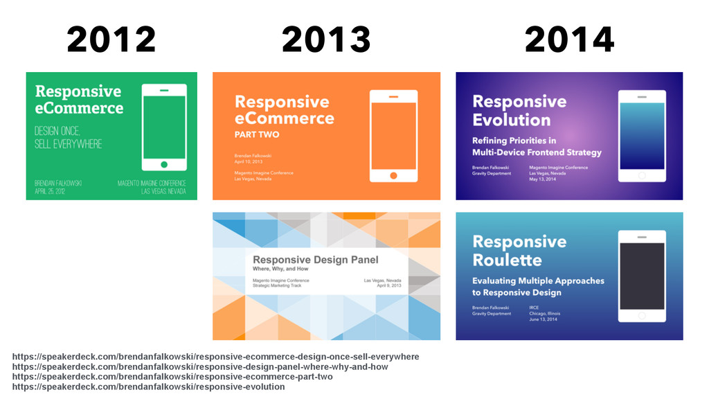
For the last three years, I’ve made the case for responsive, many-device eCommerce websites. Year one was about possibilities. Year two was about my experience on the front lines. Year three was about evolving a responsive frontend strategy for maintainability and performance.

This year I want to get back to business: RWD along the conversion path. I’ve spent the last 18 months building responsive B2B commerce with multi-billion dollar companies, and the last four years thinking about RWD + eCommerce.

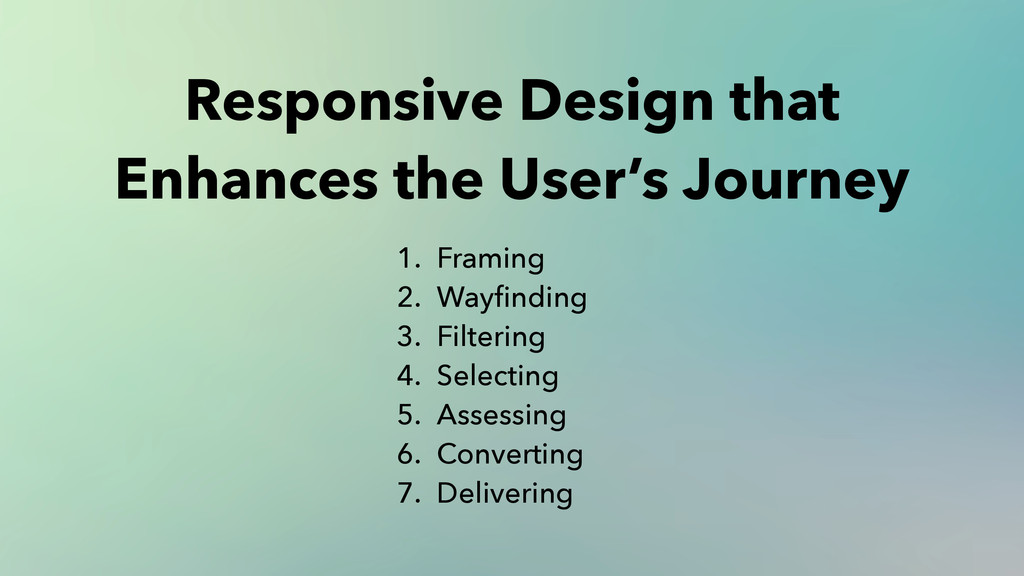
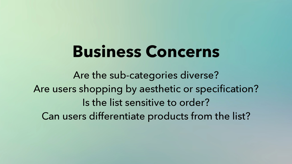
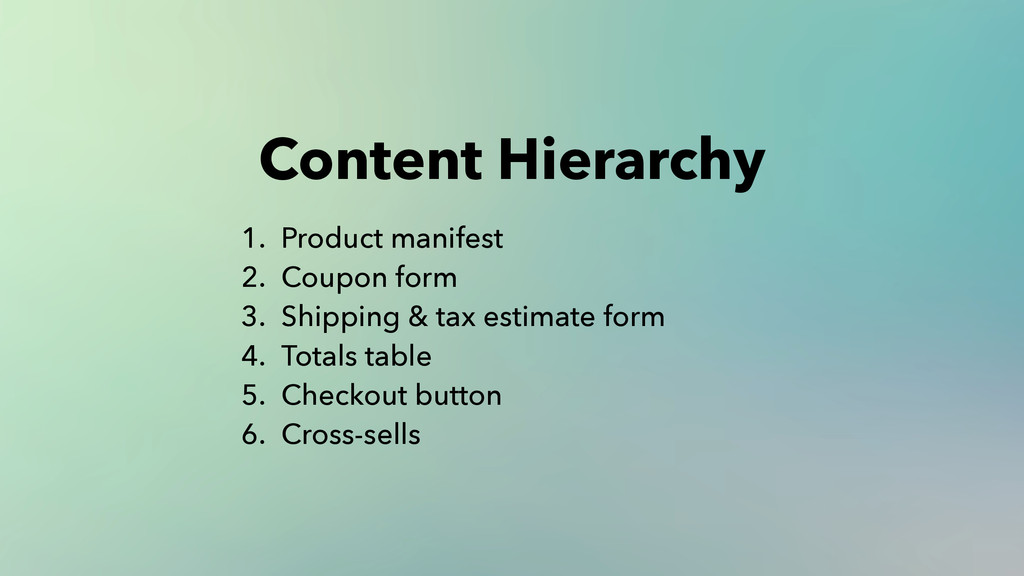
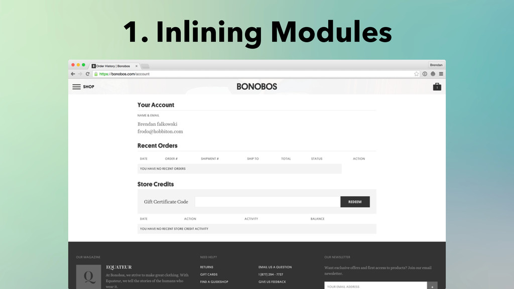
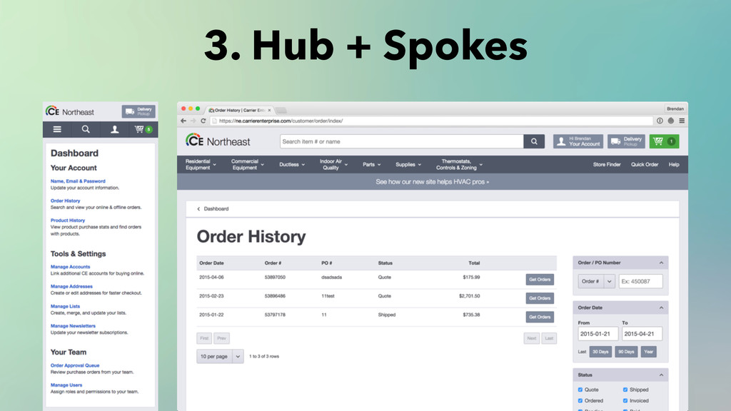
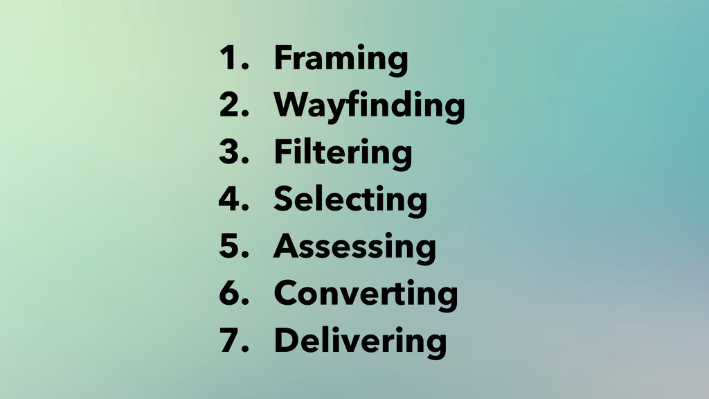
This presentation details my thought process and the critical steps when designing for the conversion path as a complete user experience rather than a series of milestones. Expressing the details in this format brings value to the customer and the business.

More info: http://gravitydept.com/blog/meet-magento-ny-2015

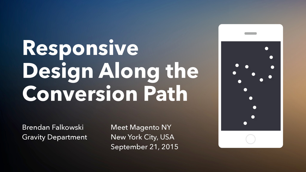
Conference: Meet Magento NY 2015
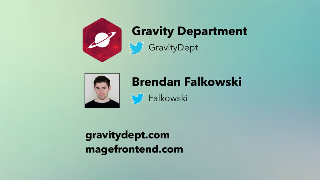
Speaker: Brendan Falkowski @ http://gravitydept.com
Location: New York City, USA
Date: September 21, 2015

Brendan Falkowski

September 21, 2015
Tweet

More Decks by Brendan Falkowski

Other Decks in Design

Transcript

  1. Responsive
    Design Along the
    Conversion Path
    Brendan Falkowski
    Gravity Department
    Meet Magento NY
    New York City, USA
    September 21, 2015

    View Slide

  2. Brendan
    Falkowski
    @Falkowski

    View Slide

  3. GravityDept.com

    View Slide

  4. Frontend Consulting For
    GEMAIRE

    View Slide

  5. gravitydept.com/to/acumen
    Acumen Theme
    Acumen 2 (wink)
    Powers 1400+ stores
    Supported for 5+ years

    View Slide

  6. View Slide

  7. https://speakerdeck.com/brendanfalkowski/responsive-ecommerce-design-once-sell-everywhere
    https://speakerdeck.com/brendanfalkowski/responsive-design-panel-where-why-and-how
    https://speakerdeck.com/brendanfalkowski/responsive-ecommerce-part-two
    https://speakerdeck.com/brendanfalkowski/responsive-evolution
    2012 2013 2014

    View Slide

  8. Responsive Design
    Along the
    Conversion Path

    View Slide

  9. Reduced technology footprint.
    Increased reach.
    Improved brand consistency.
    Merchants Love
    Responsive Design

    View Slide

  10. The Highest ROI vs
    Mobile Apps or Native Apps

    View Slide

  11. 1. Framing
    2. Wayfinding
    3. Filtering
    4. Selecting
    5. Assessing
    6. Converting
    7. Delivering
    Responsive Design that
    Enhances the User’s Journey

    View Slide

  12. Framing
    1

    View Slide

  13. Framing separates
    navigation from content.

    View Slide

  14. View Slide

  15. Study the business
    and products first.

    View Slide

  16. Why do customers buy the product?
    How many products are purchased at once?
    What’s the frequency of orders?
    Is the focus on acquiring or retaining customers?
    Do you need to represent an offline business too?
    Are categories the most useful navigational taxonomy for your catalog?
    How critical is search relative to the catalog’s size?
    Is “buy now” more applicable than the “shopping cart” model?
    Should creating an account be emphasized or required?
    What priority do promotions, shipping terms and customer support have?
    Framing Questions

    View Slide

  17. Framing
    Content

    View Slide

  18. http://www.hugeinc.com/ideas/perspective/everybody-scrolls
    We learned that participants almost always
    scrolled, regardless of how they are cued
    to do so — and that’s liberating.
    “ Rebecca Gordon
    Research Lead @ Huge

    View Slide

  19. Framing
    Content
    journal.digital-atelier.com

    View Slide

  20. Framing is a convenience.
    It’s not content.

    View Slide

  21. 1. List all the elements you may include in the header.
    2.
    3.
    4.
    5.
    Better Framing

    View Slide

  22. 1. List all the elements you may include in the header.
    2. Rank them by priority according to business goals.
    3.
    4.
    5.
    Better Framing

    View Slide

  23. 1. List all the elements you may include in the header.
    2. Rank them by priority according to business goals.
    3. Group them into logical sets.
    4.
    5.
    Better Framing

    View Slide

  24. 1. List all the elements you may include in the header.
    2. Rank them by priority according to business goals.
    3. Group them into logical sets.
    4. Design the small-screen interaction around these groups.
    5.
    Better Framing

    View Slide

  25. 1. List all the elements you may include in the header.
    2. Rank them by priority according to business goals.
    3. Group them into logical sets.
    4. Design the small-screen interaction around these groups.
    5. Adapt the patterns for larger screens.
    Better Framing

    View Slide

  26. Navigating
    Authenticating
    Converting

    View Slide

  27. Promoting Navigating Finding Personalizing Converting
    Sales Home Search Scoping Sign In Link: Cart
    Offers Categories Search Form Sign Out Link: Checkout
    Free Shipping Lookbook Typeahead Dashboard # of Items in Cart
    Support Company Info Store Locator Wishlist Cart Subtotal

    View Slide

  28. Navigating Finding Converting Personalizing

    View Slide

  29. Framing
    Content

    View Slide

  30. Consistency
    Awareness
    Context
    Utility
    Successful Framing

    View Slide

  31. Wayfinding
    2

    View Slide

  32. 1. Hierarchical navigation
    2. Search
    3. Advertisements and callouts
    4. Recommendation engines
    5. Shopping assistants
    6. Personalization
    7. Showrooming
    8. Social proofing
    Wayfinding Methods

    View Slide

  33. 1. Hierarchical navigation
    2. Search
    3. Advertisements and callouts
    4. Recommendation engines
    5. Shopping assistants
    6. Personalization
    7. Showrooming
    8. Social proofing
    Wayfinding Methods

    View Slide

  34. Your taxonomy must
    represent the catalog and
    enhance discoverability.

    View Slide

  35. Category-Driven Nav Persona-Driven Nav
    Headphones Beginners
    Mixers Enthusiasts
    Software Professional
    Turntables
    Example:
    DJ supplier taxonomies

    View Slide

  36. Good taxonomies lead
    users to products.

    View Slide

  37. Great taxonomies inform
    the user what you sell
    + how to find it.

    View Slide

  38. http://thenextweb.com/dd/2014/04/08/ux-designers-side-drawer-navigation-costing-half-user-engagement/
    Nav Drawer or Nav Bar?

    View Slide

  39. High-level nav
    structure is
    always visible

    View Slide

  40. Rich Menus, One Tap Away

    View Slide

  41. 1. Maximum of three levels for taxonomy depth.
    2. Maximum of seven child categories per parent.
    Taxonomy Guidelines

    View Slide

  42. Three
    Maximum Nav Levels

    View Slide

  43. Content is the landmark
    between navigation directions.

    View Slide

  44. 1. Dense menus are hard to
    orient within on small screens.

    View Slide

  45. 2. Filtering by attributes and
    sorting works better.

    View Slide

  46. 3. UI patterns for multi-level
    menus don’t scale forever.

    View Slide

  47. A shallower nav is more likely
    to be explored by users.

    View Slide

  48. Seven
    Maximum Nav Children

    View Slide

  49. 1. Faster to scan.
    2.
    3.
    Advantages of Narrow Branches

    View Slide

  50. 1. Faster to scan.
    2. Increased visibility.
    3.
    Advantages of Narrow Branches

    View Slide

  51. 1. Faster to scan.
    2. Increased visibility.
    3. Parent + children stay onscreen.
    Advantages of Narrow Branches

    View Slide

  52. Broad root
    branches need a
    containing menu

    View Slide

  53. View Slide

  54. View Slide

  55. View Slide

  56. View Slide

  57. Source

    View Slide

  58. Identify edge cases before
    designing the taxonomy UI.

    View Slide

  59. Showing breadth gradually
    becomes less important as
    users focus on products.

    View Slide

  60. Filtering
    3

    View Slide

  61. Am I in the right place, should I go back, or go deeper?
    Can I exclude unsuitable products from this list?
    Is this product worth inspecting closer?
    User Concerns

    View Slide

  62. Are the sub-categories diverse?
    Are users shopping by aesthetic or specification?
    Is the list sensitive to order?
    Can users differentiate products from the list?
    Business Concerns

    View Slide

  63. Filtering UIs differentiate the
    shopping experience.

    View Slide

  64. View Slide

  65. View Slide

  66. Faceted navigation can be
    more effective for filtering.

    View Slide

  67. View Slide

  68. View Slide

  69. View Slide

  70. View Slide

  71. View Slide

  72. Tailor the filtering UI
    to your catalog.

    View Slide

  73. Hint the filter toggle button.

    View Slide

  74. View Slide

  75. Selecting
    4

    View Slide

  76. Is “add to cart” the
    most important action?

    View Slide

  77. How would you prioritize
    the top five actions?

    View Slide

  78. The product view is
    designed for selection.

    View Slide

  79. 5%
    Pretty good conversion rate

    View Slide

  80. 95%
    Selecting another action

    View Slide

  81. Exercise 1/2:
    Non-Conversion Optimization

    View Slide

  82. 1. Assemble a team

    View Slide

  83. Add to cart
    Buy within a bundle
    Buy with complementary products
    Buy an alternative product being upsold
    Check product specs
    Add to wishlist
    Add to compare
    Write a review
    Share with others
    Go back
    Leave
    2. List actions

    View Slide

  84. 35: Add to cart
    15: Buy within a bundle
    10: Buy with complementary products
    10: Buy an alternative product being upsold
    8: Check product specs
    3: Add to wishlist
    3: Add to compare
    3: Write a review
    3: Share with others
    3: Go back
    0: Leave
    3. Divide 100 points

    View Slide

  85. Scores reflect the business’
    goals — not what users do.

    View Slide

  86. 4. Note differences

    View Slide

  87. Exercise 2/2:
    Content Hierarchy

    View Slide

  88. Product name
    Product photo + media
    Availability + delivery estimate
    Price + promotion modifiers
    Configurable options + size charts
    Add to cart button
    Add to wishlist
    Social share
    1. List every content component
    Upsells
    Description
    Specifications
    Reviews
    FAQs
    Cross sells
    Recently viewed products
    Breadcrumbs

    View Slide

  89. Product name + Photo
    Availability + Pricing
    Configure + Quantity
    Add to cart + save to wishlist + share
    Sweeten the deal (bundle or upsell)
    Description + Specs + Reviews + FAQs
    Redirect attention (cross sells + recently viewed)
    2. Group related components

    View Slide

  90. 3. Rank components
    What am I looking at? ➔ Product name + Photo
    Can I obtain it? ➔ Availability + Pricing
    Which options? ➔ Configure + Quantity
    My action? ➔ Add to cart + save to wishlist + share
    Unsure? ➔ Sweeten the deal (bundle or upsell)
    Need more info? ➔ Description + Specs + Reviews + FAQs
    Not interested? ➔ Redirect attention (cross sells + recently viewed)

    View Slide

  91. https://twitter.com/lukew/status/541986443598393345
    The issue isn’t whether the call to action is
    visible.
    The issue is whether your call to action is
    visible at the point where someone has
    become convinced to take action.
    “ Luke Wroblewski
    Product Director @ Google

    View Slide

  92. http://blog.chartbeat.com/2013/08/12/scroll-behavior-across-the-web/

    View Slide

  93. Assessing
    5

    View Slide

  94. The cart is essentially a
    temporary wishlist.

    View Slide

  95. 1. Confirm what’s in the cart
    2. Make edits
    3. Apply any discounts
    4. See the final price
    5. Begin checkout
    User Goals

    View Slide

  96. 1. Product manifest
    2. Coupon form
    3. Shipping & tax estimate form
    4. Totals table
    5. Checkout button
    6. Cross-sells
    Content Hierarchy

    View Slide

  97. The Cart Manifest

    View Slide

  98. Tables don’t work well
    on small screens.

    View Slide

  99. View Slide

  100. 1. Browsers still download images in hidden columns.
    2.
    3.
    4.
    Table Consequences

    View Slide

  101. 1. Browsers still download images in hidden columns.
    2. Lines wrap after a word or two.
    3.
    4.
    Table Consequences

    View Slide

  102. 1. Browsers still download images in hidden columns.
    2. Lines wrap after a word or two.
    3. Long words can easily overflow the table.
    4.
    Table Consequences

    View Slide

  103. 1. Browsers still download images in hidden columns.
    2. Lines wrap after a word or two.
    3. Long words can easily overflow the table.
    4. The lack of labels is unclear.
    Table Consequences

    View Slide

  104. View Slide

  105. Densely packed buttons are
    hard to tap accurately.

    View Slide

  106. Product, options, quantity, price
    Inspecting Info

    View Slide

  107. Change quantity, save to wishlist, remove from cart
    Editing Actions

    View Slide

  108. View Slide

  109. View Slide

  110. Always Be Closing

    View Slide

  111. Cart button
    before
    manifest
    Menu with
    cart and
    checkout
    actions

    View Slide

  112. Converting
    6

    View Slide

  113. Checkout on small screens
    forces focus on one thing.

    View Slide

  114. Most sites fail to make
    checkout micro optimizations.

    View Slide

  115. 1. Pre-fill all data you have.

    View Slide

  116. 2. Eliminate unnecessary inputs.

    View Slide

  117. 3. Make inputs work for users.

    View Slide

  118. 4. Copy identical info forward.

    View Slide

  119. 5. Use HTML5 input types.

    View Slide

  120. autocapitalize + autocorrect + spellcheck
    6. Use HTML5 input attributes.

    View Slide

  121. 7. Use WHATWG standard
    `name` and `autocomplete`
    attributes.
    https://developers.google.com/web/fundamentals/input/form/label-and-name-inputs

    View Slide

  122. 8. Use HTML5 input
    placeholders.

    View Slide

  123. 9. Validate inline.

    View Slide

  124. Users don’t need any of this
    to complete forms, but you
    can/should provide it.

    View Slide

  125. Delivering
    7

    View Slide

  126. Transactional email is the first
    touchpoint after a sale.

    View Slide

  127. 53%
    of email was opened on
    mobile devices in 2014
    https://litmus.com/blog/53-of-emails-opened-on-mobile-outlook-opens-decrease-33

    View Slide

  128. Order confirmation
    Shipment notification + tracking link
    Support inquiries
    Reminder to review products
    Share with a friend
    Password resets
    Common transactional email

    View Slide

  129. A little care goes a long way.

    View Slide

  130. Account dashboard:
    not where users spend time.

    View Slide

  131. Tracking a shipment
    Update addresses
    View order history
    Check gift card balance
    Organize wishlists
    Dashboard Tasks

    View Slide

  132. View Slide

  133. View Slide

  134. 1. Inlining Modules

    View Slide

  135. 2. Sidebar to Menu

    View Slide

  136. 3. Hub + Spokes

    View Slide

  137. View Slide

  138. Wrapping Up

    View Slide

  139. 1. Framing
    2. Wayfinding
    3. Filtering
    4. Selecting
    5. Assessing
    6. Converting
    7. Delivering

    View Slide

  140. Stay curious,
    keep your eyes open.

    View Slide

  141. Thank you

    View Slide

  142. Q&A

    View Slide

  143. Gravity Department
    GravityDept
    gravitydept.com
    magefrontend.com
    Brendan Falkowski
    Falkowski

    View Slide