Upgrade to Pro
— share decks privately, control downloads, hide ads and more …
Speaker Deck
Features
Speaker Deck
PRO
Sign in
Sign up for free
Search
Search
Responsive web design
Search
brutiko
July 14, 2012
Design
37
0
Share
Embed
Copy iframe code
Copy JS code
Copy link
Start on current slide
Responsive web design
brutiko
July 14, 2012
More Decks by brutiko
See All by brutiko
Tipografia
brutiko
1
60
Kiehls - Plano de marketing
brutiko
0
130
Like a boss - Designer empreendedor
brutiko
0
78
NODUS
brutiko
1
380
Intercâmbio Universidade de Aveiro - Portugal
brutiko
1
110
Other Decks in Design
See All in Design
社長の宿題への回答 「新卒×AI」が生み出す価値
saki822
2
180
設計と制作 意図を形に表す / Design and Making: Intent Made Form
usagimaru
3
2k
2026の目標「もっと定量的に事業、会社へ貢献する!」
yuri_ohashi
0
870
全員がアウトプットを出せる時代、 誰を採用する?
nishame
0
610
もう迷わない!“なんとなく”を卒業するフォントの選び方【村田俊英】
toshihidemurata
0
760
デザイナーが主導権を握る、AI協業の本音と実践
satosio
7
3.4k
kintone開発におけるライターの役割の変化〜AI活用を添えて〜 / Changes in the Role of Writers in Kintone Development
keroyama
0
140
デザインワークフローの最前線。 ログラスでのAI活用の現在地
ukaoli
1
1.6k
where_imagination_ends_ai_begins.pdf
r5ni4
0
240
「おすすめ」はなぜ信用されないのか - 信頼を築くUI/UX設計
ryu1013
0
170
1000人規模の組織でデザインハーネスを導入するための第一歩
pkshadeck
PRO
2
2.5k
組織で働く大人が「知らないままにやってみる」を取り戻す方法とその意味〜企業で働く実務家による実践知の言語化を事例とした考察〜
chiemitaki
1
240
Featured
See All Featured
SEO for Brand Visibility & Recognition
aleyda
0
4.6k
Become a Pro
speakerdeck
PRO
31
6k
"I'm Feeling Lucky" - Building Great Search Experiences for Today's Users (#IAC19)
danielanewman
230
23k
The Power of CSS Pseudo Elements
geoffreycrofte
82
6.4k
Claude Code どこまでも/ Claude Code Everywhere
nwiizo
65
56k
Hiding What from Whom? A Critical Review of the History of Programming languages for Music
tomoyanonymous
3
990
The Illustrated Children's Guide to Kubernetes
chrisshort
51
53k
Visual Storytelling: How to be a Superhuman Communicator
reverentgeek
2
590
AI Search: Implications for SEO and How to Move Forward - #ShenzhenSEOConference
aleyda
1
1.3k
How to Build an AI Search Optimization Roadmap - Criteria and Steps to Take #SEOIRL
aleyda
1
2.1k
Money Talks: Using Revenue to Get Sh*t Done
nikkihalliwell
0
400
Put a Button on it: Removing Barriers to Going Fast.
kastner
60
4.4k
Transcript
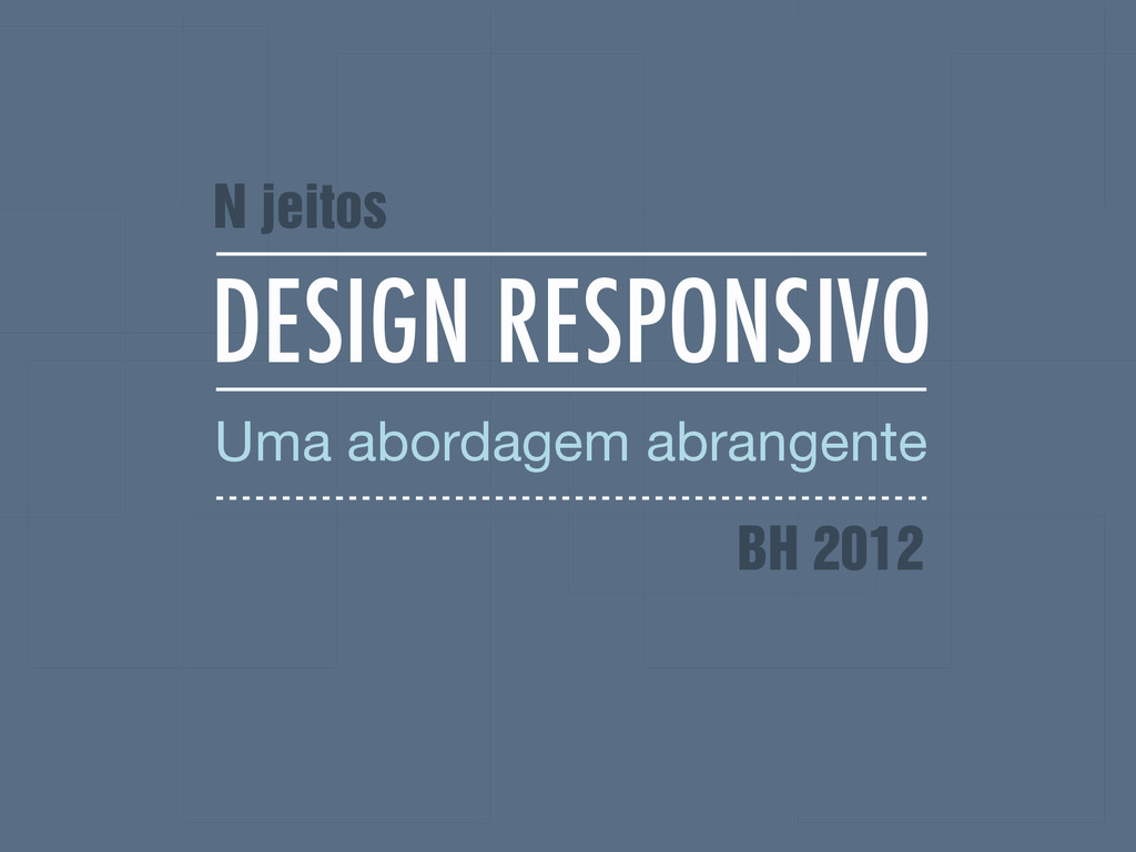
DESIGN RESPONSIVO Uma abordagem abrangente N jeitos BH 2012
BRUNA KOCHI @brutiko
[email protected]
ROGER ROSSI @_utgardloki
[email protected]
A OFICINA HISTÓRICO PRODUÇÃO BOAS PRÁTICAS
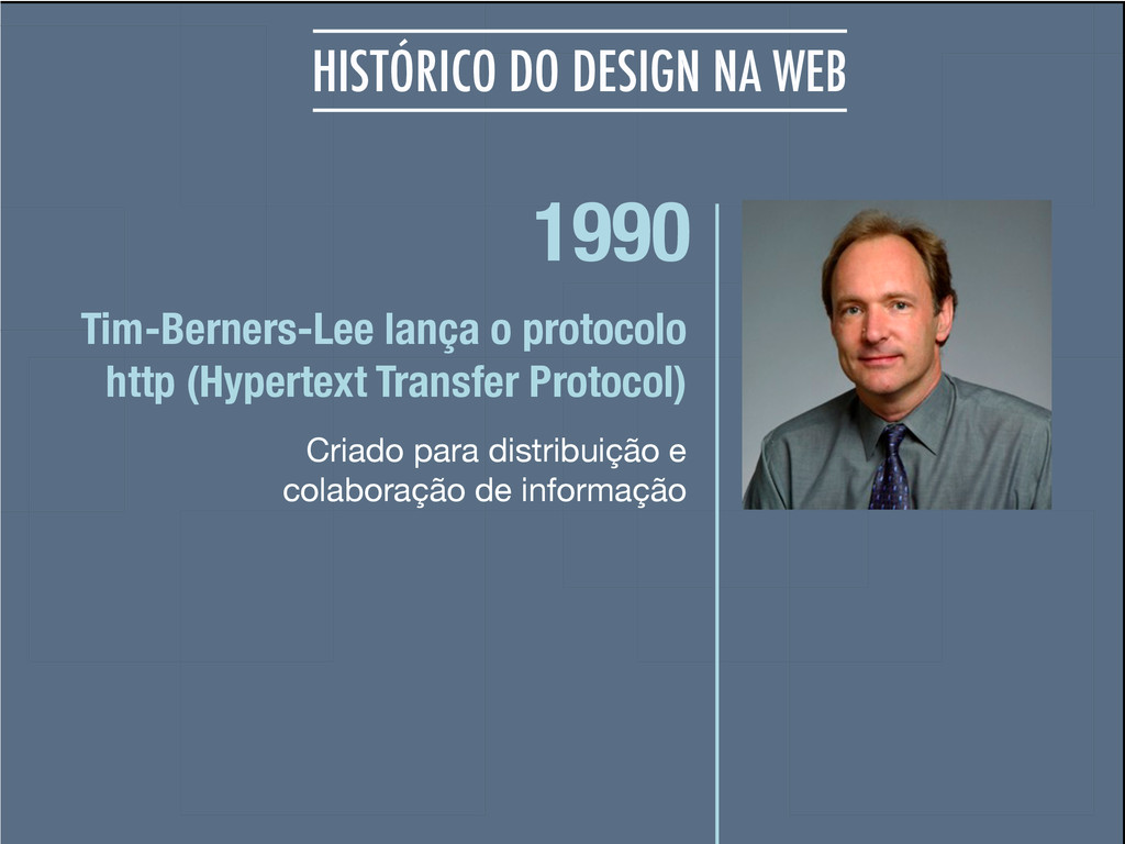
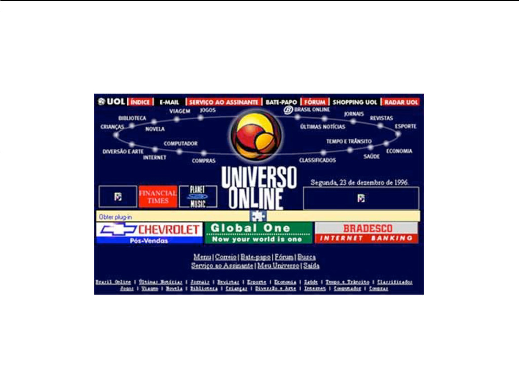
1990 Criado para distribuição e colaboração de informação Tim-Berners-Lee lança
o protocolo http (Hypertext Transfer Protocol) HISTÓRICO DO DESIGN NA WEB
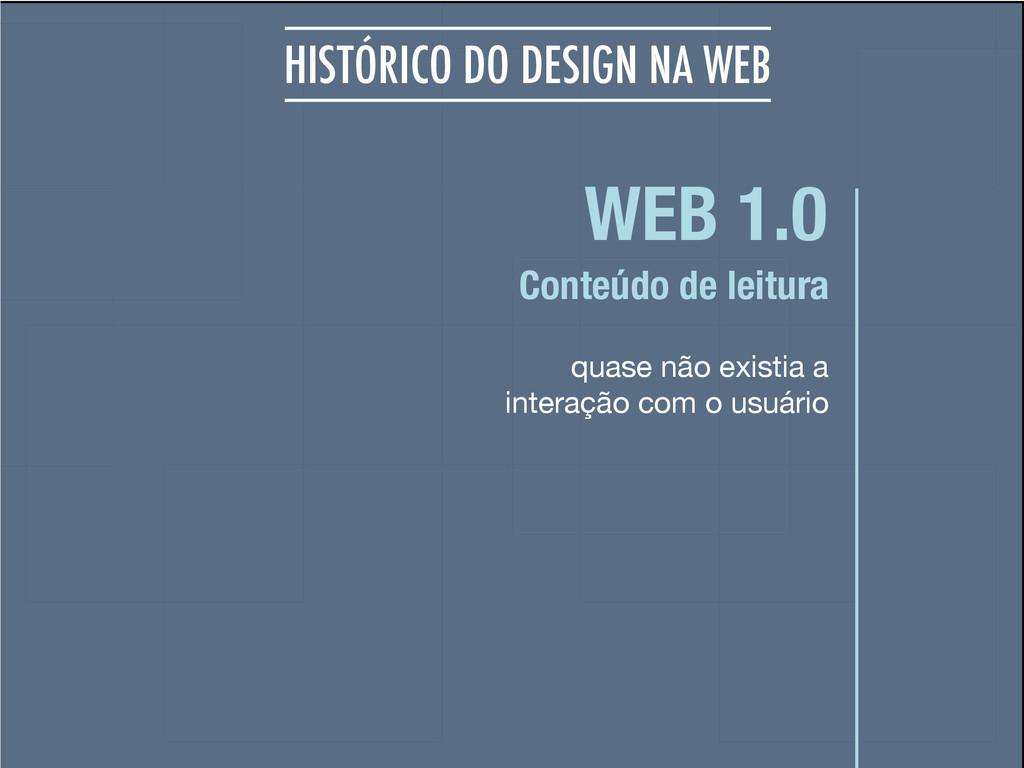
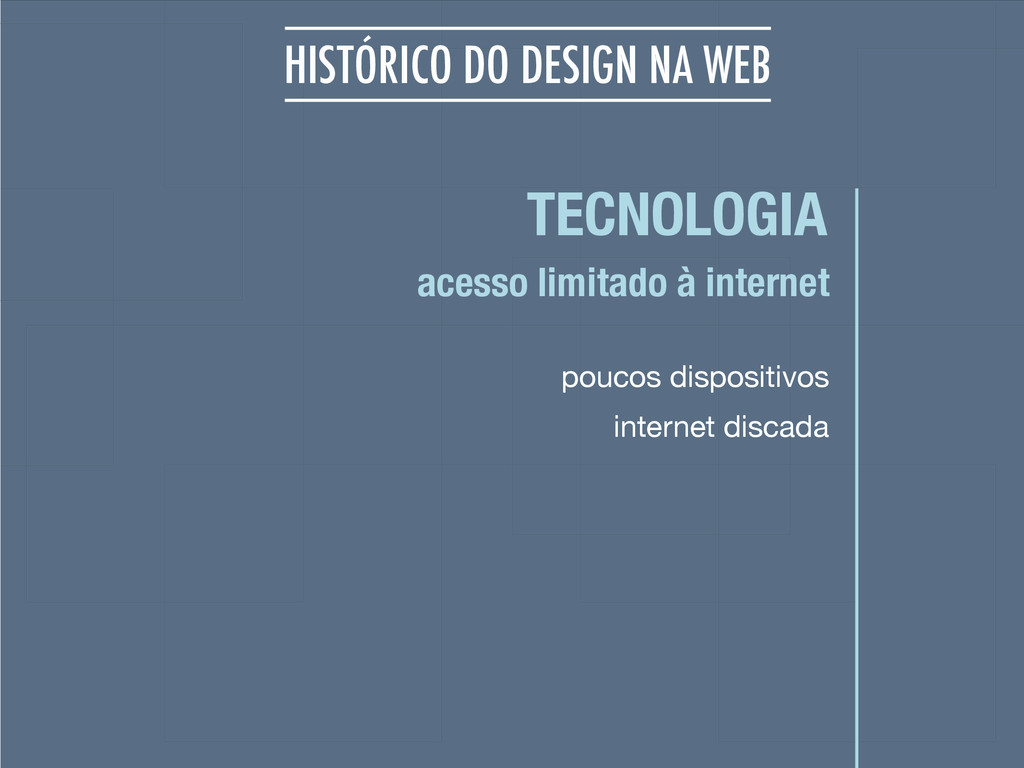
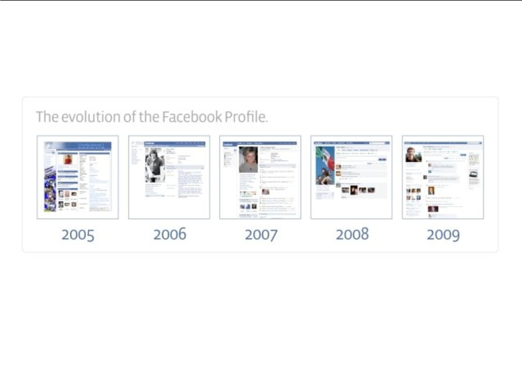
HISTÓRICO DO DESIGN NA WEB
None
None
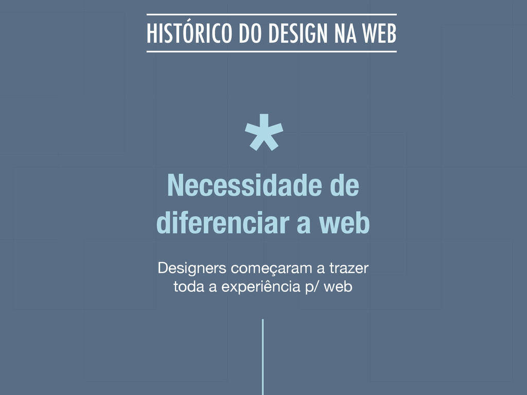
Designers começaram a trazer toda a experiência p/ web Necessidade
de diferenciar a web HISTÓRICO DO DESIGN NA WEB *
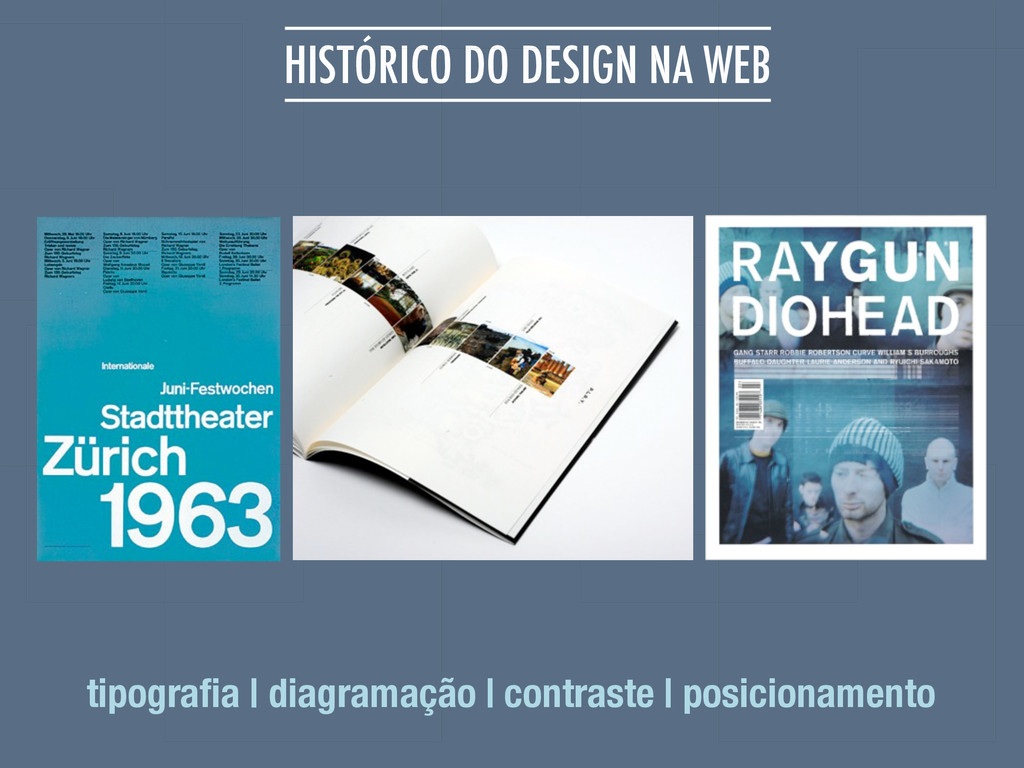
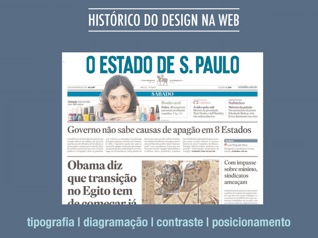
HISTÓRICO DO DESIGN NA WEB tipografia | diagramação | contraste
| posicionamento
HISTÓRICO DO DESIGN NA WEB tipografia | diagramação | contraste
| posicionamento
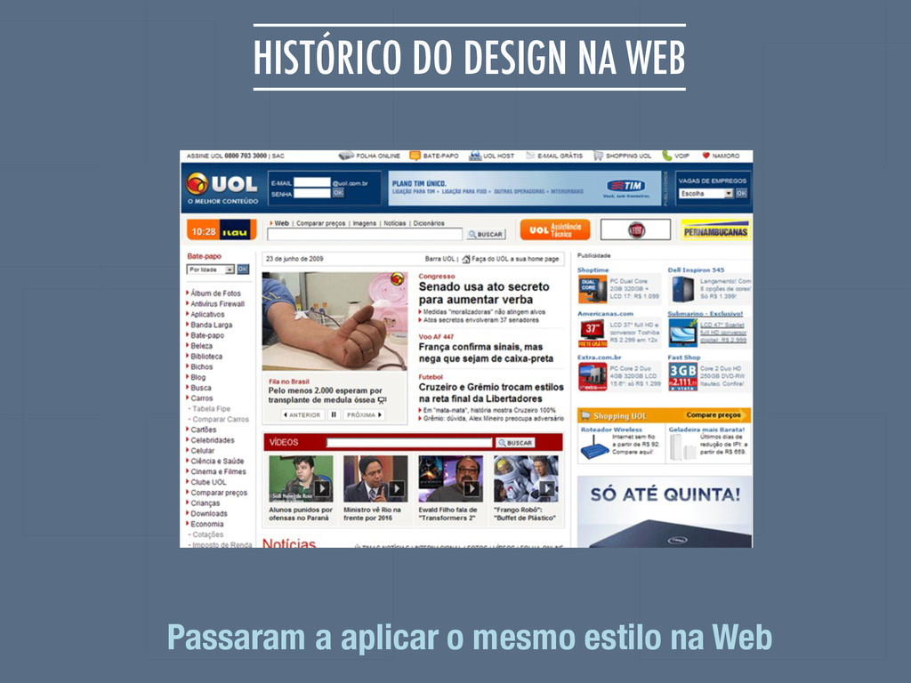
HISTÓRICO DO DESIGN NA WEB Passaram a aplicar o mesmo
estilo na Web
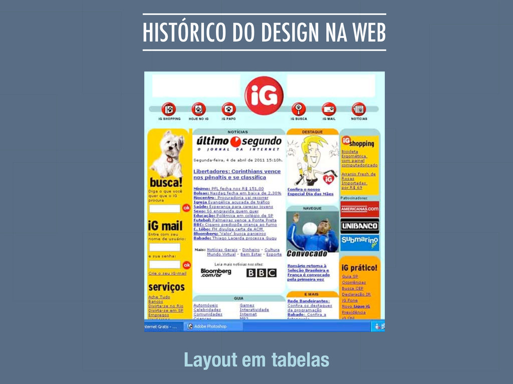
HISTÓRICO DO DESIGN NA WEB Layout em tabelas
1998 Layouts de forma semântica, uso de tabelas apenas para
dados tabulares Movimento Tableless Html propósito original HISTÓRICO DO DESIGN NA WEB
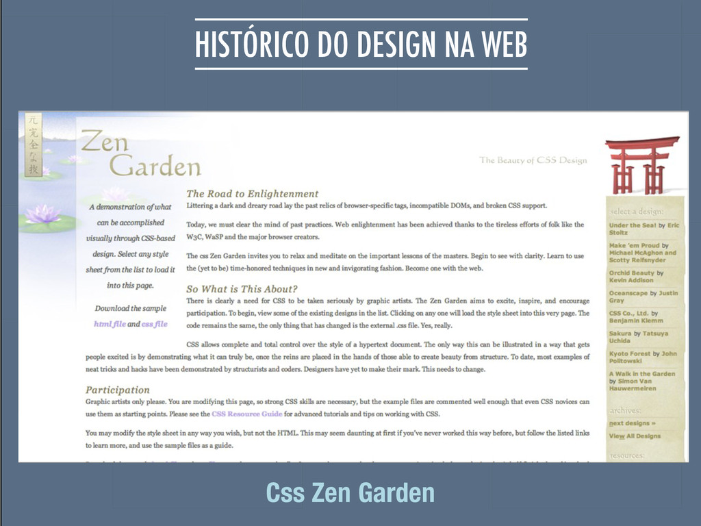
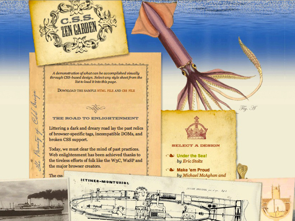
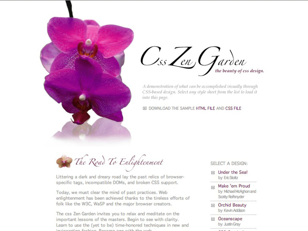
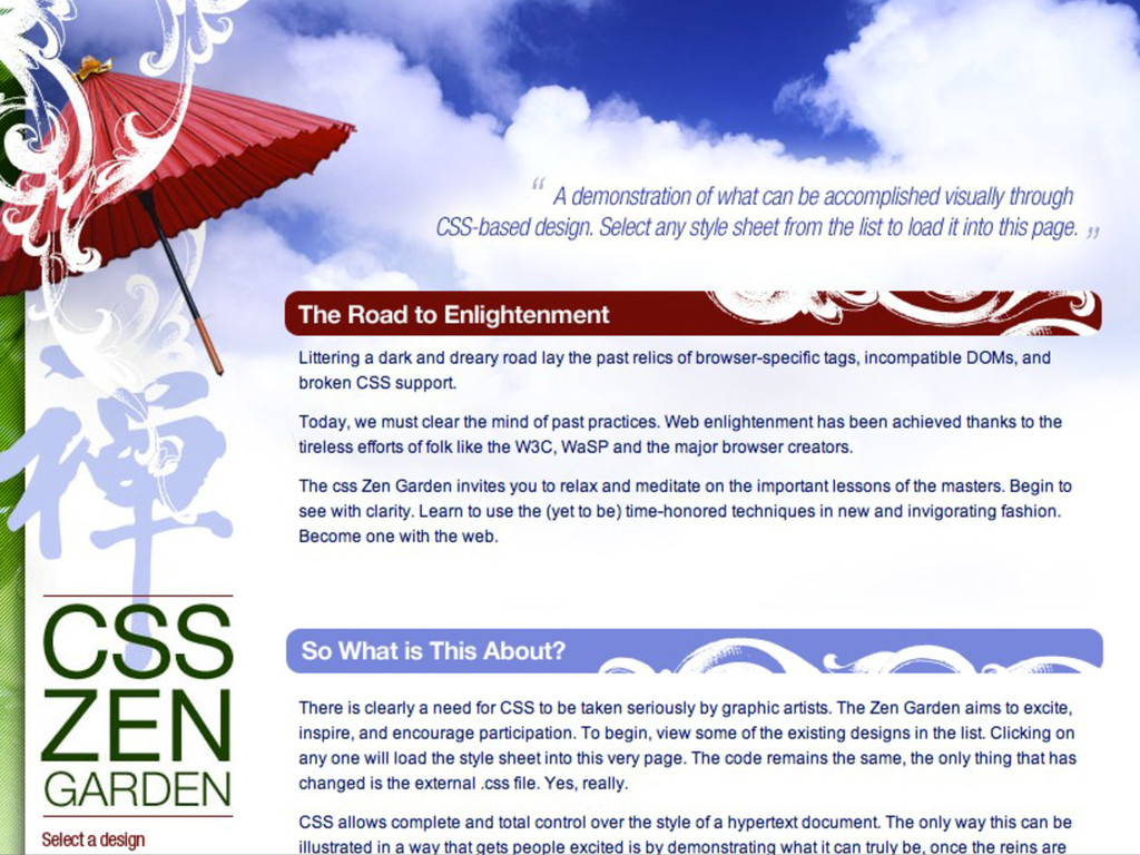
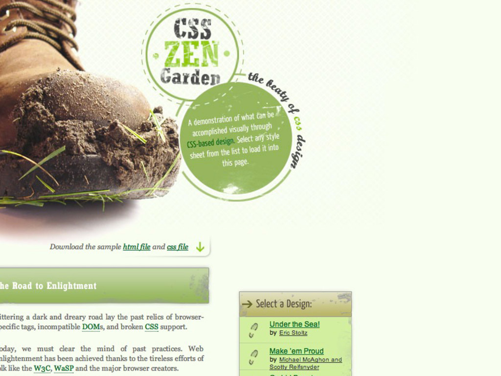
HISTÓRICO DO DESIGN NA WEB Css Zen Garden
None
None
None
None
WEB 1.0 quase não existia a interação com o usuário
Conteúdo de leitura HISTÓRICO DO DESIGN NA WEB
TECNOLOGIA poucos dispositivos acesso limitado à internet HISTÓRICO DO DESIGN
NA WEB internet discada
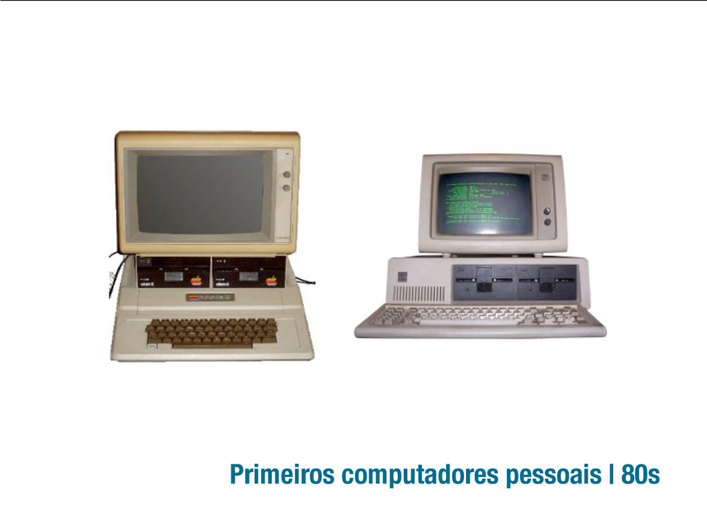
Primeiros computadores pessoais | 80s
PC
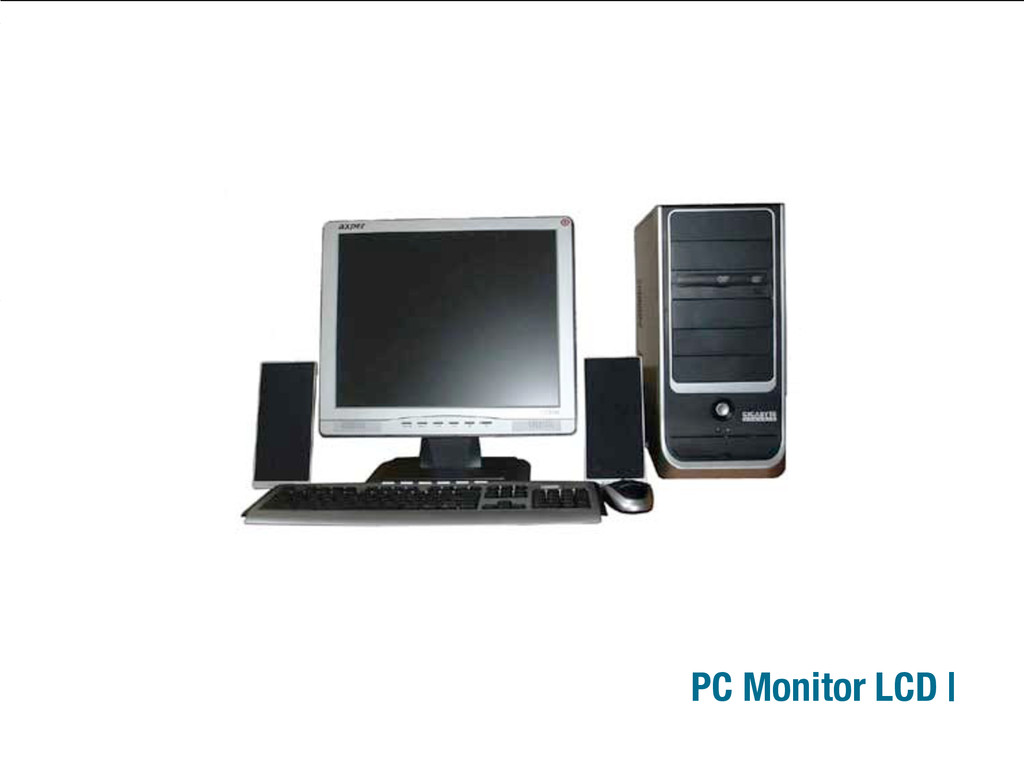
PC Monitor LCD |
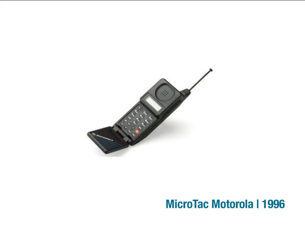
MicroTac Motorola | 1996
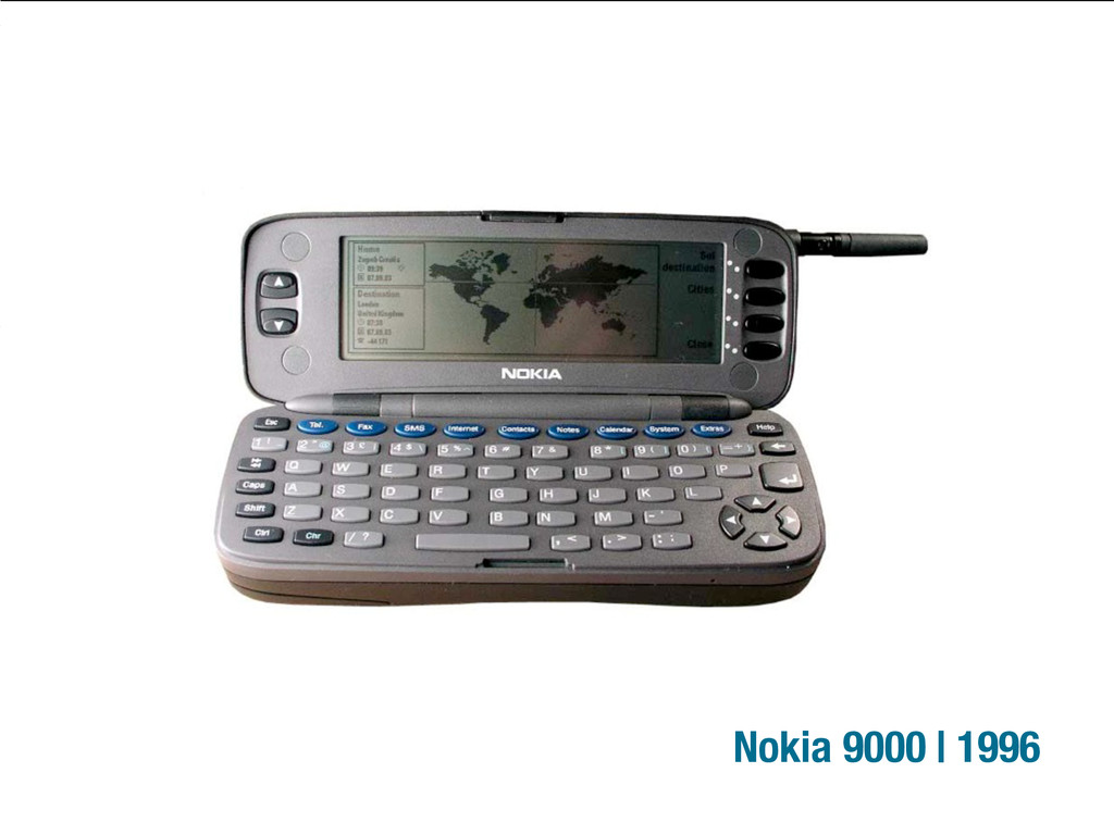
Nokia 9000 | 1996
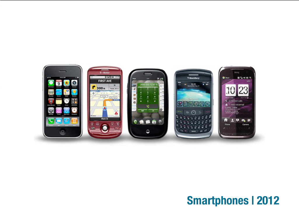
Smartphones | 2012
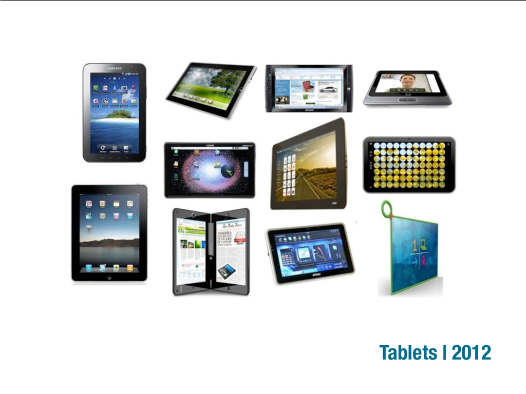
Tablets | 2012
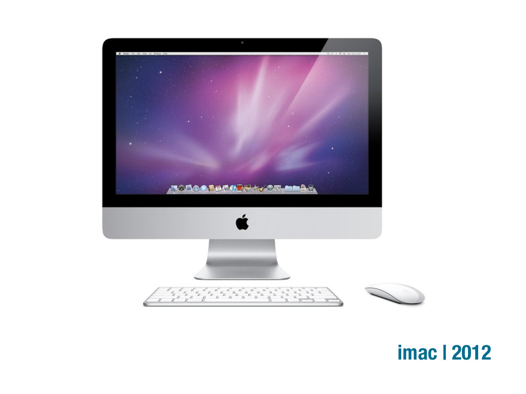
imac | 2012
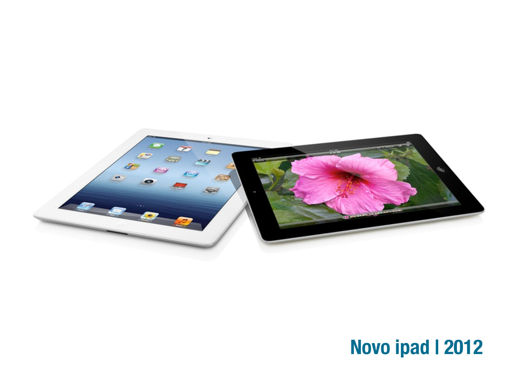
Novo ipad | 2012
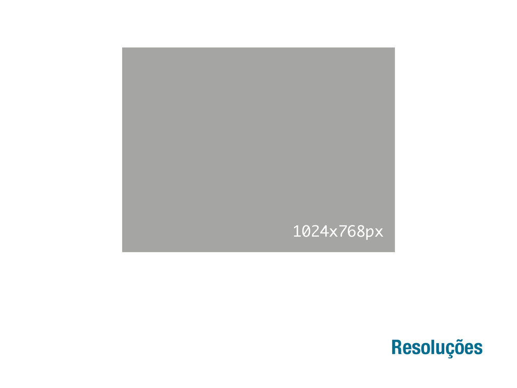
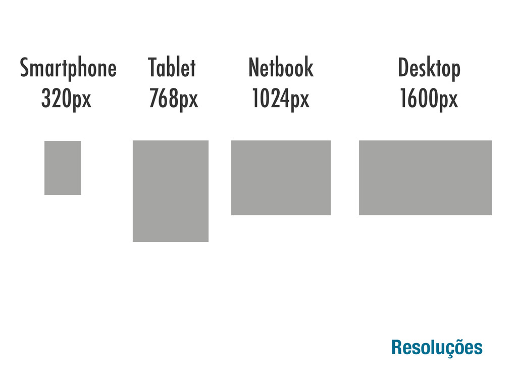
Resoluções 1024x768px
Resoluções 1024x768px Smartphone Tablet Netbook Desktop 320px 768px 1024px 1600px
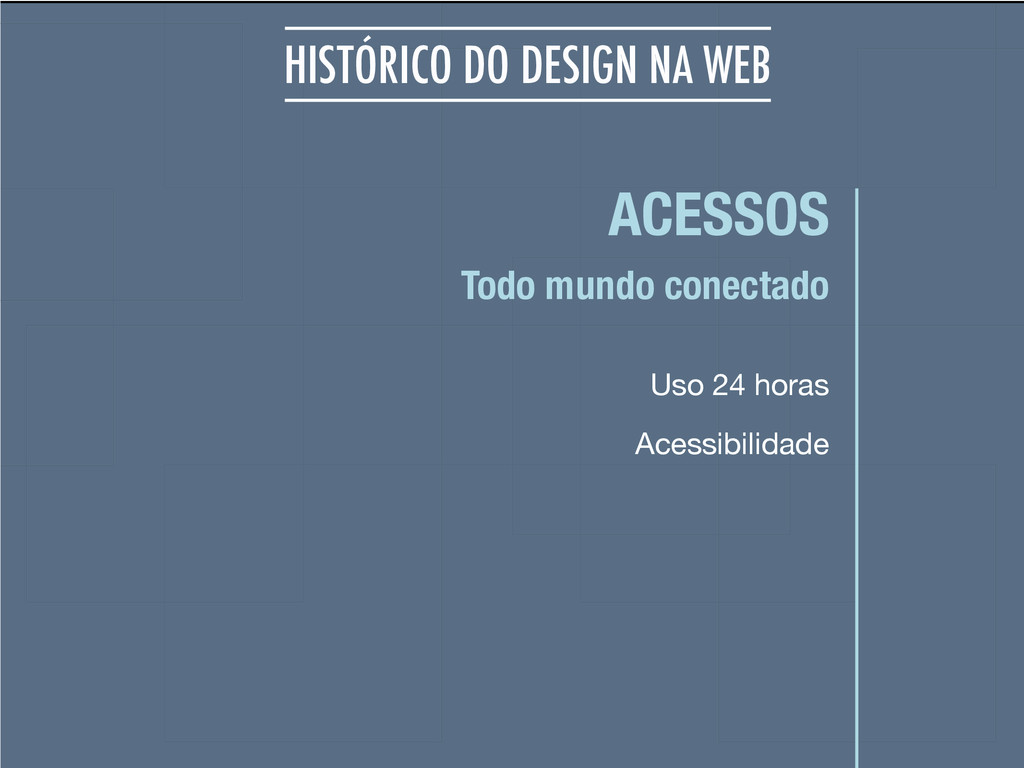
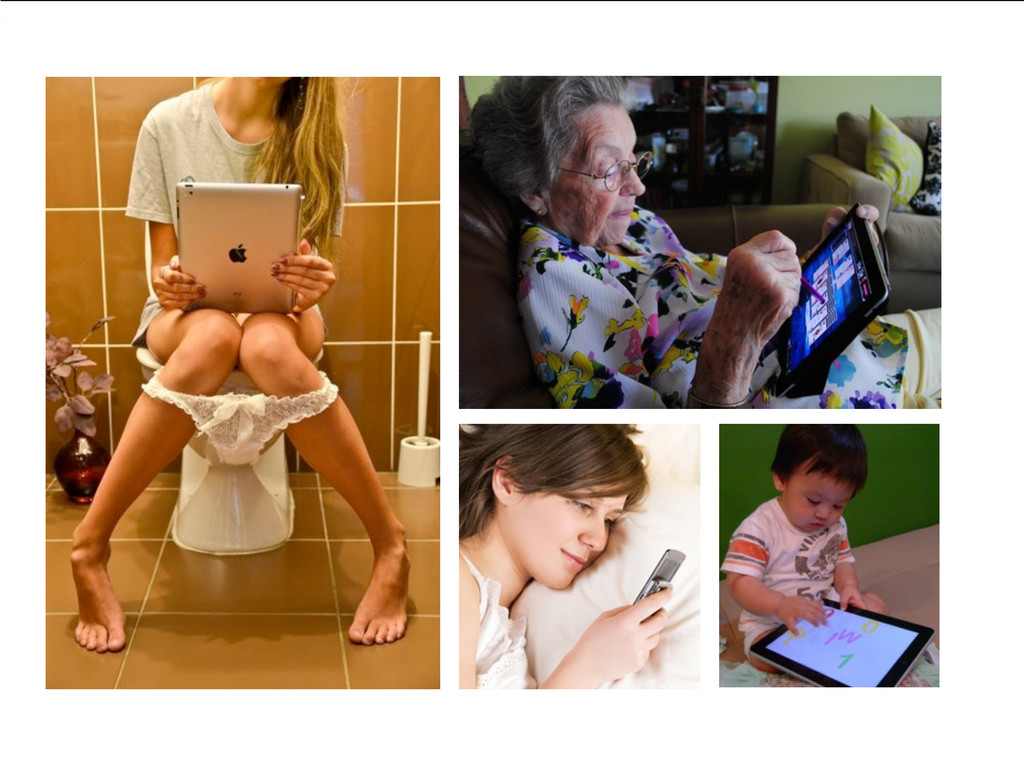
ACESSOS Uso 24 horas Todo mundo conectado HISTÓRICO DO DESIGN
NA WEB Acessibilidade
None
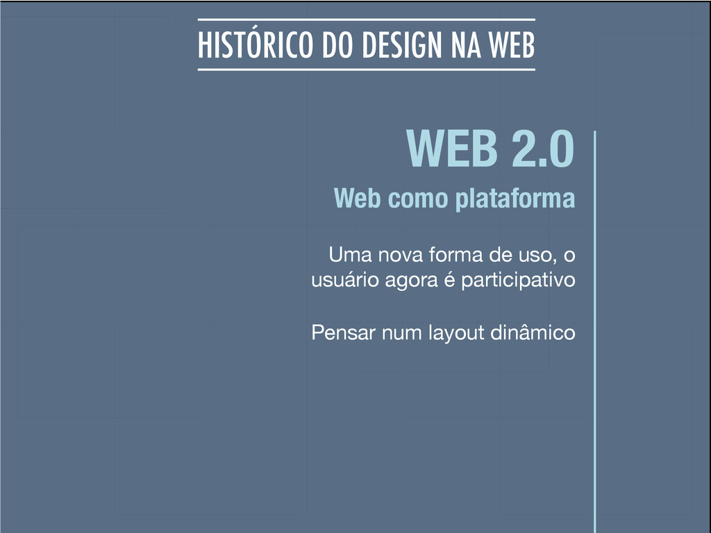
WEB 2.0 Uma nova forma de uso, o usuário agora
é participativo Web como plataforma HISTÓRICO DO DESIGN NA WEB Pensar num layout dinâmico
None
None
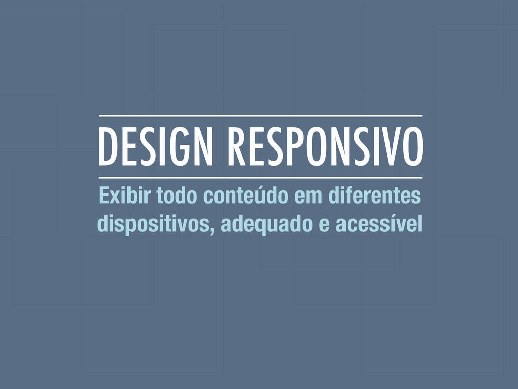
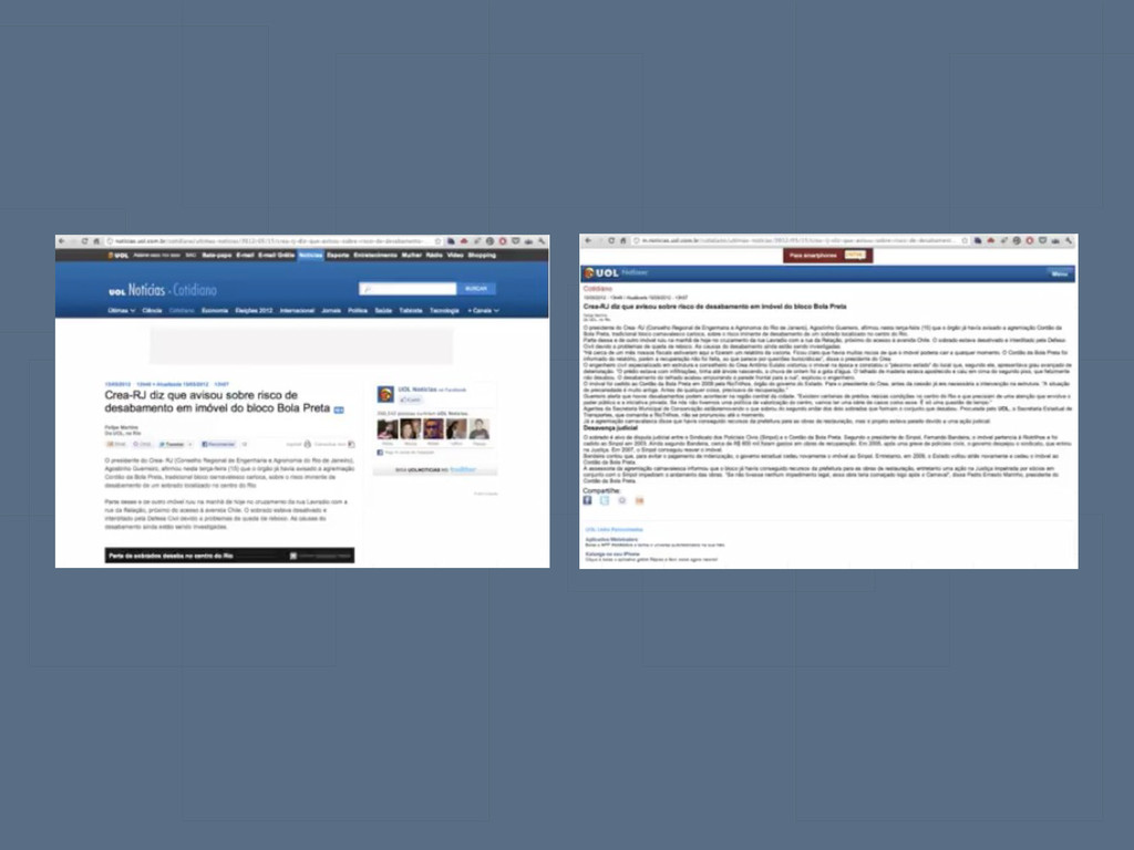
DESIGN RESPONSIVO Exibir todo conteúdo em diferentes dispositivos, adequado e
acessível
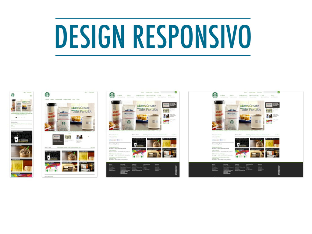
DESIGN RESPONSIVO
None
None
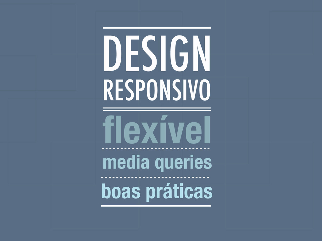
RESPONSIVO flexível media queries boas práticas DESIGN
None
None
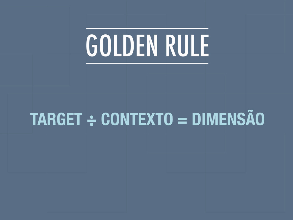
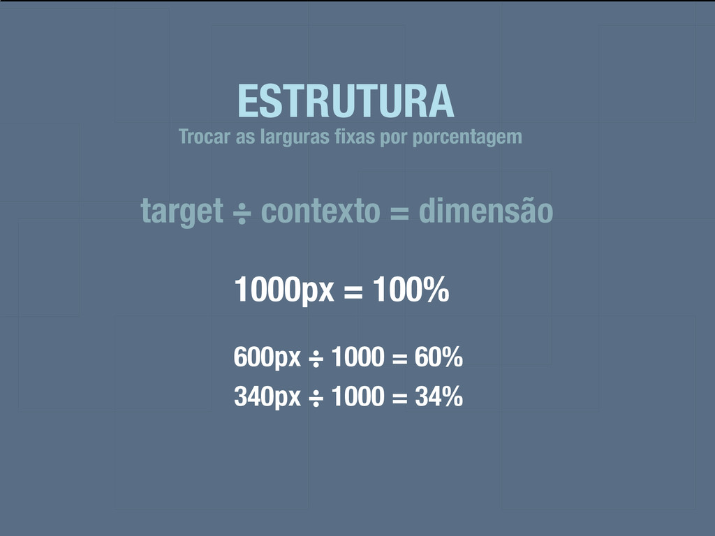
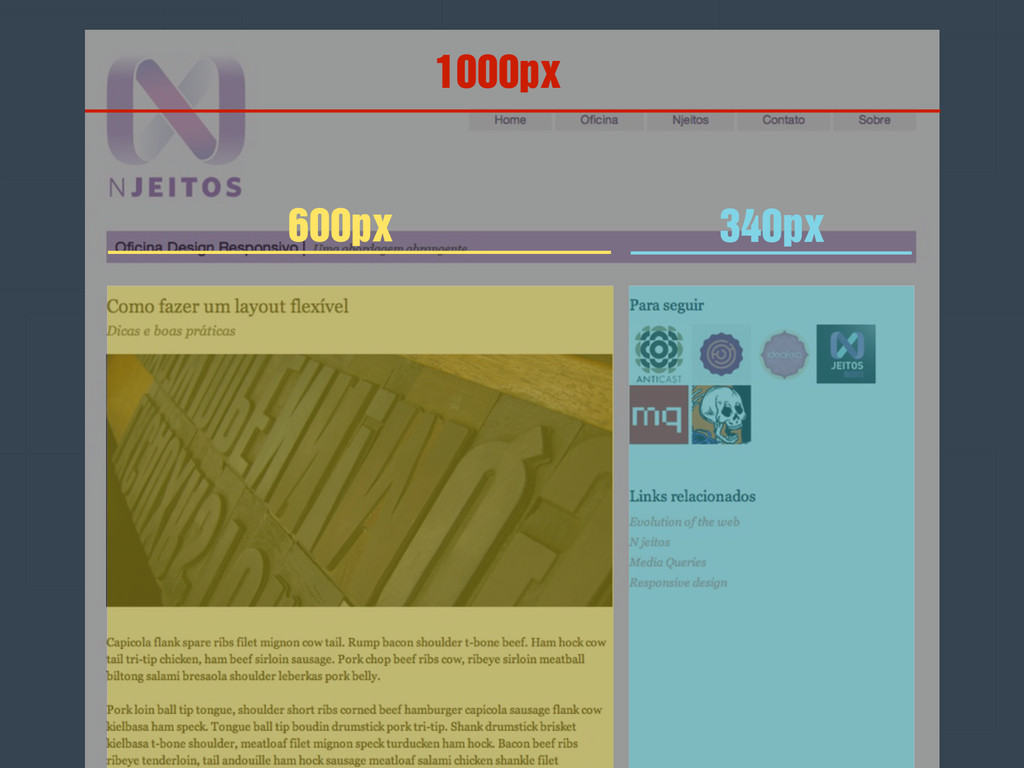
GOLDEN RULE TARGET ÷ CONTEXTO = DIMENSÃO
ESTRUTURA target ÷ contexto = dimensão Trocar as larguras fixas
por porcentagem 1000px = 100% 600px ÷ 1000 = 60% 340px ÷ 1000 = 34%
600px 340px 1000px
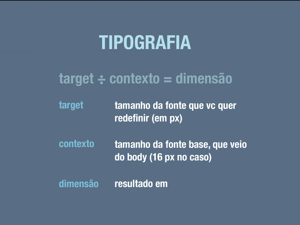
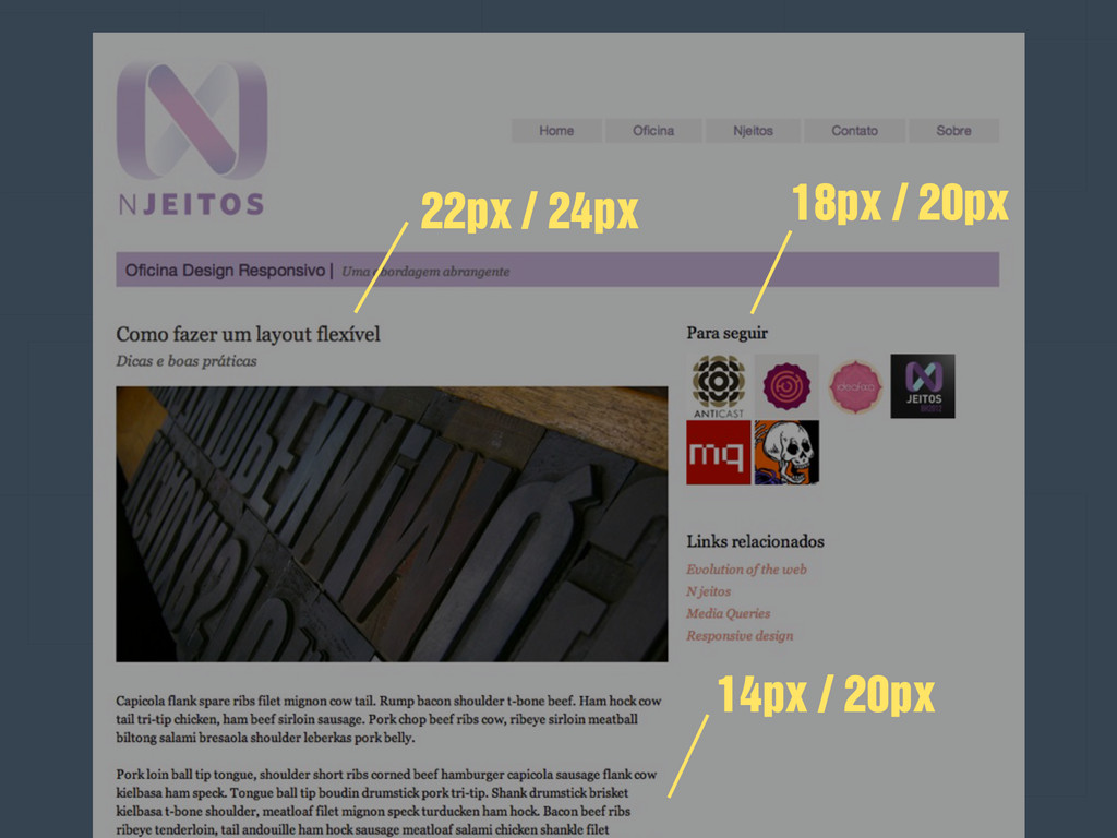
TIPOGRAFIA target ÷ contexto = dimensão target tamanho da fonte
que vc quer redefinir (em px) contexto tamanho da fonte base, que veio do body (16 px no caso) dimensão resultado em
22px / 24px 18px / 20px 14px / 20px
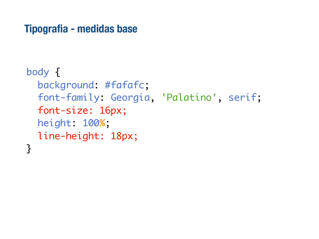
Tipografia - medidas base body { background: #fafafc; font-family: Georgia,
'Palatino', serif; font-size: 16px; height: 100%; line-height: 18px; }
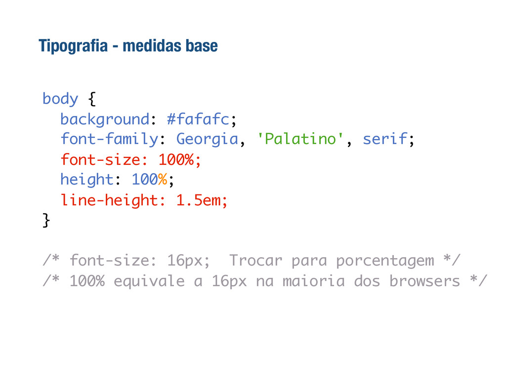
body { background: #fafafc; font-family: Georgia, 'Palatino', serif; font-size: 100%;
height: 100%; line-height: 1.5em; } /* font-size: 16px; Trocar para porcentagem */ /* 100% equivale a 16px na maioria dos browsers */ Tipografia - medidas base
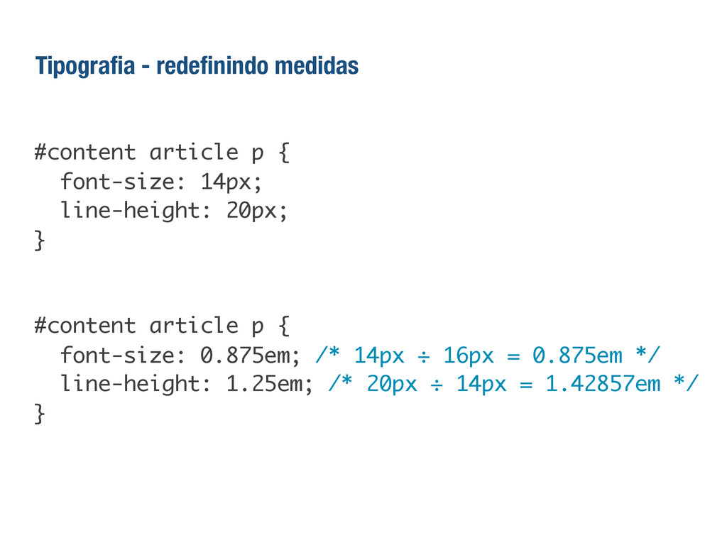
#content article p { font-size: 14px; line-height: 20px; } #content
article p { font-size: 0.875em; /* 14px ÷ 16px = 0.875em */ line-height: 1.25em; /* 20px ÷ 14px = 1.42857em */ } Tipografia - redefinindo medidas
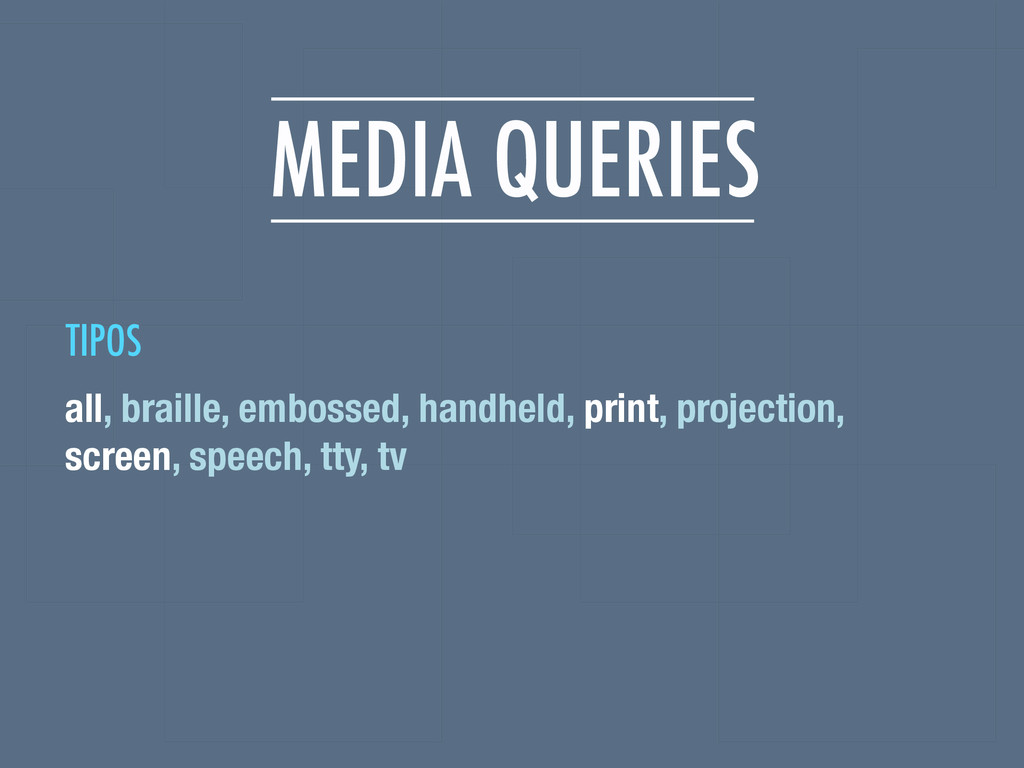
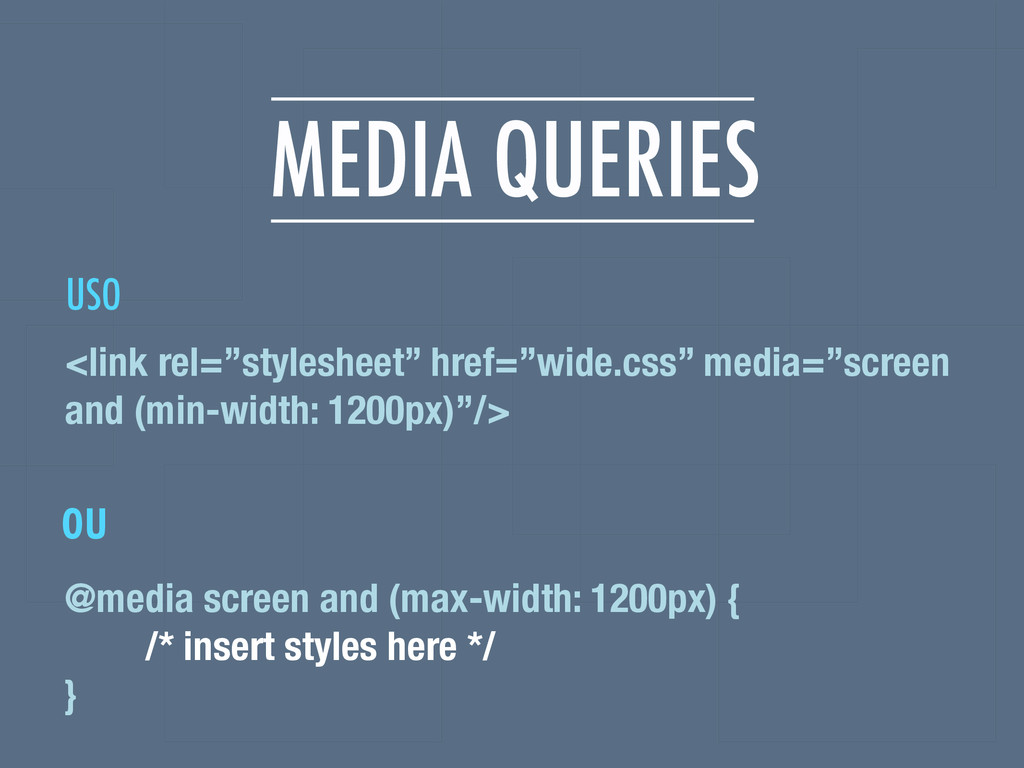
MEDIA QUERIES all, braille, embossed, handheld, print, projection, screen, speech,
tty, tv TIPOS
MEDIA QUERIES @media screen and (max-width: 1200px) { /* insert
styles here */ } <link rel=”stylesheet” href=”wide.css” media=”screen and (min-width: 1200px)”/> ou USO
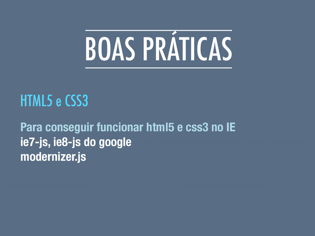
BOAS PRÁTICAS Para conseguir funcionar html5 e css3 no IE
ie7-js, ie8-js do google modernizer.js HTML5 e CSS3
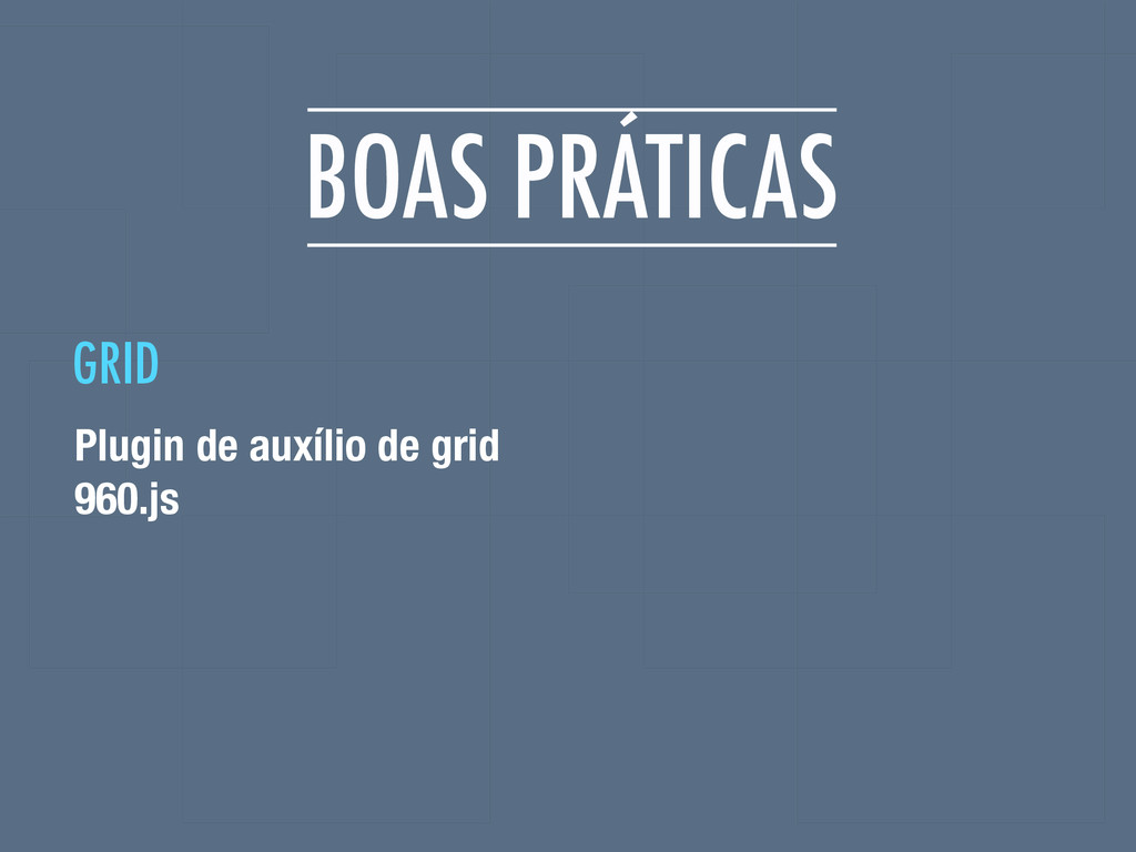
BOAS PRÁTICAS Plugin de auxílio de grid 960.js GRID
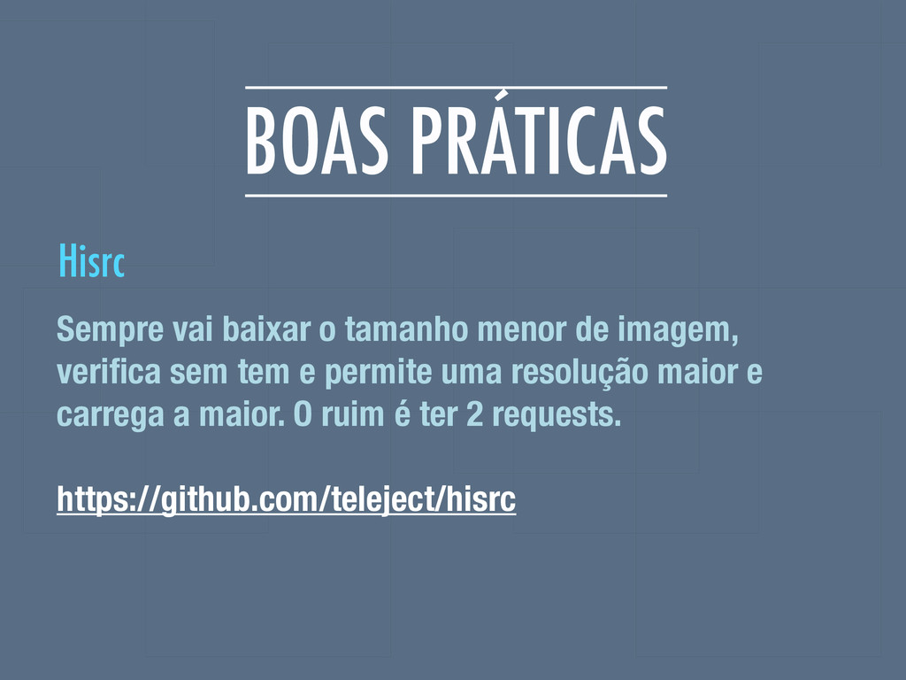
BOAS PRÁTICAS Sempre vai baixar o tamanho menor de imagem,
verifica sem tem e permite uma resolução maior e carrega a maior. O ruim é ter 2 requests. https://github.com/teleject/hisrc Hisrc
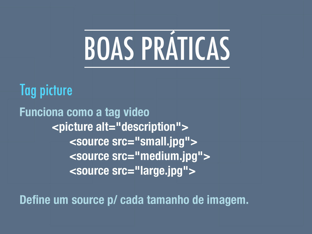
BOAS PRÁTICAS Funciona como a tag video <picture alt="description"> <source
src="small.jpg"> <source src="medium.jpg"> <source src="large.jpg"> Define um source p/ cada tamanho de imagem. Tag picture
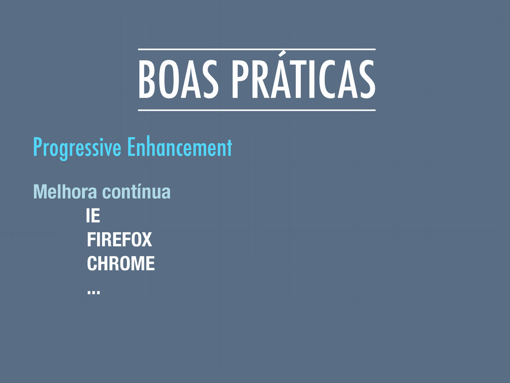
BOAS PRÁTICAS Melhora contínua IE FIREFOX CHROME ... Progressive Enhancement
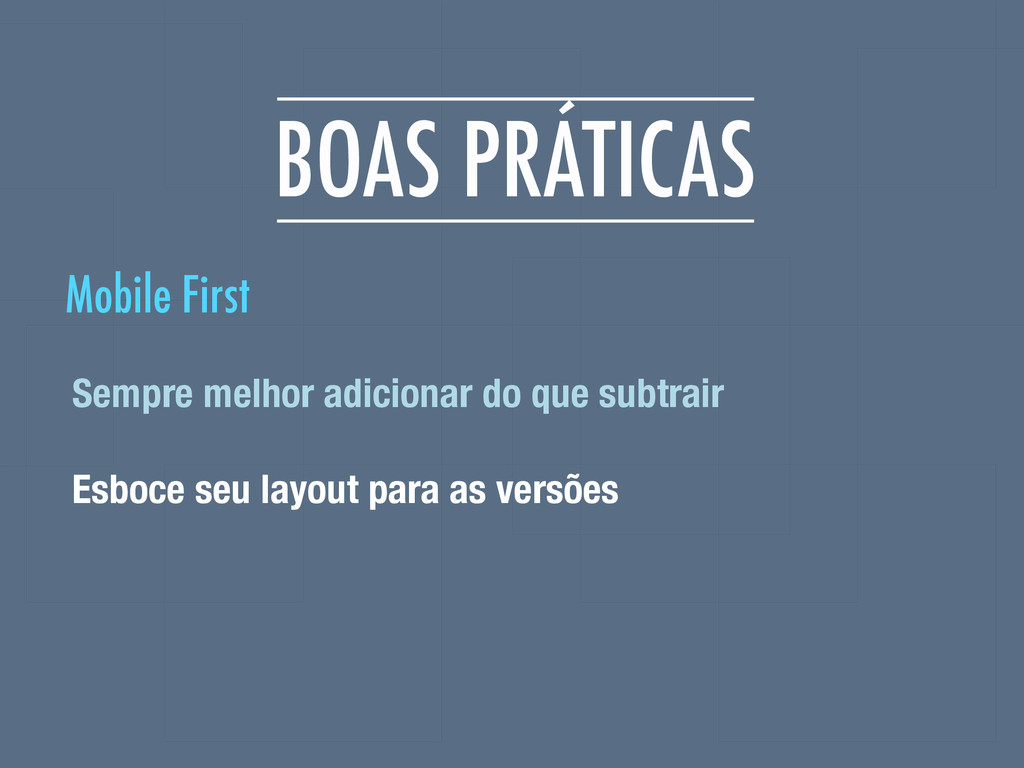
BOAS PRÁTICAS Sempre melhor adicionar do que subtrair Esboce seu
layout para as versões Mobile First
REFERÊNCIAS http://mediaqueri.es/ http://www.evolutionoftheweb.com/ http://dabblet.com/ http://css-tricks.com/which-responsive-images-solution-should-you-use/
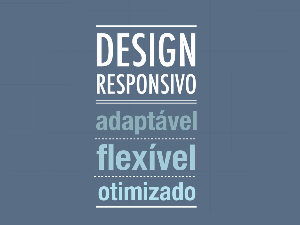
RESPONSIVO adaptável flexível otimizado DESIGN
 brutiko
 saki822
 usagimaru
 yuri_ohashi
 nishame
 toshihidemurata
 satosio
 keroyama
 ukaoli
 r5ni4
r5ni4
 ryu1013
 pkshadeck
 chiemitaki
 aleyda
 speakerdeck
 danielanewman
 geoffreycrofte
 nwiizo
 tomoyanonymous
 chrisshort
 reverentgeek
 nikkihalliwell
 kastner
![BRUNA KOCHI @brutiko [email protected]](https://files.speakerdeck.com/presentations/5205734037e101322c8876e1a203b64c/slide_1.jpg)
![ROGER ROSSI @_utgardloki [email protected]](https://files.speakerdeck.com/presentations/5205734037e101322c8876e1a203b64c/slide_2.jpg)