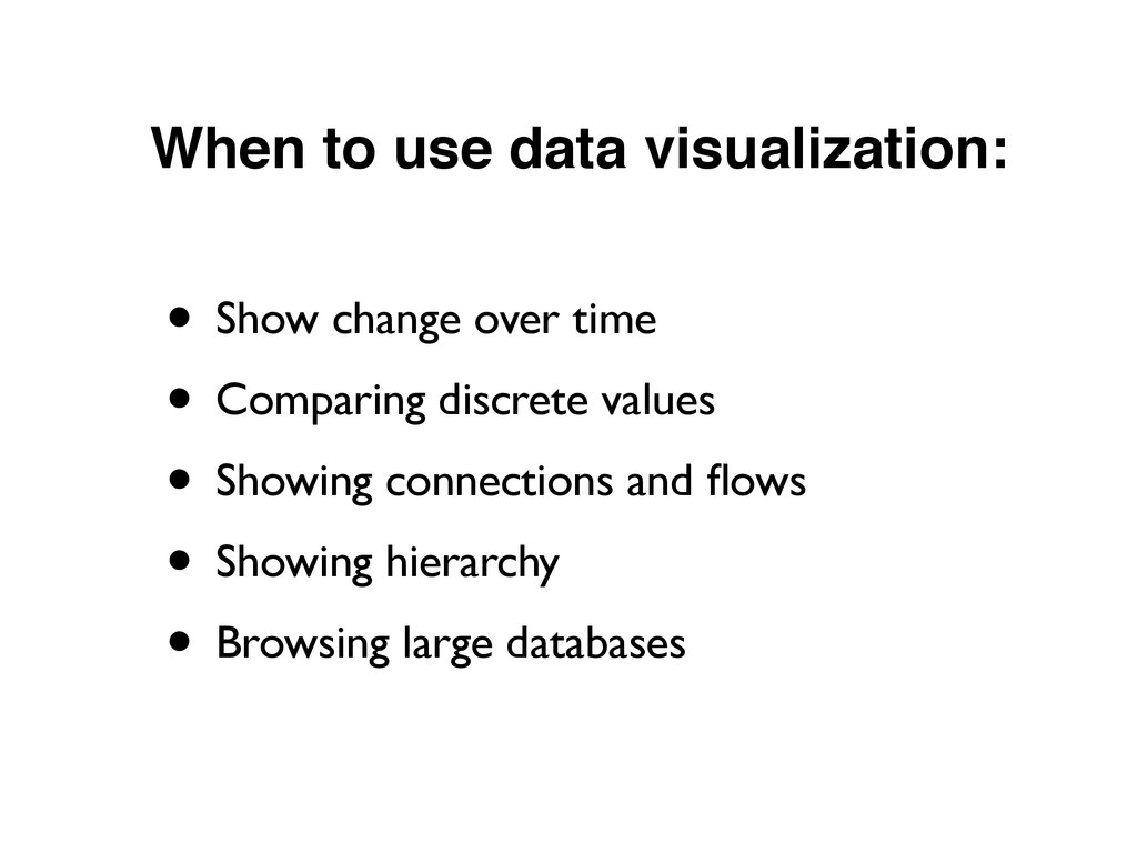
narrative. •Interactive, communicative, visual. •Ranges from simple (charts) to complex (database-driven applications). •Both a technique and a format. •Both entertaining and factual. • See: “The Many Words for Visualization”
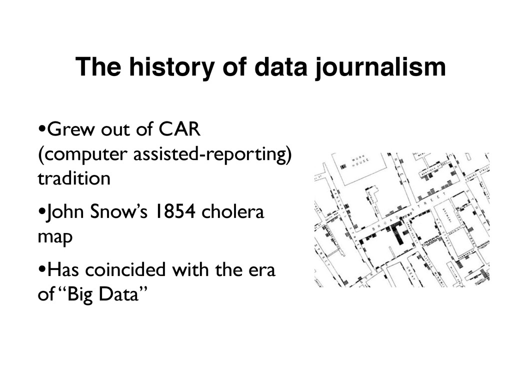
information was scarce, most of our efforts were devoted to hunting and gathering. Now that information is abundant, processing is more important." –Phillip Meyer, UNC Chapel Hill
be data-savvy . . . Data-driven journalism is the future.” –Sir Tim Berners Lee. •“The explosion of Web-based tools and ways of sifting through and sharing data has created something approaching a revolution, and the potential benefits for journalism are only just beginning to reveal themselves.” –Matthew Ingram
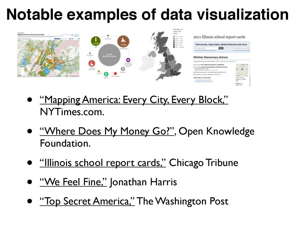
Every Block,” NYTimes.com. • “Where Does My Money Go?”, Open Knowledge Foundation. • “Illinois school report cards,” Chicago Tribune • “We Feel Fine,” Jonathan Harris • “Top Secret America,” The Washington Post
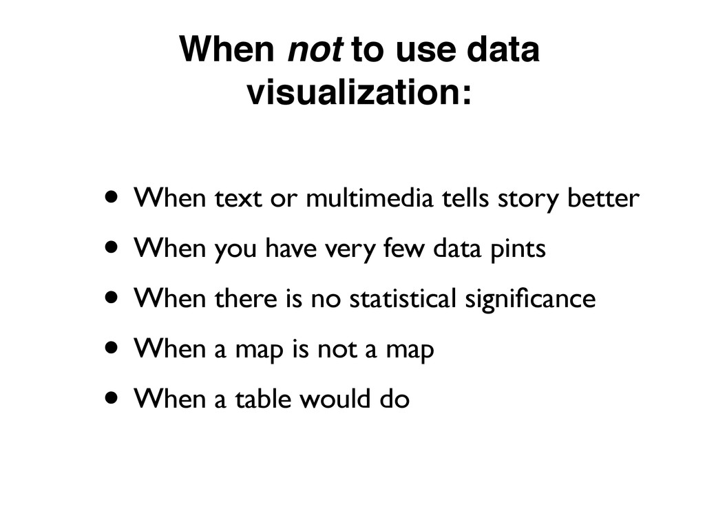
multimedia tells story better • When you have very few data pints • When there is no statistical significance • When a map is not a map • When a table would do
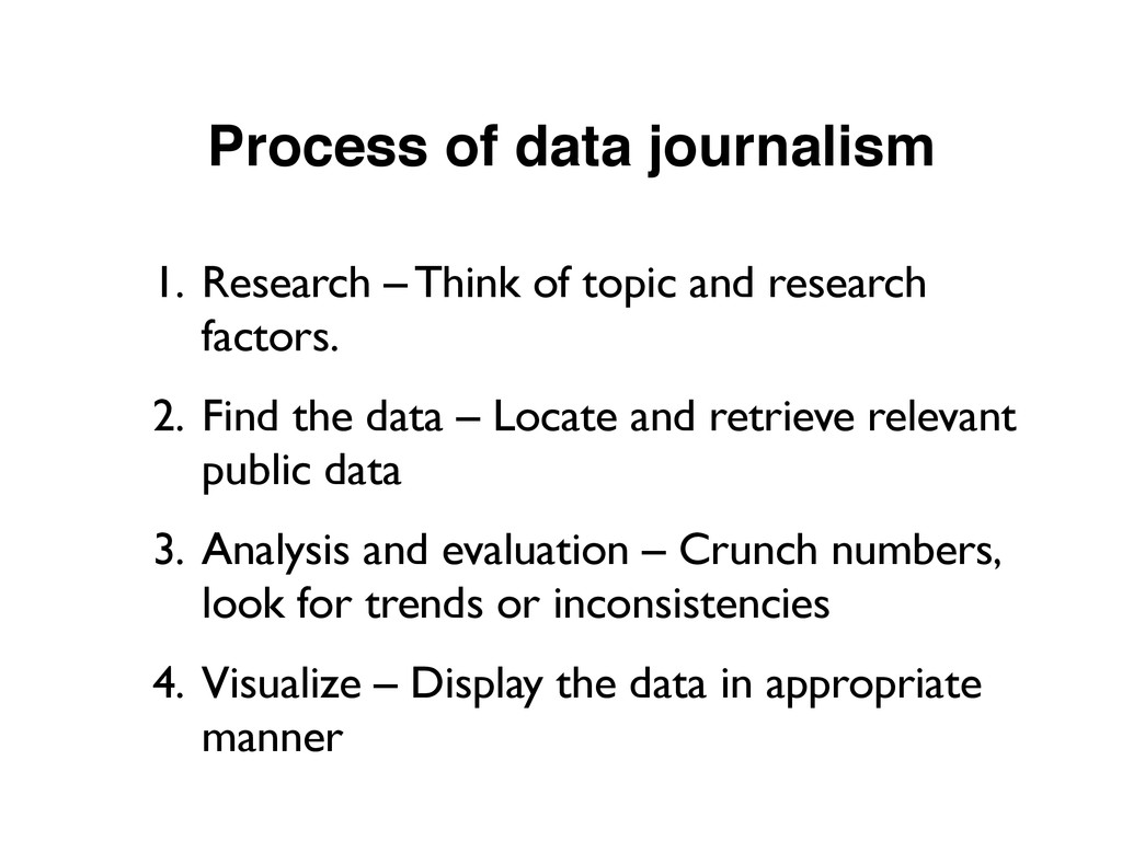
and research factors. 2. Find the data – Locate and retrieve relevant public data 3. Analysis and evaluation – Crunch numbers, look for trends or inconsistencies 4. Visualize – Display the data in appropriate manner
government bodies and nonprofits. • Most commonly in delimited spreadsheet format (look for .csv, .xls), sometimes in XML and JSON. • For geographic data, look for .kml or .shp • Can be found directly at source or by search engine keyword
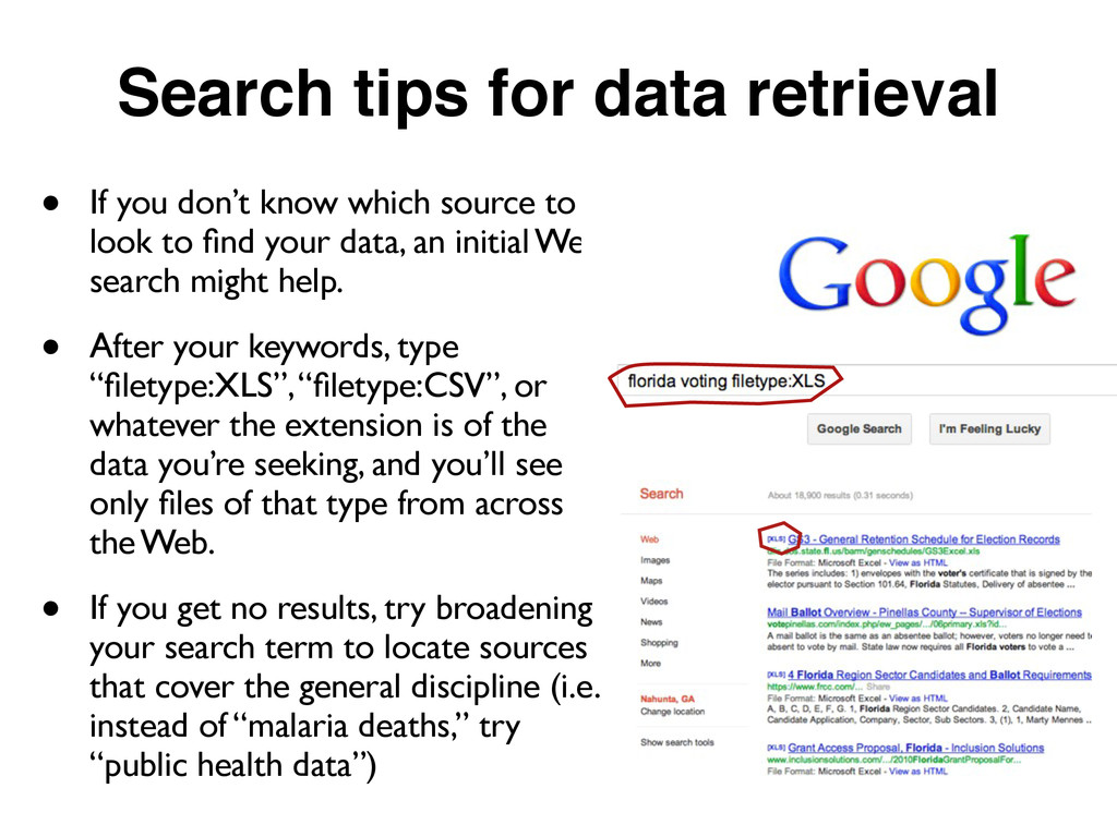
which source to look to find your data, an initial Web search might help. • After your keywords, type “filetype:XLS”, “filetype:CSV”, or whatever the extension is of the data you’re seeking, and you’ll see only files of that type from across the Web. • If you get no results, try broadening your search term to locate sources that cover the general discipline (i.e. instead of “malaria deaths,” try “public health data”)
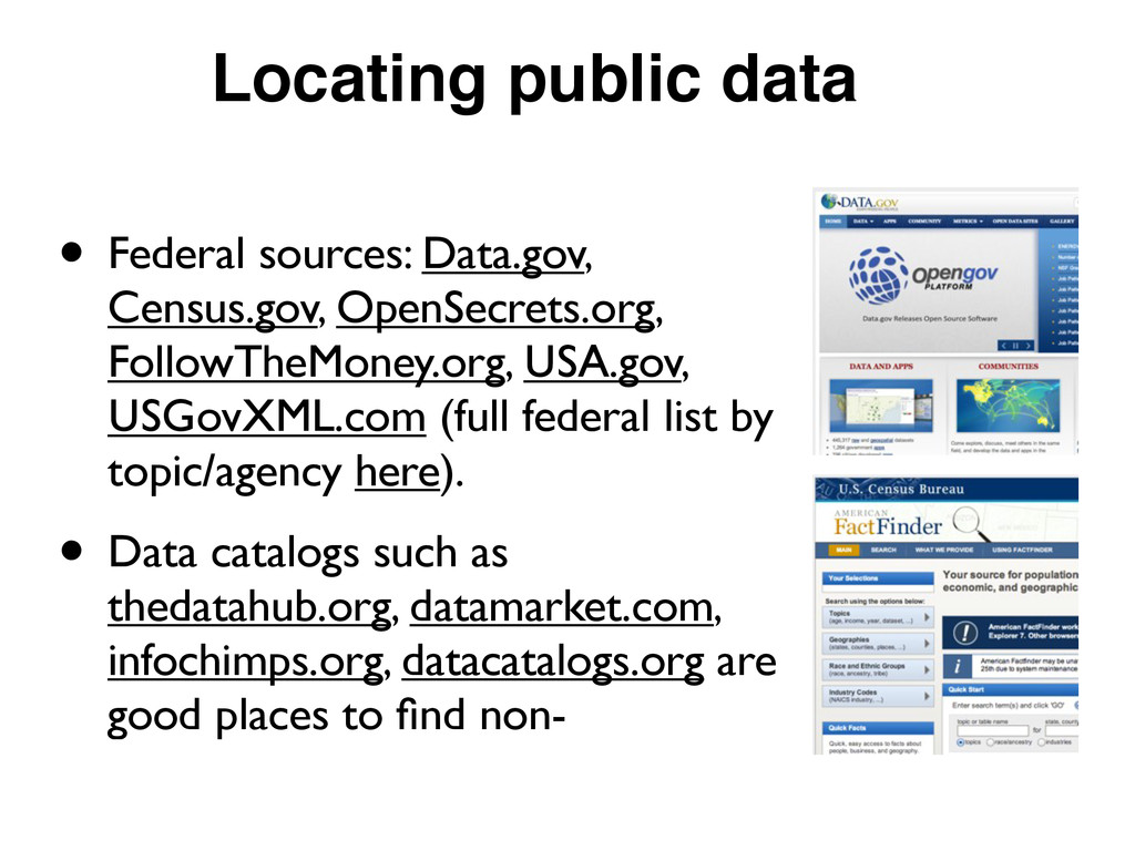
USA.gov, USGovXML.com (full federal list by topic/agency here). • Data catalogs such as thedatahub.org, datamarket.com, infochimps.org, datacatalogs.org are good places to find non-
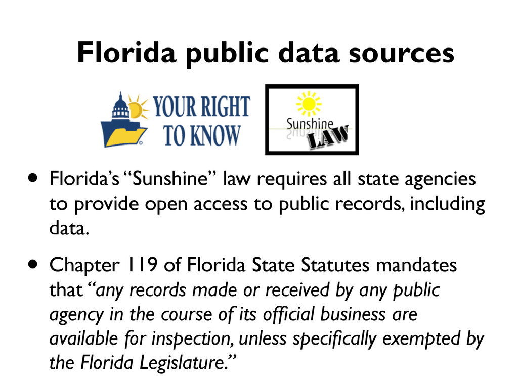
open access to public records, including data. • Chapter 119 of Florida State Statutes mandates that “any records made or received by any public agency in the course of its official business are available for inspection, unless specifically exempted by the Florida Legislature.” Florida public data sources
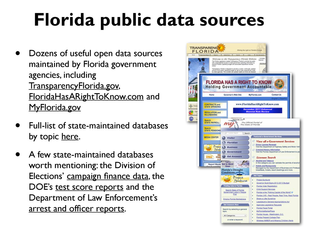
government agencies, including TransparencyFlorida.gov, FloridaHasARightToKnow.com and MyFlorida.gov • Full-list of state-maintained databases by topic here. • A few state-maintained databases worth mentioning: the Division of Elections’ campaign finance data, the DOE’s test score reports and the Department of Law Enforcement’s arrest and officer reports. Florida public data sources
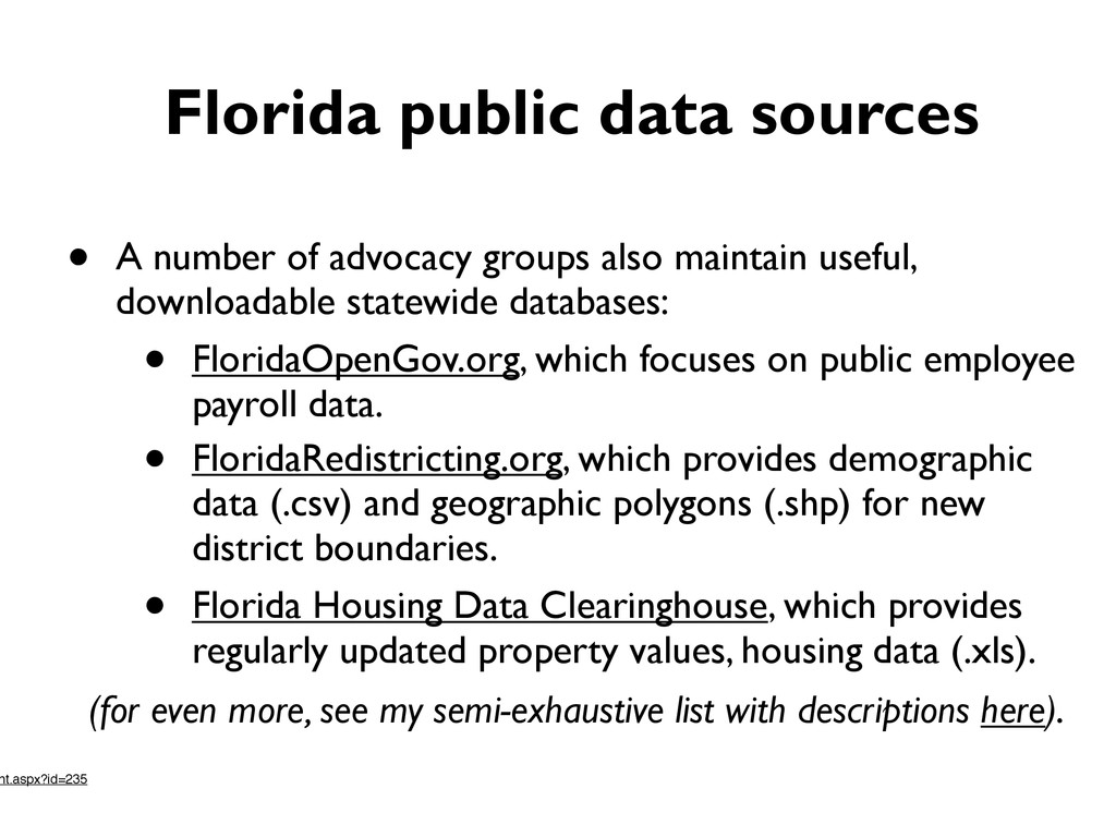
also maintain useful, downloadable statewide databases: • FloridaOpenGov.org, which focuses on public employee payroll data. • FloridaRedistricting.org, which provides demographic data (.csv) and geographic polygons (.shp) for new district boundaries. • Florida Housing Data Clearinghouse, which provides regularly updated property values, housing data (.xls). (for even more, see my semi-exhaustive list with descriptions here). nt.aspx?id=235
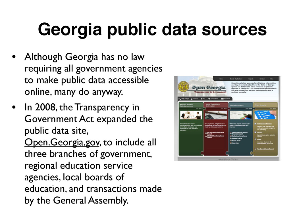
requiring all government agencies to make public data accessible online, many do anyway. • In 2008, the Transparency in Government Act expanded the public data site, Open.Georgia.gov, to include all three branches of government, regional education service agencies, local boards of education, and transactions made by the General Assembly.
databases from state agencies in Georgia can be found here. • The State Ethics Committee has made all campaign finance reports, lobbyist reports and campaign contributions available in downloadable spreadsheets. • OASIS provides a set of web-based tools to browse the Georgia Department of Public Health’s Data Warehouse, and download the data yourself if you wish.
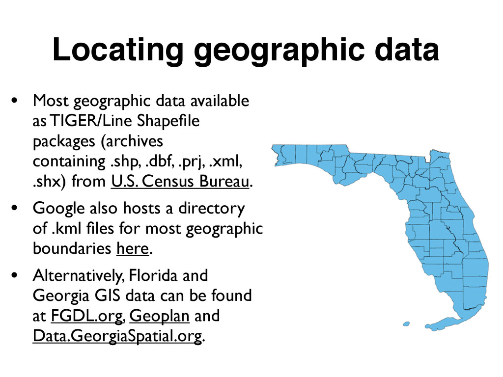
Shapefile packages (archives containing .shp, .dbf, .prj, .xml, .shx) from U.S. Census Bureau. • Google also hosts a directory of .kml files for most geographic boundaries here. • Alternatively, Florida and Georgia GIS data can be found at FGDL.org, Geoplan and Data.GeorgiaSpatial.org.
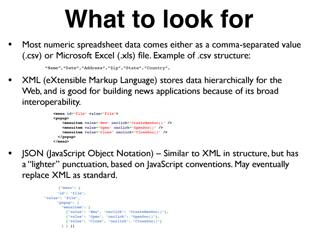
either as a comma-separated value (.csv) or Microsoft Excel (.xls) file. Example of .csv structure: “Name”,“Date”,“Address”,”Zip”,”State”,”Country”, • XML (eXtensible Markup Language) stores data hierarchically for the Web, and is good for building news applications because of its broad interoperability. <menu id="file" value="File"> <popup> <menuitem value="New" onclick="CreateNewDoc()" /> <menuitem value="Open" onclick="OpenDoc()" /> <menuitem value="Close" onclick="CloseDoc()" /> </popup> </menu> • JSON (JavaScript Object Notation) – Similar to XML in structure, but has a “lighter” punctuation, based on JavaScript conventions. May eventually replace XML as standard. {"menu": { "id": "file", "value": "File", "popup": { "menuitem": [ {"value": "New", "onclick": "CreateNewDoc()"}, {"value": "Open", "onclick": "OpenDoc()"}, {"value": "Close", "onclick": "CloseDoc()"} ] } }}
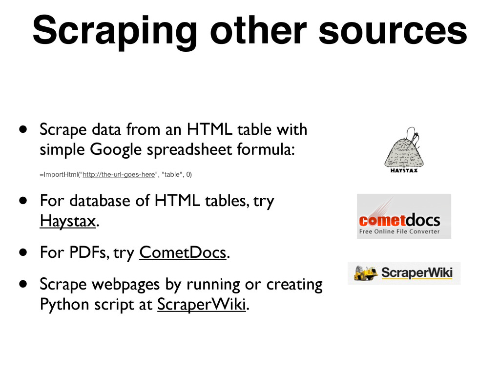
with simple Google spreadsheet formula: =ImportHtml("http://the-url-goes-here", "table", 0) • For database of HTML tables, try Haystax. • For PDFs, try CometDocs. • Scrape webpages by running or creating Python script at ScraperWiki.
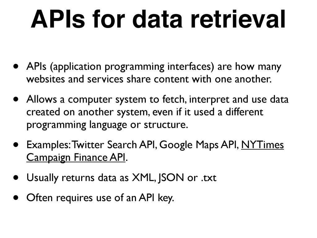
how many websites and services share content with one another. • Allows a computer system to fetch, interpret and use data created on another system, even if it used a different programming language or structure. • Examples: Twitter Search API, Google Maps API, NYTimes Campaign Finance API. • Usually returns data as XML, JSON or .txt • Often requires use of an API key.
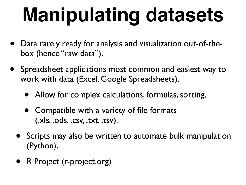
out-of-the- box (hence “raw data”). • Spreadsheet applications most common and easiest way to work with data (Excel, Google Spreadsheets). • Allow for complex calculations, formulas, sorting. • Compatible with a variety of file formats (.xls, .ods, .csv, .txt, .tsv). • Scripts may also be written to automate bulk manipulation (Python). • R Project (r-project.org)
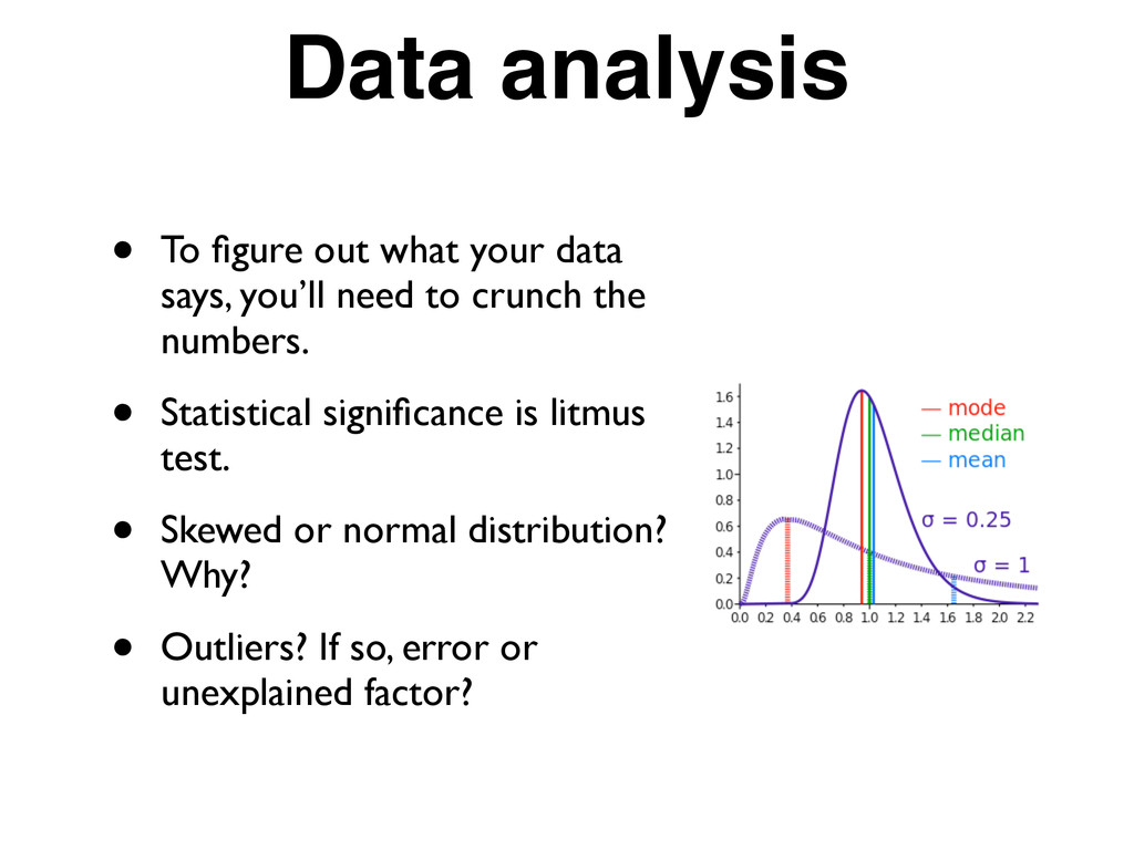
you’ll need to crunch the numbers. • Statistical significance is litmus test. • Skewed or normal distribution? Why? • Outliers? If so, error or unexplained factor?
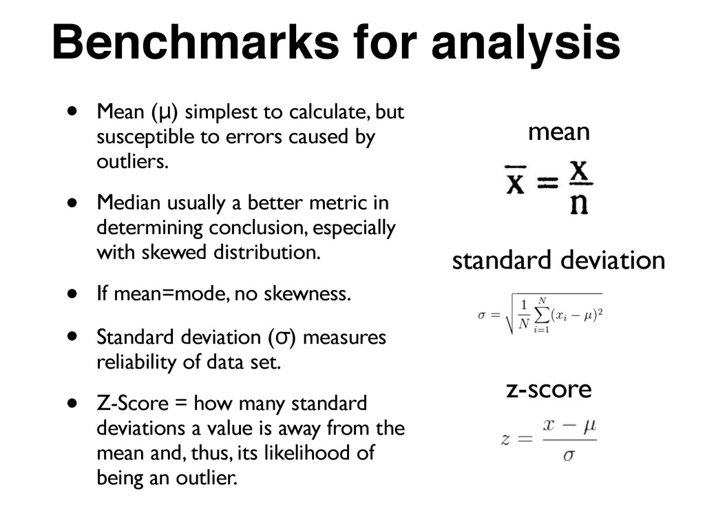
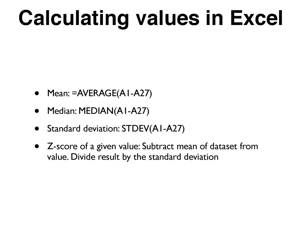
susceptible to errors caused by outliers. • Median usually a better metric in determining conclusion, especially with skewed distribution. • If mean=mode, no skewness. • Standard deviation (σ) measures reliability of data set. • Z-Score = how many standard deviations a value is away from the mean and, thus, its likelihood of being an outlier. standard deviation mean z-score
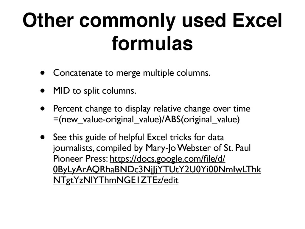
columns. • MID to split columns. • Percent change to display relative change over time =(new_value-original_value)/ABS(original_value) • See this guide of helpful Excel tricks for data journalists, compiled by Mary-Jo Webster of St. Paul Pioneer Press: https://docs.google.com/file/d/ 0ByLyArAQRhaBNDc3NjJjYTUtY2U0Yi00NmIwLThk NTgtYzNlYThmNGE1ZTEz/edit
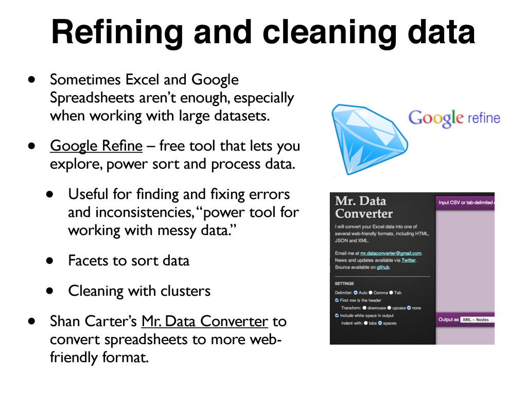
aren’t enough, especially when working with large datasets. • Google Refine – free tool that lets you explore, power sort and process data. • Useful for finding and fixing errors and inconsistencies, “power tool for working with messy data.” • Facets to sort data • Cleaning with clusters • Shan Carter’s Mr. Data Converter to convert spreadsheets to more web- friendly format.
in first row. • Put geographic data in first columns • When you have two different datasets, a good tool to merge them is Google Fusion Tables (make sure they share a common attribute). • Never round until the end of calculations. Round to two decimal points for visualization purposes. • Cut and paste calculations into a new column as values only. • Know the principle data types (integer, real, string, boolean), and make sure numeric data is classified as either integer (whole numbers only) or real (any value).
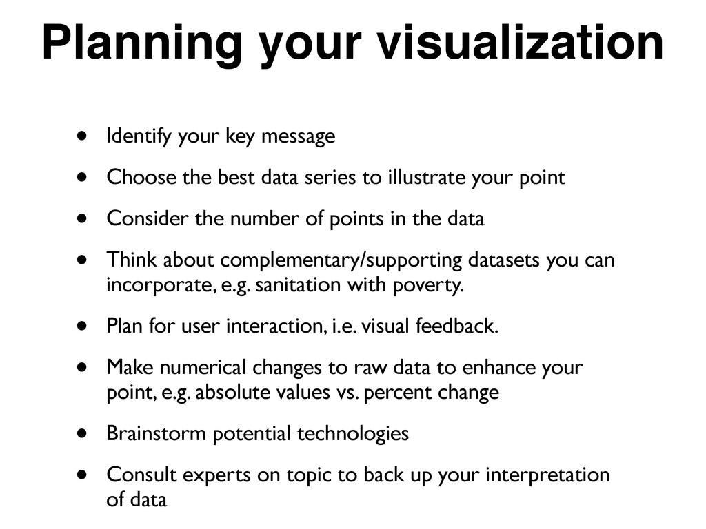
the best data series to illustrate your point • Consider the number of points in the data • Think about complementary/supporting datasets you can incorporate, e.g. sanitation with poverty. • Plan for user interaction, i.e. visual feedback. • Make numerical changes to raw data to enhance your point, e.g. absolute values vs. percent change • Brainstorm potential technologies • Consult experts on topic to back up your interpretation of data
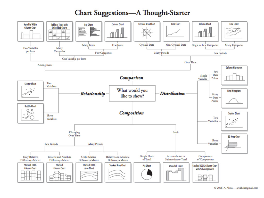
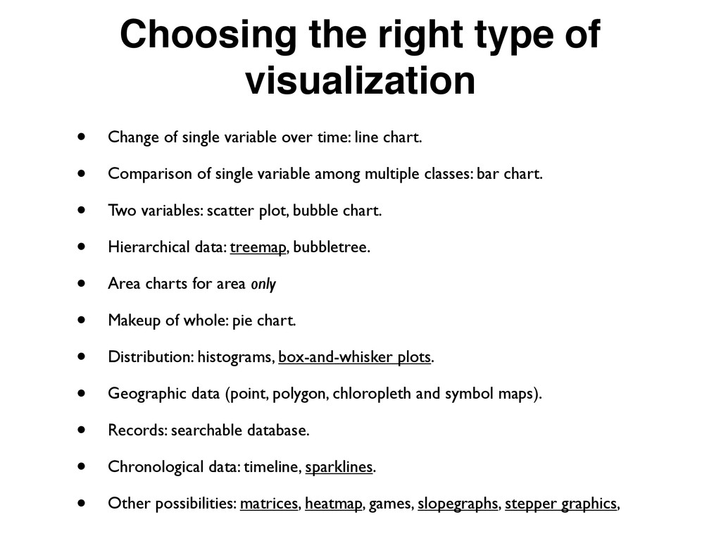
variable over time: line chart. • Comparison of single variable among multiple classes: bar chart. • Two variables: scatter plot, bubble chart. • Hierarchical data: treemap, bubbletree. • Area charts for area only • Makeup of whole: pie chart. • Distribution: histograms, box-and-whisker plots. • Geographic data (point, polygon, chloropleth and symbol maps). • Records: searchable database. • Chronological data: timeline, sparklines. • Other possibilities: matrices, heatmap, games, slopegraphs, stepper graphics,
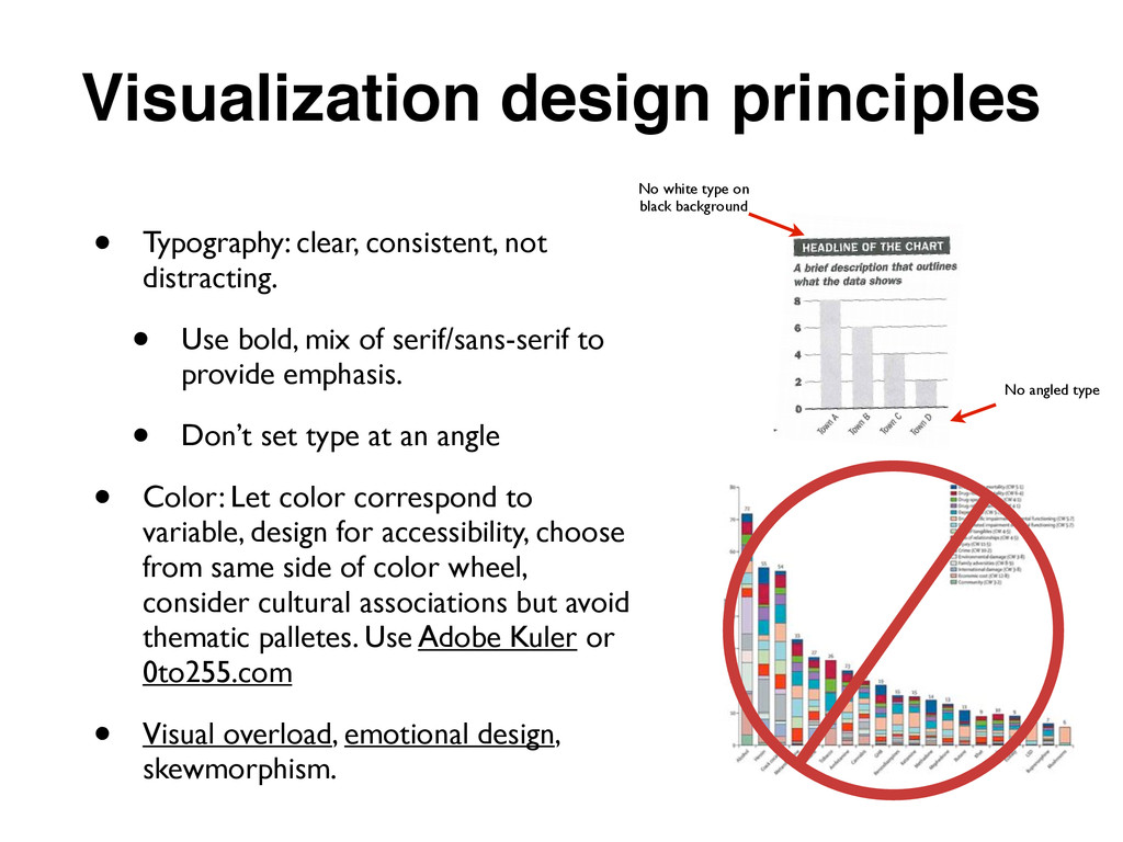
Use bold, mix of serif/sans-serif to provide emphasis. • Don’t set type at an angle • Color: Let color correspond to variable, design for accessibility, choose from same side of color wheel, consider cultural associations but avoid thematic palletes. Use Adobe Kuler or 0to255.com • Visual overload, emotional design, skewmorphism. No white type on black background No angled type
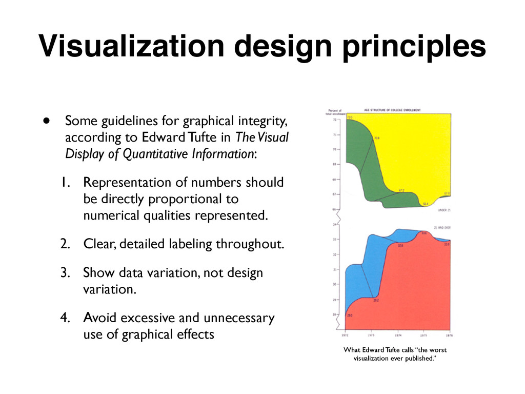
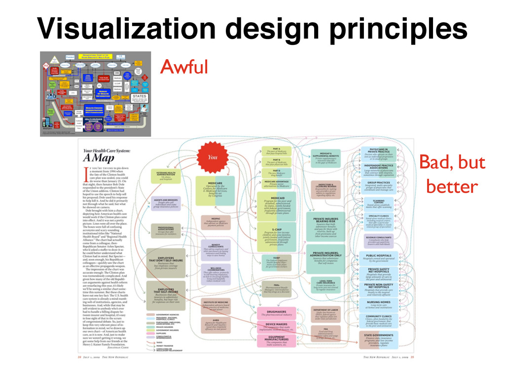
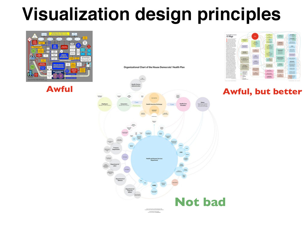
in The Visual Display of Quantitative Information: 1. Representation of numbers should be directly proportional to numerical qualities represented. 2. Clear, detailed labeling throughout. 3. Show data variation, not design variation. 4. Avoid excessive and unnecessary use of graphical effects What Edward Tufte calls “the worst visualization ever published.” Visualization design principles
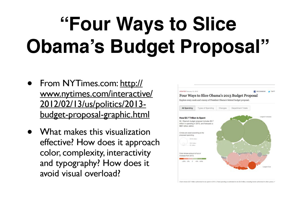
http:// www.nytimes.com/interactive/ 2012/02/13/us/politics/2013- budget-proposal-graphic.html • What makes this visualization effective? How does it approach color, complexity, interactivity and typography? How does it avoid visual overload?
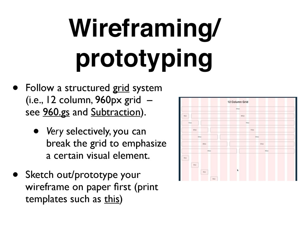
column, 960px grid – see 960.gs and Subtraction). • Very selectively, you can break the grid to emphasize a certain visual element. • Sketch out/prototype your wireframe on paper first (print templates such as this)
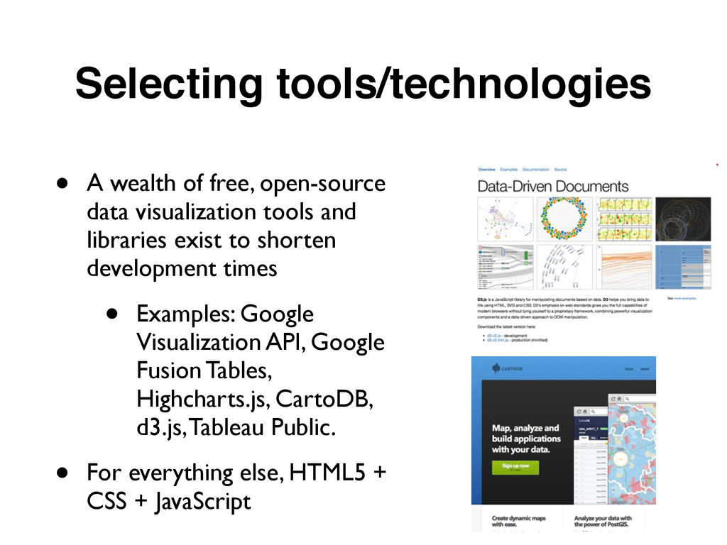
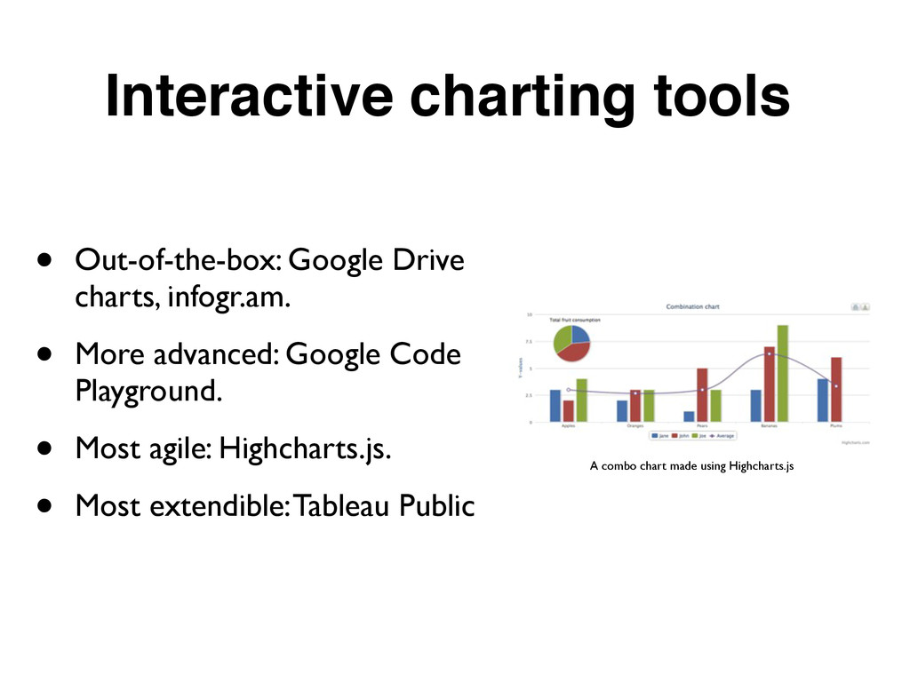
tools and libraries exist to shorten development times • Examples: Google Visualization API, Google Fusion Tables, Highcharts.js, CartoDB, d3.js, Tableau Public. • For everything else, HTML5 + CSS + JavaScript
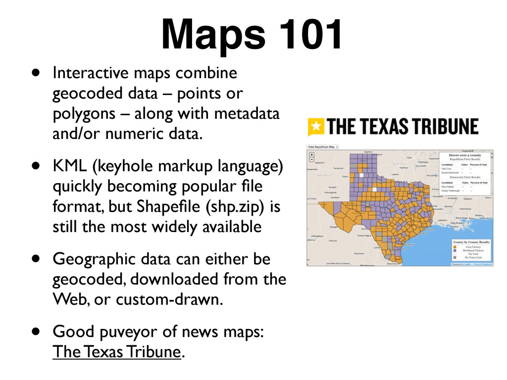
or polygons – along with metadata and/or numeric data. • KML (keyhole markup language) quickly becoming popular file format, but Shapefile (shp.zip) is still the most widely available • Geographic data can either be geocoded, downloaded from the Web, or custom-drawn. • Good puveyor of news maps: The Texas Tribune.
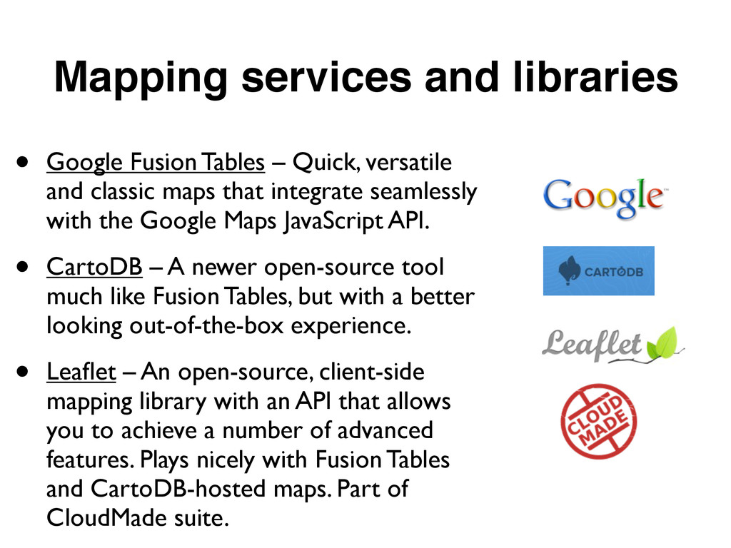
versatile and classic maps that integrate seamlessly with the Google Maps JavaScript API. • CartoDB – A newer open-source tool much like Fusion Tables, but with a better looking out-of-the-box experience. • Leaflet – An open-source, client-side mapping library with an API that allows you to achieve a number of advanced features. Plays nicely with Fusion Tables and CartoDB-hosted maps. Part of CloudMade suite.
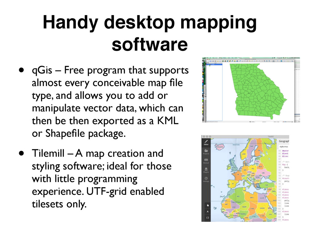
supports almost every conceivable map file type, and allows you to add or manipulate vector data, which can then be then exported as a KML or Shapefile package. • Tilemill – A map creation and styling software; ideal for those with little programming experience. UTF-grid enabled tilesets only.
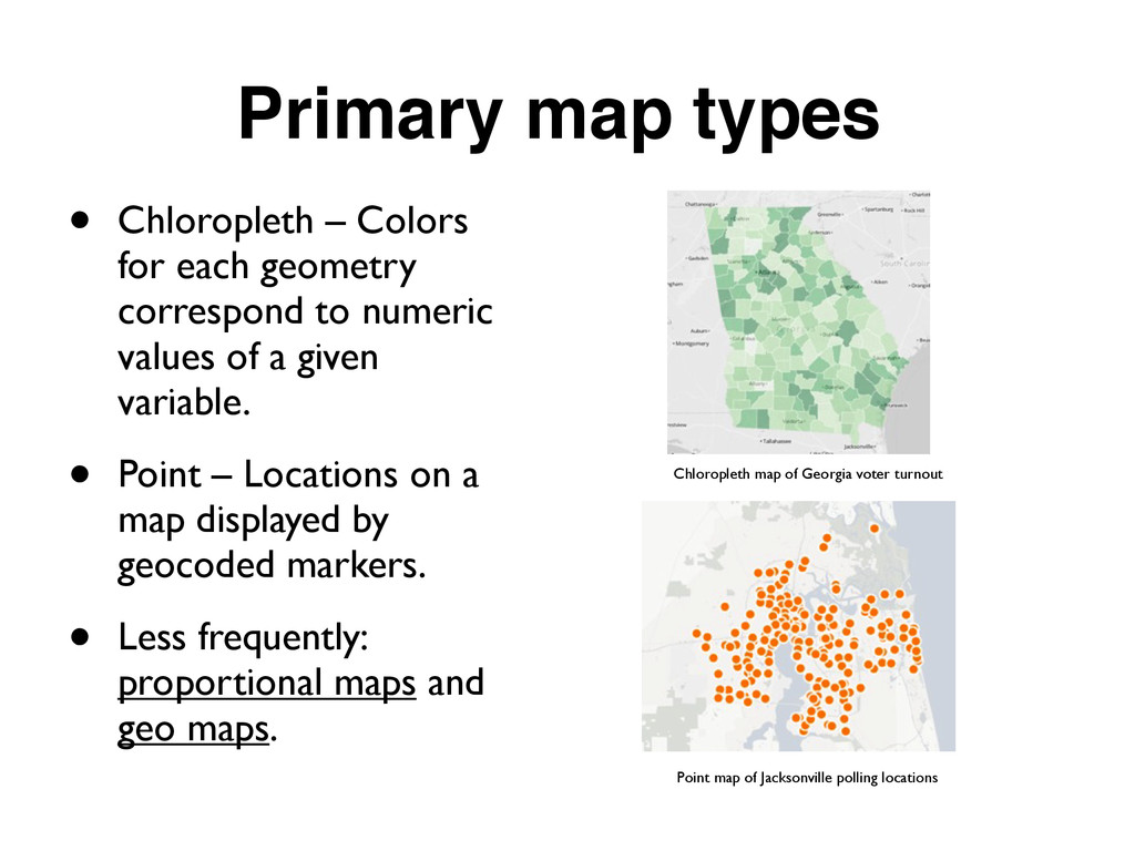
correspond to numeric values of a given variable. • Point – Locations on a map displayed by geocoded markers. • Less frequently: proportional maps and geo maps. Chloropleth map of Georgia voter turnout Point map of Jacksonville polling locations
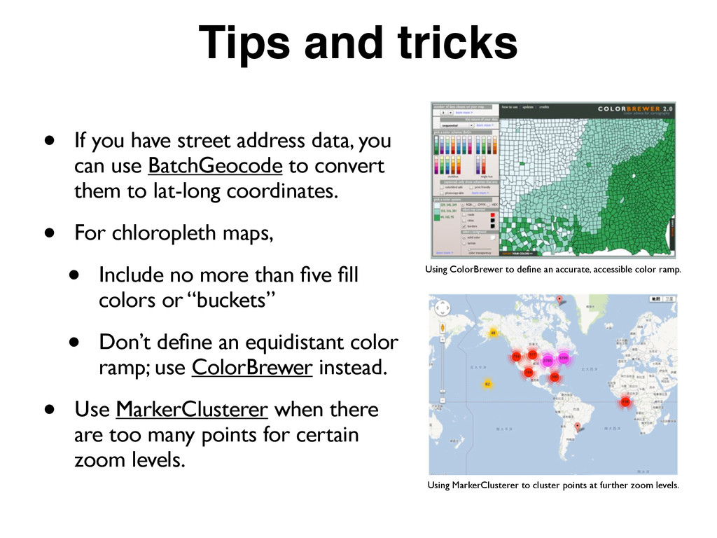
you can use BatchGeocode to convert them to lat-long coordinates. • For chloropleth maps, • Include no more than five fill colors or “buckets” • Don’t define an equidistant color ramp; use ColorBrewer instead. • Use MarkerClusterer when there are too many points for certain zoom levels. Using ColorBrewer to define an accurate, accessible color ramp. Using MarkerClusterer to cluster points at further zoom levels.
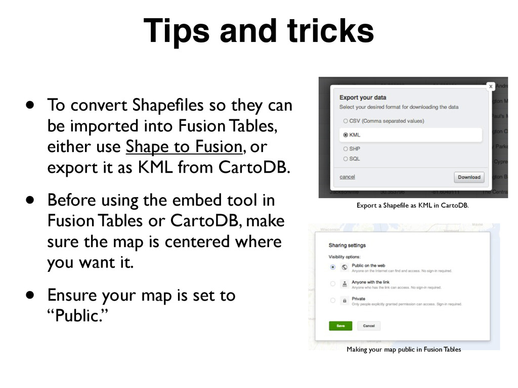
be imported into Fusion Tables, either use Shape to Fusion, or export it as KML from CartoDB. • Before using the embed tool in Fusion Tables or CartoDB, make sure the map is centered where you want it. • Ensure your map is set to “Public.” Export a Shapefile as KML in CartoDB. Making your map public in Fusion Tables
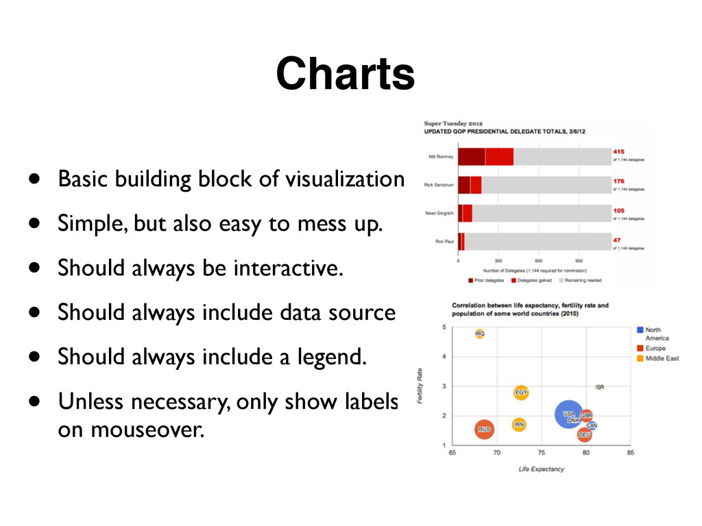
also easy to mess up. • Should always be interactive. • Should always include data source. • Should always include a legend. • Unless necessary, only show labels on mouseover.
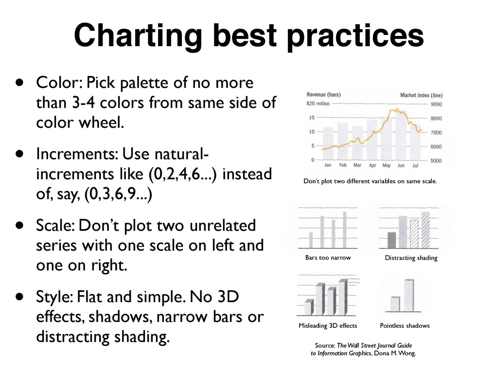
than 3-4 colors from same side of color wheel. • Increments: Use natural- increments like (0,2,4,6...) instead of, say, (0,3,6,9...) • Scale: Don’t plot two unrelated series with one scale on left and one on right. • Style: Flat and simple. No 3D effects, shadows, narrow bars or distracting shading. Don’t plot two different variables on same scale. Bars too narrow Distracting shading Misleading 3D effects Pointless shadows Source: The Wall Street Journal Guide to Information Graphics, Dona M. Wong.
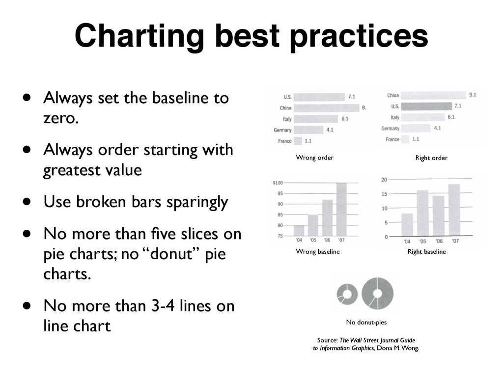
• Always order starting with greatest value • Use broken bars sparingly • No more than five slices on pie charts; no “donut” pie charts. • No more than 3-4 lines on line chart Wrong order Right order Wrong baseline Right baseline No donut-pies Source: The Wall Street Journal Guide to Information Graphics, Dona M. Wong.
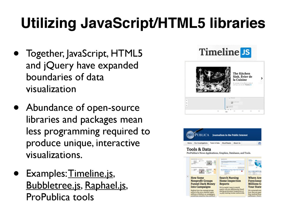
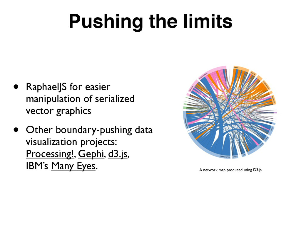
expanded boundaries of data visualization • Abundance of open-source libraries and packages mean less programming required to produce unique, interactive visualizations. • Examples: Timeline.js, Bubbletree.js, Raphael.js, ProPublica tools
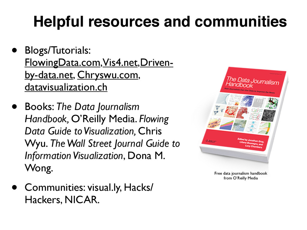
• Books: The Data Journalism Handbook, O’Reilly Media. Flowing Data Guide to Visualization, Chris Wyu. The Wall Street Journal Guide to Information Visualization, Dona M. Wong. • Communities: visual.ly, Hacks/ Hackers, NICAR. Free data journalism handbook from O’Reilly Media