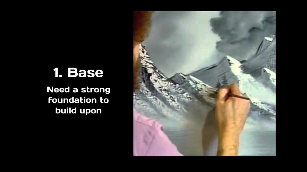
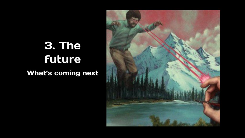
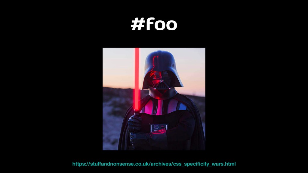
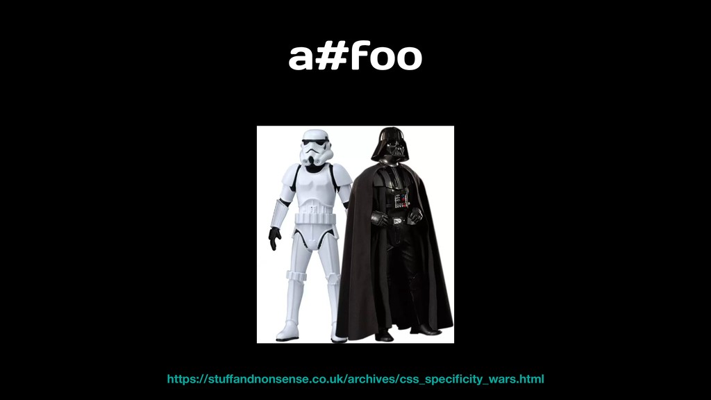
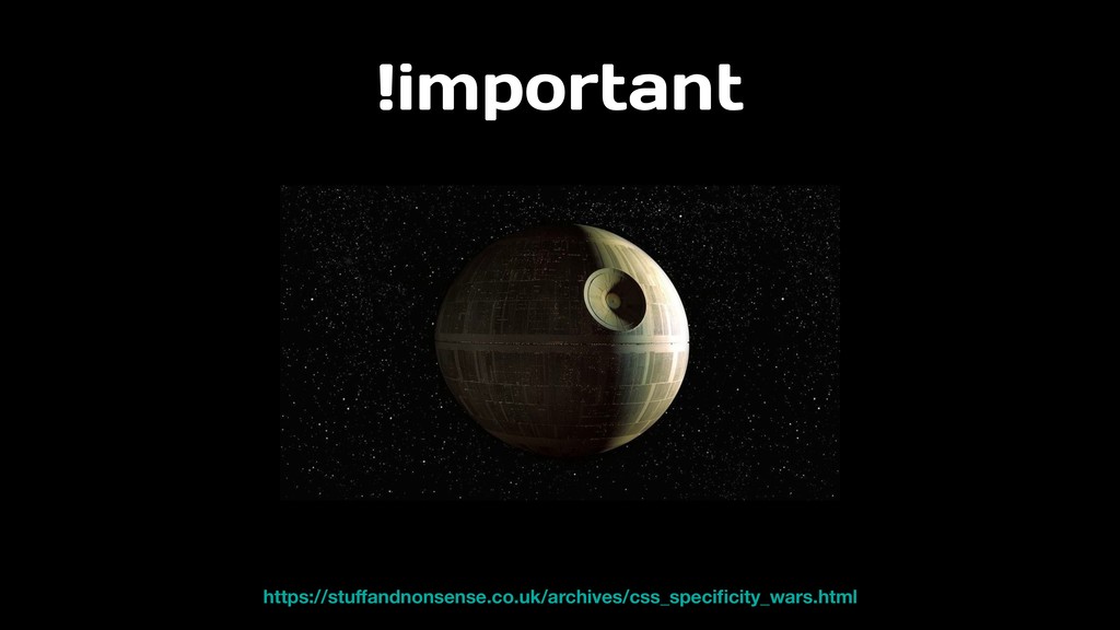
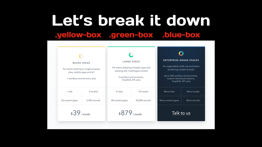
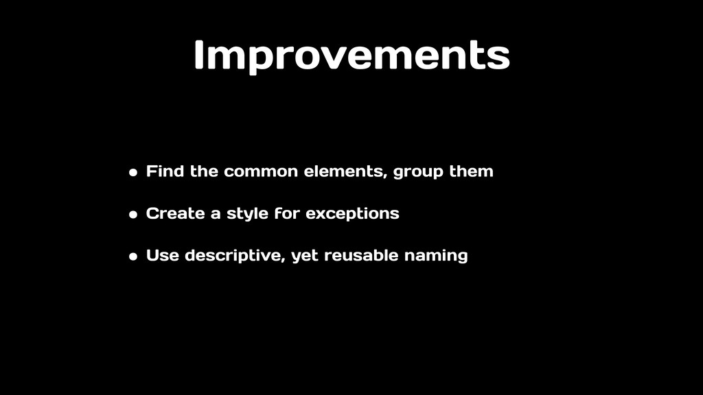
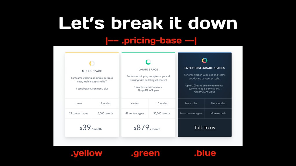
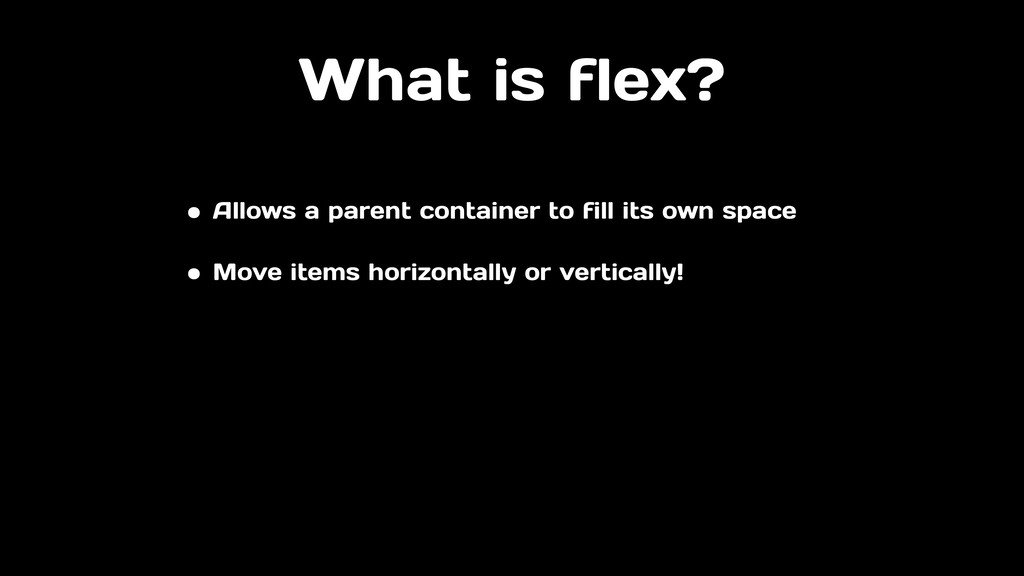
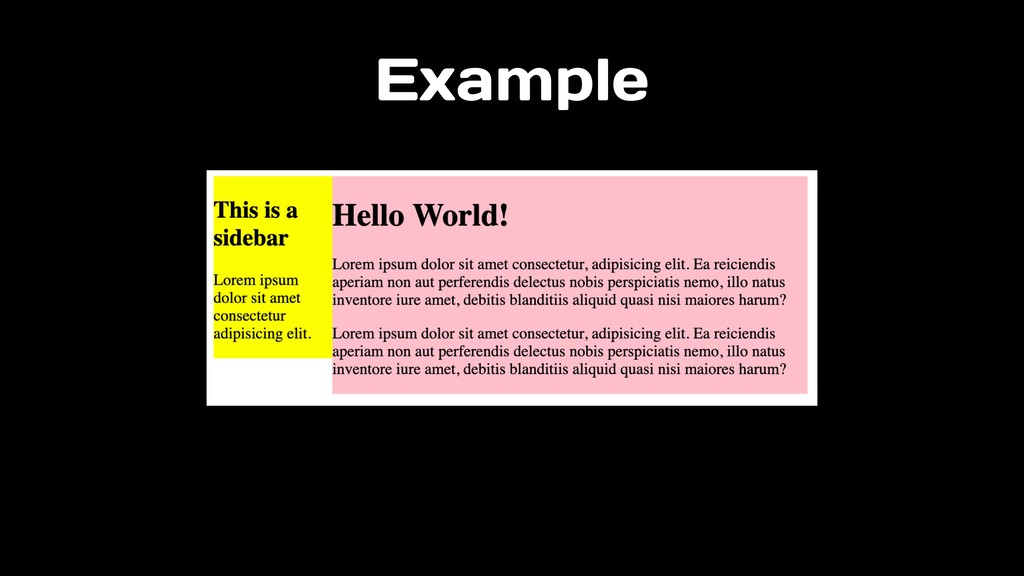
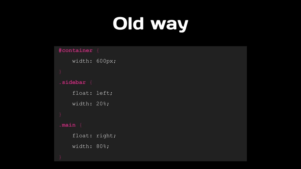
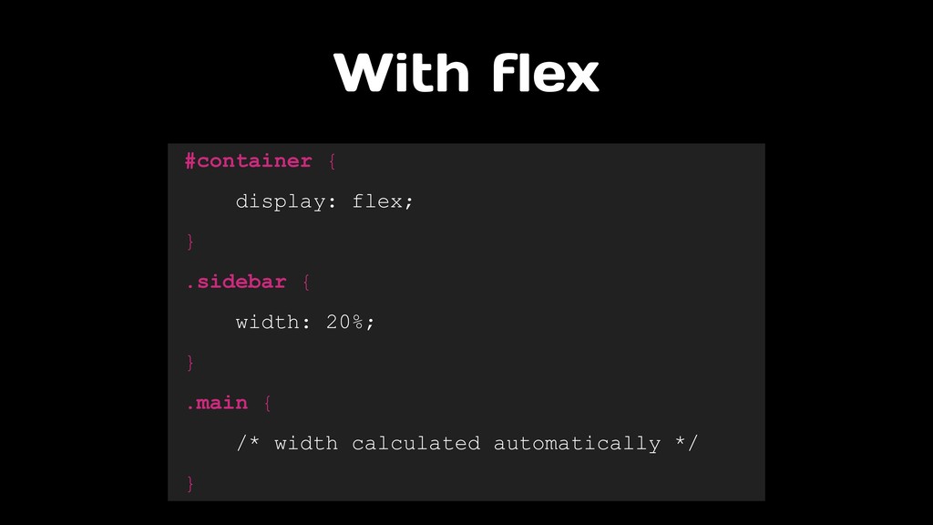
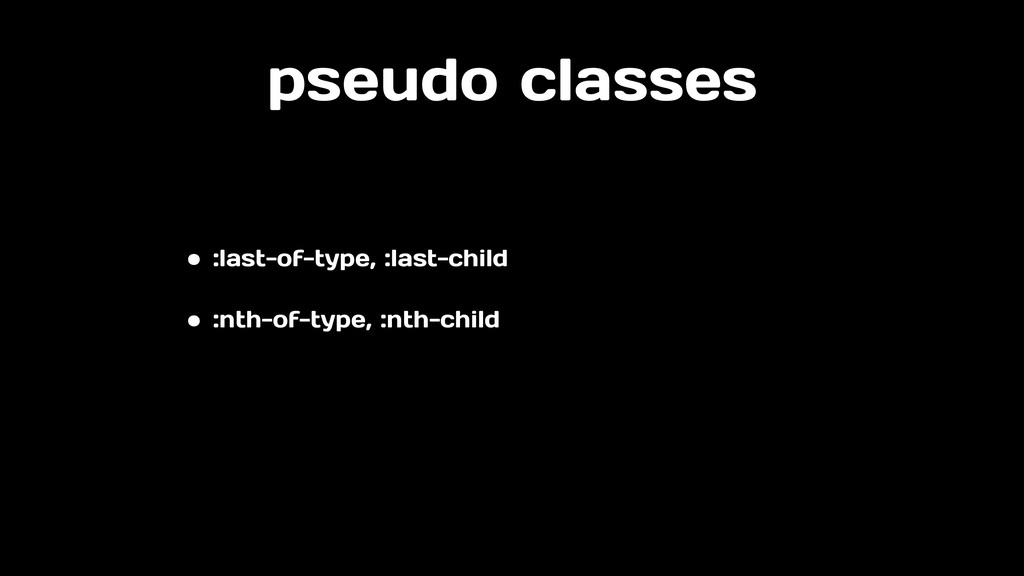
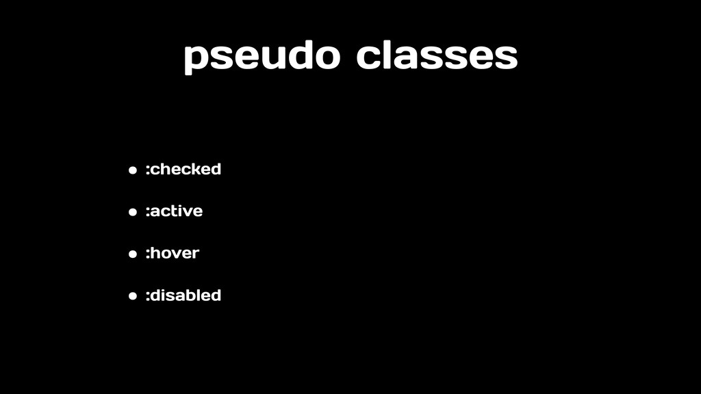
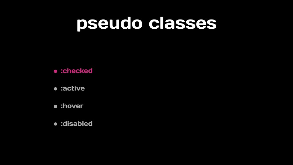
“I try to avoid it” or “just use !important” are things I hear developers say when it comes to CSS. Writing CSS that yields beautiful websites is an art, just as writing well-organized, reusable CSS is a science. In this talk, we’ll mix both art and science to level up your knowledge of CSS. We’ll revisit the basics to build a stronger CSS foundation. Then, we’ll step it up to SCSS, Flex, and pseudo-classes to build more advanced logic. And lastly, we’ll take a peek at what’s coming next with CSS Variables, Grid, and Houdini. By the end of the talk, you’ll be excited to work on CSS again!
 cecyc
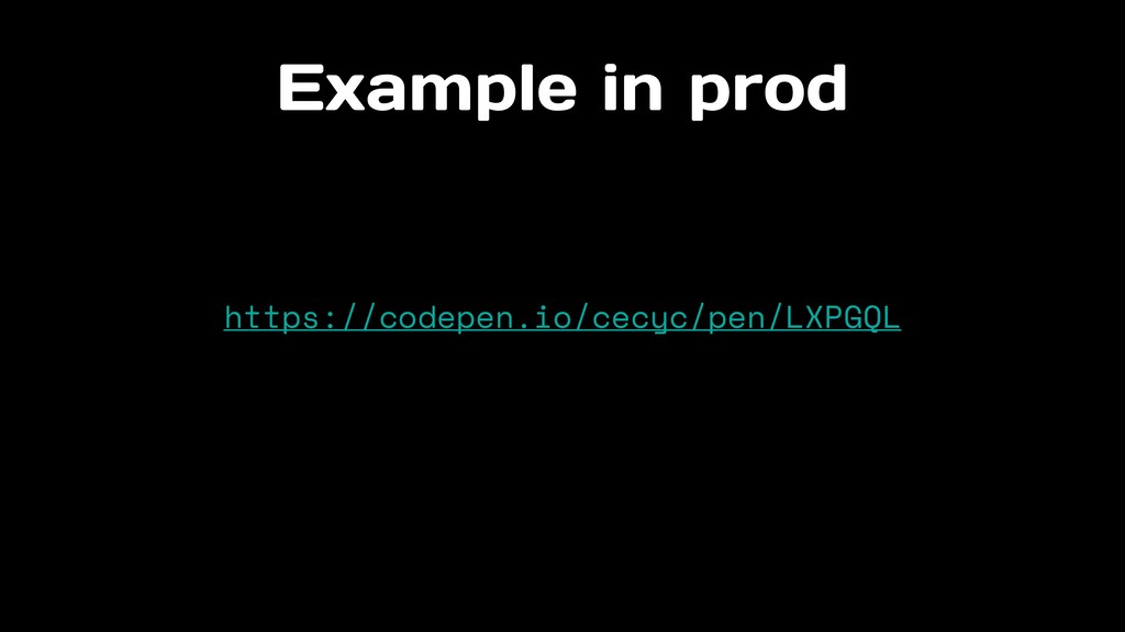
cecyc
 yama3133
 makies
 nek0128
 kakehashi
 diggymo
 kamoshika
 kanny
kanny
 rryz09
 cscengineer
 oracle4engineer
 chmikata
 kekke_n
 addyosmani
 jonoalderson
 skipperchong
 danielanewman
 signer
 bethany
 cassininazir
 akademiya2063
 axbom
axbom
 katarinadahlin
 michielstock