Upgrade to Pro — share decks privately, control downloads, hide ads and more …

Supporting Middle-Out in CSS

Supporting Middle-Out in CSS

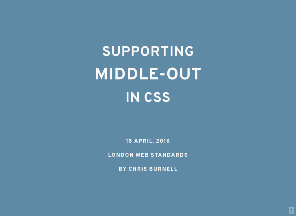
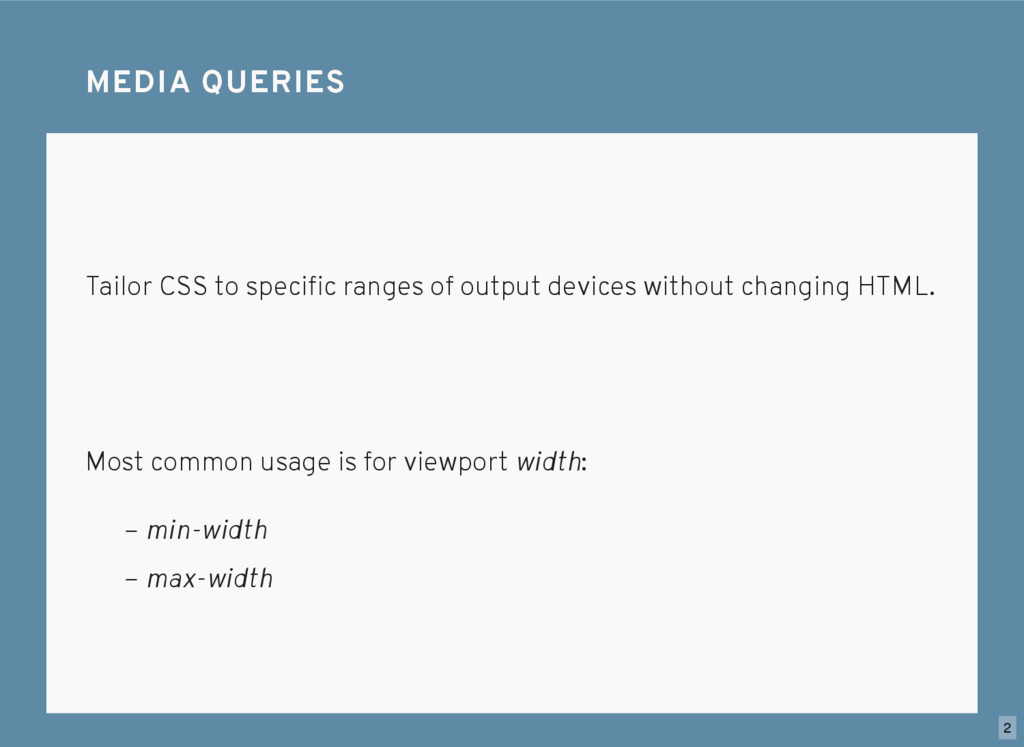
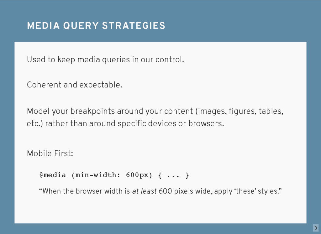
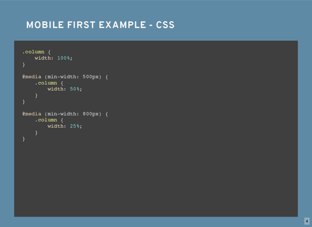
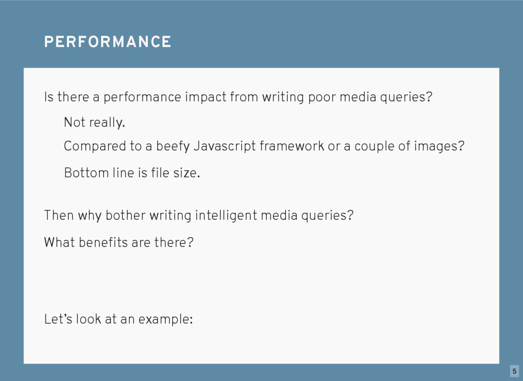
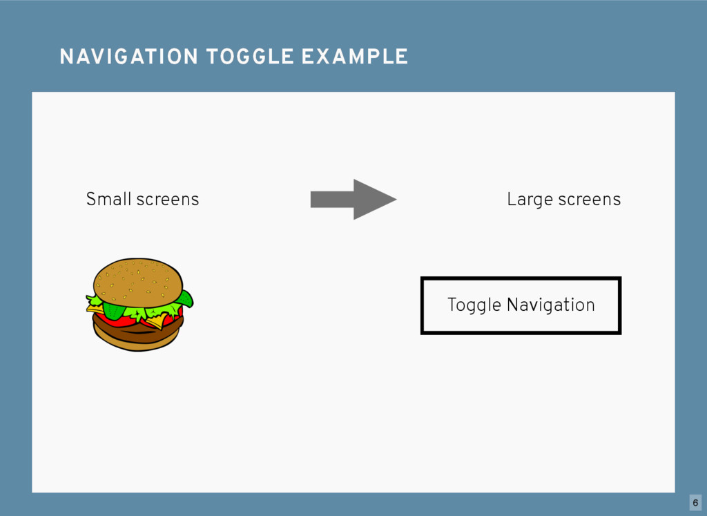
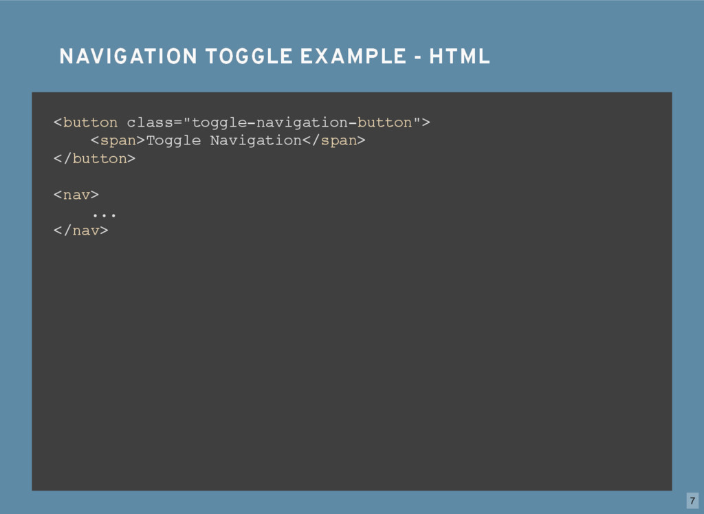
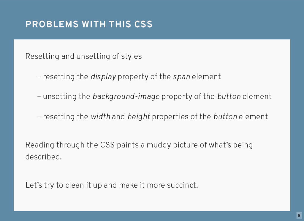
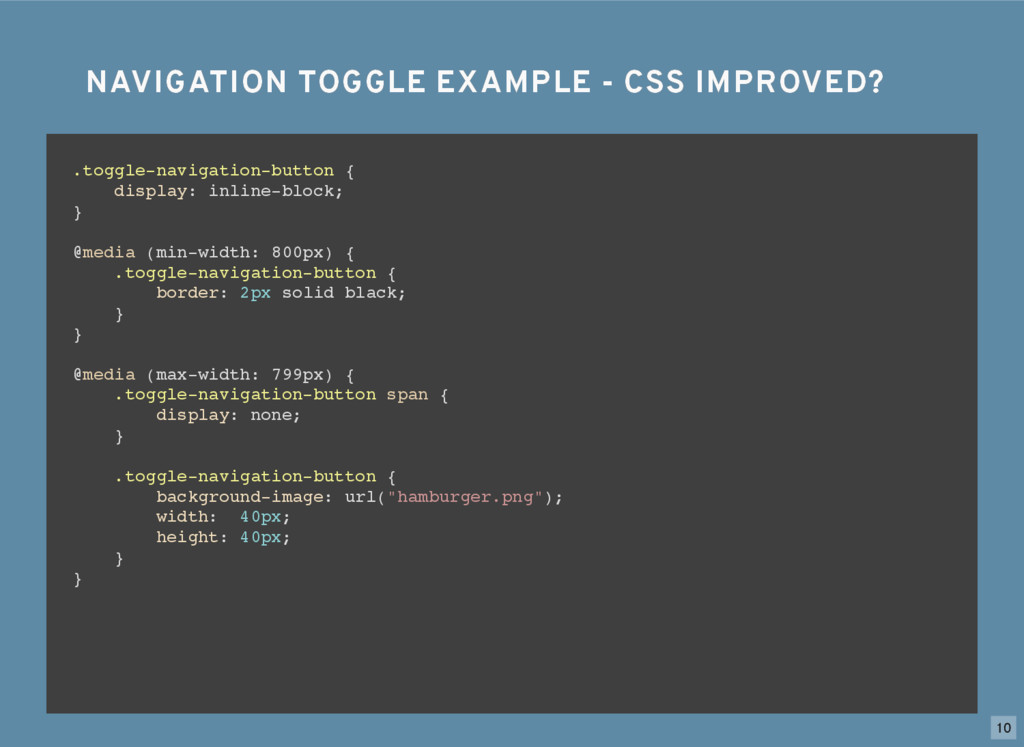
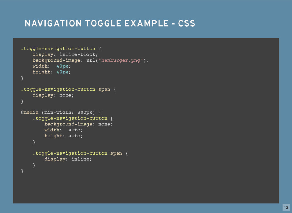
We’re used to hearing about and involving ourselves in methodologies like “Mobile First” when we write CSS, and more specifically, Media Queries. While these methodologies help to keep our CSS consistent, sometimes we get so obsessed with following our pre-defined tracks that what we’re really trying to accomplish becomes muddled. So how can we write media queries that are both consistent and succinct?

Full article with more information at https://chrisburnell.com/talk/middle-out/

Chris Burnell

April 18, 2016
Tweet

Other Decks in Technology

Transcript

  1. SUPPORTING SUPPORTING MIDDLE-OUT MIDDLE-OUT IN CSS IN CSS 18 APRIL,

    2016 18 APRIL, 2016 LONDON WEB STANDARDS LONDON WEB STANDARDS BY CHRIS BURNELL BY CHRIS BURNELL 1
  2. Tailor CSS to specific ranges of output devices without changing

    HTML. MEDIA QUERIES MEDIA QUERIES Most common usage is for viewport width: – max-width – min-width​ ​ 2
  3. #1. Don’t spell it media query​ s. MEDIA QUERY STRATEGIES

    MEDIA QUERY STRATEGIES Used to keep media queries in our control. Coherent and expectable. @media (min-width: 600px) { ... } “When the browser width is at least 600 pixels wide, apply ‘these’ styles.” Mobile First: Model your breakpoints around your content (images, figures, tables, etc.) rather than around specific devices or browsers. 3
  4. MOBILE FIRST EXAMPLE - CSS MOBILE FIRST EXAMPLE - CSS

    .column { width: 100%; } .column { width: 100%; } @media (min-width: 500px) { .column { width: 50%; } } .column { width: 100%; } @media (min-width: 500px) { .column { width: 50%; } } @media (min-width: 800px) { .column { width: 25%; } } 4
  5. Is there a performance impact from writing poor media queries?

    PERFORMANCE PERFORMANCE Not really. Compared to a beefy Javascript framework or a couple of images? Bottom line is file size. Then why bother writing intelligent media queries? What benefits are there? Let’s look at an example: 5
  6. NAVIGATION TOGGLE EXAMPLE - HTML NAVIGATION TOGGLE EXAMPLE - HTML

    <button class="toggle-navigation-button"> <span>Toggle Navigation</span> </button> <nav> ... </nav> 7
  7. NAVIGATION TOGGLE EXAMPLE - CSS NAVIGATION TOGGLE EXAMPLE - CSS

    .toggle-navigation-button { display: inline-block; } .toggle-navigation-button { display: inline-block; background-image: url("hamburger.png"); width: 40px; height: 40px; } .toggle-navigation-button { display: inline-block; background-image: url("hamburger.png"); width: 40px; height: 40px; } .toggle-navigation-button span { display: none; } .toggle-navigation-button { display: inline-block; background-image: url("hamburger.png"); width: 40px; height: 40px; } .toggle-navigation-button span { display: none; } @media (min-width: 800px) { } .toggle-navigation-button { display: inline-block; background-image: url("hamburger.png"); width: 40px; height: 40px; } .toggle-navigation-button span { display: none; } @media (min-width: 800px) { .toggle-navigation-button { background-image: none; width: auto; height: auto; } } .toggle-navigation-button { display: inline-block; background-image: url("hamburger.png"); width: 40px; height: 40px; } .toggle-navigation-button span { display: none; } @media (min-width: 800px) { .toggle-navigation-button { background-image: none; width: auto; height: auto; } .toggle-navigation-button span { display: inline; } } 8
  8. Resetting and unsetting of styles PROBLEMS WITH THIS CSS PROBLEMS

    WITH THIS CSS Reading through the CSS paints a muddy picture of what’s being described. – resetting the display property of the span element – unsetting the background-image property of the button element – resetting the width and height properties of the button element Let’s try to clean it up and make it more succinct. 9
  9. NAVIGATION TOGGLE EXAMPLE - CSS IMPROVED? NAVIGATION TOGGLE EXAMPLE -

    CSS IMPROVED? .toggle-navigation-button { display: inline-block; } .toggle-navigation-button { display: inline-block; } @media (min-width: 800px) { } .toggle-navigation-button { display: inline-block; } @media (min-width: 800px) { .toggle-navigation-button { border: 2px solid black; } } .toggle-navigation-button { display: inline-block; } @media (min-width: 800px) { .toggle-navigation-button { border: 2px solid black; } } @media (max-width: 799px) { } .toggle-navigation-button { display: inline-block; } @media (min-width: 800px) { .toggle-navigation-button { border: 2px solid black; } } @media (max-width: 799px) { .toggle-navigation-button span { display: none; } } .toggle-navigation-button { display: inline-block; } @media (min-width: 800px) { .toggle-navigation-button { border: 2px solid black; } } @media (max-width: 799px) { .toggle-navigation-button span { display: none; } .toggle-navigation-button { background-image: url("hamburger.png"); width: 40px; height: 40px; } } 10
  10. When the end-result of our CSS is the same as

    far as the end-user is concerned, we benefit. SO WHO BENEFITS? SO WHO BENEFITS? Consider describing the two approaches to the same CSS styles out loud, as you might scan it in your head. 11
  11. NAVIGATION TOGGLE EXAMPLE - CSS NAVIGATION TOGGLE EXAMPLE - CSS

    .toggle-navigation-button { display: inline-block; background-image: url("hamburger.png"); width: 40px; height: 40px; } .toggle-navigation-button span { display: none; } @media (min-width: 800px) { .toggle-navigation-button { background-image: none; width: auto; height: auto; } .toggle-navigation-button span { display: inline; } } 12
  12. NAVIGATION TOGGLE EXAMPLE - CSS IMPROVED? NAVIGATION TOGGLE EXAMPLE -

    CSS IMPROVED? .toggle-navigation-button { display: inline-block; } @media (min-width: 800px) { .toggle-navigation-button { border: 2px solid black; } } @media (max-width: 799px) { .toggle-navigation-button span { display: none; } .toggle-navigation-button { background-image: url("hamburger.png"); width: 40px; height: 40px; } } 13
  13. TAKEAWAYS TAKEAWAYS Use a strategy to keep your media queries

    under control and consistent. Writing coherent and understandable CSS: – makes for a stronger codebase – helps your teams – helps newcomers – helps you Avoid resetting or unsetting styles. 14