l'amore è disegnato su tutte le foglie degli alberi, l'amore è inciso sulle piume dei passeri, o sulle gocce di pioggia”. Nizar Qabbani “Love, oh my love, is a beautiful poem written on the moon. Love is what’s drawn on every leaf of every tree, Love is engraved into each bird’s feathers, every drop of rain”. Nizar Qabbani
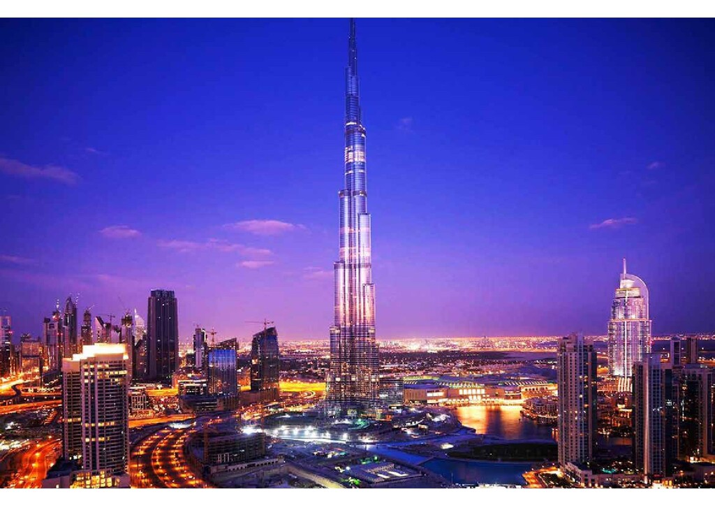
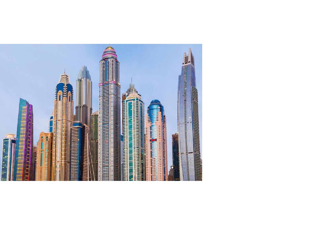
la sensazione di essere già stati. Il modello costruttivo spiazza per familiarità con le grandi città americane e l’organizzazione degli spazi a ridosso del mare non si distingue da altri esempi simili sulla East Coast. Passeggiando per le strade di Dubai Marina si ha la sensazione di essere a Miami, tra sopraelevate e ponti stradali sui canali che si insinuano tra i grattaceli. Abbiamo voluto proporre questa sensazione nella nostra prima proposta, chiamata semplicemente “Skyline of Dubai”. Dubai is a modern metropolis which gives you the immediate feeling of having been there before. The building models astound with their striking parallels to the major American cities, while the design of seaside spaces recalls similar examples all along the East Coast. Strolling down the streets of Dubai Marina, you have the impression of being in Miami, between flyovers and road bridges which lead through the channels amongst the skyscrapers. We wanted to evoke this kind of feeling in our first proposal, called simply “Skyline of Dubai”.
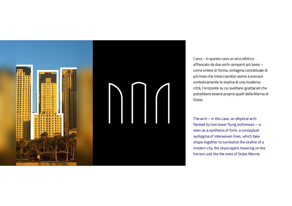
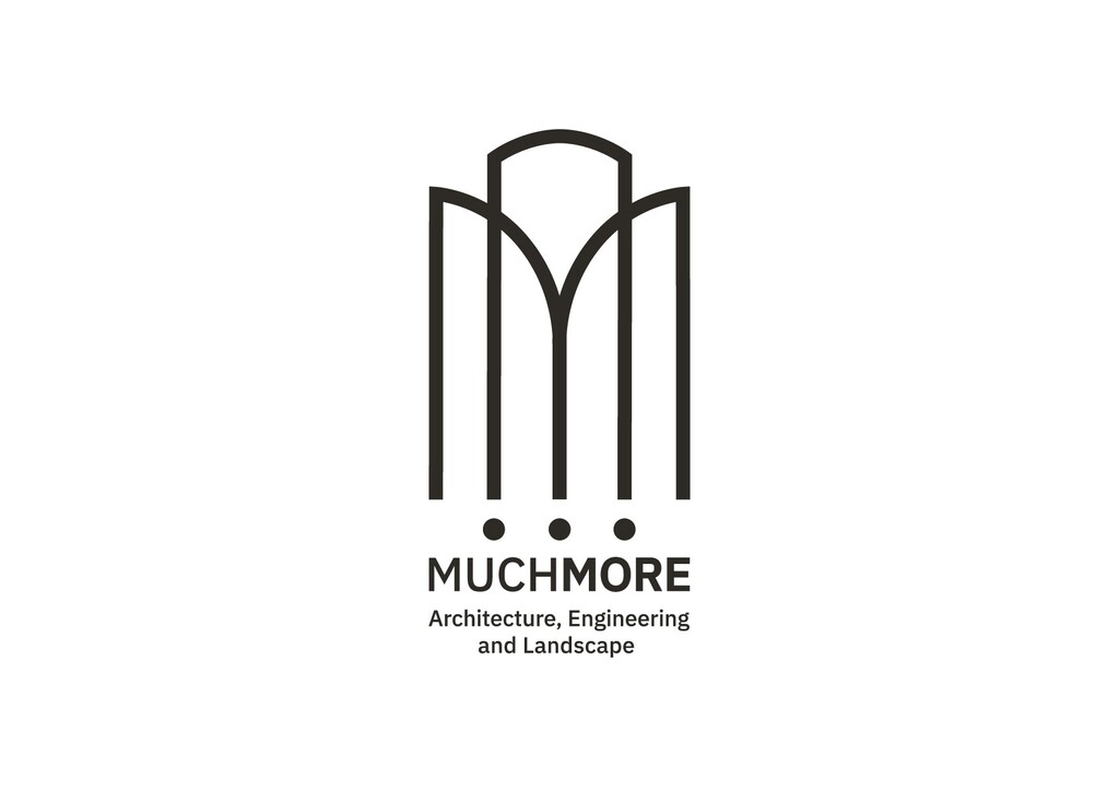
by two lower flying buttresses – is seen as a synthesis of form, a conceptual syntagma of interwoven lines, which take shape together to symbolize the skyline of a modern city, the skyscrapers towering on the horizon just like the ones of Dubai Marina. L’arco - in questo caso un arco ellittico affiancato da due archi rampanti più bassi – come sintesi di forma, sintagma concettuale di più linee che intrecciandosi vanno a evocare simbolicamente lo skyline di una moderna città, l’orizzonte su cui svettano grattacieli che potrebbero essere proprio quelli della Marina di Dubai.
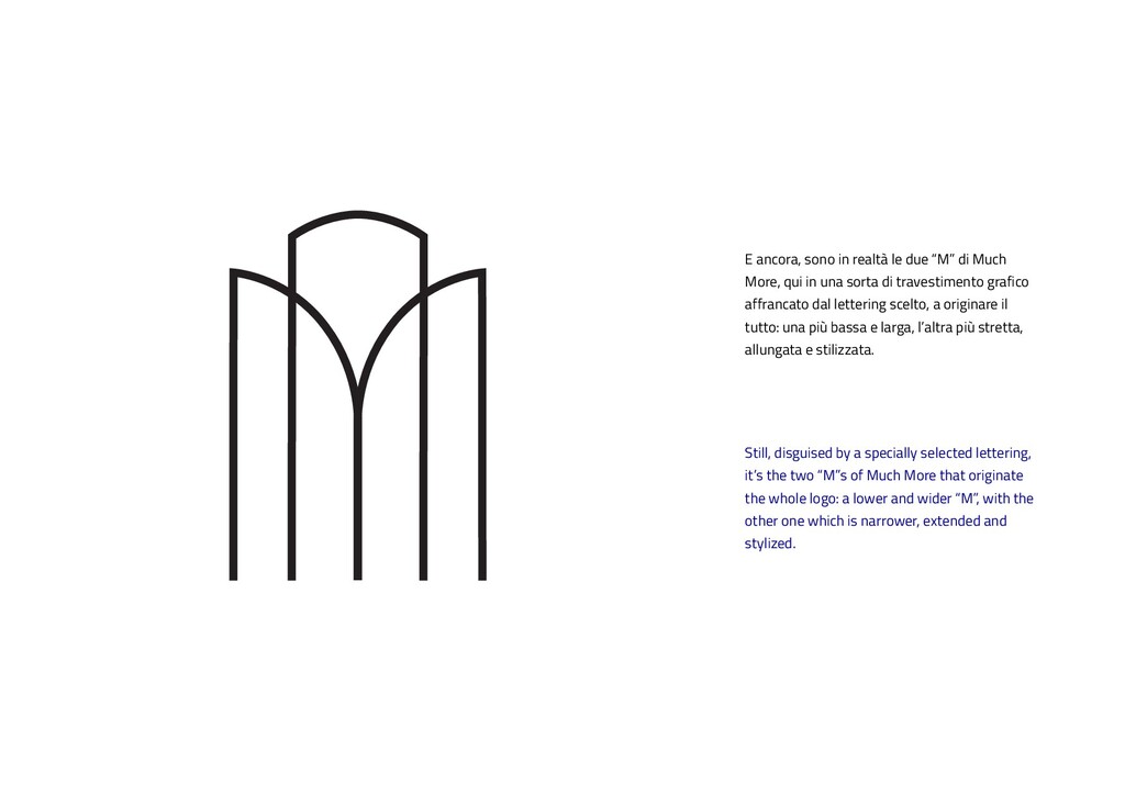
“M”s of Much More that originate the whole logo: a lower and wider “M”, with the other one which is narrower, extended and stylized. E ancora, sono in realtà le due “M” di Much More, qui in una sorta di travestimento grafico affrancato dal lettering scelto, a originare il tutto: una più bassa e larga, l’altra più stretta, allungata e stilizzata.
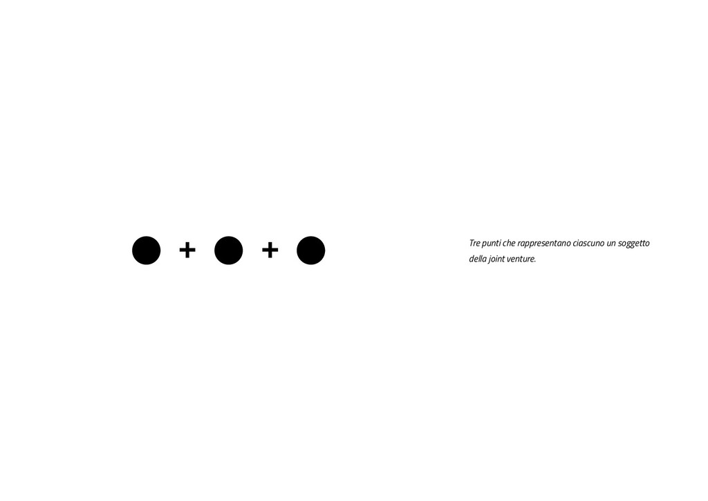
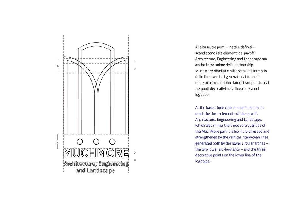
base, three clear and defined points mark the three elements of the payoff, Architecture, Engineering and Landscape, which also mirror the three core qualities of the MuchMore partnership, here stressed and strengthened by the vertical interwoven lines generated both by the lower circular arches – the two lower arc-boutants – and the three decorative points on the lower line of the logotype. Alla base, tre punti – netti e definiti – scandiscono i tre elementi del payoff: Architecture, Engineering and Landscape ma anche le tre anime della partnership MuchMore ribadita e rafforzata dall’intreccio delle linee verticali generate dai tre archi ribassati circolari (i due laterali rampanti) e dai tre punti decorativi nella linea bassa del logotipo.
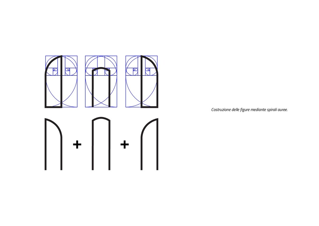
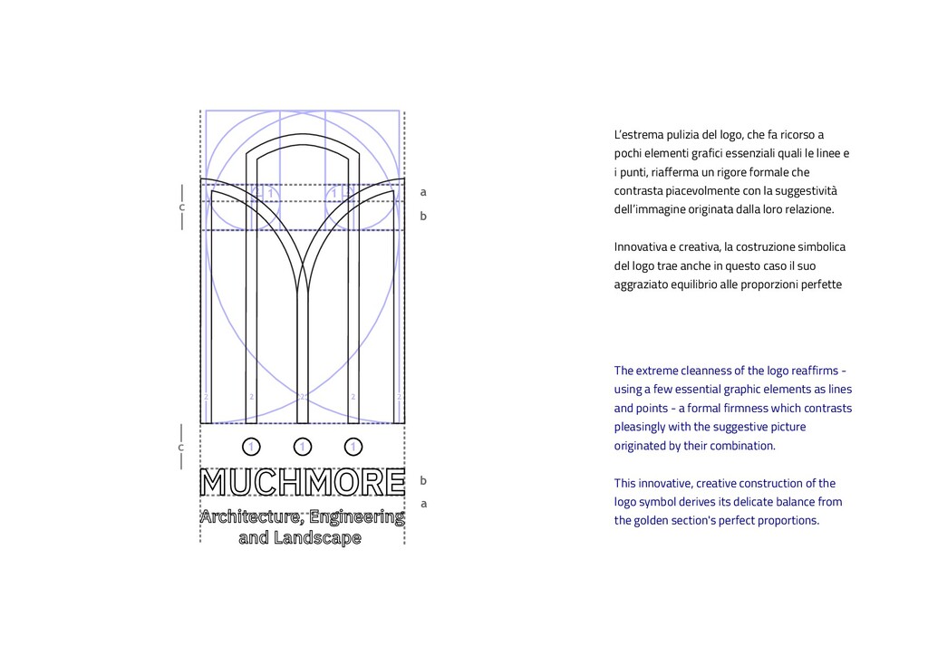
c c c 2 2 2 2 2 2 2 2 2 2 The extreme cleanness of the logo reaffirms - using a few essential graphic elements as lines and points - a formal firmness which contrasts pleasingly with the suggestive picture originated by their combination. This innovative, creative construction of the logo symbol derives its delicate balance from the golden section's perfect proportions. L’estrema pulizia del logo, che fa ricorso a pochi elementi grafici essenziali quali le linee e i punti, riafferma un rigore formale che contrasta piacevolmente con la suggestività dell’immagine originata dalla loro relazione. Innovativa e creativa, la costruzione simbolica del logo trae anche in questo caso il suo aggraziato equilibrio alle proporzioni perfette
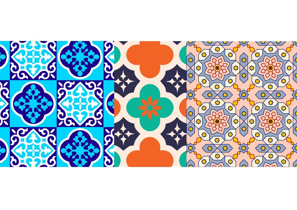
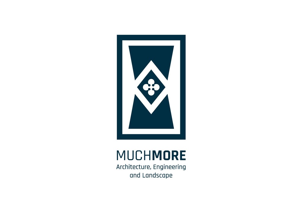
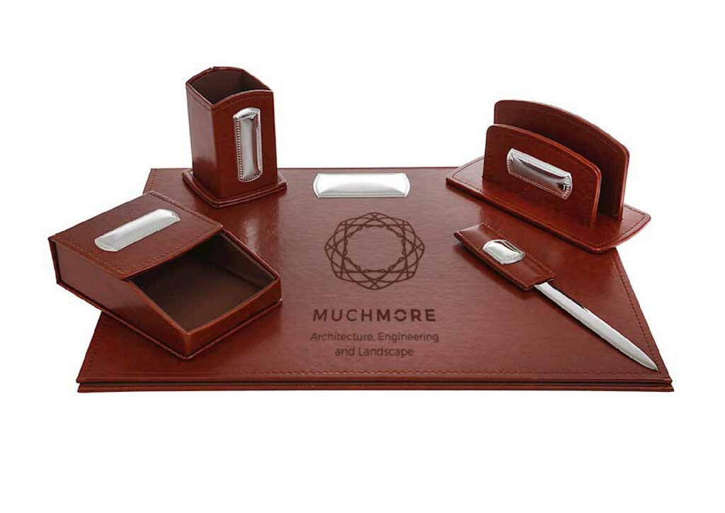
distinctive element of the Islamic art: the decorated ceramic tile, here adorned with a central quatrefoil inscribed within a rhombus. The latter is, in fact, a quadrilateral designed according to the golden ratio and consisting of two mirrored “M,” the initials for MuchMore Anche in questo caso il rimando è a un raffinato elemento distintivo dell’arte islamica: la piastrella in ceramica decorata, qui ornata da un quadrilobo centrale inscritto in un rombo. Quest’ultimo è in effetti un quadrilatero costruito sulle proporzioni auree e formato dall’incontro di due “M” speculari, le iniziali di Much More appunto.
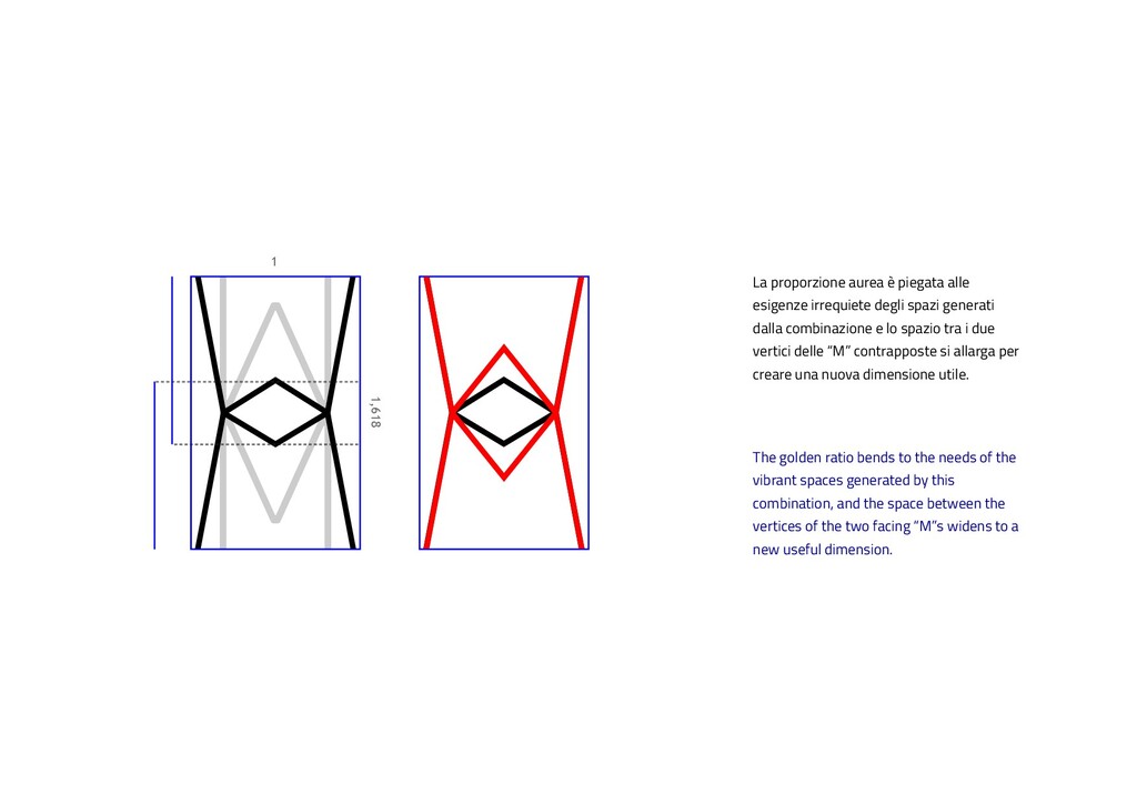
the vibrant spaces generated by this combination, and the space between the vertices of the two facing “M”s widens to a new useful dimension. La proporzione aurea è piegata alle esigenze irrequiete degli spazi generati dalla combinazione e lo spazio tra i due vertici delle “M” contrapposte si allarga per creare una nuova dimensione utile.
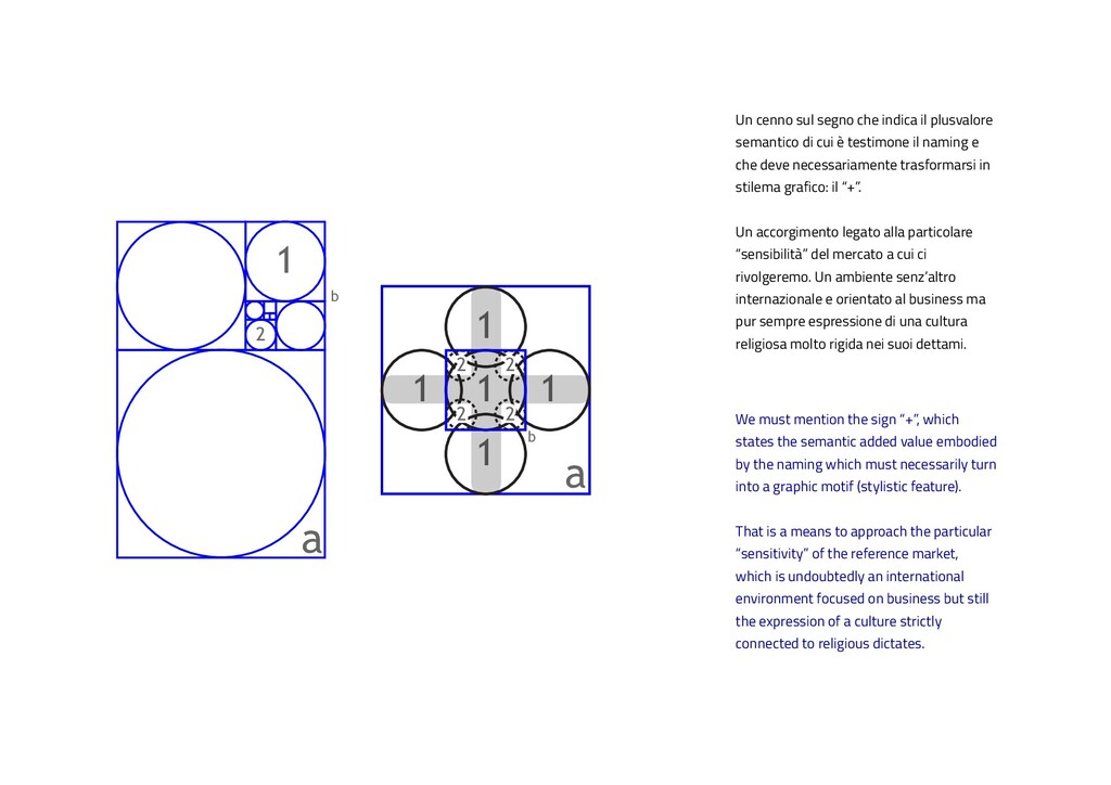
2 2 1 b a We must mention the sign “+”, which states the semantic added value embodied by the naming which must necessarily turn into a graphic motif (stylistic feature). That is a means to approach the particular “sensitivity” of the reference market, which is undoubtedly an international environment focused on business but still the expression of a culture strictly connected to religious dictates. Un cenno sul segno che indica il plusvalore semantico di cui è testimone il naming e che deve necessariamente trasformarsi in stilema grafico: il “+”. Un accorgimento legato alla particolare “sensibilità” del mercato a cui ci rivolgeremo. Un ambiente senz’altro internazionale e orientato al business ma pur sempre espressione di una cultura religiosa molto rigida nei suoi dettami.
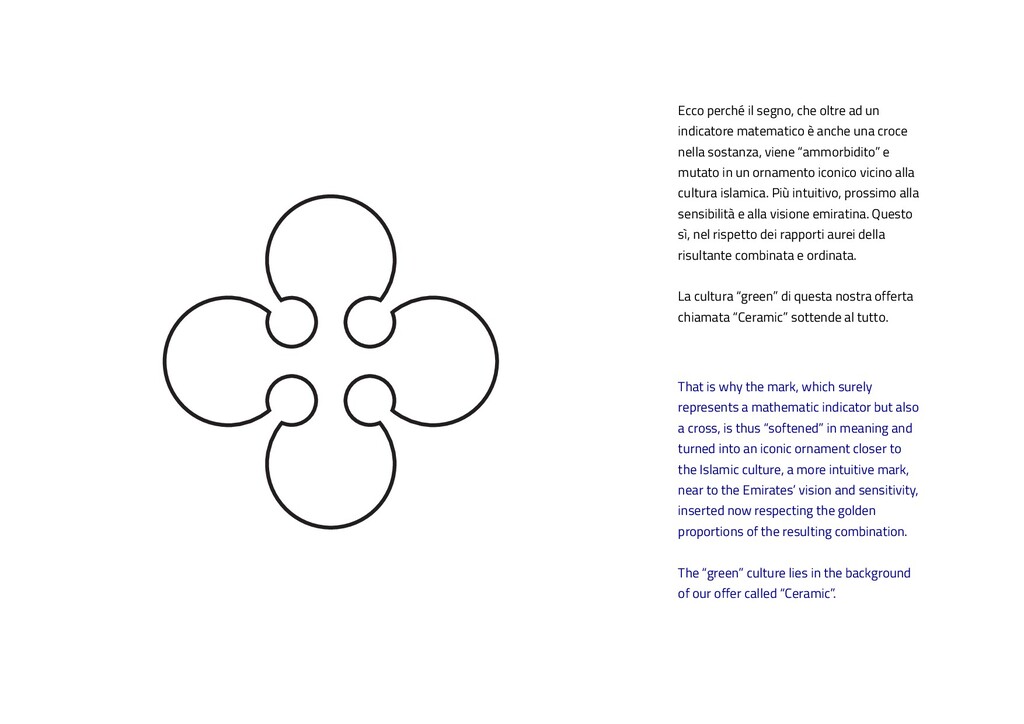
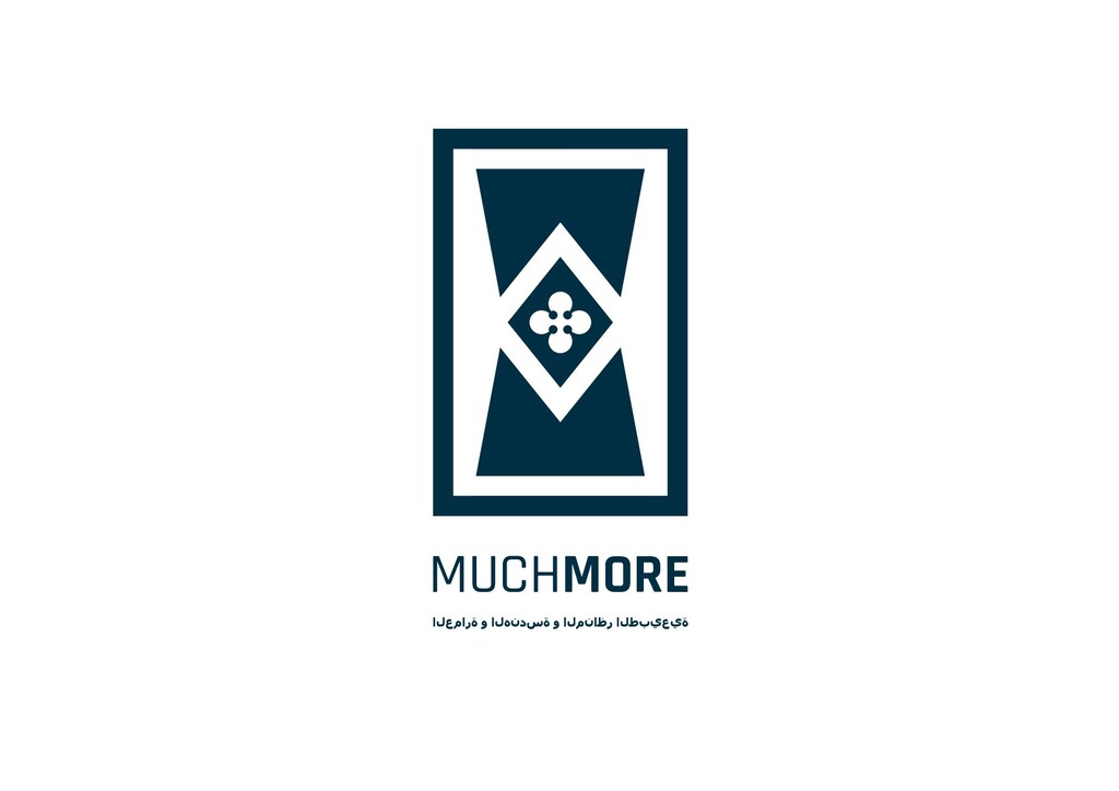
indicator but also a cross, is thus “softened” in meaning and turned into an iconic ornament closer to the Islamic culture, a more intuitive mark, near to the Emirates’ vision and sensitivity, inserted now respecting the golden proportions of the resulting combination. The “green” culture lies in the background of our offer called “Ceramic”. Ecco perché il segno, che oltre ad un indicatore matematico è anche una croce nella sostanza, viene “ammorbidito” e mutato in un ornamento iconico vicino alla cultura islamica. Più intuitivo, prossimo alla sensibilità e alla visione emiratina. Questo sì, nel rispetto dei rapporti aurei della risultante combinata e ordinata. La cultura “green” di questa nostra offerta chiamata “Ceramic” sottende al tutto.
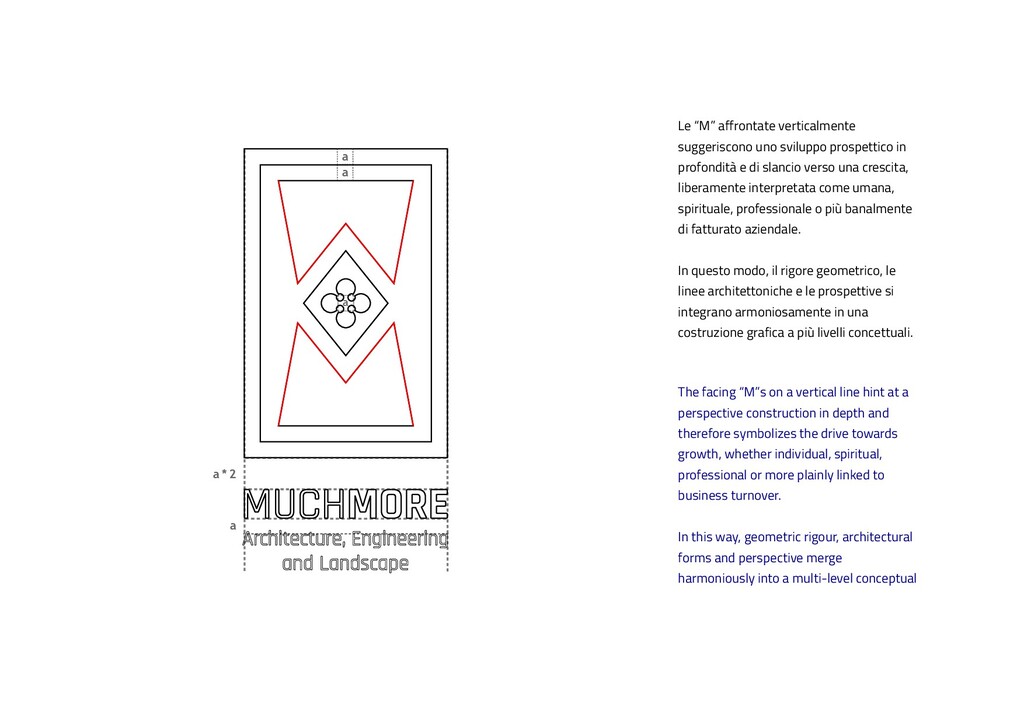
on a vertical line hint at a perspective construction in depth and therefore symbolizes the drive towards growth, whether individual, spiritual, professional or more plainly linked to business turnover. In this way, geometric rigour, architectural forms and perspective merge harmoniously into a multi-level conceptual Le “M” affrontate verticalmente suggeriscono uno sviluppo prospettico in profondità e di slancio verso una crescita, liberamente interpretata come umana, spirituale, professionale o più banalmente di fatturato aziendale. In questo modo, il rigore geometrico, le linee architettoniche e le prospettive si integrano armoniosamente in una costruzione grafica a più livelli concettuali.
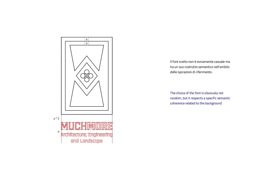
the font is obviously not random, but it respects a specific semantic coherence related to the background Il font scelto non è ovviamente casuale ma ha un suo costrutto semantico nell’ambito delle ispirazioni di riferimento.
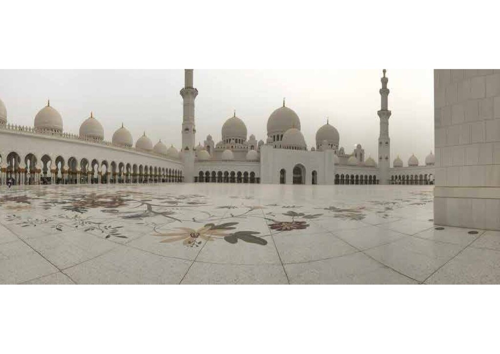
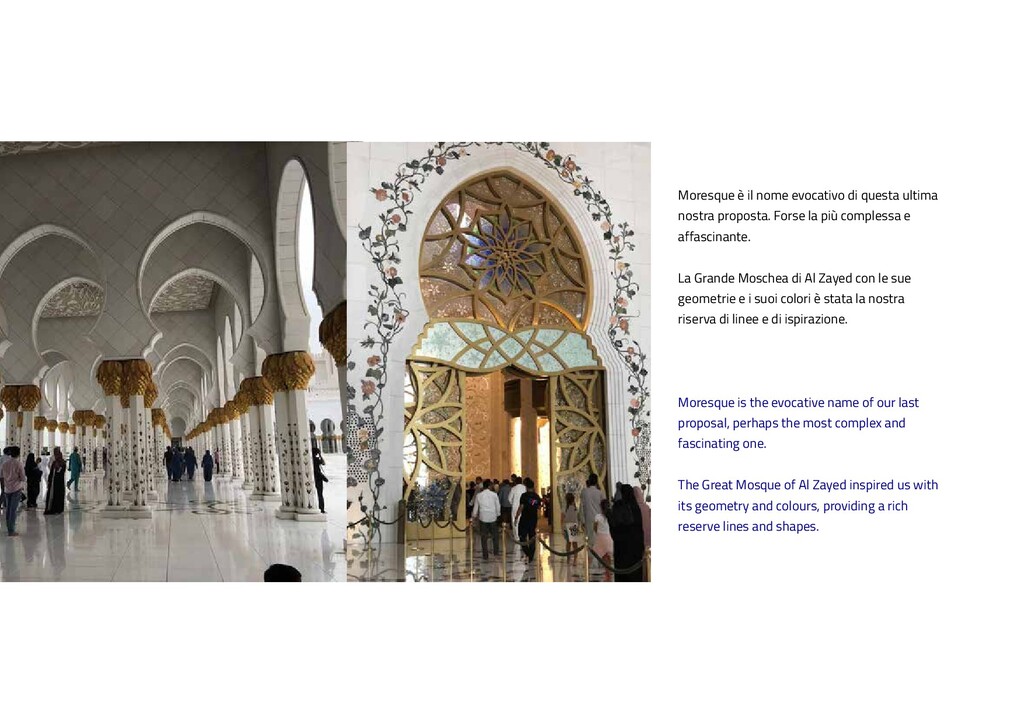
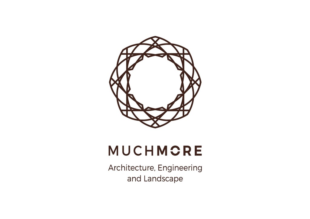
the most complex and fascinating one. The Great Mosque of Al Zayed inspired us with its geometry and colours, providing a rich reserve lines and shapes. Moresque è il nome evocativo di questa ultima nostra proposta. Forse la più complessa e affascinante. La Grande Moschea di Al Zayed con le sue geometrie e i suoi colori è stata la nostra riserva di linee e di ispirazione.
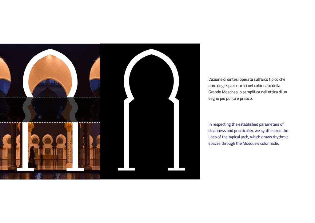
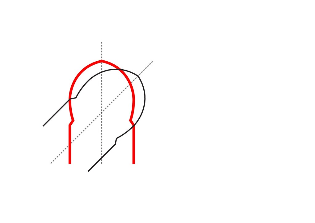
synthesized the lines of the typical arch, which draws rhythmic spaces through the Mosque’s colonnade. L’azione di sintesi operata sull’arco tipico che apre degli spazi ritmici nel colonnato della Grande Moschea lo semplifica nell’ottica di un segno più pulito e pratico.
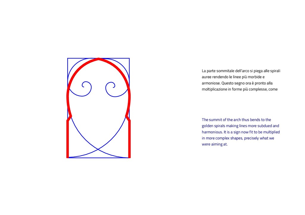
spirals making lines more subdued and harmonious. It is a sign now fit to be multiplied in more complex shapes, precisely what we were aiming at. La parte sommitale dell’arco si piega alle spirali auree rendendo le linee più morbide e armoniose. Questo segno ora è pronto alla moltiplicazione in forme più complesse, come
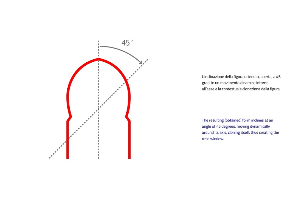
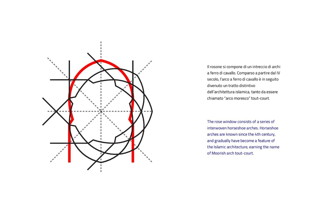
45 degrees, moving dynamically around its axis, cloning itself, thus creating the rose window. L’inclinazione della figura ottenuta, aperta, a 45 gradi in un movimento dinamico intorno all’asse e la contestuale clonazione della figura
arches. Horseshoe arches are known since the 4th century, and gradually have become a feature of the Islamic architecture, earning the name of Moorish arch tout-court. Il rosone si compone di un intreccio di archi a ferro di cavallo. Comparso a partire dal IV secolo, l’arco a ferro di cavallo è in seguito divenuto un tratto distintivo dell’architettura islamica, tanto da essere chiamato “arco moresco” tout-court.
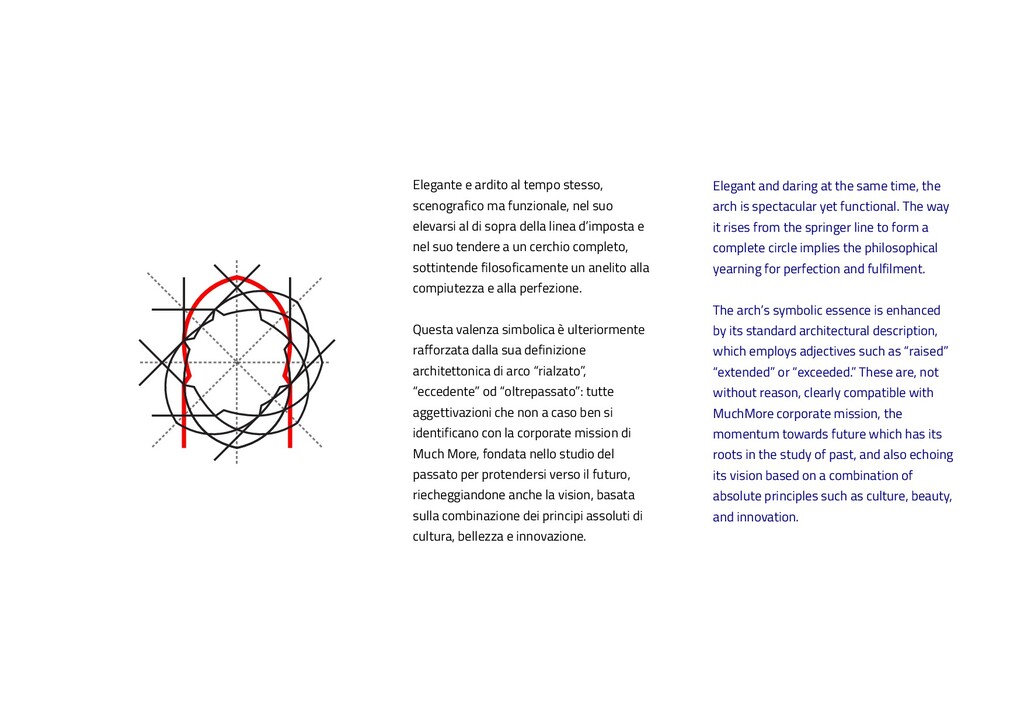
spectacular yet functional. The way it rises from the springer line to form a complete circle implies the philosophical yearning for perfection and fulfilment. The arch’s symbolic essence is enhanced by its standard architectural description, which employs adjectives such as “raised” “extended” or “exceeded.” These are, not without reason, clearly compatible with MuchMore corporate mission, the momentum towards future which has its roots in the study of past, and also echoing its vision based on a combination of absolute principles such as culture, beauty, and innovation. Elegante e ardito al tempo stesso, scenografico ma funzionale, nel suo elevarsi al di sopra della linea d’imposta e nel suo tendere a un cerchio completo, sottintende filosoficamente un anelito alla compiutezza e alla perfezione. Questa valenza simbolica è ulteriormente rafforzata dalla sua definizione architettonica di arco “rialzato”, “eccedente” od “oltrepassato”: tutte aggettivazioni che non a caso ben si identificano con la corporate mission di Much More, fondata nello studio del passato per protendersi verso il futuro, riecheggiandone anche la vision, basata sulla combinazione dei principi assoluti di cultura, bellezza e innovazione.
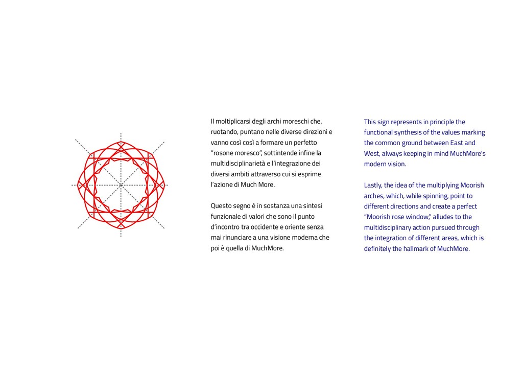
values marking the common ground between East and West, always keeping in mind MuchMore’s modern vision. Lastly, the idea of the multiplying Moorish arches, which, while spinning, point to different directions and create a perfect “Moorish rose window,” alludes to the multidisciplinary action pursued through the integration of different areas, which is definitely the hallmark of MuchMore. Il moltiplicarsi degli archi moreschi che, ruotando, puntano nelle diverse direzioni e vanno così così a formare un perfetto “rosone moresco”, sottintende infine la multidisciplinarietà e l’integrazione dei diversi ambiti attraverso cui si esprime l’azione di Much More. Questo segno è in sostanza una sintesi funzionale di valori che sono il punto d’incontro tra occidente e oriente senza mai rinunciare a una visione moderna che poi è quella di MuchMore.
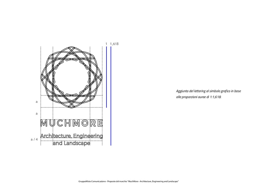
al simbolo grafico in base alle proporzioni auree di 1:1,618. GruppoMisto Comunicazione - Proposte del marchio “MuchMore - Architecture, Engineering and Landscape”
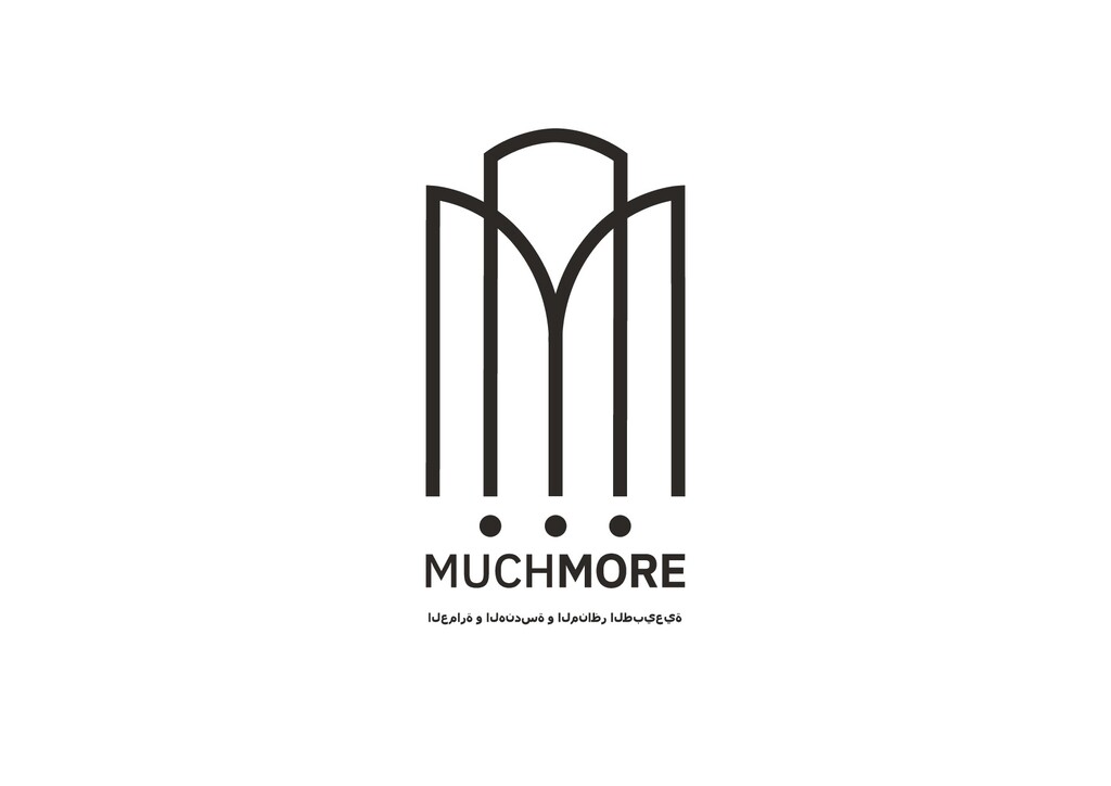
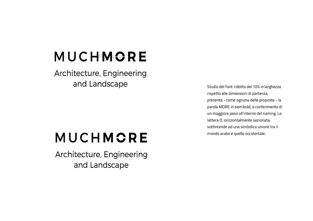
dimensioni di partenza, presenta - come ognuna delle proposte - la parola MORE in semibold, a conferimento di un maggiore peso all’interno del naming. La lettera O, orizzontalmente sezionata, sottintende ad una simbolica unione tra il mondo arabo e quello occidentale.