– Like a fancy array, but with more built-in operations DataFrame – 2D (usually) tabular data structure. Similar to a programmable spreadsheet, but in a good way. Extremely popular with scientists and data wranglers, so tons of good documentations and Stack Overflow examples exist. That’s pretty much how I learned it. CC BY-SA 2.5 es, https://commons.wikimedia.org/w/index.php?curid=531560
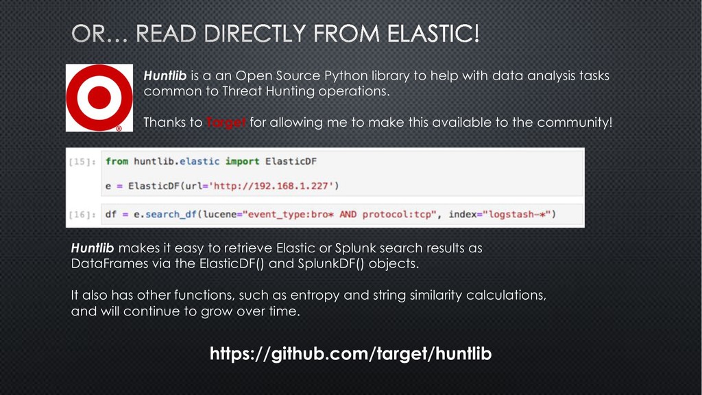
with data analysis tasks common to Threat Hunting operations. Thanks to Target for allowing me to make this available to the community! Huntlib makes it easy to retrieve Elastic or Splunk search results as DataFrames via the ElasticDF() and SplunkDF() objects. It also has other functions, such as entropy and string similarity calculations, and will continue to grow over time. https://github.com/target/huntlib
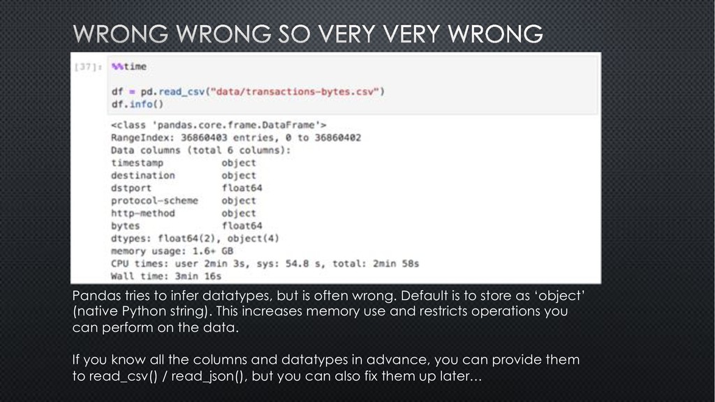
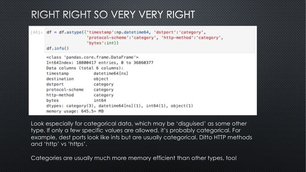
is to store as ‘object’ (native Python string). This increases memory use and restricts operations you can perform on the data. If you know all the columns and datatypes in advance, you can provide them to read_csv() / read_json(), but you can also fix them up later…
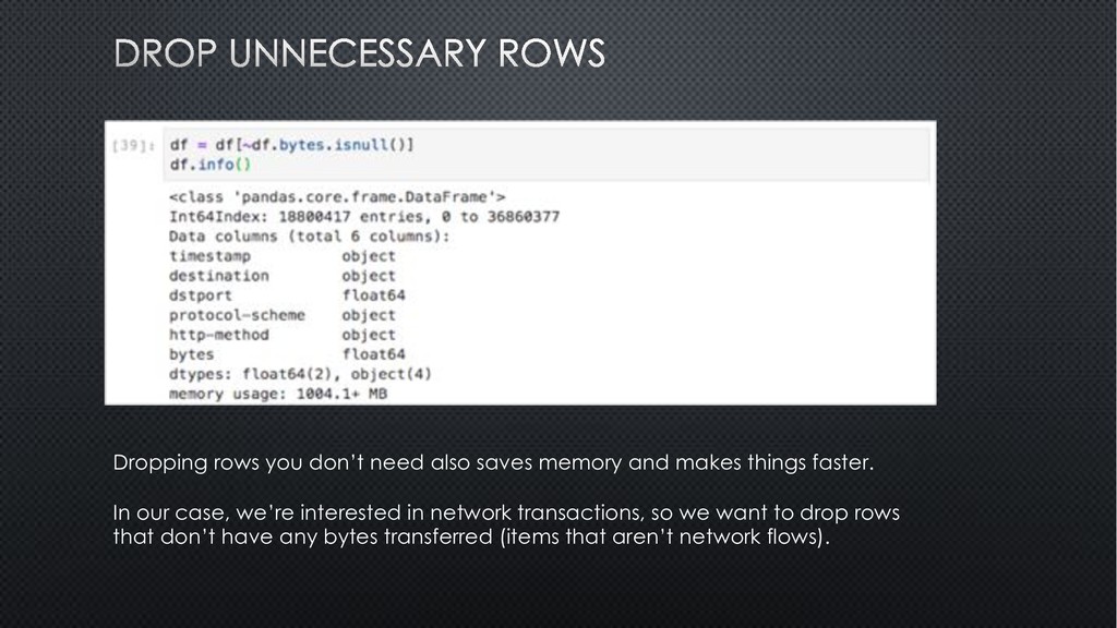
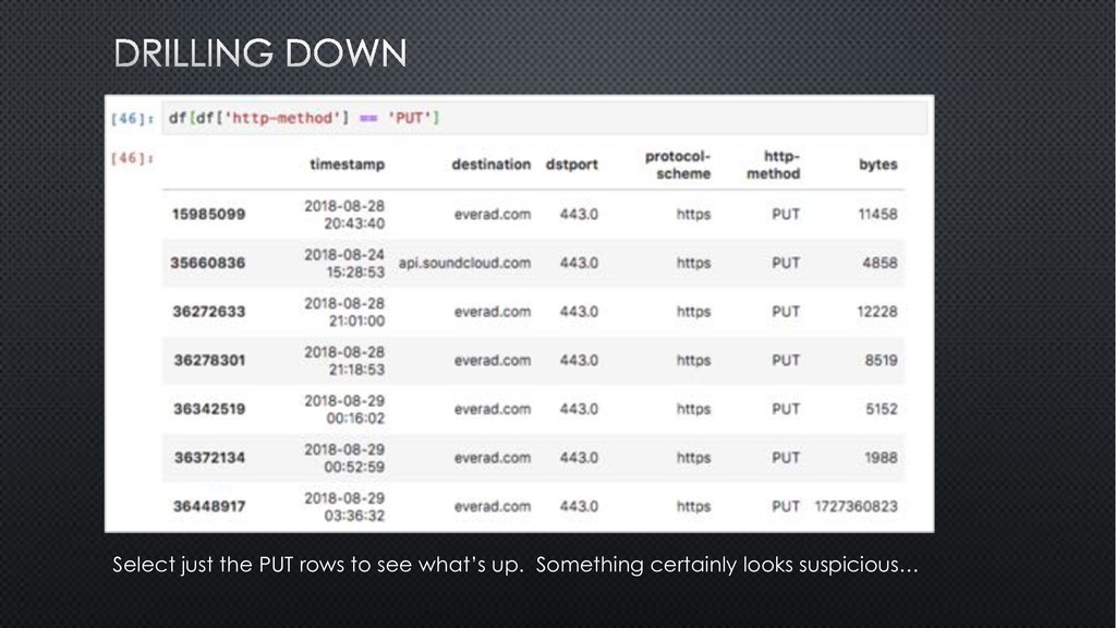
things faster. In our case, we’re interested in network transactions, so we want to drop rows that don’t have any bytes transferred (items that aren’t network flows).
some other type. If only a few specific values are allowed, it’s probably categorical. For example, dest ports look like ints but are usually categorical. Ditto HTTP methods and ‘http’ vs ‘https’. Categories are usually much more memory efficient than other types, too!
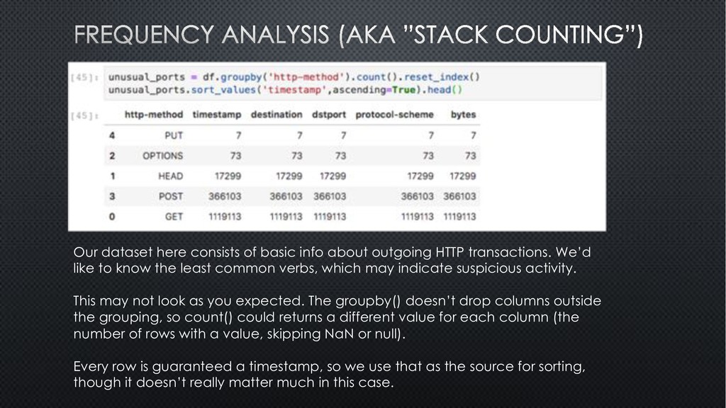
transactions. We’d like to know the least common verbs, which may indicate suspicious activity. This may not look as you expected. The groupby() doesn’t drop columns outside the grouping, so count() could returns a different value for each column (the number of rows with a value, skipping NaN or null). Every row is guaranteed a timestamp, so we use that as the source for sorting, though it doesn’t really matter much in this case.
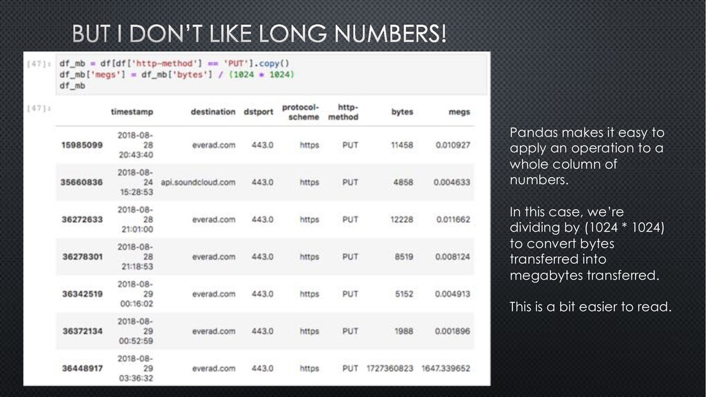
whole column of numbers. In this case, we’re dividing by (1024 * 1024) to convert bytes transferred into megabytes transferred. This is a bit easier to read.
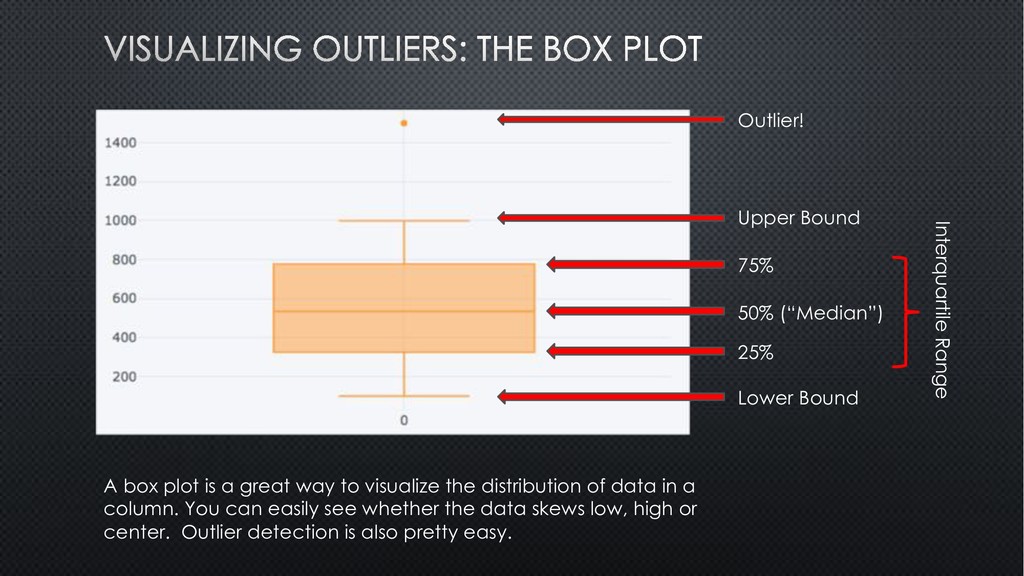
distribution of data in a column. You can easily see whether the data skews low, high or center. Outlier detection is also pretty easy. Outlier! Upper Bound 75% 50% (“Median”) 25% Lower Bound Interquartile Range
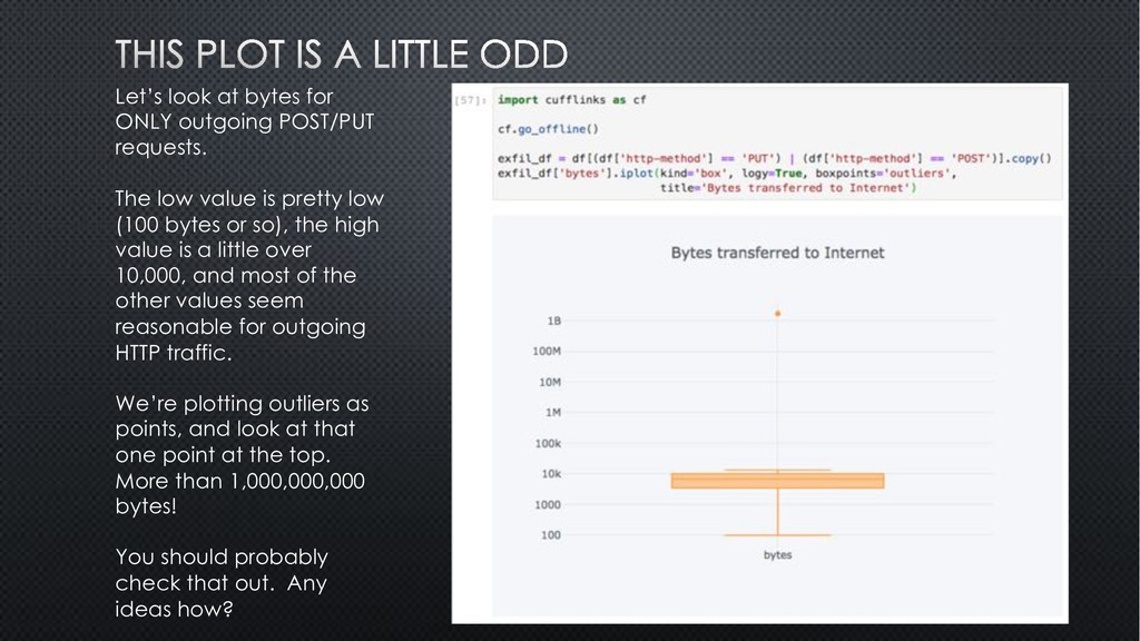
low value is pretty low (100 bytes or so), the high value is a little over 10,000, and most of the other values seem reasonable for outgoing HTTP traffic. We’re plotting outliers as points, and look at that one point at the top. More than 1,000,000,000 bytes! You should probably check that out. Any ideas how?
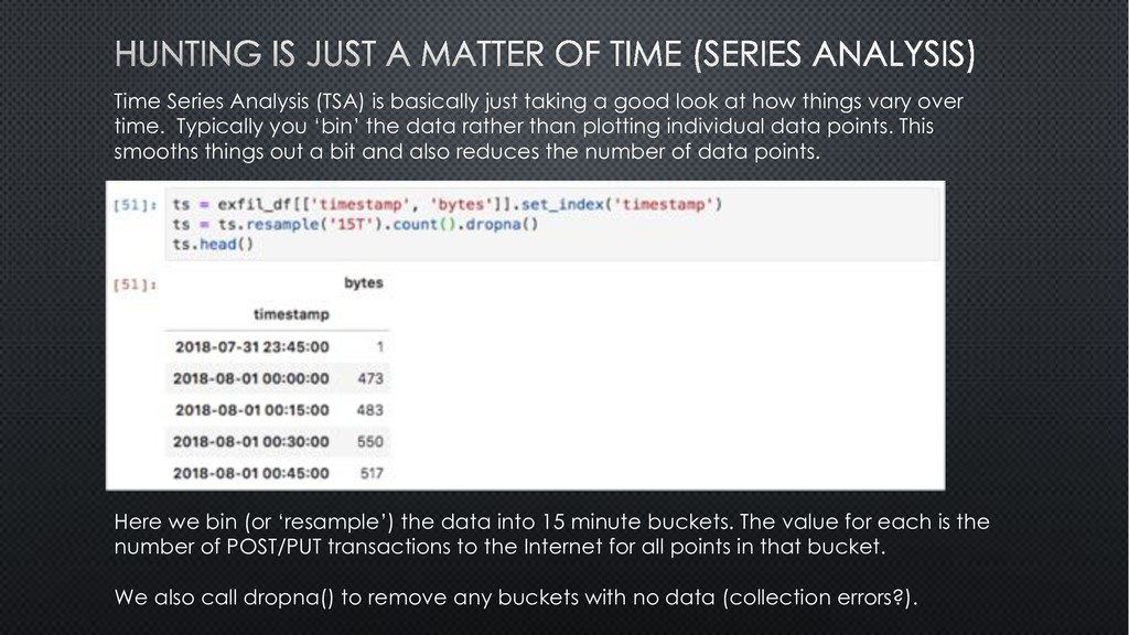
look at how things vary over time. Typically you ‘bin’ the data rather than plotting individual data points. This smooths things out a bit and also reduces the number of data points. Here we bin (or ‘resample’) the data into 15 minute buckets. The value for each is the number of POST/PUT transactions to the Internet for all points in that bucket. We also call dropna() to remove any buckets with no data (collection errors?).
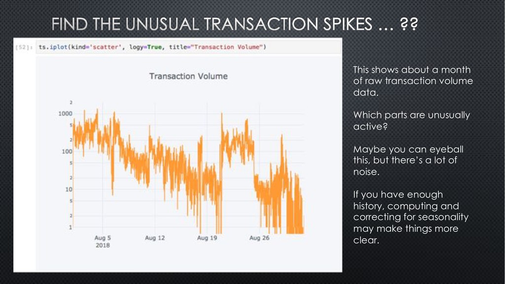
Which parts are unusually active? Maybe you can eyeball this, but there’s a lot of noise. If you have enough history, computing and correcting for seasonality may make things more clear.
specific regular intervals (e.g., days, weeks, months). We’ll try a ‘daily’ period. Our data is binned by 15 mins, so frequency is 24 hours * 60 minutes, divided by 15 (bucket size). There is a clear seasonal component. The residual is the observed data corrected for the daily pattern and trend.
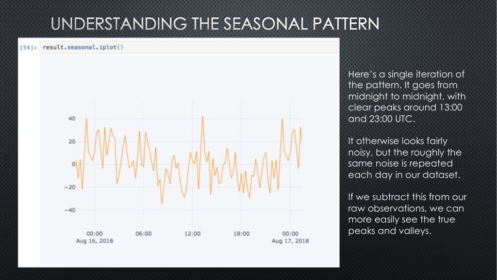
midnight to midnight, with clear peaks around 13:00 and 23:00 UTC. It otherwise looks fairly noisy, but the roughly the same noise is repeated each day in our dataset. If we subtract this from our raw observations, we can more easily see the true peaks and valleys.
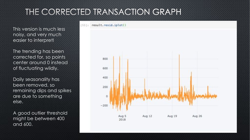
to interpret! The trending has been corrected for, so points center around 0 instead of fluctuating wildly. Daily seasonality has been removed, so remaining dips and spikes are due to something else. A good outlier threshold might be between 400 and 600.
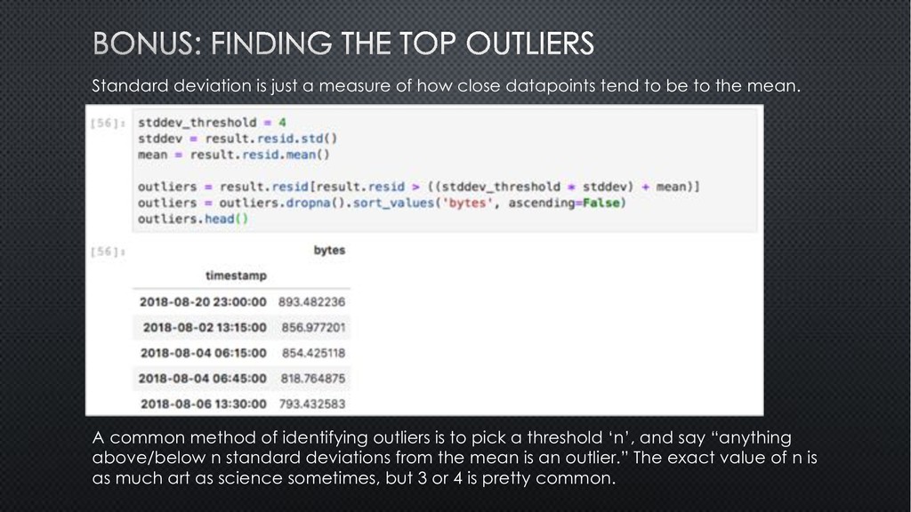
threshold ‘n’, and say “anything above/below n standard deviations from the mean is an outlier.” The exact value of n is as much art as science sometimes, but 3 or 4 is pretty common. Standard deviation is just a measure of how close datapoints tend to be to the mean.