Upgrade to Pro
— share decks privately, control downloads, hide ads and more …
Speaker Deck
Features
Speaker Deck
PRO
Sign in
Sign up for free
Search
Search
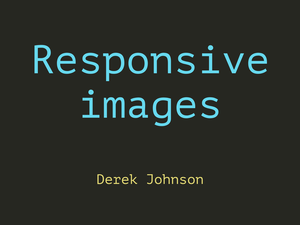
Responsive images have landed
Search
Derek Johnson
October 09, 2014
Technology
180
2
Share
Embed
Copy iframe code
Copy JS code
Copy link
Start on current slide
Responsive images have landed
An introduction to responsive images standards: , @srcset and @sizes.
Derek Johnson
October 09, 2014
More Decks by Derek Johnson
See All by Derek Johnson
Responsive Web Design
derekjohnson
0
47
Git branching strategy
derekjohnson
0
100
Git basics
derekjohnson
1
68
How modern web design works
derekjohnson
0
430
Other Decks in Technology
See All in Technology
Baseline対応のDOMの型定義を作った
uhyo
3
730
LLMやAIエージェントをソフトウェアに組み込むプラクティス
shibuiwilliam
0
130
証券システムを10年Scalaで作り続けるということ - 関数型まつり2026
krrrr38
3
810
「ちゃんとやっている」は独りよがりだった ― 不安に寄り添うインシデント対応へ / Towards incident response that addresses anxieties
chmikata
1
4.5k
知らん間に、回ってる
ming_ayami
0
380
Terraform共通モジュールをチーム横断で“変えられる”運用へ ― リリースと適用の分離
kekke_n
1
2.4k
AI Driven AI Governance
pict3
0
320
テスト設計の本質を改めて考えてみる~生成AIを活用する時代だからこそ、作ったテストの説明性を高めよう~
yamasaki696
1
440
Kotlin 開発のツラミを爆破した話! / Explode the difficulty of Kotlin dev!
eller86
0
160
FinOps X 2026 Recap from Engineer Side #JapanFinOps
chacco38
0
270
なぜ私たちのSREプラクティスはなかなか機能しないのか 〜システムより先に組織を見る〜 / Why our SRE practices aren't really working
vtryo
3
3.3k
攻撃者がいなくてもAIエージェントはインシデントを起こす
nomizone
0
210
Featured
See All Featured
HDC tutorial
michielstock
2
740
Code Reviewing Like a Champion
maltzj
528
40k
GitHub's CSS Performance
jonrohan
1033
470k
Easily Structure & Communicate Ideas using Wireframe
afnizarnur
194
17k
The Invisible Side of Design
smashingmag
301
52k
Fireside Chat
paigeccino
42
4k
Principles of Awesome APIs and How to Build Them.
keavy
128
18k
jQuery: Nuts, Bolts and Bling
dougneiner
66
8.5k
The Art of Programming - Codeland 2020
erikaheidi
57
14k
We Are The Robots
honzajavorek
0
270
Marketing Yourself as an Engineer | Alaka | Gurzu
gurzu
0
260
The SEO identity crisis: Don't let AI make you average
varn
0
510
Transcript
Responsive images ! Derek Johnson
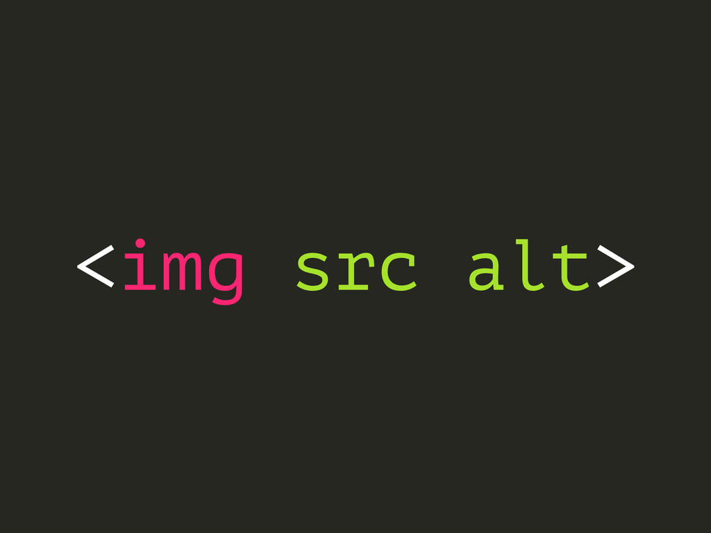
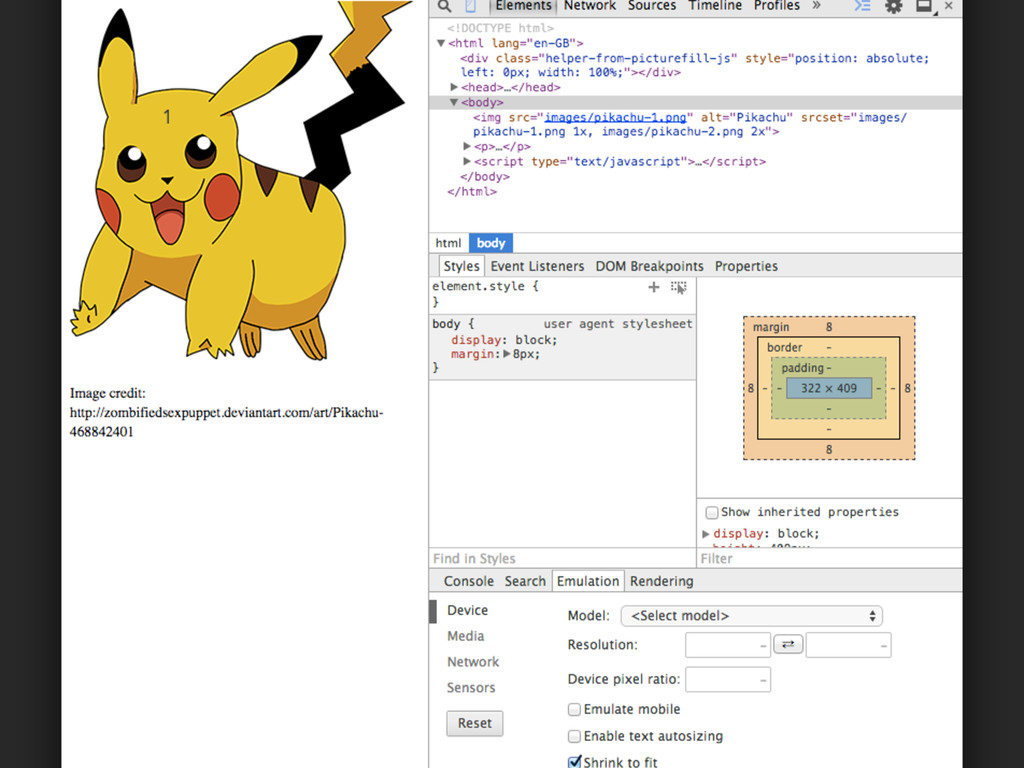
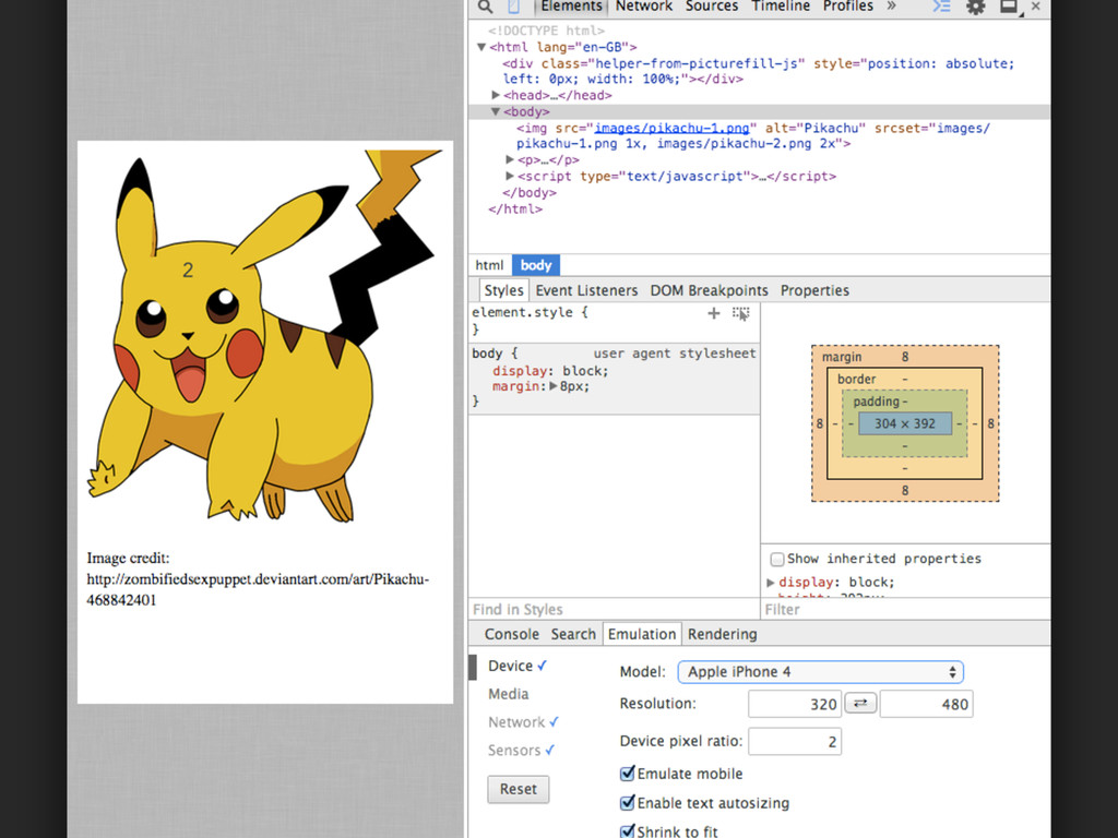
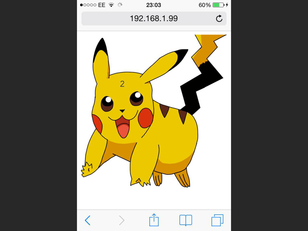
<img src alt>
None
None
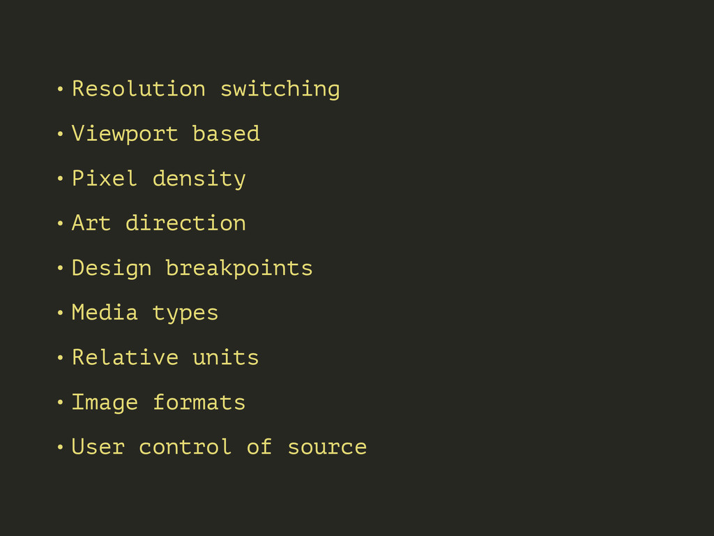
• Resolution switching • Viewport based • Pixel density •
Art direction • Design breakpoints • Media types • Relative units • Image formats • User control of source
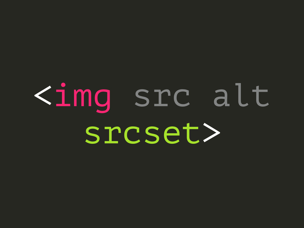
<img src alt srcset>
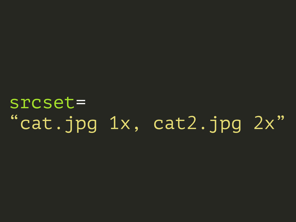
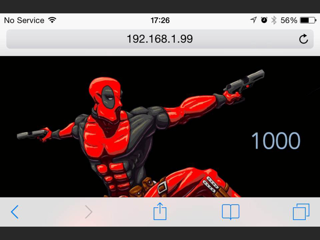
srcset= “cat.jpg 1x, cat2.jpg 2x”
None
None
None
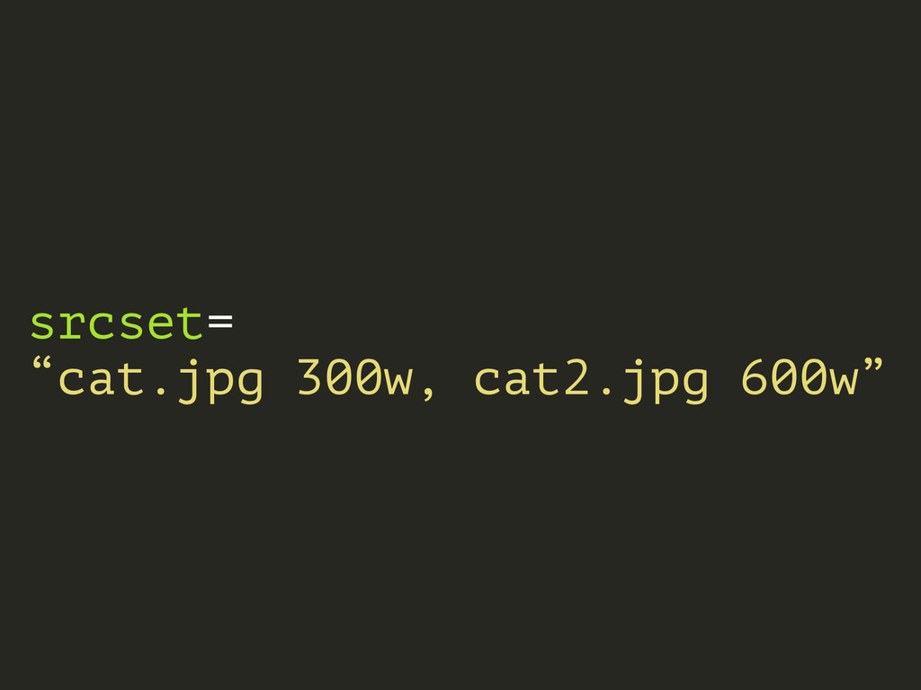
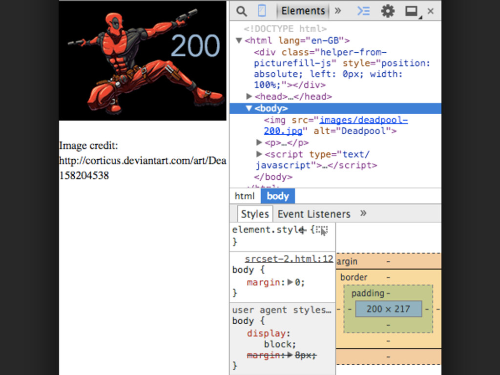
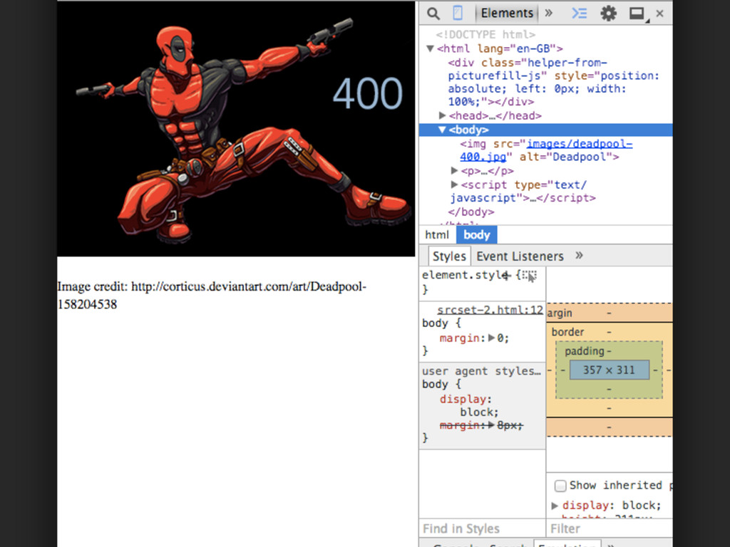
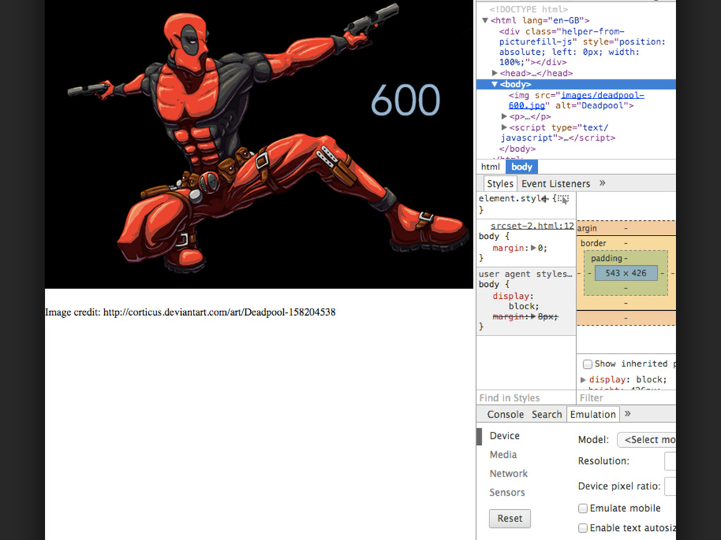
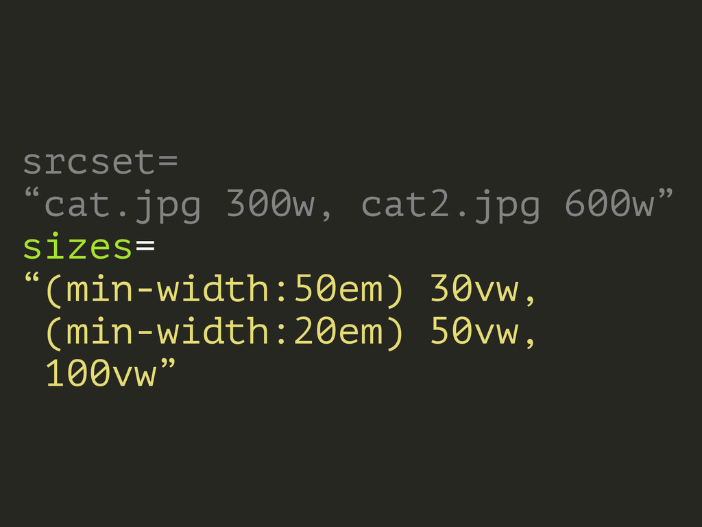
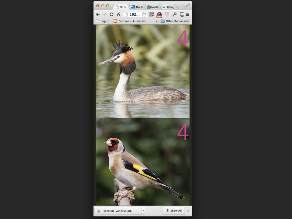
srcset= “cat.jpg 300w, cat2.jpg 600w”
None
None
None
None
None
None
None
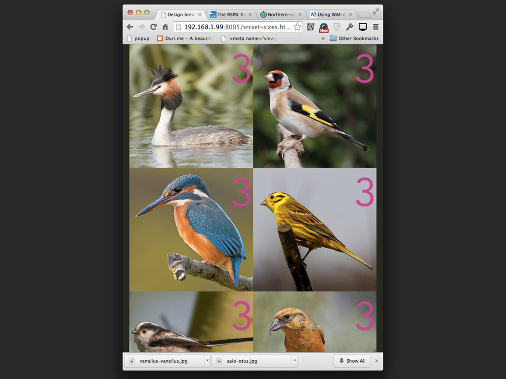
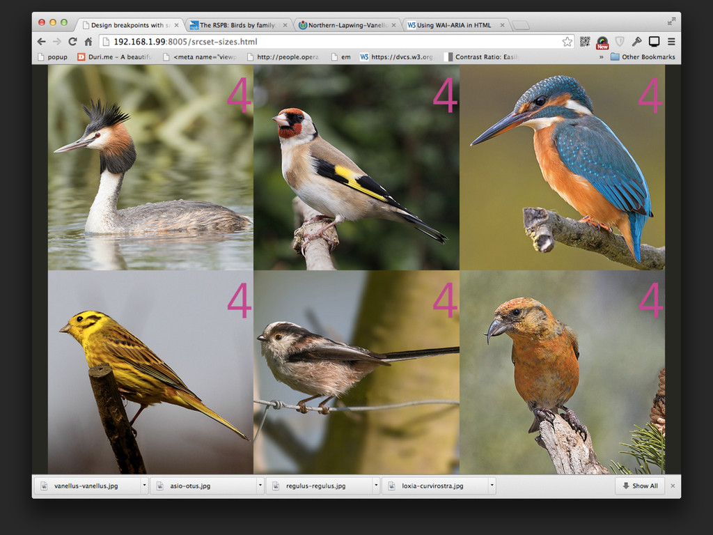
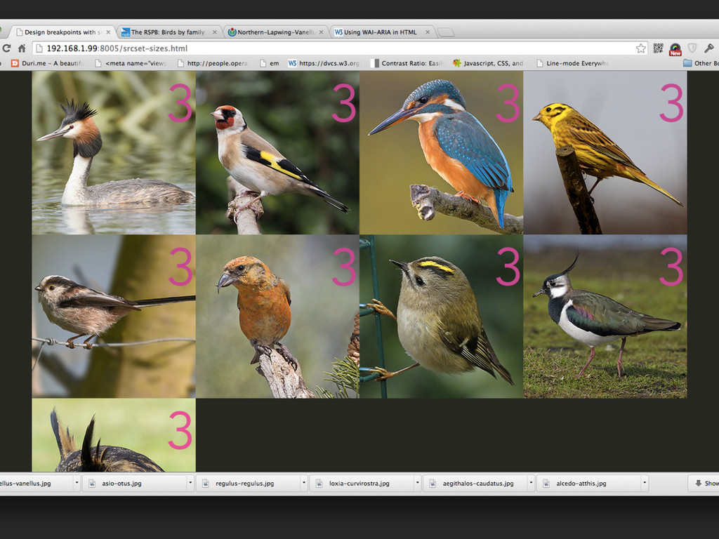
srcset= “cat.jpg 300w, cat2.jpg 600w” sizes= “(min-width:50em) 30vw, (min-width:20em) 50vw,
100vw”
None
None
None
None
None
None
None
<picture> <source srcset media> <source srcset media> <img src alt>
</picture>
<picture> <source srcset type> <source srcset type> <img src alt>
</picture>
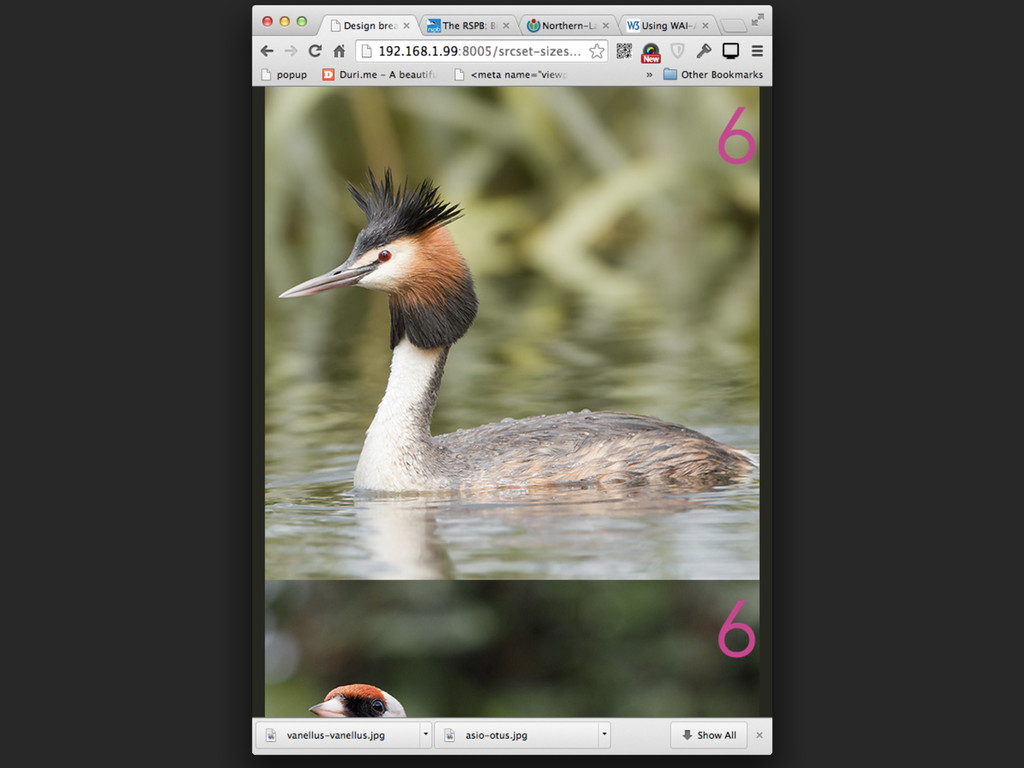
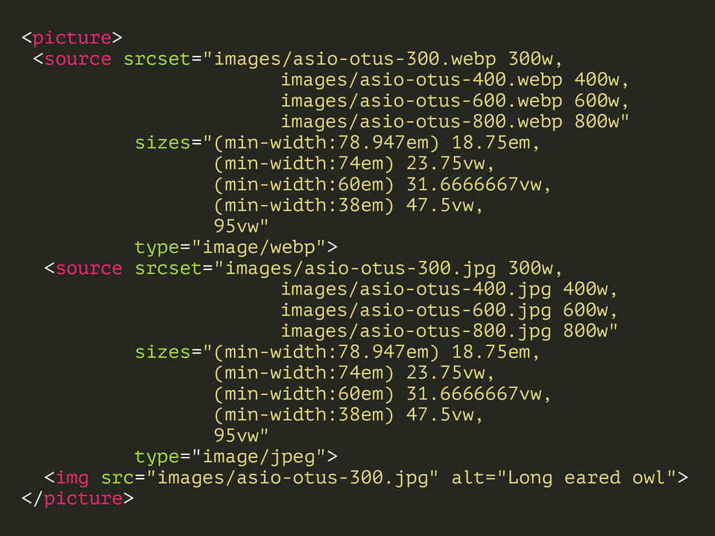
<picture> <source srcset="images/asio-otus-300.webp 300w, images/asio-otus-400.webp 400w, images/asio-otus-600.webp 600w, images/asio-otus-800.webp 800w"
sizes="(min-width:78.947em) 18.75em, (min-width:74em) 23.75vw, (min-width:60em) 31.6666667vw, (min-width:38em) 47.5vw, 95vw" type="image/webp"> <source srcset="images/asio-otus-300.jpg 300w, images/asio-otus-400.jpg 400w, images/asio-otus-600.jpg 600w, images/asio-otus-800.jpg 800w" sizes="(min-width:78.947em) 18.75em, (min-width:74em) 23.75vw, (min-width:60em) 31.6666667vw, (min-width:38em) 47.5vw, 95vw" type="image/jpeg"> <img src="images/asio-otus-300.jpg" alt="Long eared owl"> </picture>
browser support
polyfill
None
 derekjohnson
 uhyo
uhyo
 shibuiwilliam
 krrrr38
 chmikata
 ming_ayami
 kekke_n
 pict3
pict3
 yamasaki696
 eller86
 chacco38
 vtryo
vtryo
 nomizone
 michielstock
 maltzj
 jonrohan
 afnizarnur
 smashingmag
 paigeccino
 keavy
keavy
 dougneiner
 erikaheidi
 honzajavorek
 gurzu
gurzu
 varn
varn