Upgrade to Pro — share decks privately, control downloads, hide ads and more …

How to Create Effective Data Visualizations

How to Create Effective Data Visualizations

Talk from PyCon DE
April 15th 2026

Avatar for Dominik Haitz

Dominik Haitz

April 15, 2026

More Decks by Dominik Haitz

Other Decks in Programming

Transcript

  1. Agenda 1. Basic principles • Know your message • The

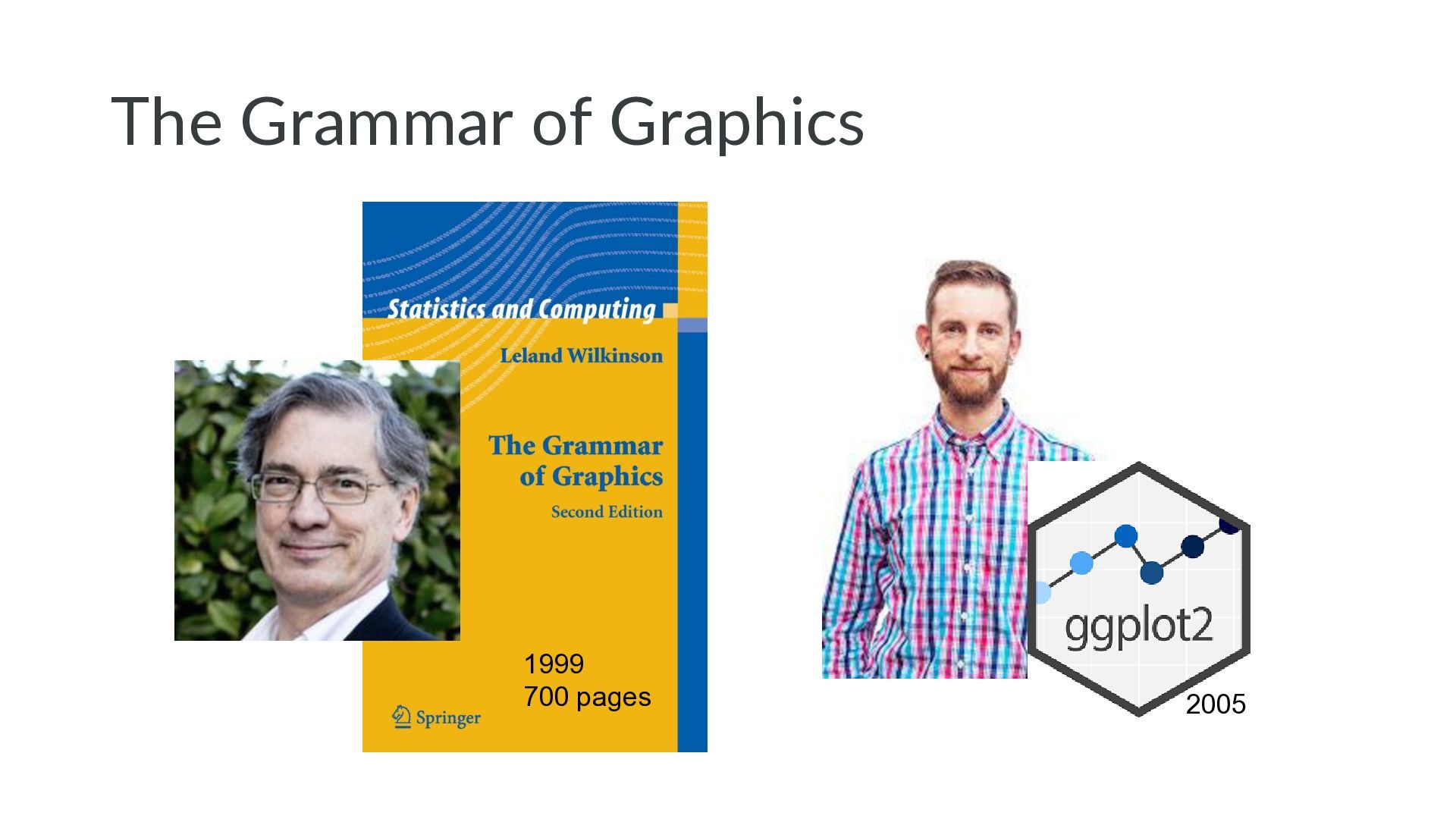
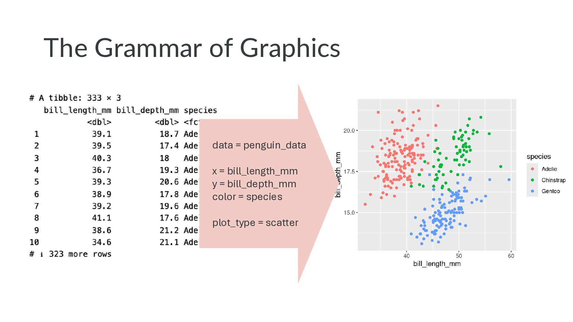
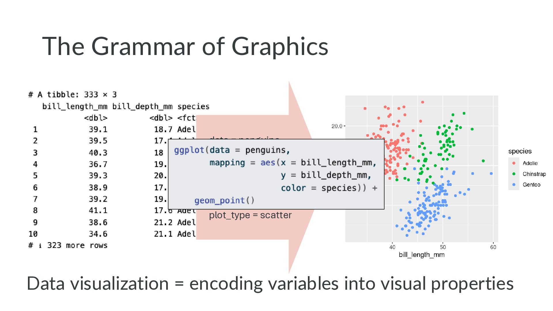
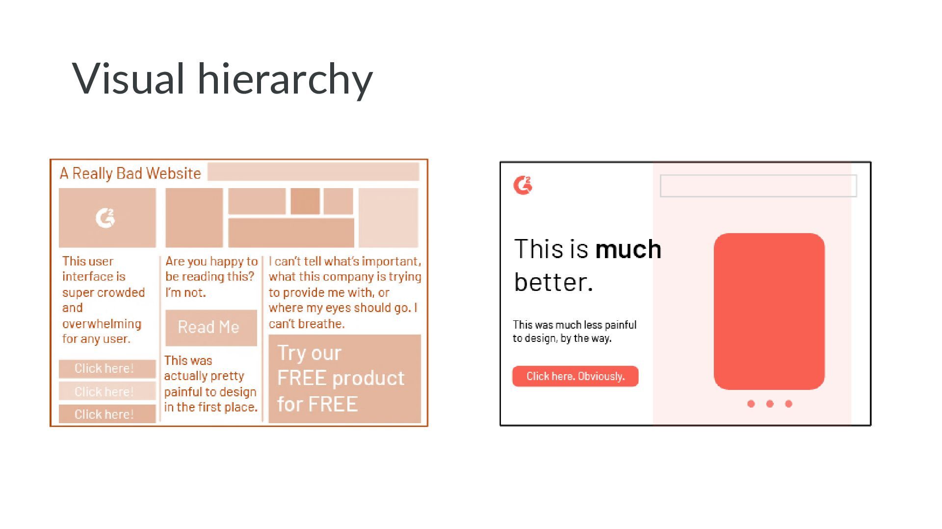
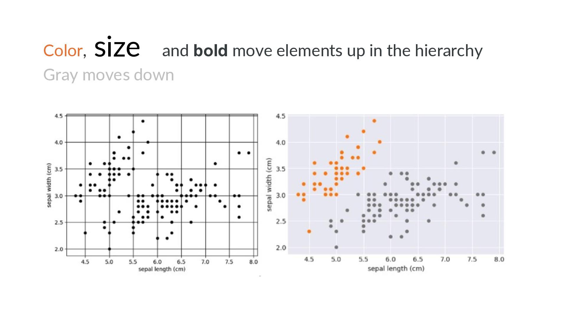
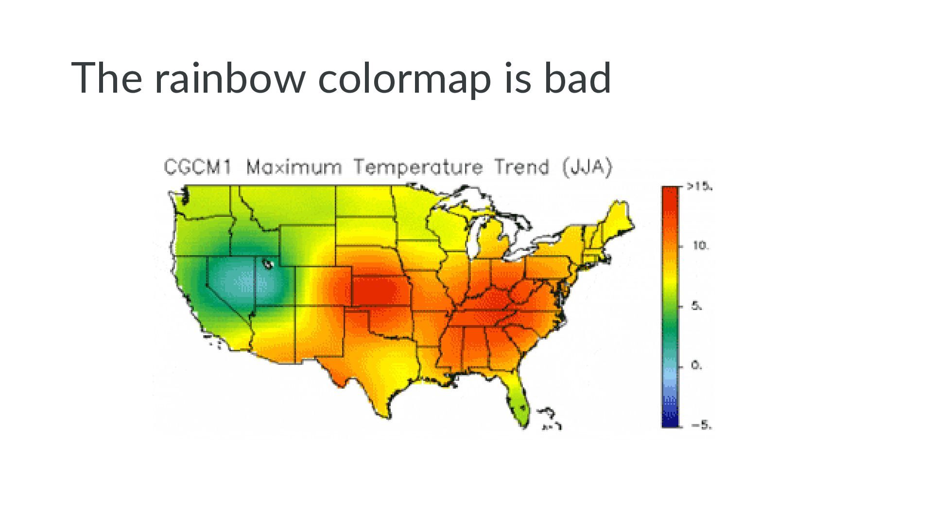
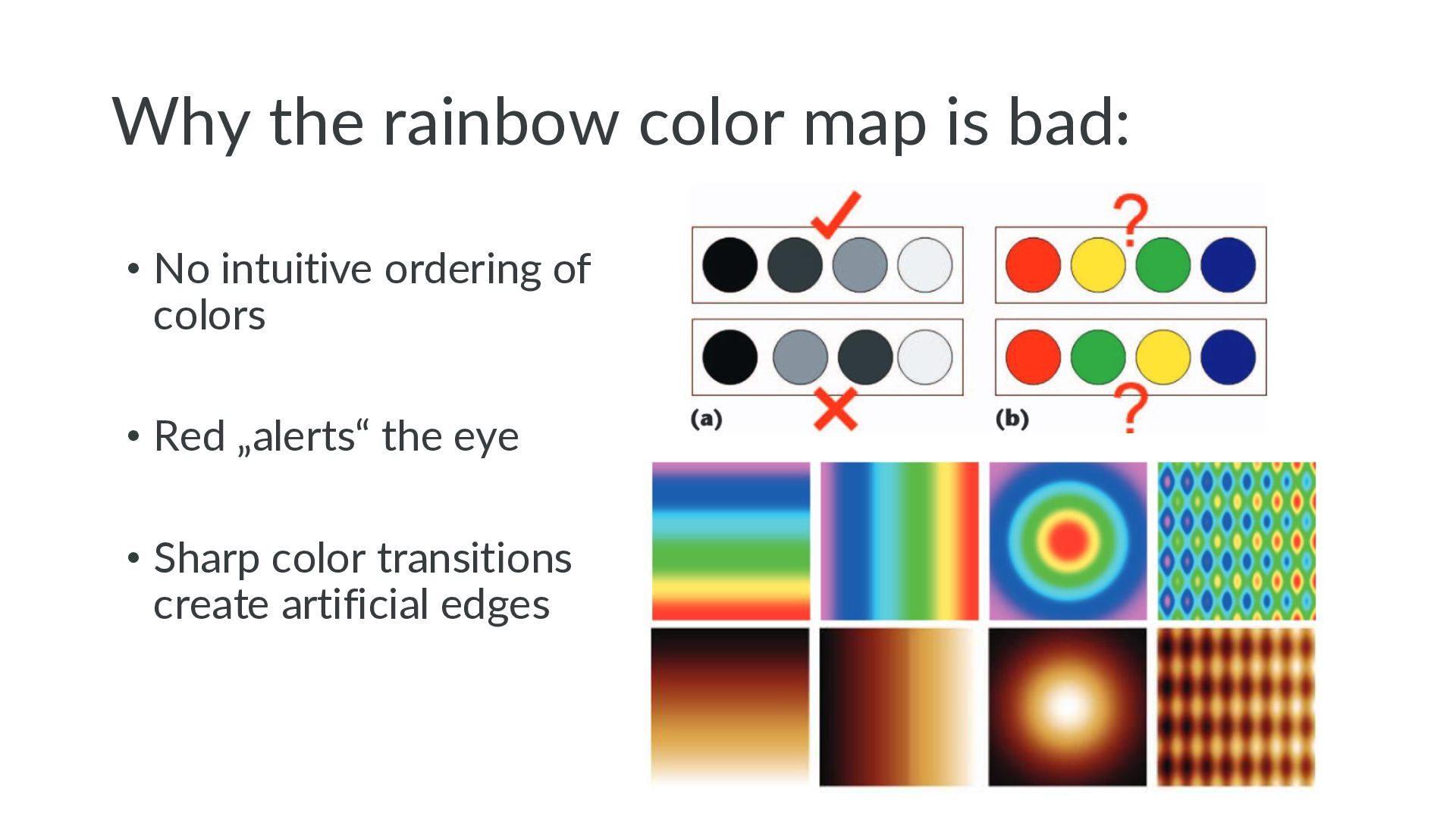
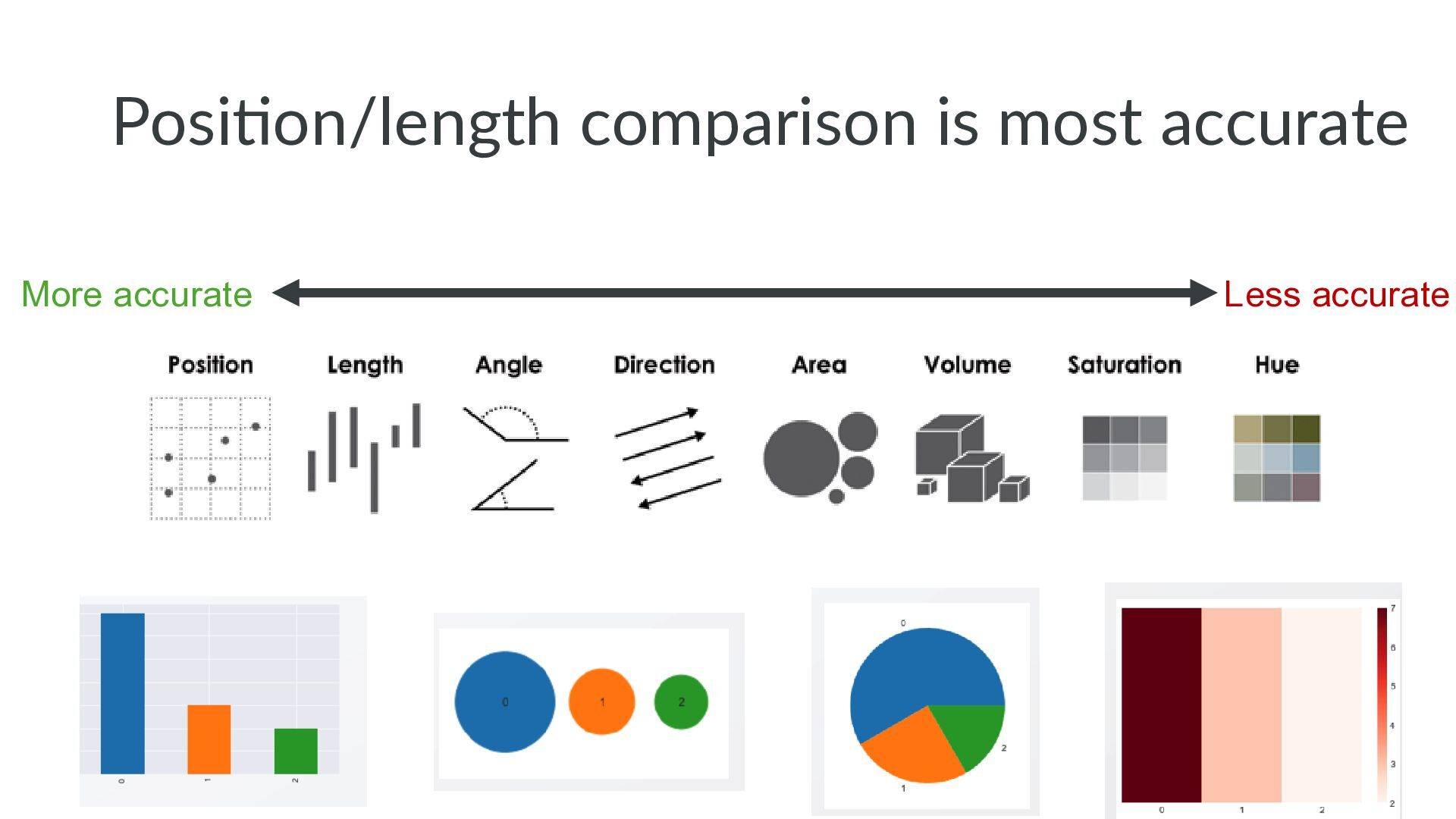
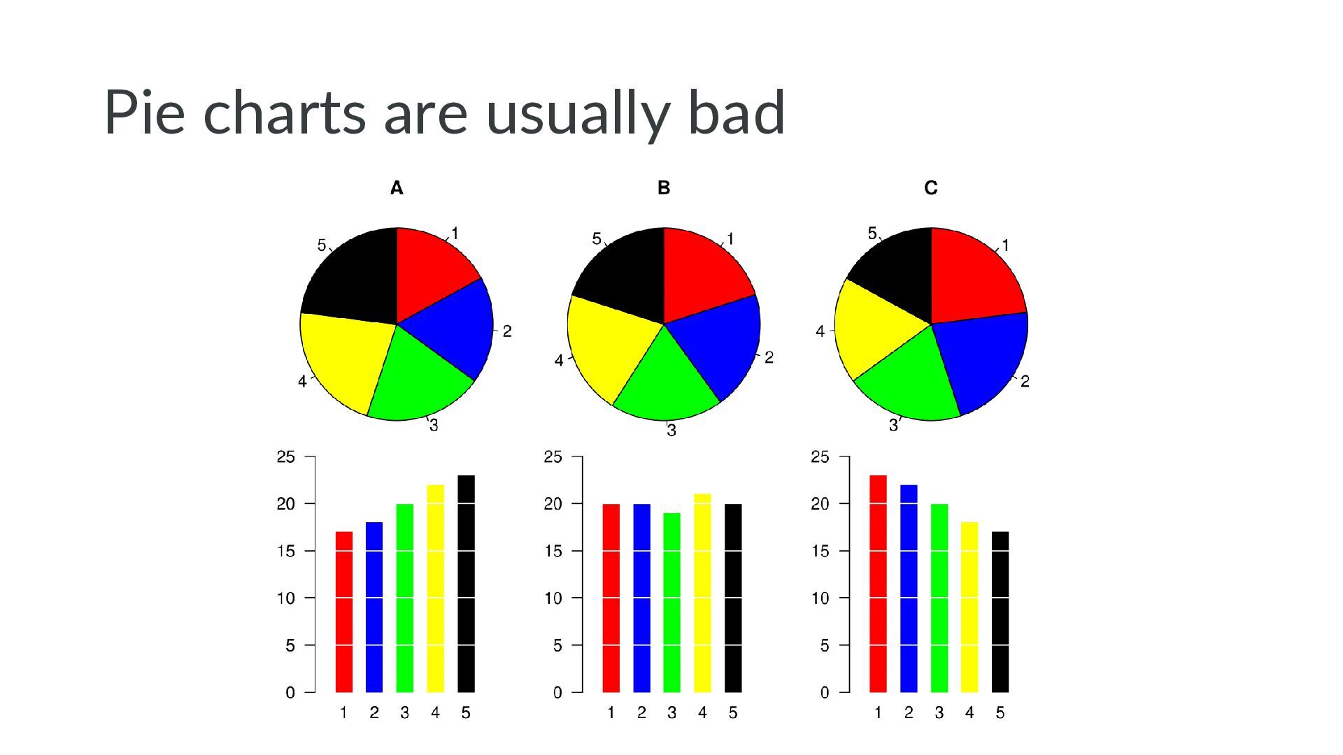
    Grammar of Graphics • Visual hierarchy 2. Dos and don‘ts • Annotations and highlighting • Colors • Visual comparability • Bonus chart types • Misc. tips and tricks 3. Data visualization landscape in Python
  2. Be conscious about your message • What you want to

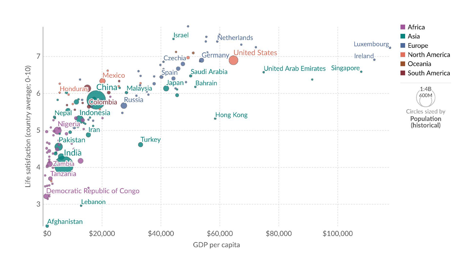
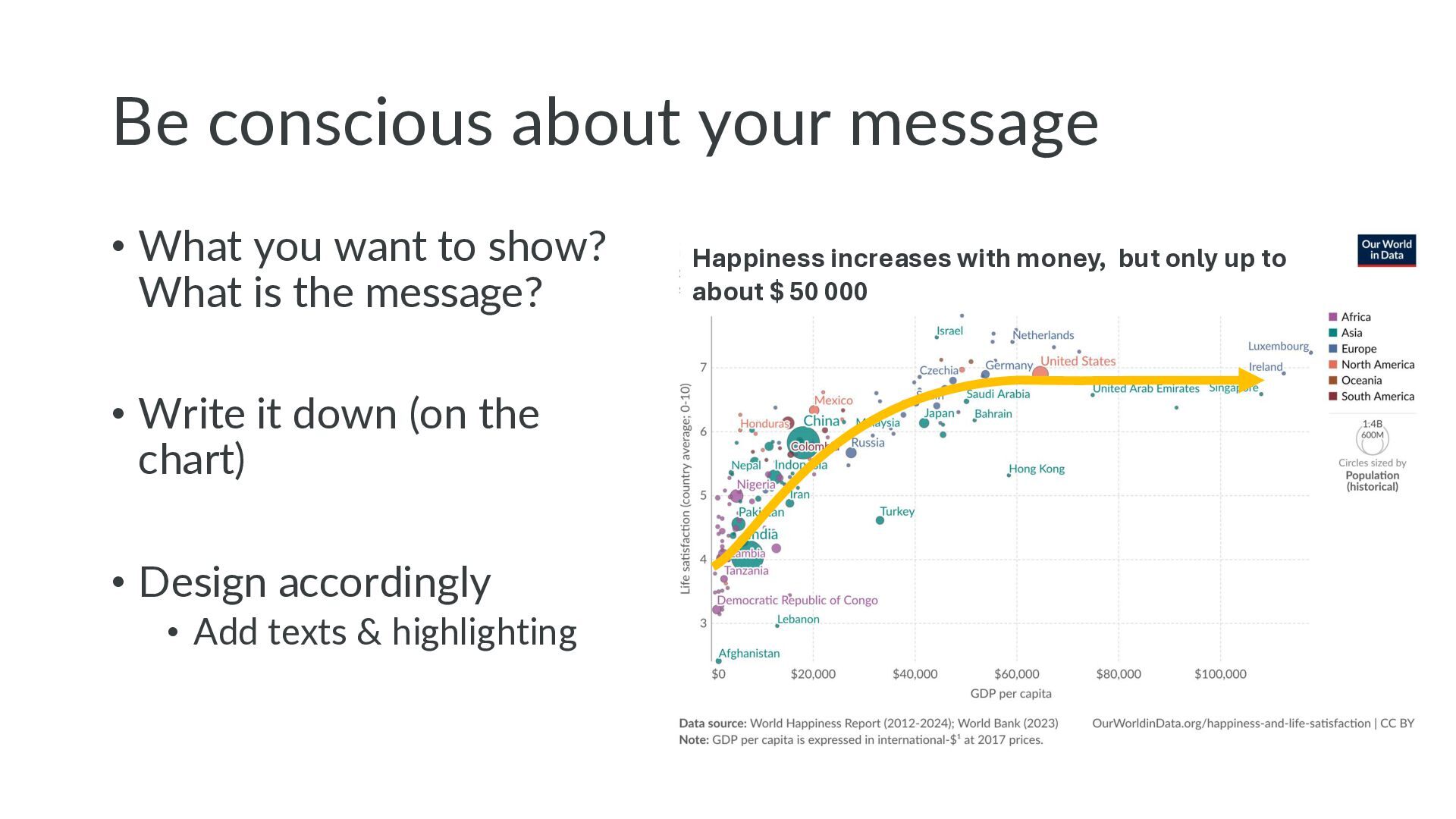
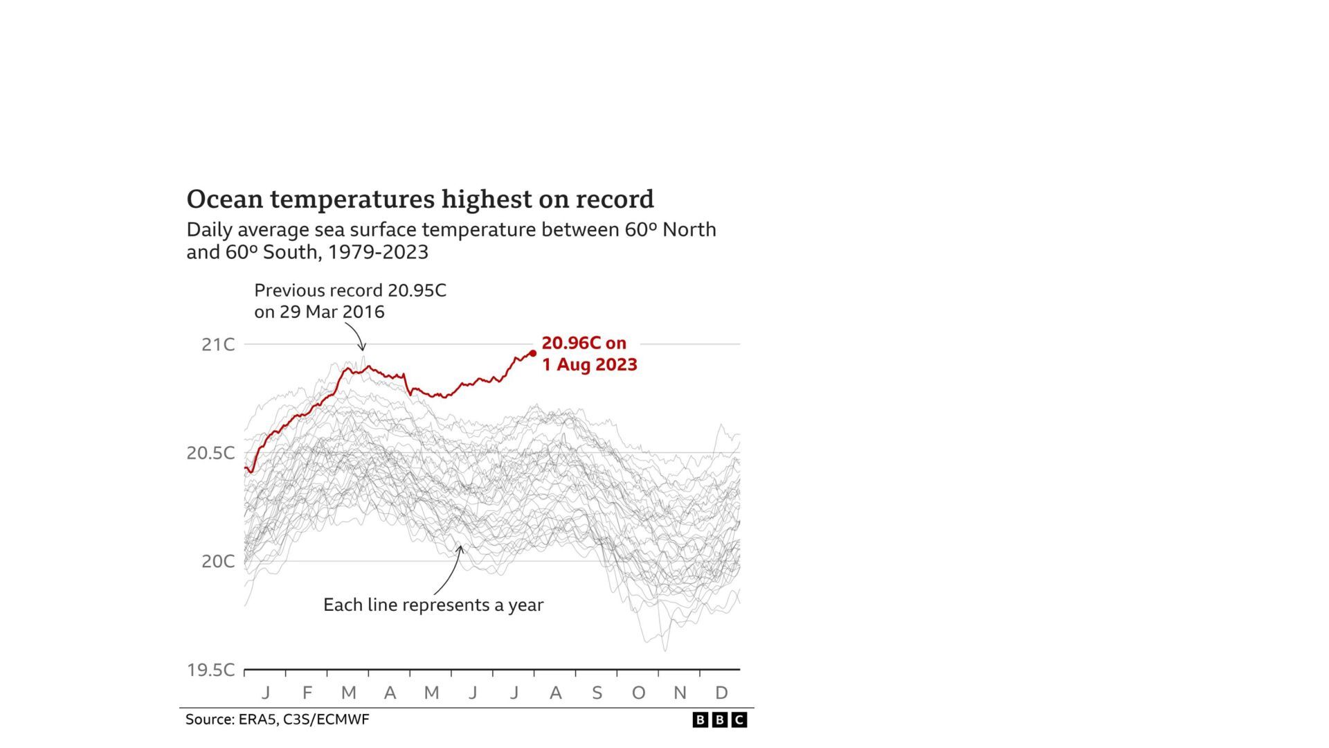
    show? What is the message? • Write it down (on the chart) • Design accordingly • Add texts & highlighting Happiness increases with money, but only up to about $ 50 000
  3. The Grammar of Graphics data = penguin_data x = bill_length_mm

    y = bill_depth_mm color = species plot_type = scatter
  4. The Grammar of Graphics data = penguins x = bill_length_mm

    y = bill_depth_mm color = species plot_type = scatter Data visualization = encoding variables into visual properties
  5. Tailor chart to audience Title: Take-home-message Comment and highlighting support

    the message Subtitle: Context Sources Explanatory comments help understand
  6. Which colors to use for which type of data Categorical

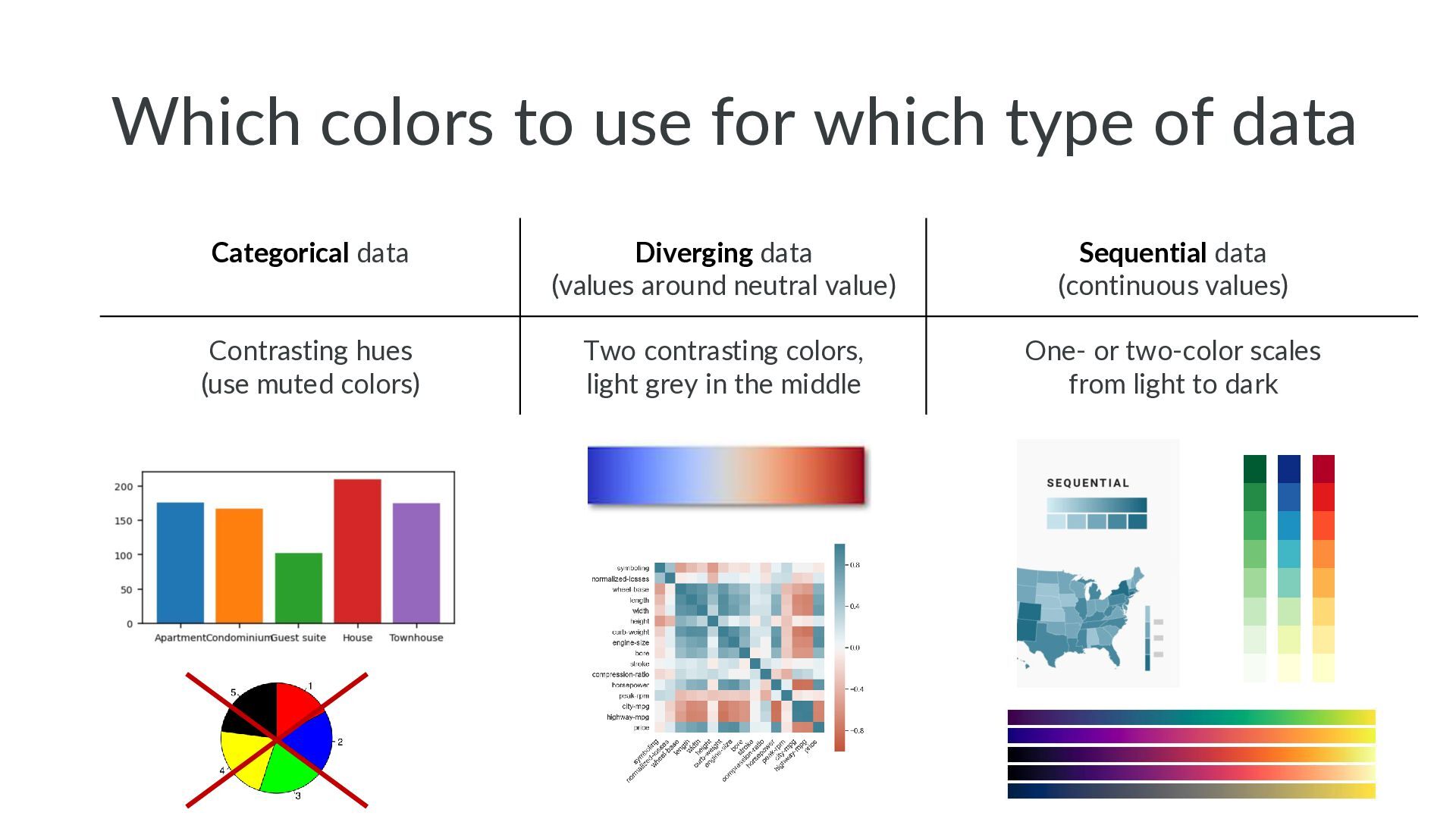
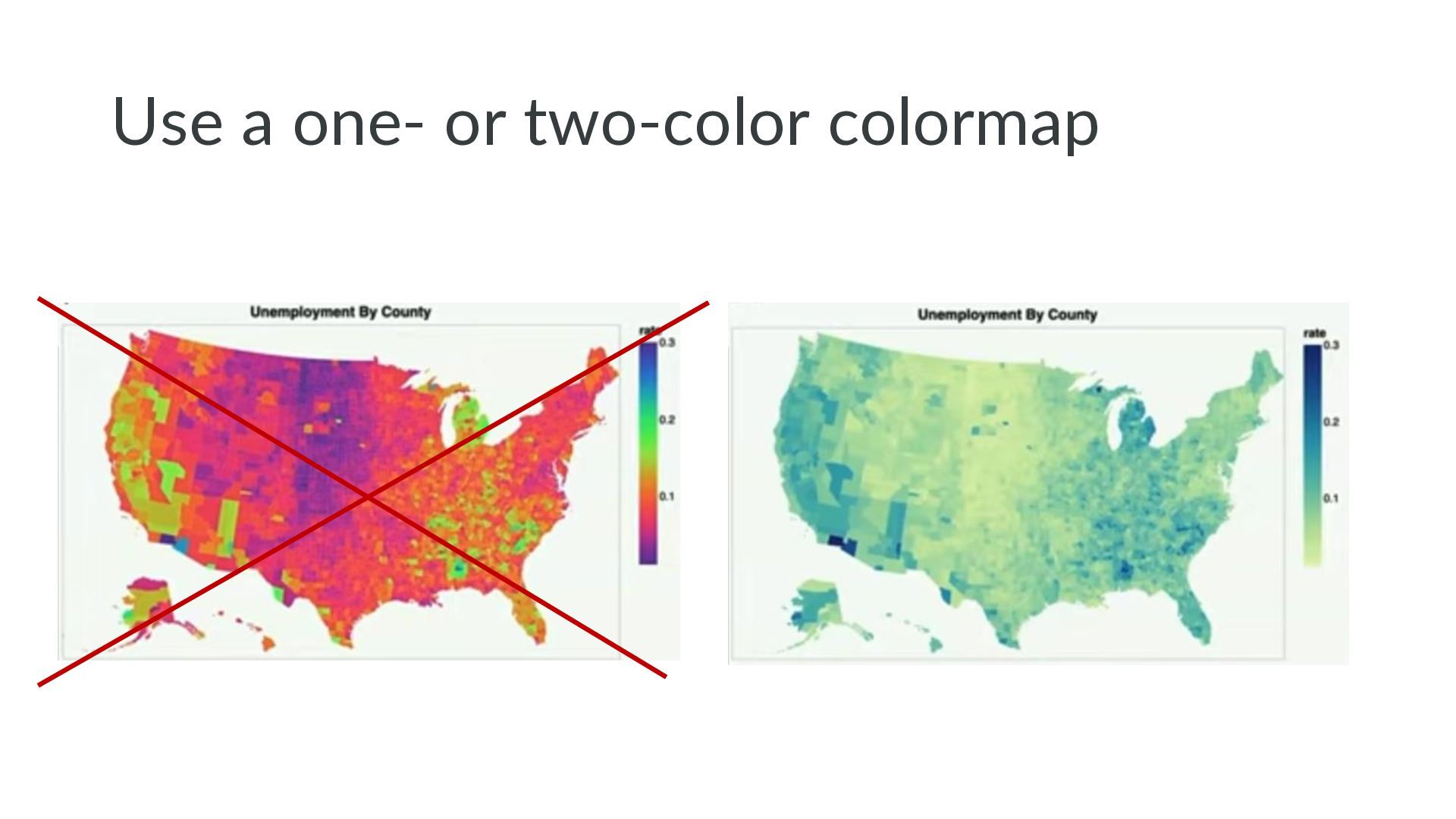
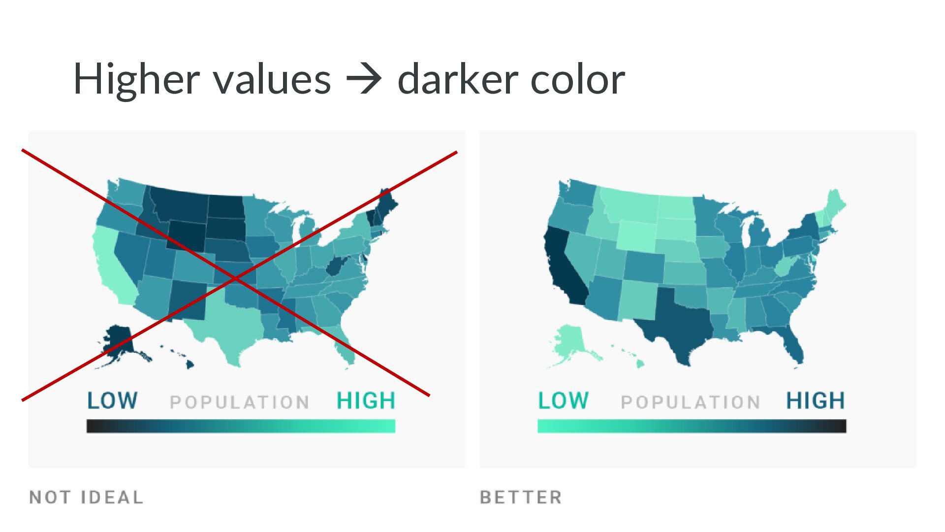
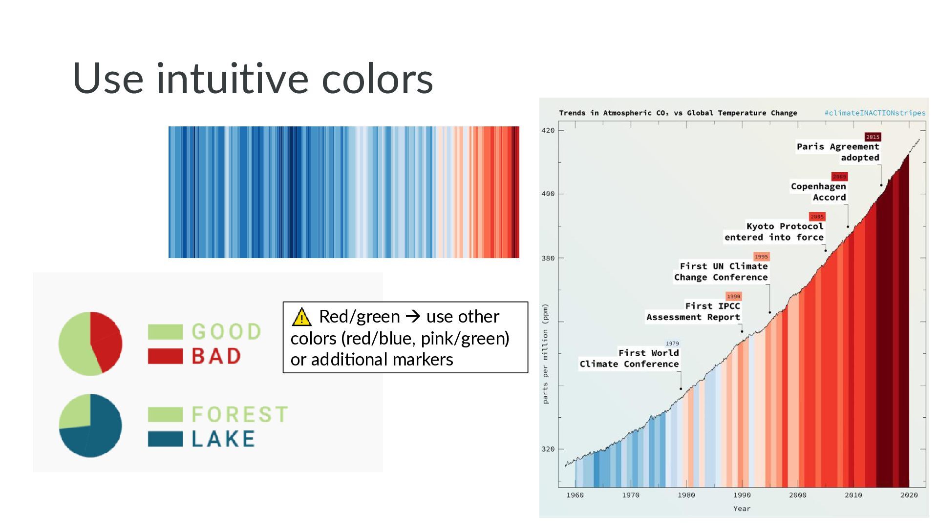
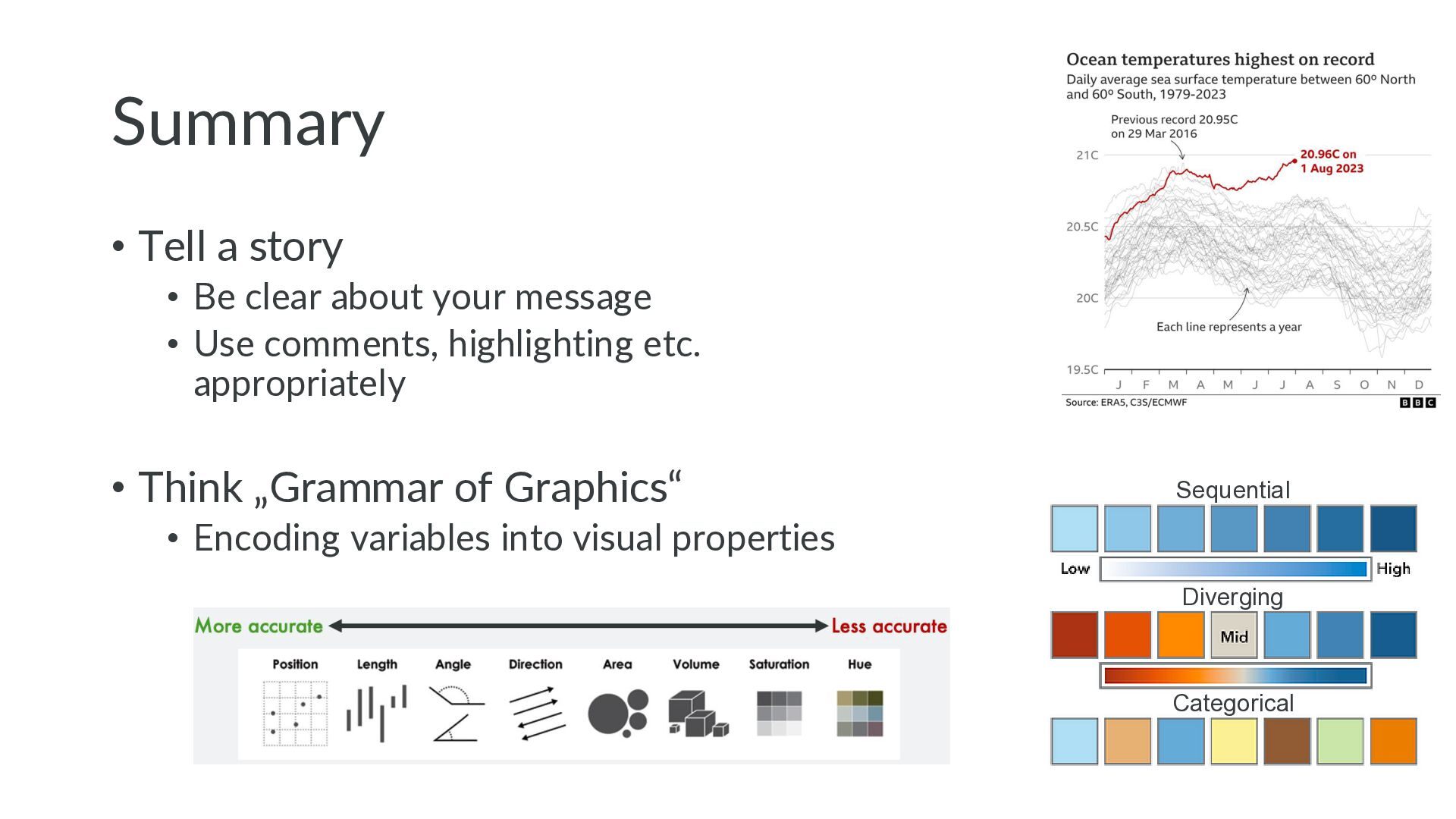
    data Diverging data (values around neutral value) Sequential data (continuous values) Contrasting hues (use muted colors) Two contrasting colors, light grey in the middle One- or two-color scales from light to dark
  7. Why the rainbow color map is bad: • No intuitive

    ordering of colors • Red „alerts“ the eye • Sharp color transitions create artificial edges
  8. Only good at: Showing sth. is the fraction of a

    whole, especially at 25 or 75%
  9. Matplotlib seaborn yellowbrick mplcyberpunk • Popular and well tested •

    High configurability → can do all kinds of plots • API can be confusing • (Previously poor stylistic defaults) plotnine
  10. Which to use • Matplolib for non-standard plots or for

    high customization • Plotly express or altair for exploration and interactive plotting in notebooks or dashboards
  11. Summary • Tell a story • Be clear about your

    message • Use comments, highlighting etc. appropriately • Think „Grammar of Graphics“ • Encoding variables into visual properties Sequential Diverging Categorical