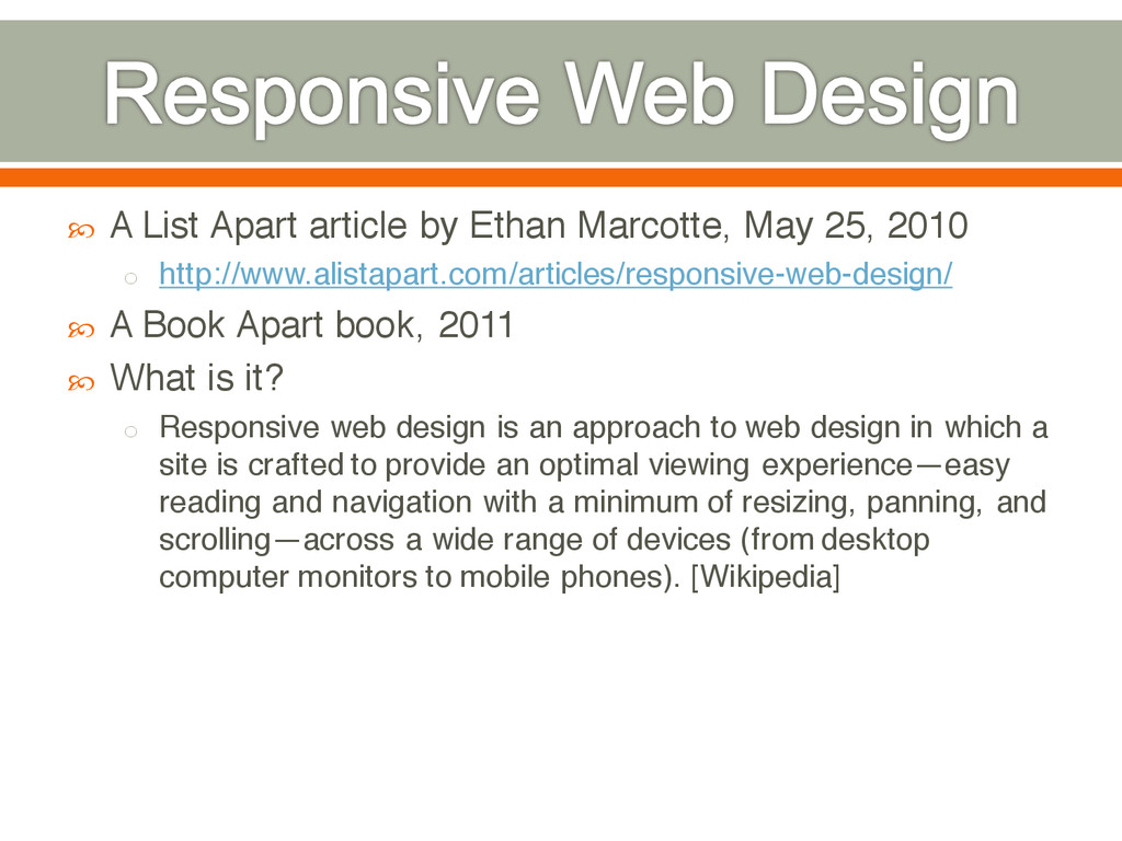
2010 o http://www.alistapart.com/articles/responsive-web-design/ A Book Apart book, 2011 What is it? o Responsive web design is an approach to web design in which a site is crafted to provide an optimal viewing experience—easy reading and navigation with a minimum of resizing, panning, and scrolling—across a wide range of devices (from desktop computer monitors to mobile phones). [Wikipedia]
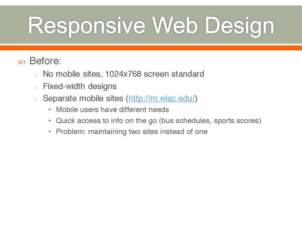
Fixed-width designs o Separate mobile sites (http://m.wisc.edu/) • Mobile users have different needs • Quick access to info on the go (bus schedules, sports scores) • Problem: maintaining two sites instead of one
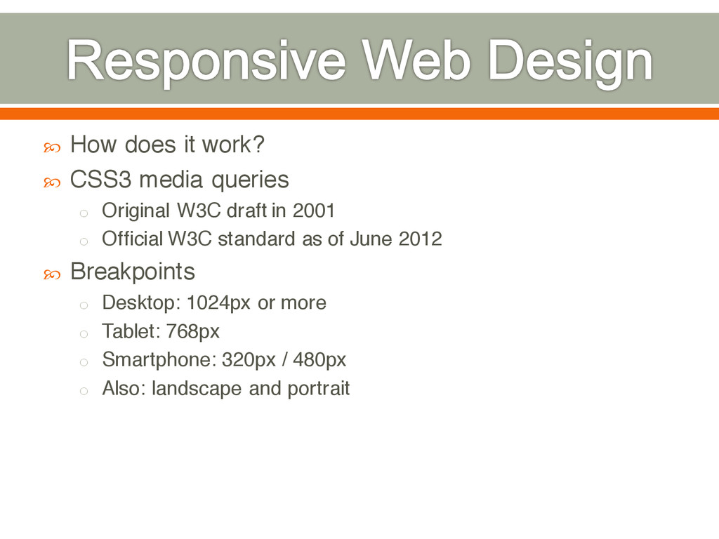
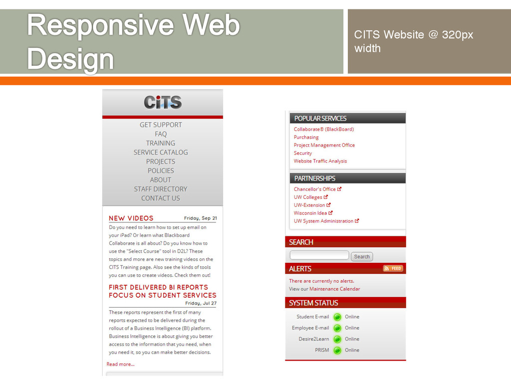
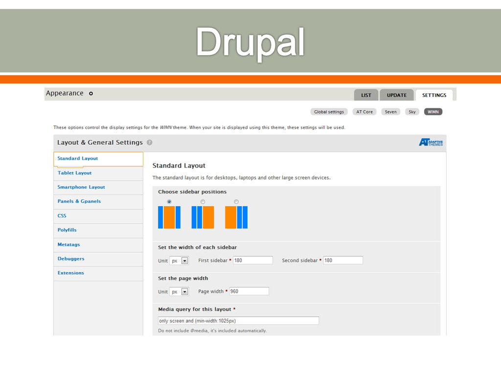
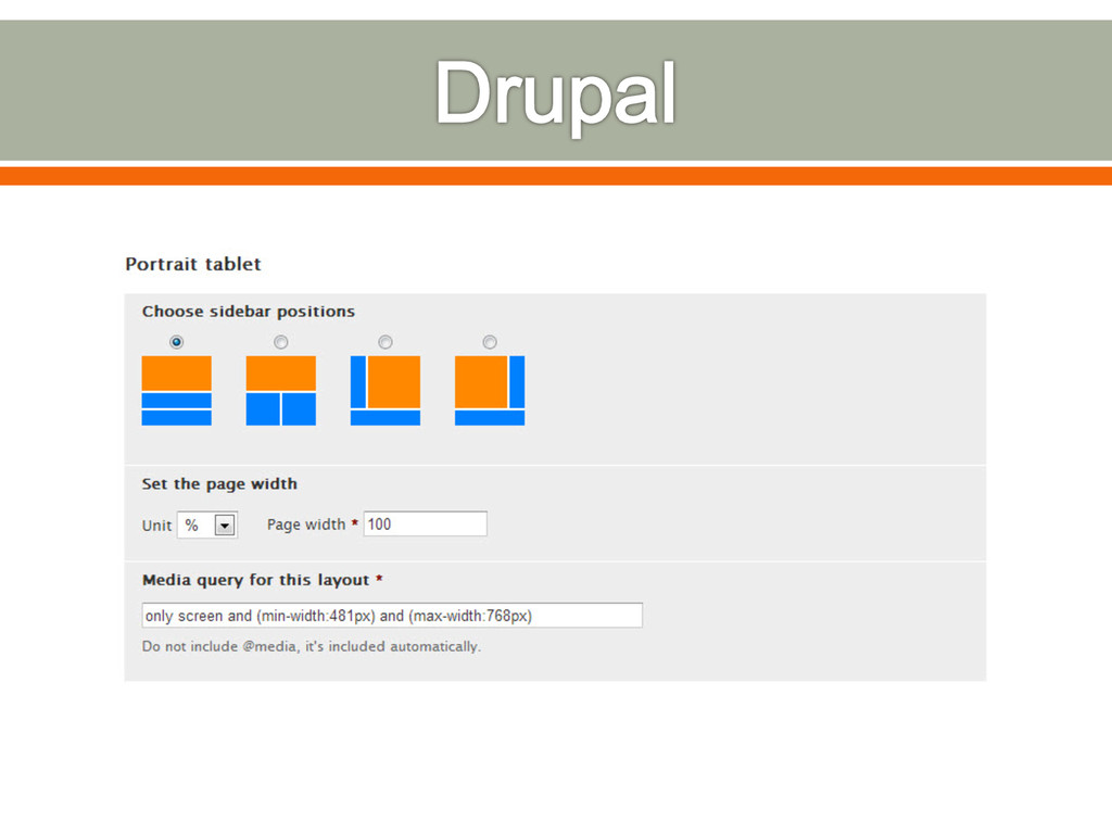
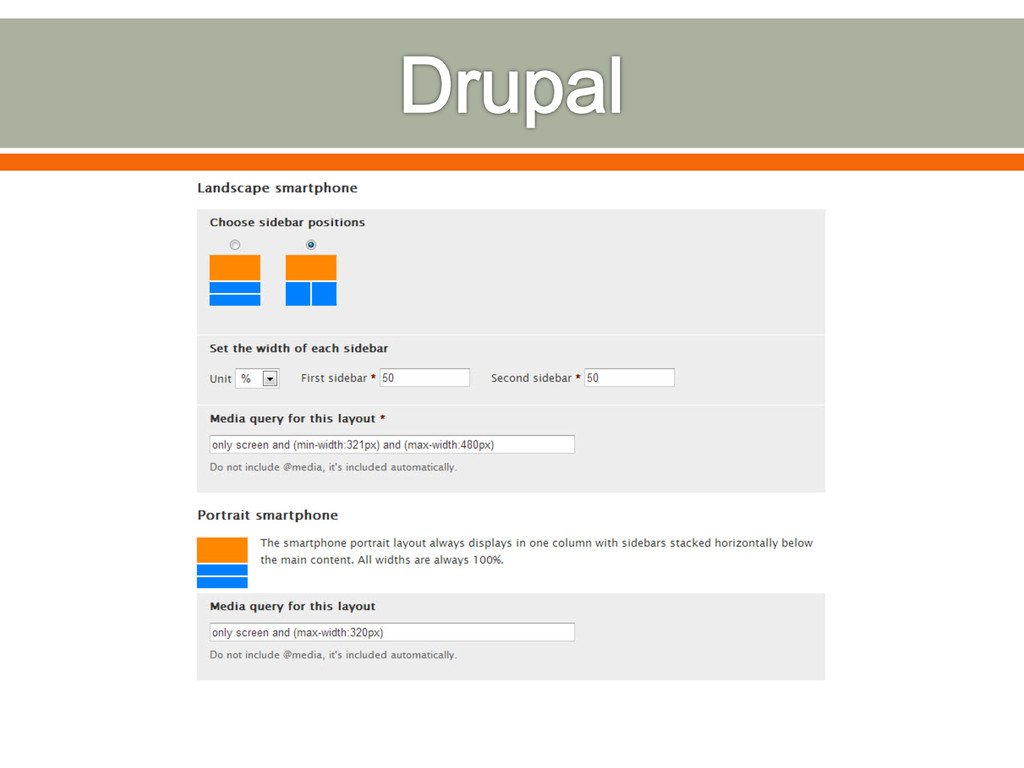
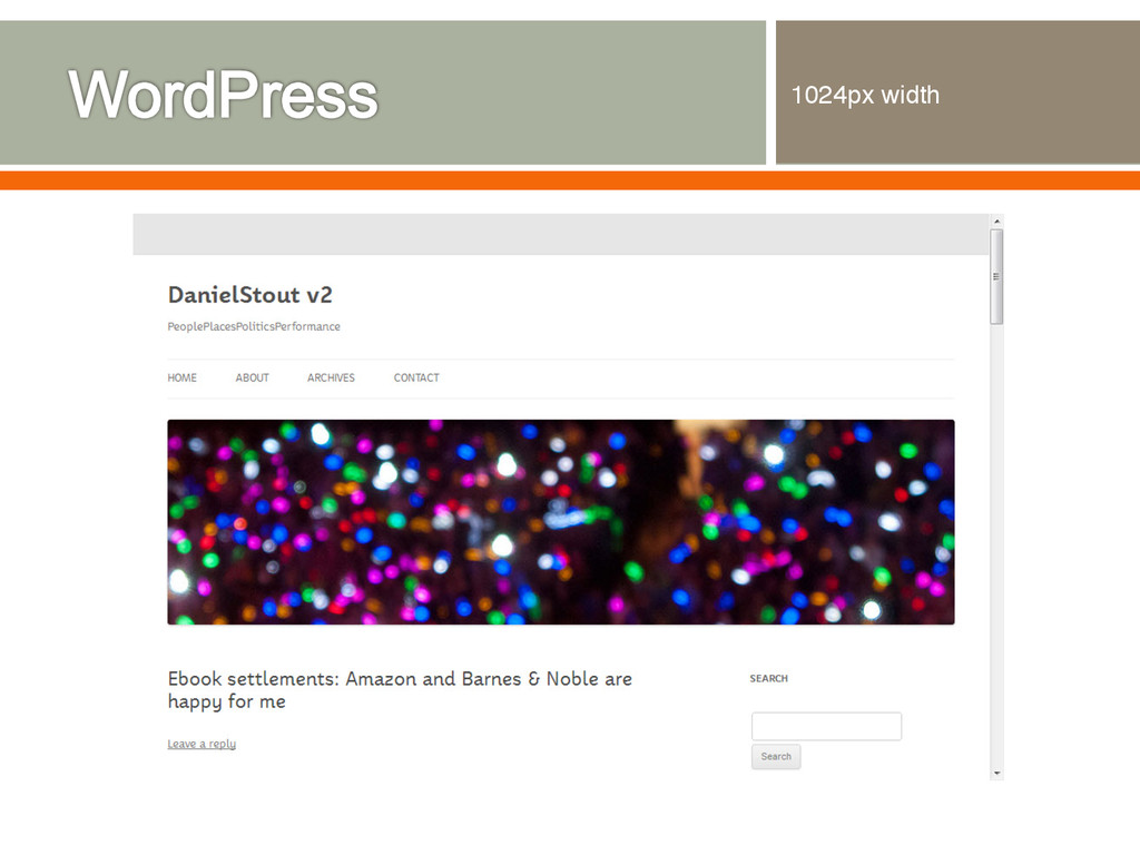
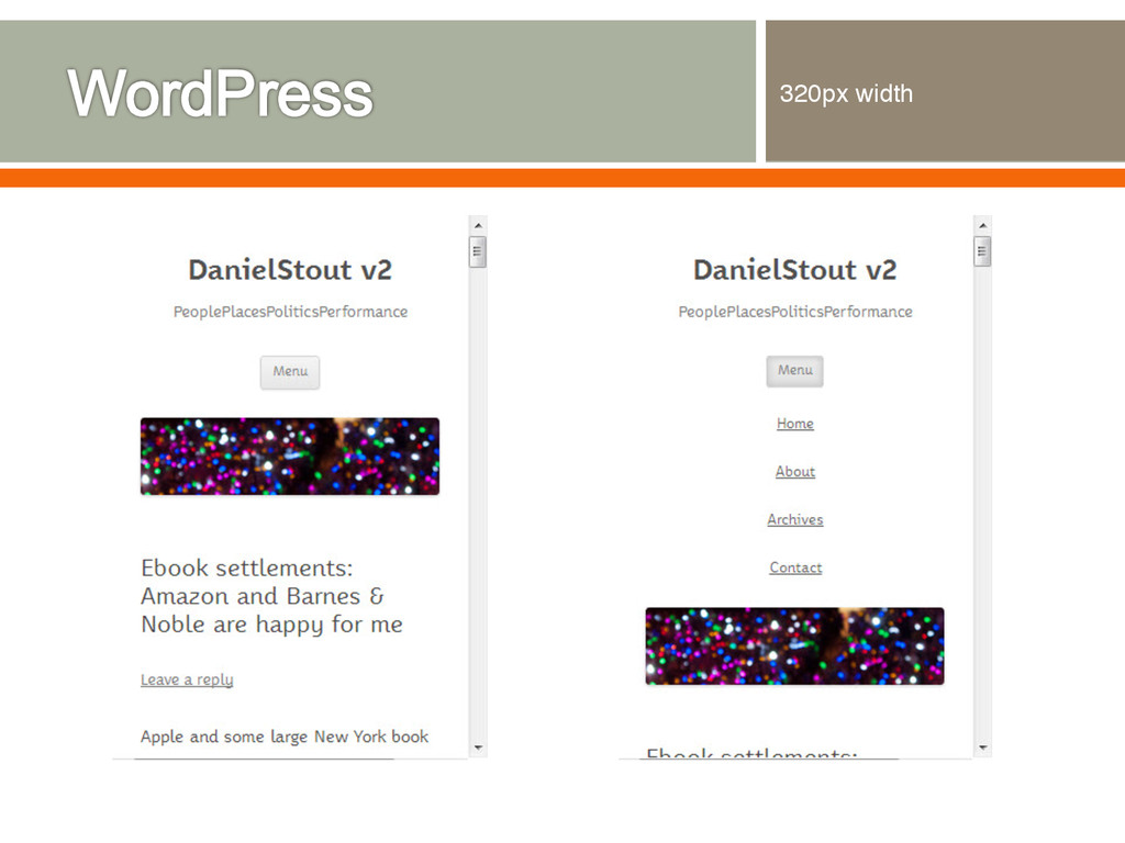
Original W3C draft in 2001 o Official W3C standard as of June 2012 Breakpoints o Desktop: 1024px or more o Tablet: 768px o Smartphone: 320px / 480px o Also: landscape and portrait
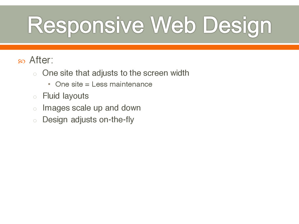
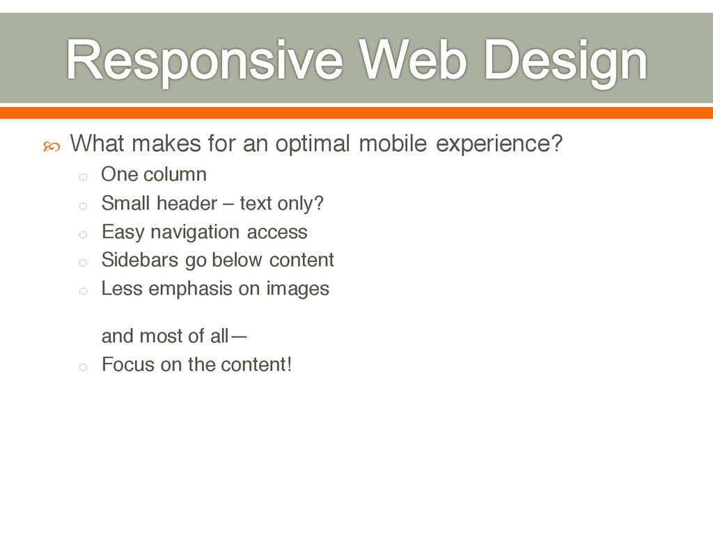
column o Small header – text only? o Easy navigation access o Sidebars go below content o Less emphasis on images and most of all— o Focus on the content!
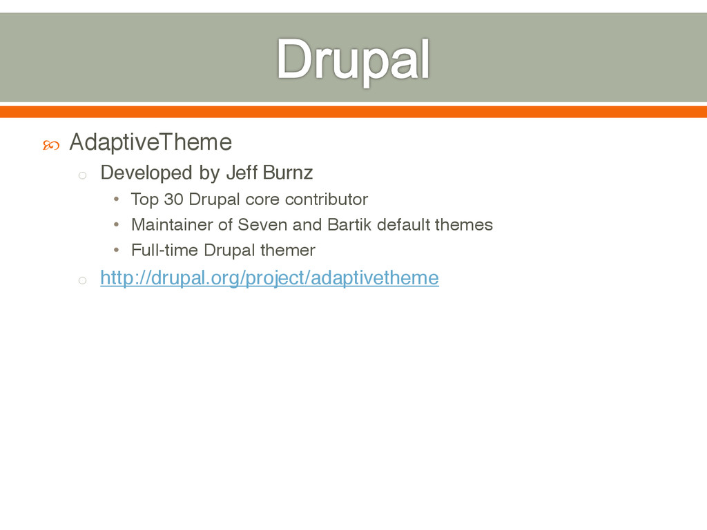
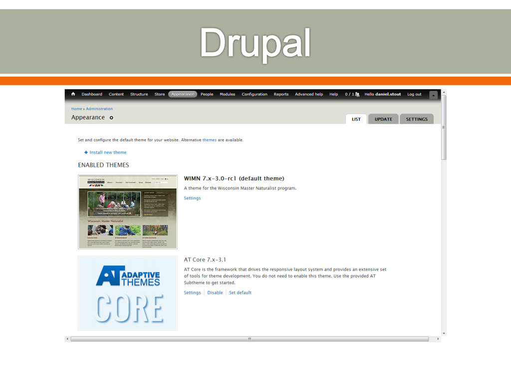
System (CMS) or Content Management Framework (CMF) Widely used in academia Look & Feel o Themes o Theme frameworks supporting RWD • AdaptiveTheme • Omega • Zen o Sub-themes o http://drupal.org/project/themes
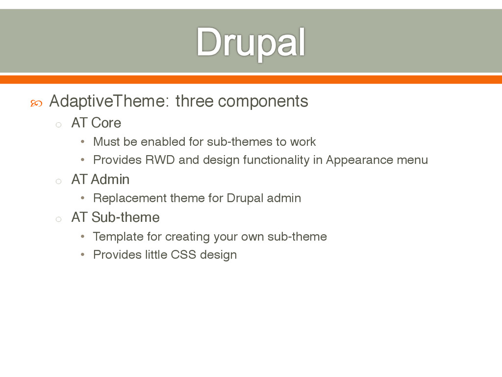
enabled for sub-themes to work • Provides RWD and design functionality in Appearance menu o AT Admin • Replacement theme for Drupal admin o AT Sub-theme • Template for creating your own sub-theme • Provides little CSS design
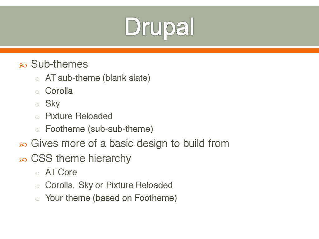
Sky o Pixture Reloaded o Footheme (sub-sub-theme) Gives more of a basic design to build from CSS theme hierarchy o AT Core o Corolla, Sky or Pixture Reloaded o Your theme (based on Footheme)
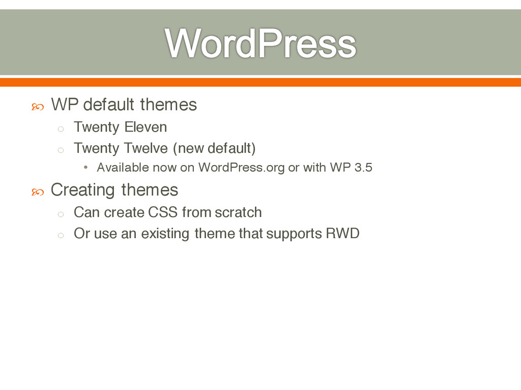
(new default) • Available now on WordPress.org or with WP 3.5 Creating themes o Can create CSS from scratch o Or use an existing theme that supports RWD
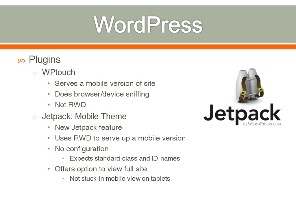
site • Does browser/device sniffing • Not RWD o Jetpack: Mobile Theme • New Jetpack feature • Uses RWD to serve up a mobile version • No configuration • Expects standard class and ID names • Offers option to view full site • Not stuck in mobile view on tablets
vs. themes • Frameworks offer a lot more functionality WordPress – o Easier to setup o Simpler out-of-the-box experience o Auto-mobile with Jetpack’s Mobile Theme
RWD: o Don’t use arbitrary pixel breakpoints o Android proves screens come in many, many sizes o Instead, base breakpoints on the design o When design breaks, create a breakpoint
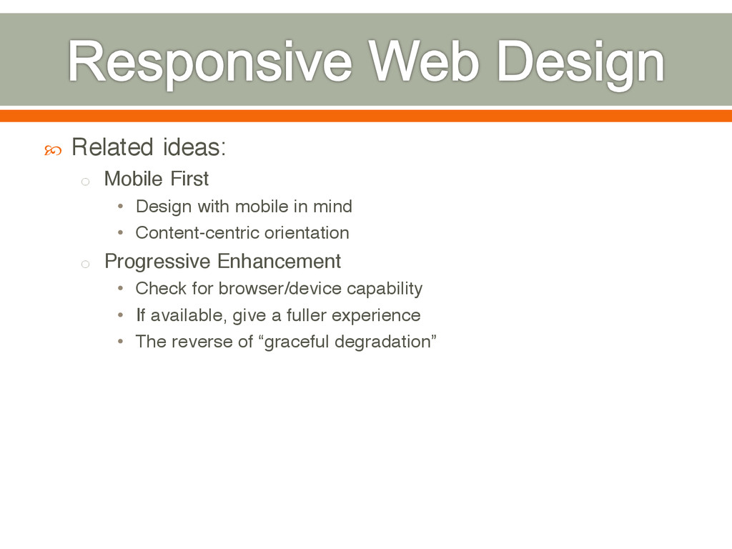
in mind • Content-centric orientation o Progressive Enhancement • Check for browser/device capability • If available, give a fuller experience • The reverse of “graceful degradation”
 dstout
 cscengineer
 jj1uzh
 ymty
ymty
 oracle4engineer
 z63d
z63d
 taka_aki
 maruloop
 sugupoko
 hwangbyeonghun
 yamasaki696
 odan611
 kintotechdev
 rkaga
rkaga
 tammielis
 sergeychernyshev
 eileencodes
 jct
jct
 tapps
tapps
 bkeepers
 notwaldorf
 tammyeverts
 marketingsoph
 rmw
rmw
 panda_program