Upgrade to Pro — share decks privately, control downloads, hide ads and more …

Building a University Website with RWD (Responsible Web Development)

Building a University Website with RWD (Responsible Web Development)

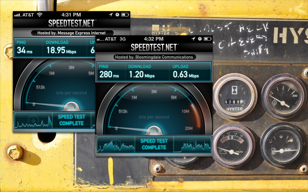
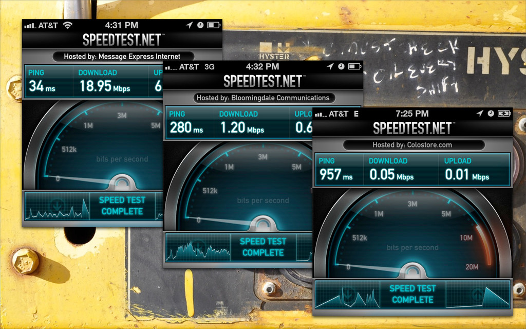
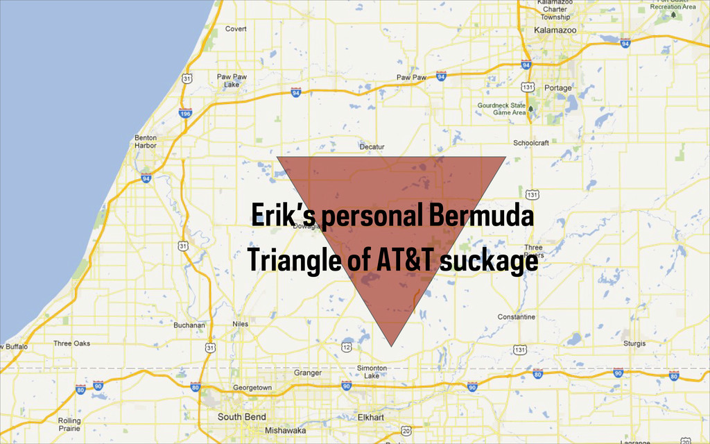
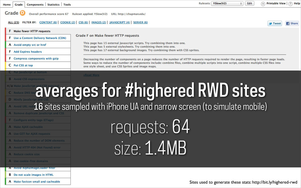
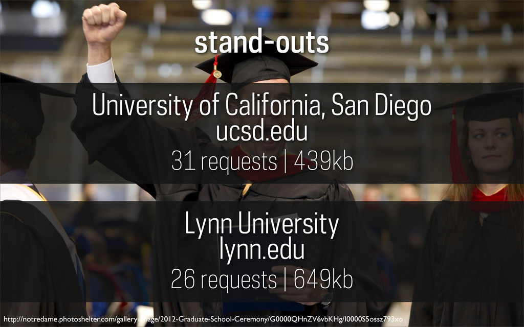
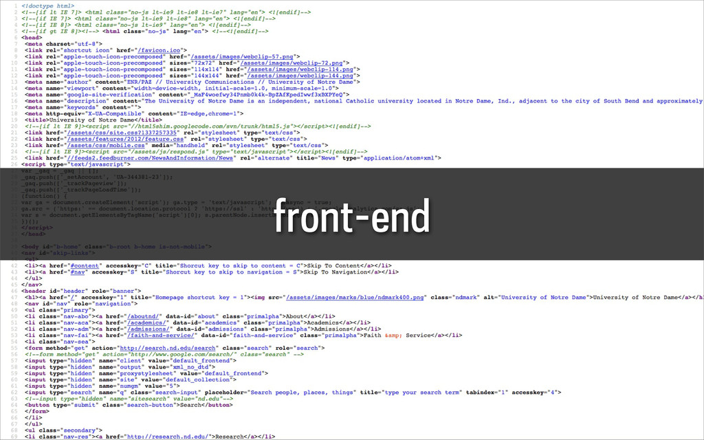
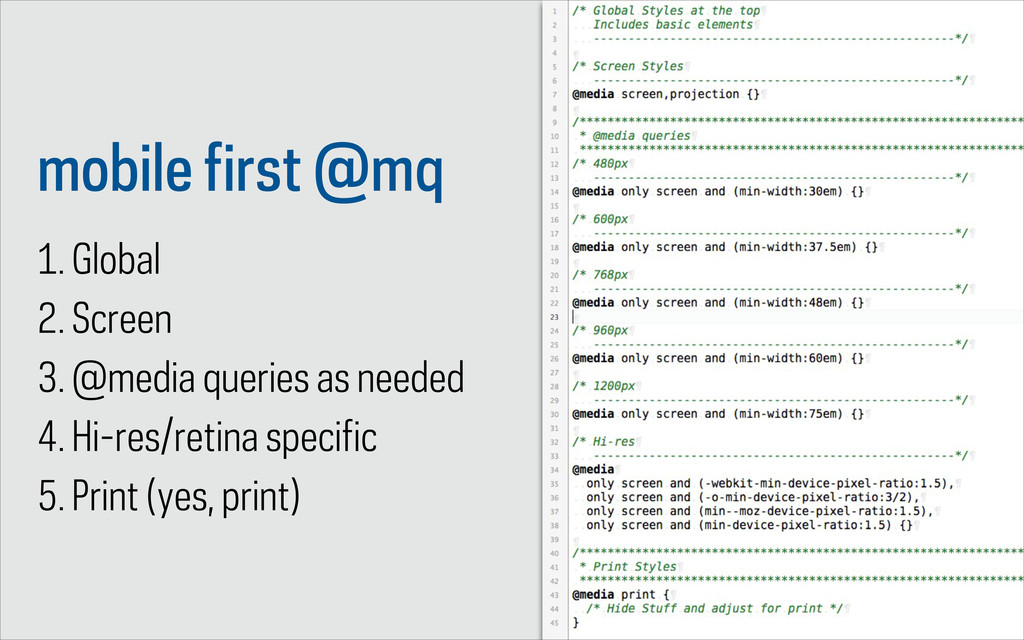
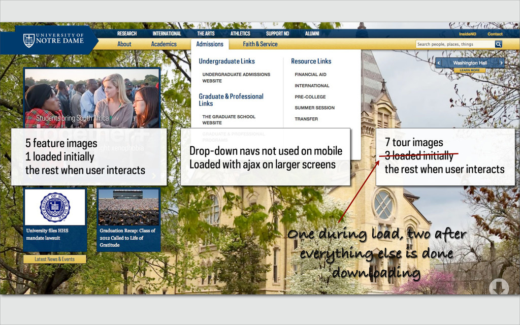
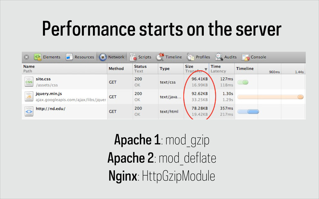
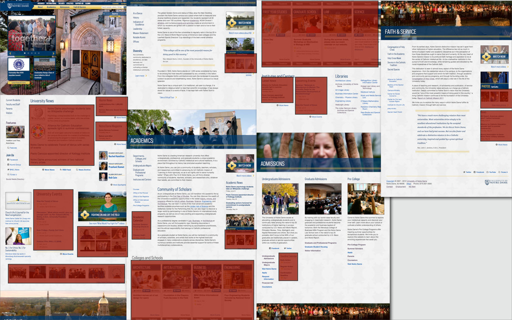
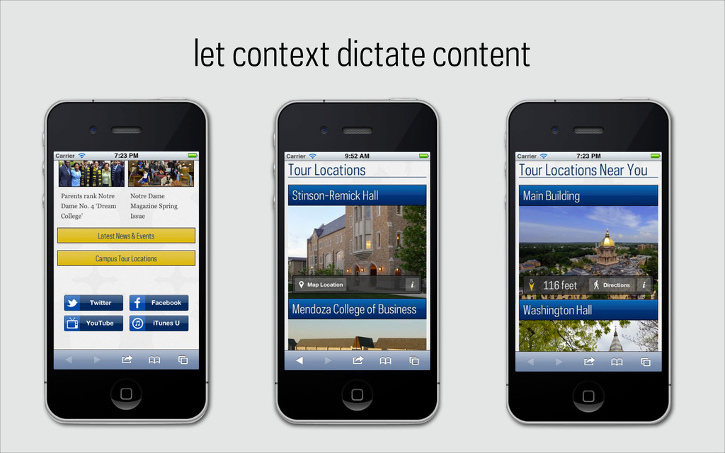
The web community is diving into responsive web design with reckless abandon. And though our intentions are good, our users may be suffering from our lack foresight. The sites we're building may look great on a smart-phone, but the megabytes of data we require them to download is resulting in less than stellar experiences. As developers, we need to take it upon ourselves to provide our users with a performant experience while at the same time providing access to all of the content and information they would expect while on a larger-screen device. This session will discuss the wide variety of issues a developer should consider while building a responsive site, including lessons learned while building the latest Notre Dame (nd.edu) homepage.

Erik Runyon
PRO

June 12, 2012
Tweet

More Decks by Erik Runyon

Other Decks in Technology

Transcript

  1. Building a University Website with RWD
    (Responsible Web Development)
    Erik Runyon | @erunyon | #PSUWeb12

    View Slide

  2. who am i?
    Erik Runyon
    Manager of Interactive Development
    Wed Developer
    University of Notre Dame

    View Slide

  3. i’m from here…

    View Slide

  4. i work here…

    View Slide

  5. only one of them plays…

    View Slide

  6. we’re all #highered

    View Slide

  7. we have a problem

    View Slide

  8. news.cnet.com/2100-1038_3-5172107.html
    nytimes.com/2005/06/21/technology/21iht-broad.html
    flickr.com/photos/foolswisdom/108953458/lightbox/
    Broadband began to overtake dial-up in
    2004*
    * In major U.S. Cities

    View Slide

  9. http://www.flickr.com/photos/specialkrb/4045683750/
    dial-up 56Kbps
    edge 384Kbps
    3g 1.2Mbps

    View Slide

  10. View Slide

  11. View Slide

  12. View Slide

  13. Erik’s personal Bermuda
    Triangle of AT&T suckage

    View Slide

  14. http://www.websiteoptimization.com/speed/tweak/average-web-page/
    http://www.webperformancetoday.com/2012/05/24/average-web-page-size-1-mb/
    “Within the last eight years, the size of the
    average web page has more than septupled, and
    the number of external objects has more than
    tripled. While broadband users have experienced
    somewhat faster response times, dial-up users
    have been left behind.”
    - websiteoptimization.com (May 31, 2011)
    In the past 18 months, the average web page has
    grown by 50% — from 702 KB in November
    2010 to 1042 KB on May 1, 2012. At this rate,
    the average page will hit 2 MB by 2015.
    - webperformancetoday.com (May 24, 2012)

    View Slide

  15. averages for #highered RWD sites
    16 sites sampled with iPhone UA and narrow screen (to simulate mobile)
    requests: 64
    size: 1.4MB
    Sites used to generate these stats: http://bit.ly/highered-rwd

    View Slide

  16. stand-outs
    University of California, San Diego
    ucsd.edu
    Lynn University
    lynn.edu
    31 requests | 439kb
    26 requests | 649kb
    http://notredame.photoshelter.com/gallery-image/2012-Graduate-School-Ceremony/G0000QHnZV6vbKHg/I0000S5ossz793xo

    View Slide

  17. front-end

    View Slide

  18. size matters

    View Slide

  19. photos = jpg (~80% compression)
    graphics = png/svg (png8 if possible)
    NOT LOL’ing

    View Slide

  20. ImageAlpha on transparent PNGs
    compress all images
    pngmini.com imageoptim.com

    View Slide

  21. requests

    View Slide

  22. Combine CSS/JS

    View Slide

  23. Image Sprites

    View Slide

  24. 13 icons x 3 colors = 39 images
    or
    39 icons combined = 7kb and 1 request

    View Slide

  25. @media only screen and (-webkit-min-device-pixel-ratio: 1.5),
    only screen and (-o-min-device-pixel-ratio: 3/2),
    only screen and (min--moz-device-pixel-ratio: 1.5),
    only screen and (min-device-pixel-ratio: 1.5) {
    .icn {background-image:url([email protected]);
    -moz-background-size:900px 1300px;
    -ie-background-size:900px 1300px;
    -o-background-size:900px 1300px;
    -webkit-background-size:900px 1300px;
    background-size:900px 1300px;
    }
    }
    http://bit.ly/JfHQOu

    View Slide

  26. CSS at the top
    JS at the bottom

    View Slide

  27. JS at the bottom
    http://developer.yahoo.com/performance/rules.html#js_bottom
    “While a script is downloading the browser won't start any
    other downloads, even on different hostnames.”

    View Slide

  28. two exceptions

    View Slide

  29. mobile first @mq

    View Slide

  30. “The absence of support for
    @media queries is in fact the
    first @media query”
    @bryanrieger
    www.slideshare.net/bryanrieger/rethinking-the-mobile-web-by-yiibu

    View Slide

  31. mobile first @mq
    1. Global
    2. Screen
    3. @media queries as needed
    4. Hi-res/retina specific
    5. Print (yes, print)

    View Slide

  32. progressive/on-request loading

    View Slide

  33. One during load, two after
    everything else is done
    downloading

    View Slide

  34. especially important here

    View Slide

  35. server-side
    http://www.flickr.com/photos/40987321@N02/5580348753

    View Slide

  36. Performance starts on the server
    Apache 1: mod_gzip
    Apache 2: mod_deflate
    Nginx: HttpGzipModule

    View Slide

  37. View Slide

  38. View Slide

  39. http://bit.ly/PHPFeedCache

    View Slide

  40. http://bit.ly/PHPFeedCache
    $cache = new FeedCache('local.xml','http://example.com/feed.xml');
    $data = simplexml_load_string($cache->get_data());
    /**
    * 1. If local file is valid, use it (defaults to 60 minutes)
    * 2. If it's not, try to cache it
    * 3. If that fails, use the local even if its expired
    */

    View Slide

  41. RESS
    (responsive design + server-side components)
    lukew.com/ff/entry.asp?1392

    View Slide

  42. RESS Tools
    http://www.flickr.com/photos/dipster1/1403240351/

    View Slide

  43. http://www.flickr.com/photos/dipster1/1403240351/
    WURFL: wurfl.sourceforge.net (free for non-commercial)
    51degrees.mobi: 51degrees.mobi (free “Lite” version)
    Device Atlas: deviceatlas.com (pay service)
    OpenDDR: openddr.org (free)

    View Slide

  44. UA-Parser/Detector
    github.com/tobie/ua-parser
    detector.dmolsen.com

    View Slide

  45. UA-Parser
    github.com/tobie/ua-parser

    View Slide

  46. View Slide

  47. require("UAParser.php");
    $result = UA::parse();
    /*
    * Some other generic boolean options
    */
    print $result->isMobile;
    // return true if the browser met criteria of a mobile browser based on the user agent information
    print $result->isMobileDevice;
    // return true if the device met criteria of a mobile device based on the user agent information
    print $result->isTablet;
    // return true if the device was a tablet according to the user agent information
    print $result->isSpider;
    // return true if the device was a spider according to the user agent information
    print $result->isComputer;
    // return true if the device was a computer according to the user agent information
    print $result->isUIWebview;
    // return true if the user agent was from a uiwebview in iOS
    ?>
    UA-Parser

    View Slide

  48. Detector
    detector.dmolsen.com

    View Slide

  49. Detector uses Modernizer’s core
    tests to provide browser features
    on the server-side

    View Slide

  50. so what?

    View Slide

  51. touch
    device orientation/motion
    lowbandwidth (uses navigator.connection - Android 2.2+)
    copyright filamentgroupinc flickr.com/photos/filamentgroup/5149016958/

    View Slide

  52. so what now?

    View Slide

  53. customize the experience

    View Slide

  54. let context dictate content

    View Slide

  55. go a little crazy

    View Slide

  56. erik runyon
    @erunyon
    weedygarden.net
    speakerdeck.com/u/erunyon

    View Slide