Upgrade to Pro — share decks privately, control downloads, hide ads and more …

Now you see it

Gang Tao
April 10, 2014

Now you see it

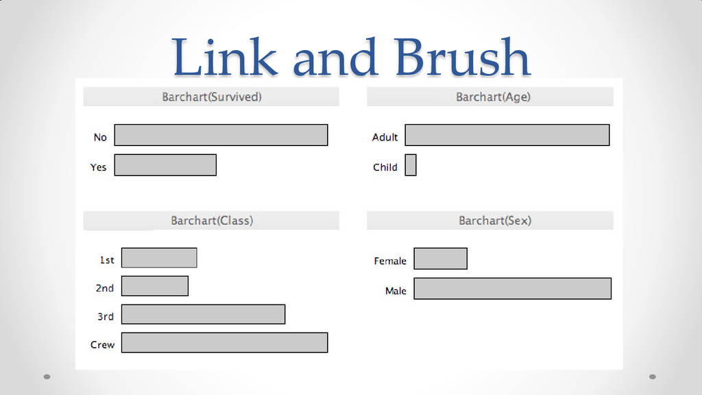
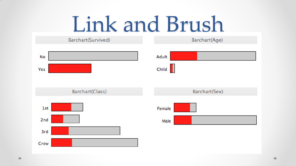
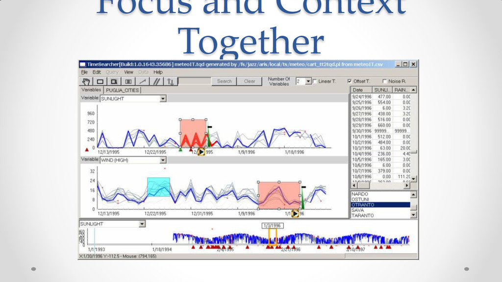
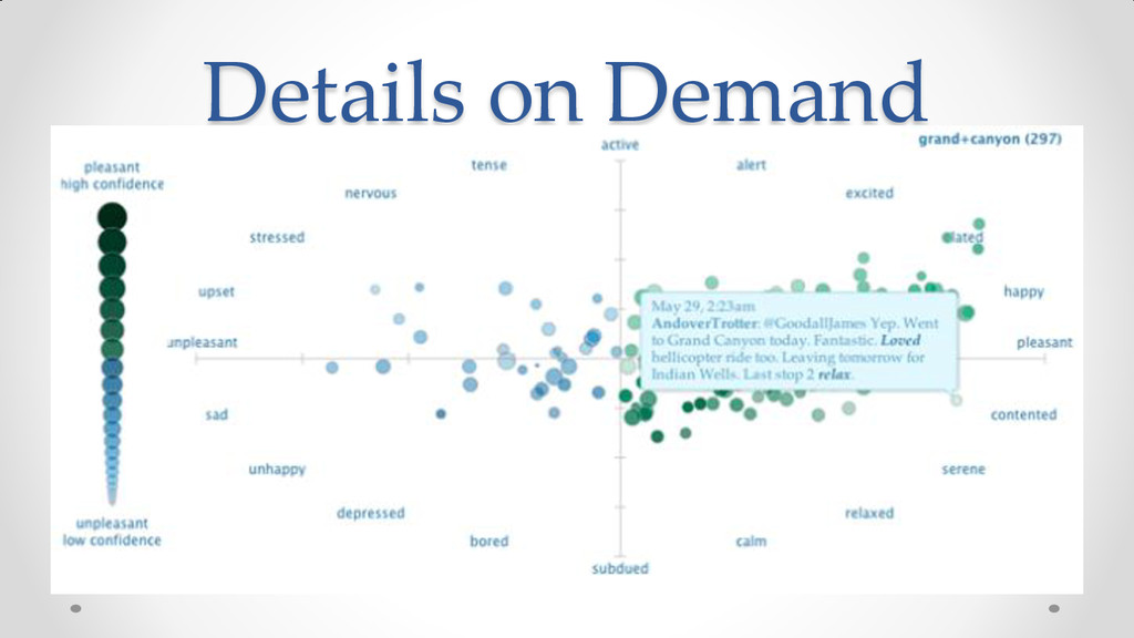
This is a reading note I made after reading the book.
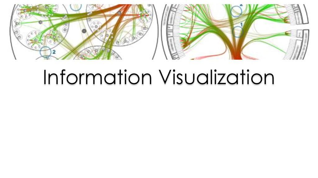
Now You See It: Simple Visualization Techniques for Quantitative Analysis teaches simple, practical means to explore and analyze quantitative data--techniques that rely primarily on using your eyes. This book features graphical techniques that can be applied to a broad range of software tools, including Microsoft Excel, because so many people have nothing else, but also more powerful visual analysis tools that can dramatically extend your analytical reach. You'll learn to make sense of quantitative data by discerning the meaningful patterns, trends, relationships, and exceptions that measure your organization's performance, identify potential problems and opportunities, and reveal what will likely happen in the future. Now You See It is not just for those with "analyst" in their titles, but for everyone who's interested in discovering the stories in their data that reveal their organization's performance and how it can be improved.

Gang Tao

April 10, 2014
Tweet

More Decks by Gang Tao

Other Decks in Technology

Transcript

  1. Term - Visualization •Exploration •Sense-making Activity •Information Visualization •Scientific Visualization

    Technologies •Understanding Immediate Goal •Good Decisions End Goal Communication Graphical Presentation
  2. Definition of Data Visualization • Computer-supported • Interactive • Visual

    Representations • Abstract Data • Amplify Cognition The purpose of information visualization is not to make pictures, but to help us to think
  3. Visual Perception • We do not attend to everything that

    we see. • Visual perception is selective, at it must be for awareness of everything would overwhelm us. • Our attention is often drawn to contrasts to the norm. • Memory plays an important role in human cognition, but working memory is extremely limited. • Our eyes are drawn to familiar patterns. • We see what we know and expect.
  4. Visualization Attributes • Form • Length, Width, Orientation, Size, Shape,

    Curvature, Enclosure, Blur • Color • Hue, Intensity • Spatial Position • 2-D Position, Spatial Grouping • Motion • Direction
  5. Building Block Information Visualization Visual Patterns, Trends, and Exceptions Understanding

    Good Decision Quantitative Reasoning Quantitative Relationship Quantitative Comparisons Visual Perception Visual Properties Visual Objects
  6. Effectiveness of Visualization • Ability to clearly and accurately represent

    information • Ability to interact with visualization to figure out what the information is
  7. Ways of Interacting • Comparing • Sorting • Adding variables

    • Filtering • Highlighting • Re-scaling • Accessing details on demand • Annotating • Bookmarking • Aggregating • Re-expressing • Re-visualizing • Zooming and Panning
  8. 3D

  9. Comparing • Provide a selection of graphs that support the

    full spectrum of commonly needed comparisons • Provide graphs that are designed for easy comparison of those values and relevant patterns without distraction • Provide the means to place a great deal of information that we wish to compare on the screen at the same time, thereby avoiding the need to scroll or move from screen to screen
  10. Sorting • Provide the means to sort items in a

    graph based on various values, especially the values that are featured in the graph • Provide extremely quick and easy means to re-sort data in different ways, ideally with a single click of the mouse • Provide the means to link multiple graphs and easily sort the data in each graph in the same way, assuming that the graphs share a common categorical variable.
  11. Adding Variables • Provide convenient access to every available variable

    that might be needed for analysis • Provide easy means to add a variable to or remove one from the display, such as by directly grabbing the variable and placing it or removing
  12. Filtering • Easy filtering based on any information in the

    connected data source not just based o information that is currently being displayed • Allow date to be filtered rapidly using simple controls, the lag time between issuing the filter command and seeing the result should be almost unnoticeable. • Provide means to directly select items in a graph and then remove them from display by single/two click • Visible feedback on filter • Complex filter with multiple conditions • Filter multiple graph that linked together
  13. Highlighting • Provide the means to highlight a subset of

    data by selecting from lists of categorical items. • Provide the means to highlight a subset of data by directly selecting it in a graph (mouse click, brush) • Highlight selected information so that it can be seen independently from the rest while still allowing viewers to se the entire set of data • Provide the means to highlights a set of items I none graph and have those same items automatically highlighted in other graphs that share the same dataset (link)
  14. Aggregating • Provide the means to easily aggregate the quantitative

    data to the level of items In a categorical variable • Provide the means to easily aggregate data in a number of useful way, especially summing, averaging and counting • Provide the means to easily aggregate data based on equal intervals of a quantitative variable. • Process the transition from one level of aggregation to another without noticeable delay (Drill down/up) • Ad Hoc Grouping
  15. Drill • Define hierarchical relationship among categorical variables • Drill

    down/up through hierarchy with no more than one/two click • Can skip levels • Support nature hierarchies such as time
  16. Re-Expressing • Switch current unit of measure to percentage •

    Re-express values in terms of how they compare to a reference value or as a rolling value
  17. Re-visualizing • Easily and Rapidly switch from one type to

    another • List the available graph types that are appropriate for current data • Prevent or make more difficult the selection of the graph that would display the data inappropriately
  18. Zooming and Pan • Directly select an area of a

    graph and then zoom into it with a single click • Zoom back • Pan when some portion of the graph is out of the view
  19. Re-scaling • Change the quantitative scale from linear to logarithmic

    • Set log scale’s base • Set starting and ending value for the scale • Prevent or make inconvenient the use of log scale for bar and box plot
  20. Accessing Details on Demand • View details related to an

    item in a visualization when needed, in form of text • Make details disappear when it is no longer required
  21. Annotating • Add notes to a visualization so that they

    are associated with the visualization as a whole, a particular region, or one or more particular value • The note should reposition to the associated data value
  22. Bookmarking • Save the state of an analysis for later

    access without interrupting the flow of analysis • Maintain a history of the steps and states during the analytical process
  23. Techniques and practices • Optimal quantitative scales • Reference lines

    and regions • Trellises and crosstabs • Multiple concurrent views and brushing • Focus and context together • Details on demand • Over-plotting reduction
  24. Optimal Quantitative Scales • When using a bar graph, begin

    the scale at zero and end at the scale a little above the highest value • With every type of graph other than a bar graph, begin the scale a little below the lowest value and end it a little above the highest value • Begin the end the scale at round numbers, and make the intervals round number as well.
  25. Reference Line and Region • Add reference line based on

    a specific value and ad hoc calculation or statistical calculation • Automated calculations for : mean, median, standard deviation, specific percentiles, minimum and maximum • Reference line based on the values that appear in the graph only or on a larger set of value • Label the reference lines to clearly indicate what the lines represent • Format the reference line as needed (hue, color intensity, line weight, line styles etc)
  26. Over-plotting Reduction • Reduce the size of data objects •

    Remove fill color from data objects • Changing the shape of data objects • Jittering data objects • Making data objects transparent • Encoding the density of values • Reducing the number of values