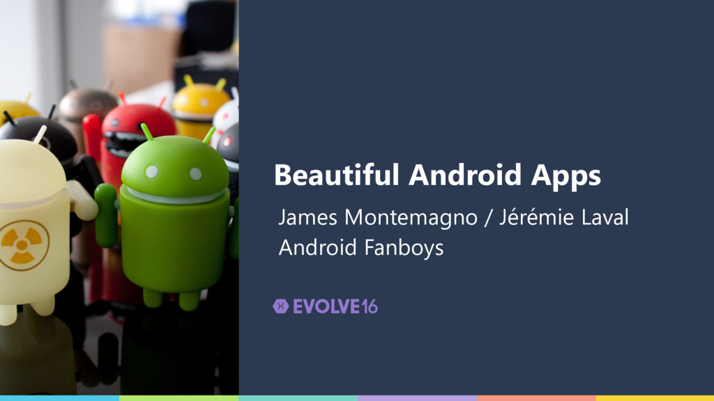
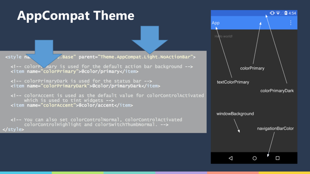
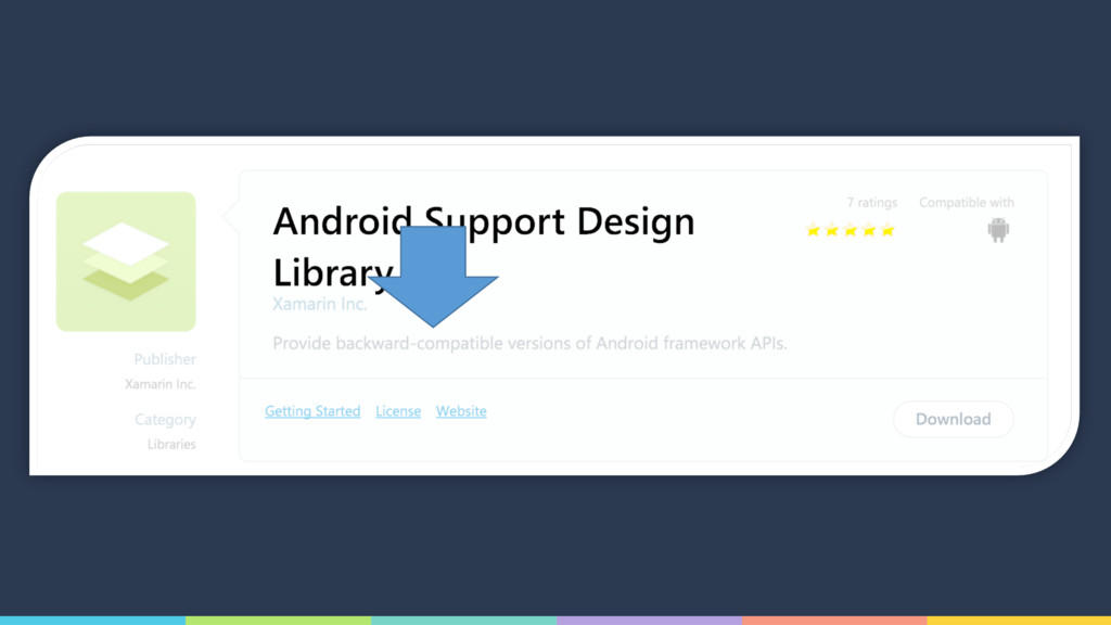
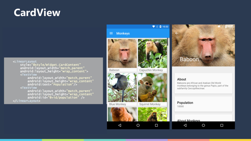
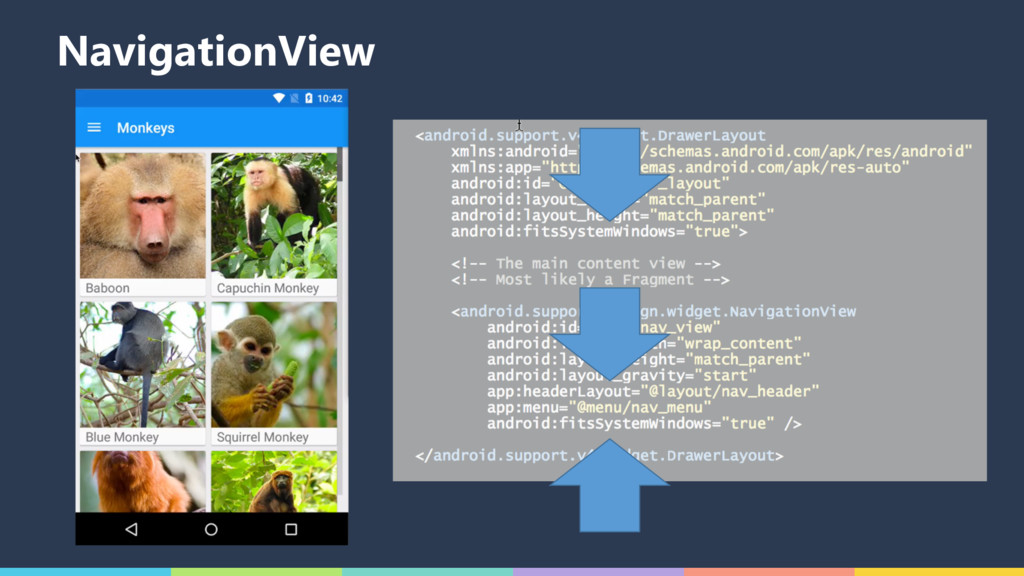
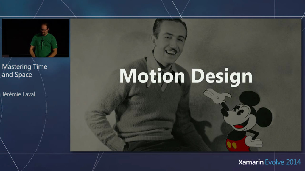
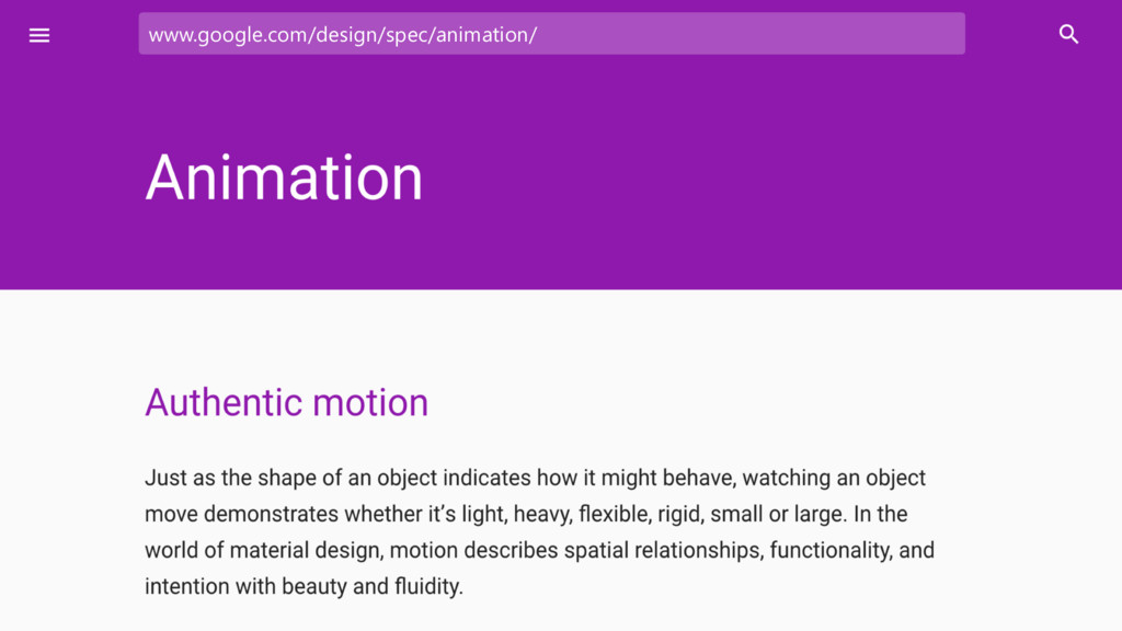
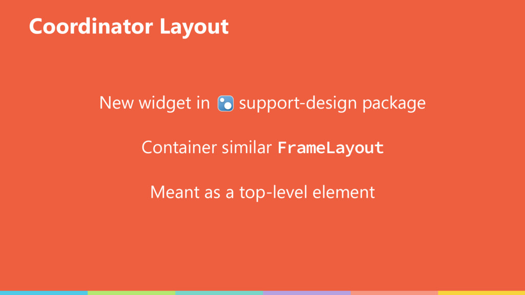
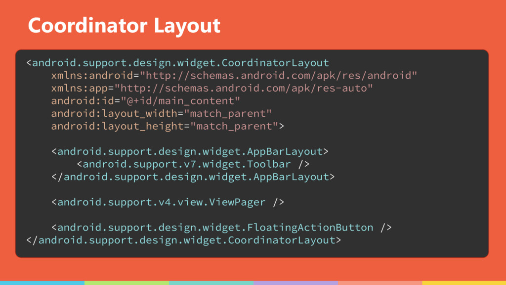
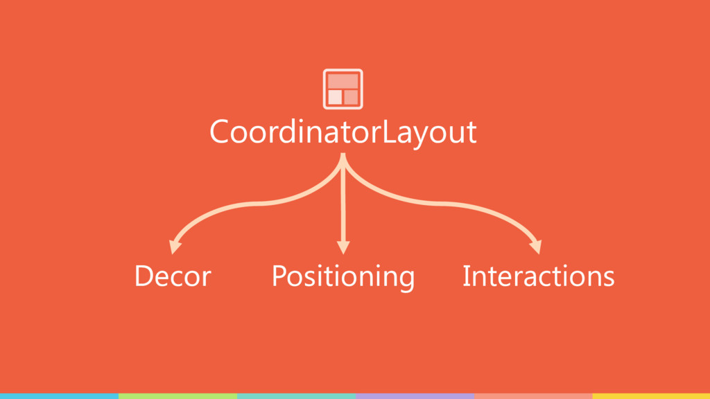
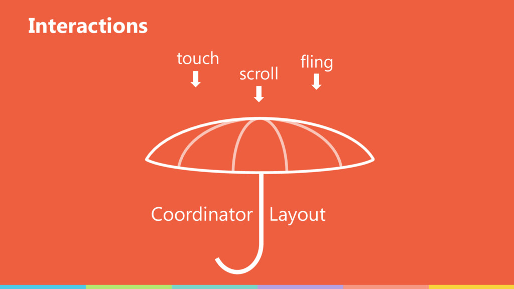
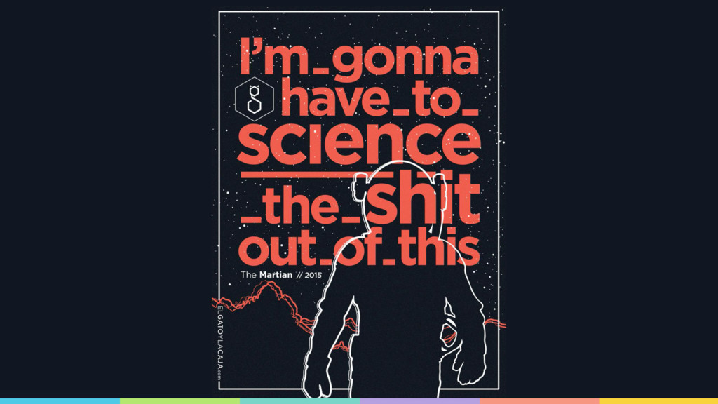
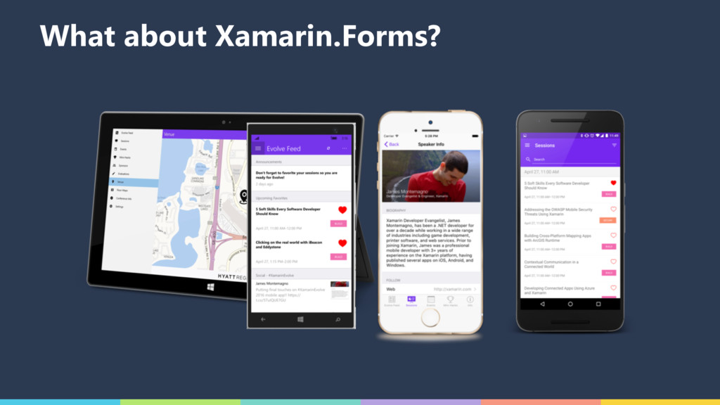
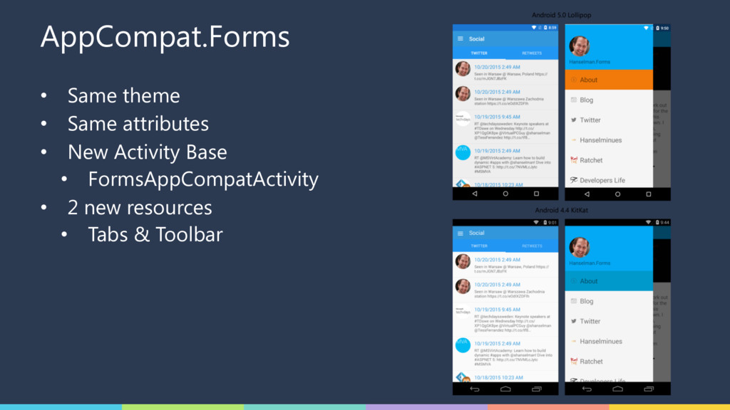
Building beautiful Android apps doesn't have to be hard. Since its original induction, Material Design (MD) has taken the Android world by storm, generating rapid adoption throughout the dev community. A lot has changed from the original material design specification, with the updates to the Android Support v7 AppCompat library and intro of the Support Design library, MD themes, controls, and features now available on all devices running Android. This session will show you how to transform your app into a stunning work of Material art, and even how to utilize MD in your Xamarin.Forms apps.
 garuma
 yuksew
 miyukki
 muehara
 rakus_dev
 yama3133
 nstock
 lycorptech_jp
 smt7174
 tsukamotokenji
 satohy0323
 tomzoh
 raygrieselhuber
 szymonslowik
 aleyda
 akademiya2063
 thekraken
 mraible
 brad_frost
 reverentgeek
 geoffreycrofte
 chriscoyier
 kneath
![James Montemagno Developer Evangelist, Xamarin [email protected] motzcod.es @JamesMontemagno Jérémie Laval](https://files.speakerdeck.com/presentations/5a706813862045e1b6e1d8e9e16740ea/slide_1.jpg)