Upgrade to Pro — share decks privately, control downloads, hide ads and more …

SwiftUI vs Jetpack Compose by an Android Engineer

Gerard
December 27, 2022

SwiftUI vs Jetpack Compose by an Android Engineer

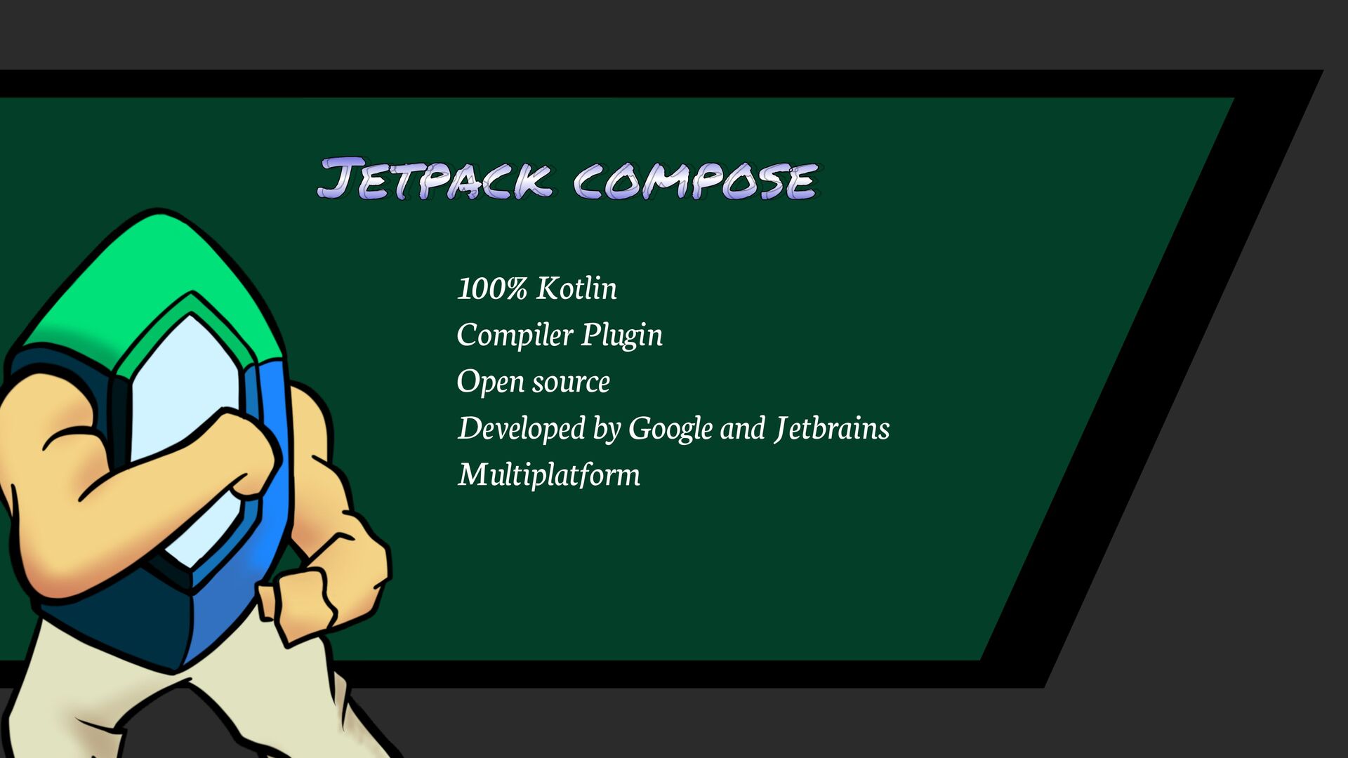
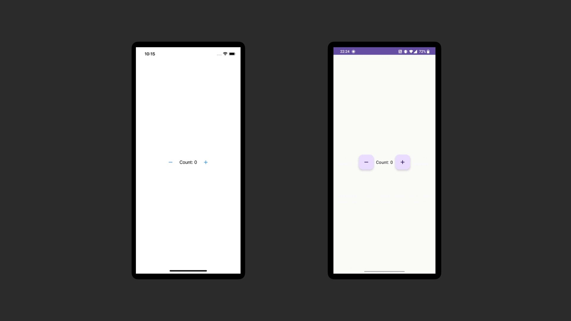
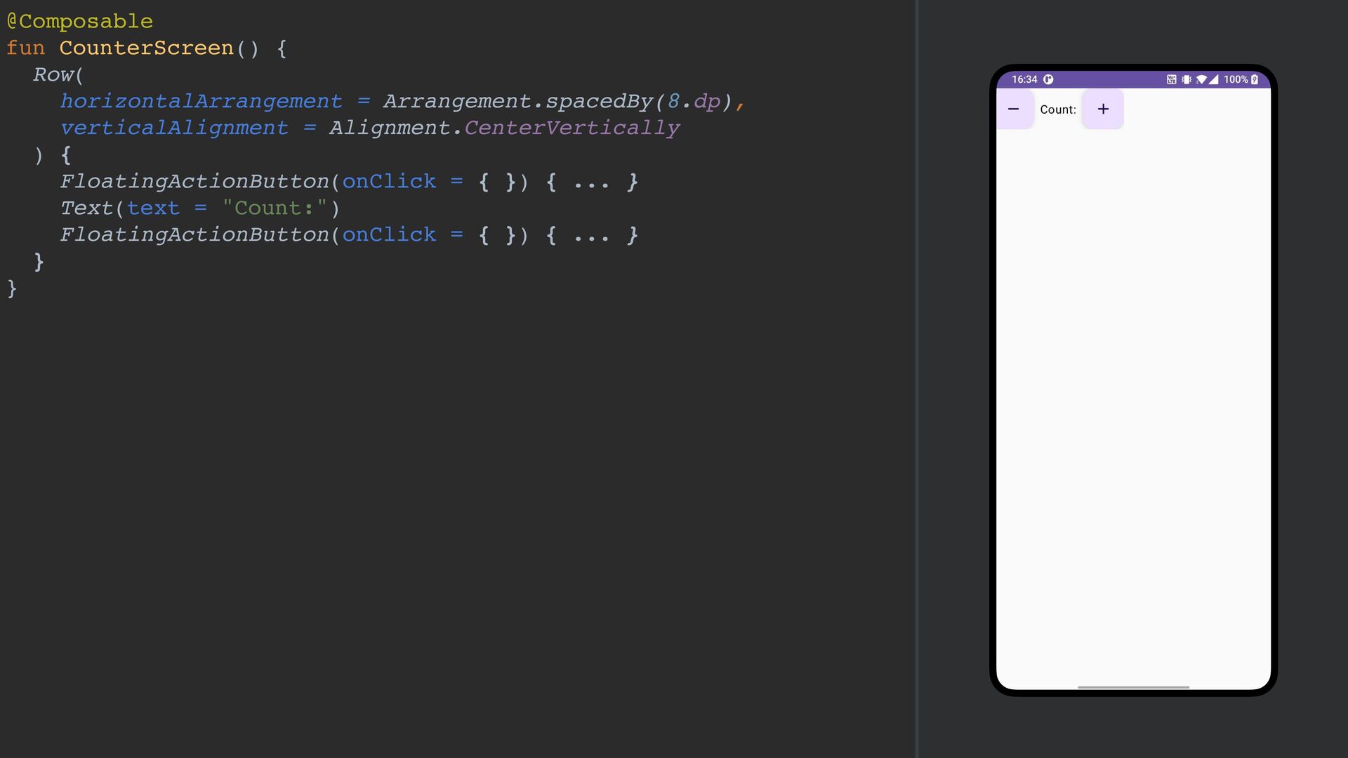
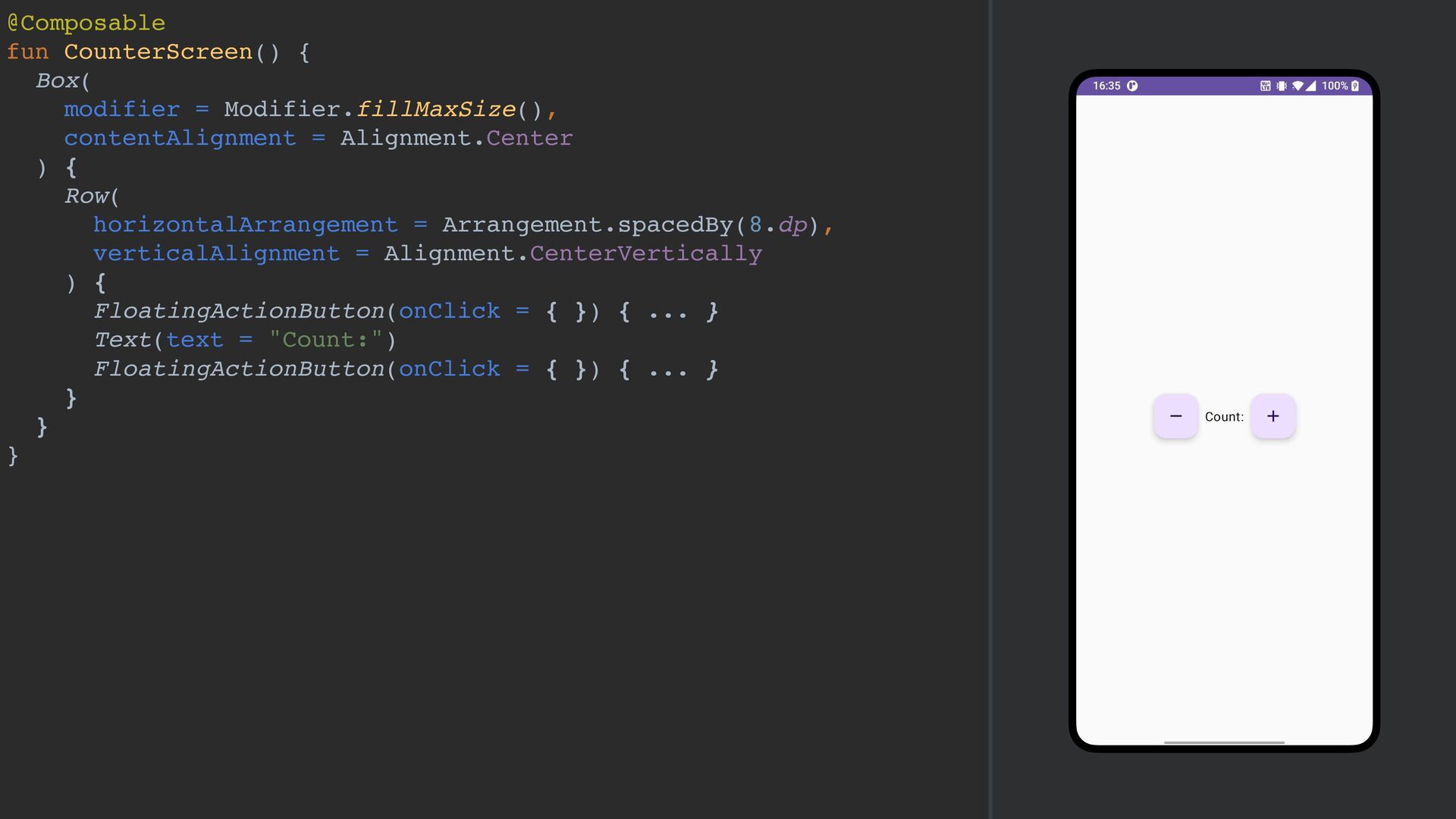
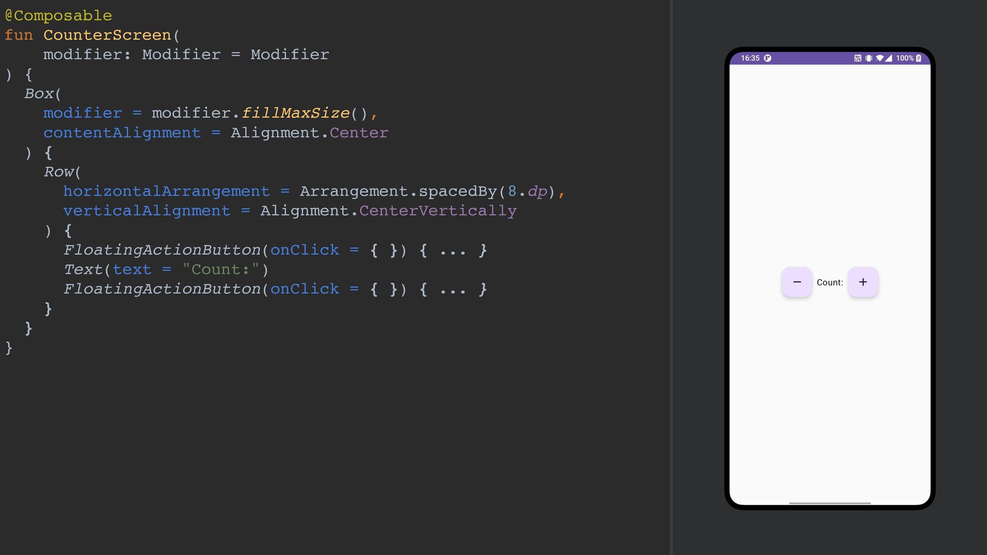
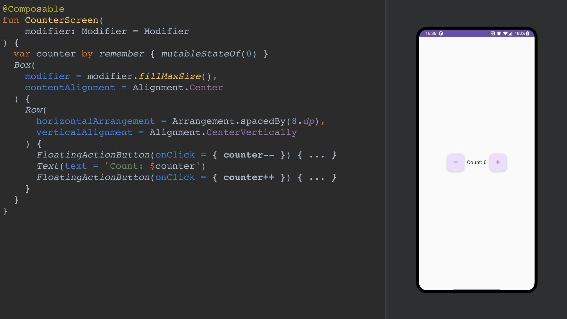
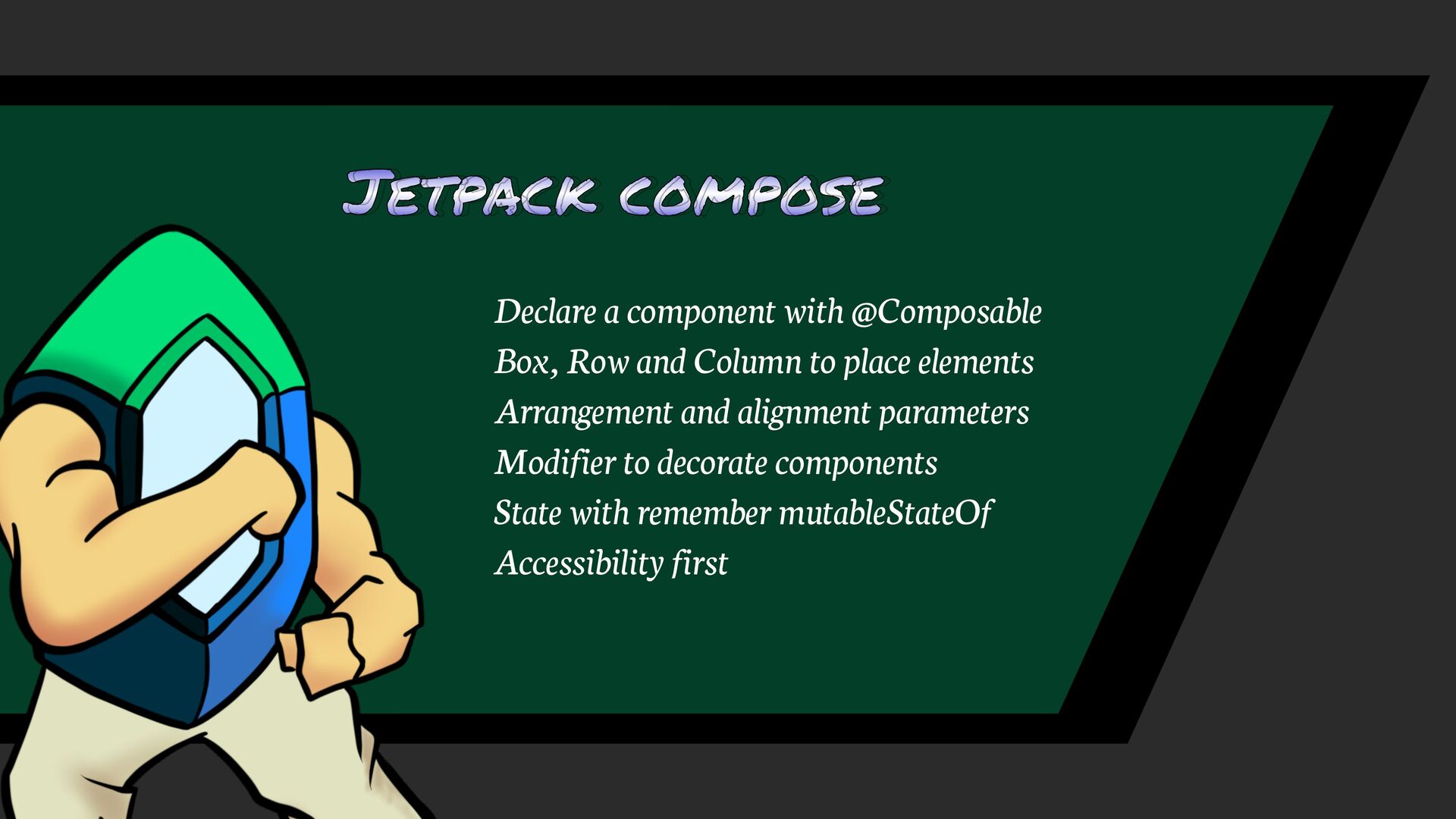
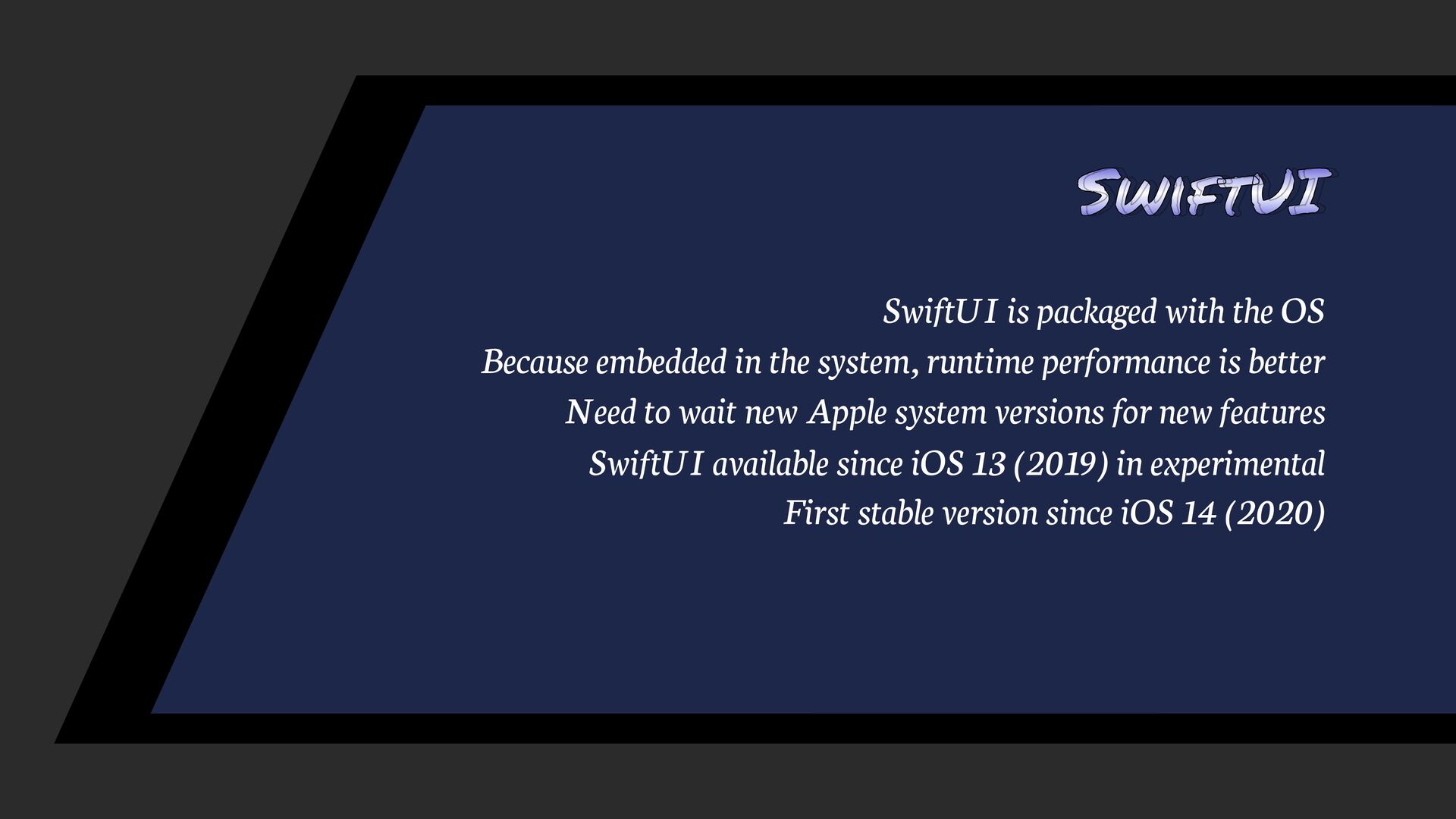
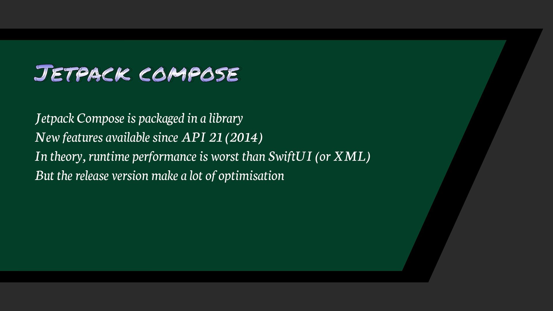
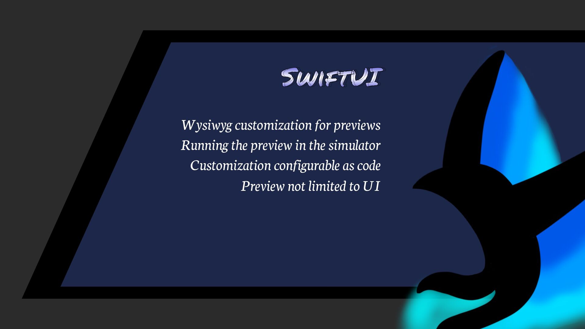
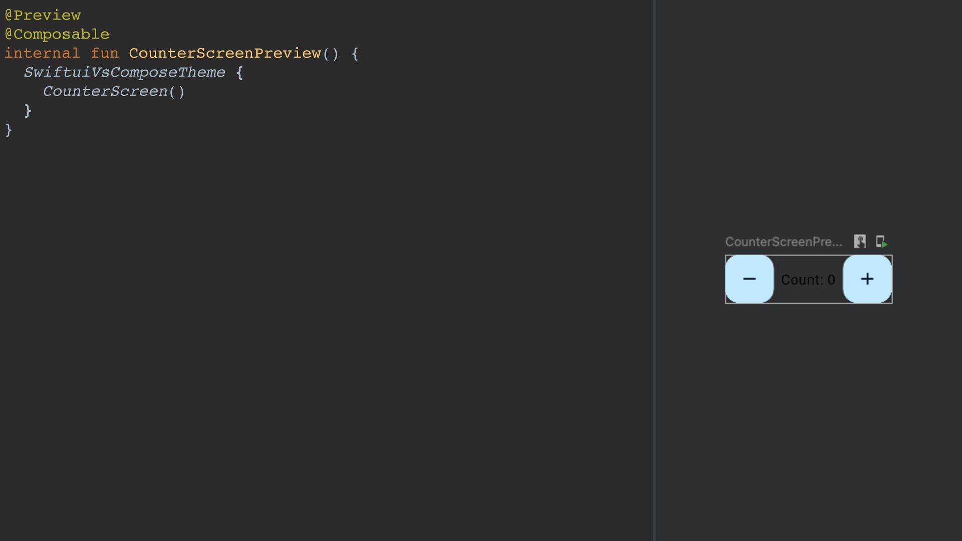
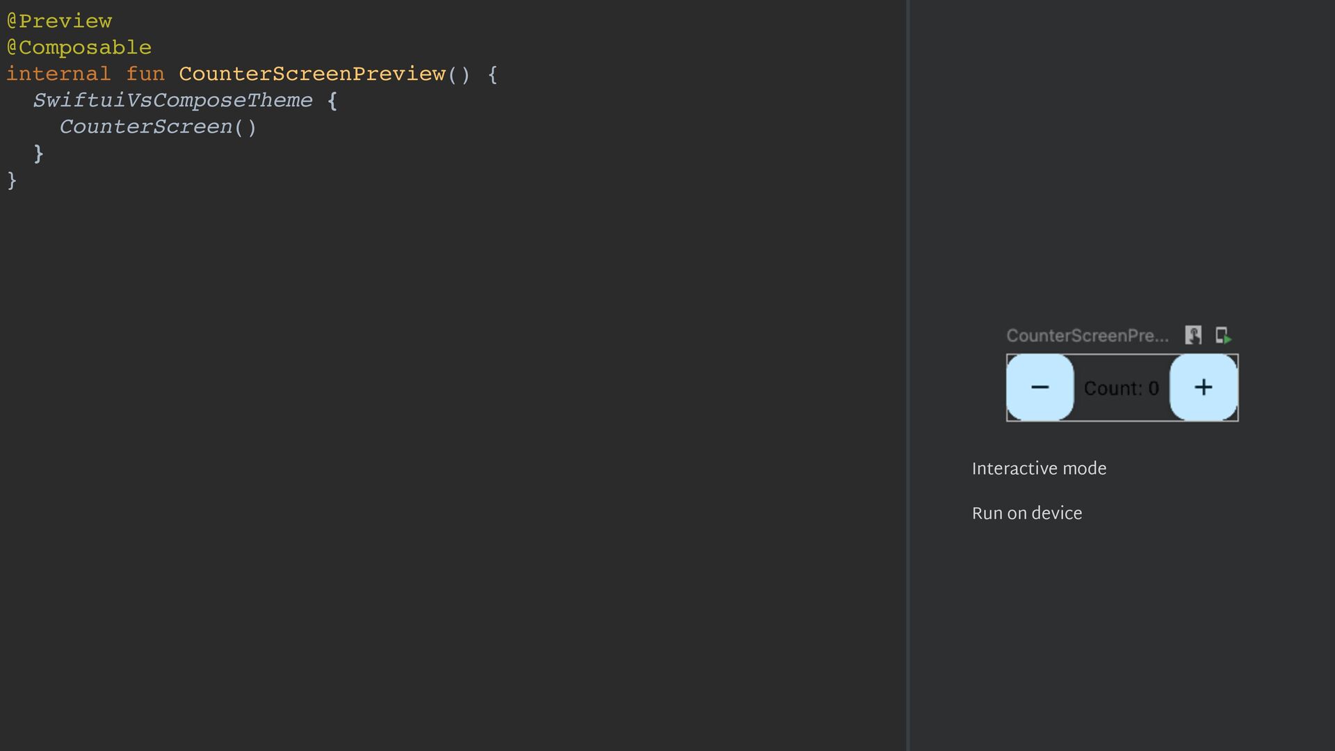
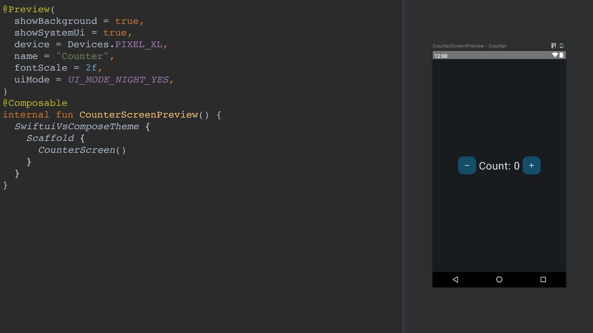
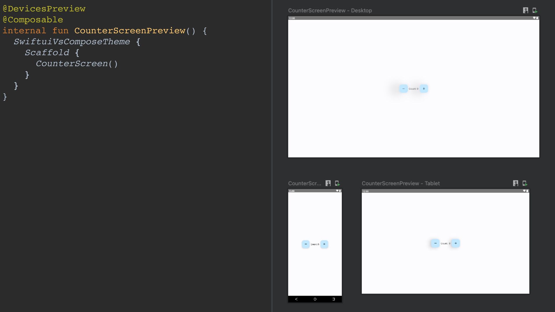
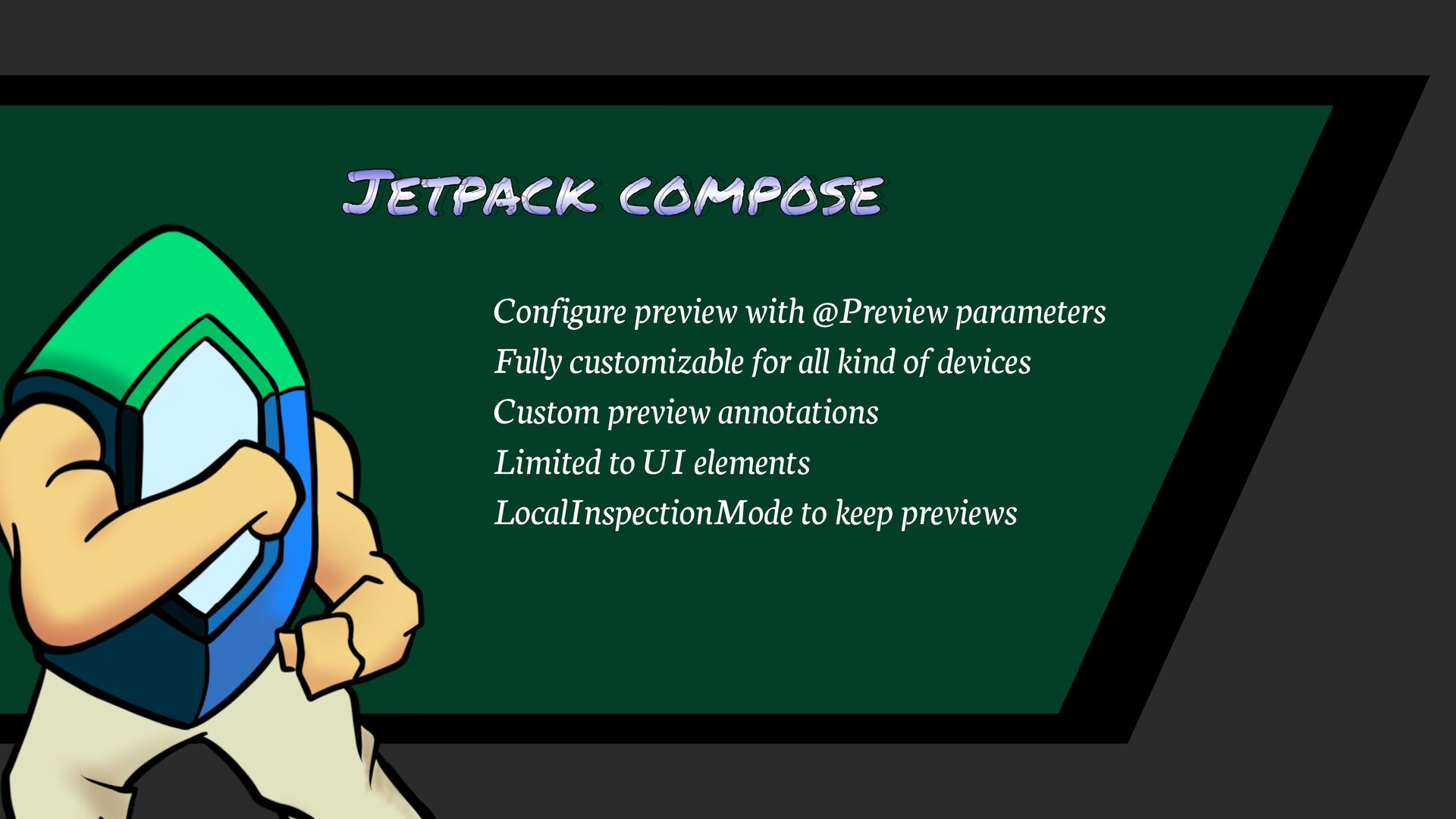
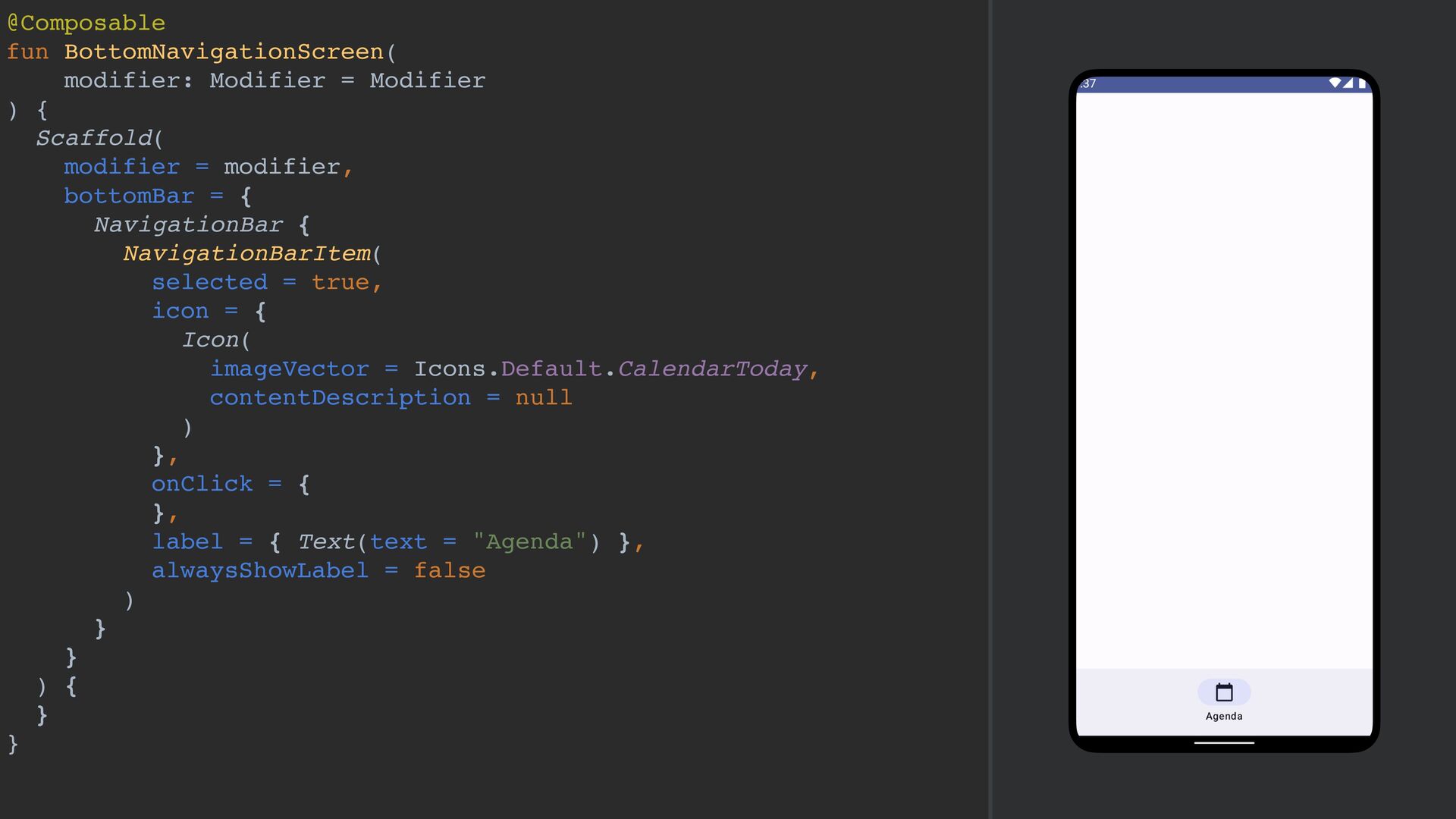
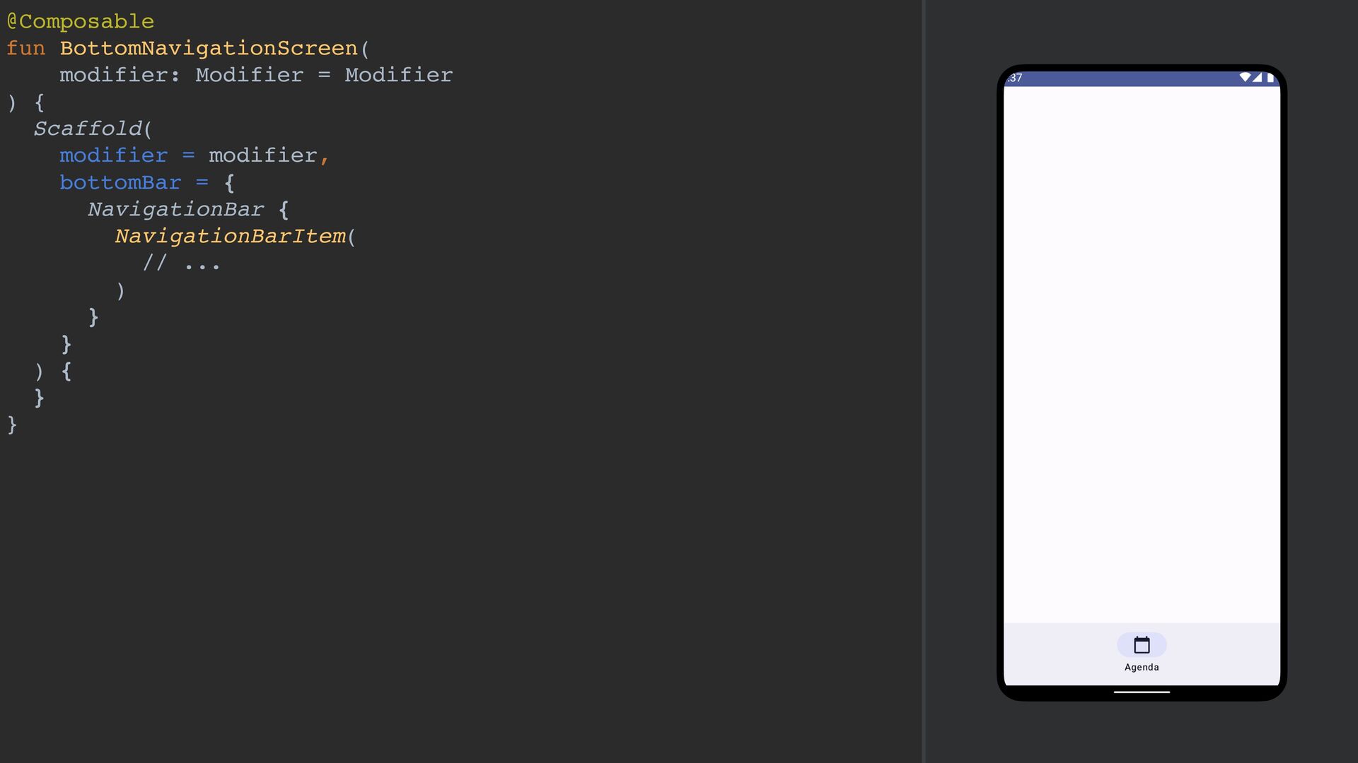
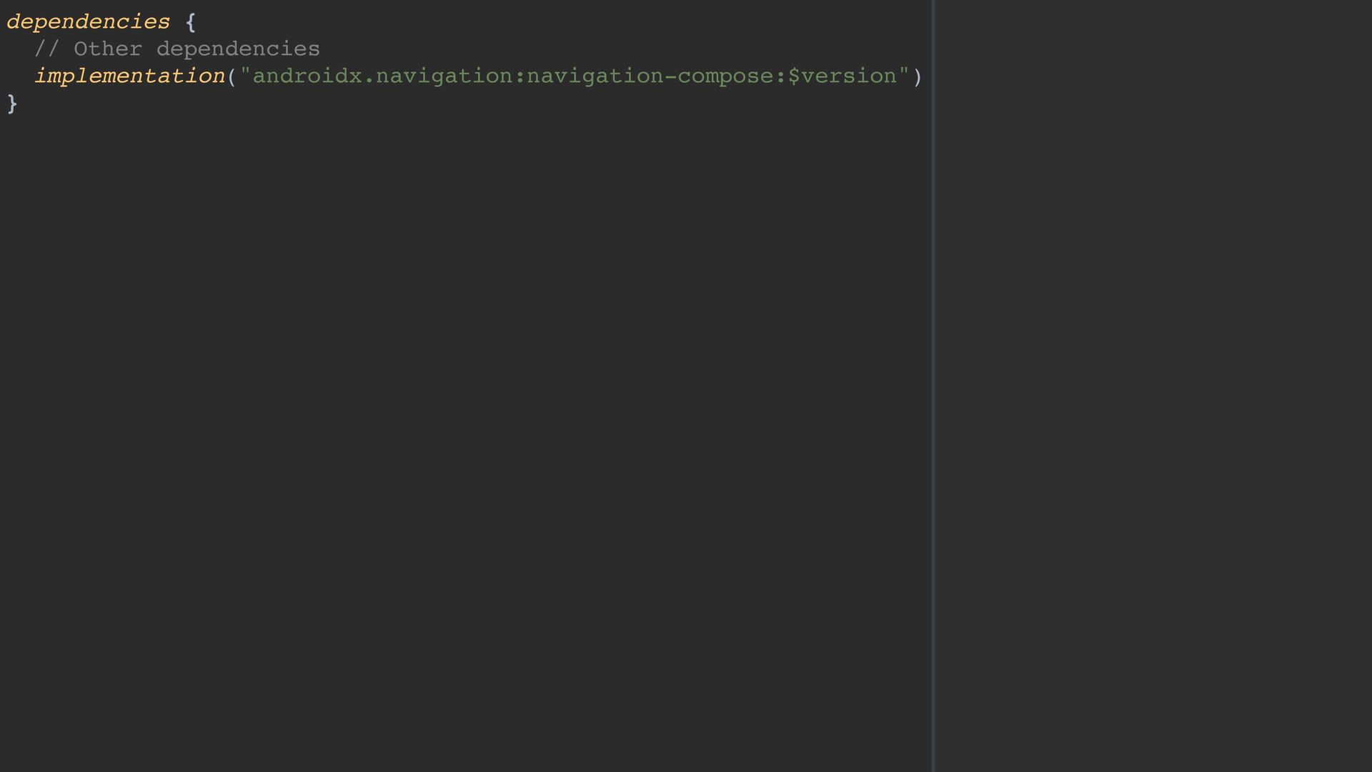
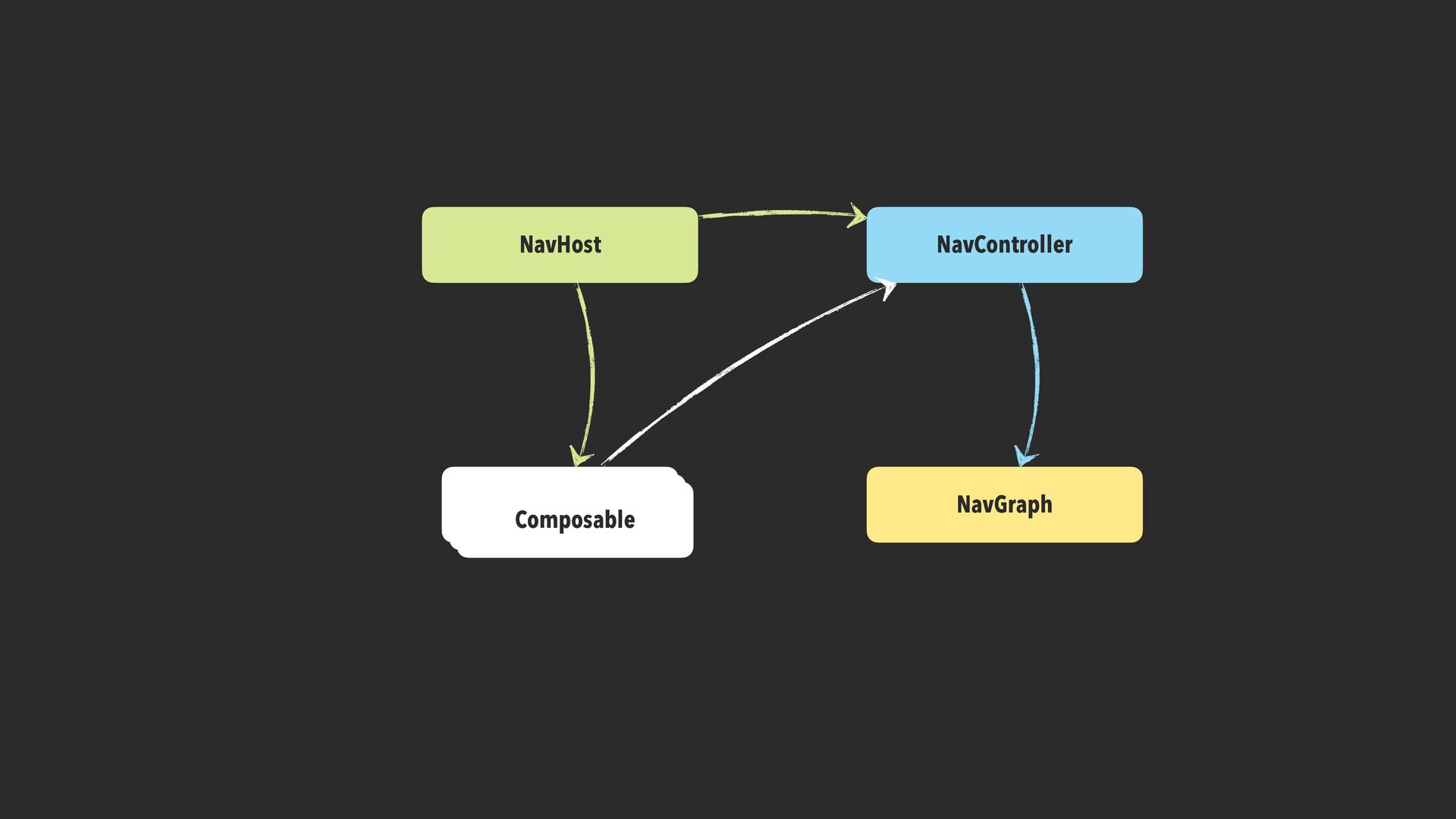
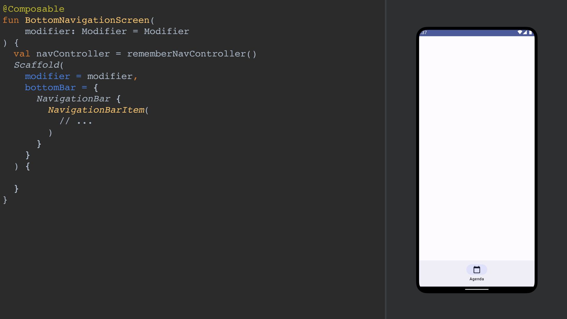
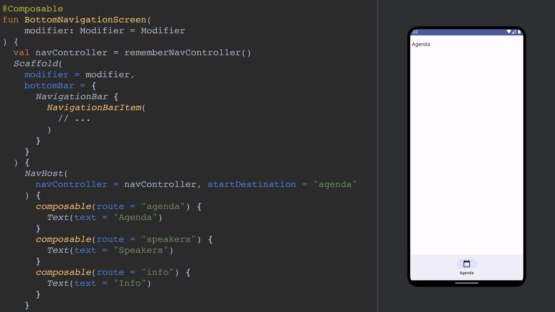
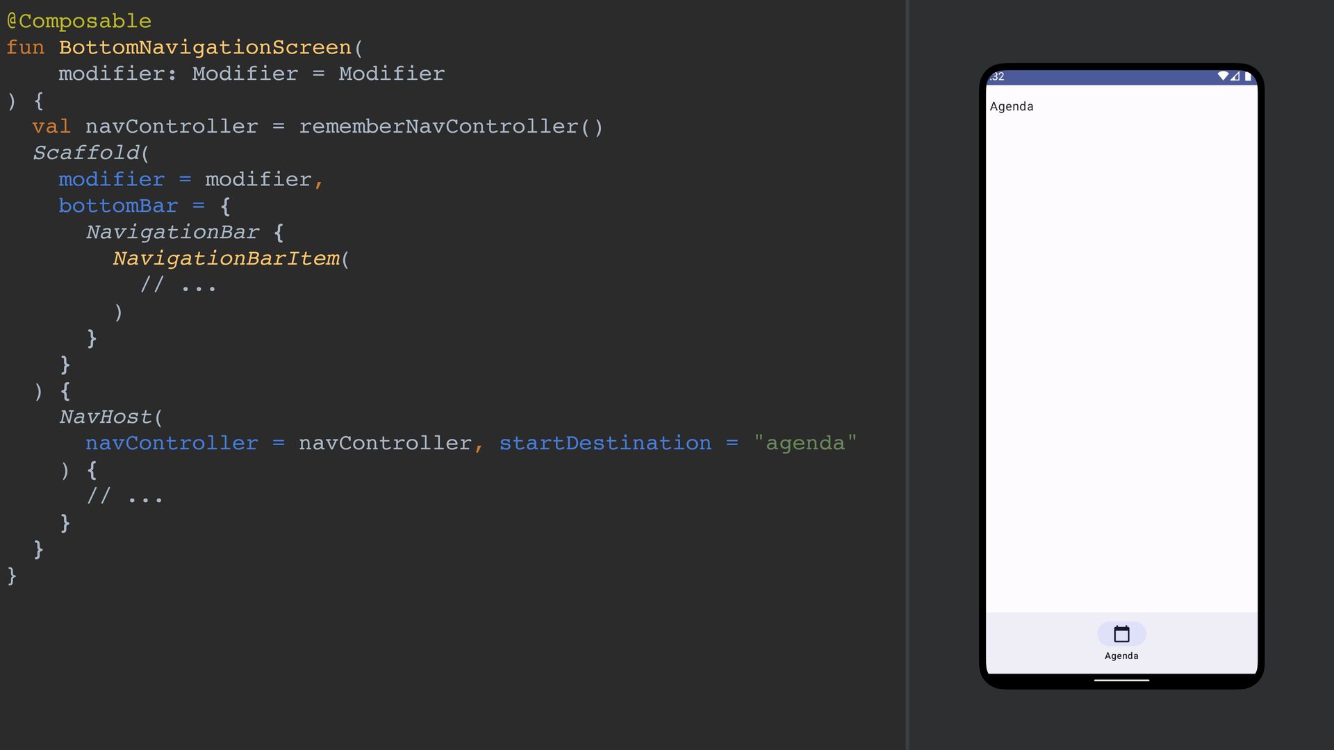
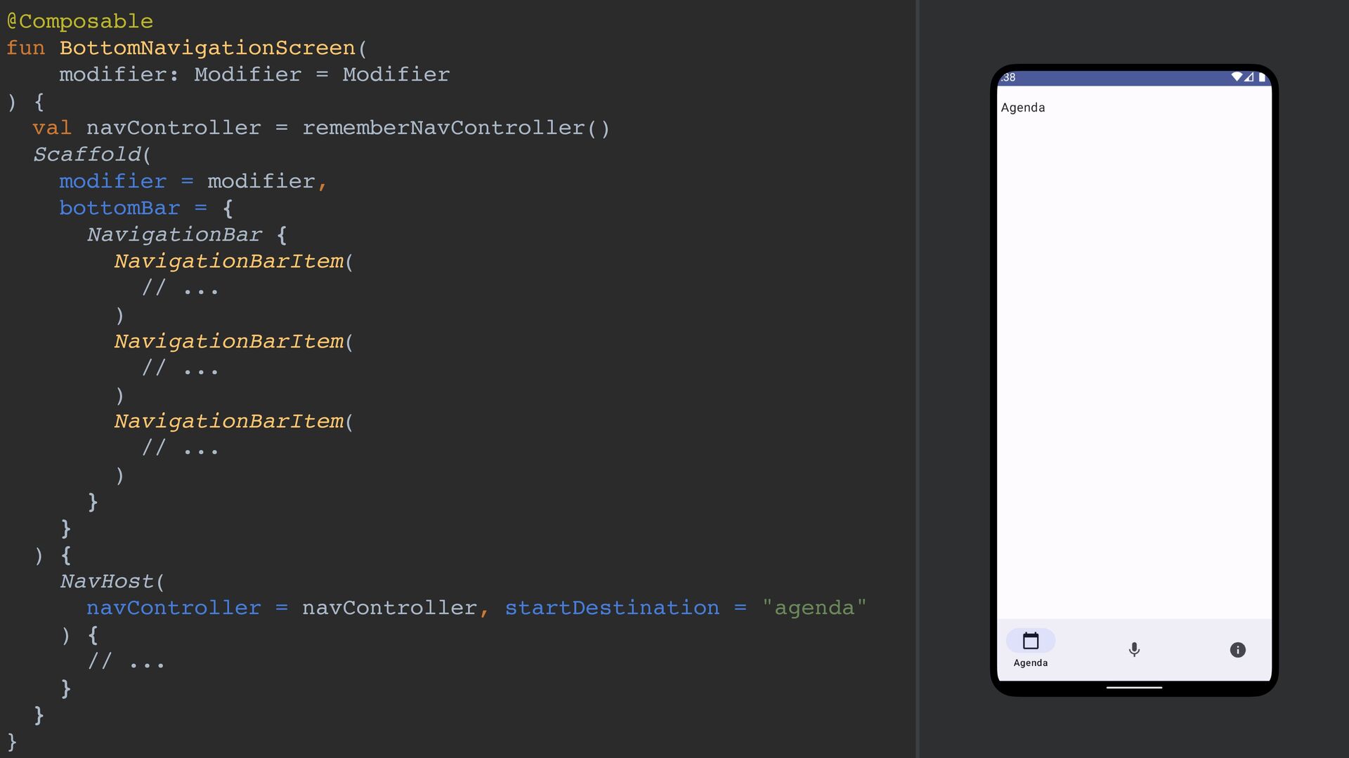
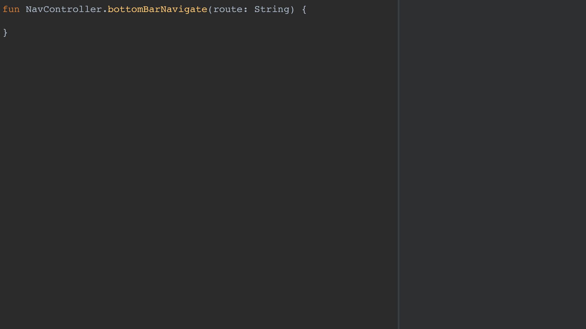
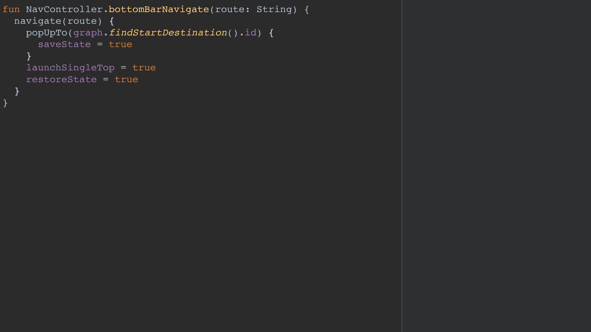
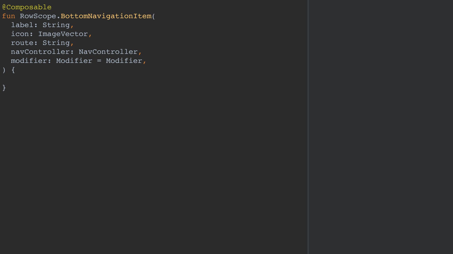
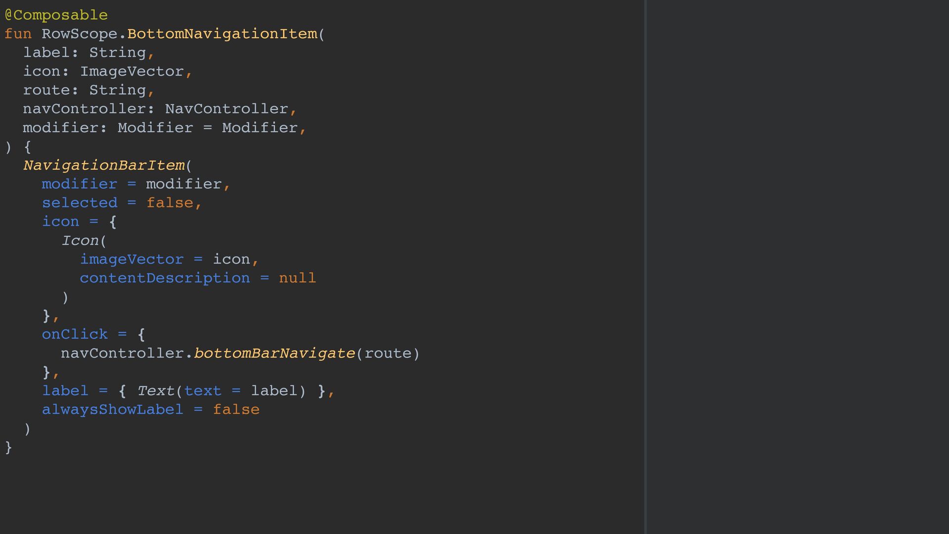
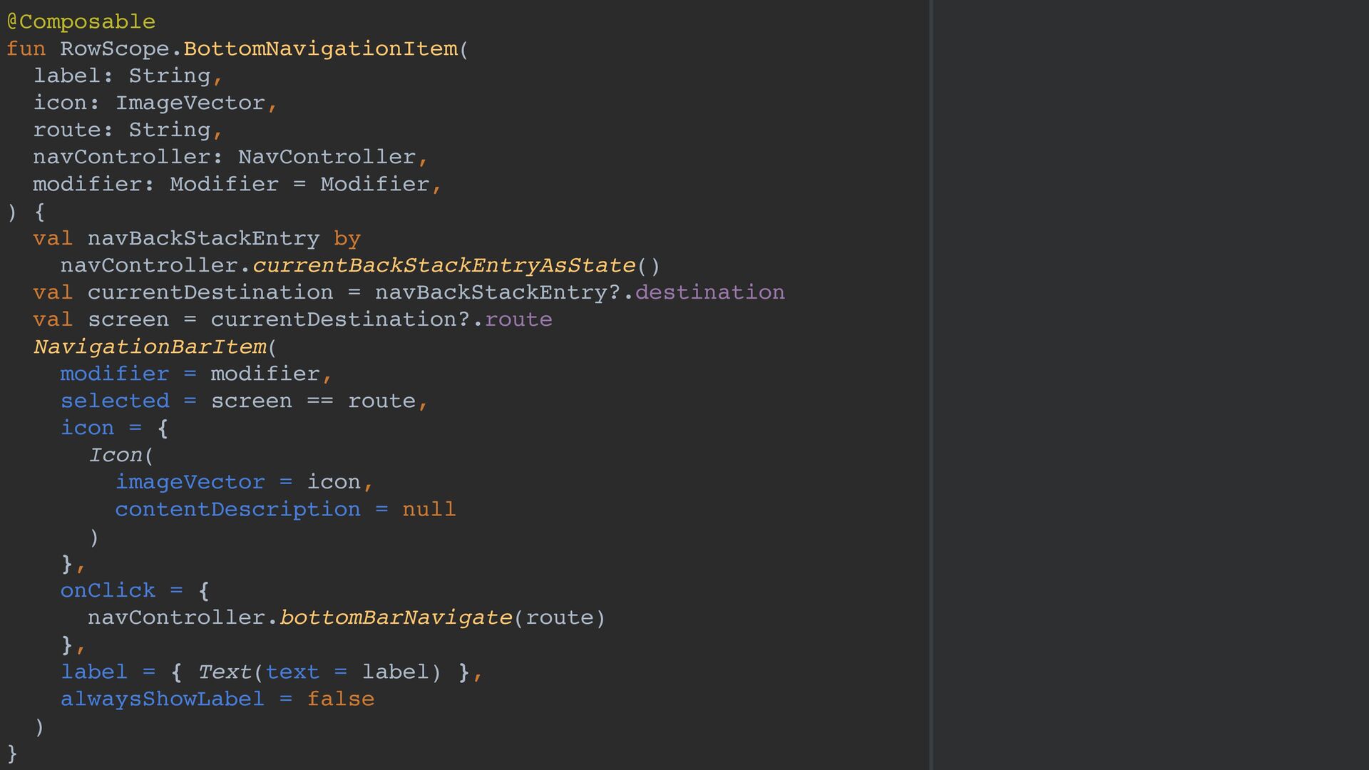
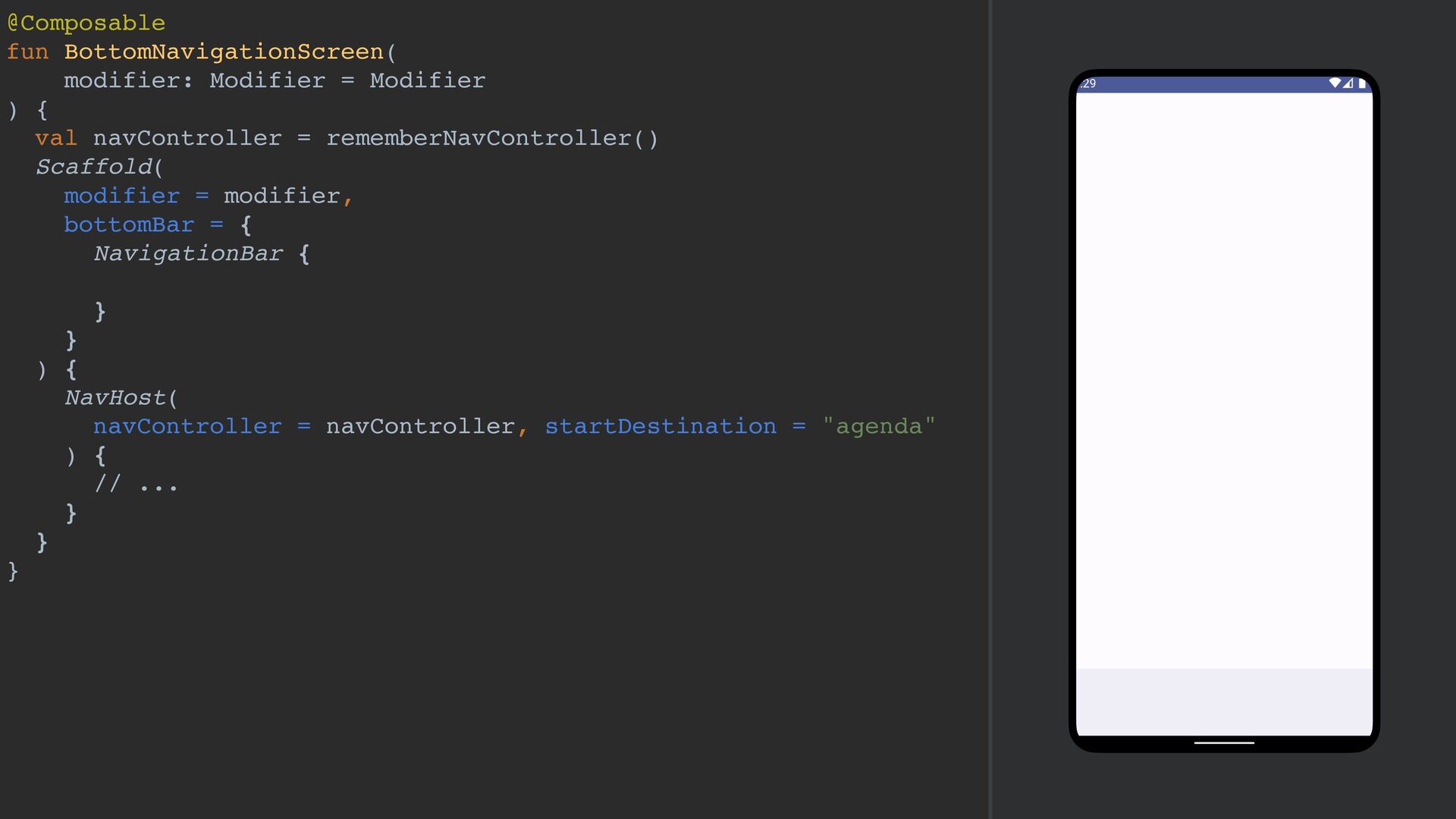
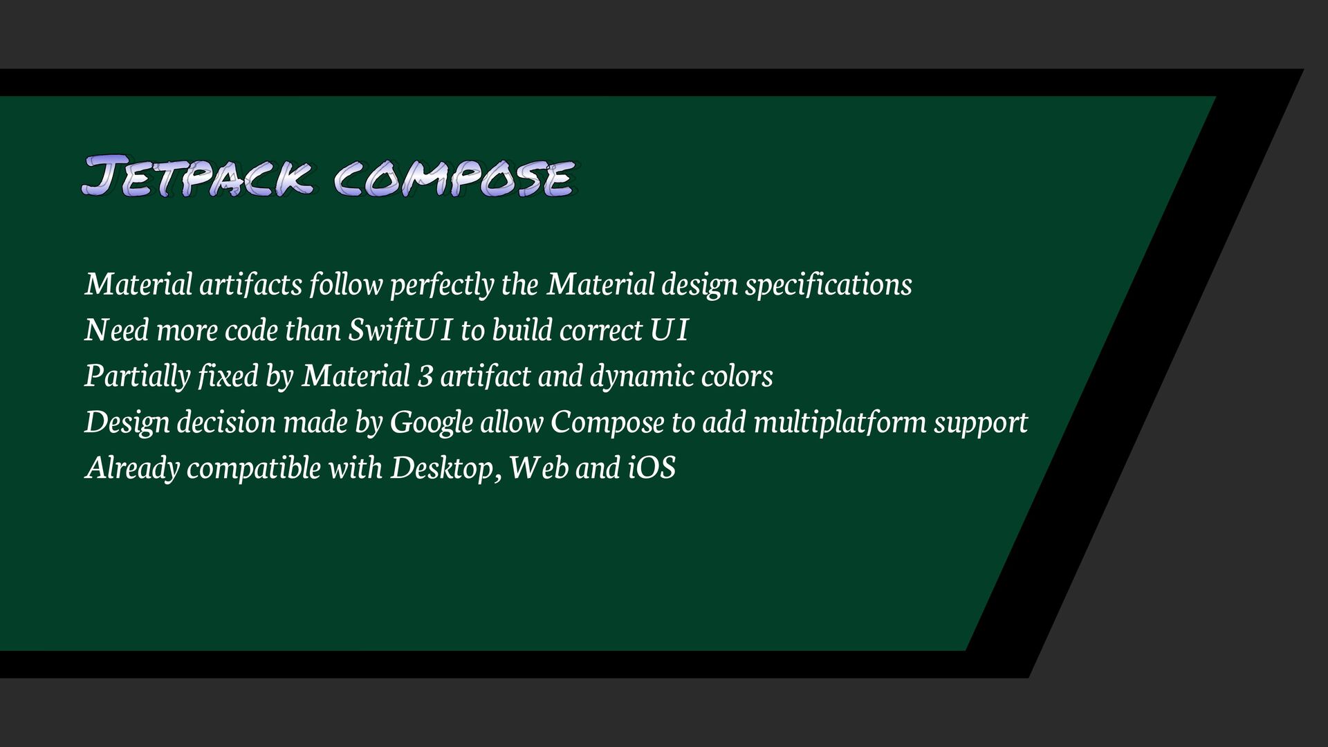
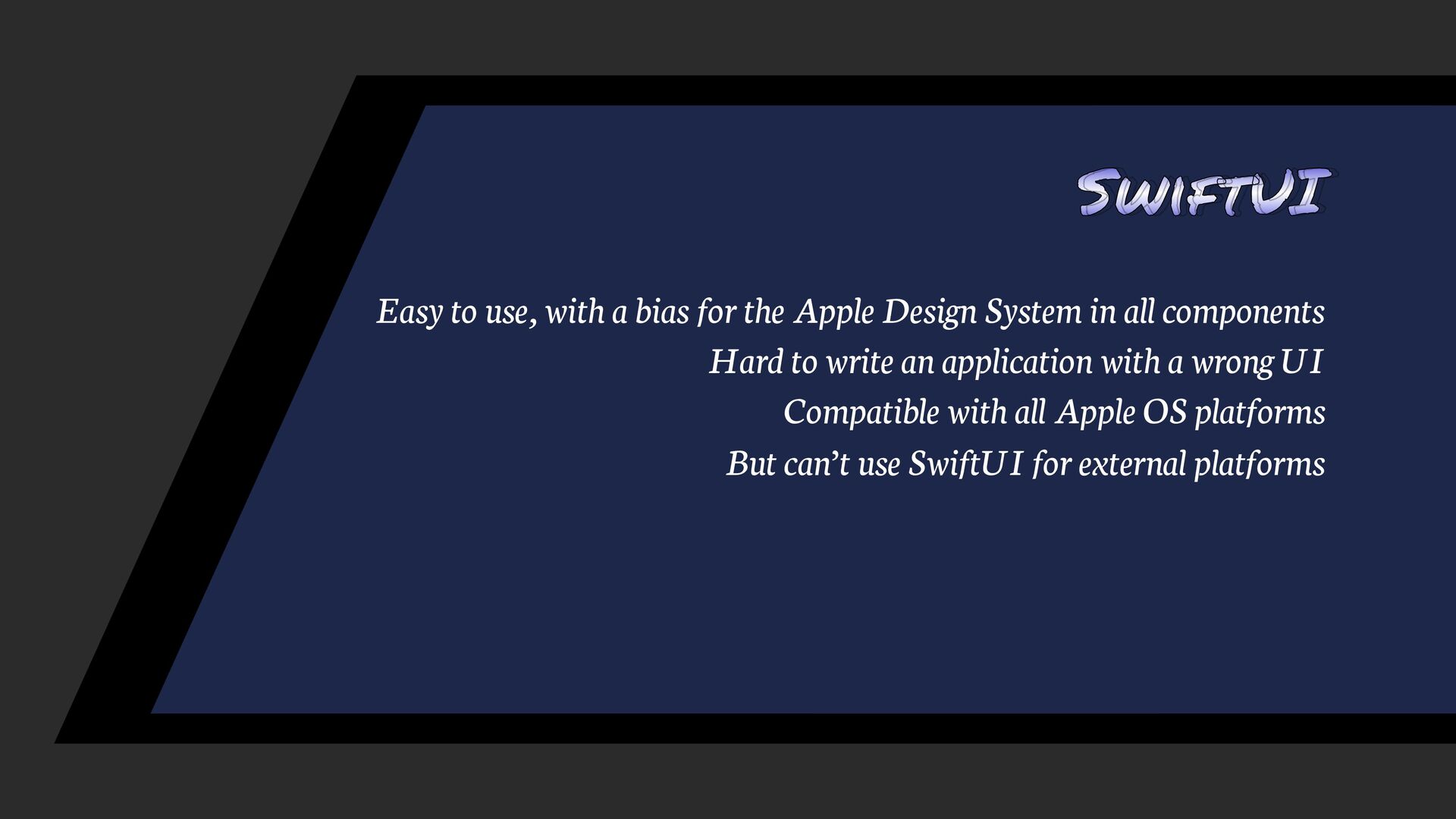
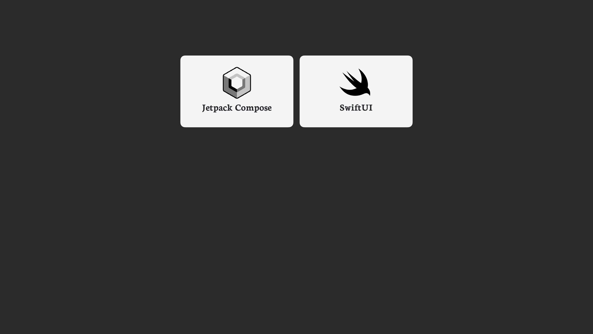
As an Android Engineer, Jetpack Compose is a revolution. Build and maintain user interface and be compatible with older Android versions are daily challenges for engineers. These points are some of why Jetpack Compose is now an essential library. But in Apple side, SwiftUI is a great alternative in the development of user interfaces for Apple products.

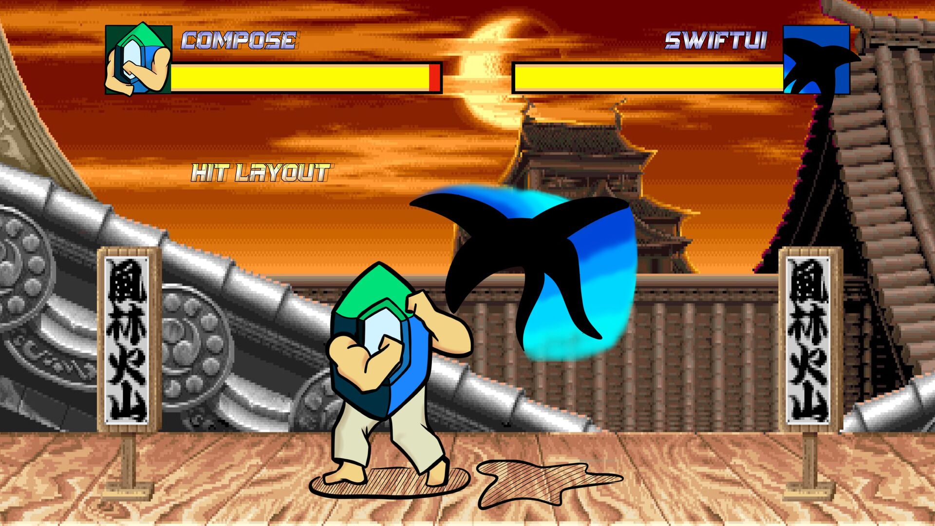
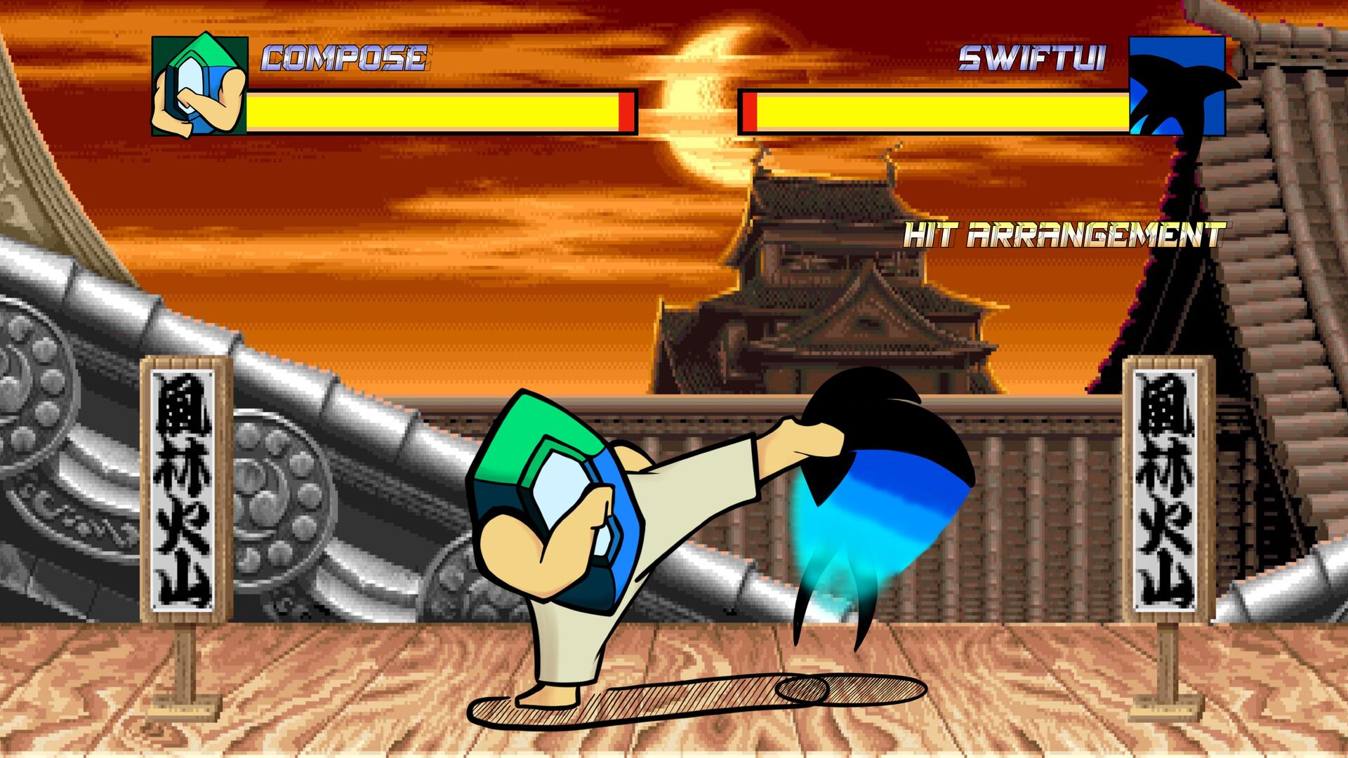
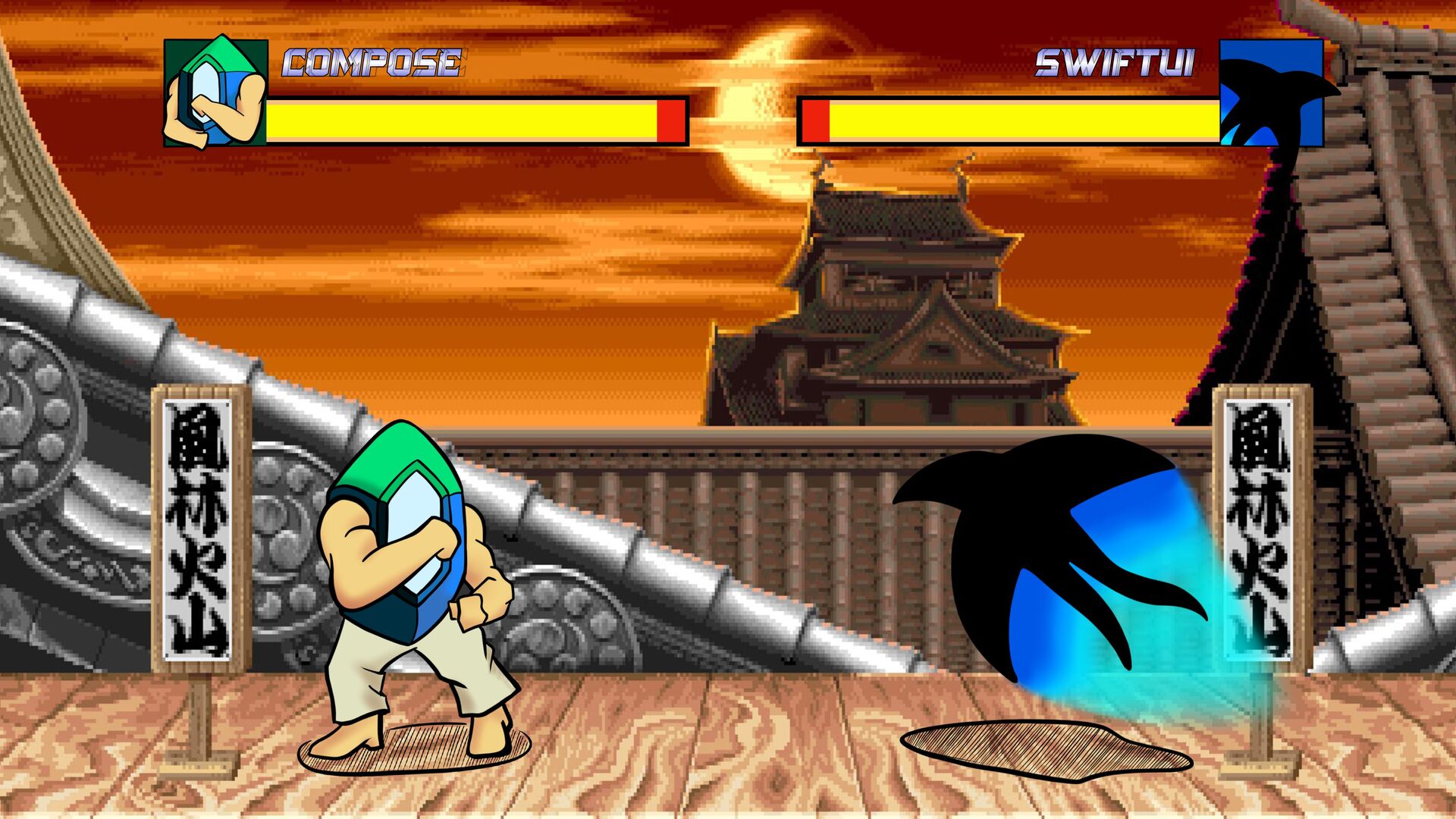
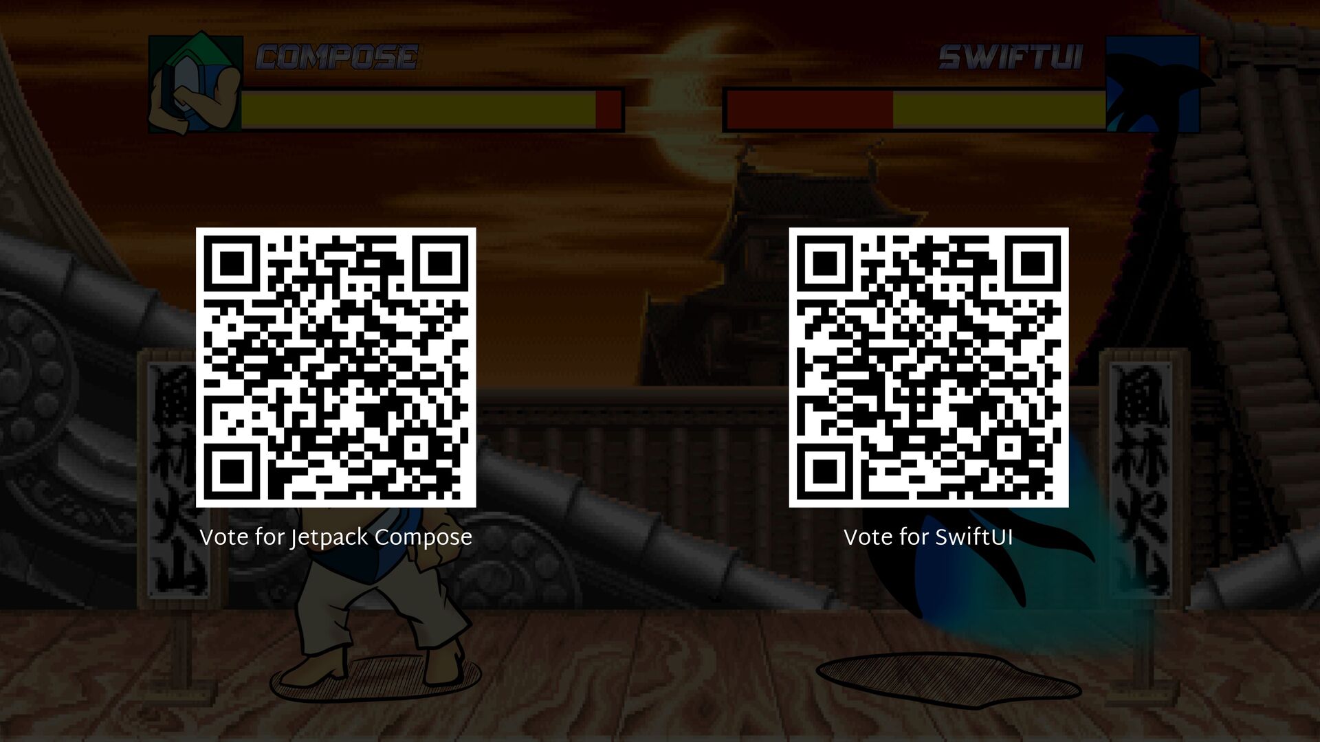
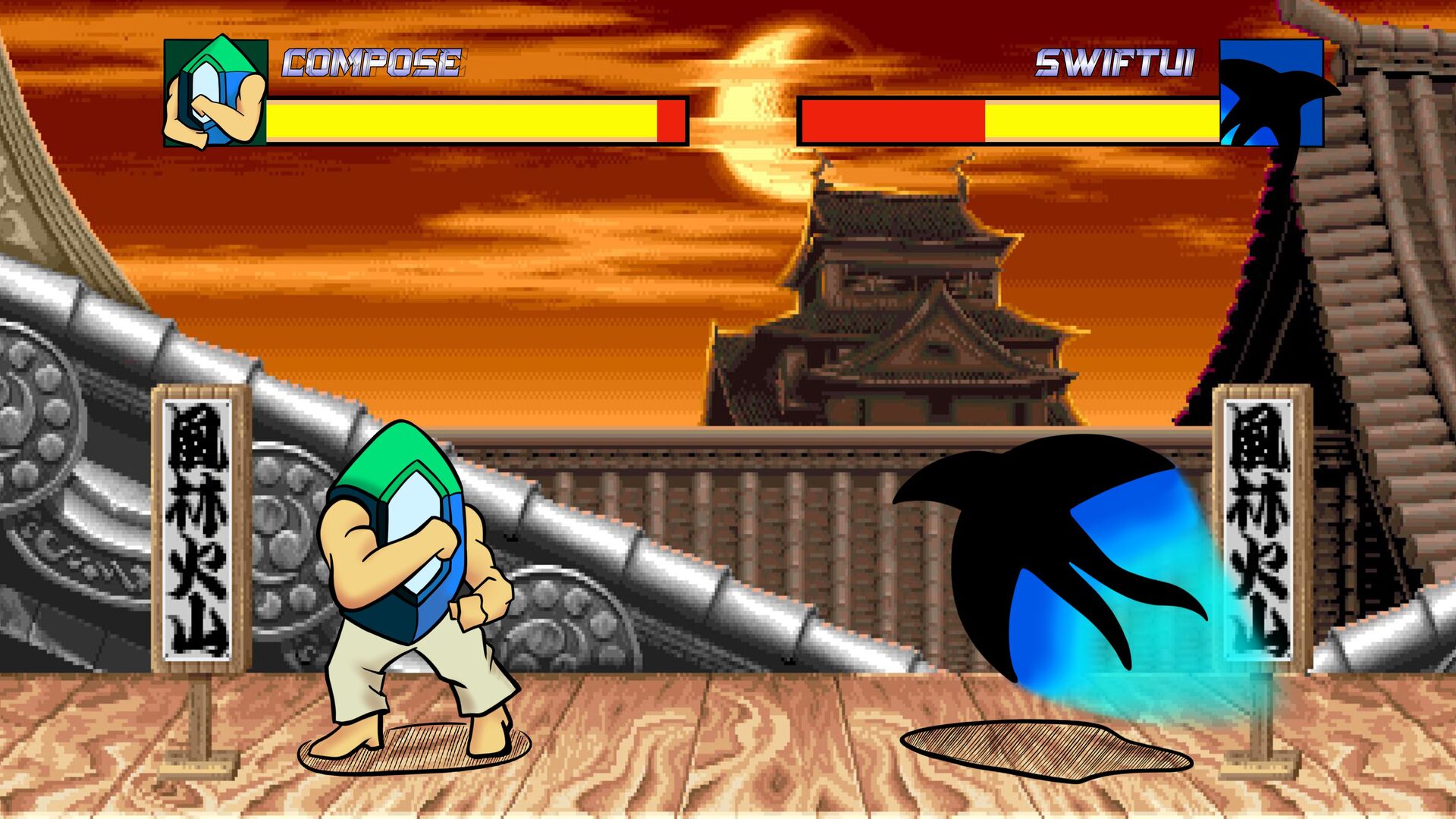
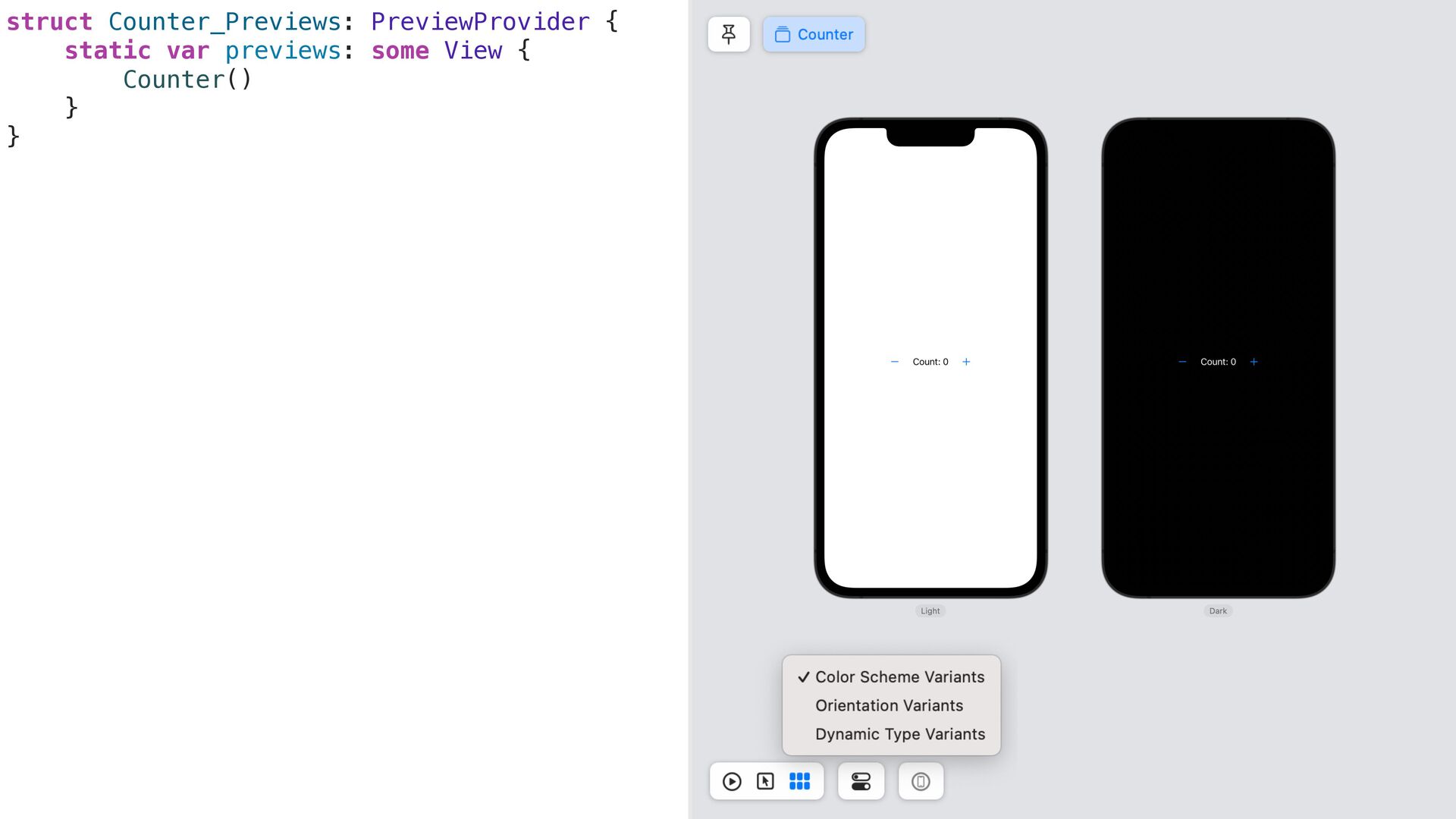
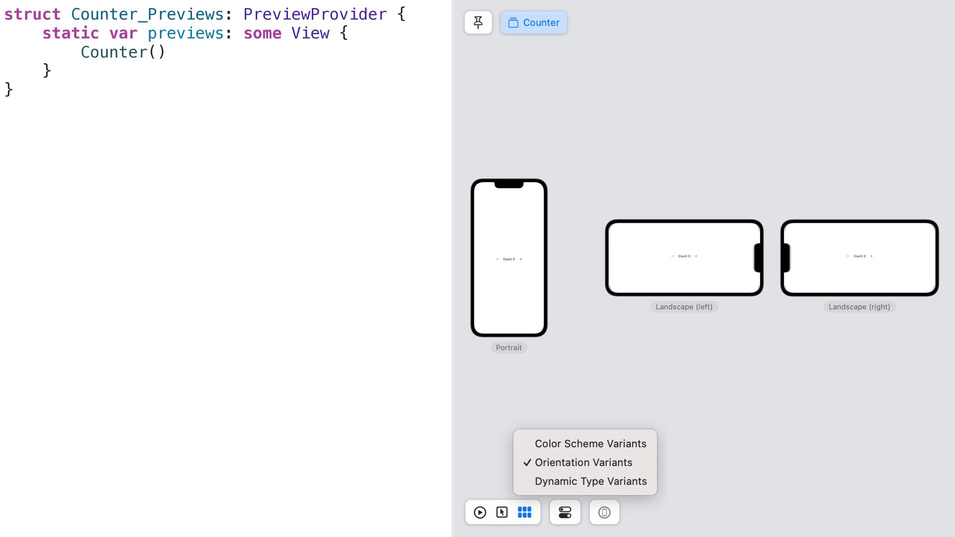
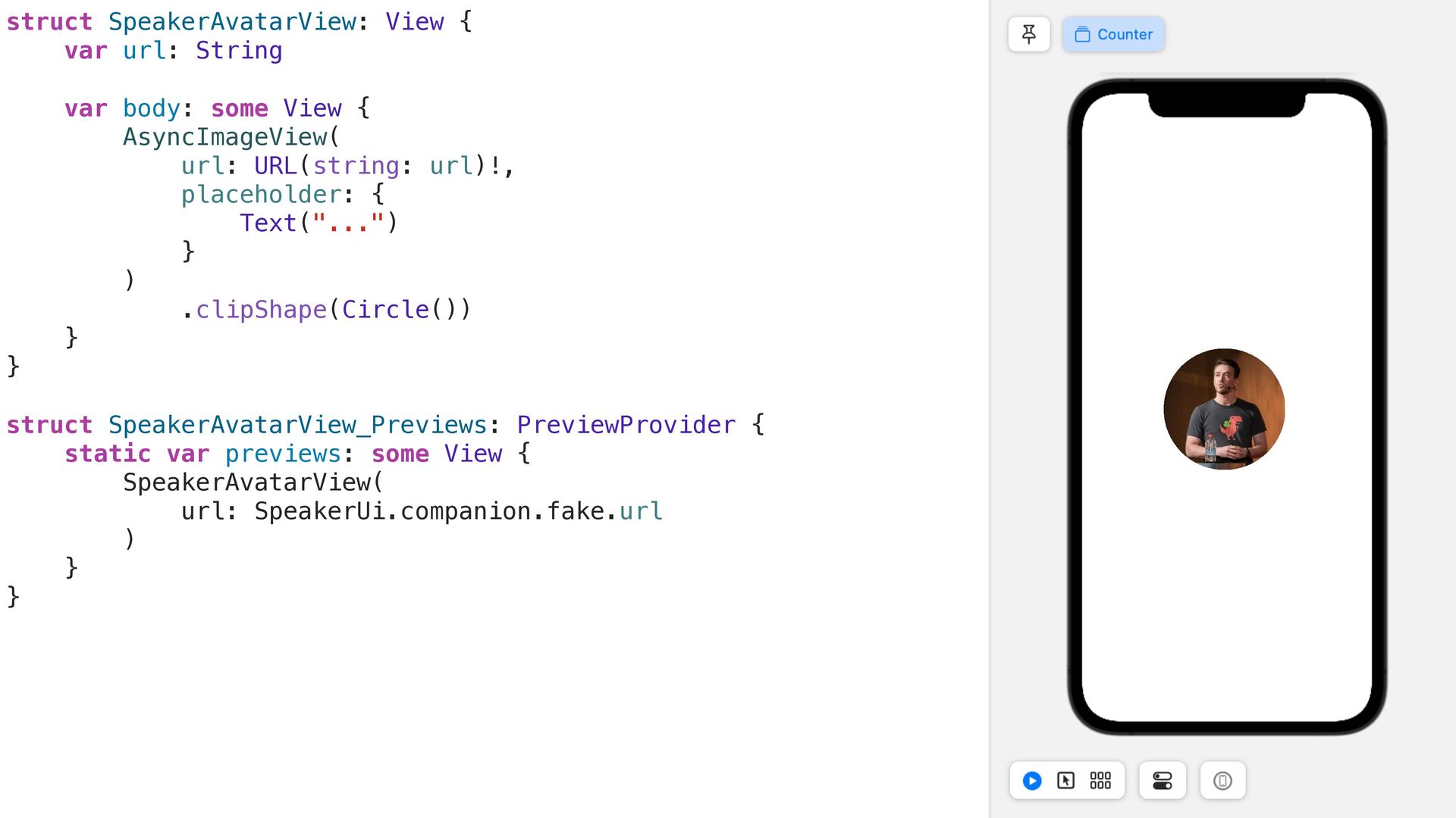
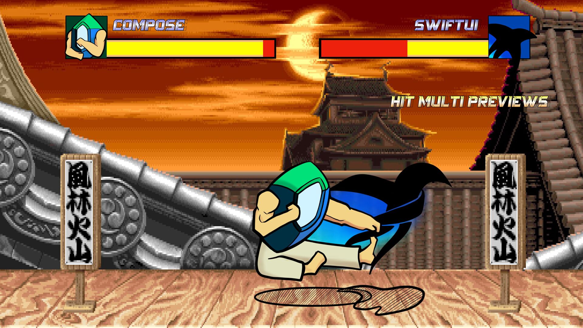
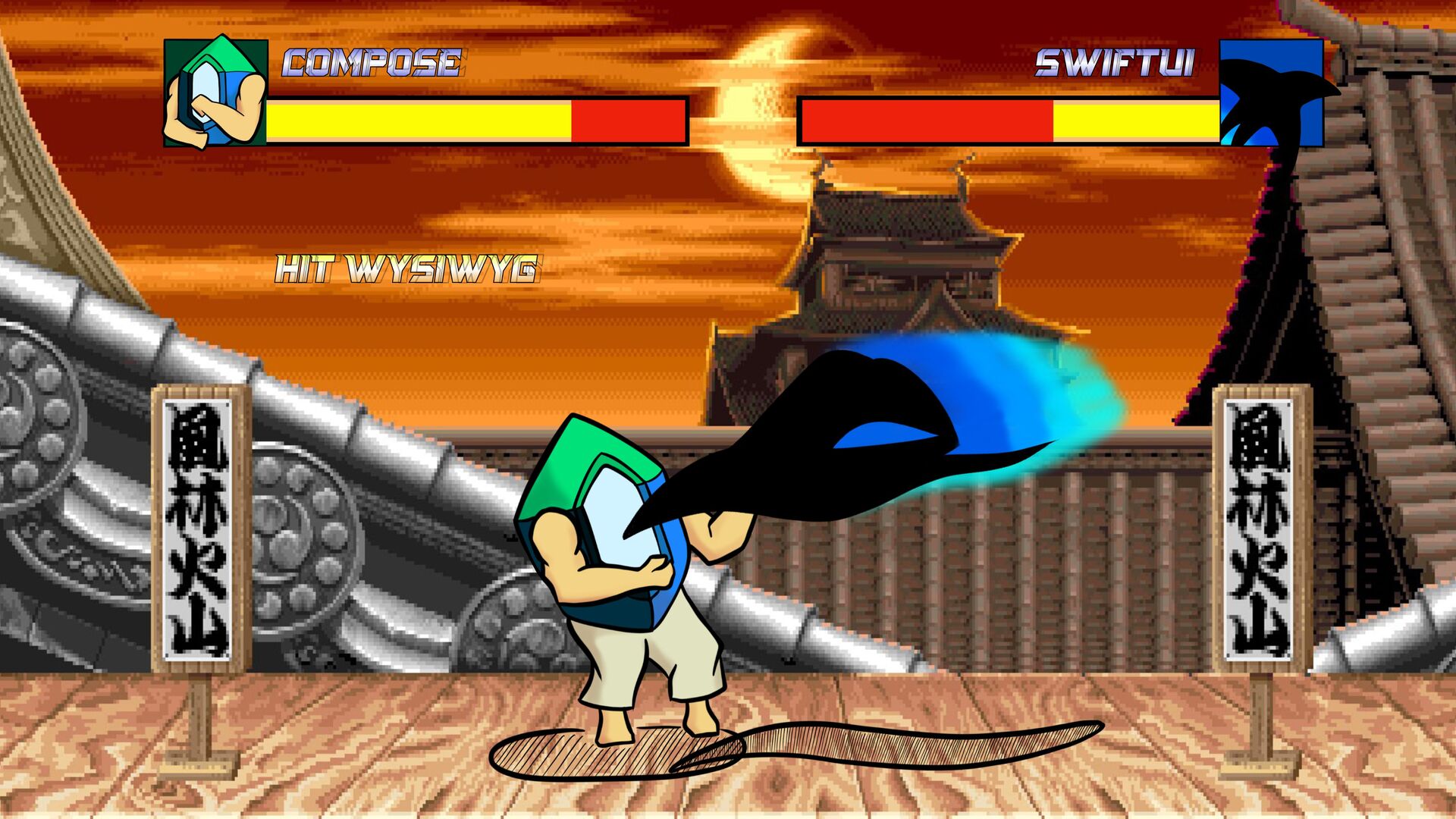
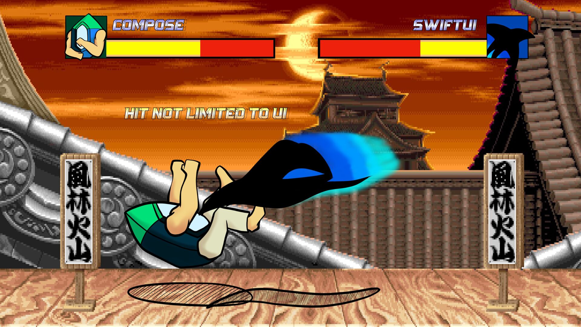
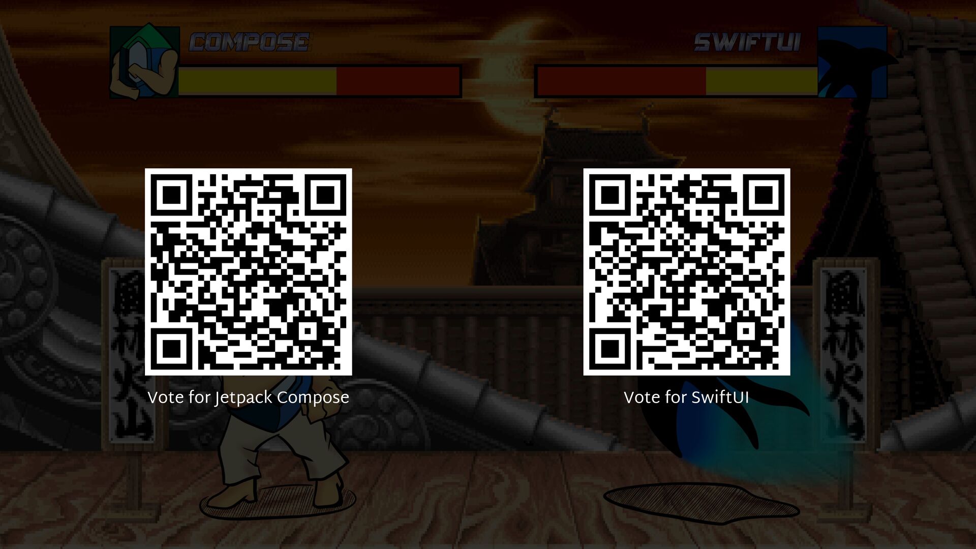
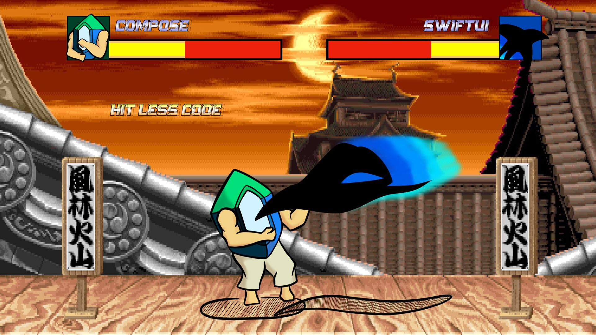
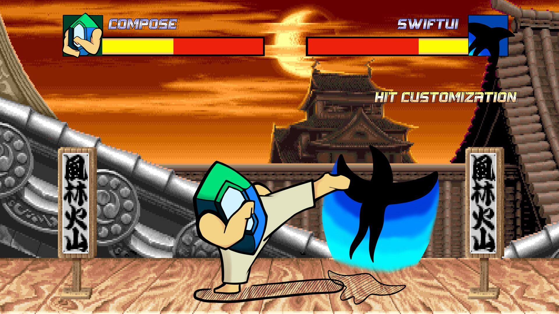
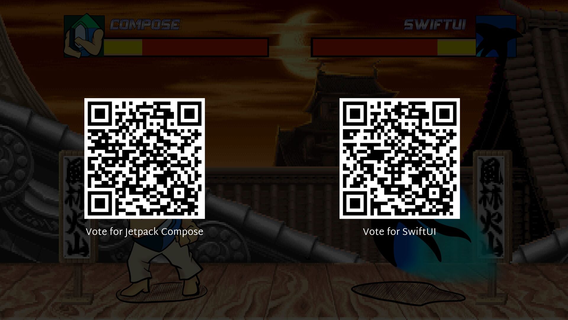
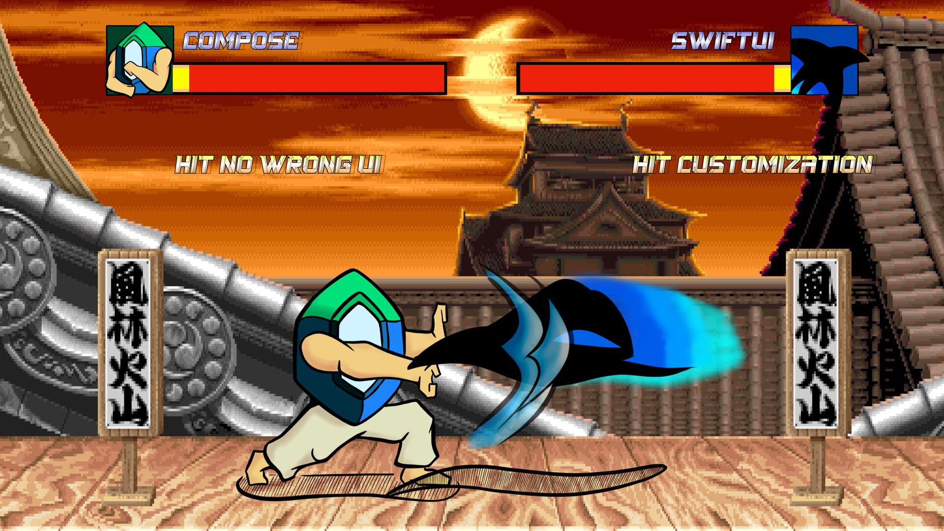
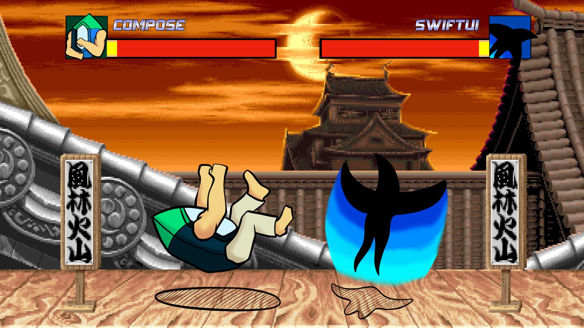
I suggest you to organize a fight between SwiftUI to me right and Jetpack Compose to my left. We'll compare their design, usage, differences and next steps to define who is the best and win this battle!

Take pop corn and trolls, there will be blood!

Gerard

December 27, 2022
Tweet

More Decks by Gerard

Other Decks in Technology

Transcript

  1. @Composable fun CounterScreen() { Row { FloatingActionButton(onClick = { })

    { Icon( imageVector = Icons.Default.Remove, contentDescription = "Decrement" ) } FloatingActionButton(onClick = { }) { Icon( imageVector = Icons.Default.Add, contentDescription = "Increment" ) } } }
  2. @Composable fun CounterScreen() { Row { FloatingActionButton(onClick = { })

    { ... } FloatingActionButton(onClick = { }) { ... } } }
  3. @Composable fun CounterScreen() { Row( horizontalArrangement = Arrangement.spacedBy(8.dp), verticalAlignment =

    Alignment.CenterVertically ) { FloatingActionButton(onClick = { }) { ... } Text(text = "Count:") FloatingActionButton(onClick = { }) { ... } } }
  4. @Composable fun CounterScreen() { Box( modifier = Modifier.fillMaxSize(), contentAlignment =

    Alignment.Center ) { Row( horizontalArrangement = Arrangement.spacedBy(8.dp), verticalAlignment = Alignment.CenterVertically ) { FloatingActionButton(onClick = { }) { ... } Text(text = "Count:") FloatingActionButton(onClick = { }) { ... } } } }
  5. @Composable fun CounterScreen( modifier: Modifier = Modifier ) { Box(

    modifier = modifier.fillMaxSize(), contentAlignment = Alignment.Center ) { Row( horizontalArrangement = Arrangement.spacedBy(8.dp), verticalAlignment = Alignment.CenterVertically ) { FloatingActionButton(onClick = { }) { ... } Text(text = "Count:") FloatingActionButton(onClick = { }) { ... } } } }
  6. @Composable fun CounterScreen( modifier: Modifier = Modifier ) { var

    counter by remember { mutableStateOf(0) } Box( modifier = modifier.fillMaxSize(), contentAlignment = Alignment.Center ) { Row( horizontalArrangement = Arrangement.spacedBy(8.dp), verticalAlignment = Alignment.CenterVertically ) { FloatingActionButton(onClick = { counter-- }) { ... } Text(text = "Count: $counter") FloatingActionButton(onClick = { counter++ }) { ... } } } }
  7. Jetpack compose Declare a component with @Composable Box, Row and

    Column to place elements Arrangement and alignment parameters State with remember mutableStateOf Modifier to decorate components Accessibility first
  8. struct Counter: View { var body: some View { HStack

    { Button { // Action } label: { Image(systemName: "minus") } Button { // Action } label: { Image(systemName: "plus") } } } }
  9. struct Counter: View { var body: some View { HStack

    { Button { // Action } label: { Image(systemName: "minus") } Text("Count:") Button { // Action } label: { Image(systemName: "plus") } } } }
  10. struct Counter: View { var body: some View { HStack

    { Button { // Action } label: { Image(systemName: "minus") } .padding() Text("Count:") Button { // Action } label: { Image(systemName: "plus") } .padding() } } }
  11. struct Counter: View { @State var counter: Int = 0

    var body: some View { HStack { Button { counter = counter - 1 } label: { Image(systemName: "minus") } .padding() Text("Count: \(counter)") Button { counter = counter + 1 } label: { Image(systemName: "plus") } .padding() } } }
  12. SwiftUI Declare a component with protocol impl ZStack, HStack and

    VStack to place elements Custom components decorated automatically State with @State property
  13. SwiftUI SwiftUI is packaged with the OS Because embedded in

    the system, runtime performance is better Need to wait new Apple system versions for new features SwiftUI available since iOS 13 (2019) in experimental First stable version since iOS 14 (2020)
  14. Jetpack compose Jetpack Compose is packaged in a library New

    features available since API 21 (2014) In theory, runtime performance is worst than SwiftUI (or XML) But the release version make a lot of optimisation
  15. struct Counter_Previews: PreviewProvider { static var previews: some View {

    Counter() } } Pin a preview Preview name Live preview Selectable preview Variants Canvas Device Settings Run on device
  16. struct SpeakerAvatarView: View { var url: String var body: some

    View { AsyncImageView( url: URL(string: url)!, placeholder: { Text("...") } ) .clipShape(Circle()) } } struct SpeakerAvatarView_Previews: PreviewProvider { static var previews: some View { SpeakerAvatarView( url: SpeakerUi.companion.fake.url ) } }
  17. SwiftUI Wysiwyg customization for previews Running the preview in the

    simulator Customization configurable as code Preview not limited to UI
  18. @MustBeDocumented @Retention(AnnotationRetention.SOURCE) @Target( AnnotationTarget.ANNOTATION_CLASS, AnnotationTarget.FUNCTION ) @Repeatable annotation class Preview(

    val name: String = "", val group: String = "", @IntRange(from = 1) val apiLevel: Int = -1, val widthDp: Int = -1, val heightDp: Int = -1, val locale: String = "", @FloatRange(from = 0.01) val fontScale: Float = 1f, val showSystemUi: Boolean = false, val showBackground: Boolean = false, val backgroundColor: Long = 0, @UiMode val uiMode: Int = 0, @Device val device: String = Devices.DEFAULT )
  19. object Devices { const val DEFAULT = "" const val

    PIXEL_3 = "id:pixel_3" const val PIXEL_3_XL = "id:pixel_3_xl" const val PIXEL_3A = "id:pixel_3a" const val PIXEL_3A_XL = "id:pixel_3a_xl" const val PIXEL_4 = "id:pixel_4" const val PIXEL_4_XL = "id:pixel_4_xl" const val AUTOMOTIVE_1024p = "id:automotive_1024p_landscape" const val WEAR_OS_LARGE_ROUND = "id:wearos_large_round" const val WEAR_OS_SMALL_ROUND = "id:wearos_small_round" const val WEAR_OS_SQUARE = "id:wearos_square" const val WEAR_OS_RECT = "id:wearos_rect" // Reference devices const val PHONE = "spec:id=reference_phone,shape=Normal,width=411,height=891,unit=dp, dpi=420" const val FOLDABLE = "spec:shape=Normal,width=673,height=841,unit=dp,dpi=480" const val TABLET = "spec:shape=Normal,width=1280,height=800,unit=dp,dpi=420" const val DESKTOP = "spec:shape=Normal,width=1920,height=1080,unit=dp,dpi=420" }
  20. @Preview( showBackground = true, showSystemUi = true, device = Devices.PIXEL_XL,

    name = "Counter", fontScale = 2f, uiMode = UI_MODE_NIGHT_YES, ) @Composable internal fun CounterScreenPreview() { SwiftuiVsComposeTheme { CounterScreen() } }
  21. @Preview( showBackground = true, showSystemUi = true, device = Devices.PIXEL_XL,

    name = "Counter", fontScale = 2f, uiMode = UI_MODE_NIGHT_YES, ) @Composable internal fun CounterScreenPreview() { SwiftuiVsComposeTheme { Scaffold { CounterScreen() } } }
  22. @Composable fun Scaffold( modifier: Modifier = Modifier, topBar: @Composable ()

    -> Unit = {}, bottomBar: @Composable () -> Unit = {}, snackbarHost: @Composable () -> Unit = {}, floatingActionButton: @Composable () -> Unit = {}, floatingActionButtonPosition: FabPosition = FabPosition.End, containerColor: Color = MaterialTheme.colorScheme.background, contentColor: Color = contentColorFor(containerColor), content: @Composable (PaddingValues) -> Unit )
  23. @Preview( group = "Devices", name = "Pixel 4", showSystemUi =

    true, device = Devices.PIXEL_4 ) @Preview( group = "Devices", name = "Tablet", showSystemUi = true, device = Devices.TABLET ) @Preview( group = "Devices", name = "Desktop", showSystemUi = true, device = Devices.DESKTOP ) annotation class DevicesPreview
  24. @Composable fun SpeakerAvatar( url: String, displayName: String, modifier: Modifier =

    Modifier ) { Image( painter = rememberAsyncImagePainter( model = url, imageLoader = LocalContext.current.imageLoader ), contentDescription = displayName, contentScale = ContentScale.FillWidth, modifier = modifier.clip(CircleShape) ) }
  25. @Composable fun SpeakerAvatar( url: String, displayName: String, modifier: Modifier =

    Modifier ) { if (LocalInspectionMode.current) { Box( modifier = modifier .background( color = MaterialTheme.colors.secondary, shape = CircleShape ) ) } else { Image( painter = rememberAsyncImagePainter( model = url, imageLoader = LocalContext.current.imageLoader ), contentDescription = displayName, contentScale = ContentScale.FillWidth, modifier = modifier.clip(CircleShape) ) } }
  26. @Composable fun SpeakerAvatar( url: String, displayName: String, modifier: Modifier =

    Modifier ) { Image( painter = rememberAsyncImagePainter( model = url, placeholder = ColorPainter(MaterialTheme.colors.secondary), imageLoader = LocalContext.current.imageLoader ), contentDescription = displayName, contentScale = ContentScale.FillWidth, modifier = modifier.clip(CircleShape) ) }
  27. Jetpack compose Configure preview with @Preview parameters Fully customizable for

    all kind of devices Custom preview annotations LocalInspectionMode to keep previews Limited to UI elements
  28. struct TabScreen: View { var body: some View { TabView

    { Counter() .tabItem { Label("screenAgenda", systemImage: "calendar") } Counter() .tabItem { Label("screenSpeakers", systemImage: "person") } Counter() .tabItem { Label("screenInfo", systemImage: "info") } } } }
  29. SwiftUI Just easy to use! By default, the UI match

    the Design System But the customization can be more tricky
  30. @Composable fun BottomNavigationScreen( modifier: Modifier = Modifier ) { Scaffold(

    modifier = modifier, bottomBar = { NavigationBar { } } ) { } }
  31. @Composable fun BottomNavigationScreen( modifier: Modifier = Modifier ) { Scaffold(

    modifier = modifier, bottomBar = { NavigationBar { NavigationBarItem( selected = true, icon = { Icon( imageVector = Icons.Default.CalendarToday, contentDescription = null ) }, onClick = { }, label = { Text(text = "Agenda") }, alwaysShowLabel = false ) } } ) { } }
  32. @Composable fun BottomNavigationScreen( modifier: Modifier = Modifier ) { Scaffold(

    modifier = modifier, bottomBar = { NavigationBar { NavigationBarItem( // ... ) } } ) { } }
  33. @Composable fun BottomNavigationScreen( modifier: Modifier = Modifier ) { val

    navController = rememberNavController() Scaffold( modifier = modifier, bottomBar = { NavigationBar { NavigationBarItem( // ... ) } } ) { } }
  34. @Composable fun BottomNavigationScreen( modifier: Modifier = Modifier ) { val

    navController = rememberNavController() Scaffold( modifier = modifier, bottomBar = { NavigationBar { NavigationBarItem( // ... ) } } ) { NavHost( navController = navController, startDestination = "agenda" ) { composable(route = "agenda") { Text(text = "Agenda") } composable(route = "speakers") { Text(text = "Speakers") } composable(route = "info") { Text(text = "Info") } }
  35. @Composable fun BottomNavigationScreen( modifier: Modifier = Modifier ) { val

    navController = rememberNavController() Scaffold( modifier = modifier, bottomBar = { NavigationBar { NavigationBarItem( // ... ) } } ) { NavHost( navController = navController, startDestination = "agenda" ) { // ... } } }
  36. @Composable fun BottomNavigationScreen( modifier: Modifier = Modifier ) { val

    navController = rememberNavController() Scaffold( modifier = modifier, bottomBar = { NavigationBar { NavigationBarItem( // ... onClick = { navController.navigate("agenda") { popUpTo( navController.graph.findStartDestination().id ) { saveState = true } launchSingleTop = true restoreState = true } }, ) } } ) { NavHost( navController = navController, startDestination = "agenda"
  37. @Composable fun BottomNavigationScreen( modifier: Modifier = Modifier ) { val

    navController = rememberNavController() Scaffold( modifier = modifier, bottomBar = { NavigationBar { NavigationBarItem( // ... ) NavigationBarItem( // ... ) NavigationBarItem( // ... ) } } ) { NavHost( navController = navController, startDestination = "agenda" ) { // ... } } }
  38. @Composable fun RowScope.BottomNavigationItem( label: String, icon: ImageVector, route: String, navController:

    NavController, modifier: Modifier = Modifier, ) { NavigationBarItem( modifier = modifier, selected = false, icon = { Icon( imageVector = icon, contentDescription = null ) }, onClick = { navController.bottomBarNavigate(route) }, label = { Text(text = label) }, alwaysShowLabel = false ) }
  39. @Composable fun RowScope.BottomNavigationItem( label: String, icon: ImageVector, route: String, navController:

    NavController, modifier: Modifier = Modifier, ) { val navBackStackEntry by navController.currentBackStackEntryAsState() val currentDestination = navBackStackEntry?.destination val screen = currentDestination?.route NavigationBarItem( modifier = modifier, selected = screen == route, icon = { Icon( imageVector = icon, contentDescription = null ) }, onClick = { navController.bottomBarNavigate(route) }, label = { Text(text = label) }, alwaysShowLabel = false ) }
  40. @Composable fun BottomNavigationScreen( modifier: Modifier = Modifier ) { val

    navController = rememberNavController() Scaffold( modifier = modifier, bottomBar = { NavigationBar { } } ) { NavHost( navController = navController, startDestination = "agenda" ) { // ... } } }
  41. @Composable fun BottomNavigationScreen( modifier: Modifier = Modifier ) { val

    navController = rememberNavController() Scaffold( modifier = modifier, bottomBar = { NavigationBar { BottomNavigationItem( route = "agenda", label = "Agenda", icon = Icons.Default.CalendarToday, navController = navController ) BottomNavigationItem( // ... ) BottomNavigationItem( // ... ) } } ) { NavHost( navController = navController, startDestination = "agenda" ) { // ...
  42. Jetpack compose Need to take care about the navigation Need

    to take care about the selected tab Need so much code compared to SwiftUI! Easy to refactor for something more concise But the customization is easier
  43. Jetpack compose Material artifacts follow perfectly the Material design specifications

    Need more code than SwiftUI to build correct UI Partially fixed by Material 3 artifact and dynamic colors Already compatible with Desktop, Web and iOS Design decision made by Google allow Compose to add multiplatform support
  44. SwiftUI Easy to use, with a bias for the Apple

    Design System in all components Hard to write an application with a wrong UI Compatible with all Apple OS platforms But can’t use SwiftUI for external platforms
  45. References 
 SwiftUI vs Jetpack Compose by an Android Engineer

    by Gérard Paligot 
 https://proandroiddev.com/swiftui-vs-jetpack-compose-by-an-android-engineer-6b48415f36b3 SwiftUI vs. Jetpack Compose: Why Android Wins Hands Down by Michael Long 
 https://michaellong.medium.com/swiftui-vs-jetpack-compose-why-android-wins-hands-down-b5f849b730db An iOS Engineer learns about Android’s Jetpack Compose and loves it. by Dimitri James Tsi fl itzis 
 https://medium.com/@tsif/an-ios-engineer-learns-about-androids-jetpack-compose-and-loves-it-c04fc6a53f10 SwiftUI vs. Jetpack Compos by Jeulian Bissekkou 
 https://quickbirdstudios.com/blog/swiftui-vs-android-jetpack-compose/ Conferences4Hall GitHub project 
 https://github.com/GerardPaligot/conferences4hall
  46. Soundtracks 
 Title Theme - Street Fighter 2 Character Select

    - Street Fighter 2 Start Battle - Street Fighter 2 Guile’s Theme - Street Fighter 2 Ryu’s Theme - Street Fighter 2 Ken’s Theme - Street Fighter 2 Zangief’s Theme - Street Fighter 2 End Battle - Street Fighter 2 Credits - Street Fighter 
 Cosmonkey - Champion