Upgrade to Pro — share decks privately, control downloads, hide ads and more …

[CSS Dev Conf: "The Shining" ver.] Responsive Cross-Device Development with Web Standards

[CSS Dev Conf: "The Shining" ver.] Responsive Cross-Device Development with Web Standards

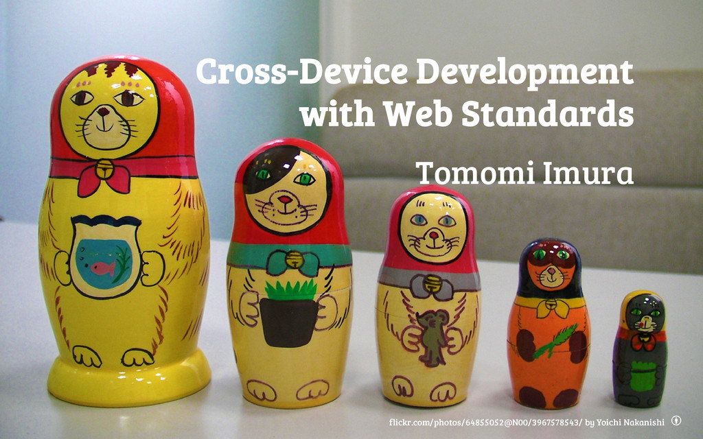
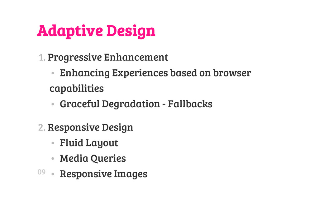
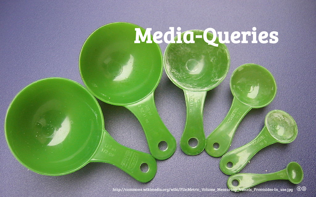
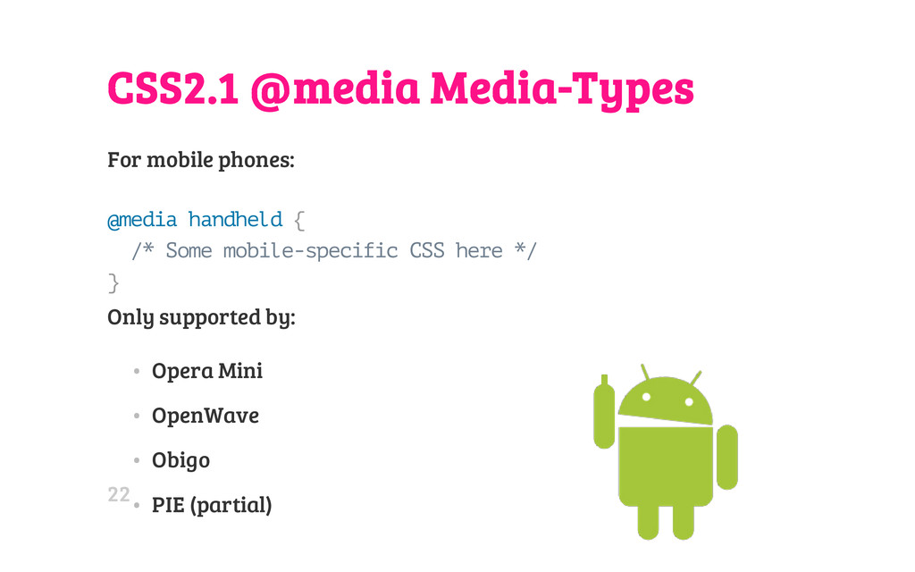
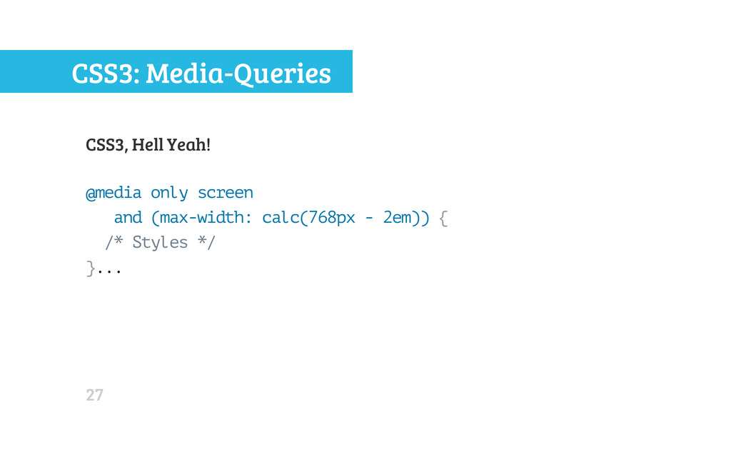
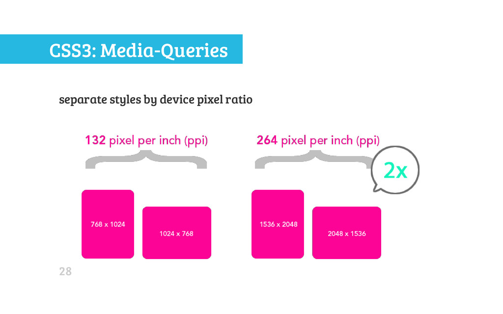
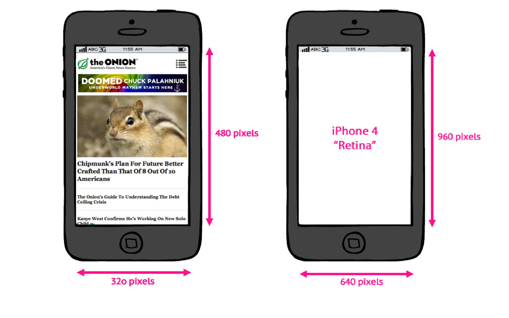
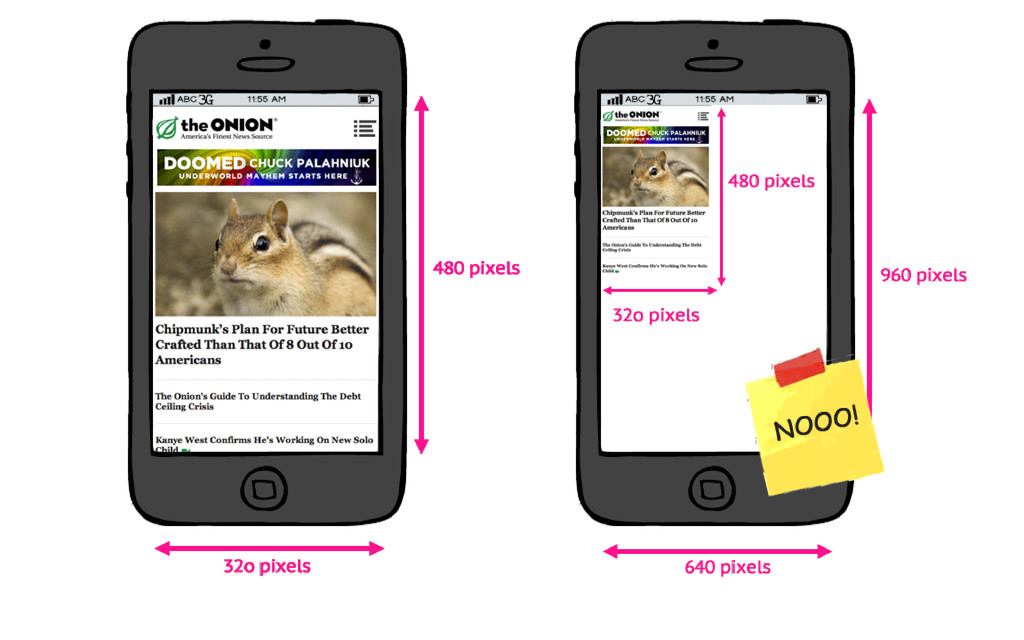
Cross-device development using standard technologies- current stable state and emerging standards. I am covering media-queries (incl. high-DPI screen support, matchMedia(), device adaptation, MQ Level 4), fluid layout "neue" with CSS 3, and responsive images.

The interactive slides (in html) is hosted on github:
http://girliemac.github.io/presentation-slides/html5-mobile-approach/rwd.html

thanks :-)

Tomomi Imura

October 21, 2013
Tweet

More Decks by Tomomi Imura

Other Decks in Technology

Transcript

  1. H E L L O M Y N A M

    E I S Tomomi @girlie_mac 03
  2. One Web Approach Mobile Web Best Practices by W3C (2008)

    One Web means making, as far as is reasonable, the same information and services available to users irrespective of the device they are using. ” “ Mobile Web Best Practices 1.0 (2008) 04
  3. Adaptive Design 1. Progressive Enhancement • Enhancing Experiences based on

    browser capabilities • Graceful Degradation - Fallbacks 2. Responsive Design • Fluid Layout • Media Queries • Responsive Images 09
  4. Why Should You Consider? • One URL works across the

    browsers • No redirect • No User-Agent sniffing • Maintainable • A single content • No separate markup 12
  5. Then • HTML Table Layout (Party like it's 1999) •

    The CSS "Holy Grail" Column Liquid Layout • Float • Negative margin • All the hacks that are PITA • UI Frameworks for Grid Layout • YUI • jQuery Masonry 14
  6. CSS Multi-column Layout Module . c o l { -

    w e b k i t - c o l u m n s : 2 0 0 p x ; - m o z - c o l u m n s : 2 0 0 p x ; c o l u m n s : 2 0 0 p x ; / * c o l u m n - c o u n t : a u t o * / } Browser Support: * 2.1* 3* 7* * 10 11.5p 15Bl* http://www.w3.org/TR/css3-multicol/ 17
  7. CSS Flexible Box Layout Module # m a i n

    { d i s p l a y : f l e x ; f l e x - f l o w : r o w ; } . . . @ m e d i a a l l a n d ( m a x - w i d t h : 6 4 0 p x ) { # m a i n { f l e x - f l o w : c o l u m n ; } } Latest syntax: 21* 7* 10* 11 12p 15Bl http://www.w3.org/TR/css3-flexbox/ 19
  8. Grid Layout with MQ An arrangement suitable for ‘portrait’ orientation.

    An arrangement suitable for ‘landscape’ orientation. 10* http://www.w3.org/TR/css3-grid-layout/ 20
  9. CSS2.1 @media Media-Types For mobile phones: @ m e d

    i a h a n d h e l d { / * S o m e m o b i l e - s p e c i f i c C S S h e r e * / } Only supported by: • Opera Mini • OpenWave • Obigo • PIE (partial) 22
  10. CSS3: Media-Queries allows content rendering to adapt to conditions: •

    width of the target viewport • width of the device's screen size • screen orientations (landscape v. portrait) • device pixel ratio (aka. Retina) etc... 23
  11. CSS3: Media-Queries Separate styles by the width of the target

    viewport @ m e d i a o n l y s c r e e n a n d ( m i n - w i d t h : 7 6 8 p x ) a n d ( m a x - w i d t h : 1 0 2 4 p x ) { / * S t y l e s * / } 24
  12. CSS3: Media-Queries by device-width, the width of the device's screen

    size @ m e d i a o n l y s c r e e n a n d ( m i n - d e v i c e - w i d t h : 3 2 0 p x ) a n d ( m a x - d e v i c e - w i d t h : 4 8 0 p x ) { / * S t y l e s * / } 25
  13. CSS3: Media-Queries combined with screen orientations @ m e d

    i a o n l y s c r e e n a n d ( m i n - d e v i c e - w i d t h : 7 6 8 p x ) a n d ( m a x - d e v i c e - w i d t h : 1 0 2 4 p x ) a n d ( o r i e n t a t i o n : l a n d s c a p e ) { / * S t y l e s * / } . . . 26
  14. CSS3: Media-Queries CSS3, Hell Yeah! @ m e d i

    a o n l y s c r e e n a n d ( m a x - w i d t h : c a l c ( 7 6 8 p x - 2 e m ) ) { / * S t y l e s * / } . . . 27
  15. CSS Pixel vs. Device Pixel • Pixel in CSS is

    relative • 1 CSS pixel != 1 device pixel 36
  16. Pixel Density in DOM w i n d o w

    . d e v i c e P i x e l R a t i o Device Browser Pixel Density Nexus One Android browser 1.5 Galaxy Nexus Chrome 2.0 Galaxy Nexus Opera Mobile 2.25 Samsung Galaxy S4 Chrome 3.0 37
  17. Zoom Dependent Pixel Density ⌘+ and ⌘- , but not

    for pinch-zoom Test page (Firefox and Chrome 31+) 38
  18. Media-Queries for "Retina" @ m e d i a o

    n l y s c r e e n a n d ( m i n - d e v i c e - p i x e l - r a t i o : 2 ) { / * s t y l e s f o r h i - D P I s c r e e n s * / } 39
  19. WTF Vendor Prefix! @ m e d i a o

    n l y s c r e e n a n d ( - w e b k i t - m i n - d e v i c e - p i x e l - r a t i o : 1 . 5 ) @ m e d i a o n l y s c r e e n a n d ( m i n - - m o z - d e v i c e - p i x e l - r a t i o : 1 . 5 ) { . . . @ m e d i a o n l y s c r e e n a n d ( - o - m i n - d e v i c e - p i x e l - r a t i o : 3 / 2 ) { . . . } 40
  20. Unprefix: resolution MQ @ m e d i a (

    - w e b k i t - m i n - d e v i c e - p i x e l - r a t i o : 2 ) , ( m i n - r e s o l u t i o n : 1 9 2 d p i ) { . . . } Typical Browser: 96dpi (96 CSS-pixel in 1 CSS-inch) 41
  21. ...even easier @ m e d i a ( -

    w e b k i t - m i n - d e v i c e - p i x e l - r a t i o : 2 ) , ( m i n - r e s o l u t i o n : 2 d p p x ) { . . . } 29 16 42
  22. CSSOM View Module: matchMedia() approaching media-queries in DOM v a

    r m q l = w i n d o w . m a t c h M e d i a ( m e d i a Q u e r y S t r i n g ) ; Browser Support: 9 3 5 10 6 10 12.1p 15Bl http://dev.w3.org/csswg/cssom-view/#the-mediaquerylist-interface 43
  23. matchMedia() v a r m q l = w i

    n d o w . m a t c h M e d i a ( ' ( o r i e n t a t i o n : l a n d s c a p e ) ' ) ; i f ( m q l . m a t c h e s ) { / * t h e c u r r e n t o r i e n t a t i o n i s i n l a n d s c a p e * / } e l s e { / * p o r t r a i t * / } 44
  24. CSS Device Adaptation < m e t a n a

    m e = " v i e w p o r t " c o n t e n t = " w i d t h = d e v i c e - w i d t h " > ↓ CSS @ v i e w p o r t { w i d t h : d e v i c e - w i d t h ; } 45
  25. CSS Device Adaptation @ - o - v i e

    w p o r t { w i d t h : d e v i c e - w i d t h } @ - m s - v i e w p o r t { w i d t h : d e v i c e - w i d t h } * @ v i e w p o r t { w i d t h : d e v i c e - w i d t h } 11P 10 * bug in IE10 - reports in device pixel value 46
  26. @viewport in @media @ m e d i a s

    c r e e n a n d ( o r i e n t a t i o n : p o r t r a i t ) { @ v i e w p o r t { w i d t h : 7 6 8 p x ; h e i g h t : 1 0 2 4 p x ; } / * C S S f o r p o r t r a i t l a y o u t g o e s h e r e * / } 47
  27. Media Queries Level 4 • "pointer" - accuracy of a

    pointing device. • n o n e • c o a r s e aka fat finger • f i n e • "hover" • 0 • 1 http://dev.w3.org/csswg/mediaqueries4/#pointer 48
  28. Media Queries Level 4 @ m e d i a

    ( h o v e r ) { . m e n u l i : h o v e r { b a c k g r o u n d - c o l o r : # b a d a 5 5 ; } } 49
  29. MQ L4 - Ambient Light Detection @ m e d

    i a ( l u m i n o s i t y : n o r m a l ) { / * n o r m a l l i g h t e n v i r o n m e n t - n o a d j u s t m e n t n e e d e d * / } @ m e d i a ( l u m i n o s i t y : d i m ) { / * s t y l e s f o r d i m m e d l i g h t e n v i r o n m e n t * / } @ m e d i a ( l u m i n o s i t y : w a s h e d ) { / * s t y l e s f o r b r i g h t l i g h t e n v - e . g . u n d e r s u n l i g h t * / } http://dev.w3.org/csswg/mediaqueries4/#luminosity 50
  30. Responsive Images Use Cases 1. Resolution switching 2. Art Direction

    3. High-res images for screens with higher DPR 52
  31. Methods • Providing different images with media-queries • ...with JavaScript

    • ...with server-side content negotiation • Resizing / cropping a single image • Creative Hacks • New: proposed solutions 53
  32. Dynamically Resizing an Image Shrink and Stretch without MQ <

    i m g s r c = " i m a g e s / r e l a t i v e l y - l a r g e - p h o t o . j p g " a l t = " c a t " > i m g { w i d t h : 1 0 0 % ; h e i g h t : a u t o ; } 57
  33. CSS2 Clip Property < d i v c l a

    s s = " i m a g e - c o n t a i n e r " > < i m g s r c = " i m a g e s / s u s h i - l a r g e . j p g " > < / d i v > . i m a g e - c o n t a i n e r { p o s i t i o n : r e l a t i v e ; } . i m a g e - c o n t a i n e r i m g { p o s i t i o n : a b s o l u t e ; } @ m e d i a o n l y s c r e e n a n d ( m a x - w i d t h : 4 8 0 p x ) { . i m a g e - c o n t a i n e r i m g { c l i p : r e c t ( 8 0 p x 2 7 0 p x 2 7 0 p x 2 4 0 p x ) ; / / B L E H ! ! ! } } 59
  34. CSS2 Clip Property p o s i t i o

    n : a b s o l u t e ; c l i p : r e c t ( t o p r i g h t b o t t o m l e f t ) ; Photo: http://www.flickr.com/photos/nicolelee/1798352472/ by Nicole Lee bna 60
  35. Up-Res Images with MQ . b a n n e

    r { b a c k g r o u n d - i m a g e : u r l ( b a n n e r . p n g ) ; w i d t h : 3 2 0 p x ; h e i g h t : 1 6 0 p x ; } @ m e d i a o n l y s c r e e n a n d ( - w e b k i t - m i n - d e v i c e - p i x e l - r a t i o : 2 ) , o n l y s c r e e n a n d ( m i n - r e s o l u t i o n : 2 d p p x ) { . b a n n e r { b a c k g r o u n d - i m a g e : u r l ( b a n n e r - 2 x . p n g ) ; b a c k g r o u n d - s i z e : 1 0 0 % ; } } 63
  36. Up-Res with CSS image-set() < d i v i d

    = " p h o t o 0 1 " > < / d i v > # p h o t o 0 1 { w i d t h : 3 0 0 p x ; h e i g h t : 2 0 0 p x ; b a c k g r o u n d - i m a g e : u r l ( i m a g e s / l o w r e s . j p g ) ; b a c k g r o u n d - i m a g e : - w e b k i t - i m a g e - s e t ( u r l ( i m a g e s / l o w r e s . j p g ) 1 x , u r l ( i m a g e s / h i r e s . j p g ) 2 x ) ; } 6 20 15bl CSS Image Values and Replaced Content Module Level 4 64
  37. Heavy resource loading Hi-Res Image loading problems: • Large sizes

    • Extra http requests * • Image resizing performance • Data transfer cost • Battery consumption 65
  38. SVG < i m g s r c = "

    l o g o . s v g " w i d t h = "4 3 2 " > 66
  39. Web Font Icons < s p a n d a

    t a - i c o n = " & # x e 0 0 0 ; " > f o r k m e < / s p a n > @ f o n t - f a c e { f o n t - f a m i l y : ' i c o n s ' ; s r c : u r l ( ' f o n t s / i c o n s . w o f f ' ) f o r m a t ( ' w o f f ' ) ; } [ d a t a - i c o n ] : : b e f o r e { f o n t - f a m i l y : ' i c o n s ' ; c o n t e n t : a t t r ( d a t a - i c o n ) ; f o n t - s i z e : 7 2 p x ; } 68
  40. Other Solutions • JavaScript • matchMedia() • Picturefill.js • Server-side

    • "Adaptive Images" (PHP) • Sencha.io Src (UA lookup in DB) • Creative Hacks • Clown Car Technique 69
  41. The srcset attribute Proposal by Apple < i m g

    a l t = " T h e B r e a k f a s t C o m b o " s r c = " b a n n e r . j p e g " s r c s e t = " b a n n e r - H D . j p e g 2 x , b a n n e r - p h o n e . j p e g 1 0 0 w , b a n n e r - p h o n e - H D . j p e g 1 0 0 w 2 x " > WebKit Nightly r154002 The srcset attribute - An HTML extension for adaptive images 72
  42. Picture Element Proposal by RespImg CG < p i c

    t u r e w i d t h = " 5 0 0 " h e i g h t = " 5 0 0 " > < s o u r c e m e d i a = " ( m i n - w i d t h : 4 5 e m ) " s r c = " l a r g e . j p g " > < s o u r c e m e d i a = " ( m i n - w i d t h : 1 8 e m ) " s r c = " m e d . j p g " > < s o u r c e s r c = " s m a l l . j p g " > < i m g s r c = " f a l l b a c k . j p g " > < p > A c c e s s i b l e t e x t < / p > < / p i c t u r e > Responsive Images Community Group 73
  43. HTTP Client-Hints Proposal from Google: let the server selects the

    right asset [ R e q u e s t ] G E T / k i t t e n . j p g H T T P / 1 . 1 U s e r - A g e n t : . . . A c c e p t : i m a g e / w e b p , i m a g e / j p g C H : d p r = 2 . 0 http://www.igvita.com/2013/08/29/automating-dpr-switching-with-client-hints/ 74
  44. Automotive proposals for standardizing HTML5-based vehicle APIs: • Tizen •

    Webinos • GENIVI • QNX W3C: Automotive and Web Platform Business Group QNX Auto Blog 77
  45. Thank you! Tomomi Imura • @girlie_mac • girliemac.com • github.com/girliemac

    • speakerdeck.com/girlie_mac Slide: http://girliemac.github.io/presentation-slides/html5-mobile- approach/rwd.html 79