Upgrade to Pro
— share decks privately, control downloads, hide ads and more …
Speaker Deck
Features
Speaker Deck
PRO
Sign in
Sign up for free
Search
Search
Introduction to Material Design
Search
Harsh Dattani
December 14, 2014
Design
180
3
Share
Embed
Copy iframe code
Copy JS code
Copy link
Start on current slide
Introduction to Material Design
Delivered a session on Introduction to Material Design at DevFest Ahmedabad 2014.
Harsh Dattani
December 14, 2014
More Decks by Harsh Dattani
See All by Harsh Dattani
Whats new in Android N
harshdattani
0
67
Developing Secure Android Application
harshdattani
2
380
Guard your Android
harshdattani
0
170
Other Decks in Design
See All in Design
From the Visible Crossroads: Turning Outputs into Outcomes
takaikanako
2
1.5k
デザイナーとエンジニアで 同じ山に登ろう
moco1013
0
280
Rethinking IFUs: What Board Game Rulebooks Contribute to IFU Usability
deadlinepoet
0
340
AI-Slopなデザインを生まないためのデザインプロセス戦略
takanorip
6
4.4k
I.A. como meio, não como fim. Como avaliar o valor entregue?
videlvequio
0
410
CULTURE DECK/Marketing Director
mhand01
0
1.4k
JBUG大阪#9_登壇資料_引き継ぎで困らないためのBacklogWikiの整え方_ミスと属人化を防ぐために、 “次の人が動ける状態”をどう残すか
webnaut
1
200
「おすすめ」はなぜ信用されないのか - 信頼を築くUI/UX設計
ryu1013
0
180
図面資産×AI 眠れる資産を起こす挑戦
aonomasahiro
0
180
タイル紹介サイト「タイルだもんで」
calpin
0
160
kintone開発におけるライターの役割の変化〜AI活用を添えて〜 / Changes in the Role of Writers in Kintone Development
keroyama
0
150
Of Ordination and Rebellion exploration sketches
rezaline
0
180
Featured
See All Featured
The Art of Delivering Value - GDevCon NA Keynote
reverentgeek
16
2k
BBQ
matthewcrist
89
10k
Design in an AI World
tapps
1
260
Money Talks: Using Revenue to Get Sh*t Done
nikkihalliwell
0
410
エンジニアに許された特別な時間の終わり
watany
108
250k
StorybookのUI Testing Handbookを読んだ
zakiyama
31
6.8k
The Illustrated Children's Guide to Kubernetes
chrisshort
51
53k
From π to Pie charts
rasagy
0
240
Build The Right Thing And Hit Your Dates
maggiecrowley
39
3.3k
The AI Search Optimization Roadmap by Aleyda Solis
aleyda
1
6k
Conquering PDFs: document understanding beyond plain text
inesmontani
PRO
4
2.9k
Helping Users Find Their Own Way: Creating Modern Search Experiences
danielanewman
31
3.3k
Transcript
Introduction to Material Design Harsh Dattani
About Me M.Tech Cyber Security Gujarat Forensic Sciences University, Gandhinagar
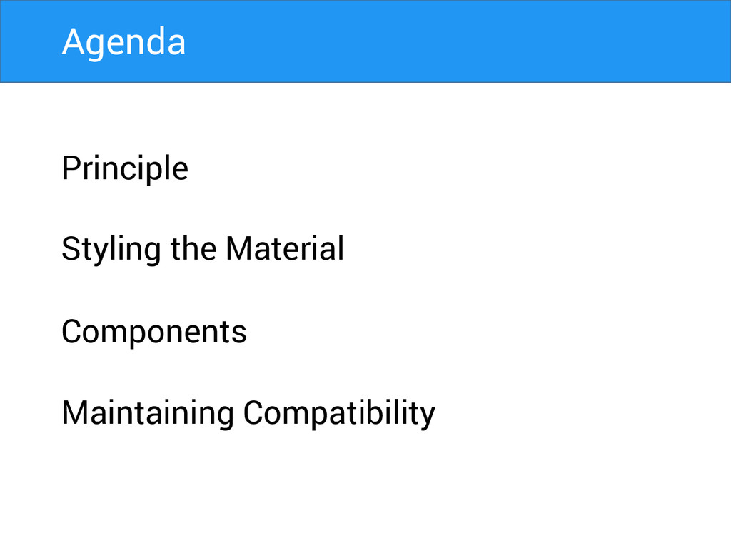
Principle Styling the Material Components Maintaining Compatibility Agenda
A great product experience starts with UX followed by UI.
Both are essential for the product’s success.
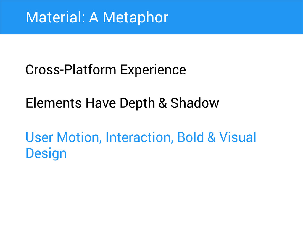
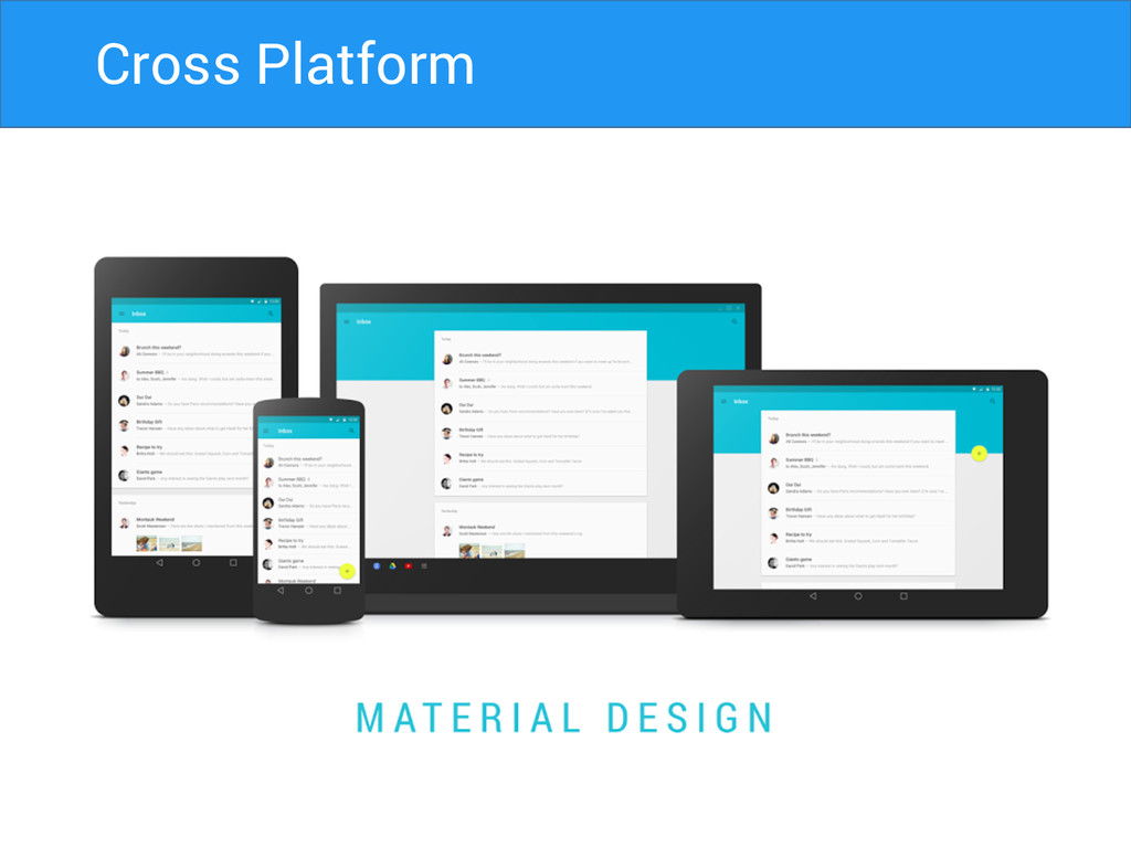
Cross-Platform Experience Material: A Metaphor
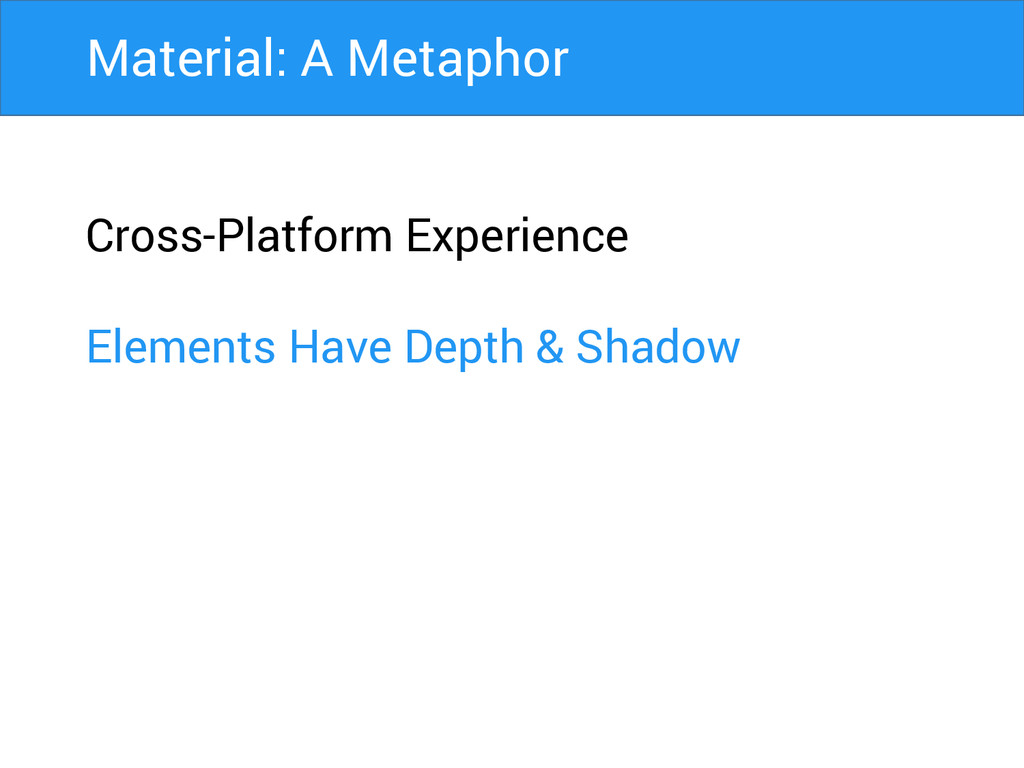
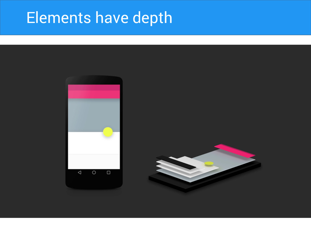
Cross-Platform Experience Elements Have Depth & Shadow Material: A Metaphor
Cross-Platform Experience Elements Have Depth & Shadow User Motion, Interaction,
Bold & Visual Design Material: A Metaphor
Cross Platform
Elements Have Depth Elements have depth
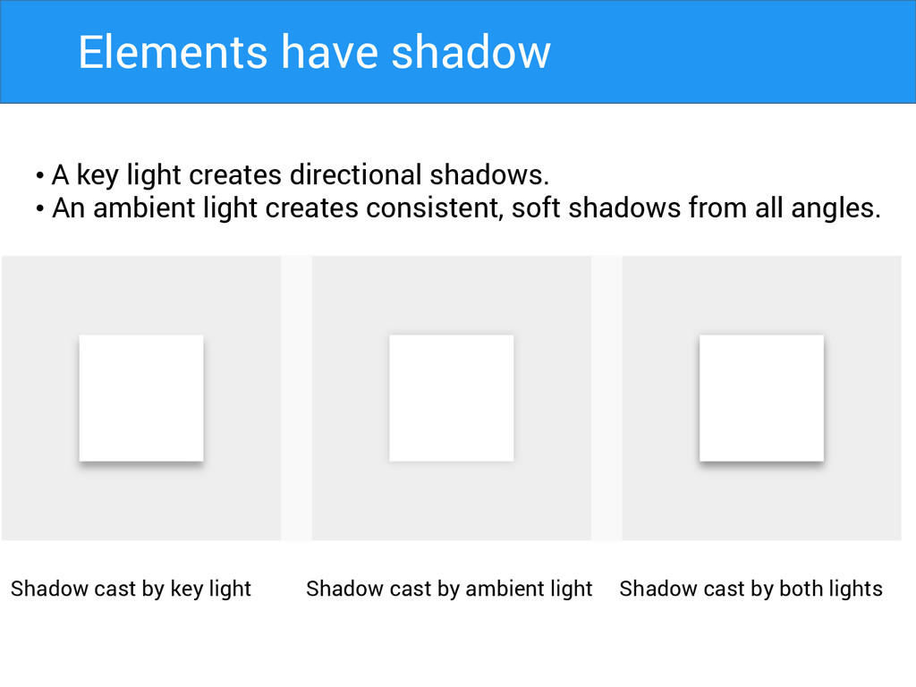
• A key light creates directional shadows. • An ambient
light creates consistent, soft shadows from all angles. Shadow cast by key light Shadow cast by ambient light Shadow cast by both lights Elements have shadow
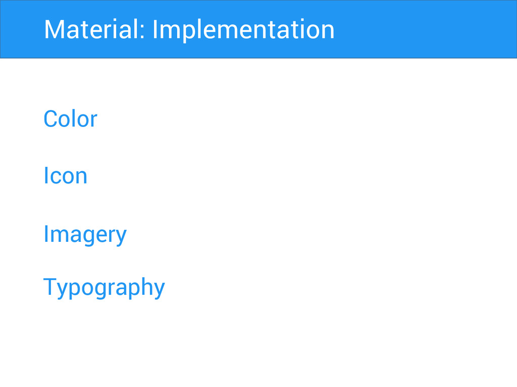
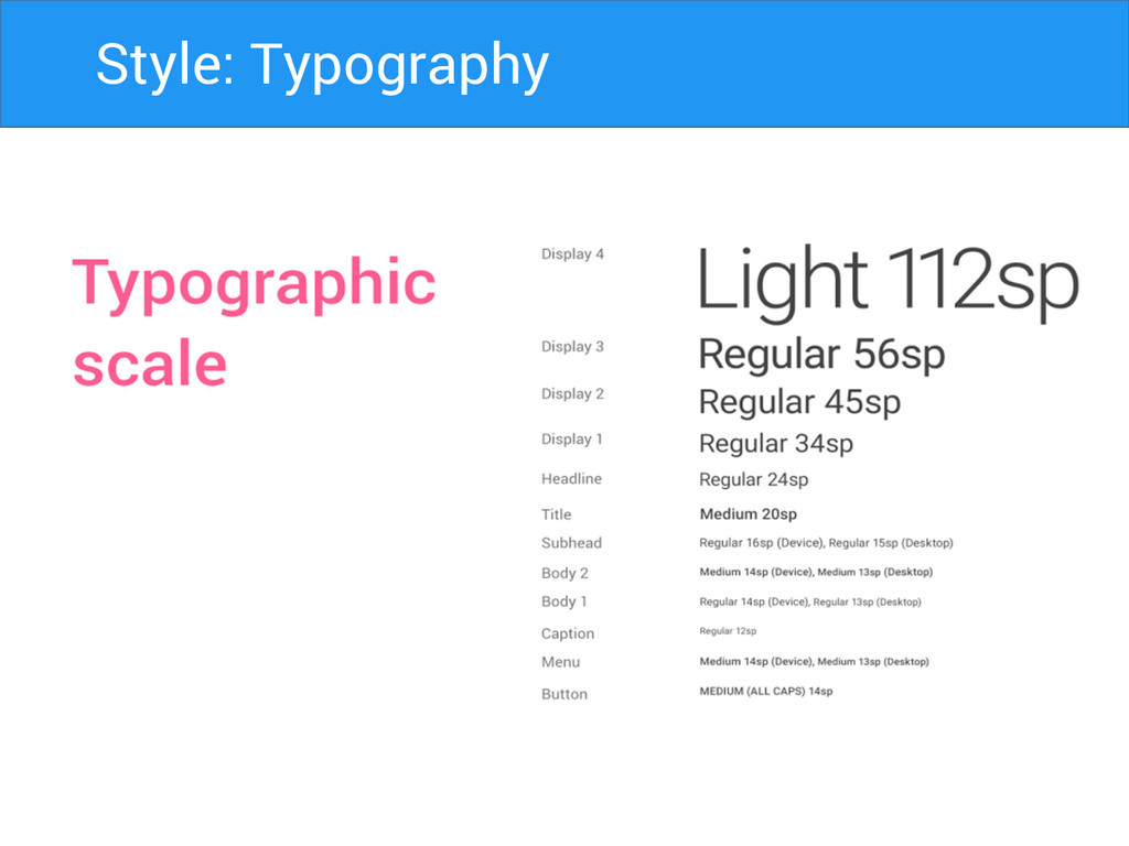
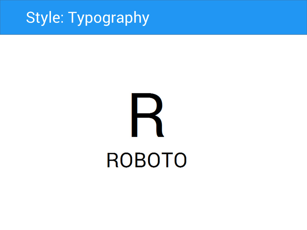
Color Icon Imagery Material: Implementation Typography
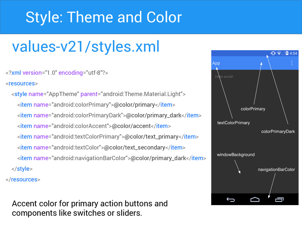
values-v21/styles.xml Accent color for primary action buttons and components like
switches or sliders. Style: Theme and Color <?xml version="1.0" encoding="utf-8"?> <resources> <style name="AppTheme" parent="android:Theme.Material.Light"> <item name="android:colorPrimary">@color/primary</item> <item name="android:colorPrimaryDark">@color/primary_dark</item> <item name="android:colorAccent">@color/accent</item> <item name="android:textColorPrimary">@color/text_primary</item> <item name="android:textColor">@color/text_secondary</item> <item name="android:navigationBarColor">@color/primary_dark</item> </style> </resources>
Primary Secondary Style: Color Palette
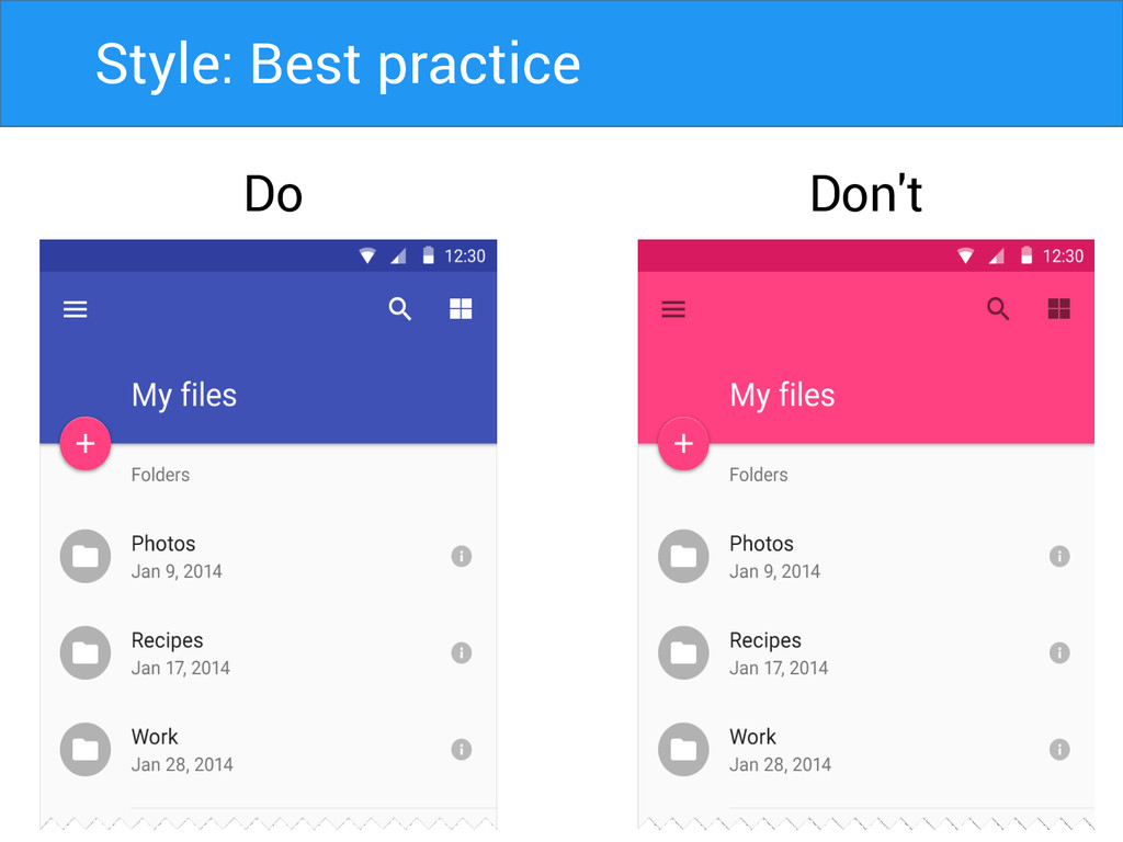
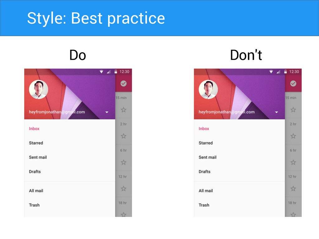
Do Don't Style: Best practice
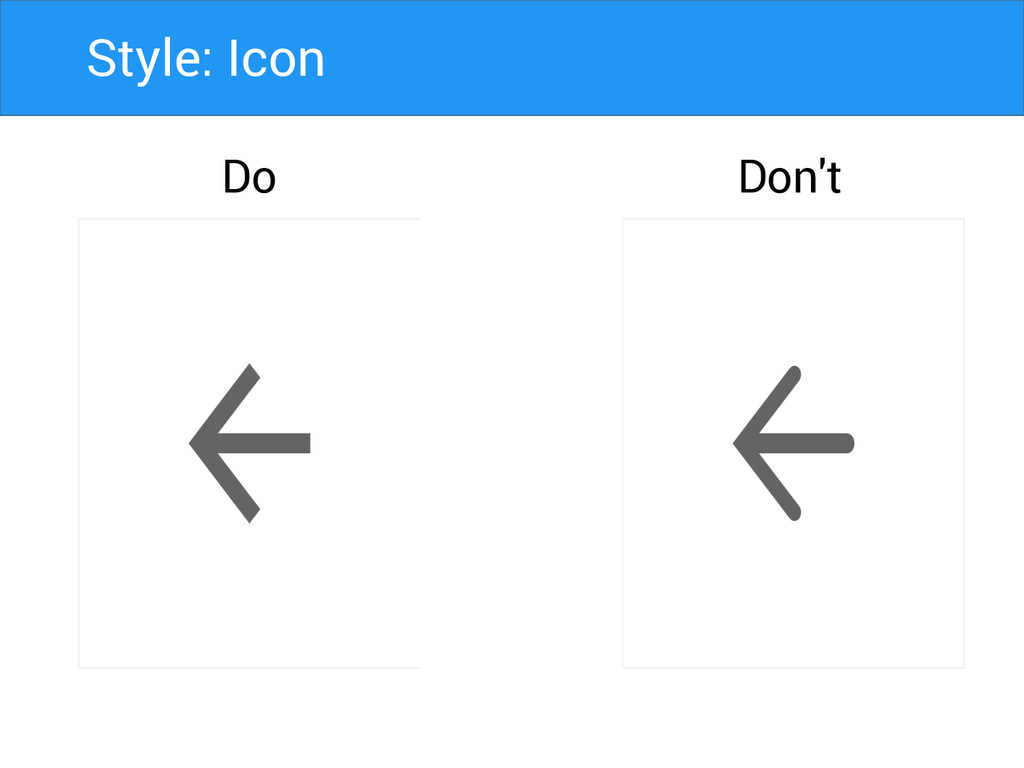
Style: Icon Do Don't
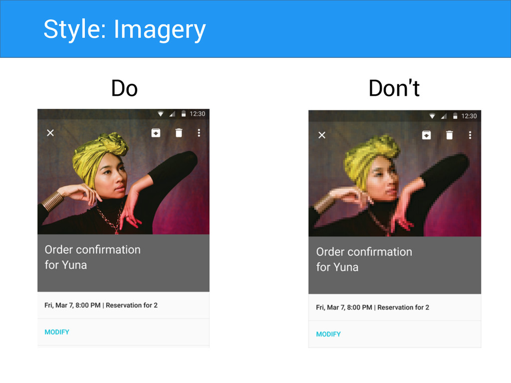
Style: Imagery Do Don't
Style: Best practice Do Don't
Style: Typography
Style: Typography
Style: Typography
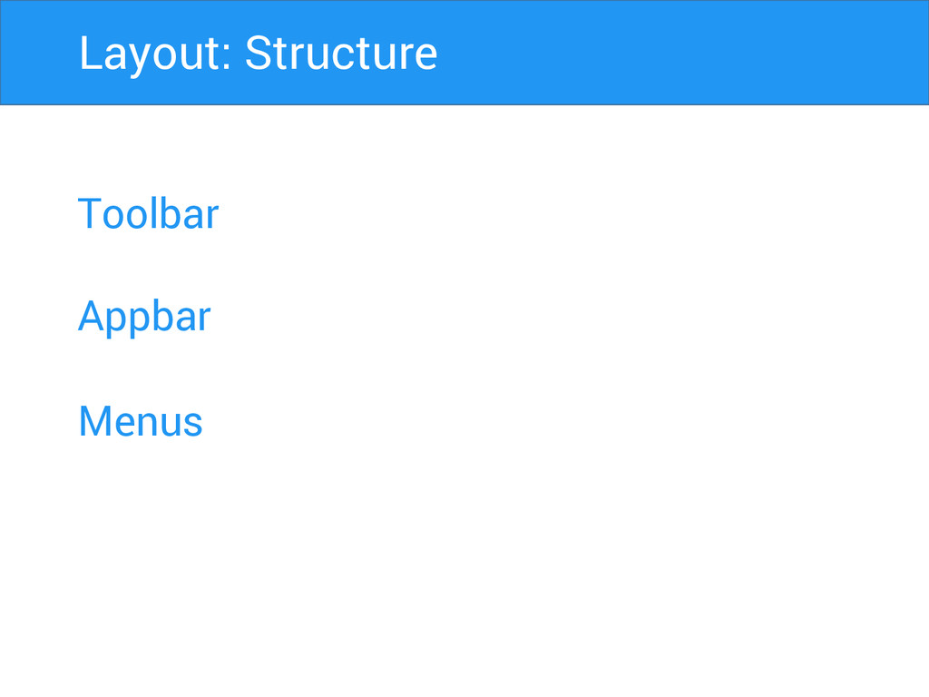
Toolbar Appbar Menus Layout: Structure
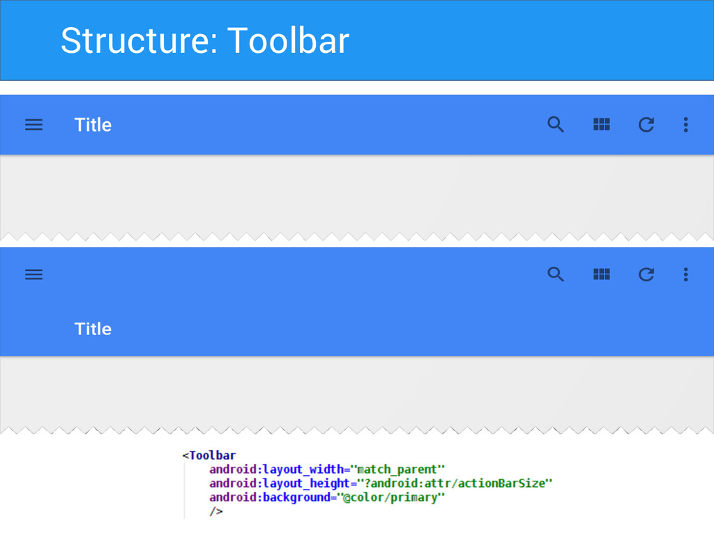
Structure: Toolbar
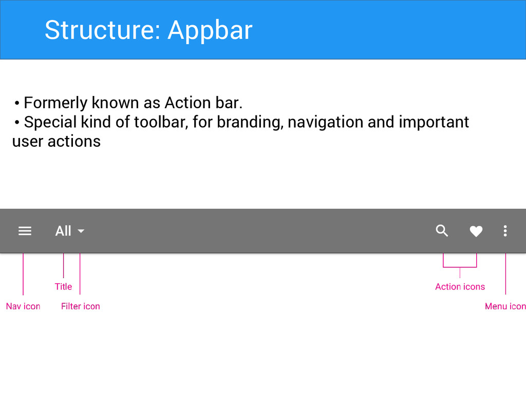
Structure: Appbar • Formerly known as Action bar. • Special
kind of toolbar, for branding, navigation and important user actions
Structure: Appbar Matrics • Mobile Landscape: 48dp • Mobile Portrait:
56dp • Tablet/Desktop: 64dp
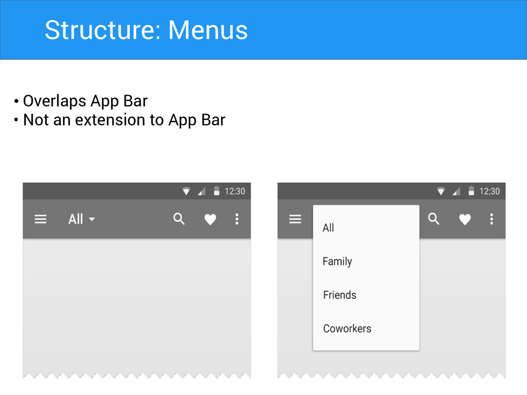
Structure: Menus • Overlaps App Bar • Not an extension
to App Bar
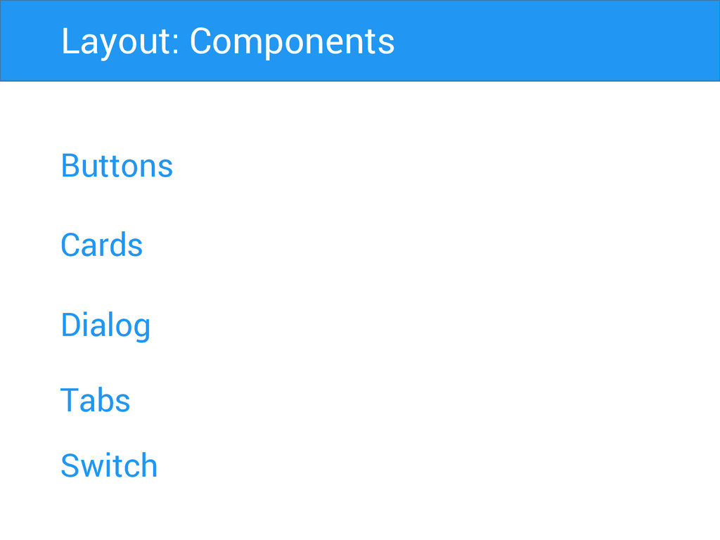
Buttons Cards Dialog Layout: Components Tabs Switch
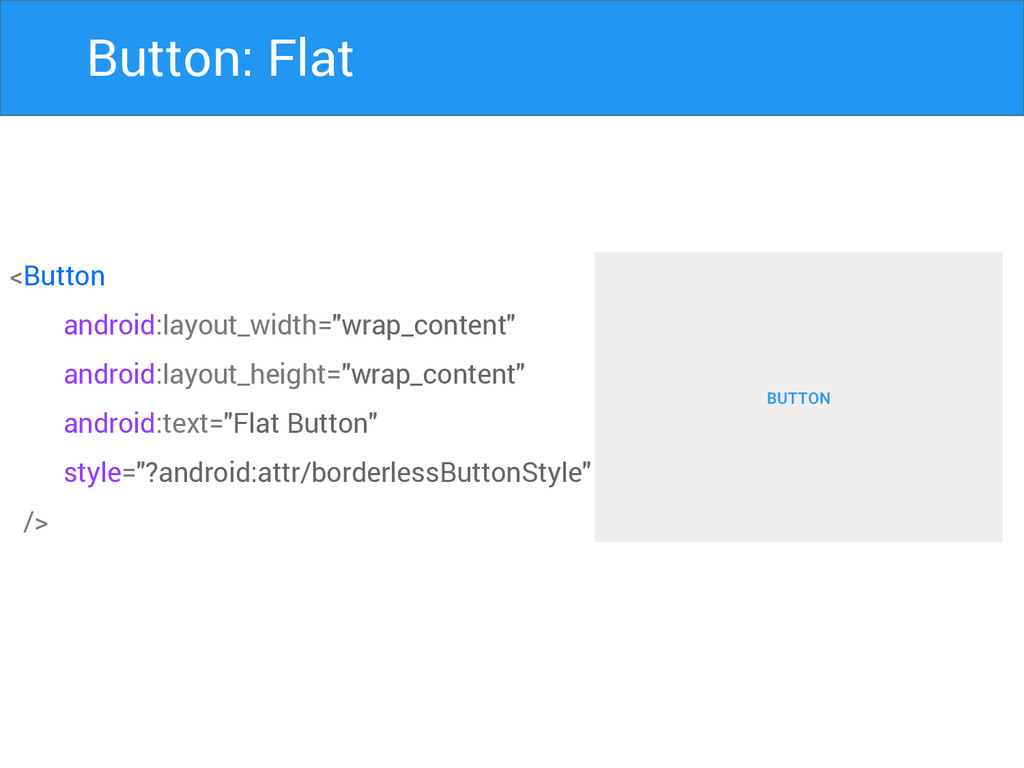
Button: Flat <Button android:layout_width="wrap_content" android:layout_height="wrap_content" android:text="Flat Button" style="?android:attr/borderlessButtonStyle" />
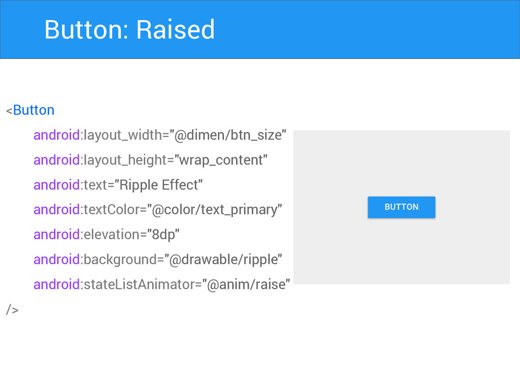
Button: Raised <Button android:layout_width="@dimen/btn_size" android:layout_height="wrap_content" android:text="Ripple Effect" android:textColor="@color/text_primary" android:elevation="8dp" android:background="@drawable/ripple"
android:stateListAnimator="@anim/raise" />
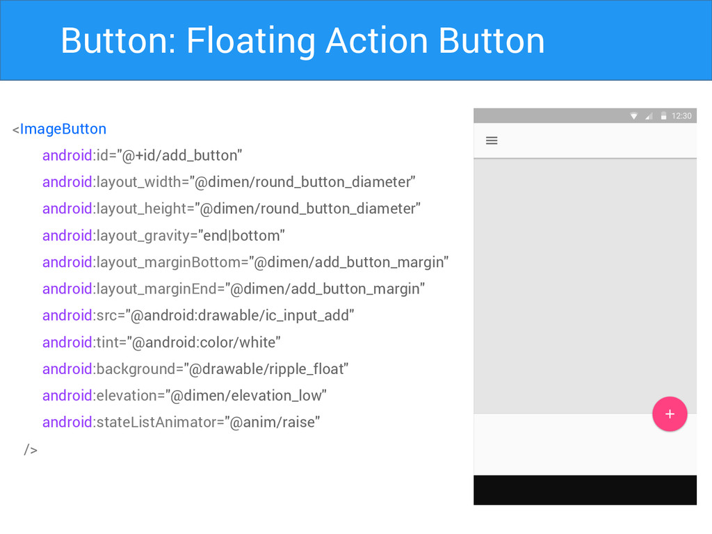
Button: Floating Action Button <ImageButton android:id="@+id/add_button" android:layout_width="@dimen/round_button_diameter" android:layout_height="@dimen/round_button_diameter" android:layout_gravity="end|bottom" android:layout_marginBottom="@dimen/add_button_margin"
android:layout_marginEnd="@dimen/add_button_margin" android:src="@android:drawable/ic_input_add" android:tint="@android:color/white" android:background="@drawable/ripple_float" android:elevation="@dimen/elevation_low" android:stateListAnimator="@anim/raise" />
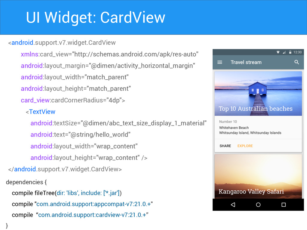
UI Widget: CardView <android.support.v7.widget.CardView xmlns:card_view="http://schemas.android.com/apk/res-auto" android:layout_margin="@dimen/activity_horizontal_margin" android:layout_width="match_parent" android:layout_height="match_parent" card_view:cardCornerRadius="4dp"> <TextView
android:textSize="@dimen/abc_text_size_display_1_material" android:text="@string/hello_world" android:layout_width="wrap_content" android:layout_height="wrap_content" /> </android.support.v7.widget.CardView> dependencies { compile fileTree(dir: 'libs', include: ['*.jar']) compile "com.android.support:appcompat-v7:21.0.+" compile “com.android.support:cardview-v7:21.0.+” }
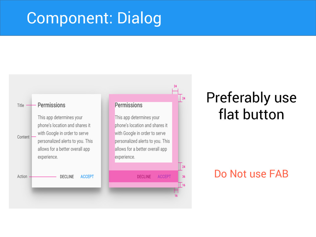
Preferably use flat button Do Not use FAB Component: Dialog
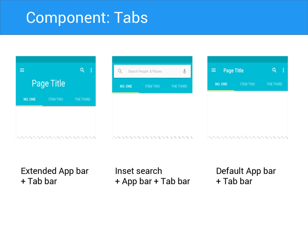
Extended App bar + Tab bar Inset search + App
bar + Tab bar Default App bar + Tab bar Component: Tabs
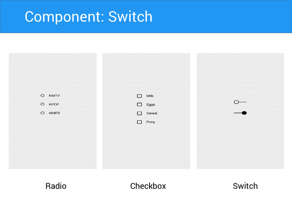
Radio Switch Checkbox Component: Switch
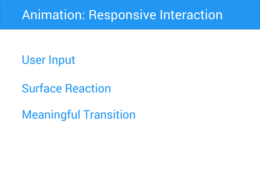
User Input Surface Reaction Animation: Responsive Interaction Meaningful Transition
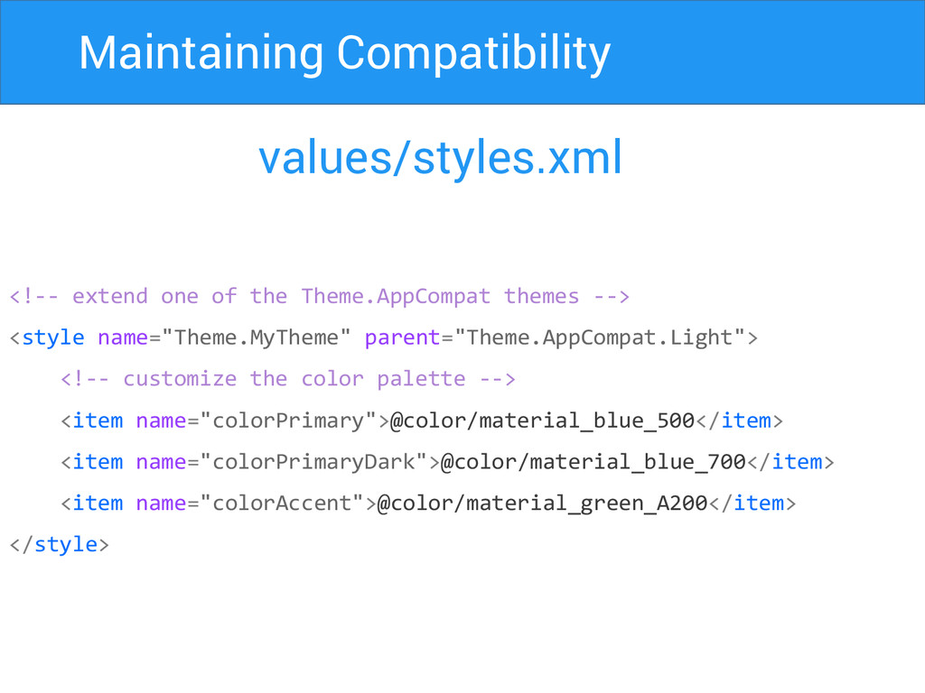
Maintaining Compatibility values/styles.xml <!-- extend one of the Theme.AppCompat themes
--> <style name="Theme.MyTheme" parent="Theme.AppCompat.Light"> <!-- customize the color palette --> <item name="colorPrimary">@color/material_blue_500</item> <item name="colorPrimaryDark">@color/material_blue_700</item> <item name="colorAccent">@color/material_green_A200</item> </style>
Maintaining Compatibility build.gradle dependencies { compile fileTree(dir: 'libs', include: ['*.jar'])
compile "com.android.support:appcompat-v7:21.0.+" compile “com.android.support:cardview-v7:21.0.+” compile “com.android.support:recyclerview-v7:21.0.+” }
Thank You Harsh Dattani @dattaniharsh Google.com/+harshdattani Github.com/harshdattani
 harshdattani
 takaikanako
 moco1013
 deadlinepoet
 takanorip
 videlvequio
 mhand01
 webnaut
 ryu1013
 aonomasahiro
 calpin
 keroyama
 rezaline
 reverentgeek
 matthewcrist
 tapps
tapps
 nikkihalliwell
 watany
 zakiyama
 chrisshort
 rasagy
 maggiecrowley
 aleyda
 inesmontani
 danielanewman
![Maintaining Compatibility build.gradle dependencies { compile fileTree(dir: 'libs', include: ['*.jar'])](https://files.speakerdeck.com/presentations/24f26860675101329de64646cf6f404b/slide_35.jpg)