Upgrade to Pro — share decks privately, control downloads, hide ads and more …

Demystifying Jetpack Compose

Lin Min Phyo
December 08, 2019

Demystifying Jetpack Compose

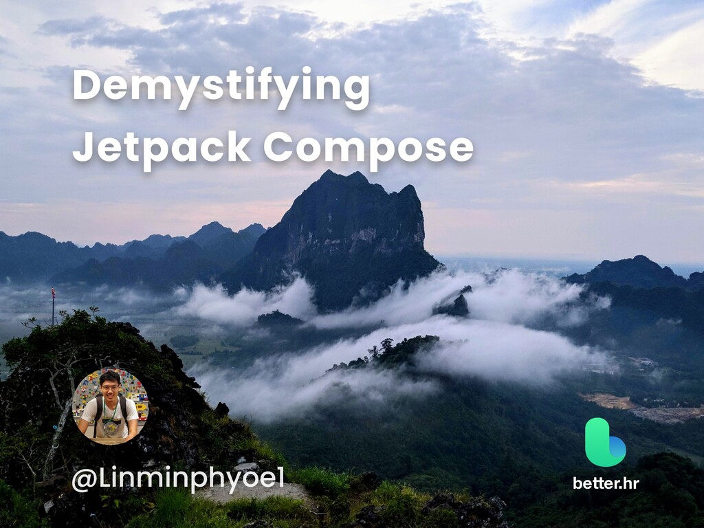
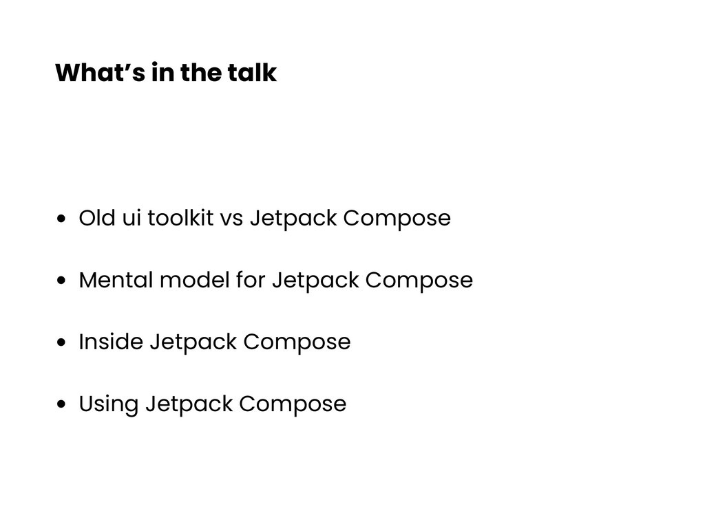
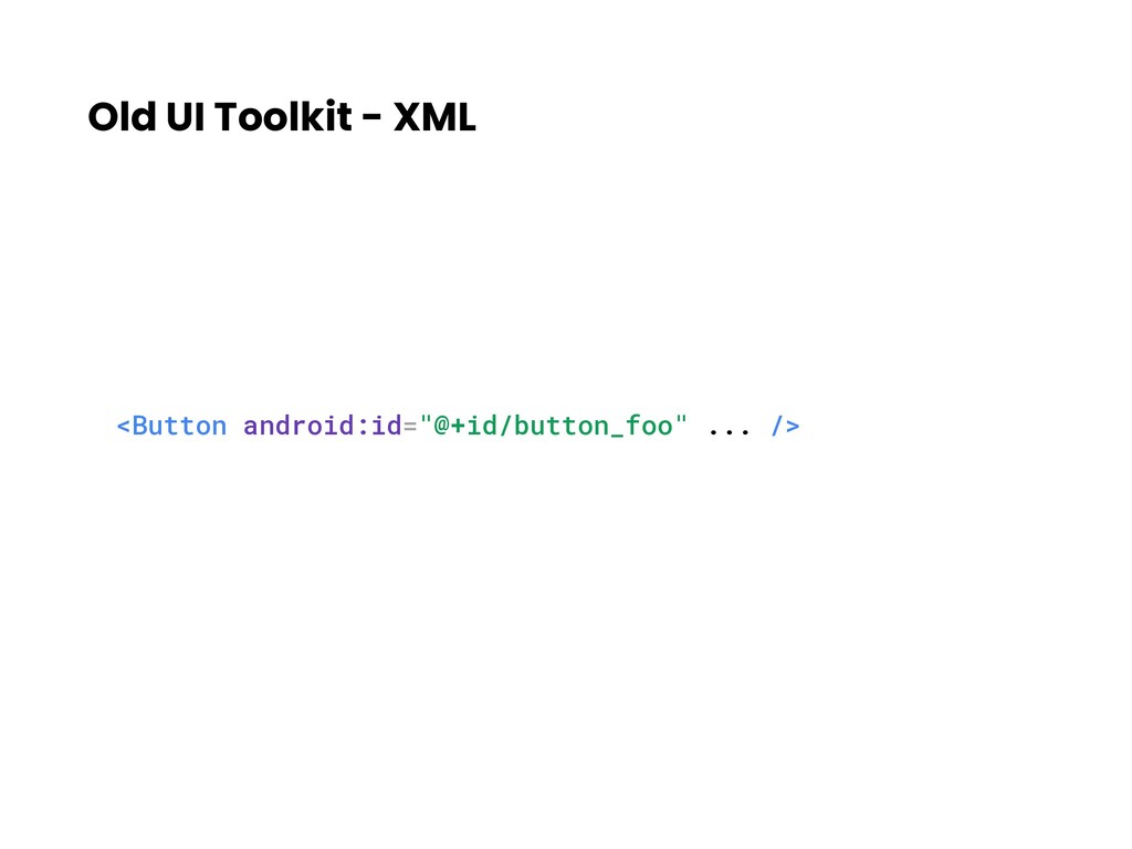
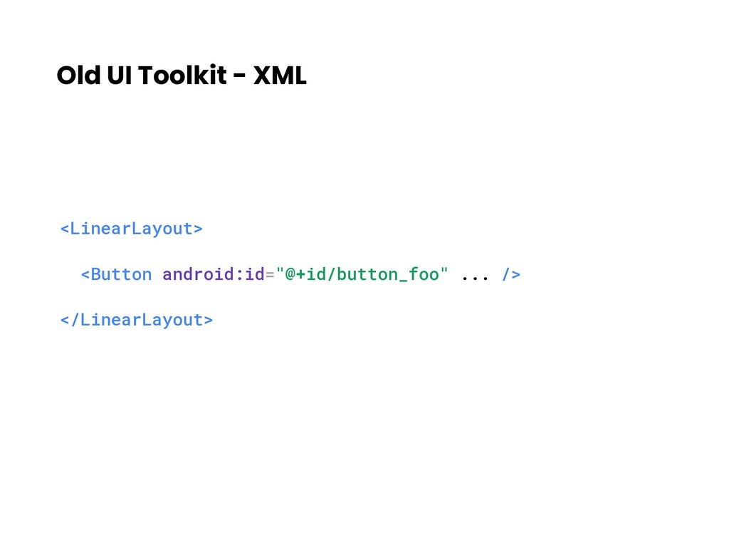
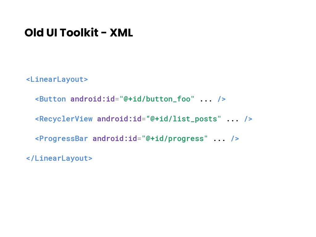
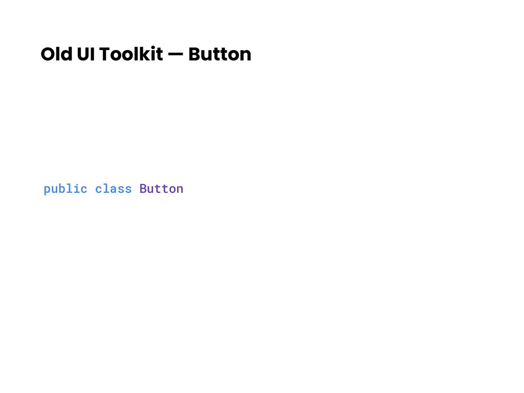
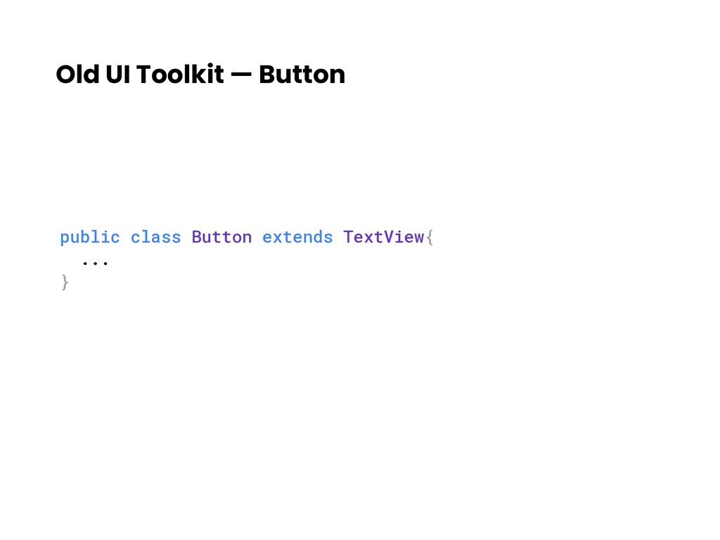
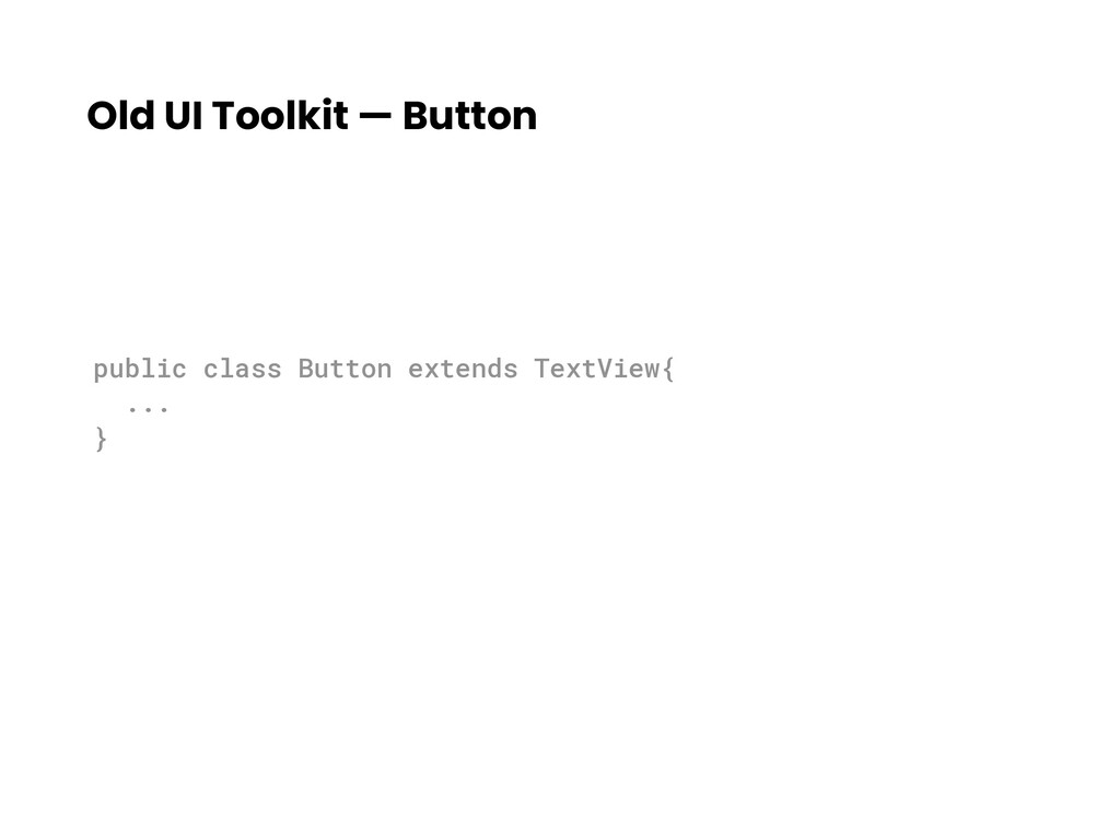
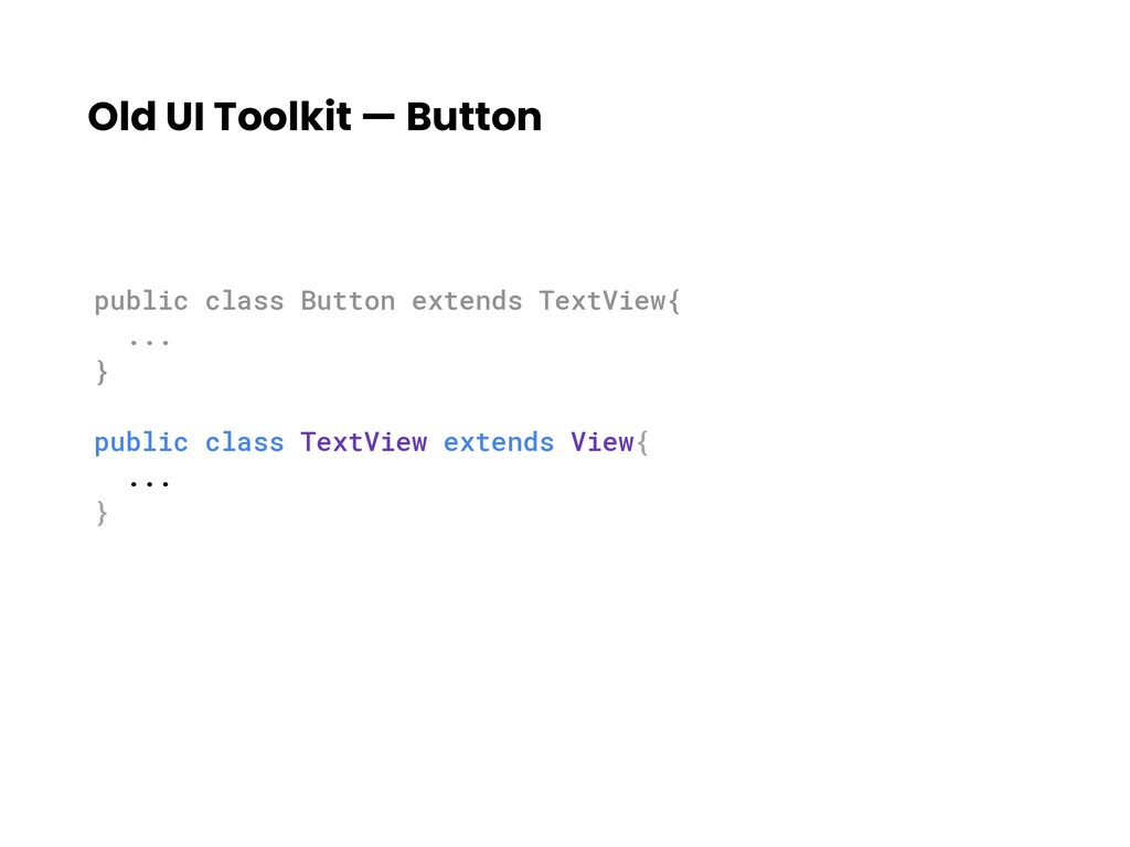
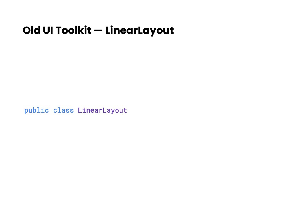
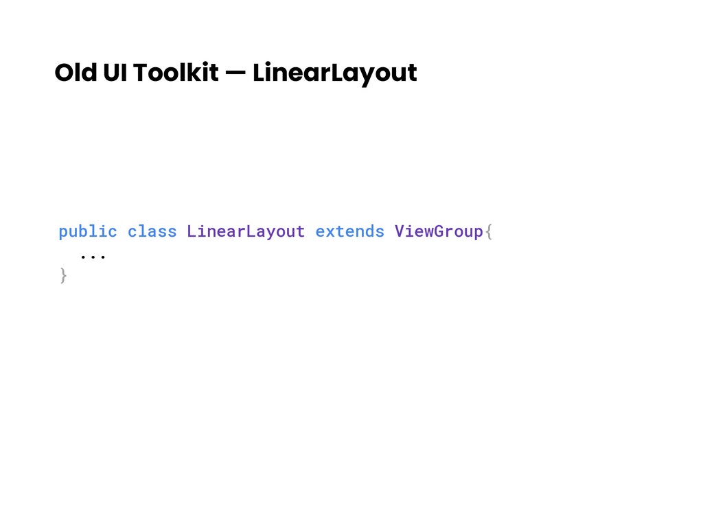
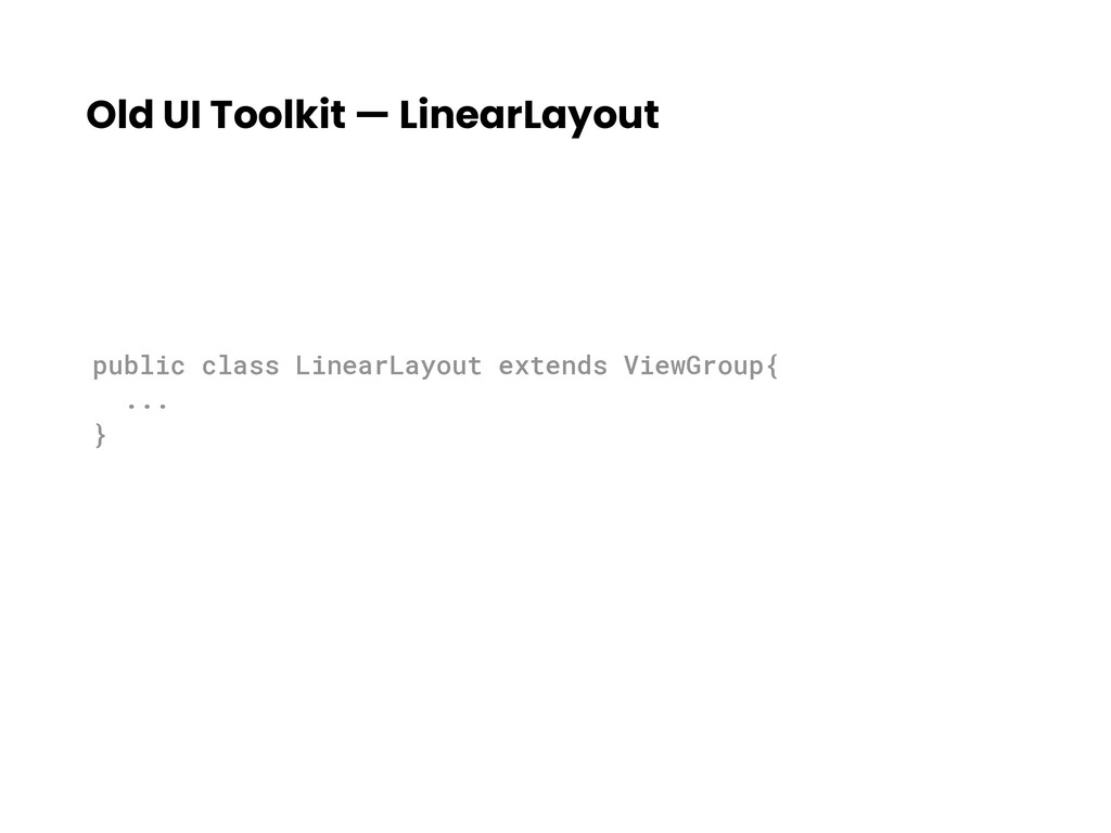
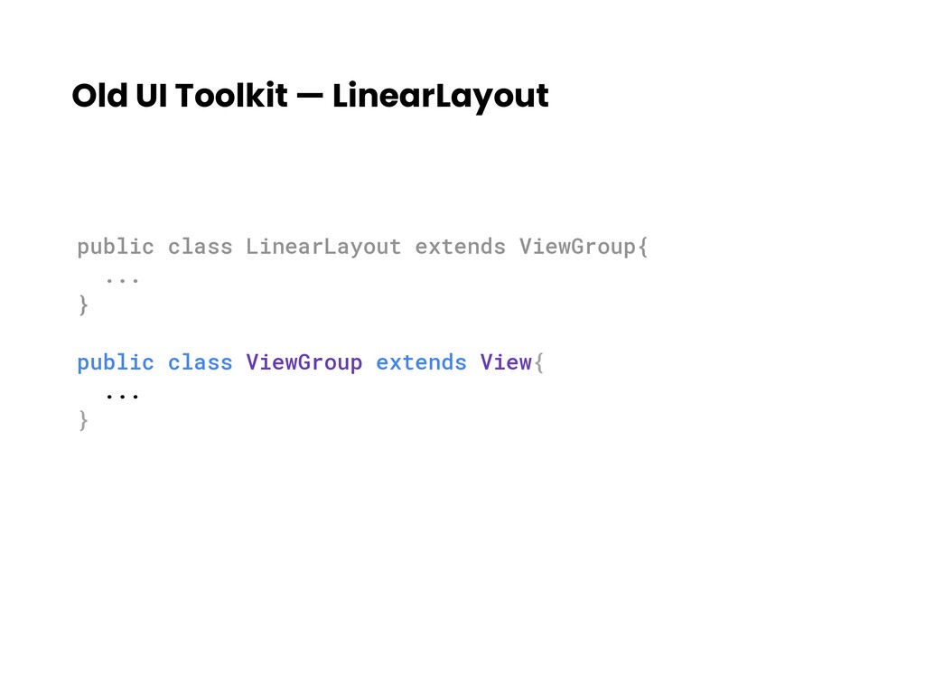
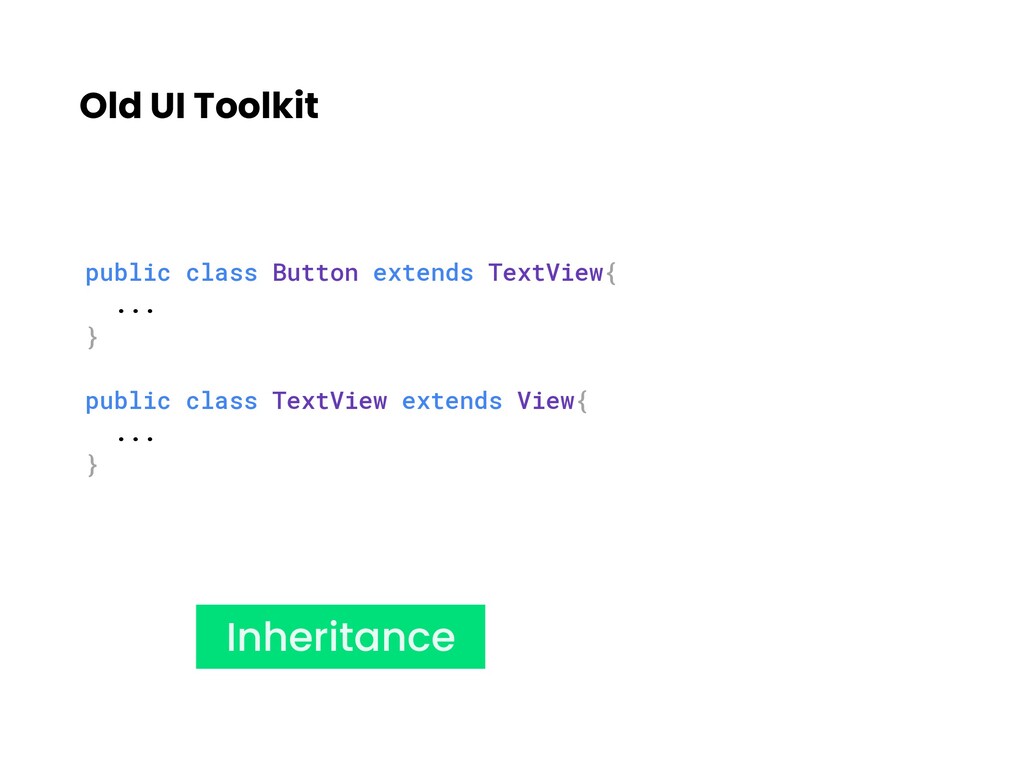
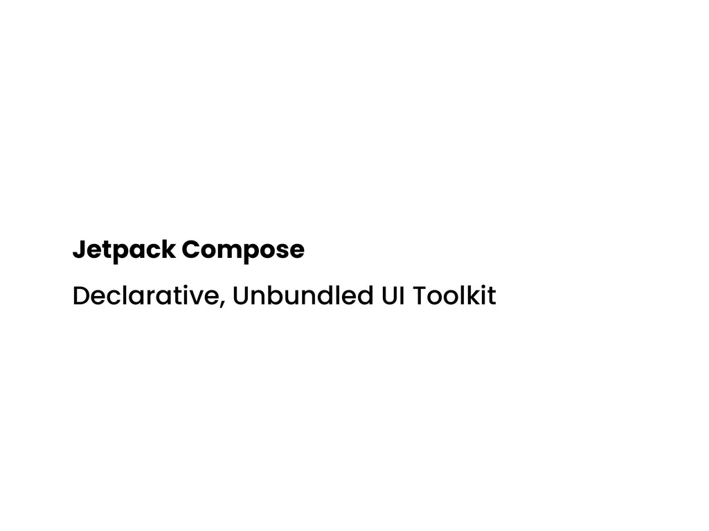
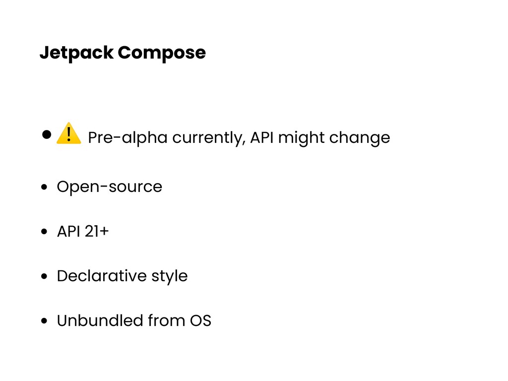
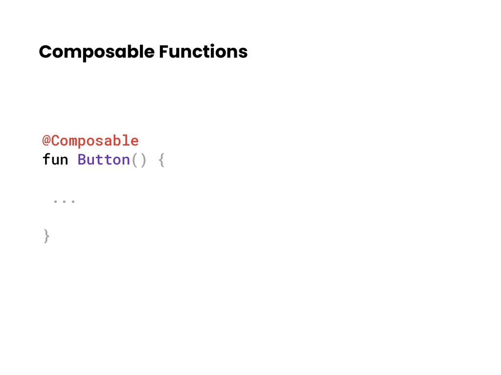
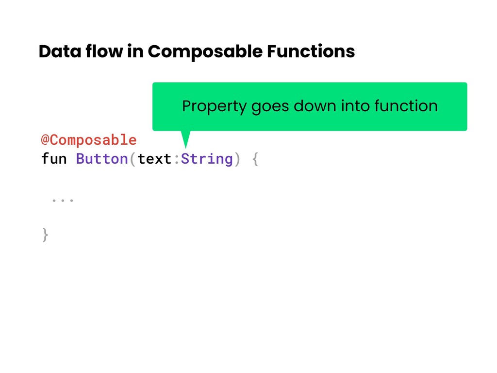
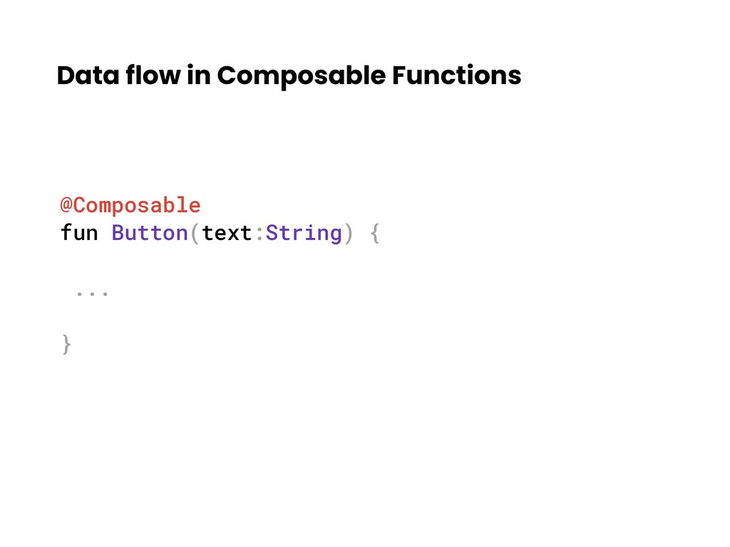
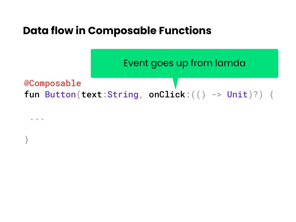
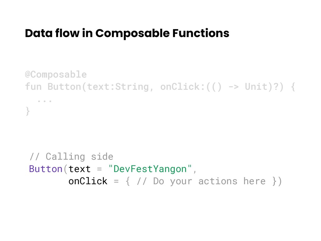
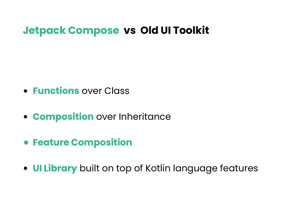
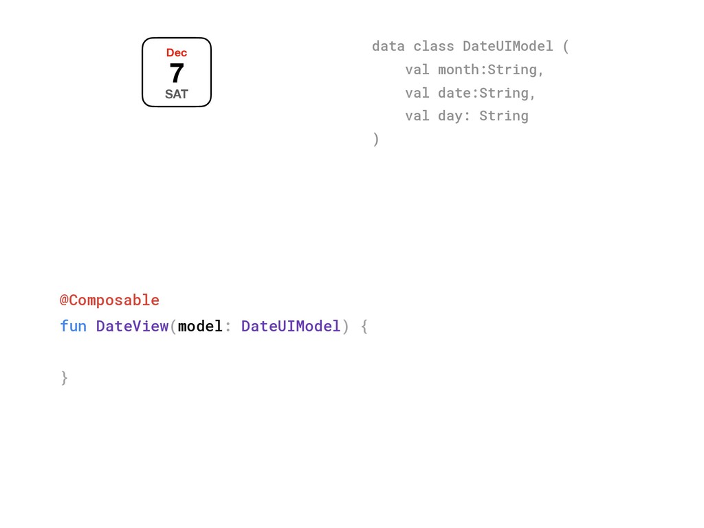
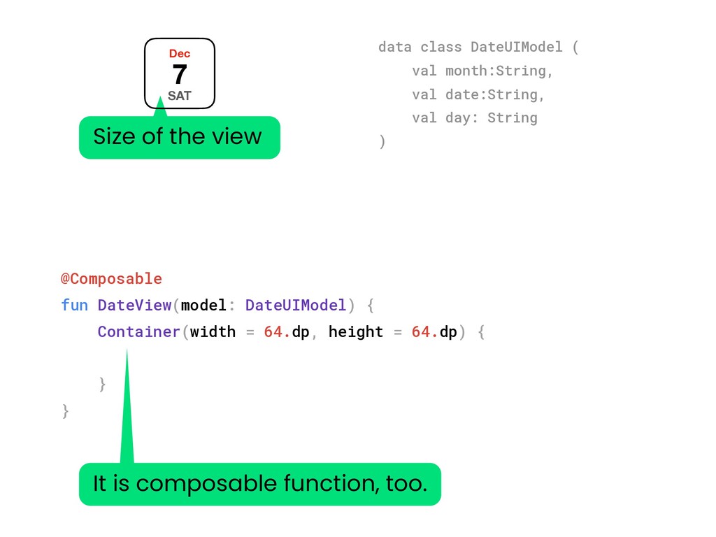
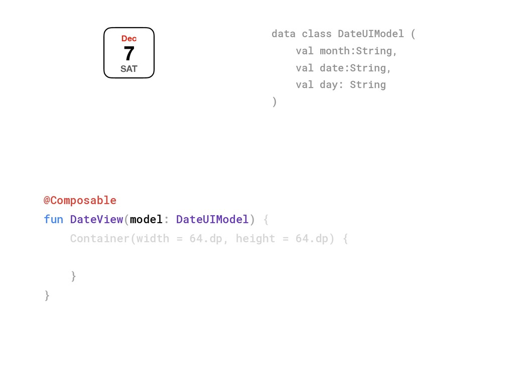
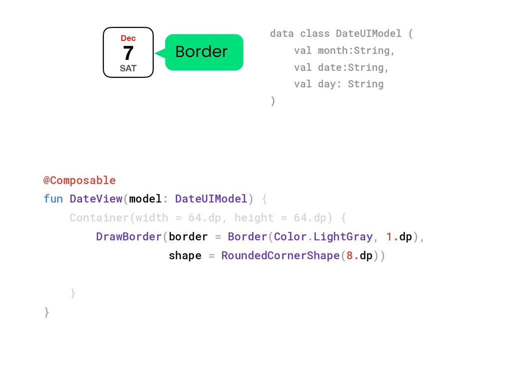
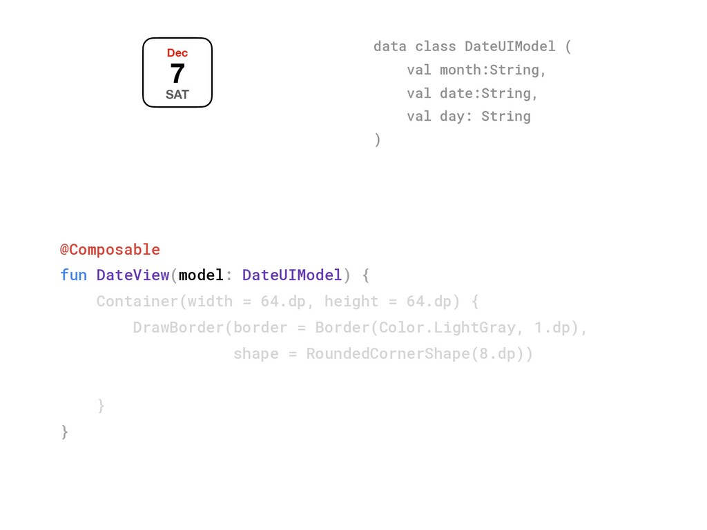
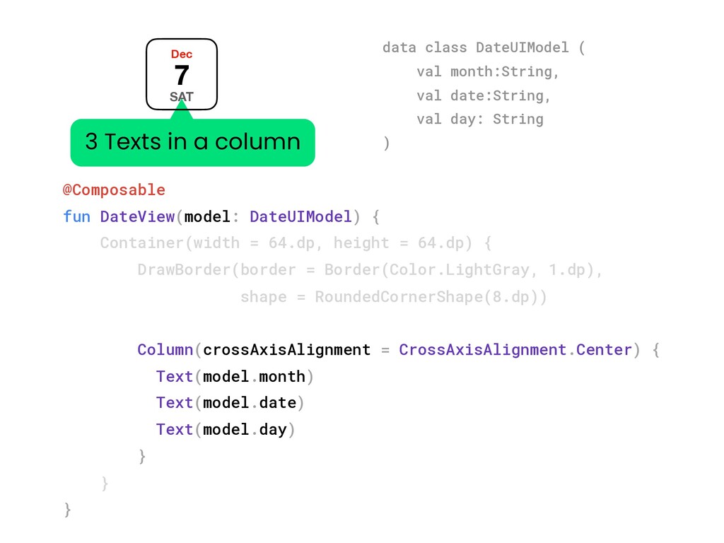
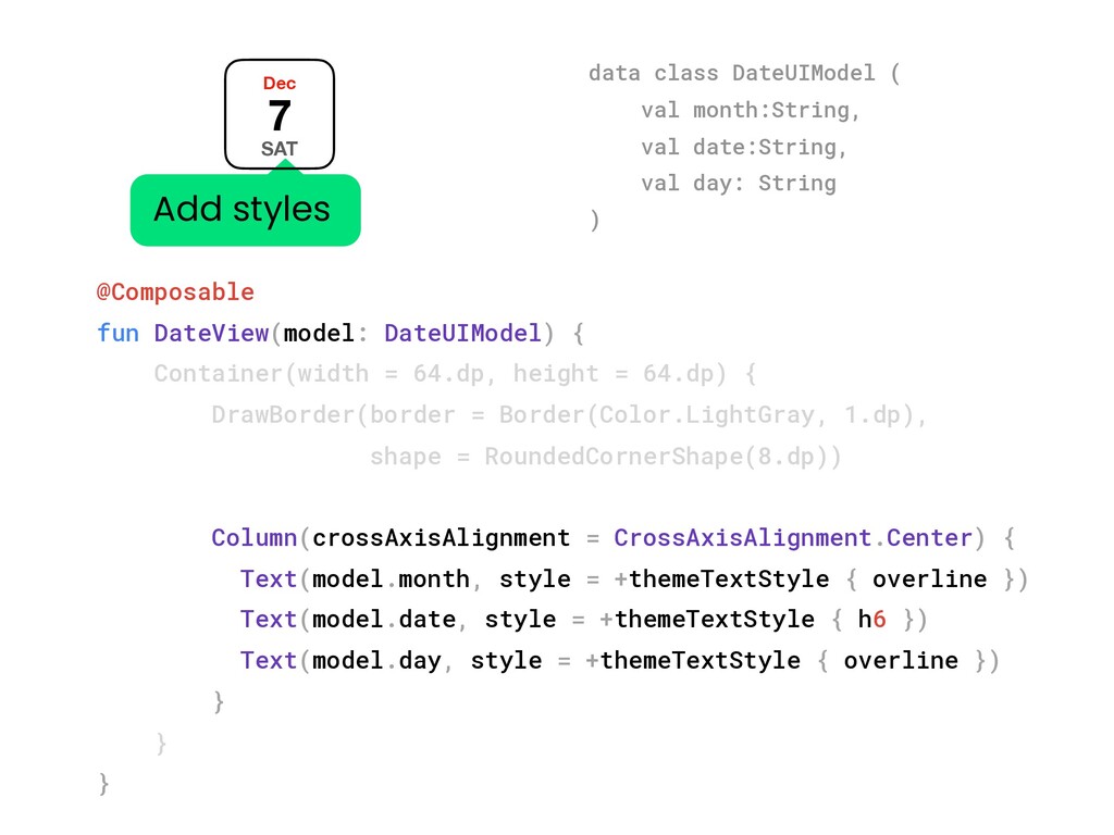
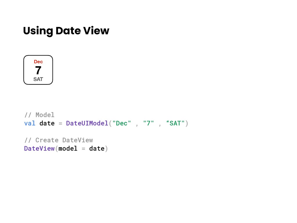
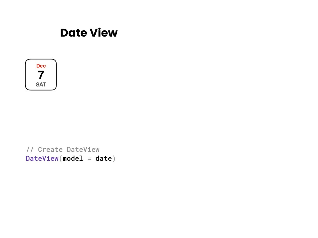
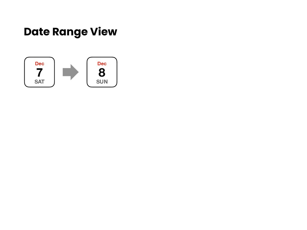
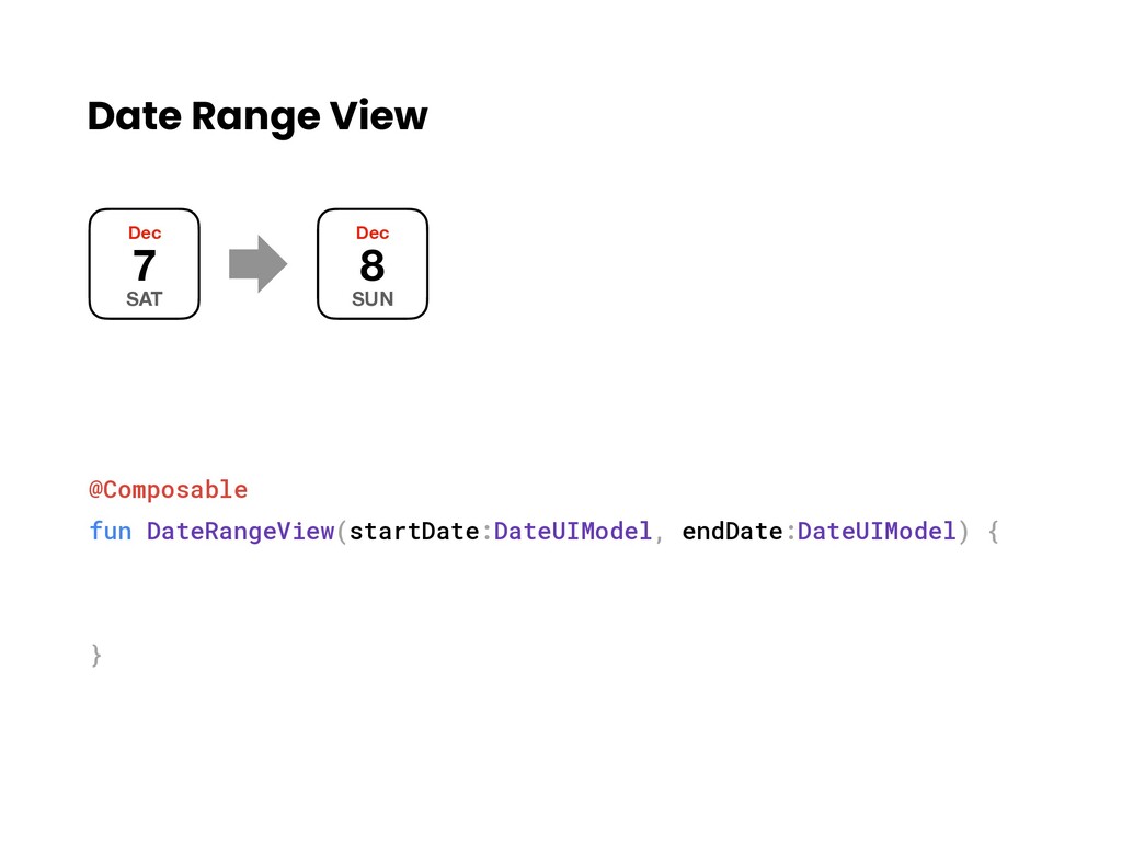
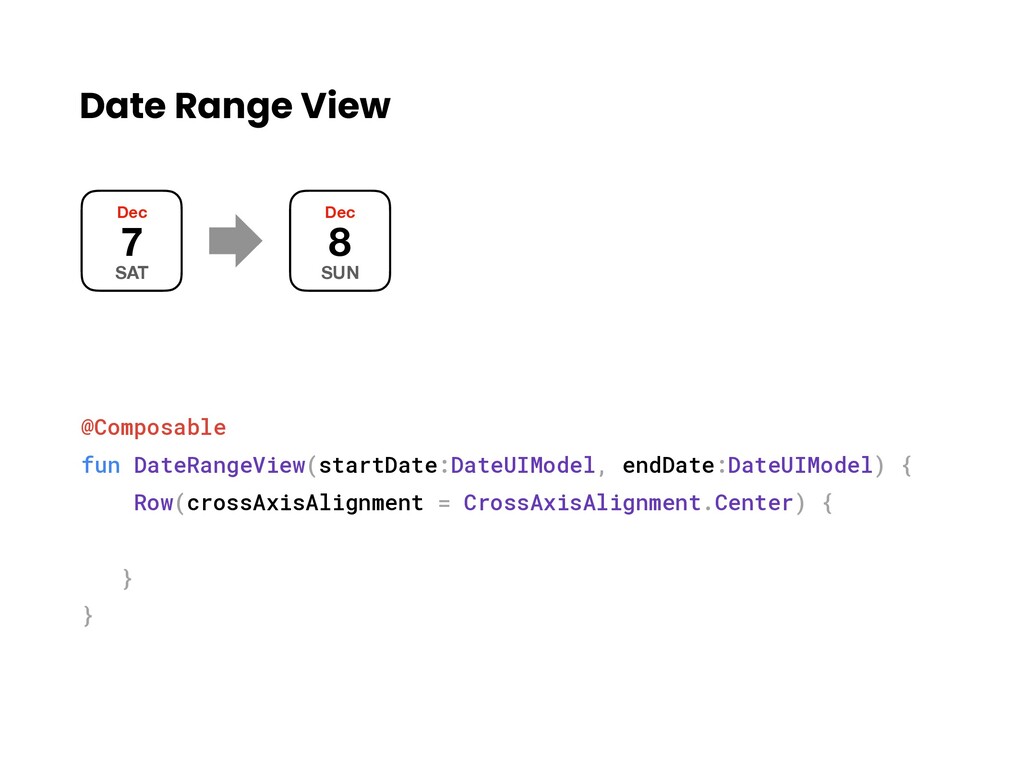
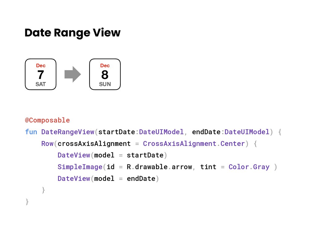
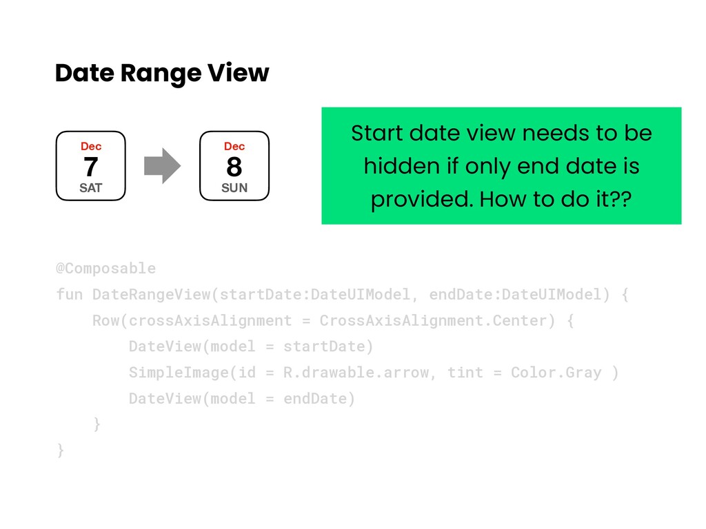
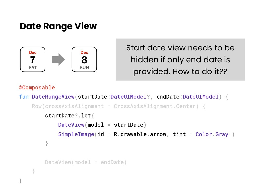
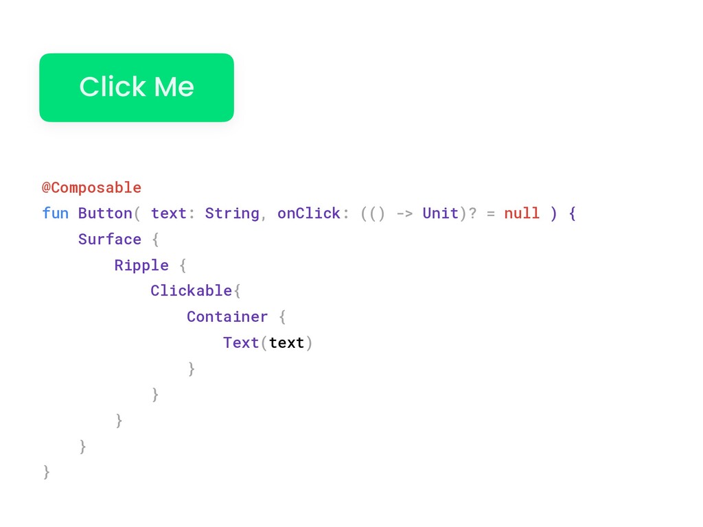
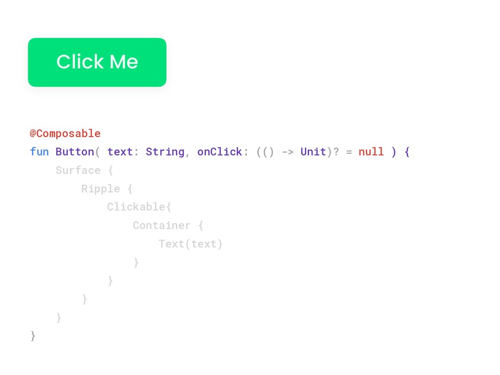
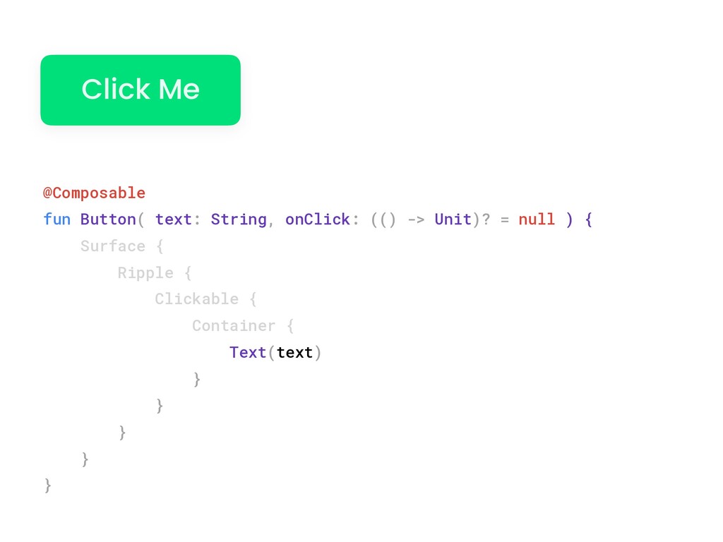
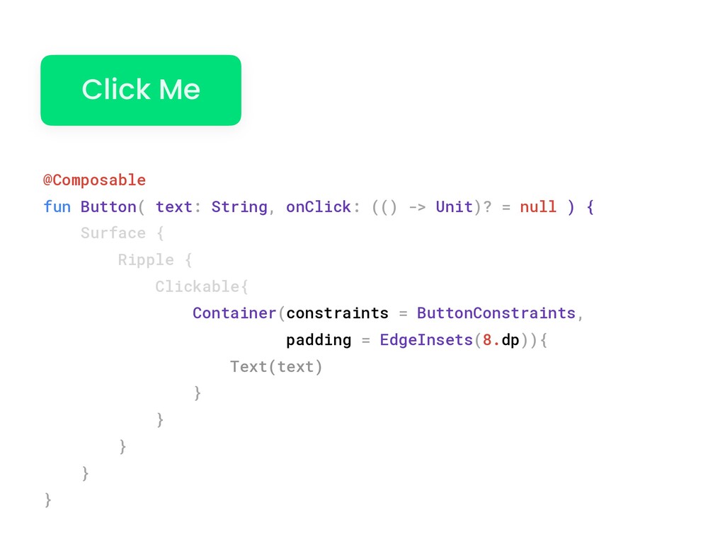
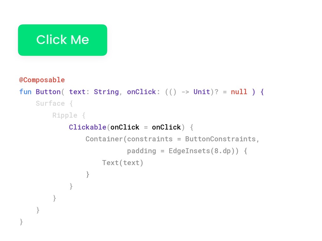
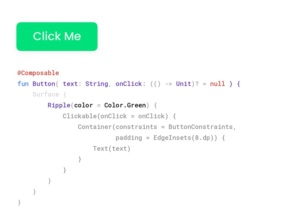
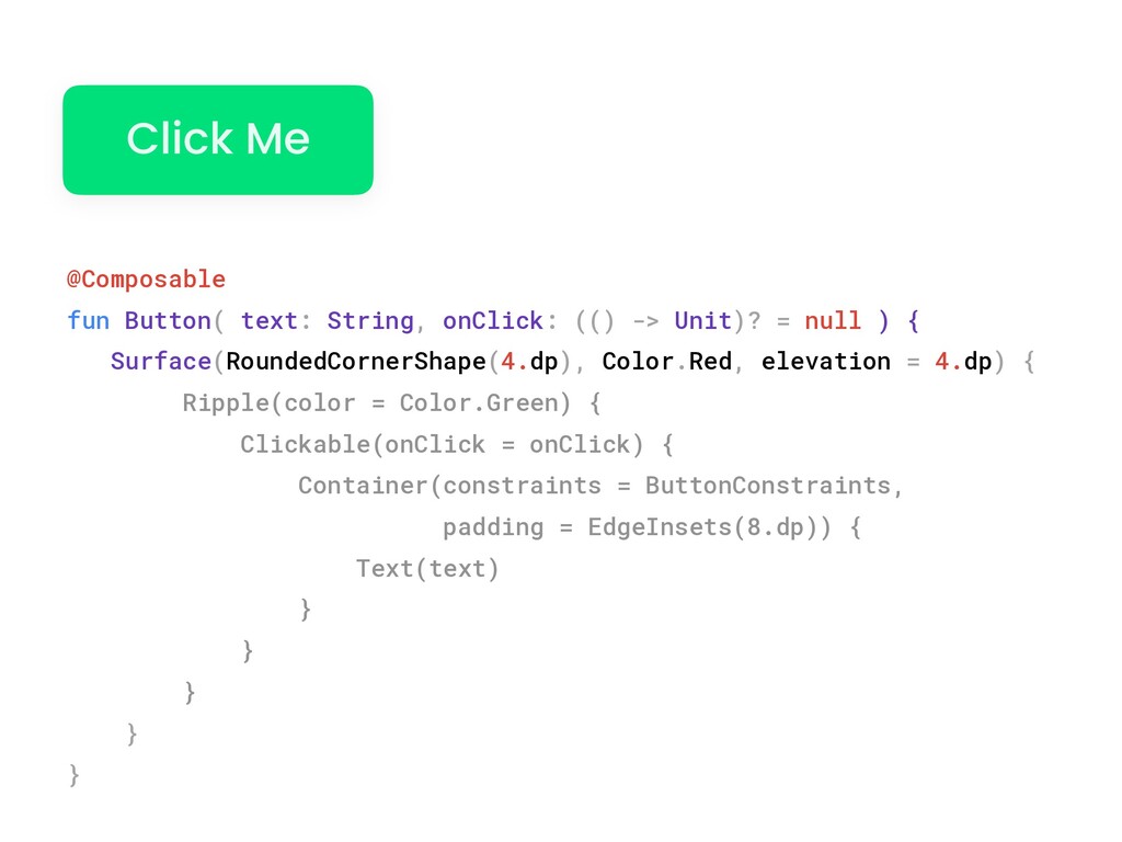
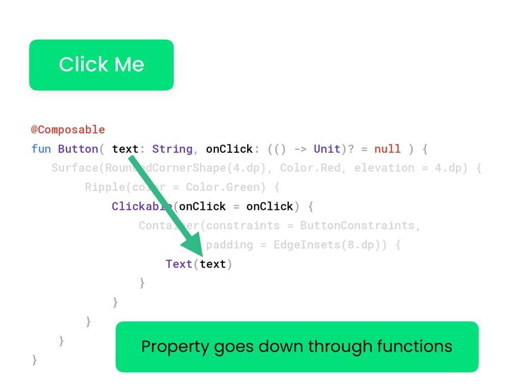
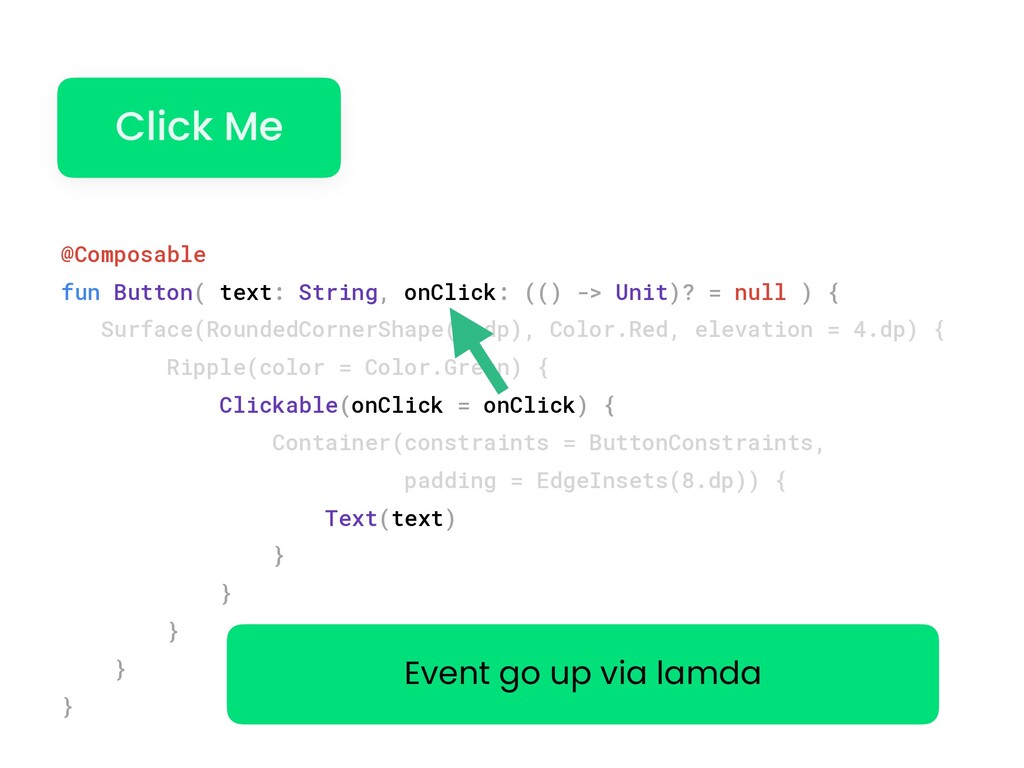
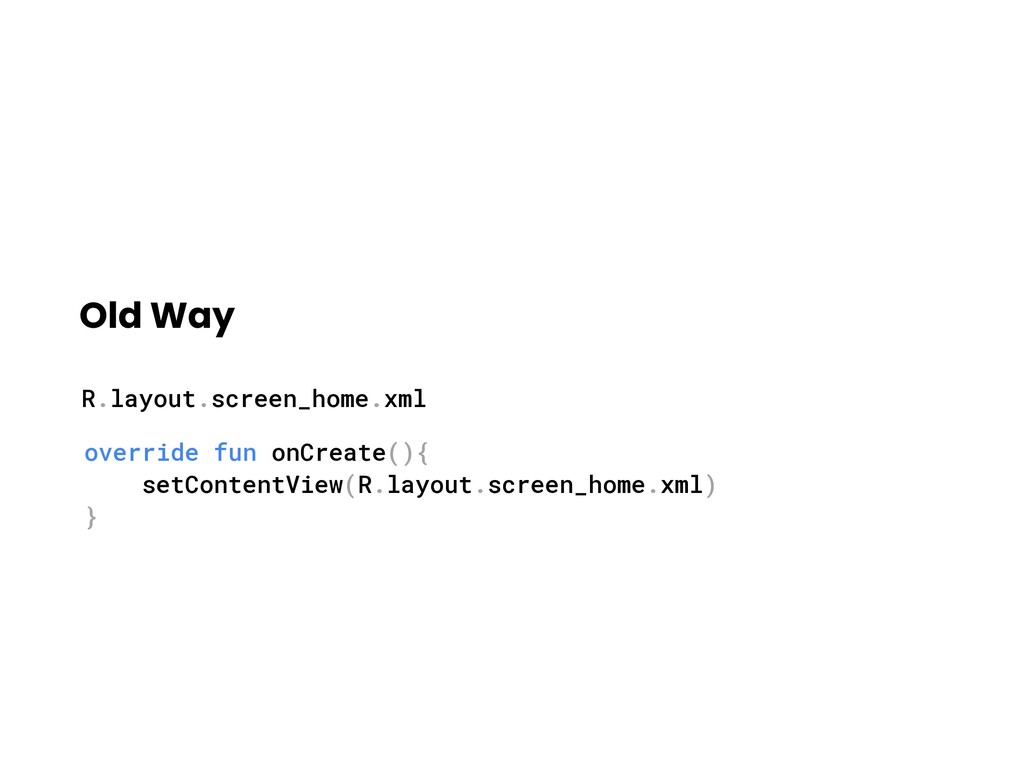
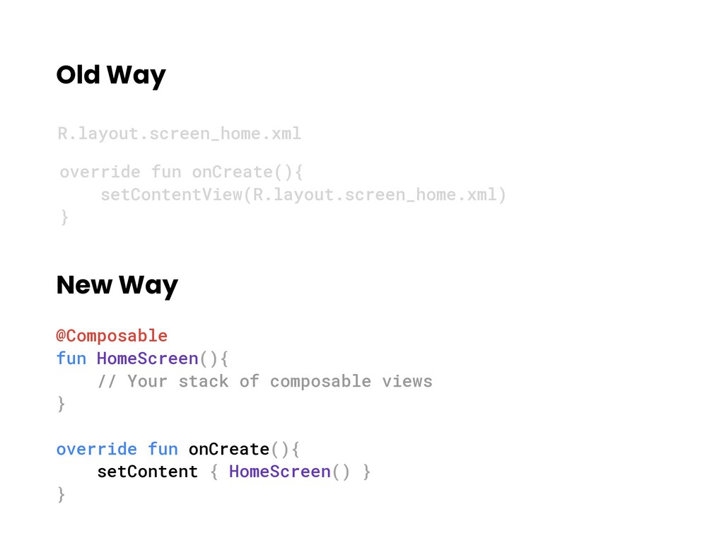
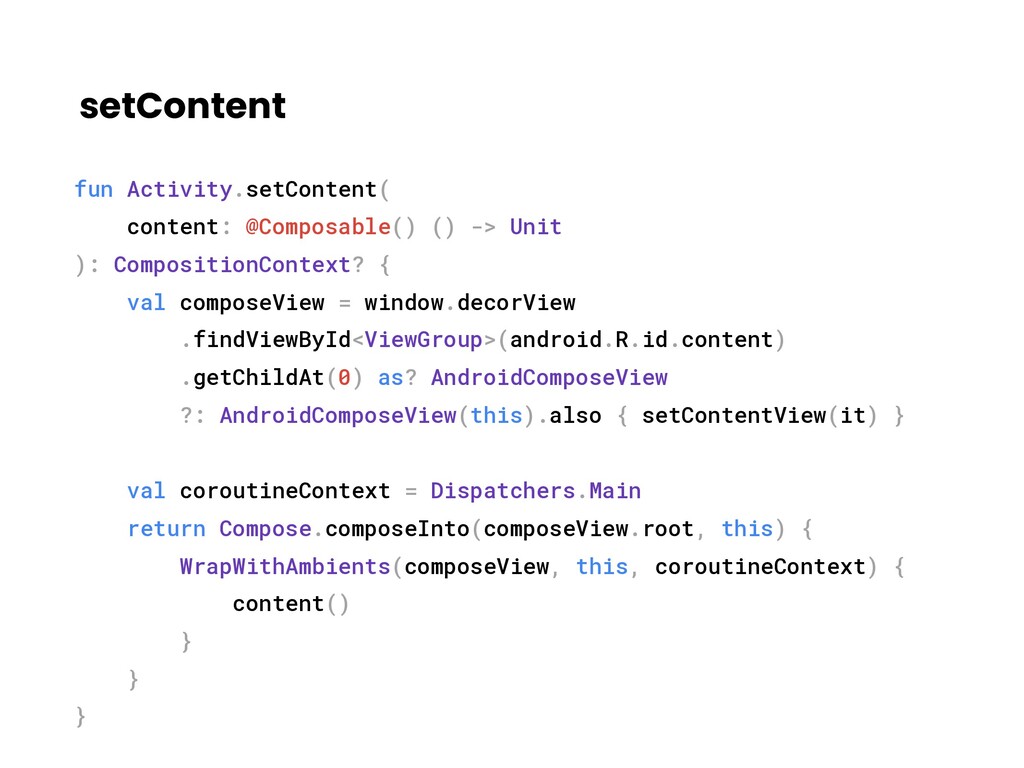
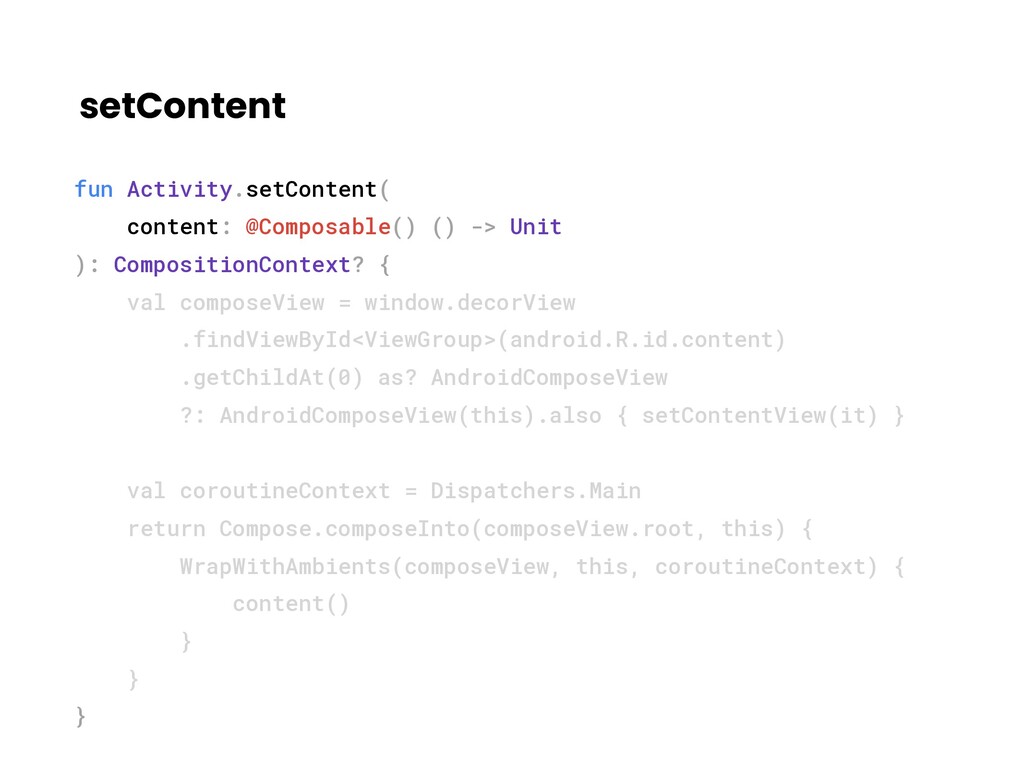
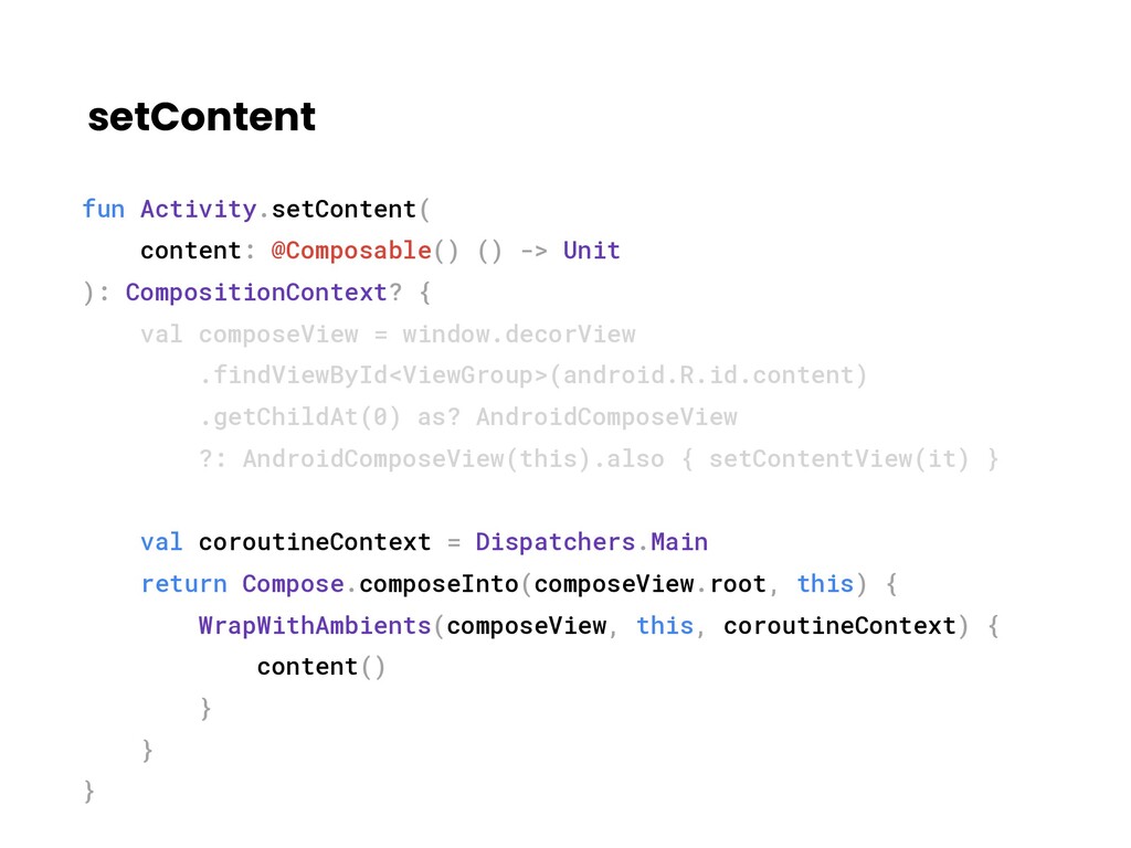
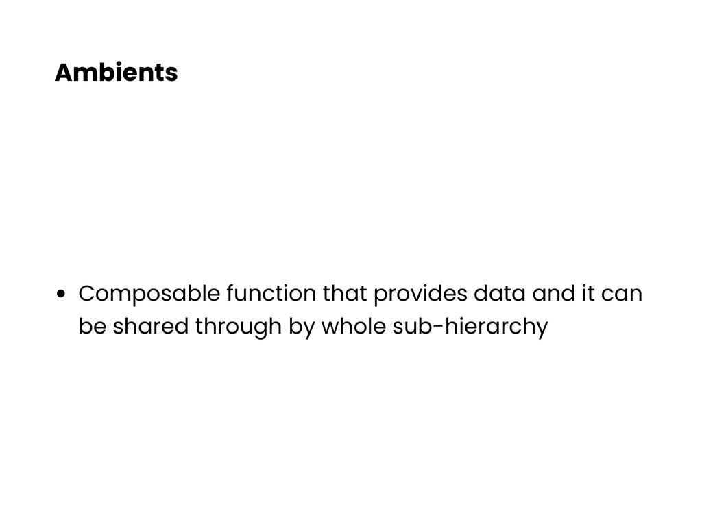
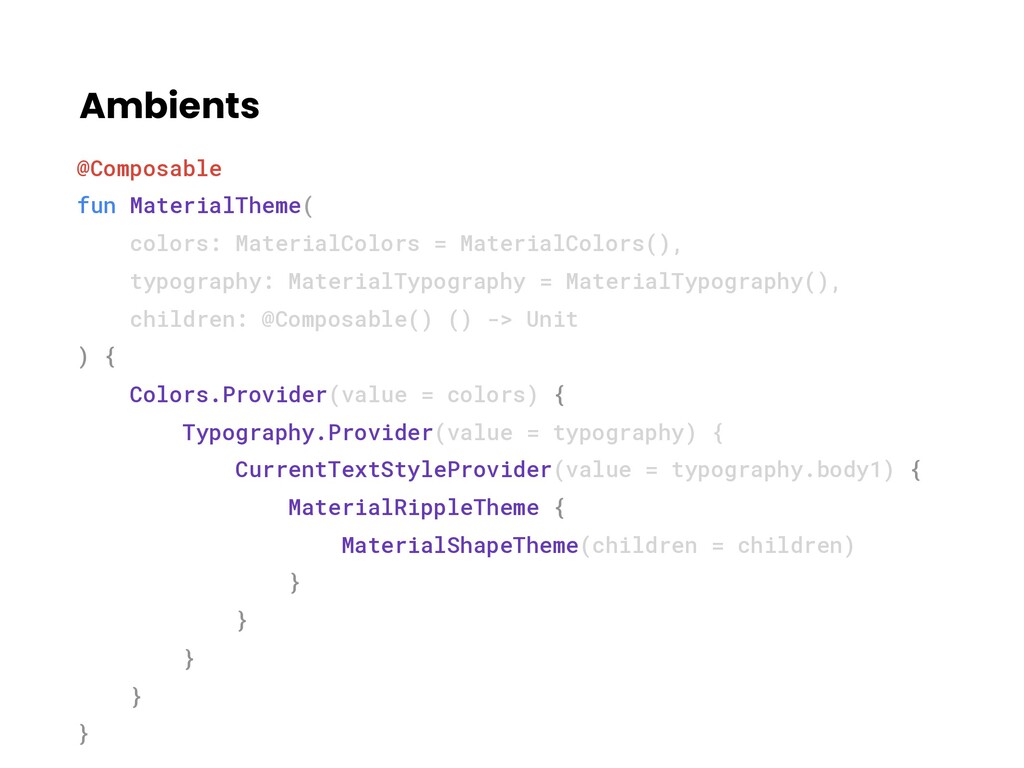
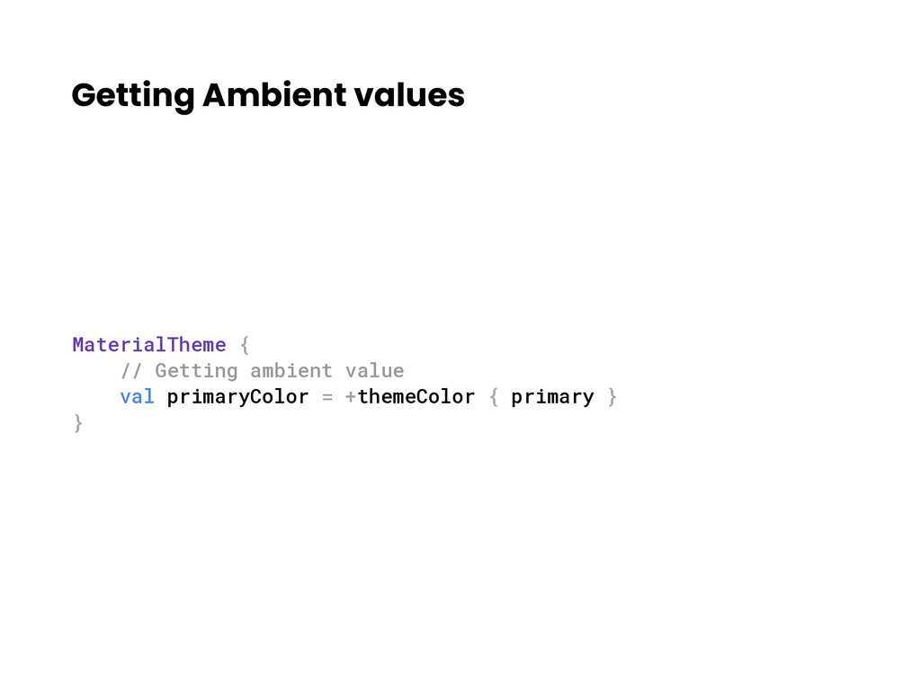
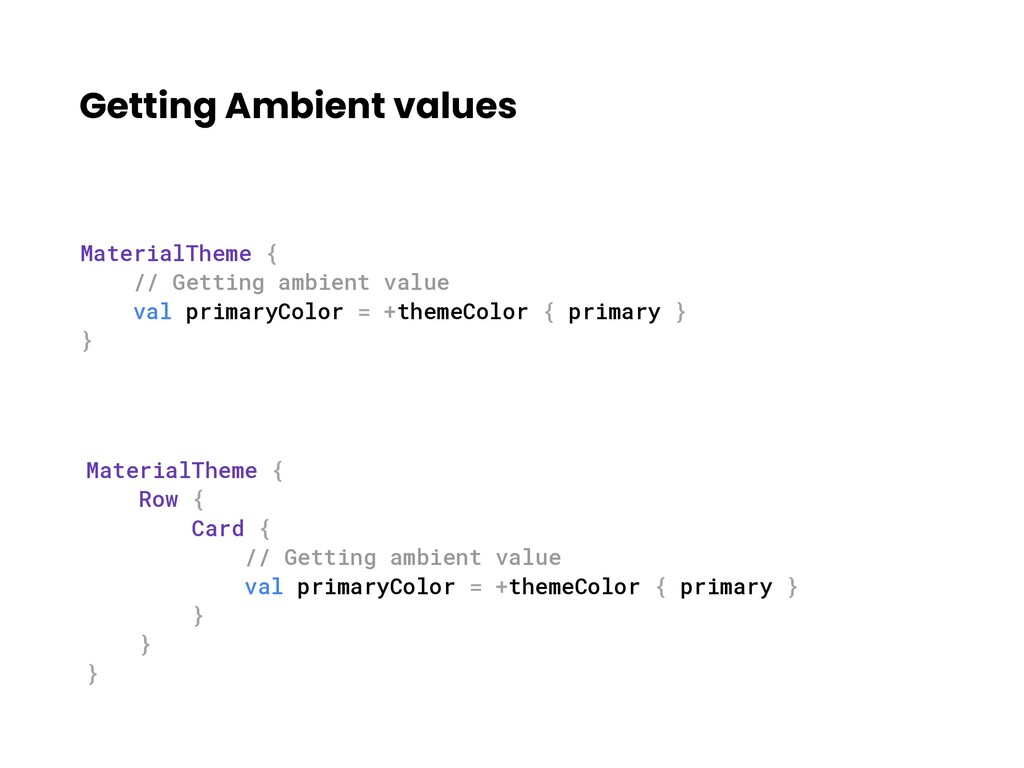
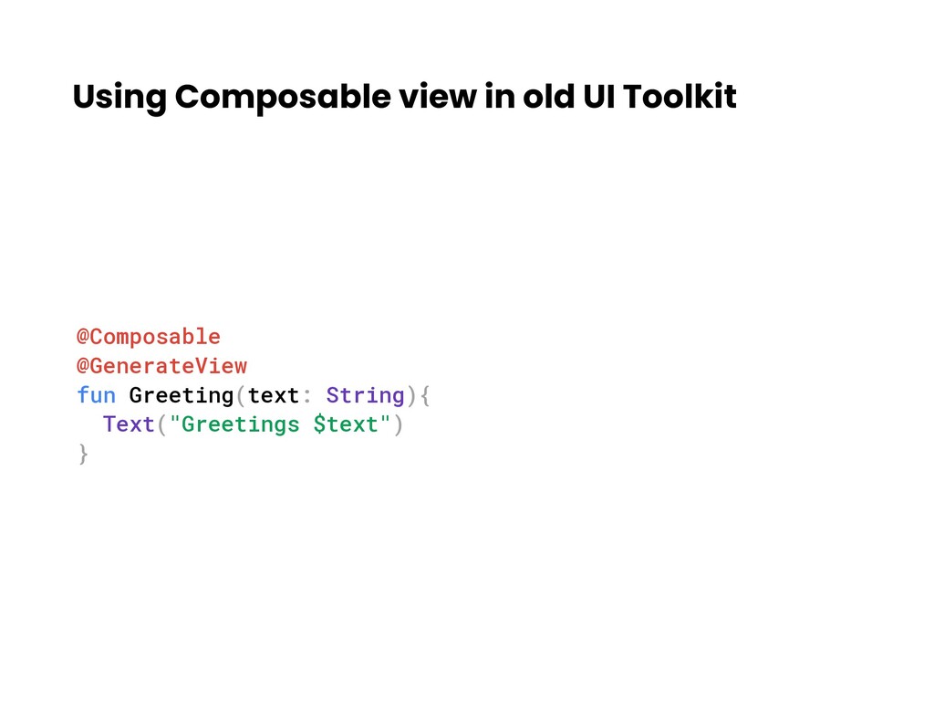
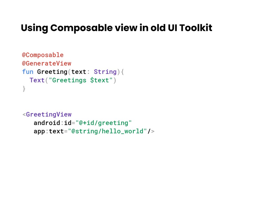
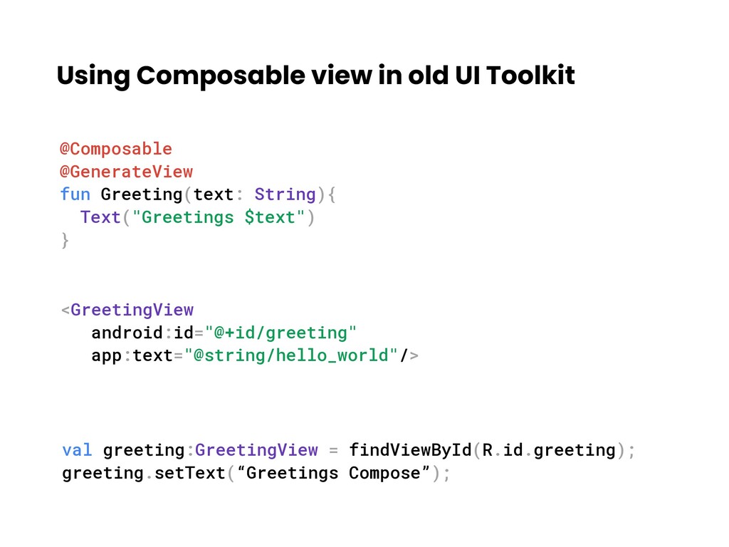
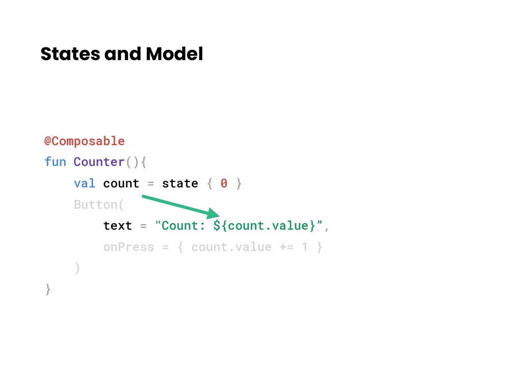
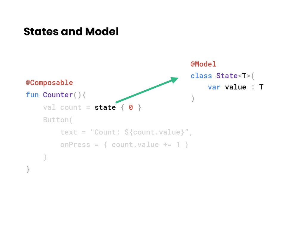
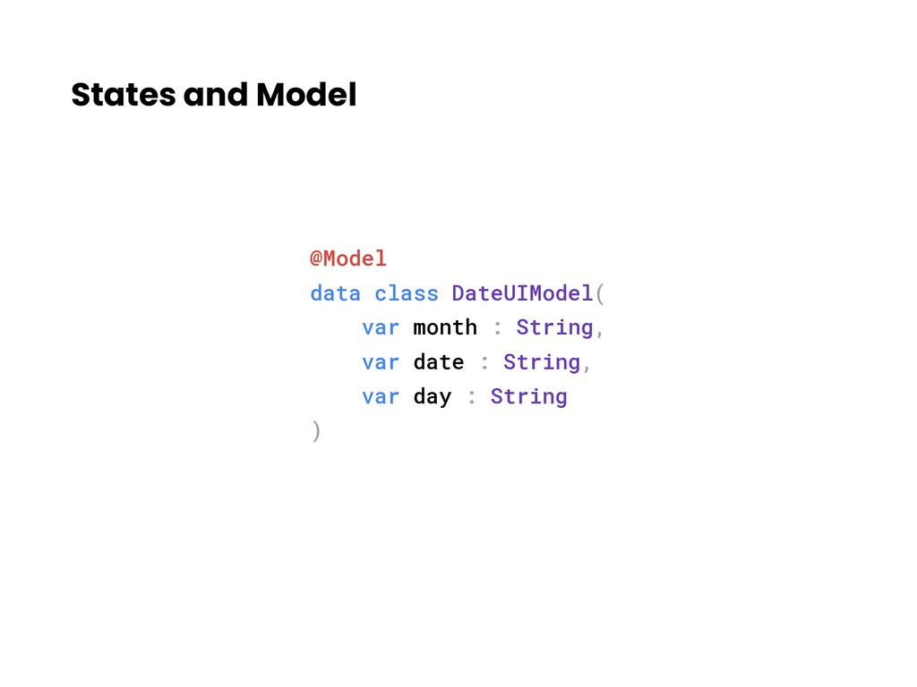
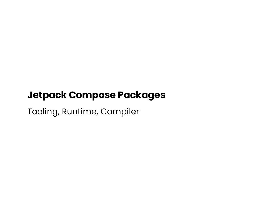
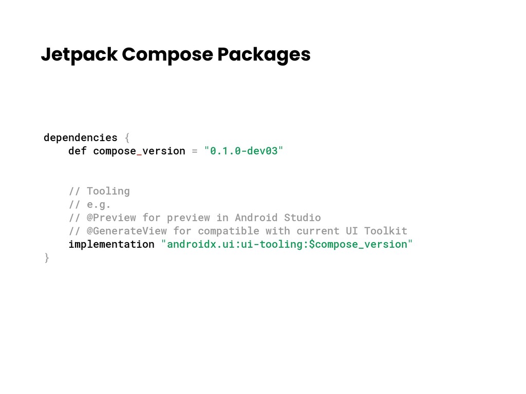
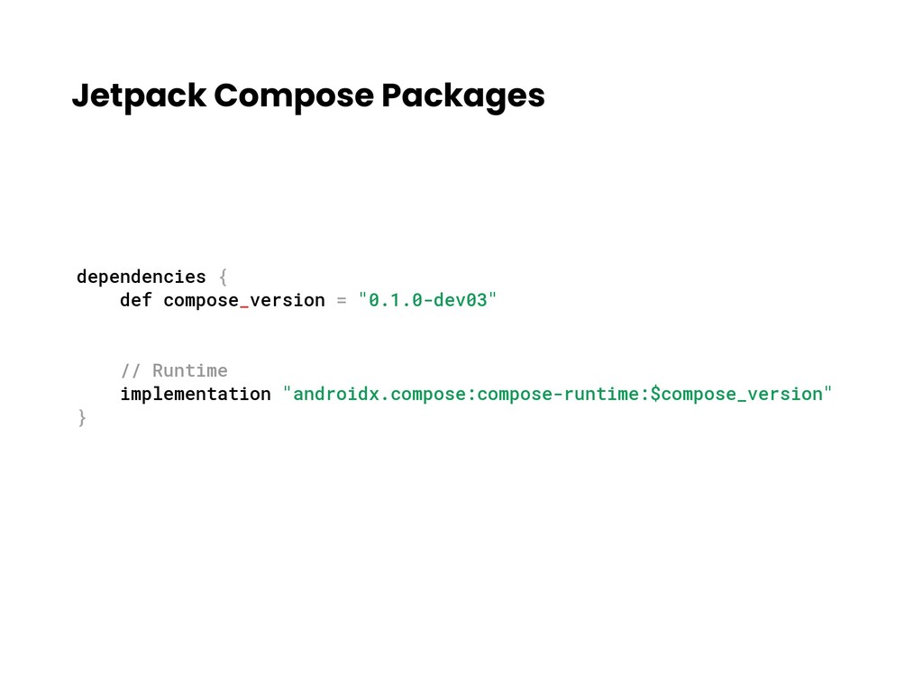
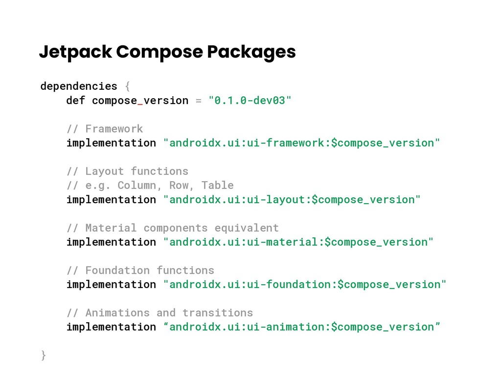
Android developers used to deal with XML to build UIs even if they love or hate. It can be very time consuming and sometimes hard to maintain if Designers requested very customized UI components or PM requested very dynamic UIs. Now, Jetpack Compose comes out and it helps developers to build UIs in declarative way. It can also be used together with XML, too. The potential of Jetpack Compose is limitless. I will present some under the hood stuffs, the potentials and how to integrate in existing apps.

Lin Min Phyo

December 08, 2019
Tweet

More Decks by Lin Min Phyo

Other Decks in Technology

Transcript

  1. What’s in the talk • Old ui toolkit vs Jetpack

    Compose • Mental model for Jetpack Compose • Inside Jetpack Compose • Using Jetpack Compose
  2. Old UI Toolkit - XML <LinearLayout> <Button android:id="@+id/button_foo" ... />

    <RecyclerView android:id=“@+id/list_posts" ... /> <ProgressBar android:id="@+id/progress" ... /> </LinearLayout>
  3. Old UI Toolkit — Button public class Button extends TextView{

    ... } public class TextView extends View{ ... }
  4. Old UI Toolkit — LinearLayout public class LinearLayout extends ViewGroup{

    ... } public class ViewGroup extends View{ ... }
  5. Old UI Toolkit public class Button extends TextView{ ... }

    public class TextView extends View{ ... } Inheritance
  6. Jetpack Compose •⚠ Pre-alpha currently, API might change • Open-source

    • API 21+ • Declarative style • Unbundled from OS
  7. Clean Code, Page 35 Functions should do one thing. They

    should do it well. They should do it only. “
  8. Composable Functions @Composable fun Button() { ... } @Composable fun

    Switch() { ... } @Composable fun Row() { Button() Switch() } • Top-level functions • Requires calling context • View tree is created as a result of function call graph
  9. Data flow in Composable Functions @Composable fun Button(text:String, onClick:(() ->

    Unit)?) { ... } // Calling side Button(text = "DevFestYangon", onClick = { // Do your actions here })
  10. Jetpack Compose vs Old UI Toolkit • Functions over Class

    • Composition over Inheritance • Feature Composition • UI Library built on top of Kotlin language features
  11. Creating Date View Dec 7 SAT data class DateUIModel (

    val month:String, val date:String, val day: String )
  12. @Composable fun DateView(model: DateUIModel) { } data class DateUIModel (

    val month:String, val date:String, val day: String ) Dec 7 SAT
  13. @Composable fun DateView(model: DateUIModel) { Container(width = 64.dp, height =

    64.dp) { } } data class DateUIModel ( val month:String, val date:String, val day: String ) Size of the view Dec 7 SAT It is composable function, too.
  14. @Composable fun DateView(model: DateUIModel) { Container(width = 64.dp, height =

    64.dp) { } } data class DateUIModel ( val month:String, val date:String, val day: String ) Dec 7 SAT
  15. @Composable fun DateView(model: DateUIModel) { Container(width = 64.dp, height =

    64.dp) { DrawBorder(border = Border(Color.LightGray, 1.dp), shape = RoundedCornerShape(8.dp)) } } data class DateUIModel ( val month:String, val date:String, val day: String ) Border Dec 7 SAT
  16. @Composable fun DateView(model: DateUIModel) { Container(width = 64.dp, height =

    64.dp) { DrawBorder(border = Border(Color.LightGray, 1.dp), shape = RoundedCornerShape(8.dp)) } } data class DateUIModel ( val month:String, val date:String, val day: String ) Dec 7 SAT
  17. @Composable fun DateView(model: DateUIModel) { Container(width = 64.dp, height =

    64.dp) { DrawBorder(border = Border(Color.LightGray, 1.dp), shape = RoundedCornerShape(8.dp)) Column(crossAxisAlignment = CrossAxisAlignment.Center) { Text(model.month) Text(model.date) Text(model.day) } } } data class DateUIModel ( val month:String, val date:String, val day: String ) 3 Texts in a column Dec 7 SAT
  18. @Composable fun DateView(model: DateUIModel) { Container(width = 64.dp, height =

    64.dp) { DrawBorder(border = Border(Color.LightGray, 1.dp), shape = RoundedCornerShape(8.dp)) Column(crossAxisAlignment = CrossAxisAlignment.Center) { Text(model.month, style = +themeTextStyle { overline }) Text(model.date, style = +themeTextStyle { h6 }) Text(model.day, style = +themeTextStyle { overline }) } } } data class DateUIModel ( val month:String, val date:String, val day: String ) Add styles Dec 7 SAT
  19. Using Date View Dec 7 SAT // Model val date

    = DateUIModel("Dec" , "7" , “SAT") // Create DateView DateView(model = date)
  20. Date Range View Dec 7 SAT Dec 8 SUN @Composable

    fun DateRangeView(startDate:DateUIModel, endDate:DateUIModel) { }
  21. Date Range View Dec 7 SAT Dec 8 SUN @Composable

    fun DateRangeView(startDate:DateUIModel, endDate:DateUIModel) { Row(crossAxisAlignment = CrossAxisAlignment.Center) { } }
  22. Date Range View Dec 7 SAT Dec 8 SUN @Composable

    fun DateRangeView(startDate:DateUIModel, endDate:DateUIModel) { Row(crossAxisAlignment = CrossAxisAlignment.Center) { DateView(model = startDate) SimpleImage(id = R.drawable.arrow, tint = Color.Gray ) DateView(model = endDate) } }
  23. Date Range View Dec 7 SAT Dec 8 SUN @Composable

    fun DateRangeView(startDate:DateUIModel, endDate:DateUIModel) { Row(crossAxisAlignment = CrossAxisAlignment.Center) { DateView(model = startDate) SimpleImage(id = R.drawable.arrow, tint = Color.Gray ) DateView(model = endDate) } } Start date view needs to be hidden if only end date is provided. How to do it??
  24. Date Range View Dec 7 SAT Dec 8 SUN @Composable

    fun DateRangeView(startDate:DateUIModel?, endDate:DateUIModel) { Row(crossAxisAlignment = CrossAxisAlignment.Center) { startDate?.let{ DateView(model = startDate) SimpleImage(id = R.drawable.arrow, tint = Color.Gray ) } DateView(model = endDate) } } Start date view needs to be hidden if only end date is provided. How to do it??
  25. Date Range View Dec 7 SAT Dec 8 SUN @Composable

    fun DateRangeView(startDate:DateUIModel?, endDate:DateUIModel) { Row(crossAxisAlignment = CrossAxisAlignment.Center) { startDate?.let{ DateView(model = startDate) SimpleImage(id = R.drawable.arrow, tint = Color.Gray ) } DateView(model = endDate) } } Start date view needs to be hidden if only end date is provided. How to do it??
  26. Click Me @Composable fun Button( text: String, onClick: (() ->

    Unit)? = null ) { Surface { Ripple { Clickable{ Container { Text(text) } } } } }
  27. Click Me @Composable fun Button( text: String, onClick: (() ->

    Unit)? = null ) { Surface { Ripple { Clickable{ Container { Text(text) } } } } }
  28. Click Me @Composable fun Button( text: String, onClick: (() ->

    Unit)? = null ) { Surface { Ripple { Clickable { Container { Text(text) } } } } }
  29. Click Me @Composable fun Button( text: String, onClick: (() ->

    Unit)? = null ) { Surface { Ripple { Clickable{ Container(constraints = ButtonConstraints, padding = EdgeInsets(8.dp)){ Text(text) } } } } }
  30. Click Me @Composable fun Button( text: String, onClick: (() ->

    Unit)? = null ) { Surface { Ripple { Clickable(onClick = onClick) { Container(constraints = ButtonConstraints, padding = EdgeInsets(8.dp)) { Text(text) } } } } }
  31. Click Me @Composable fun Button( text: String, onClick: (() ->

    Unit)? = null ) { Surface { Ripple(color = Color.Green) { Clickable(onClick = onClick) { Container(constraints = ButtonConstraints, padding = EdgeInsets(8.dp)) { Text(text) } } } } }
  32. Click Me @Composable fun Button( text: String, onClick: (() ->

    Unit)? = null ) { Surface(RoundedCornerShape(4.dp), Color.Red, elevation = 4.dp) { Ripple(color = Color.Green) { Clickable(onClick = onClick) { Container(constraints = ButtonConstraints, padding = EdgeInsets(8.dp)) { Text(text) } } } } }
  33. @Composable fun Button( text: String, onClick: (() -> Unit)? =

    null ) { Surface(RoundedCornerShape(4.dp), Color.Red, elevation = 4.dp) { Ripple(color = Color.Green) { Clickable(onClick = onClick) { Container(constraints = ButtonConstraints, padding = EdgeInsets(8.dp)) { Text(text) } } } } } Click Me Property goes down through functions
  34. @Composable fun Button( text: String, onClick: (() -> Unit)? =

    null ) { Surface(RoundedCornerShape(4.dp), Color.Red, elevation = 4.dp) { Ripple(color = Color.Green) { Clickable(onClick = onClick) { Container(constraints = ButtonConstraints, padding = EdgeInsets(8.dp)) { Text(text) } } } } } Click Me Event go up via lamda
  35. Old Way override fun onCreate(){ setContentView(R.layout.screen_home.xml) } New Way @Composable

    fun HomeScreen(){ // Your stack of composable views } override fun onCreate(){ setContent { HomeScreen() } } R.layout.screen_home.xml
  36. setContent fun Activity.setContent( content: @Composable() () -> Unit ): CompositionContext?

    { val composeView = window.decorView .findViewById<ViewGroup>(android.R.id.content) .getChildAt(0) as? AndroidComposeView ?: AndroidComposeView(this).also { setContentView(it) } val coroutineContext = Dispatchers.Main return Compose.composeInto(composeView.root, this) { WrapWithAmbients(composeView, this, coroutineContext) { content() } } }
  37. setContent fun Activity.setContent( content: @Composable() () -> Unit ): CompositionContext?

    { val composeView = window.decorView .findViewById<ViewGroup>(android.R.id.content) .getChildAt(0) as? AndroidComposeView ?: AndroidComposeView(this).also { setContentView(it) } val coroutineContext = Dispatchers.Main return Compose.composeInto(composeView.root, this) { WrapWithAmbients(composeView, this, coroutineContext) { content() } } }
  38. setContent fun Activity.setContent( content: @Composable() () -> Unit ): CompositionContext?

    { val composeView = window.decorView .findViewById<ViewGroup>(android.R.id.content) .getChildAt(0) as? AndroidComposeView ?: AndroidComposeView(this).also { setContentView(it) } val coroutineContext = Dispatchers.Main return Compose.composeInto(composeView.root, this) { WrapWithAmbients(composeView, this, coroutineContext) { content() } } }
  39. setContent fun Activity.setContent( content: @Composable() () -> Unit ): CompositionContext?

    { val composeView = window.decorView .findViewById<ViewGroup>(android.R.id.content) .getChildAt(0) as? AndroidComposeView ?: AndroidComposeView(this).also { setContentView(it) } val coroutineContext = Dispatchers.Main return Compose.composeInto(composeView.root, this) { WrapWithAmbients(composeView, this, coroutineContext) { content() } } }
  40. setContent fun ViewGroup.setContent( content: @Composable() () -> Unit ): CompositionContext?

    { val composeView = if (childCount > 0) { getChildAt(0) as? AndroidComposeView } else { removeAllViews(); null } ?: AndroidComposeView(context).also { addView(it) } val coroutineContext = Dispatchers.Main return Compose.composeInto(composeView.root, context) { WrapWithAmbients(composeView, context, coroutineContext) { content() }
  41. setContent fun ViewGroup.setContent( content: @Composable() () -> Unit ): CompositionContext?

    { val composeView = if (childCount > 0) { getChildAt(0) as? AndroidComposeView } else { removeAllViews(); null } ?: AndroidComposeView(context).also { addView(it) } val coroutineContext = Dispatchers.Main return Compose.composeInto(composeView.root, this) { WrapWithAmbients(composeView, this, coroutineContext) { content() }
  42. Ambients • Composable function that provides data and it can

    be shared through by whole sub-hierarchy
  43. Material Theme Ambients @Composable fun MaterialTheme( colors: MaterialColors = MaterialColors(),

    typography: MaterialTypography = MaterialTypography(), children: @Composable() () -> Unit ) { Colors.Provider(value = colors) { Typography.Provider(value = typography) { CurrentTextStyleProvider(value = typography.body1) { MaterialRippleTheme { MaterialShapeTheme(children = children) } } } } }
  44. Ambients @Composable fun MaterialTheme( colors: MaterialColors = MaterialColors(), typography: MaterialTypography

    = MaterialTypography(), children: @Composable() () -> Unit ) { Colors.Provider(value = colors) { Typography.Provider(value = typography) { CurrentTextStyleProvider(value = typography.body1) { MaterialRippleTheme { MaterialShapeTheme(children = children) } } } } }
  45. Getting Ambient values MaterialTheme { // Getting ambient value val

    primaryColor = +themeColor { primary } } MaterialTheme { Row { Card { // Getting ambient value val primaryColor = +themeColor { primary } } } }
  46. Using Composable view in old UI Toolkit @Composable @GenerateView fun

    Greeting(text: String){ Text("Greetings $text") }
  47. Using Composable view in old UI Toolkit @Composable @GenerateView fun

    Greeting(text: String){ Text("Greetings $text") } <GreetingView android:id="@+id/greeting" app:text="@string/hello_world"/>
  48. Using Composable view in old UI Toolkit @Composable @GenerateView fun

    Greeting(text: String){ Text("Greetings $text") } <GreetingView android:id="@+id/greeting" app:text="@string/hello_world"/> val greeting:GreetingView = findViewById(R.id.greeting); greeting.setText(“Greetings Compose”);
  49. @Composable fun Counter(){ val count = state { 0 }

    Button( text = "Count: $count.value", onPress = { count.value += 1 } ) } States and Model
  50. States and Model @Composable fun Counter(){ val count = state

    { 0 } Button( text = "Count: ${count.value}”, onPress = { count.value += 1 } ) }
  51. States and Model @Composable fun Counter(){ val count = state

    { 0 } Button( text = "Count: ${count.value}”, onPress = { count.value += 1 } ) } @Model class State<T>( var value : T )
  52. States and Model @Model data class DateUIModel( var month :

    String, var date : String, var day : String )
  53. Jetpack Compose Packages dependencies { def compose_version = "0.1.0-dev03" //

    Tooling // e.g. // @Preview for preview in Android Studio // @GenerateView for compatible with current UI Toolkit implementation "androidx.ui:ui-tooling:$compose_version" }
  54. Jetpack Compose Packages dependencies { def compose_version = "0.1.0-dev03" //

    Runtime implementation "androidx.compose:compose-runtime:$compose_version" }
  55. dependencies { def compose_version = "0.1.0-dev03" // Framework implementation "androidx.ui:ui-framework:$compose_version"

    // Layout functions // e.g. Column, Row, Table implementation "androidx.ui:ui-layout:$compose_version" // Material components equivalent implementation "androidx.ui:ui-material:$compose_version" // Foundation functions implementation "androidx.ui:ui-foundation:$compose_version" // Animations and transitions implementation “androidx.ui:ui-animation:$compose_version” } Jetpack Compose Packages
  56. @Linminphyoe1 https://lin.phyo.work Take a ride through a Burmese tech scene

    made by Burmese, for Burmese https://anchor.fm/techshaw @vincentpaing