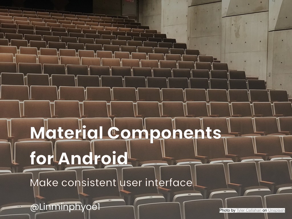
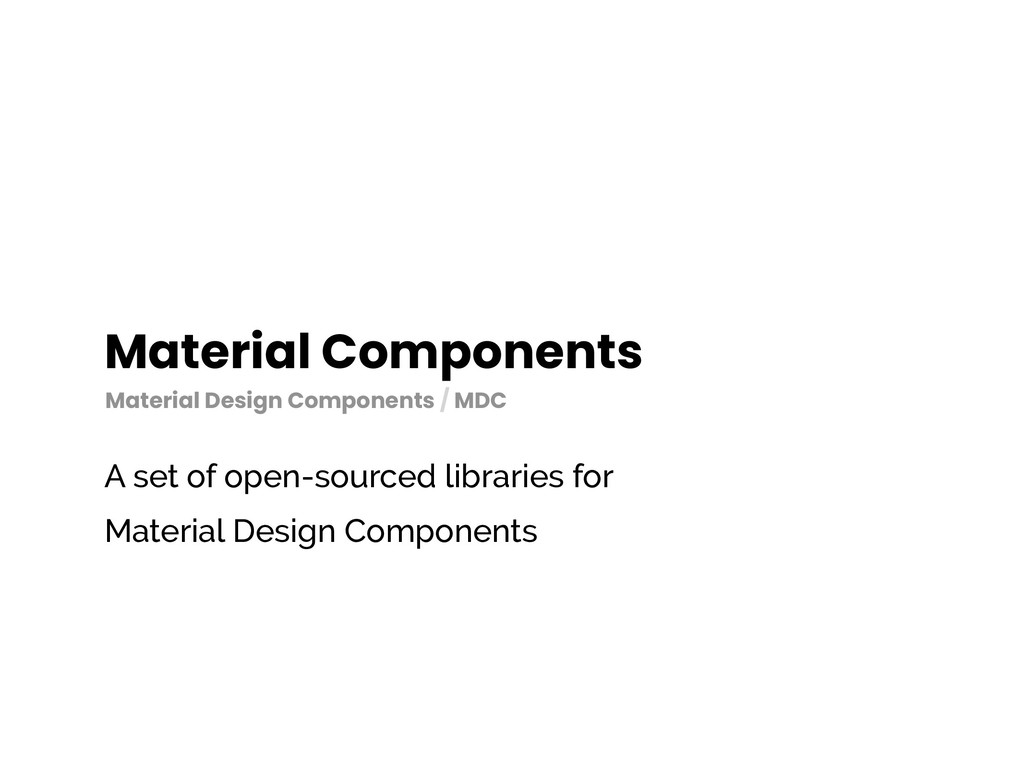
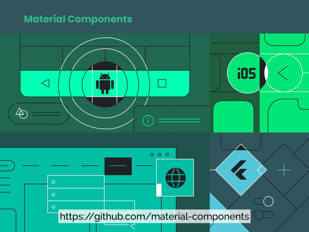
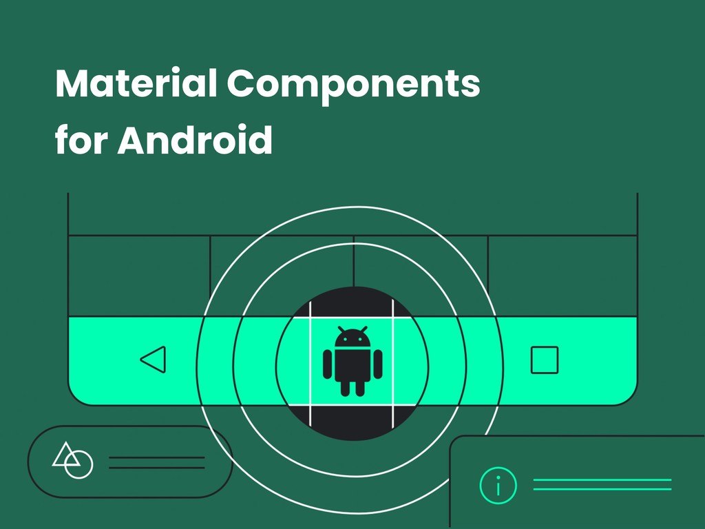
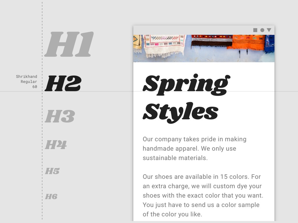
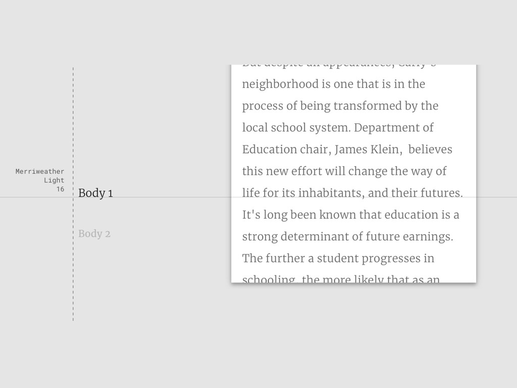
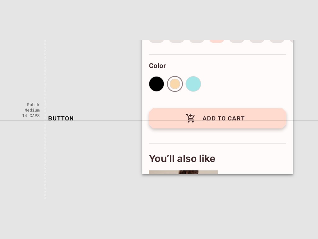
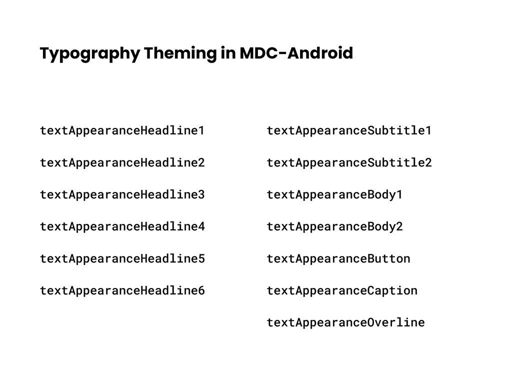
Material Components for Android : Make consistent user interface
Material components for Android is an open-sourced library that make developers to work easily with material design specification and make ui components consistent. Collaboration between designers and developers have never been easier.
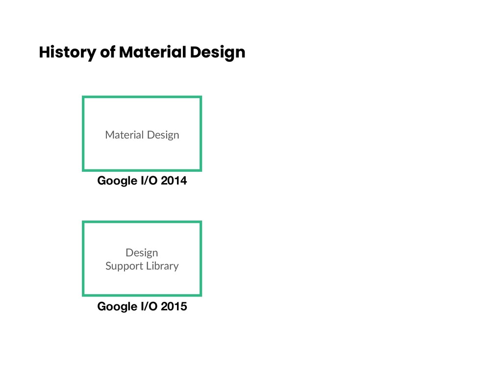
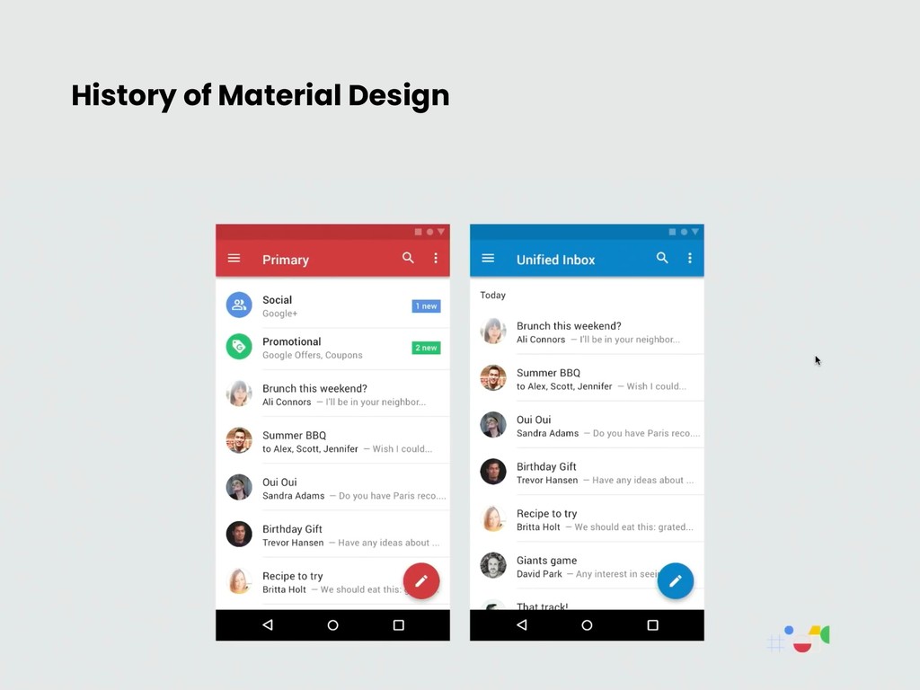
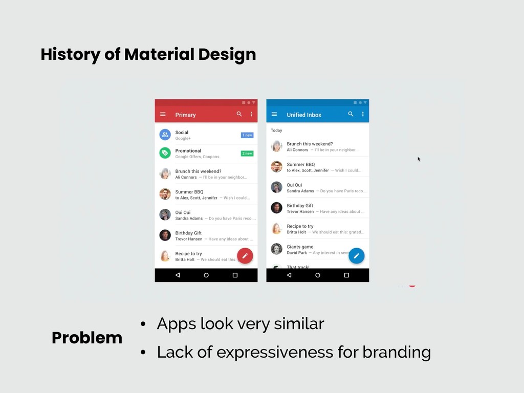
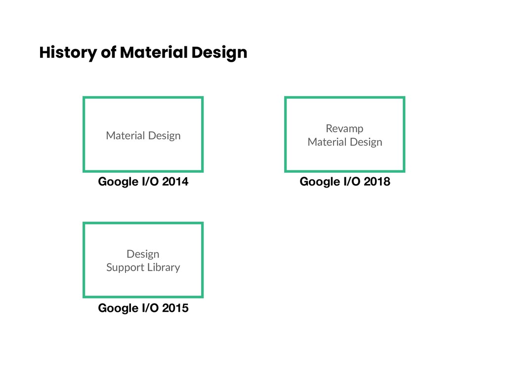
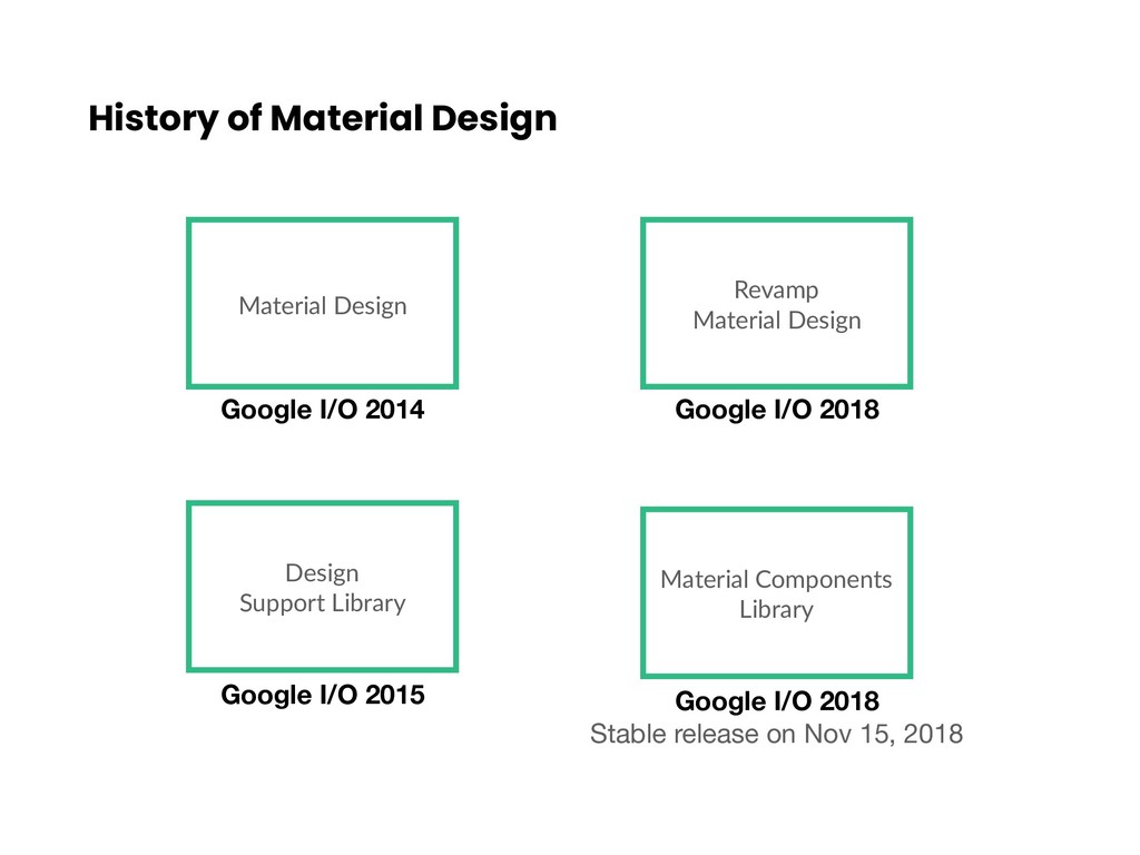
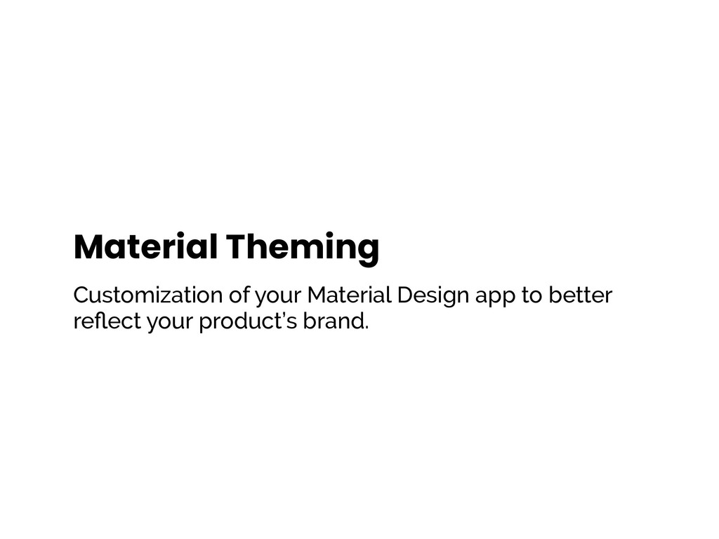
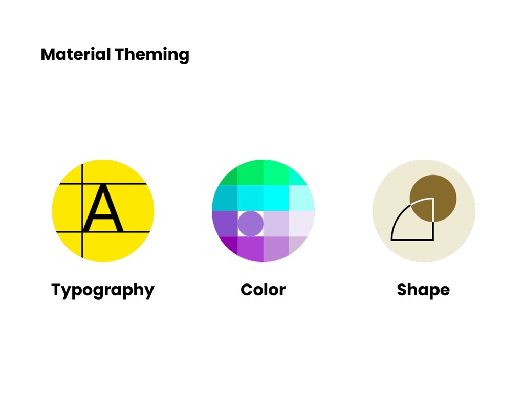
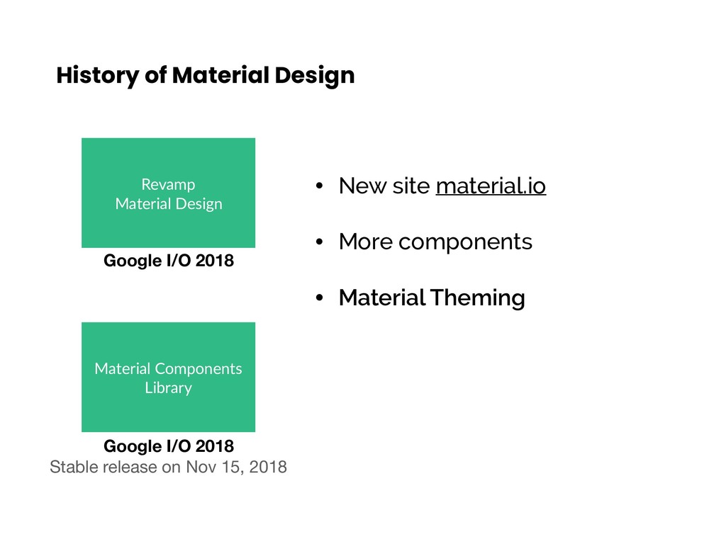
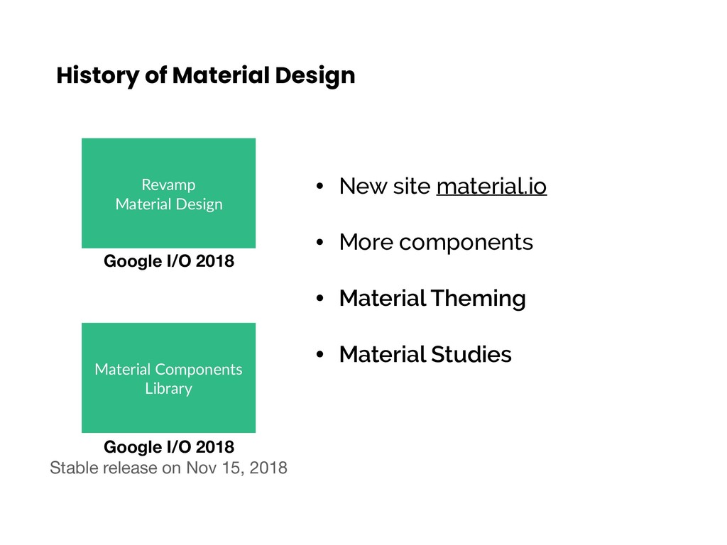
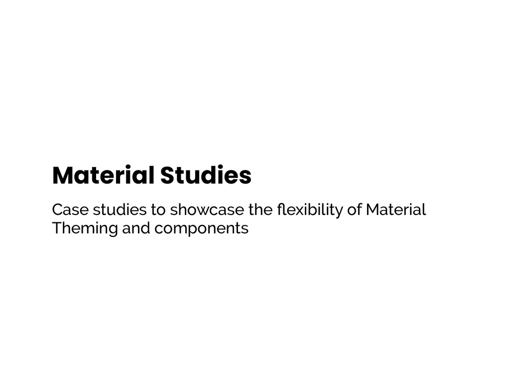
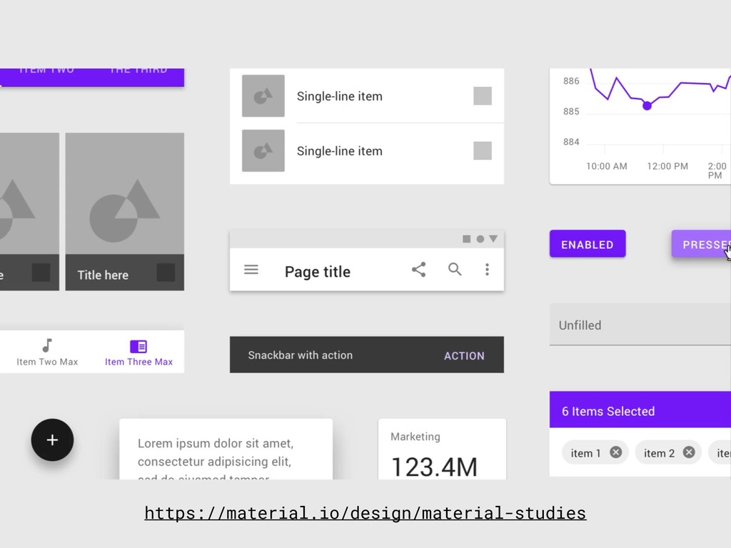
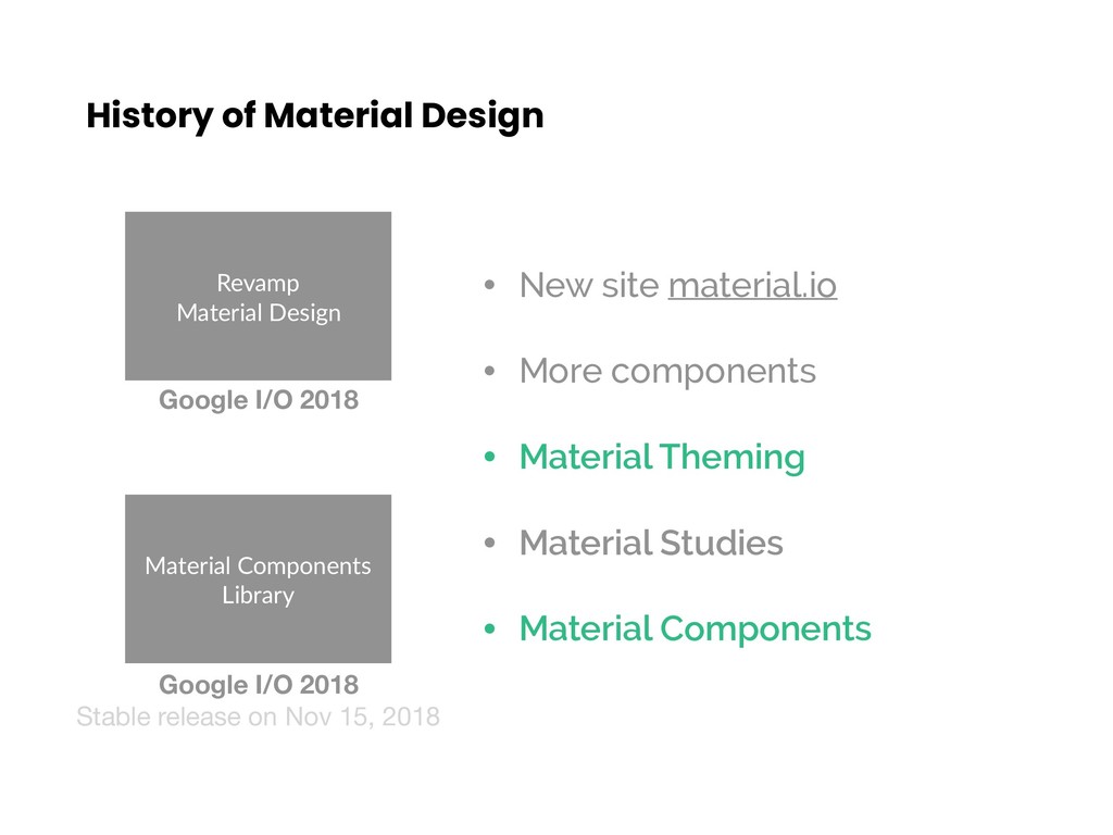
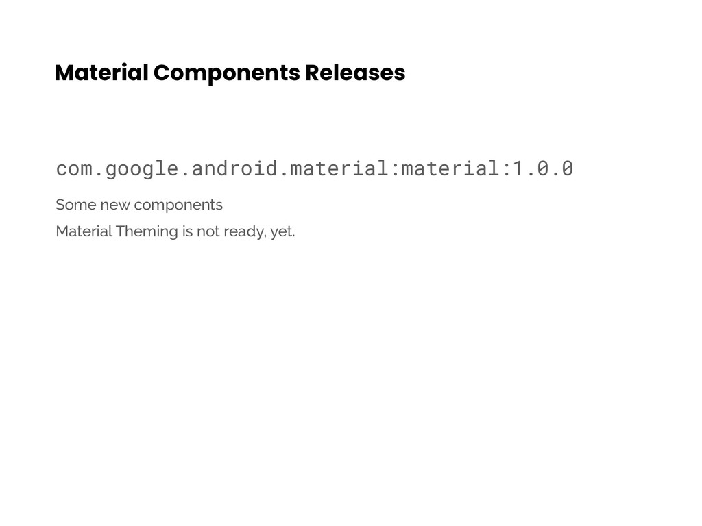
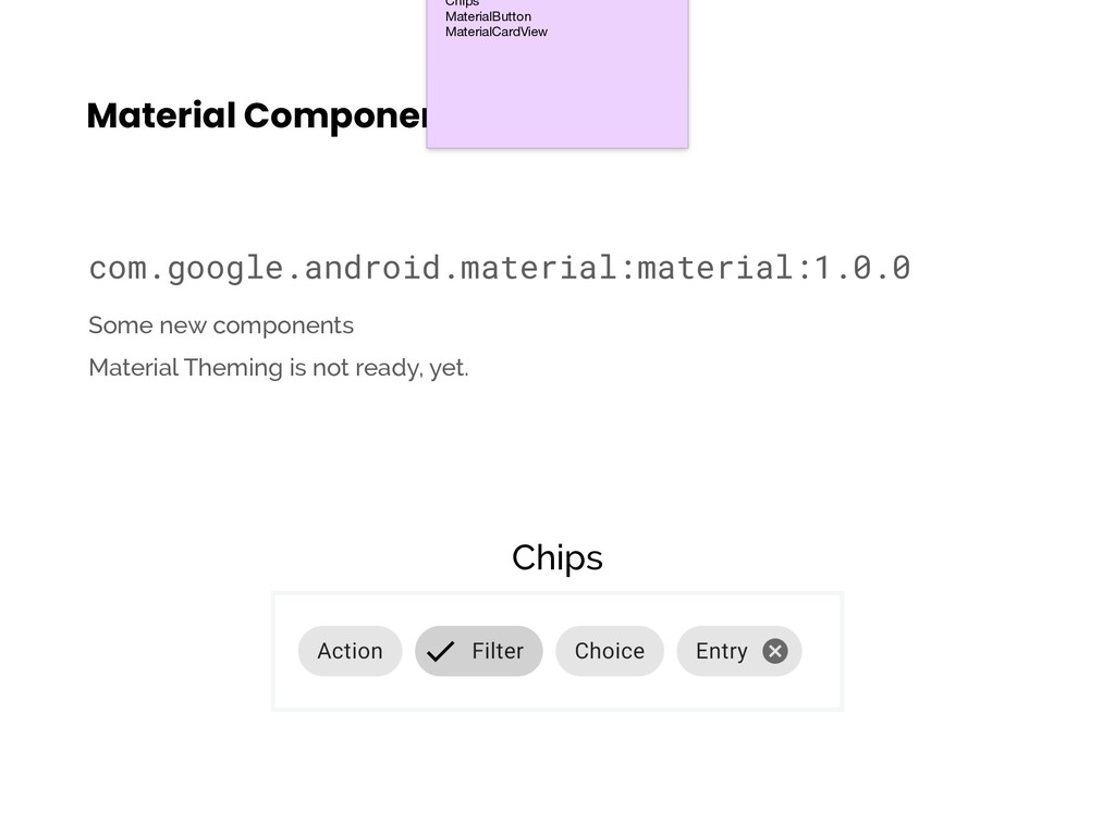
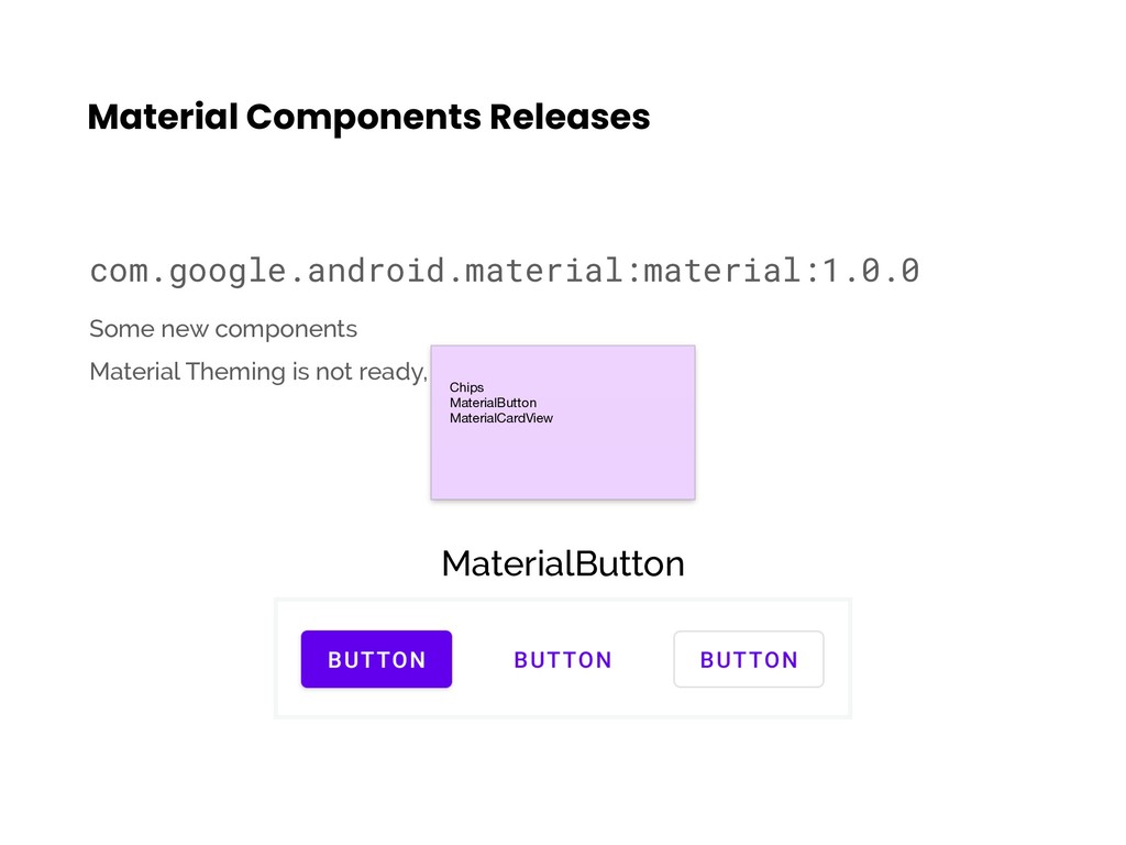
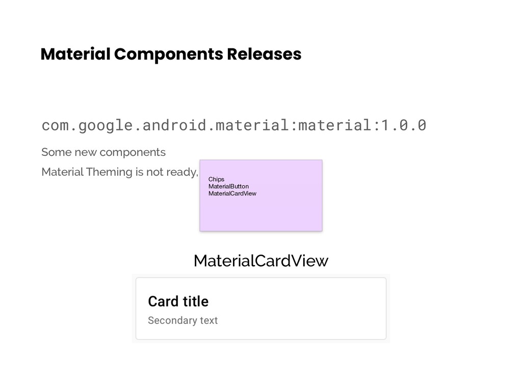
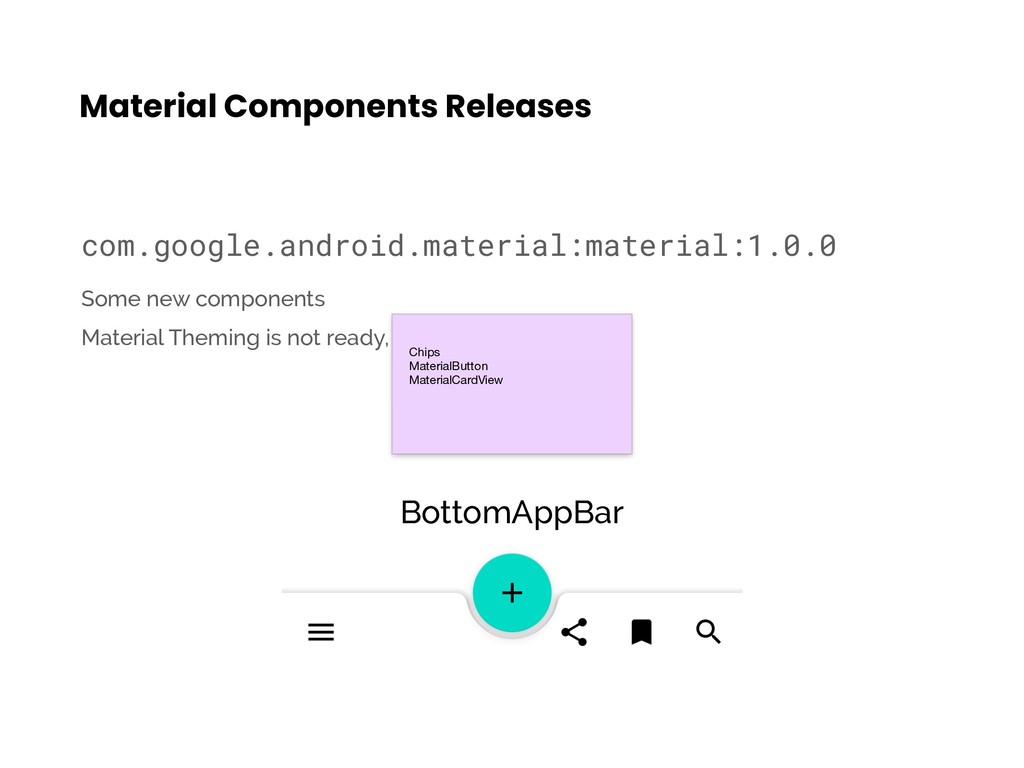
components • Material Theming • Material Studies Revamp Material Design Google I/O 2018 Material Components Library Google I/O 2018 Stable release on Nov 15, 2018
components • Material Theming • Material Studies Revamp Material Design Google I/O 2018 Material Components Library Google I/O 2018 Stable release on Nov 15, 2018
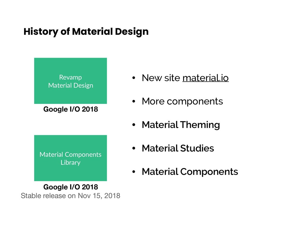
components • Material Theming • Material Studies • Material Components Revamp Material Design Google I/O 2018 Material Components Library Google I/O 2018 Stable release on Nov 15, 2018
components • Material Theming • Material Studies • Material Components Revamp Material Design Google I/O 2018 Material Components Library Google I/O 2018 Stable release on Nov 15, 2018
components • Material Theming • Material Studies • Material Components Revamp Material Design Google I/O 2018 Material Components Library Google I/O 2018 Stable release on Nov 15, 2018
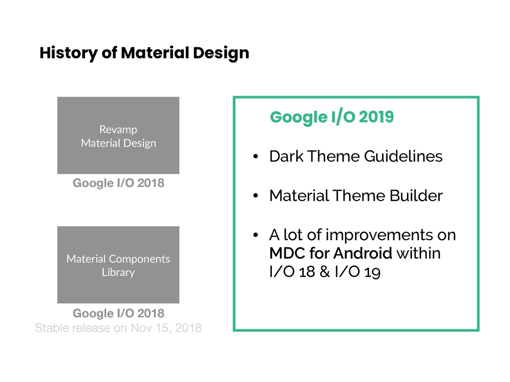
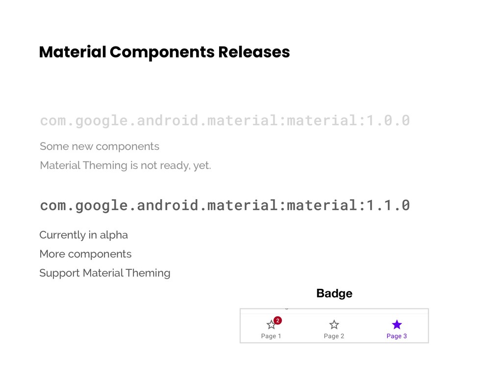
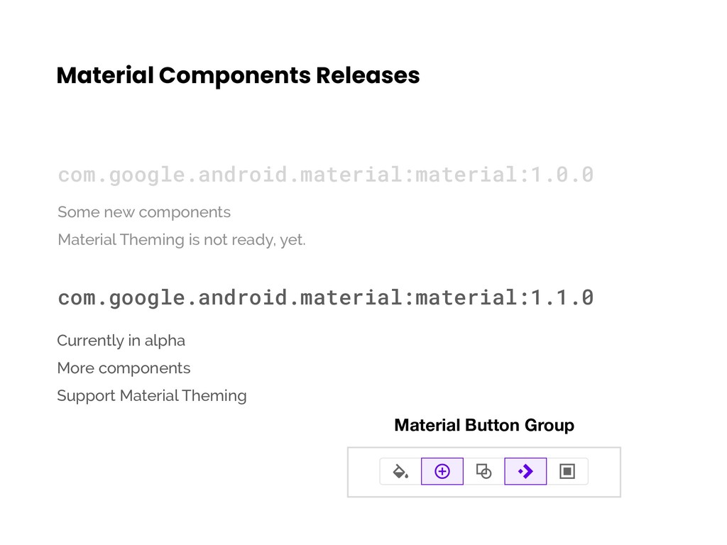
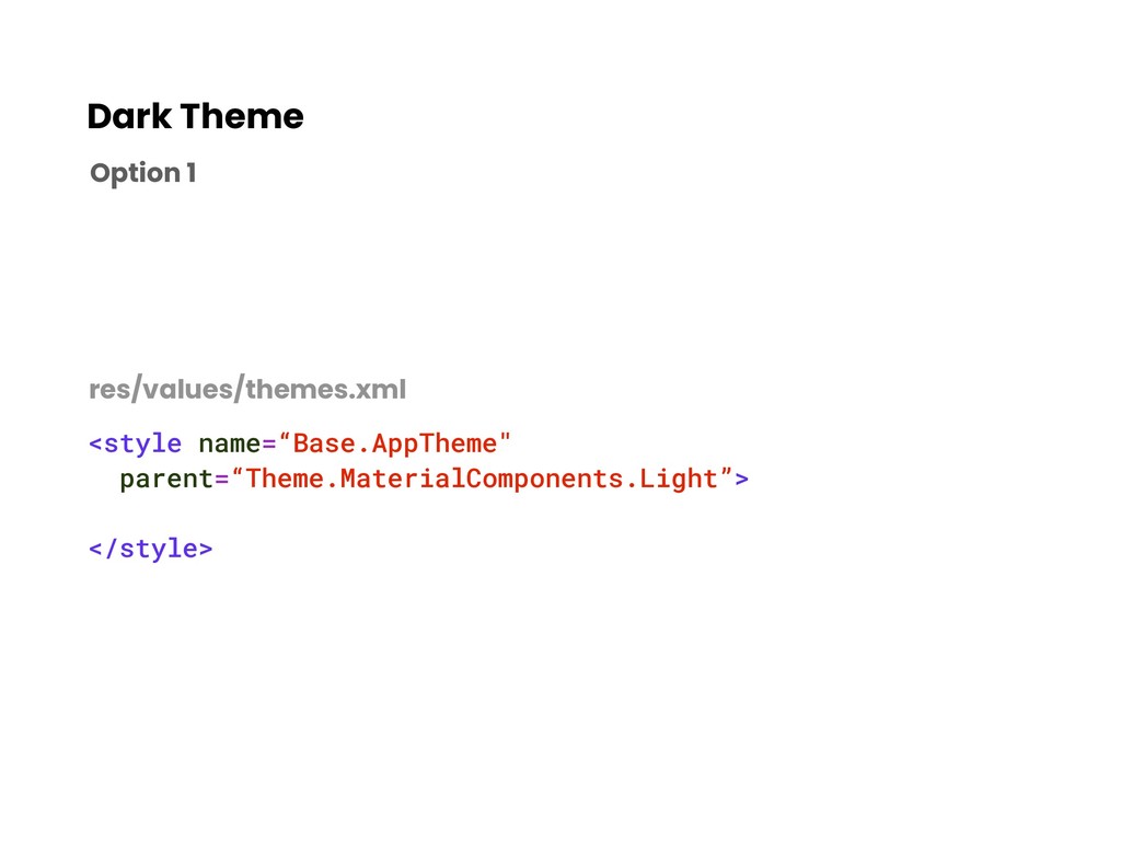
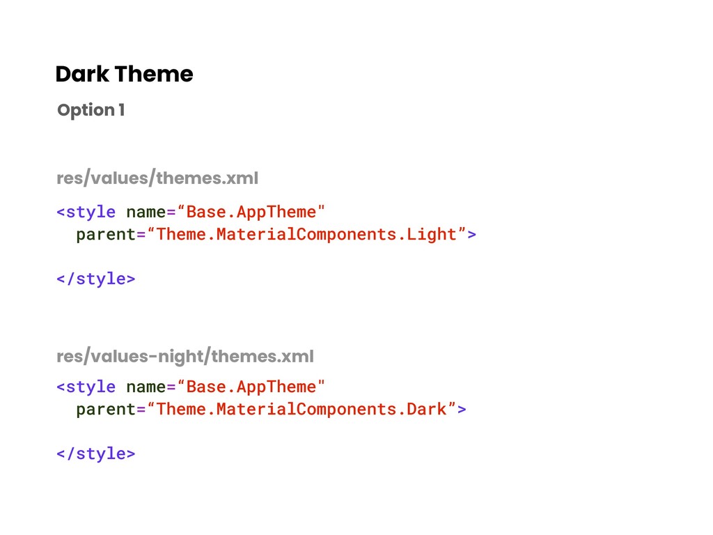
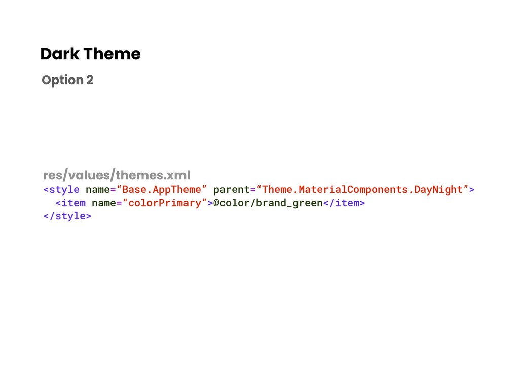
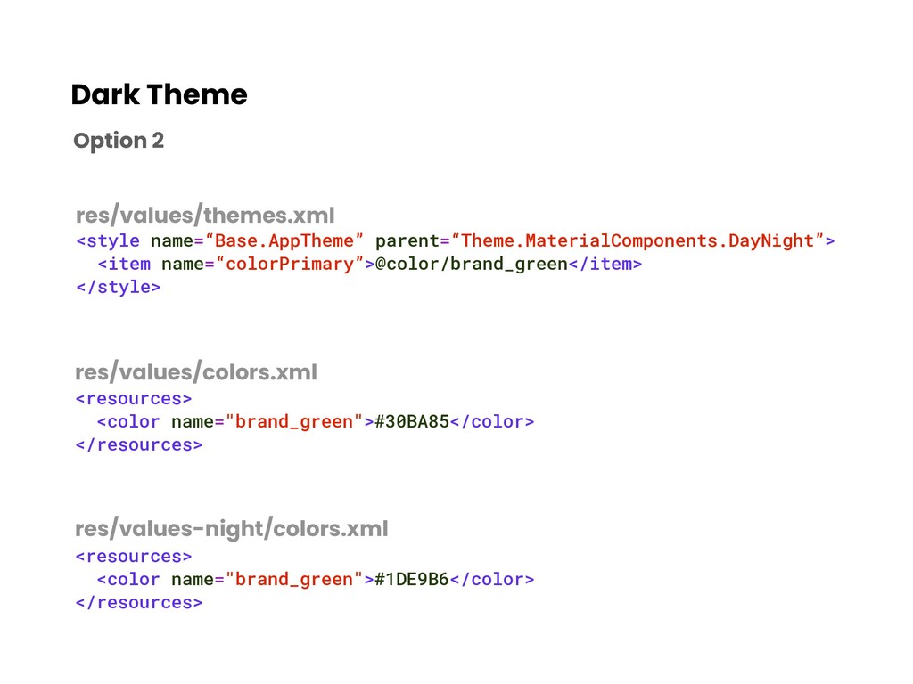
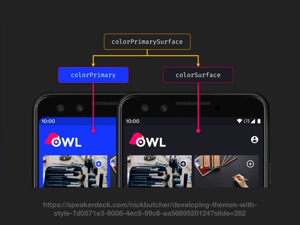
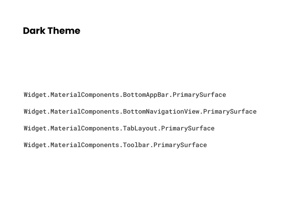
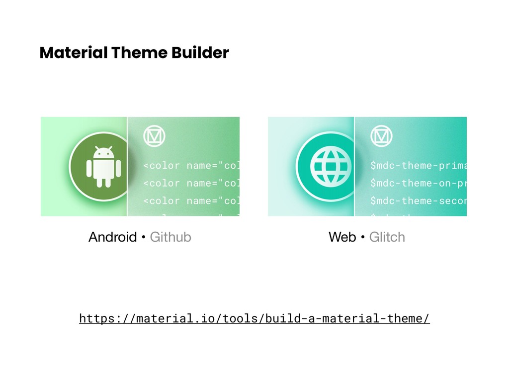
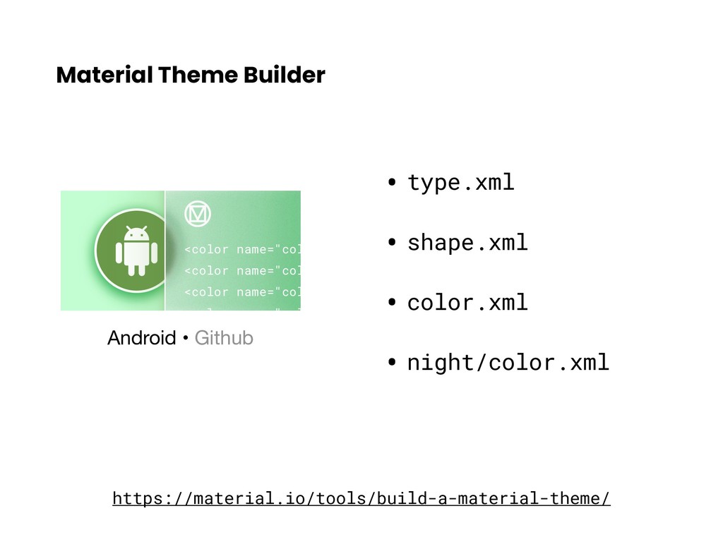
Material Components Library Google I/O 2018 Stable release on Nov 15, 2018 • Dark Theme Guidelines • Material Theme Builder • A lot of improvements on MDC for Android within I/O 18 & I/O 19 Google I/O 2019
 hashlin
 oracle4engineer
 krrrr38
 grimoh
 minorun365
 miyukichi_ospf
 shinyasaita
 sansantech
 moongift
 maroon8021
 subroh0508
 staka121
 smasato
 schlessera
 jeffersonlam
 stephaniewalter
 sachag
 bluesmoon
 mongodb
 mojombo
 speakerdeck
 lara
lara
 mlcsv
mlcsv
 eileencodes
 thekraken