don't go if you're in the wrong session. Do not loudly if you have been reading the slide. Do not snore if you are asleep. Thank you all for join this session! http://webconf.hinablue.me/2013
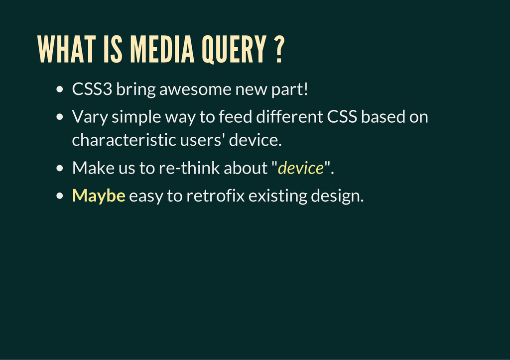
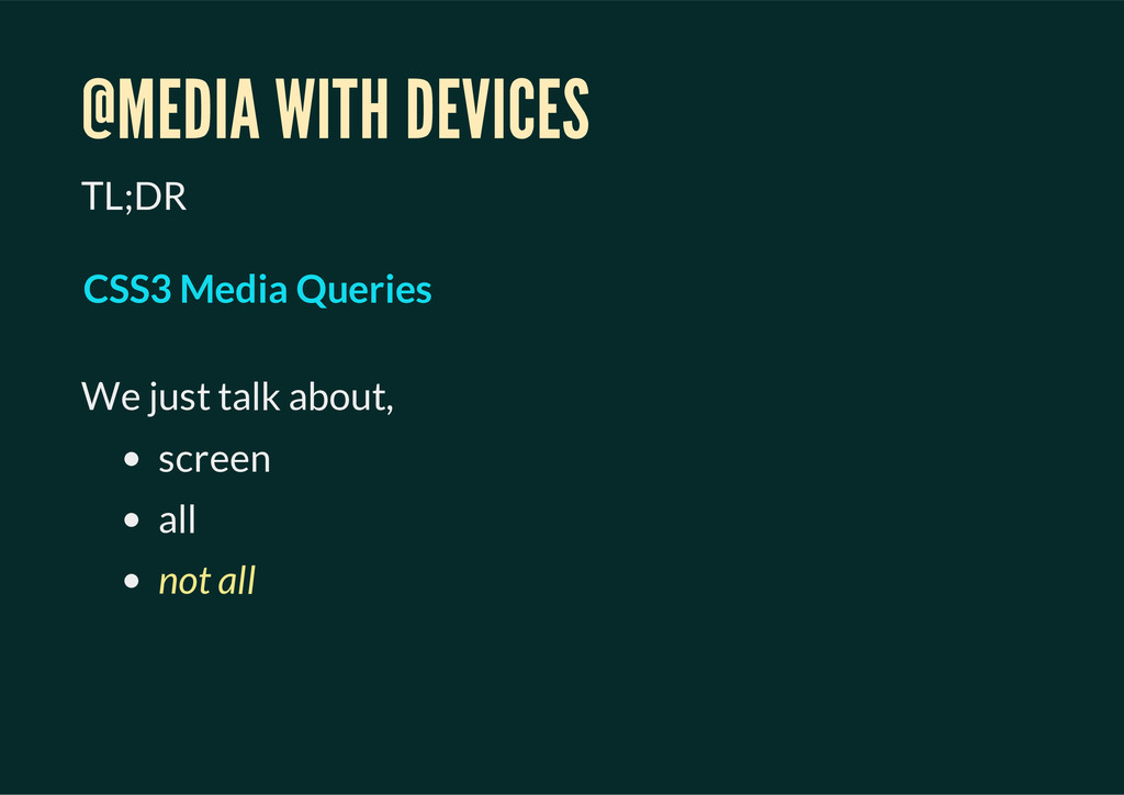
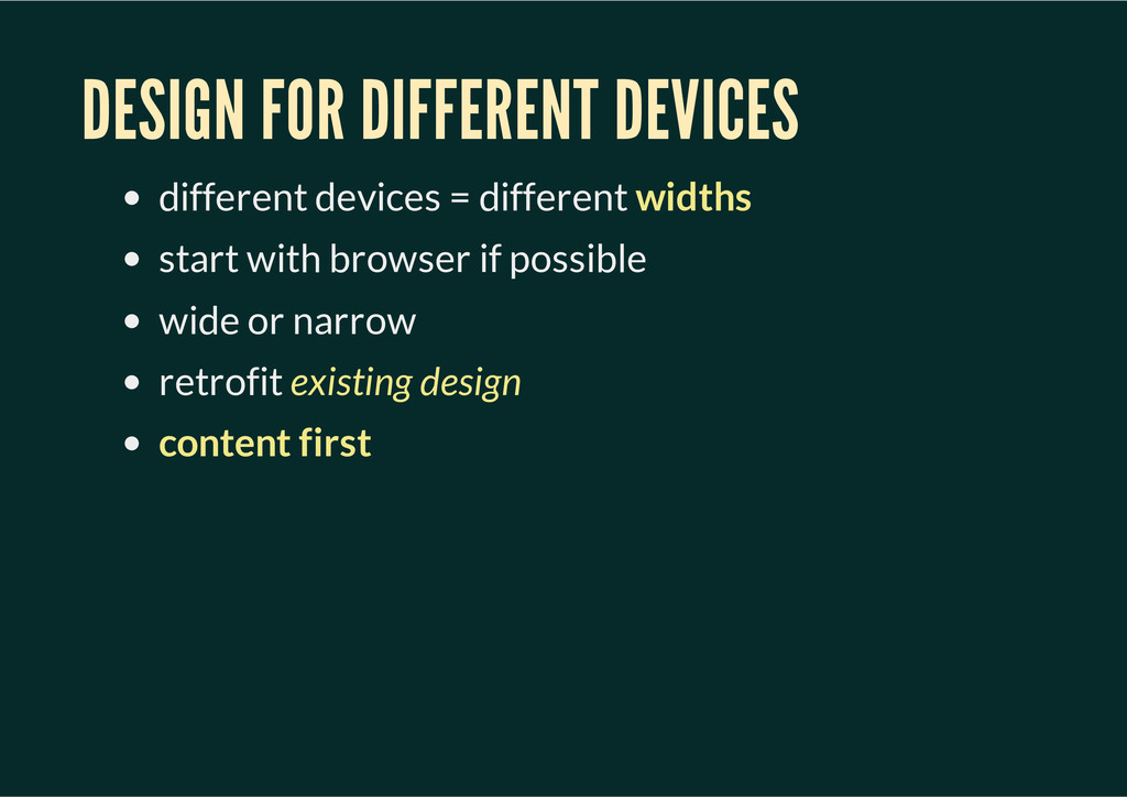
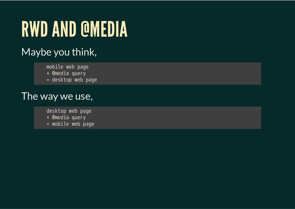
Vary simple way to feed different CSS based on characteristic users' device. Make us to re-think about "device". Maybe easy to retrofix existing design.
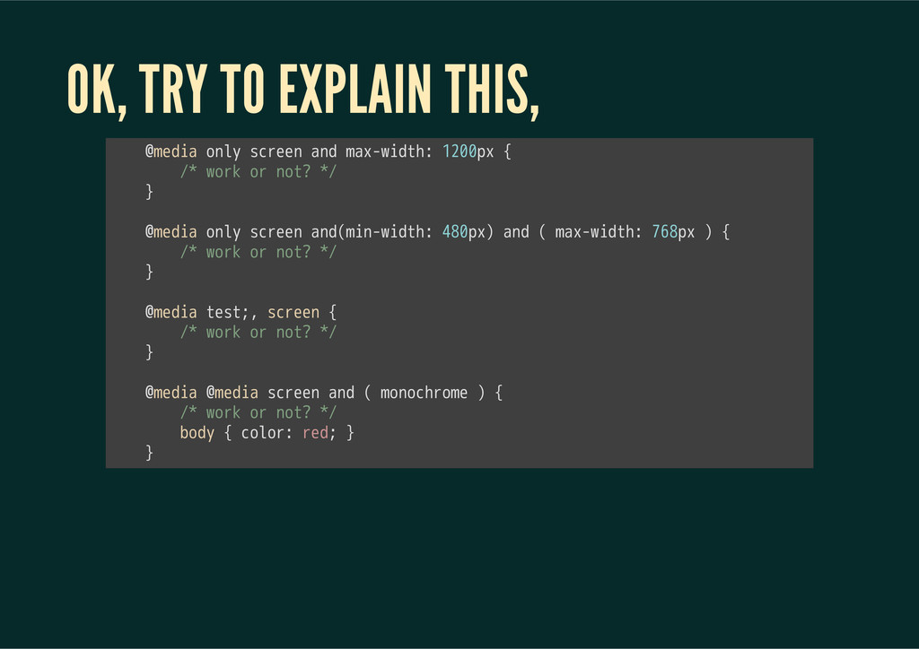
with <link> tag 2. @media with CSS 3. @media with @import 㫪㫣㫠㫥㫢㫔㫩㫜㫣㫫㫔㫪㫫㫰㫣㫜㫪㫟㫜㫜㫫㫔㫔㫤㫜㫛㫠㫘㫫㫔㫪㫚㫩㫜㫜㫥㫔㫔㫟㫩㫜㫝㫫㫔㫜㫜㫜㫔㫬 㫮㫤㫜㫛㫠㫘㫔㫪㫚㫩㫜㫜㫥㫔㫲㫔㫜㫜㫜㫔㫴 㫮㫠㫤㫧㫦㫩㫫㫔㫬㫩㫣㫖㫪㫚㫩㫜㫜㫥㫜㫚㫪㫪㫗㫔㫪㫚㫩㫜㫜㫥㫩
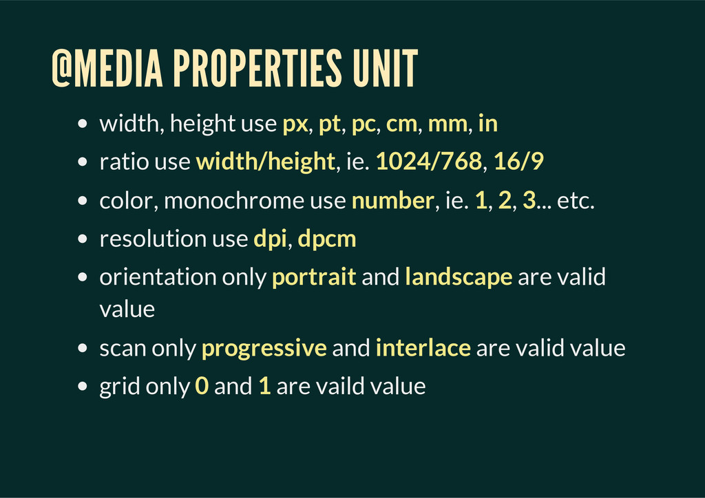
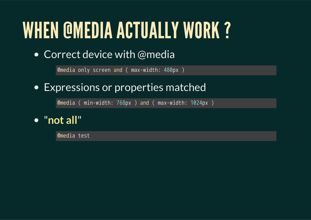
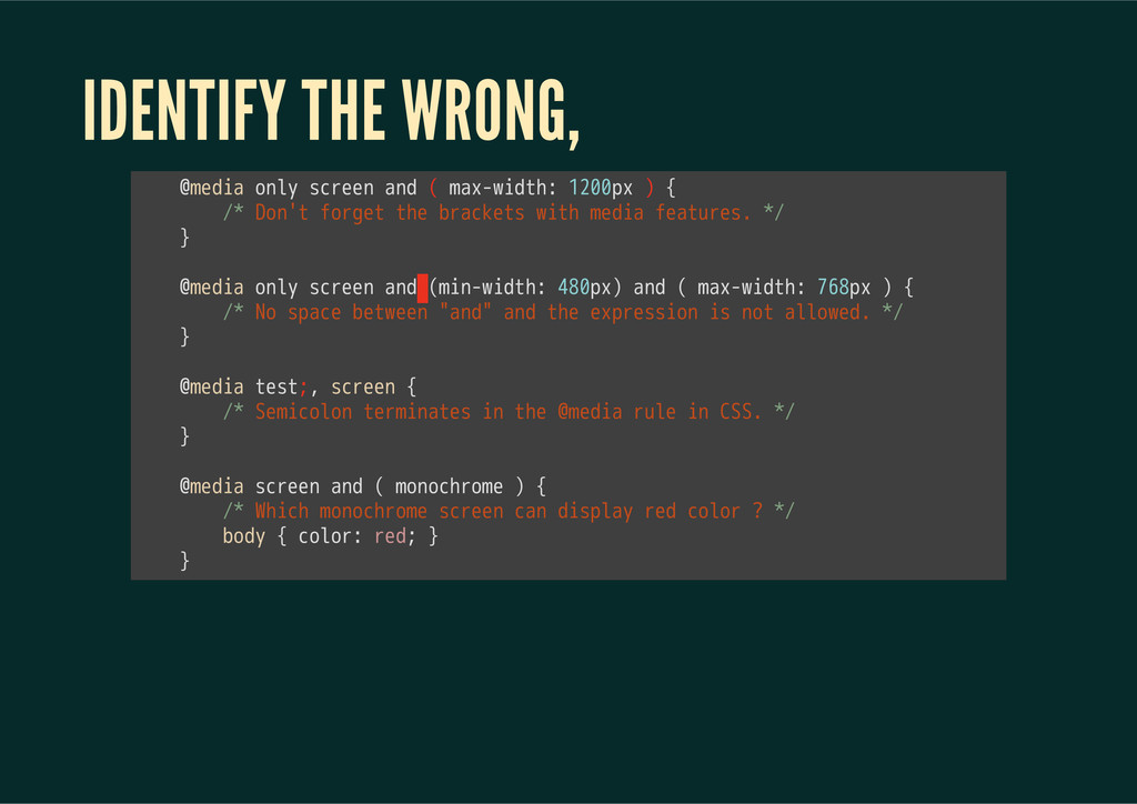
mm, in ratio use width/height, ie. 1024/768, 16/9 color, monochrome use number, ie. 1, 2, 3... etc. resolution use dpi, dpcm orientation only portrait and landscape are valid value scan only progressive and interlace are valid value grid only 0 and 1 are vaild value
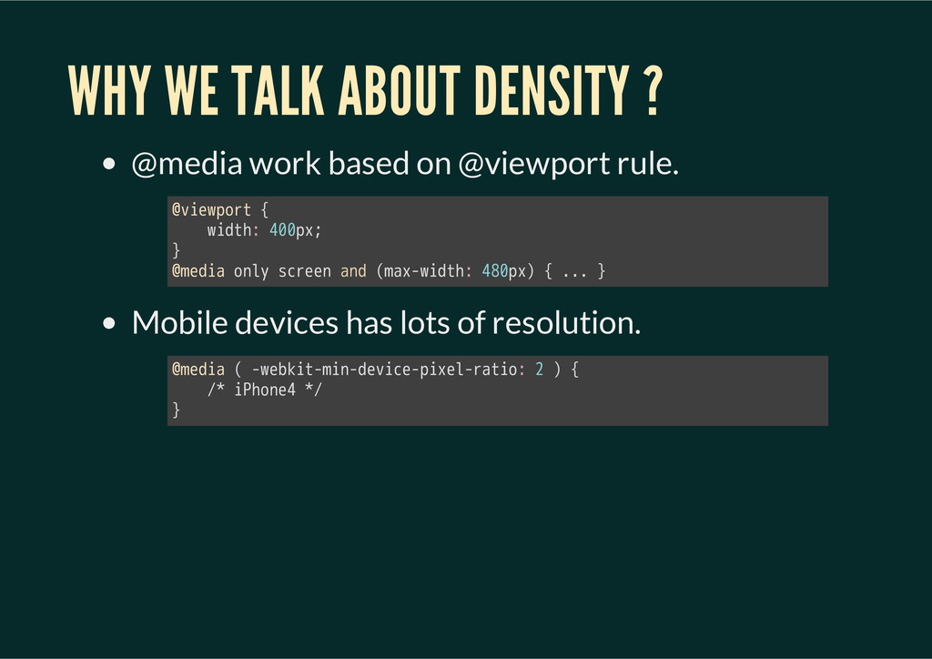
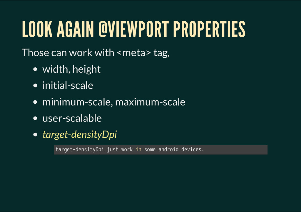
@viewport rule. Mobile devices has lots of resolution. 㫮㫭㫠㫜㫮㫧㫦㫩㫫㫔㫲 㫔㫔㫔㫔㫮㫠㫛㫫㫟㫨㫔㫢㫞㫞㫧㫯㫩 㫴 㫮㫤㫜㫛㫠㫘㫔㫦㫥㫣㫰㫔㫪㫚㫩㫜㫜㫥㫔㫘㫥㫛㫔㫖㫤㫘㫯㫛㫮㫠㫛㫫㫟㫨㫔㫢㫦㫞㫧㫯㫗㫔㫲㫔㫜㫜㫜㫔㫴 㫮㫤㫜㫛㫠㫘㫔㫖㫔㫛㫮㫜㫙㫢㫠㫫㫛㫤㫠㫥㫛㫛㫜㫭㫠㫚㫜㫛㫧㫠㫯㫜㫣㫛㫩㫘㫫㫠㫦㫨㫔㫠㫔㫗㫔㫲 㫔㫔㫔㫔㫝㫘㫔㫠㫗㫟㫦㫥㫜㫢㫔㫘㫝 㫴
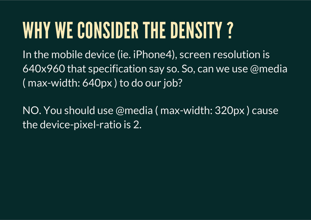
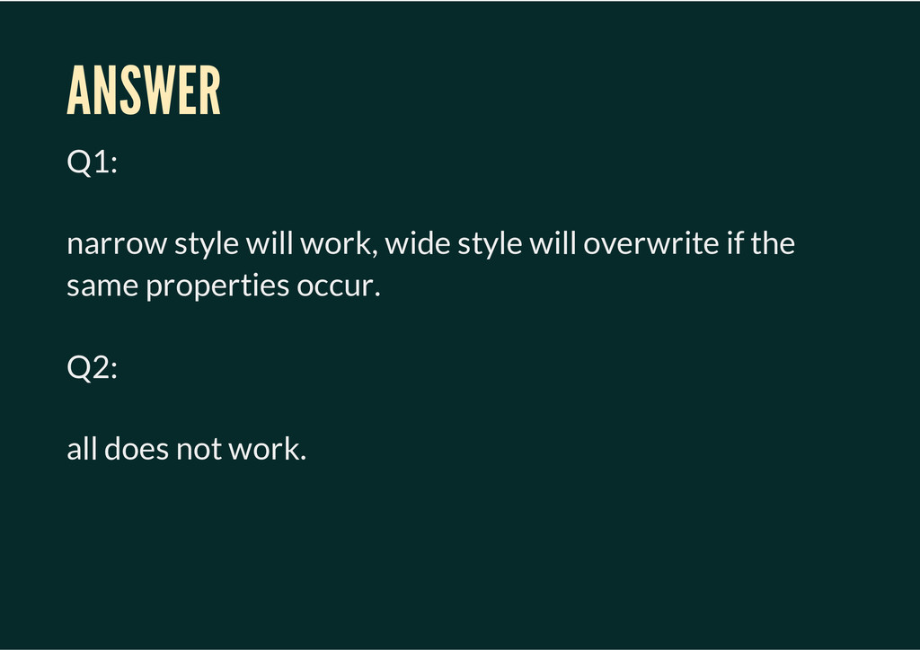
(ie. iPhone4), screen resolution is 640x960 that specification say so. So, can we use @media ( max-width: 640px ) to do our job? NO. You should use @media ( max-width: 320px ) cause the device-pixel-ratio is 2.
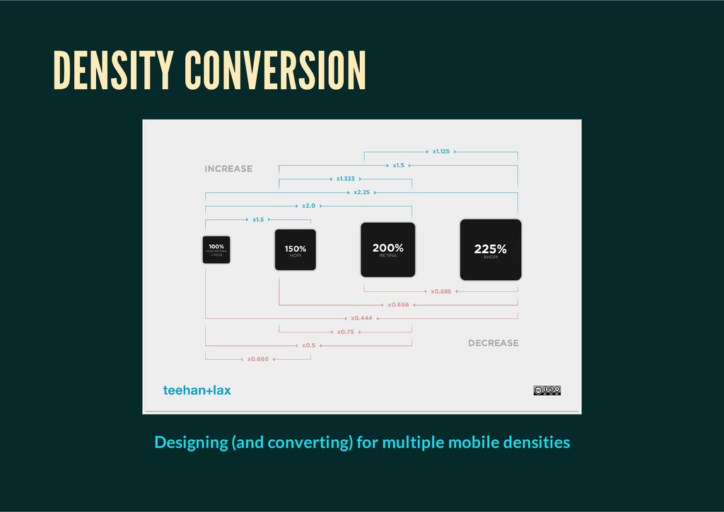
that was 100px by 100px, you'd provide an image that was 200px by 200px, but specify in CSS or as an attribute in HTML that it is 100px by 100px. The reason this works is that a pixel on the screen is not the same as a CSS pixel. This is a good thing, because otherwise as I say, things would be tiny. --Rich Bradshaw ” Pixel density, retina display and font-size in CSS
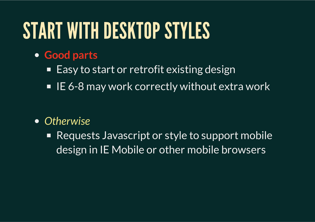
retrofit existing design IE 6-8 may work correctly without extra work Otherwise Requests Javascript or style to support mobile design in IE Mobile or other mobile browsers
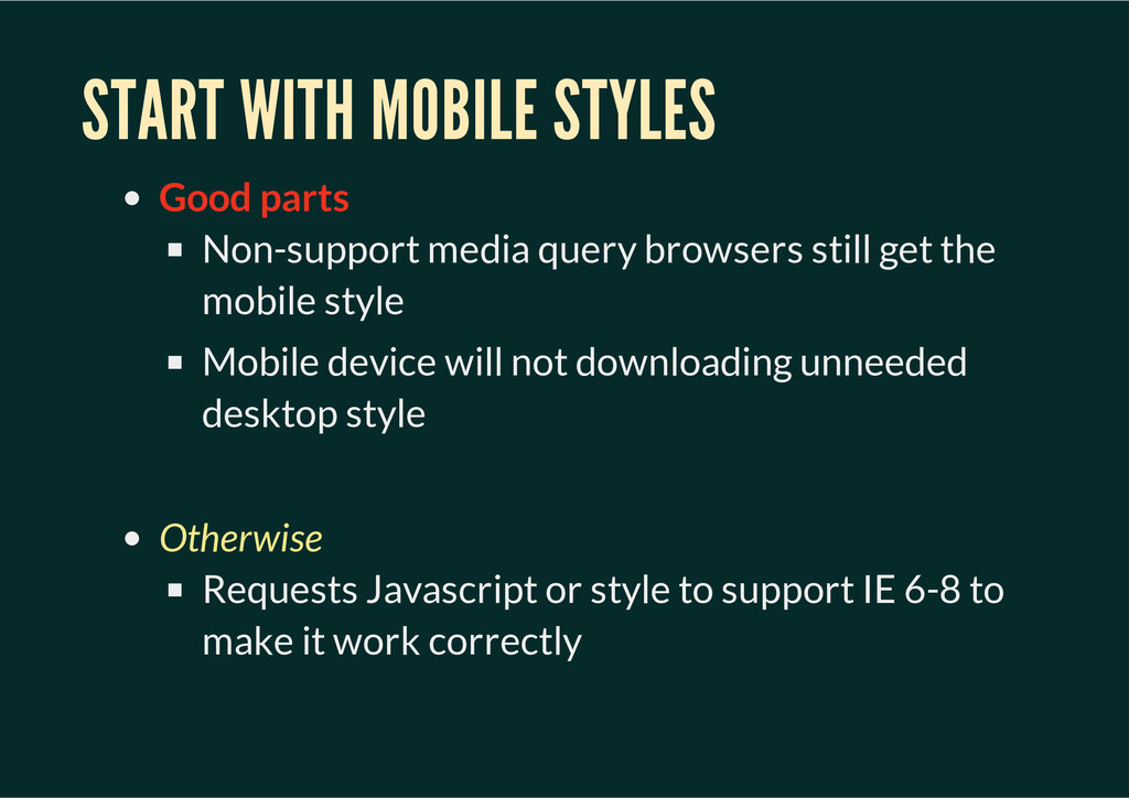
still get the mobile style Mobile device will not downloading unneeded desktop style Otherwise Requests Javascript or style to support IE 6-8 to make it work correctly
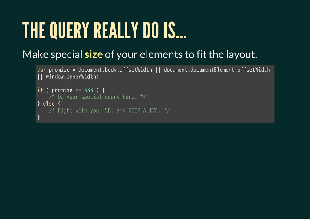
elements to fit the layout. 㫭㫘㫩㫔㫧㫩㫦㫤㫠㫪㫜㫔㫫㫔㫛㫦㫚㫬㫤㫜㫥㫫㫜㫙㫦㫛㫰㫜㫦㫝㫝㫪㫜㫫㫘㫠㫛㫫㫟㫔㫳㫳㫔㫛㫦㫚㫬㫤㫜㫥㫫㫜㫛㫦㫚㫬㫤㫜㫥㫫㫘㫣㫜㫤㫜㫥㫫㫜㫦㫝㫝㫪㫜㫫㫘㫠㫛㫫㫟㫔 㫳㫳㫔㫮㫠㫥㫛㫦㫮㫜㫠㫥㫥㫜㫩㫘㫠㫛㫫㫟㫩 㫠㫝㫔㫖㫔㫧㫩㫦㫤㫠㫪㫜㫔㫫㫫㫔㫤㫡㫡㫔㫗㫔㫲 㫔㫔㫔㫔㫝㫘㫔㫗㫦㫔㫰㫦㫬㫩㫔㫪㫧㫜㫚㫠㫘㫣㫔㫨㫬㫜㫩㫰㫔㫟㫜㫩㫜㫜㫔㫘㫝 㫴㫔㫜㫣㫪㫜㫔㫲 㫔㫔㫔㫔㫝㫘㫔㫙㫠㫞㫟㫫㫔㫮㫠㫫㫟㫔㫰㫦㫬㫩㫔㫗㫗㫚㫔㫘㫥㫛㫔㫗㫘㫘㫗㫔㫯㫘㫗㫗㫘㫜㫔㫘㫝 㫴
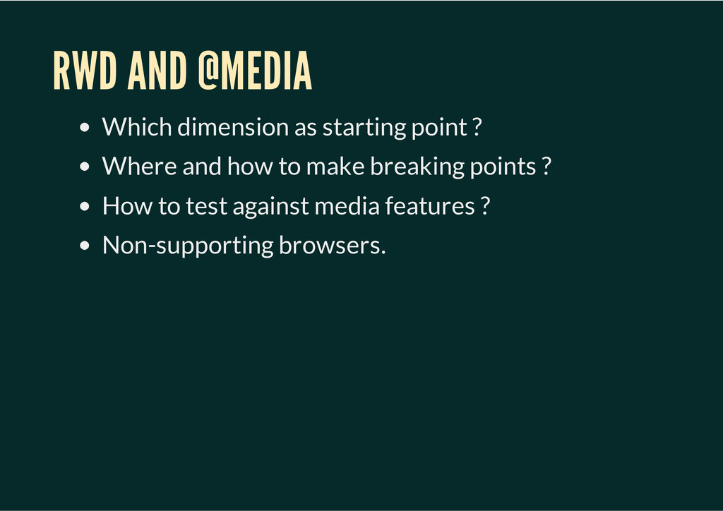
failed. Retrofit existing design is too difficult. Original design is NOT content first. Visual design cannot reuse in the narrow styles. Alomst overwriting all the style we have. Vary hard to fine tune in the mobile device. We do REALLY not want to test Android devices.
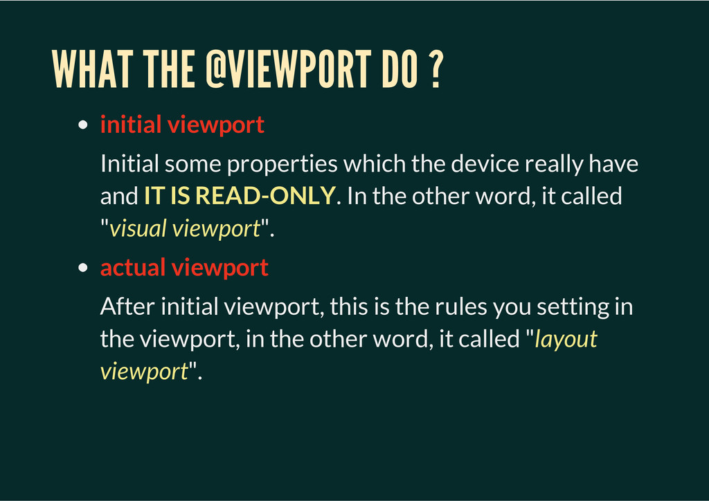
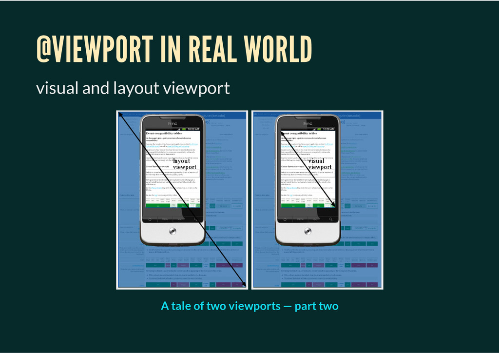
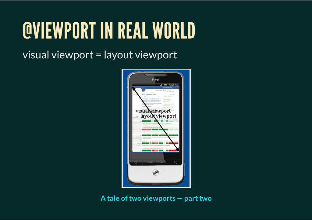
which the device really have and IT IS READ-ONLY. In the other word, it called "visual viewport". actual viewport After initial viewport, this is the rules you setting in the viewport, in the other word, it called "layout viewport".
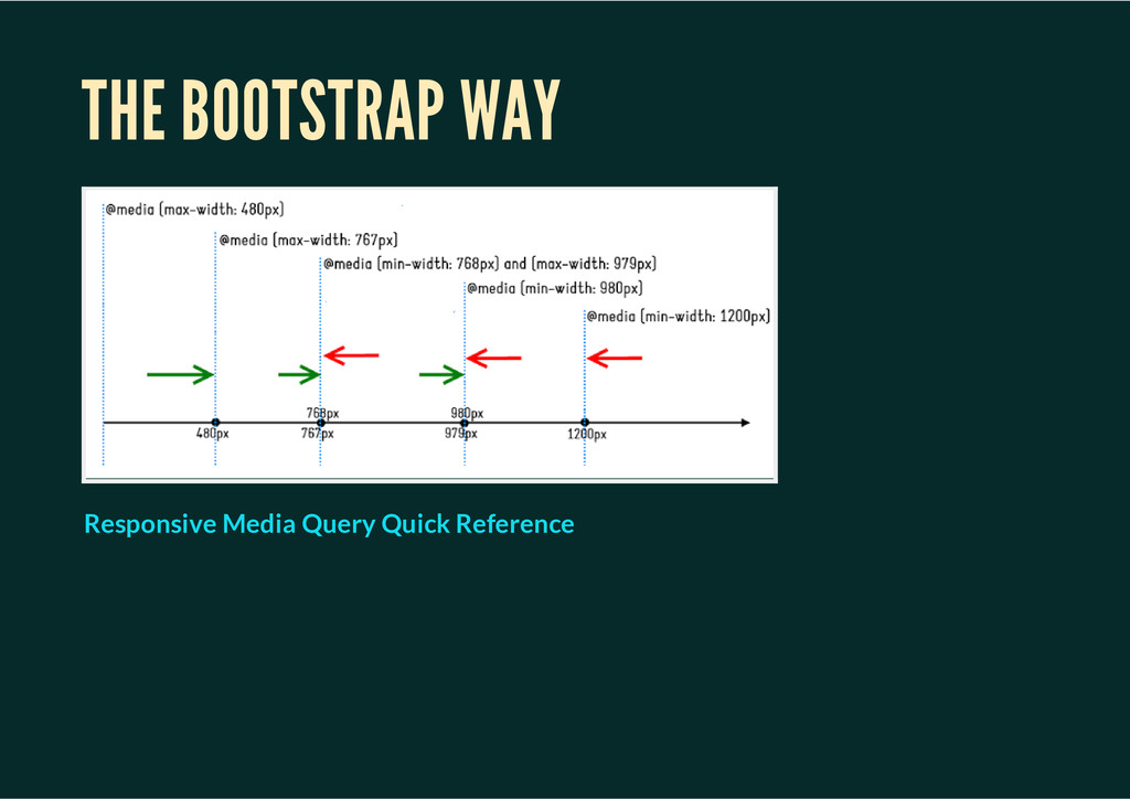
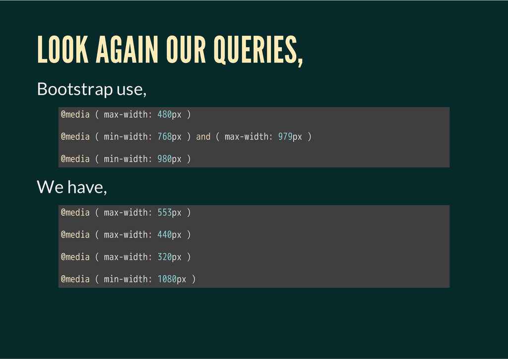
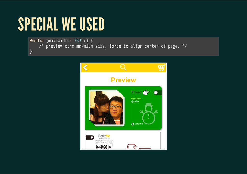
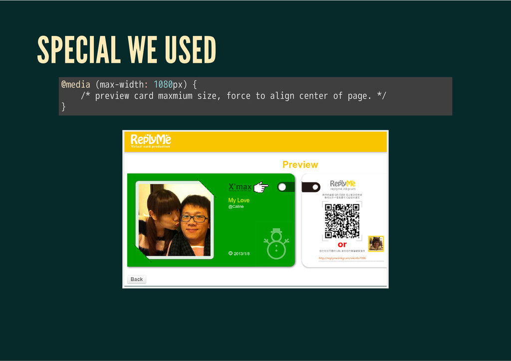
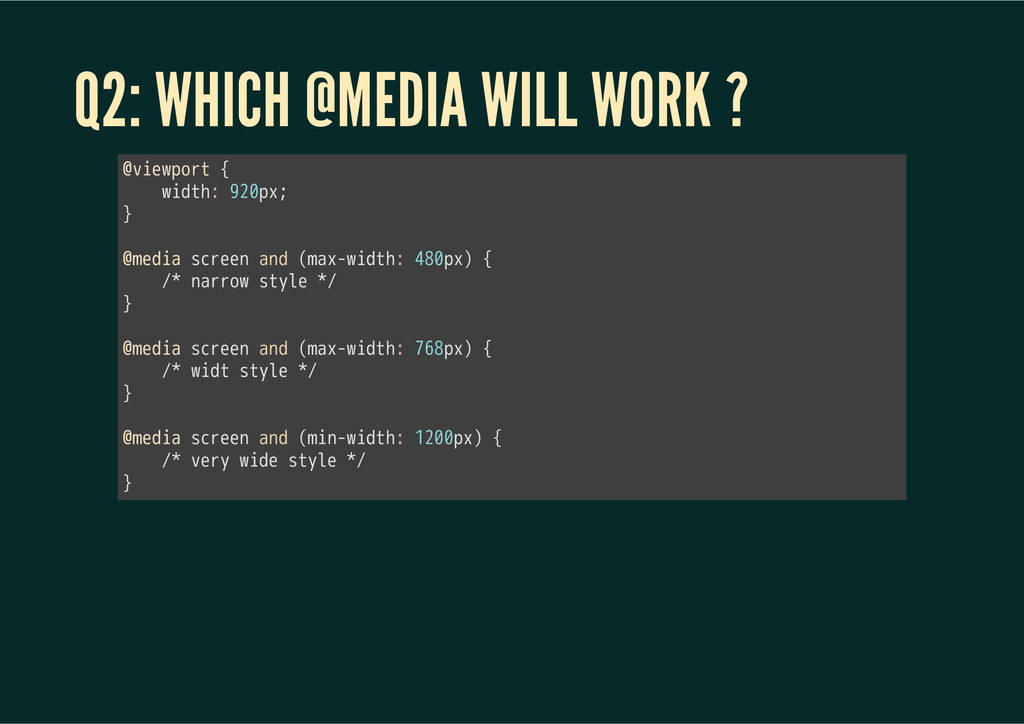
use 480px @media ( max-width: 480px ) will work "device-width" in the @media told me "320px" 㫛㫦㫚㫬㫤㫜㫥㫫㫜㫛㫦㫚㫬㫤㫜㫥㫫㫘㫣㫜㫤㫜㫥㫫㫜㫦㫝㫝㫪㫜㫫㫘㫠㫛㫫㫟 told me "480px" 㫪㫚㫩㫜㫜㫥㫜㫮㫠㫛㫫㫟 told me "320px"
creating a dedicated mobile site; the choice is between using media queries and doing nothing at all. That said, in many situations the content you want to serve up will be the same regardless of context. --Jeremy Keith ” A responsive mind
media query or Javascript. DO NOT USE strange setting with @viewport, if you don'y know why you do. Use the @media carefully, do the @media style once, not overwriting at all. Think about your content again. DO NOT fight with your visual designer.
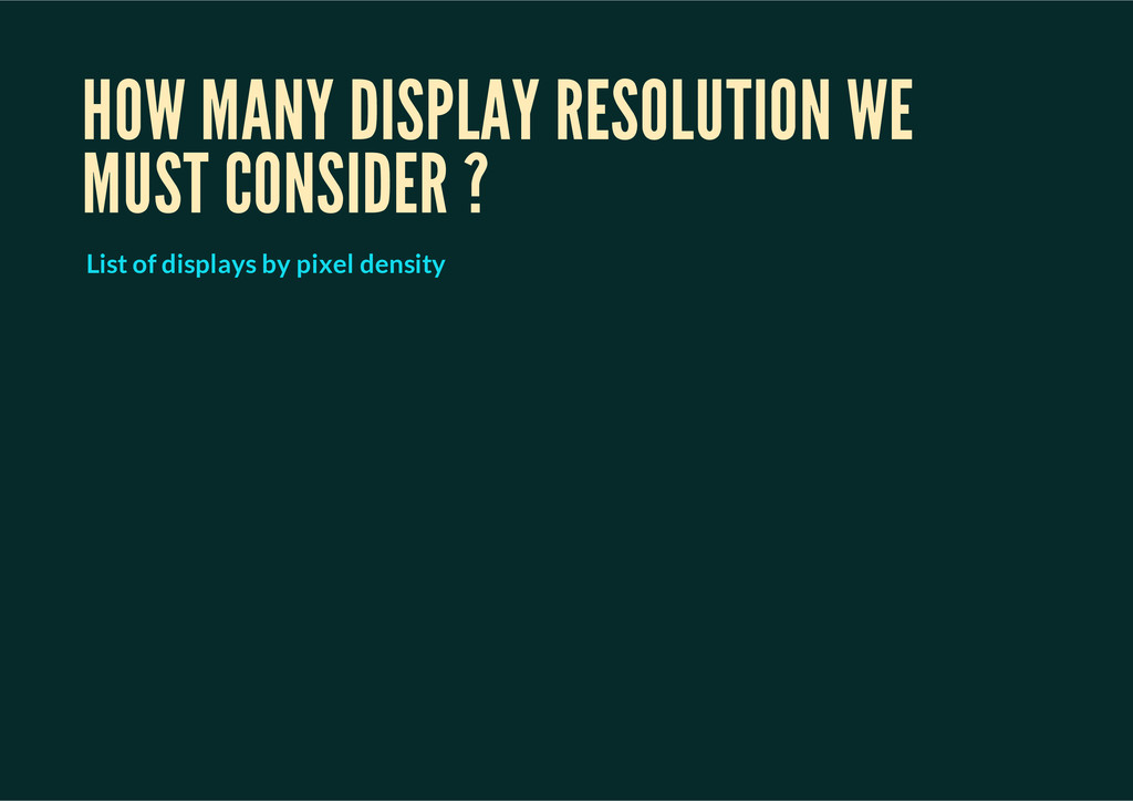
look at media queries MEDIA QUERIES PRESENTATION AT INDIECONF ESSENTIAL CONSIDERATIONS FOR CRAFTING QUALITY MEDIA QUERIES Rethinking the Mobile Web Responsive Web Design A dao of Web Design More about device-pixel-ratio A tale of two viewports - part two CSS Device Adaptation CSS3 Media Queries Resolution Units Viewport percentage lengthes List of displays by pixel density
 hinablue
 miyamu
 sue445
 kenichinakamura
 tonkotsuboy_com
 kanny
kanny
 moznion
 kekke_n
 dmmsre
 pict3
pict3
 prgckwb
 coco_se
 sansantech
 leimatthew05
 tammyeverts
 reverentgeek
 paigeccino
 akashhashmi
 rkendrick25
 jonoalderson
 jeffersonlam
 minecr
 trishagee
 tmiket
 aleyda