Upgrade to Pro — share decks privately, control downloads, hide ads and more …

ITT 2017 - Estelle Weyl - Mobile Web Performance

ITT 2017 - Estelle Weyl - Mobile Web Performance

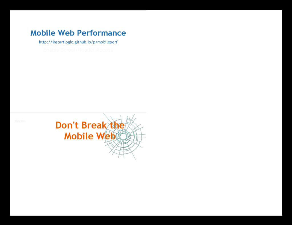
Estelle Weyl is talking about Mobile Web Performance. Some of your users are on mobile browsers that may be more advanced than the desktop browsers of other users, but chances are those phones with their advanced browsers may have similar memory and bandwidth constraints to the computer you threw out or recycled 5 years ago.

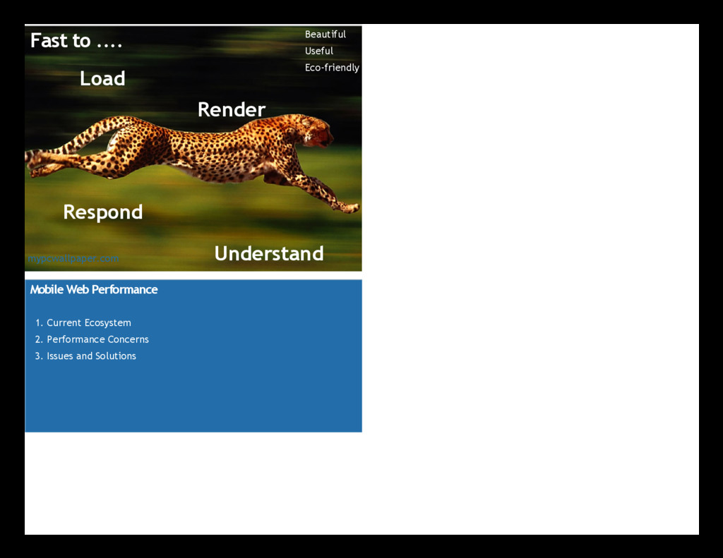
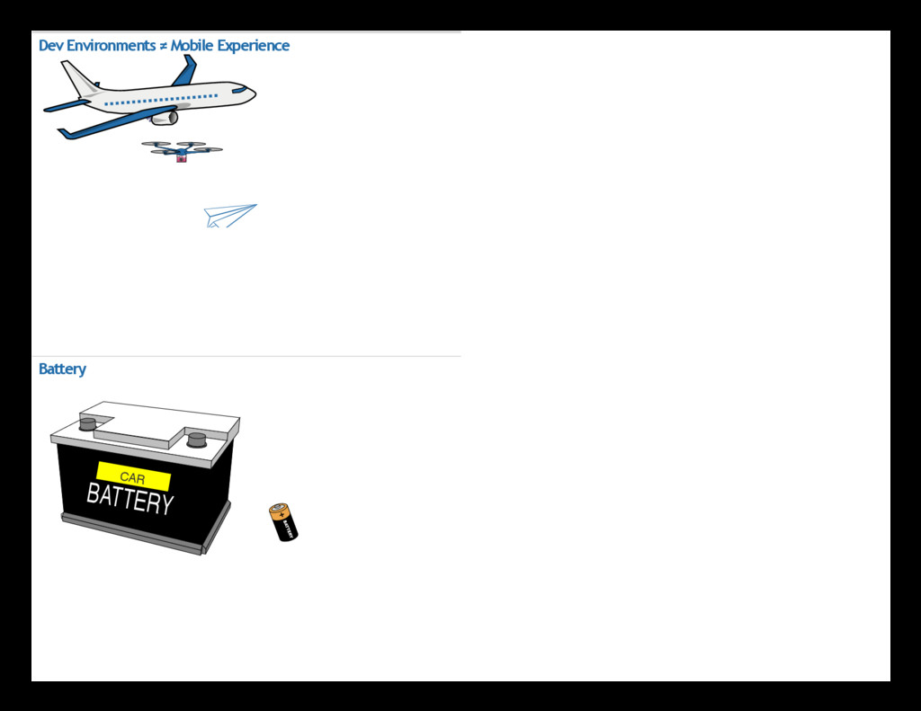
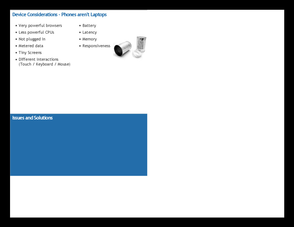
While as developers we’re finally enjoying the ubiquity of modern browsers accessing the web, it’s the devices themselves that are now creating constraints we always need to consider. The issue with mobile isn’t “Old IE”, but rather battery life, latency, memory and UI responsiveness. In this session, Estelle Weyl will discuss best practices to make sure your site performs well, no matter how your user is accessing your content.

Istanbul Tech Talks

April 03, 2017
Tweet

More Decks by Istanbul Tech Talks

Other Decks in Programming

Transcript

  1. Fast to .... Load Render Respond Understand Beautiful Useful Eco‐friendly

    mypcwallpaper.com Mobile Web Performance 1. Current Ecosystem 2. Performance Concerns 3. Issues and Solutions
  2. Estelle Weyl Open Web Evangelist Instart Logic Twitter: @webdevtips @estellevw

    @standardista Blog: www.standardista.com Github: github.com/estelle Mobile Ecosystem
  3. Top Devices Phone Cost RAM ROM CPU Samsung GALAXY S7

    $670 4 GB 32 ‐ 64 GB 1.6 GHz Apple iPhone 6s $600 1 GB 32 ‐ 128 GB 1.8 GHz LG G5 $550 4 GB 32 GB 2.5 GHz Huawei Nexus 6P $550 3 GB 32 ‐ 128 GB 2.0 GHz Samsung Galaxy Note 5 $700 4 GB 32 ‐ 64 GB 2.1 GHz Sony Xperia $600 2 GB 16 GB 1.5 ‐ 2.0 GHz Samsung Galaxy S6 $785 3 GB 32 ‐ 128 GB 2.1 GHz LG Nexus 5X $580 2 GB 32 GB 1.8 GHz Moto X Pure Edition $299 3 GB 16 ‐ 64 GB 1.8 ‐ 2.5 GHz Xiaomi Redmi Note 3 $180 2 ‐ 3 GB 16 ‐ 32 GB 2X1.8 GHz Emerging Markets
  4. Android Device Fragmentation (2015) One ZenFone 5 C5303 C6903 D2303

    D5503 D5803 D6503 D6603 GT-I8262 GT-I8552B Galaxy S II GT-I9190 Galaxy S III Galaxy S4 Galaxy S4 GT-N7100 Galaxy Y GT-S7580 GT-S7582 One One (M8) K012 A369i A536 A6000 G2 G3 Nexus 6 X XL Joy SM-G355H SM-G530H SM-G7102 Galaxy S5 Galaxy S5 S6 Edge Galaxy Note 3 SM-N9005 SM-T211 Moto E Moto GMoto G Moto G XT1080 XT1254 Z970 Via OpenSignal
  5. Mobile Performance Concerns Just because no one uses your mobile

    site, doesn't mean you don't need to improve it. Maybe no one uses it because the experience is awful. — Dawn Parzych (@dparzych) March 18, 2016
  6. I remember when 3G was primary mobile speed. It was

    slow but still worked, so why now when my phone says 3G it becomes completely useless. — Stephen Gundee (@StephenGundee) March 23, 2016 November 2010
  7. Open in separate window Youtube Feathers: Regular: 58 requests/1200 kB

    Feathers: 14 requests/100 kB Web Performance Download # of resources: images, fonts, HTML, scripts, and CSS loaded Parse File size of above resources Execute Parsing & Painting Perceived Performance User perception of load speed and reaction time.(study)
  8. Device Considerations ‐ Phones aren't Laptops Very powerful browsers Less

    powerful CPUs Not plugged In Metered data Tiny Screens Different Interactions (Touch / Keyboard / Mouse) Battery Latency Memory Responsiveness Issues and Solutions
  9. Knowns # of HTTP Requests # of Bytes Images, Animations,

    Interactions Squishiness Responsiveness Unknowns Network (latency, bandwidth) Hardware (processing power) Browser (blocking, features) While we control how we build the site, we don't have control over ... Latency
  10. Latency What's involved in a page load? Each request: go

    back to DNS lookup or HTTP Request Stylesheets are blocking Scripts are blocking. HTTP request DNS lookup TCP Connect HTTP request sent Server Magic Server Sends response Browser receives/ parses response Resources fetched from Cache Parse & Execute Scripts Render Site
  11. Navigation Timing API metrics Prompt for unload redirect unload App

    cache DNS TCP Request Response Processing onLoad navigationStart redirectStart redirectEnd fetchStart domainLookupEnd domainLookupStart connectStart (secureConnettionStart) connectEnd requestStart responseStart responseEnd unloadStart unloadEnd domLoading domInteractive domContentLoaded domComplete loadEventStart loadEventEnd Latency CDN Connection Setup TCP Handshake SSL/TLS Handshake BBR Congestion Control Dynamic Packet Recovery (DPR) "Last Mile"
  12. (Note the colors) TTFB = Latency + Server Time Limit

    # of handshakes & bandwidth req Better Performance TTFB = Latency + Server Time Limit # of handshakes & bandwidth req
  13. RAIL Four phases of interaction: end‐user’s perception Response to Input

     100ms Animation & Scrolling  16ms Idle  50ms Page Load  1s Video: How Users Perceive the Speed of The Web (2015): Paul Irish / Google In Our Control # of HTTP Requests # of Bytes Images, Animations, Interactions Squishiness Responsiveness Out of Our Control Network (latency, bandwidth) Hardware (processing power) Browser (blocking, features)
  14. Tools & Rules YSlow PageSpeed WebPageTest Developer Tools Lighthouse Minimize

    Requests Reduce DNS lookups Avoid Redirects Cache Headers Only load needed resources Minimize size & optimize media Put CSS in the <head> Put JS at the bottom Don't scale images in HTML Concatenate, Minify, Refactor Don't block the UI thread Use HTTP/2 Use a CDN PageSpeed Minimize request size Leverage browser caching. Specify a cache validator Minify CSS, JS & HTML Defer parsing of JavaScript Optimize images Specify a character set Remove query strings from static resources Specify a Vary: Accept‐Encoding header Avoid CSS @import Avoid a character set in the meta tag Avoid bad requests Avoid landing page redirects Combine images into CSS sprites Enable Keep‐Alive Page Speed ➫
  15. Usability Rules Avoid plugins Configure the viewport Size content to

    viewport Size tap targets appropriately Use legible font sizes Page Speed Insights ➫ Image Optimization My Tips & Deep Dive Note: Include an alt attribute on all foreground images, with empty alt attribute for decorative images. GZip Remove Image Metadata Resize Images Optimize Images Use the Right Image Format Reduce the Number of Images
  16. #1: Configure the Viewport <meta name="viewport" content="width=device-width, ..."> width width

    of device's virtual viewport. device‐width width of the device's screen. height height of device's virtual viewport device‐height height of the device's screen. initial‐scale Initial zoom on page visit. default 1.0. minimum‐scale If user scalable, as small as it can zoom on the page. maximum‐scale If user scalable, maximum amount visitor can zoom on the page. user‐scalable Can the web zoom in and out. Values are yes or no. One line of code....
  17. Don't be a jerk like GMail <meta name="viewport" content="initial-scale=1.0, maximum-scale=1.0,

    minimum-scale=1.0, user-scalable=no, width=device-width"> #2 Optimize all Images 1. GZip 2. Remove Image Metadata 3. Resize Images 4. Optimize Images 5. Use the Right Image Format 6. Reduce the Number of Images 7. Leverage CSS
  18. #2 Optimize all Images 1. GZip Minify and GZip SVG

    and font files. In that order. See tips for optimising SVG delivery. 2. Remove Image Metadata Metadata adds bytes and can be a security risk by exposing geographical data. You can Strip EXIF metadata from multiple images at a time. #2 Optimize all Images 3. Resize Images Serve the smallest image file for the screen size and resolution. Serve scaled images. <picture> element and srcset attribute Old browsers? load small background images Resizing images means downloading unneeded pixels and take longer to decode and paint. in CSS Internet Explorer, consider using Picturefill or JS‐free Clown Car Technique.
  19. Right Size Your Images: Unneeded pixels 240 x 240 =

    57,600 200 x 200 = 40,000 17,600 440 x 440 = 193,600 400 x 400 = 160,000 33,600 640 x 640 = 409,600 600 x 600 = 360,000 49,000 840 x 840 = 705,600 800 x 800 = 640,000 65,600 CloudFour: image breakpoints Scaling can be slow.... Scaled: 1,850 milliseconds Right‐sized: 625 milliseconds Tobin Titus, Microsoft blue = CPU used to decode green = FPS (more is better) purple = rendering PhysicsOfFast
  20. #2, sect. 3, part B <picture>, <source> & srcset <picture>

    <source srcset="large.jpg" media="(min-width: 1000px)"> <source srcset="small.jpg" media="(min-width: 500px)"> <img src="default.jpg" srcset="highresolution.jpg 2x" alt="do not forget the alt"> </picture> #2 Optimize all Images 4. Optimize Images Compressed without noticeably degrading quality. Image compression: ImageOptim, ImageAlpha, TinyPNG, PhotoShop, etc. JPEG Image compression automation? (see SmartVision).
  21. #2 Optimize all Images 5. Use the Right Image Format

    Image types include SVG, GIF, JPEG, PNG, and WebP. GIF: <= 256 color pallette, need transparency and/prlow quality animation SVG: scalable, animatable, unlimited color pallette PNG: > 256 colors if transparency needed. JPEG: raster images WebP: Animation, transparency, great resolution, small file size. Blink only. JPEG‐XR: For Edge Smallest file size Browser Optimal image format Chrome WebP IE 9+ / Edge JPEG‐XR Opera WebP Safari JPEG‐2000 You don't have to change the file extension.