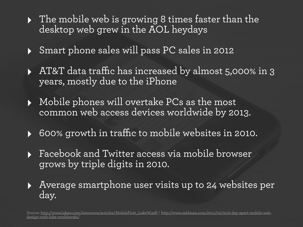
the desktop web grew in the AOL heydays ‣ Smart phone sales will pass PC sales in 2012 ‣ AT&T data traffic has increased by almost 5,000% in 3 years, mostly due to the iPhone ‣ Mobile phones will overtake PCs as the most common web access devices worldwide by 2013. ‣ 600% growth in traffic to mobile websites in 2010. ‣ Facebook and Twitter access via mobile browser grows by triple digits in 2010. ‣ Average smartphone user visits up to 24 websites per day. Source: http://www.lukew.com/resources/articles/MobileFirst_LukeW.pdf / http://www.zeldman.com/2011/03/30/a-day-apart-mobile-web- design-with-luke-wroblewski/
We don’t need more information. We need better filters. b) How can you personalize your content? - location - social demographics - registration information
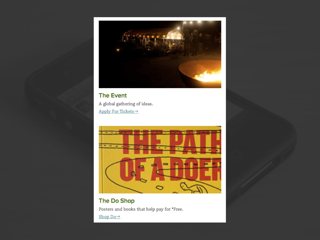
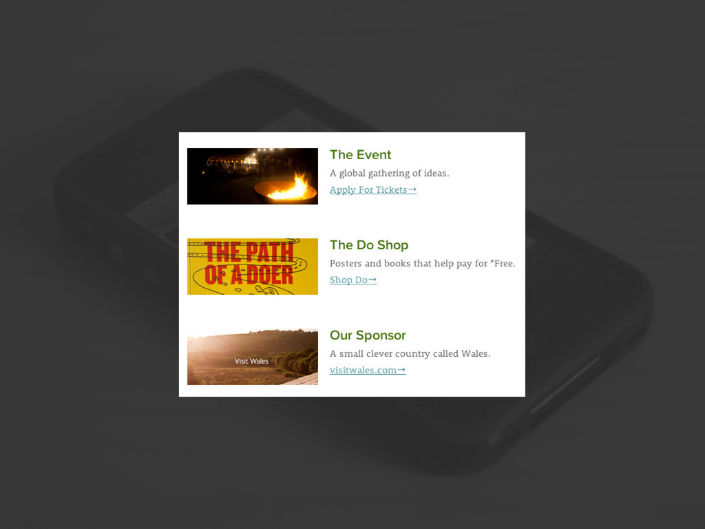
built with a flexible grid foundation. 2. Images that are incorporated into the design must be flexible themselves. 3. Different views must be enabled in different contexts via media queries
 jasonvnalue
 usagimaru
 kenichiota0711
 shoko_seven11
 base
base
 kaikou
 mottox2
 takanorip
 baasie
 centou
 moco1013
 hiromimaeo
 kakukoki
 jakevdp
 davidcarrasco
 pwiseman
 mraible
 lara
lara
 codingconduct
 oripsolob
 62gerente
 aleyda
 samtorres
 sergeychernyshev