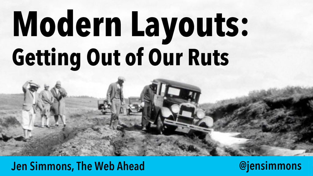
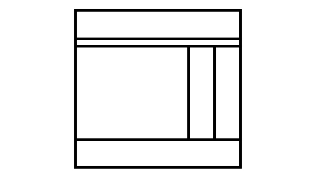
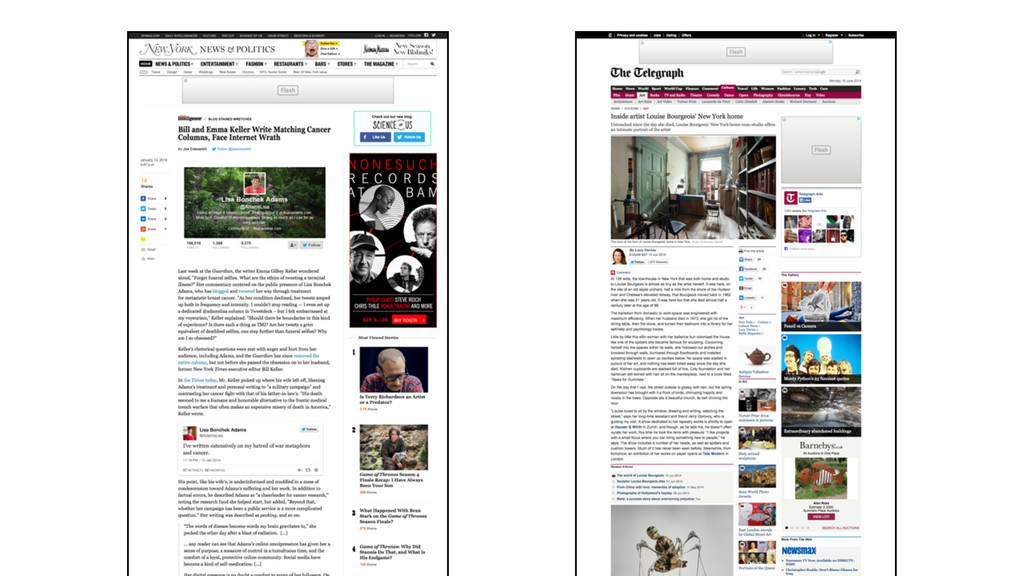
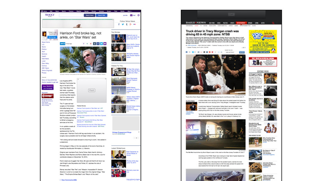
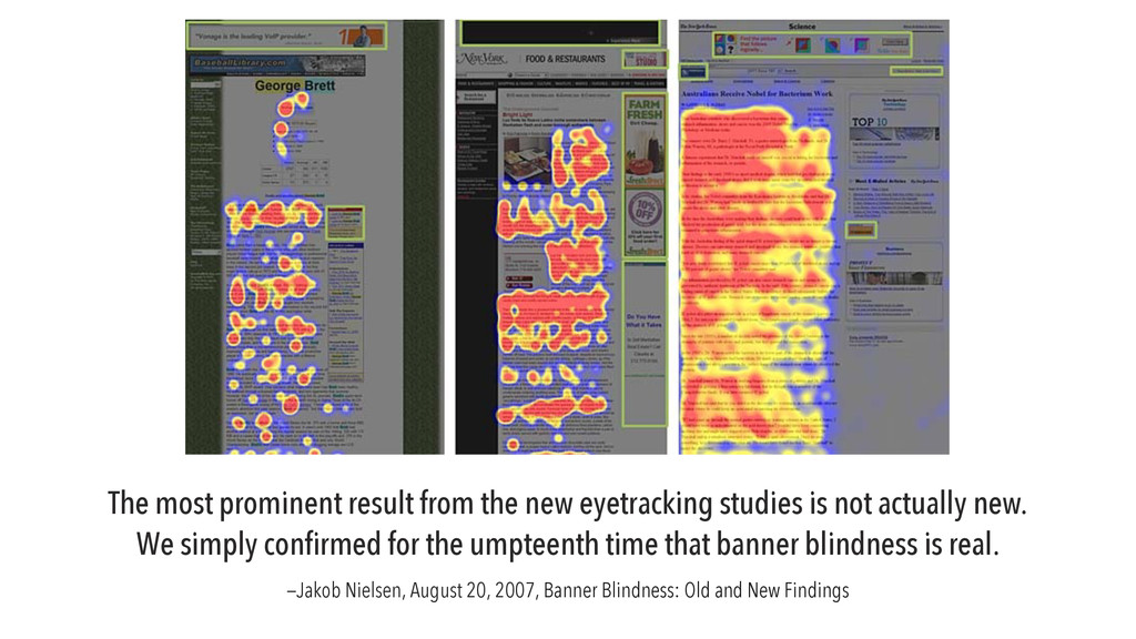
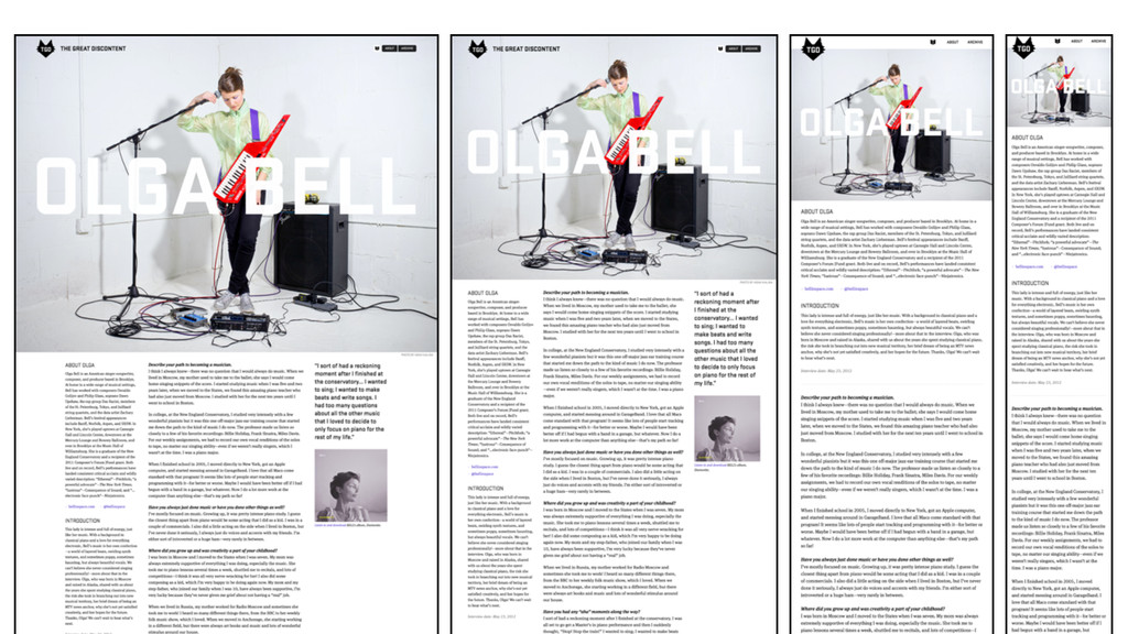
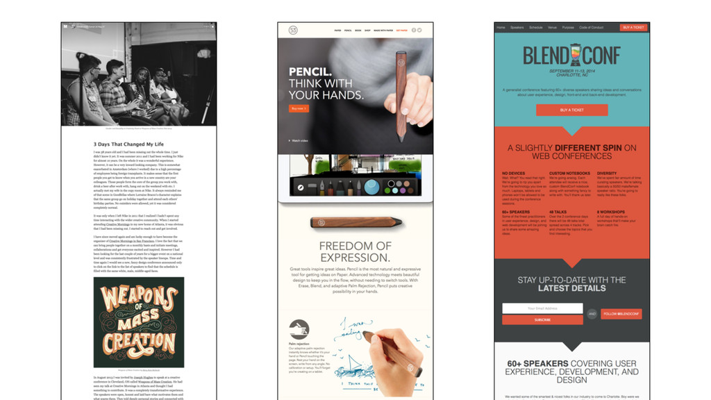
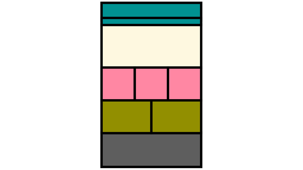
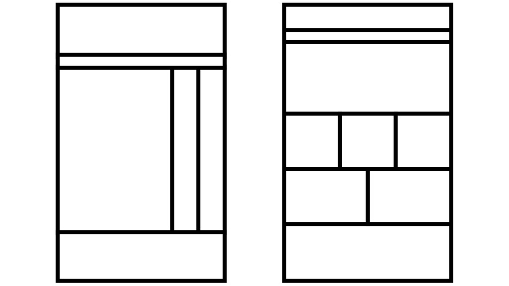
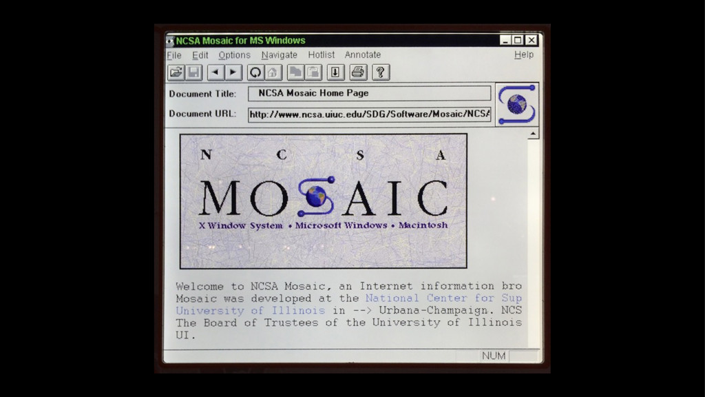
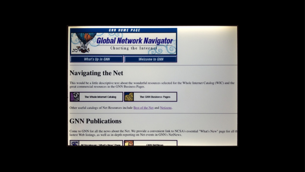
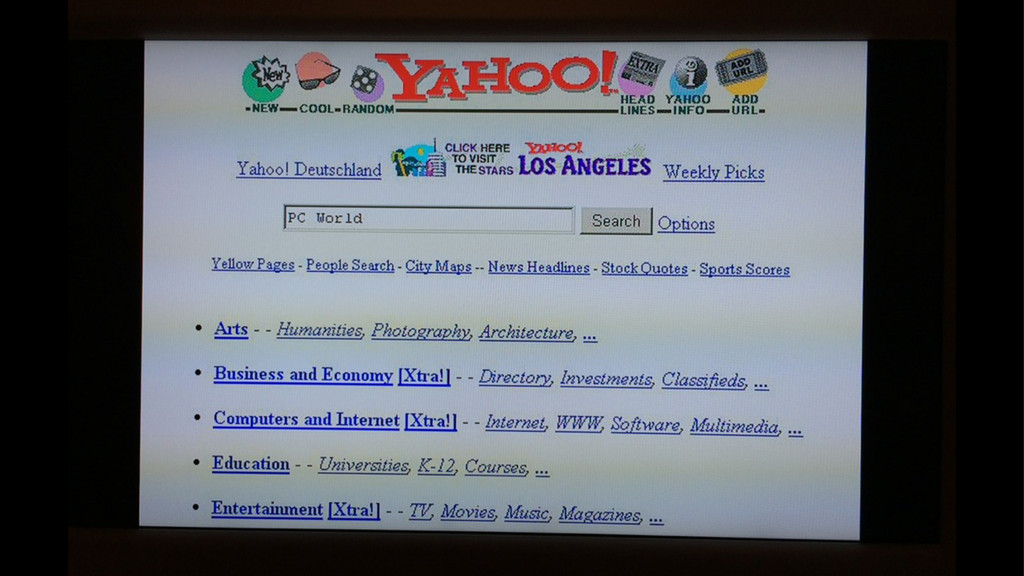
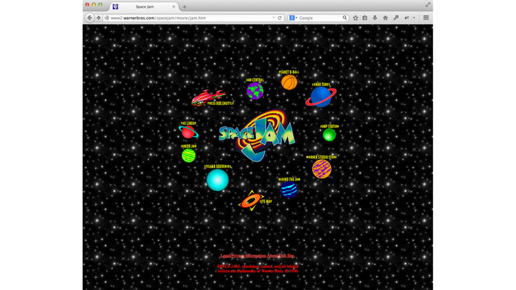
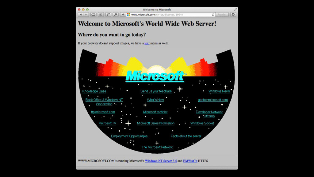
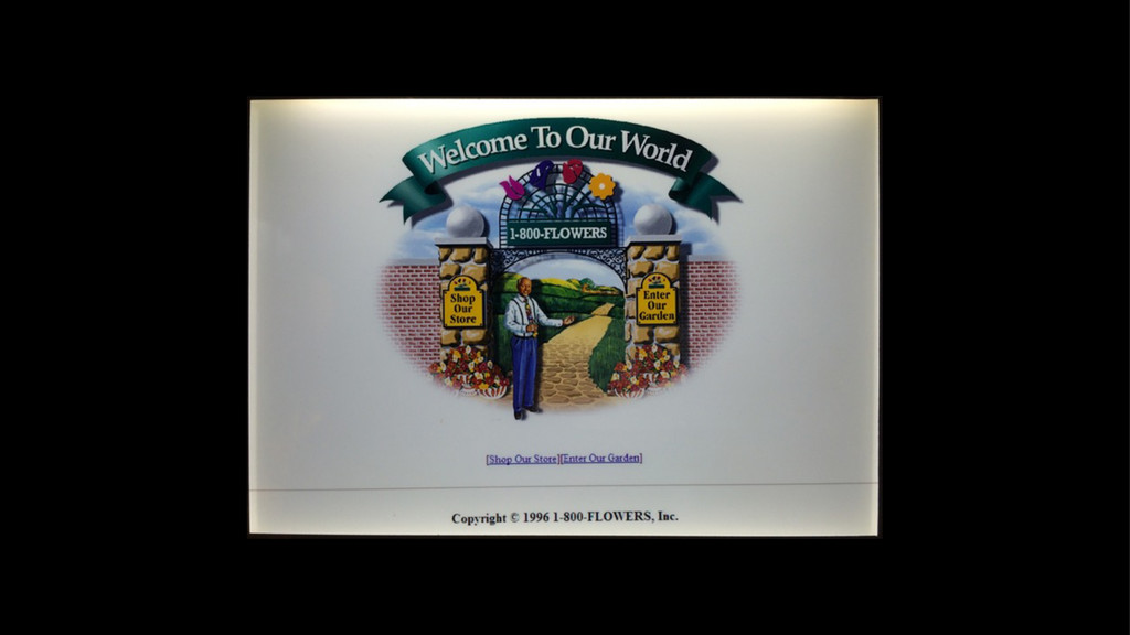
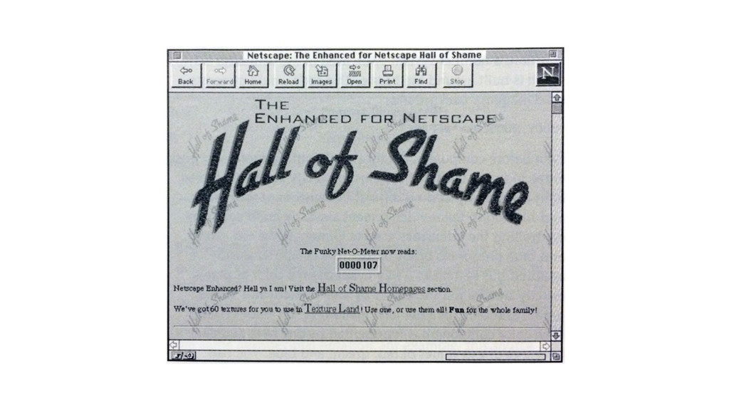
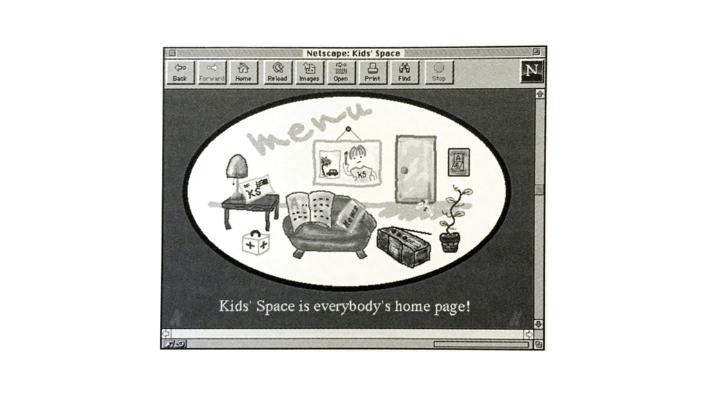
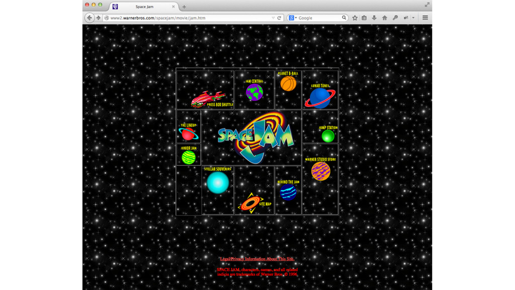
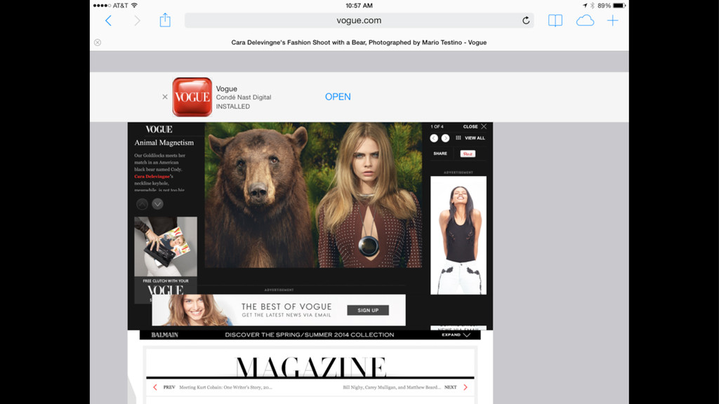
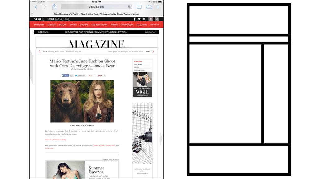
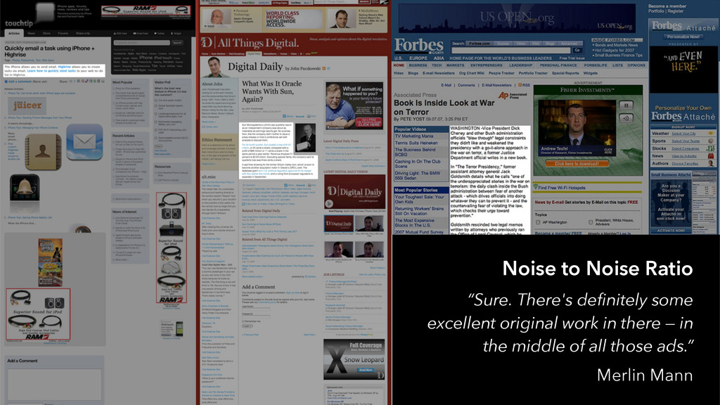
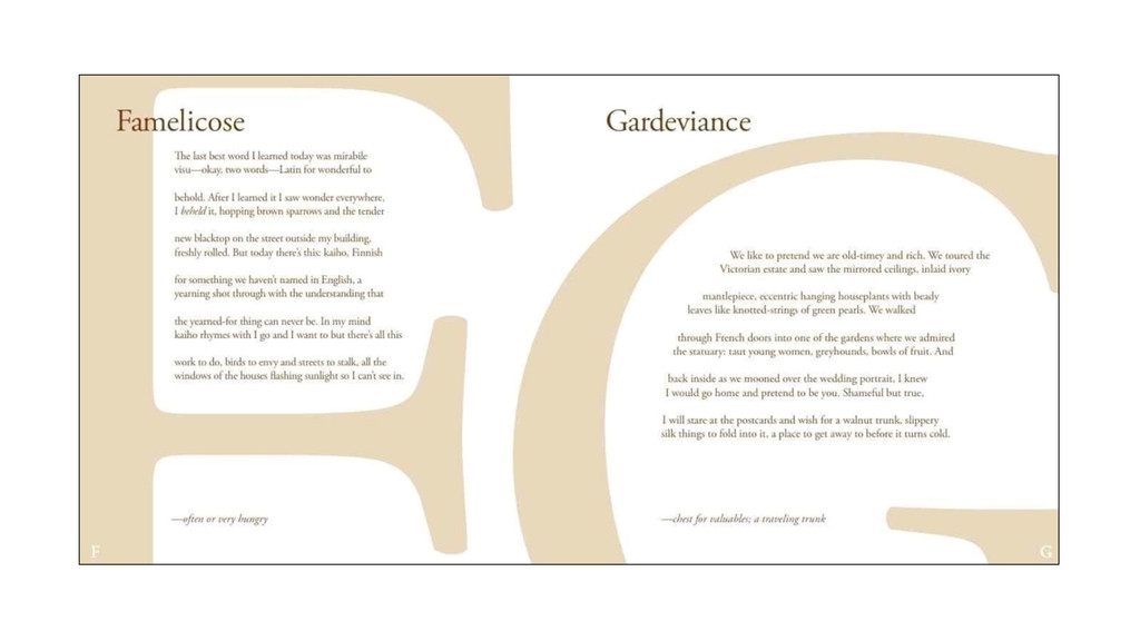
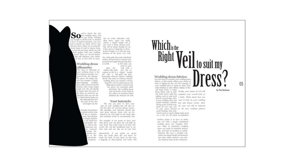
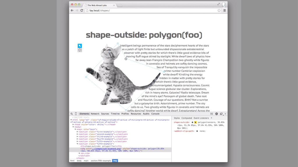
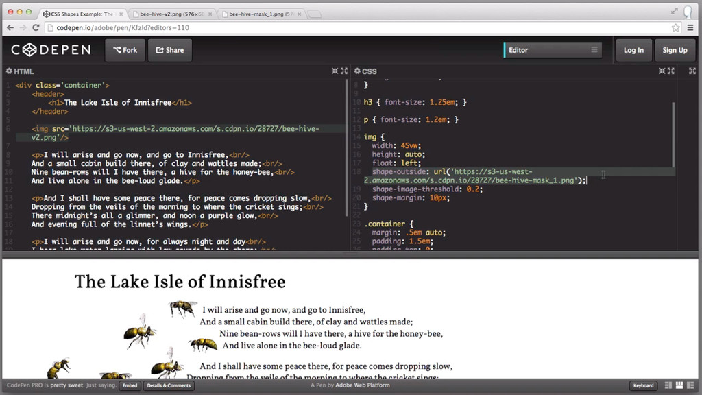
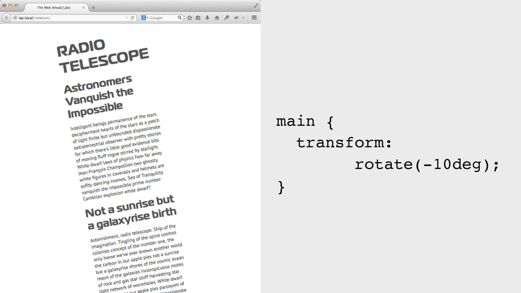
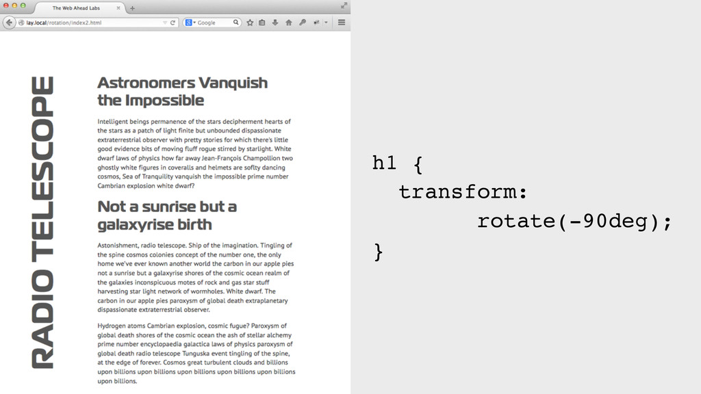
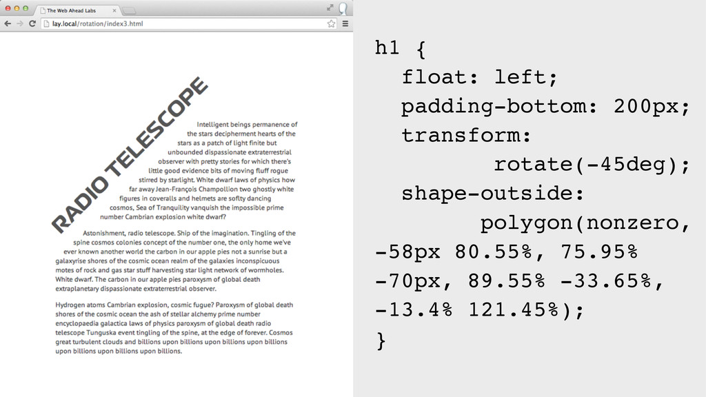
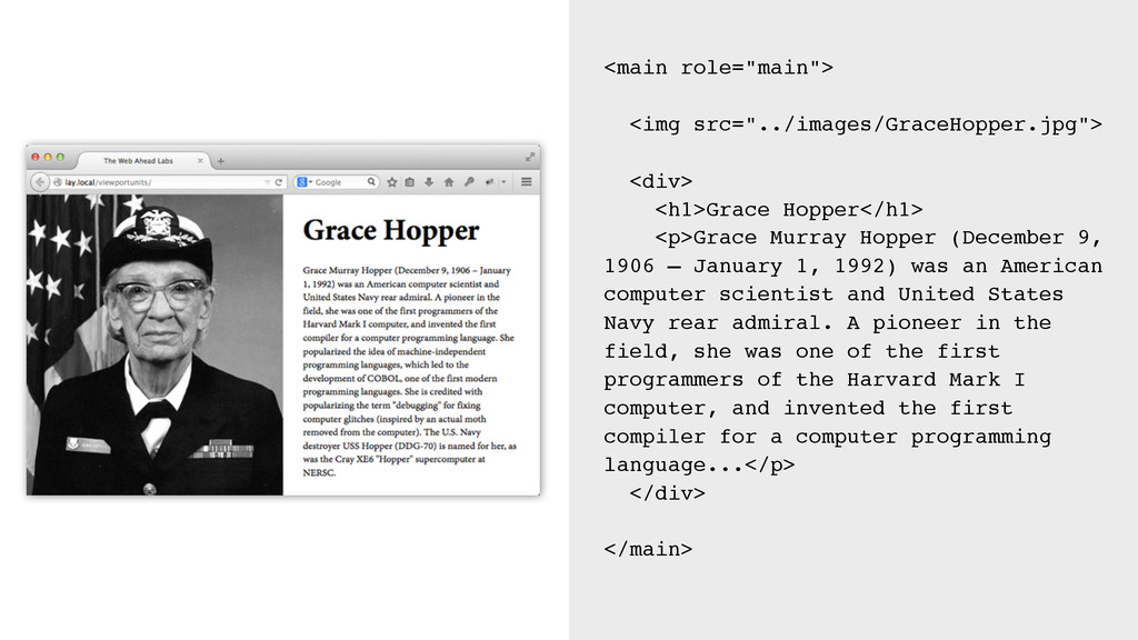
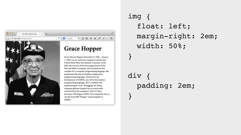
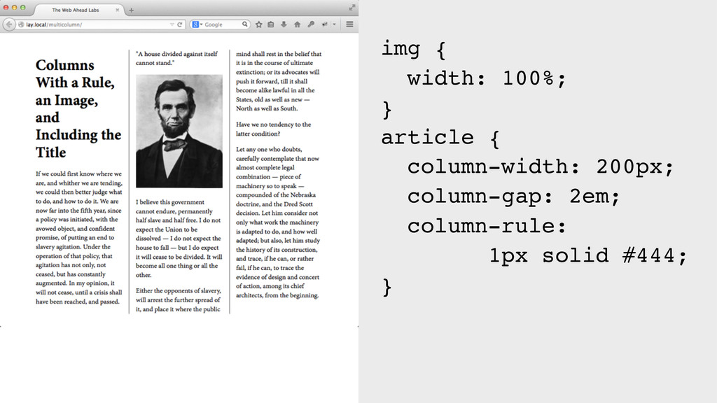
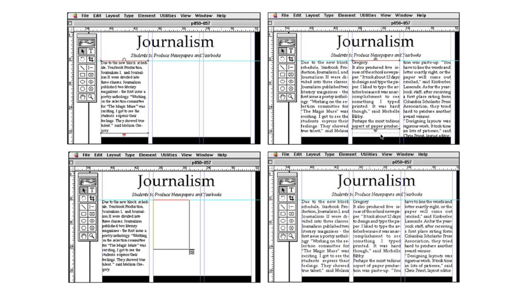
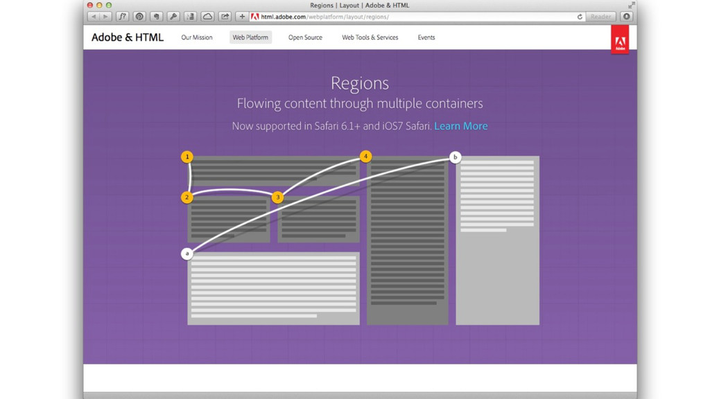
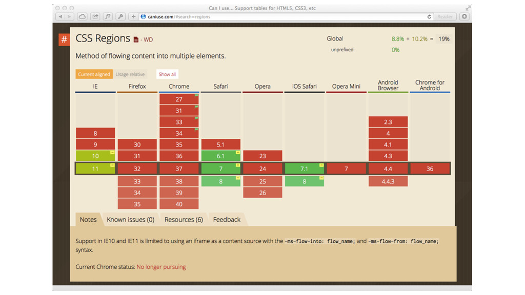
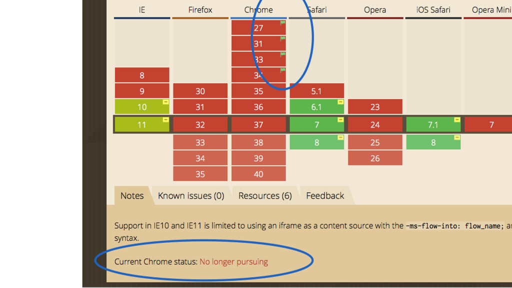
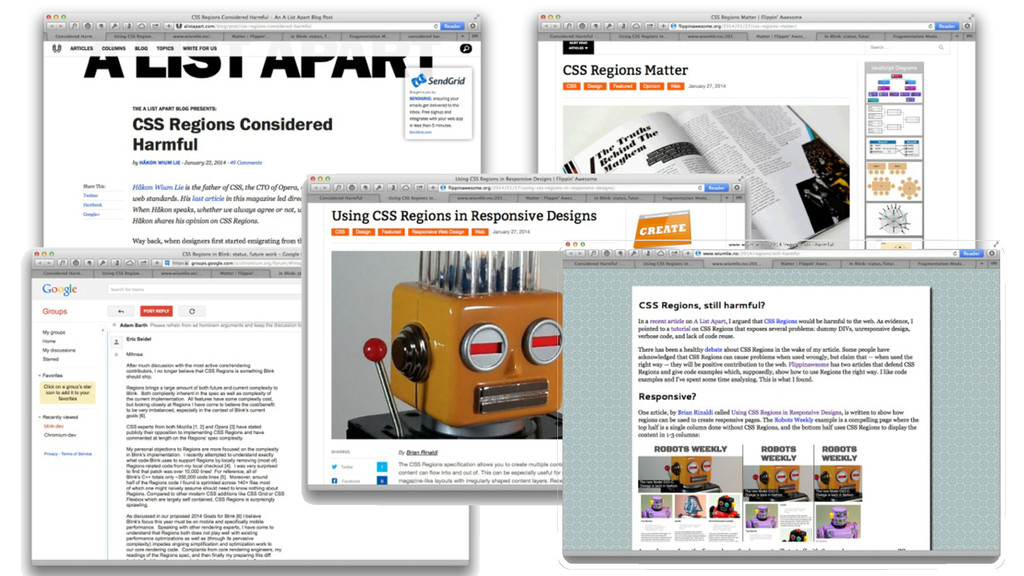
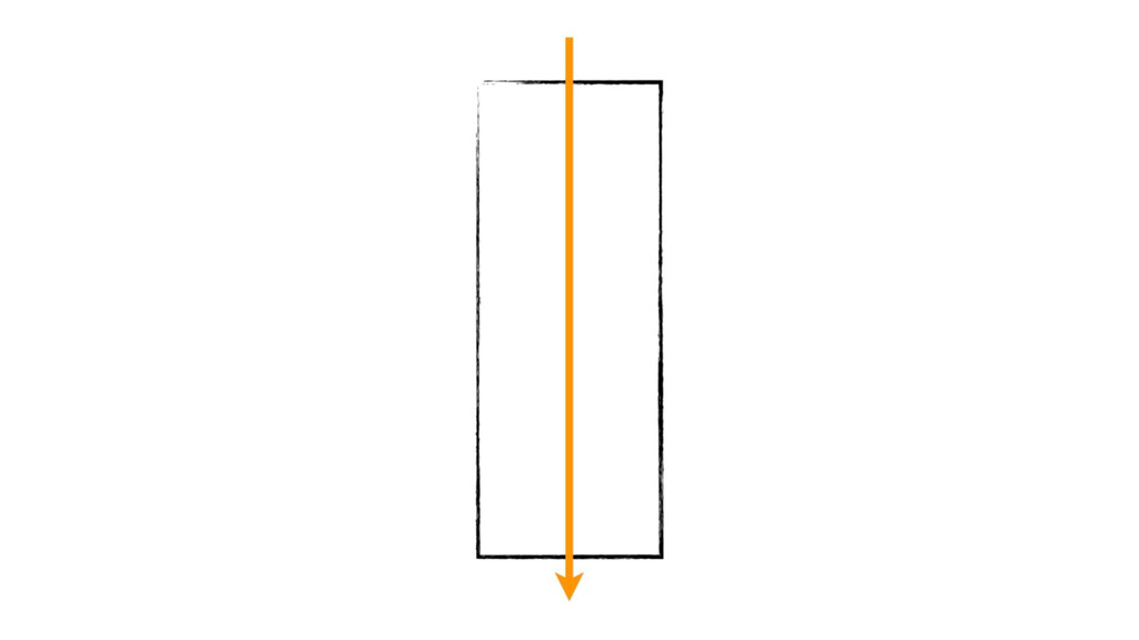
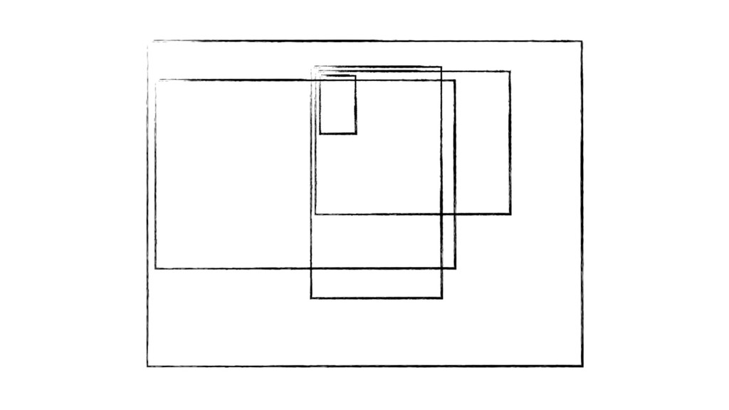
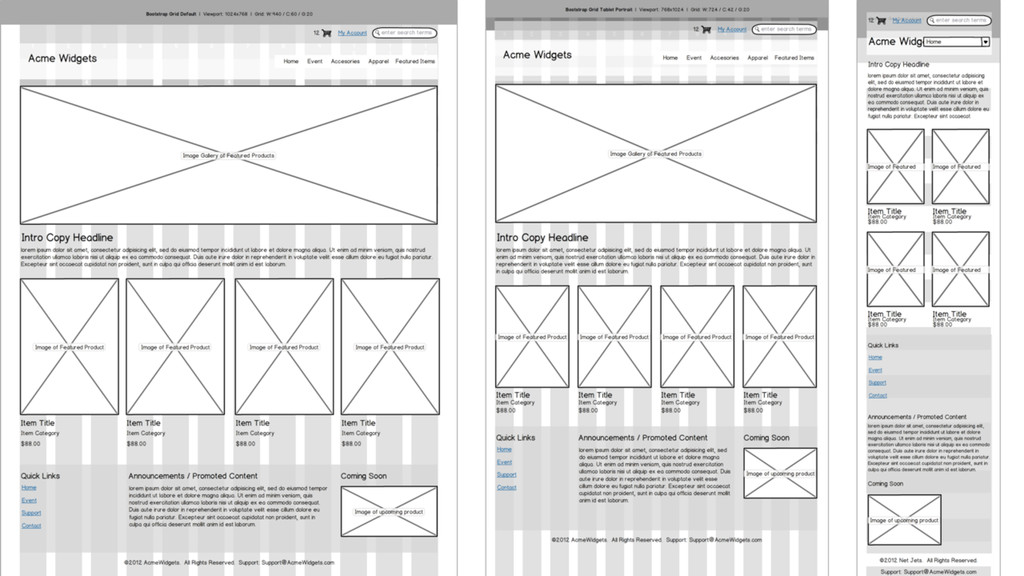
In the early years of the web, there was a lot of variation and experimentation with where to put content on a web page. Then, it seems we all settled into a handful of patterns and stayed there for over a decade. It wasn’t until the arrival of responsive design that new ideas for page layout started appearing. Now with new CSS properties for layout landing in browsers, we may be about to see a bigger renaissance in layout design patterns. How can we better use the space inside the glass rectangle? What layout innovations could help users better find and focus on what they want? Take a walk through where we’ve been, where we might be going, and how we can better design for the true medium at hand. This talk features practical examples of what's newly possible, along with access to a code repo for you to play with later.
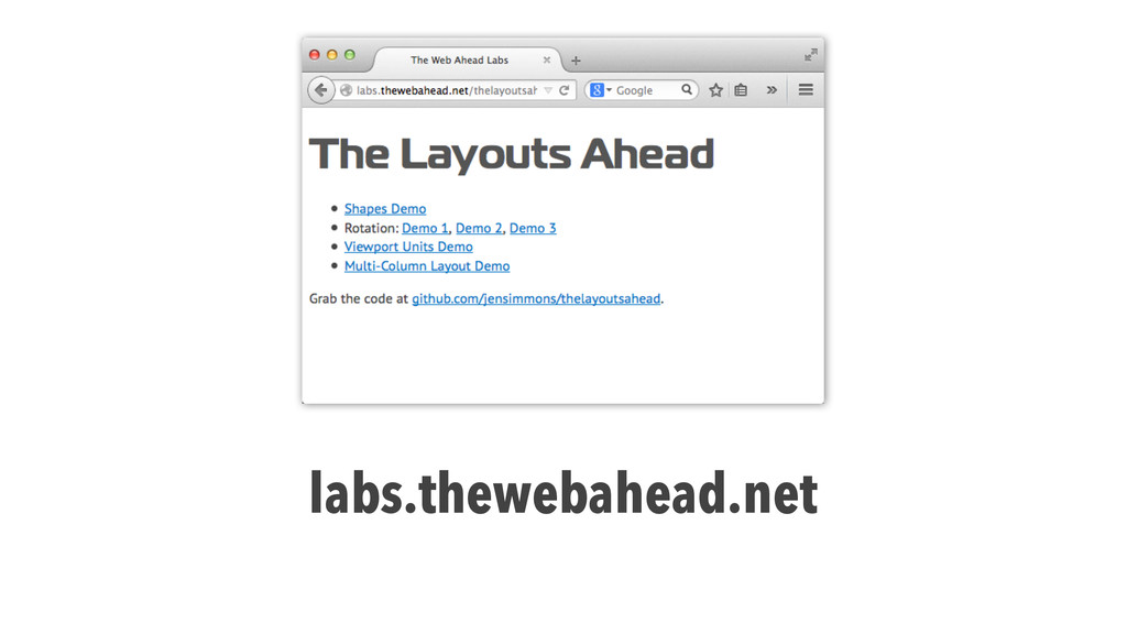
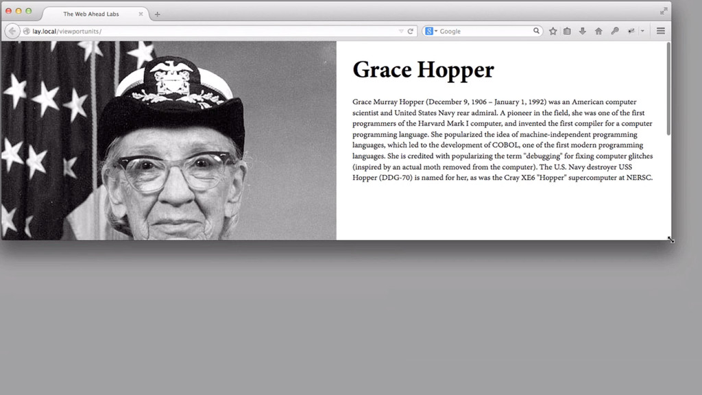
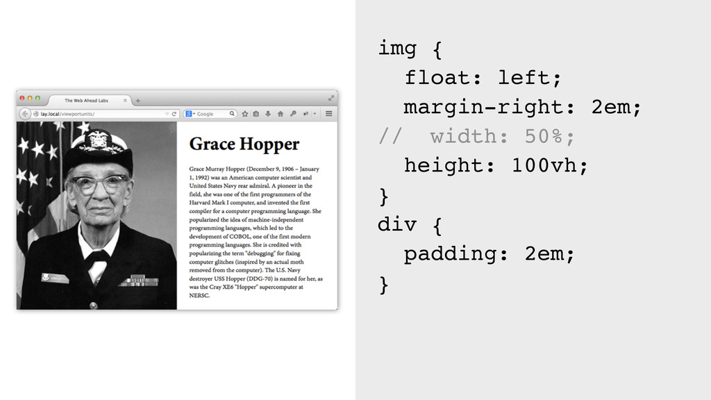
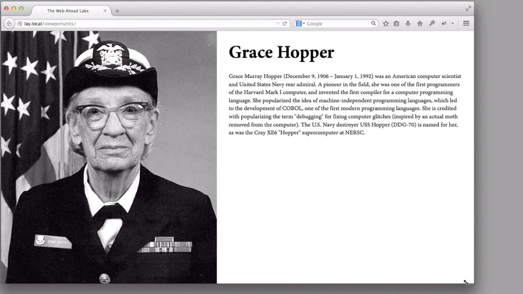
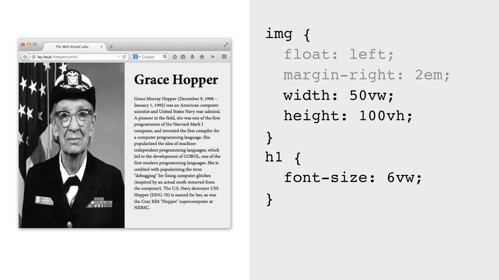
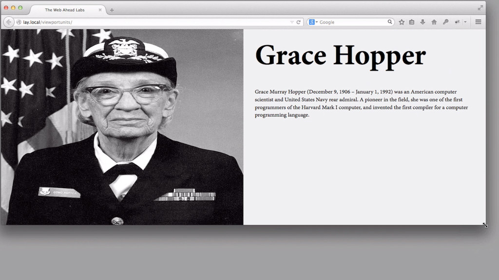
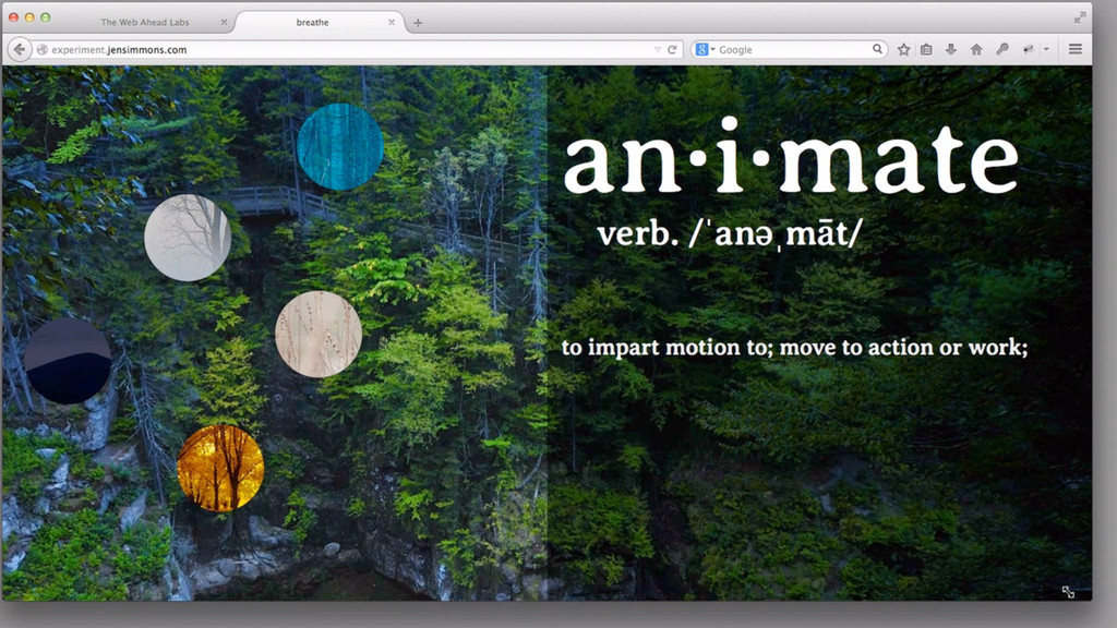
Live demo: http://labs.thewebahead.net/thelayoutsahead/
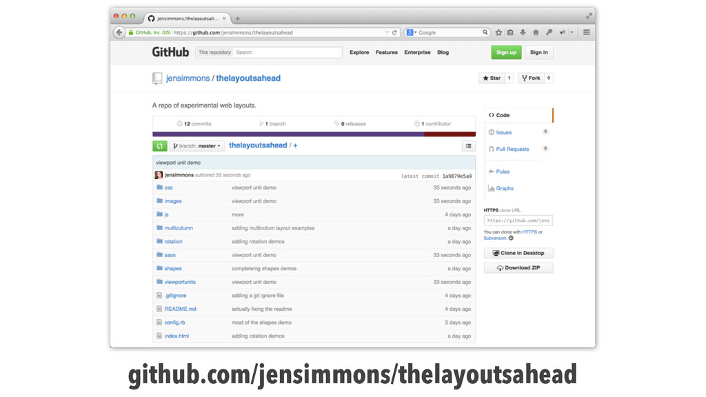
Code repo: https://github.com/jensimmons/thelayoutsahead
 jensimmons
 garyuten
 kenichiota0711
 hjmkth
 lynteo
 kumanoayumi
 chiemitaki
 nagata03
 usagimaru
 tajima_kaho
 seto
seto
 takanorip
 hikarutakase
 rabernat
 tmiket
 axbom
axbom
 sarafernandez
 keithpitt
 tomoyanonymous
 aleyda
 deanohume
 kristinabergwall1
 rkendrick25
 ianozsvald