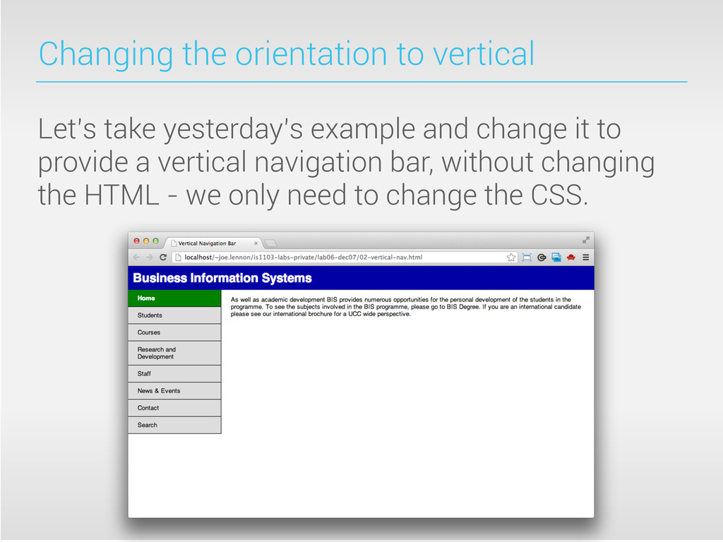
be less like a lecture and more like a lab! Yesterday, you learned how to use CSS to style up a horizontal navigation bar. Today, we’ll change that navigation bar to a vertical one using some other CSS techniques. We’ll also learn a bit more about other layout paradigms.
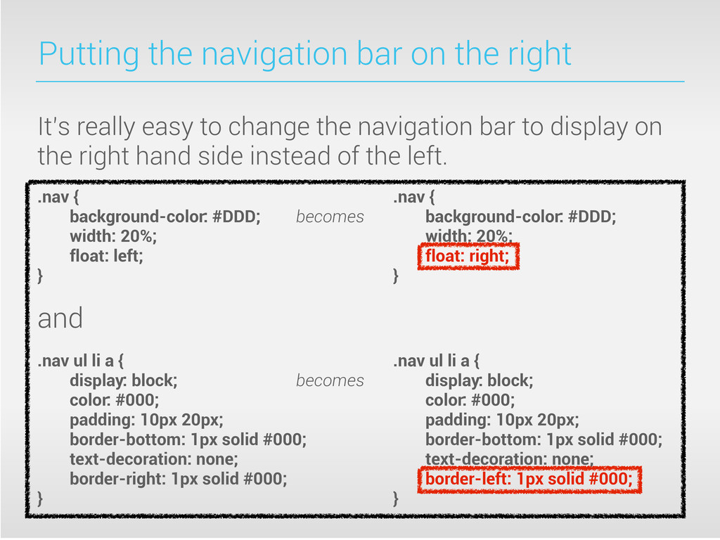
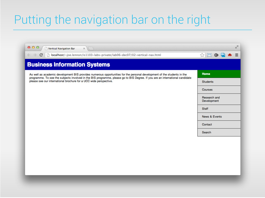
to change the navigation bar to display on the right hand side instead of the left. .nav { .nav { background-color: #DDD; becomes background-color: #DDD; width: 20%; width: 20%; float: left; float: right; } } and .nav ul li a { .nav ul li a { display: block; becomes display: block; color: #000; color: #000; padding: 10px 20px; padding: 10px 20px; border-bottom: 1px solid #000; border-bottom: 1px solid #000; text-decoration: none; text-decoration: none; border-right: 1px solid #000; border-left: 1px solid #000; } }
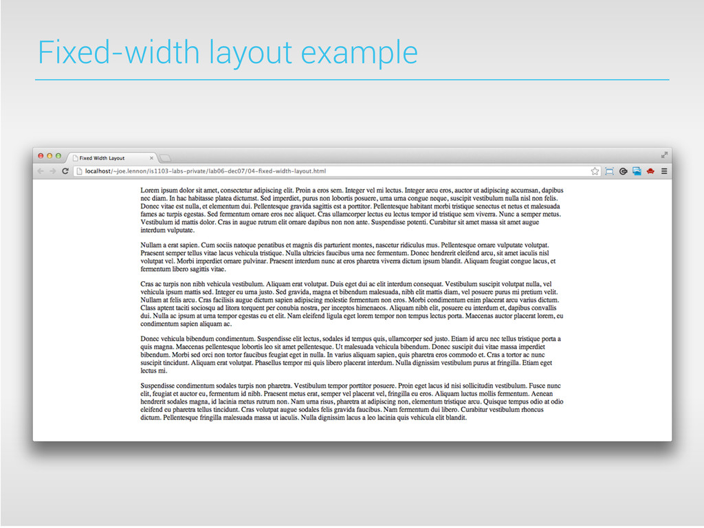
the exact width of the layout. The size of the layout will not change depending on the size of the browser window, and will not adjust if the user resizes the window. The benefits of fixed-width layouts are that they are very predictable and easy to test. The primary disadvantage is that they lead to lots of potential unused screen real estate.
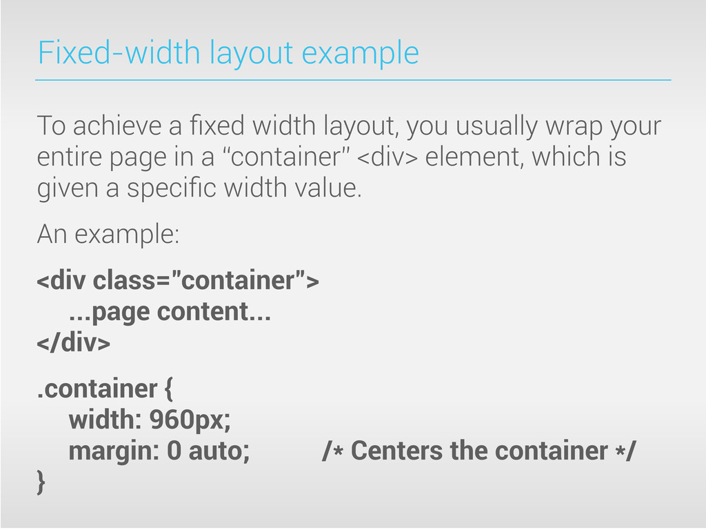
usually wrap your entire page in a “container” <div> element, which is given a specific width value. An example: <div class="container"> ...page content... </div> .container { width: 960px; margin: 0 auto; /* Centers the container */ }
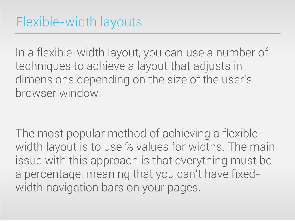
number of techniques to achieve a layout that adjusts in dimensions depending on the size of the user’s browser window. The most popular method of achieving a flexible- width layout is to use % values for widths. The main issue with this approach is that everything must be a percentage, meaning that you can’t have fixed- width navigation bars on your pages.
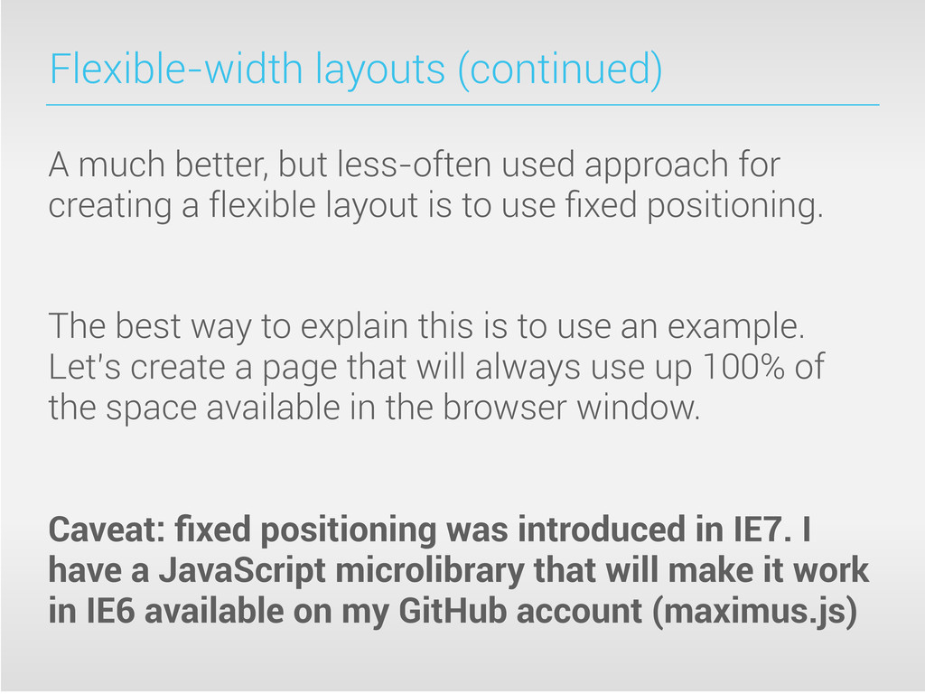
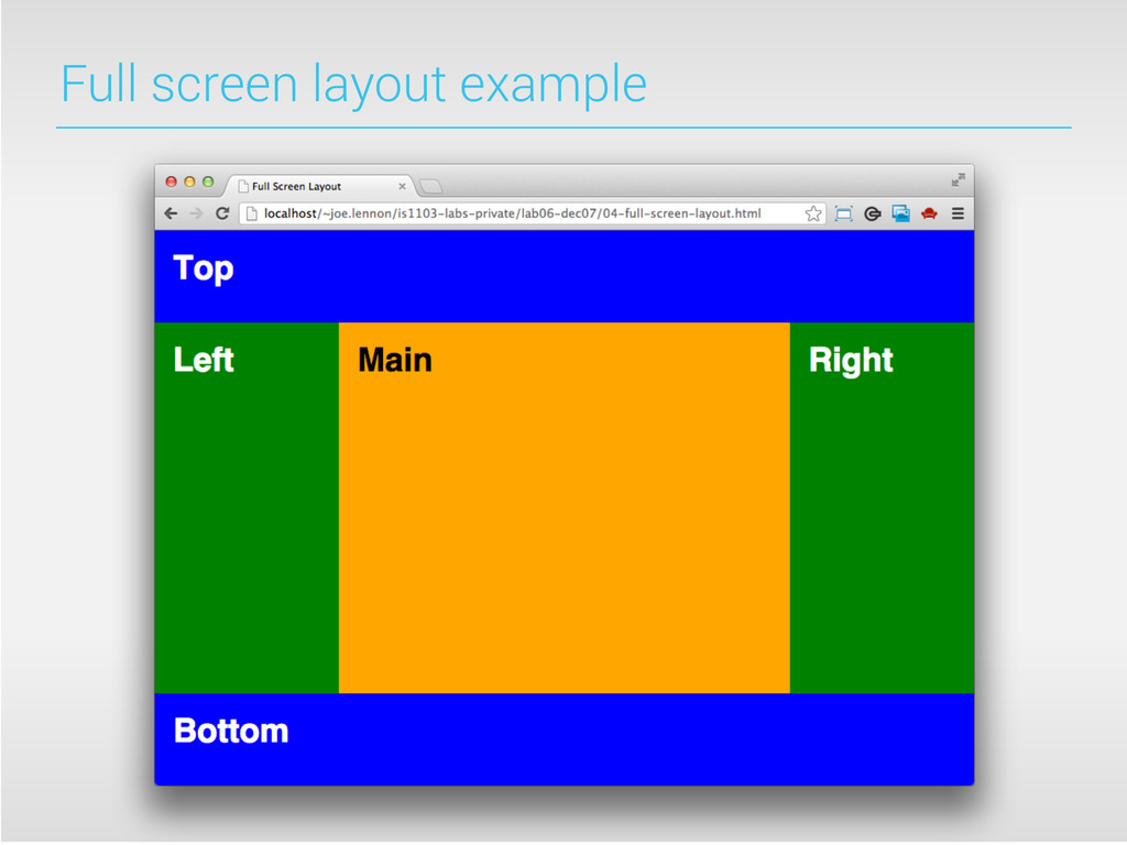
for creating a flexible layout is to use fixed positioning. The best way to explain this is to use an example. Let’s create a page that will always use up 100% of the space available in the browser window. Caveat: fixed positioning was introduced in IE7. I have a JavaScript microlibrary that will make it work in IE6 available on my GitHub account (maximus.js)
positioning in CSS. The default browser positioning system is static positioning, and will be used if you don’t explicitly use a specific type of CSS positioning. Relative positioning is a cross between static and absolute positioning that allows you to move elements in relation to their default position on the page.
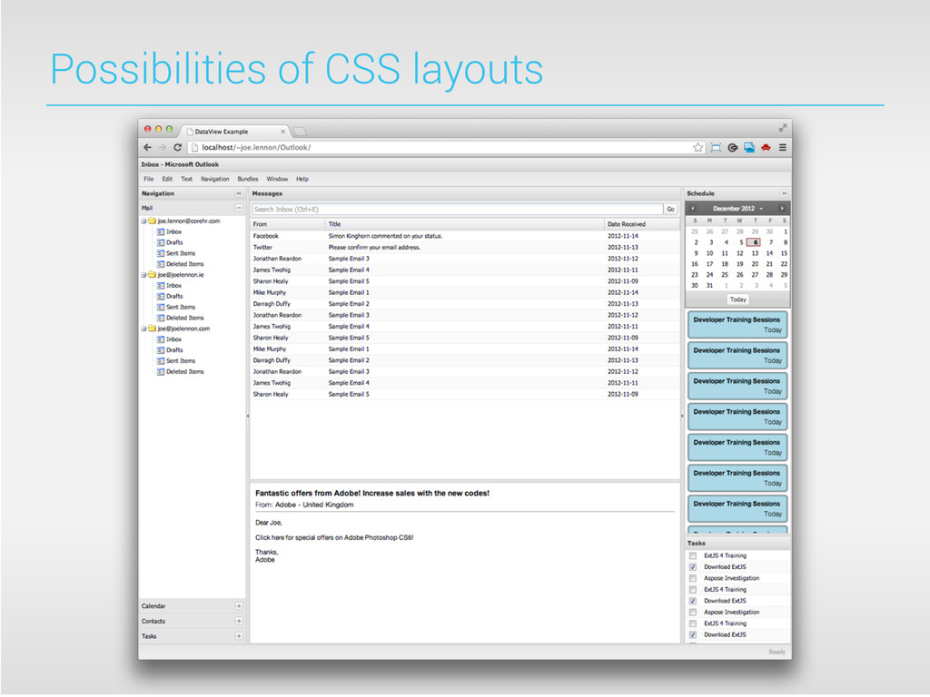
of CSS layouts to build a full-screen replica of the standard Microsoft Outlook application layout. This particular example was built using the ExtJS JavaScript framework, but this is built on top of CSS positioning and layout technology.
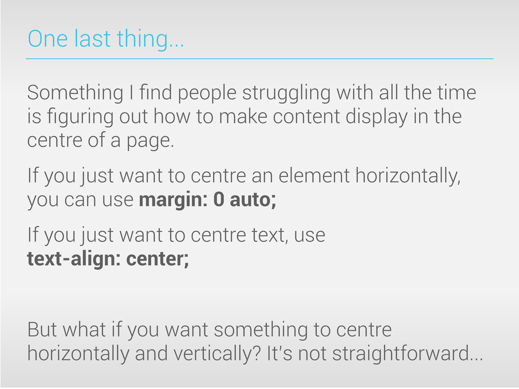
the time is figuring out how to make content display in the centre of a page. If you just want to centre an element horizontally, you can use margin: 0 auto; If you just want to centre text, use text-align: center; But what if you want something to centre horizontally and vertically? It’s not straightforward...
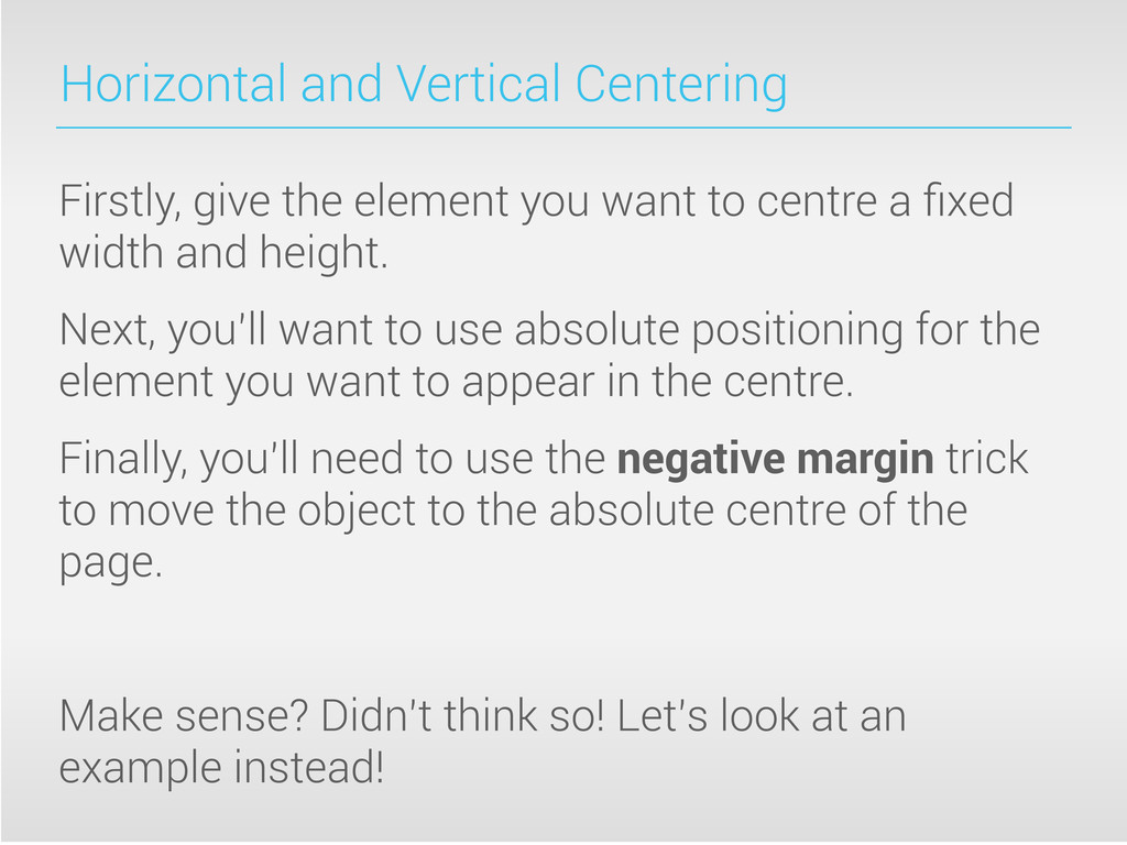
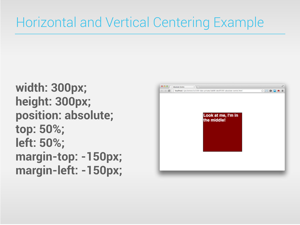
to centre a fixed width and height. Next, you’ll want to use absolute positioning for the element you want to appear in the centre. Finally, you’ll need to use the negative margin trick to move the object to the absolute centre of the page. Make sense? Didn’t think so! Let’s look at an example instead!
 joelennon
 ichimichi
 dsalo
dsalo
 yatabe
 masakat0
 sapi_kawahara
 stardy
 cm_manaus
 robintux
 cbtlibrary
 kentaro1981
 rlifchitz
 juanmartin2026
 inesmontani
 wayneb77
 notwaldorf
 katiecoart
 tammyeverts
 baasie
 keithpitt
 tamaranovitovic
 cassininazir
 stuffmc
 aleyda