Upgrade to Pro
— share decks privately, control downloads, hide ads and more …
Speaker Deck
Features
Speaker Deck
PRO
Sign in
Sign up for free
Search
Search
Responsive Web Design
Search
Sponsored
·
Your Podcast. Everywhere. Effortlessly.
Share. Educate. Inspire. Entertain. You do you. We'll handle the rest.
→
jos
May 02, 2016
Design
2
50
Responsive Web Design
National Central University Academy Program
jos
May 02, 2016
Tweet
Share
More Decks by jos
See All by jos
Firefox Marketplace Frontend
jostw
0
48
Finding Leaders with Maximum Spread of Influence through Social Networks
jostw
0
49
Other Decks in Design
See All in Design
【pmconf2025】PdMの頭の中を見える化する体験構造図
kamechi7222222
1
2.2k
Goodpatch Tour💙 / We are hiring!
goodpatch
31
1.1M
AIでデザインをつくる:基礎編
kenichiota0711
4
2.9k
AI時代、デザイナーの価値はどこに?
tararira
1
940
デザインの文脈を理解する:エンジニアがデザインカンファレンスに参加して得た学びと気づき
hypebeans
0
150
デザインコンテキストのバトンをつなぐ—AI時代のプロダクトマネジメント
kumanoayumi
6
1k
Franks Myth
gfht1
2
450
TWCP#21 UXデザインと哲学のはなし
shinn
0
320
第18回サイゼミ
lw
1
3.6k
Drawing for Animation
lynteo
2
250
デザイナーが主導権を握る、AI協業の本音と実践
satosio
7
3.1k
From the Visible Crossroads: Turning Outputs into Outcomes
takaikanako
2
1.3k
Featured
See All Featured
Lightning talk: Run Django tests with GitHub Actions
sabderemane
0
150
The B2B funnel & how to create a winning content strategy
katarinadahlin
PRO
1
310
The Invisible Side of Design
smashingmag
302
51k
How to Get Subject Matter Experts Bought In and Actively Contributing to SEO & PR Initiatives.
livdayseo
0
91
RailsConf 2023
tenderlove
30
1.4k
Sam Torres - BigQuery for SEOs
techseoconnect
PRO
0
230
The Mindset for Success: Future Career Progression
greggifford
PRO
0
290
Rebuilding a faster, lazier Slack
samanthasiow
85
9.4k
Mind Mapping
helmedeiros
PRO
1
130
Design and Strategy: How to Deal with People Who Don’t "Get" Design
morganepeng
133
19k
The Anti-SEO Checklist Checklist. Pubcon Cyber Week
ryanjones
0
100
Stop Working from a Prison Cell
hatefulcrawdad
274
21k
Transcript
RWD JOSEPH YEH May 2, 2016
ABOUT ME JOSEPH YEH 2
[email protected]
https://github.com/jostw https://www.linkedin.com/in/josyeh MOZILLA Software
Engineer MUZIK ONLINE Front End Engineer NTHU Master's Degree NCU Bachelor's degree
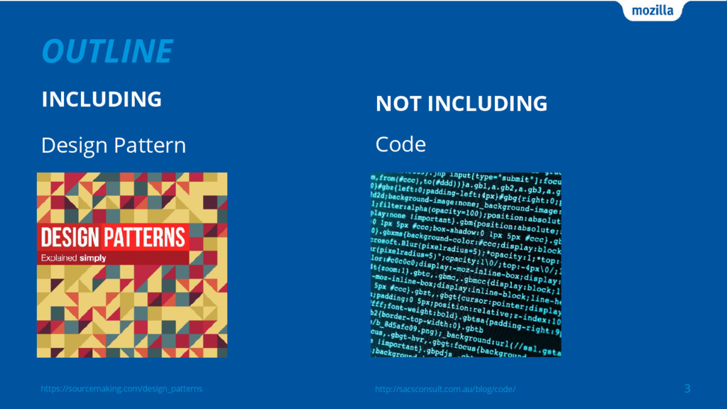
3 https://sourcemaking.com/design_patterns OUTLINE INCLUDING NOT INCLUDING Code Design Pattern http://sacsconsult.com.au/blog/code/
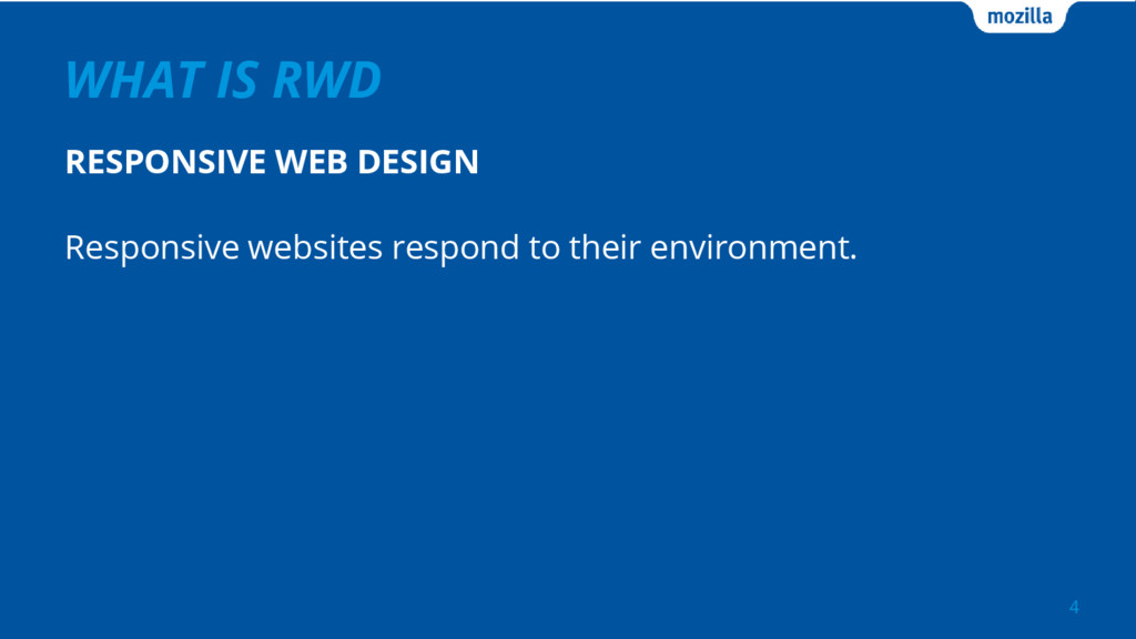
WHAT IS RWD RESPONSIVE WEB DESIGN 4 Responsive websites respond
to their environment.
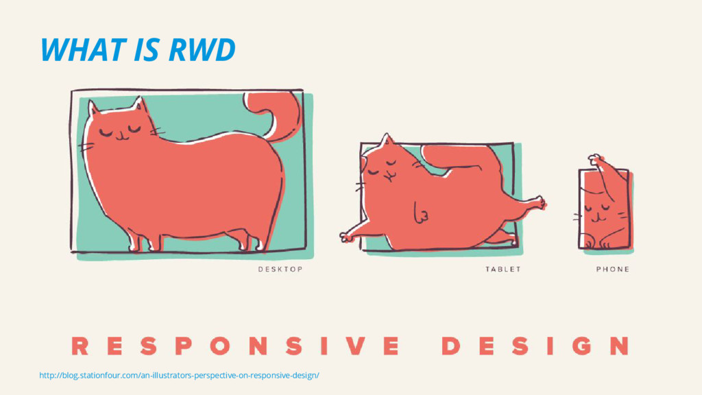
5 http://blog.stationfour.com/an-illustrators-perspective-on-responsive-design/ WHAT IS RWD
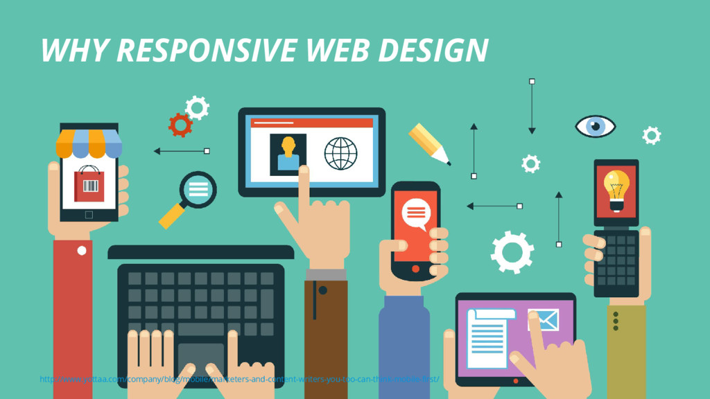
6 http://www.yottaa.com/company/blog/mobile/marketers-and-content-writers-you-too-can-think-mobile-first/ WHY RESPONSIVE WEB DESIGN
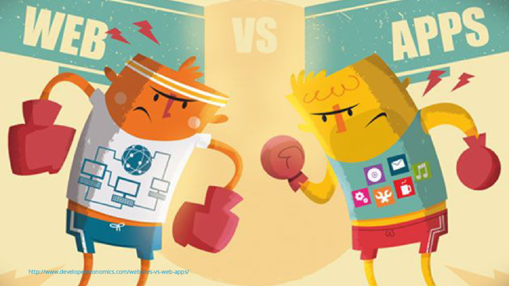
7 http://www.developereconomics.com/websites-vs-web-apps/
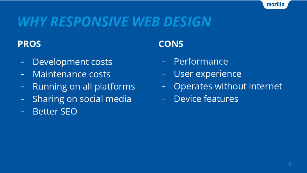
WHY RESPONSIVE WEB DESIGN PROS 8 CONS - Performance -
User experience - Operates without internet - Device features - Development costs - Maintenance costs - Running on all platforms - Sharing on social media - Better SEO
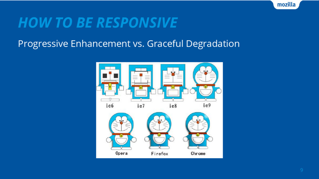
HOW TO BE RESPONSIVE Progressive Enhancement vs. Graceful Degradation 9
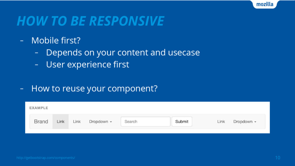
HOW TO BE RESPONSIVE - Mobile first? - Depends on
your content and usecase - User experience first - How to reuse your component? 10 http://getbootstrap.com/components/
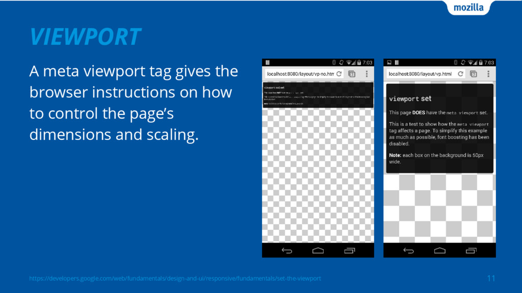
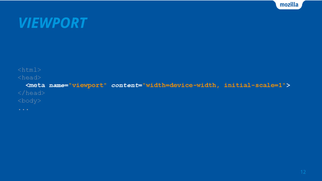
https://developers.google.com/web/fundamentals/design-and-ui/responsive/fundamentals/set-the-viewport VIEWPORT 11 A meta viewport tag gives the browser
instructions on how to control the page’s dimensions and scaling.
VIEWPORT <html> <head> <meta name="viewport" content="width=device-width, initial-scale=1"> </head> <body> ...
12
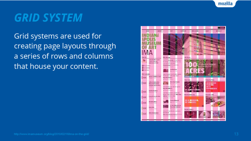
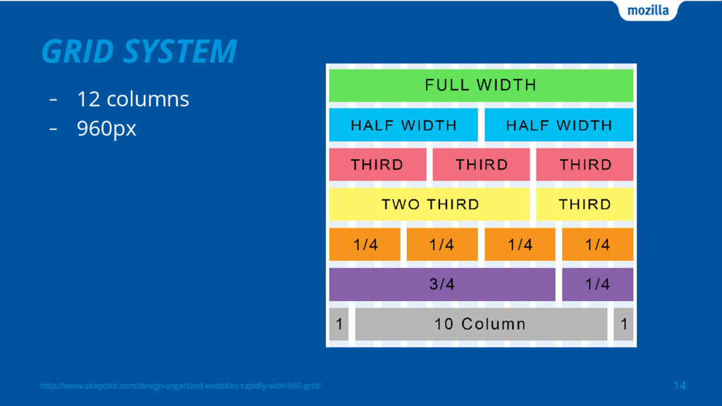
GRID SYSTEM 13 http://www.imamuseum.org/blog/2010/02/16/ima-on-the-grid/ Grid systems are used for creating
page layouts through a series of rows and columns that house your content.
GRID SYSTEM - 12 columns - 960px 14 http://www.sitepoint.com/design-organized-websites-rapidly-with-960-grid/
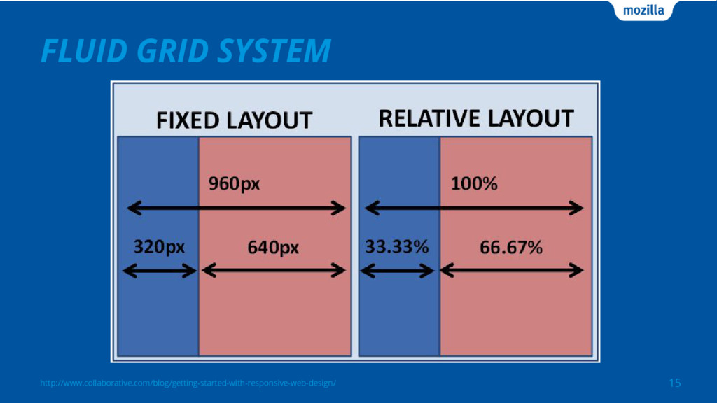
FLUID GRID SYSTEM 15 http://www.collaborative.com/blog/getting-started-with-responsive-web-design/
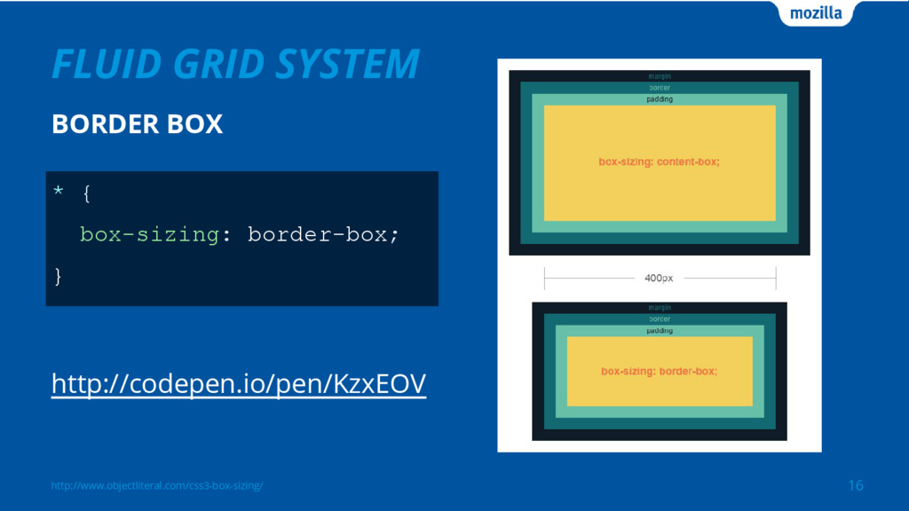
FLUID GRID SYSTEM 16 http://www.objectliteral.com/css3-box-sizing/ * { box-sizing: border-box; }
BORDER BOX http://codepen.io/pen/KzxEOV
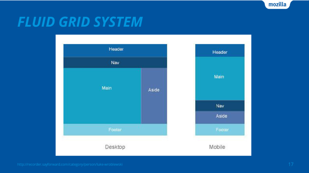
FLUID GRID SYSTEM 17 http://recorder.sayforward.com/category/person/luke-wroblewski
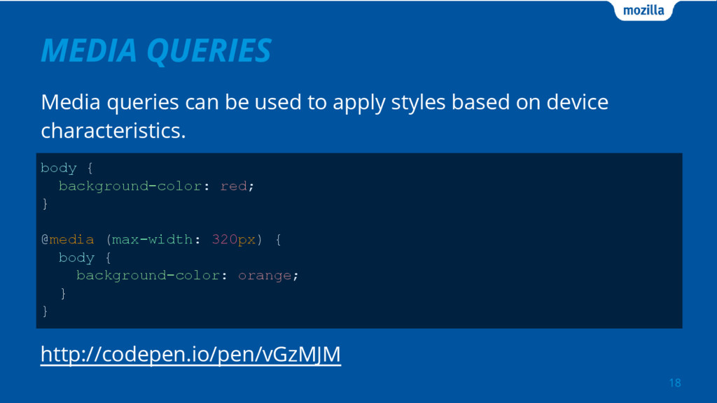
MEDIA QUERIES Media queries can be used to apply styles
based on device characteristics. 18 body { background-color: red; } @media (max-width: 320px) { body { background-color: orange; } } http://codepen.io/pen/vGzMJM
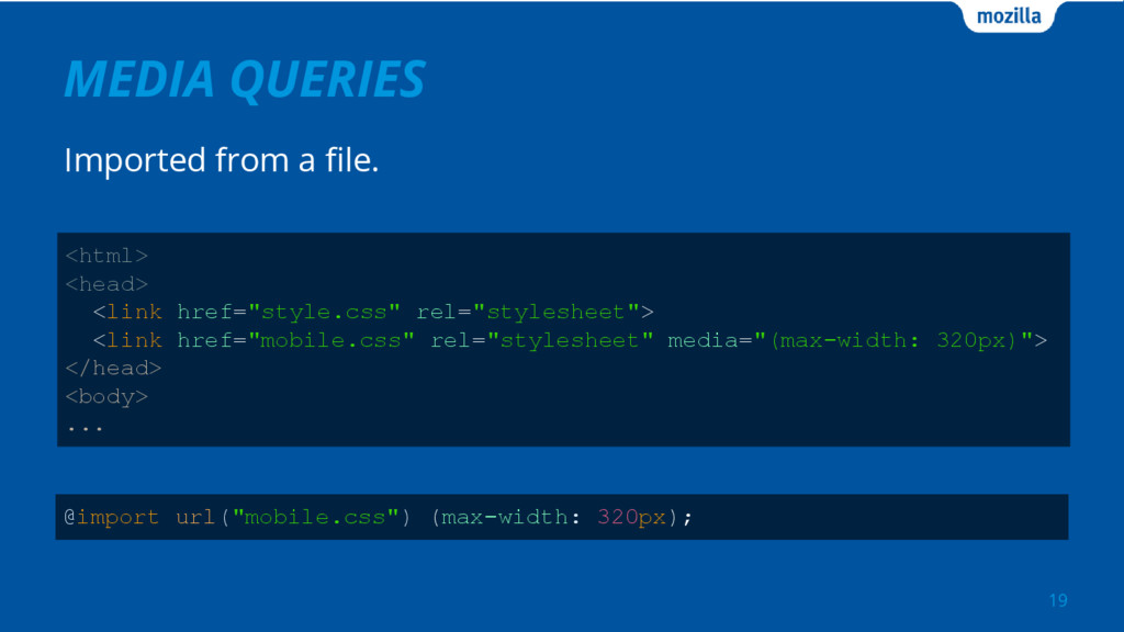
MEDIA QUERIES 19 @import url("mobile.css") (max-width: 320px); <html> <head> <link
href="style.css" rel="stylesheet"> <link href="mobile.css" rel="stylesheet" media="(max-width: 320px)"> </head> <body> ... Imported from a file.
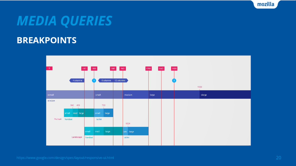
https://www.google.com/design/spec/layout/responsive-ui.html MEDIA QUERIES 20 BREAKPOINTS
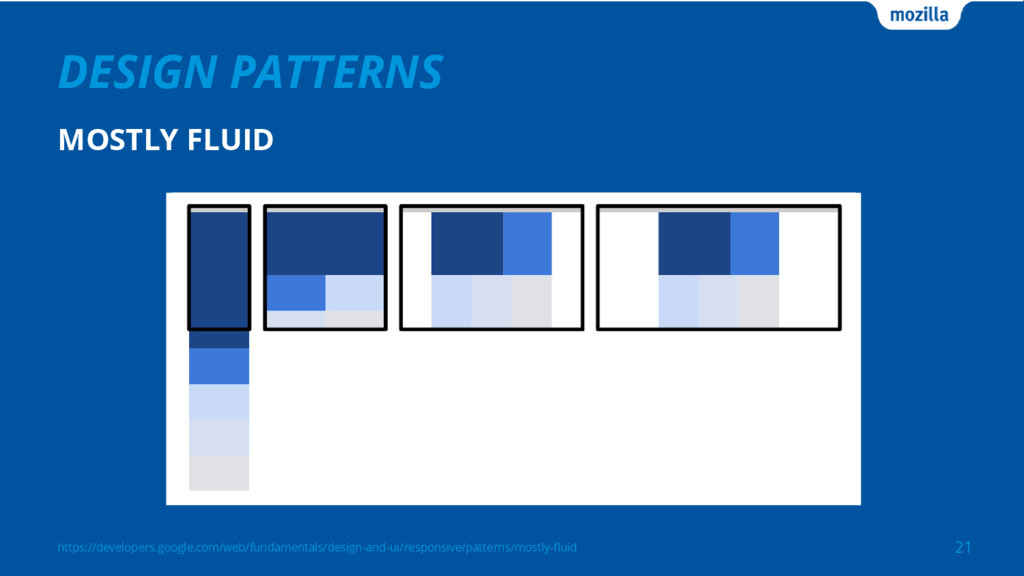
https://developers.google.com/web/fundamentals/design-and-ui/responsive/patterns/mostly-fluid DESIGN PATTERNS 21 MOSTLY FLUID
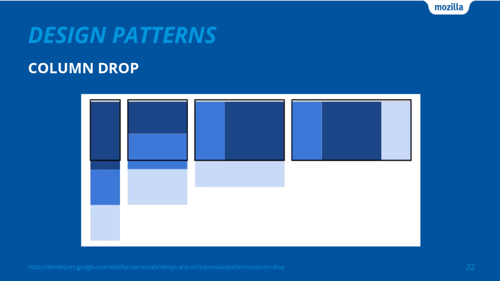
https://developers.google.com/web/fundamentals/design-and-ui/responsive/patterns/column-drop DESIGN PATTERNS 22 COLUMN DROP
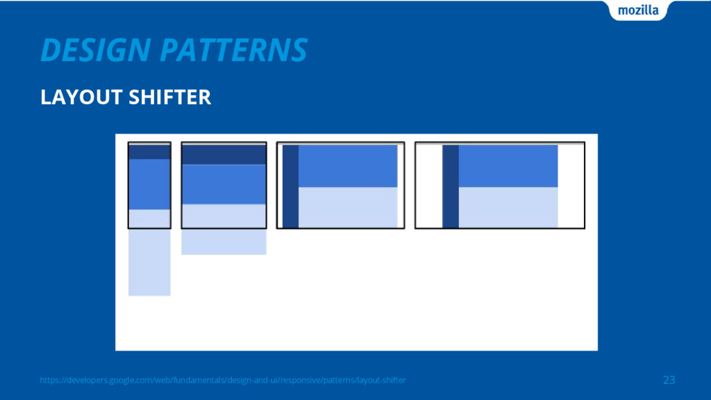
https://developers.google.com/web/fundamentals/design-and-ui/responsive/patterns/layout-shifter DESIGN PATTERNS 23 LAYOUT SHIFTER
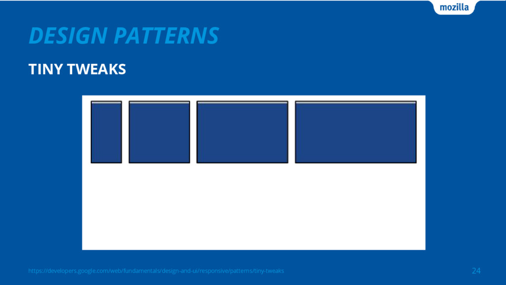
https://developers.google.com/web/fundamentals/design-and-ui/responsive/patterns/tiny-tweaks DESIGN PATTERNS 24 TINY TWEAKS
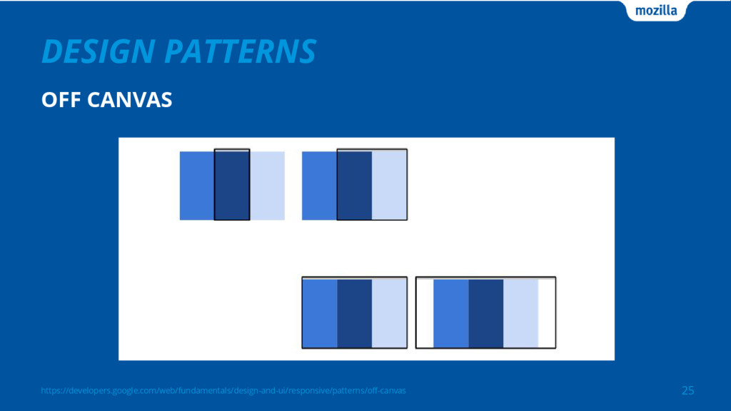
https://developers.google.com/web/fundamentals/design-and-ui/responsive/patterns/off-canvas DESIGN PATTERNS 25 OFF CANVAS
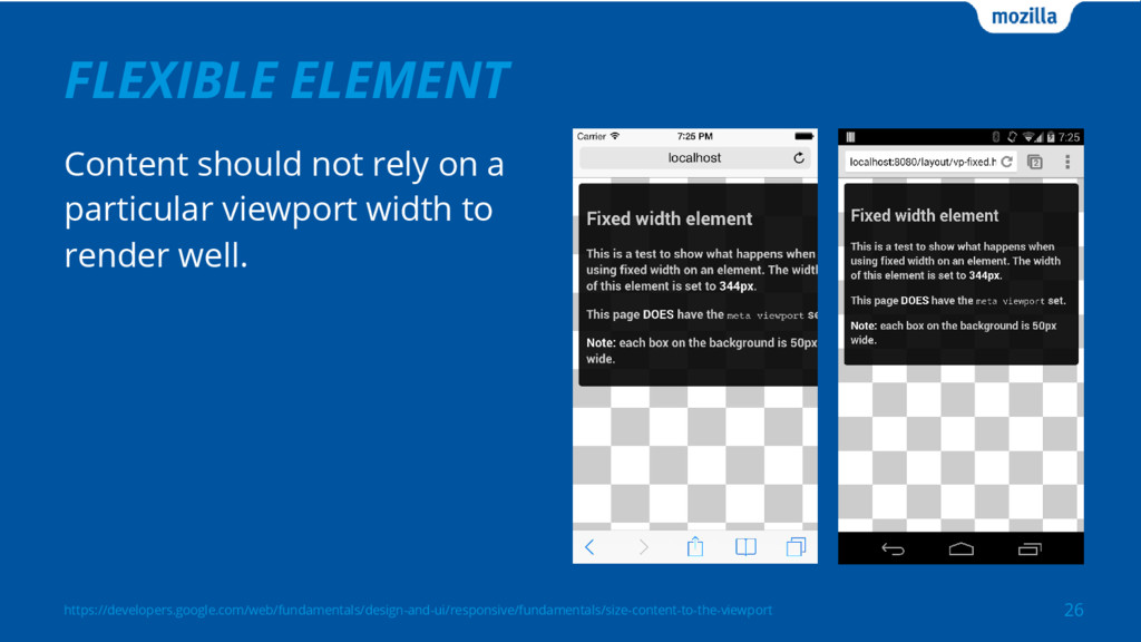
FLEXIBLE ELEMENT 26 Content should not rely on a particular
viewport width to render well. https://developers.google.com/web/fundamentals/design-and-ui/responsive/fundamentals/size-content-to-the-viewport
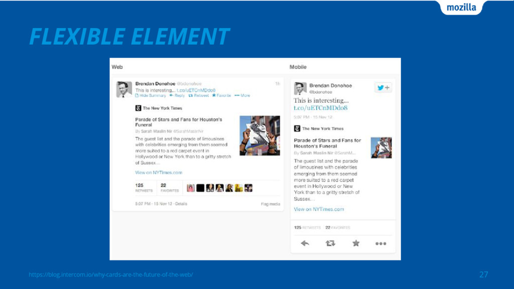
https://blog.intercom.io/why-cards-are-the-future-of-the-web/ FLEXIBLE ELEMENT 27
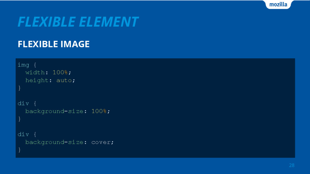
FLEXIBLE ELEMENT FLEXIBLE IMAGE 28 img { width: 100%; height:
auto; } div { background-size: 100%; } div { background-size: cover; }
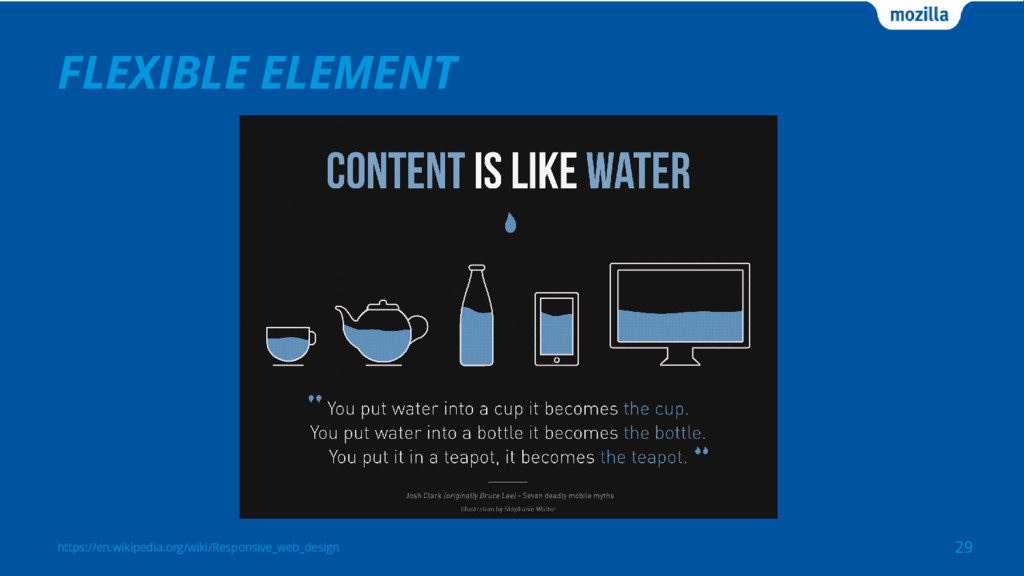
https://en.wikipedia.org/wiki/Responsive_web_design FLEXIBLE ELEMENT 29
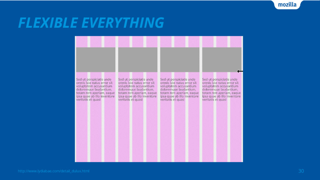
http://www.lydiabae.com/detail_dulux.html FLEXIBLE EVERYTHING 30
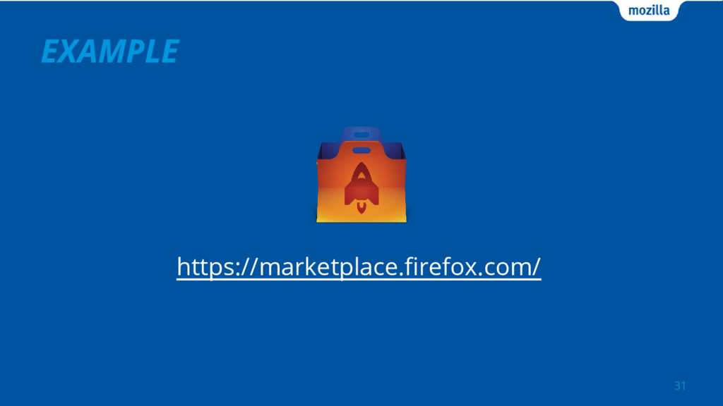
EXAMPLE 31 https://marketplace.firefox.com/
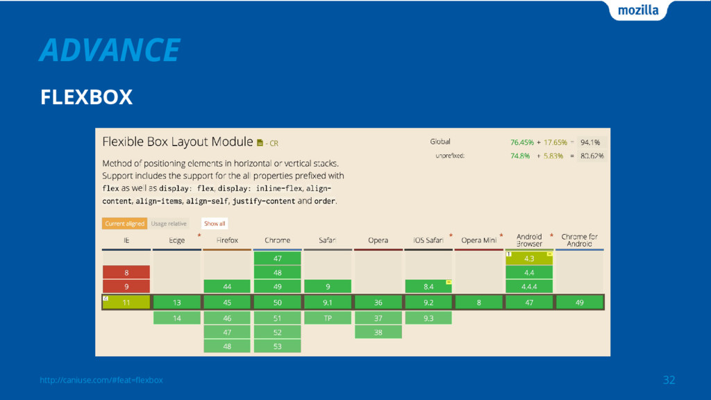
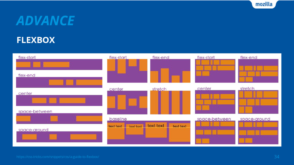
http://caniuse.com/#feat=flexbox ADVANCE 32 FLEXBOX
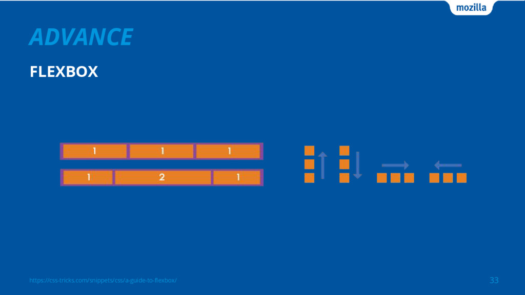
https://css-tricks.com/snippets/css/a-guide-to-flexbox/ ADVANCE 33 FLEXBOX
https://css-tricks.com/snippets/css/a-guide-to-flexbox/ ADVANCE 34 FLEXBOX
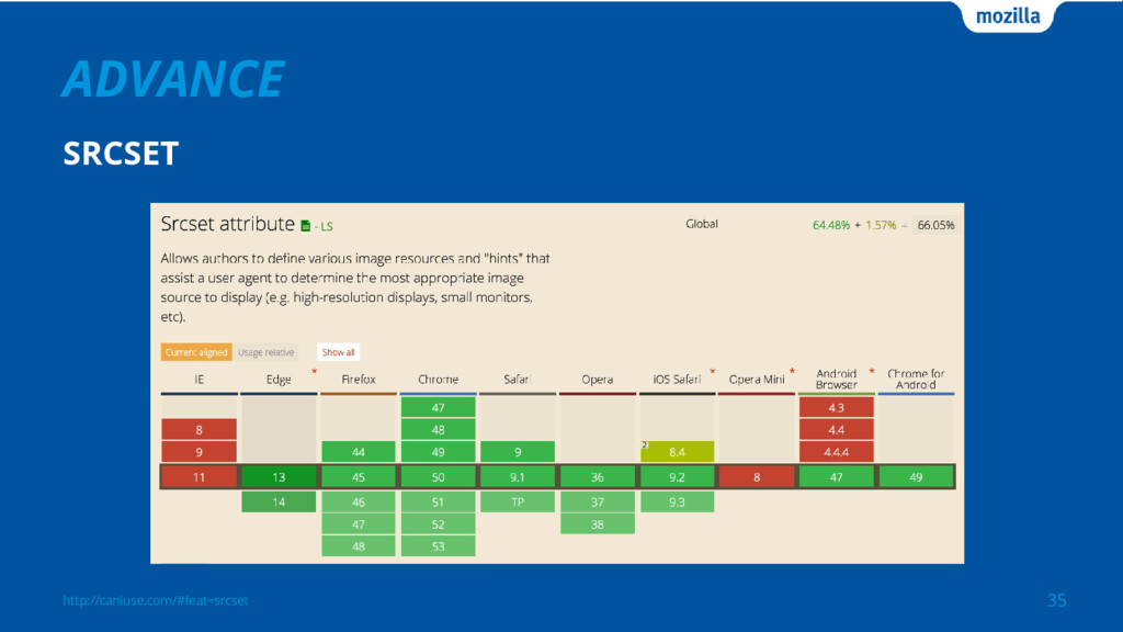
http://caniuse.com/#feat=srcset ADVANCE 35 SRCSET
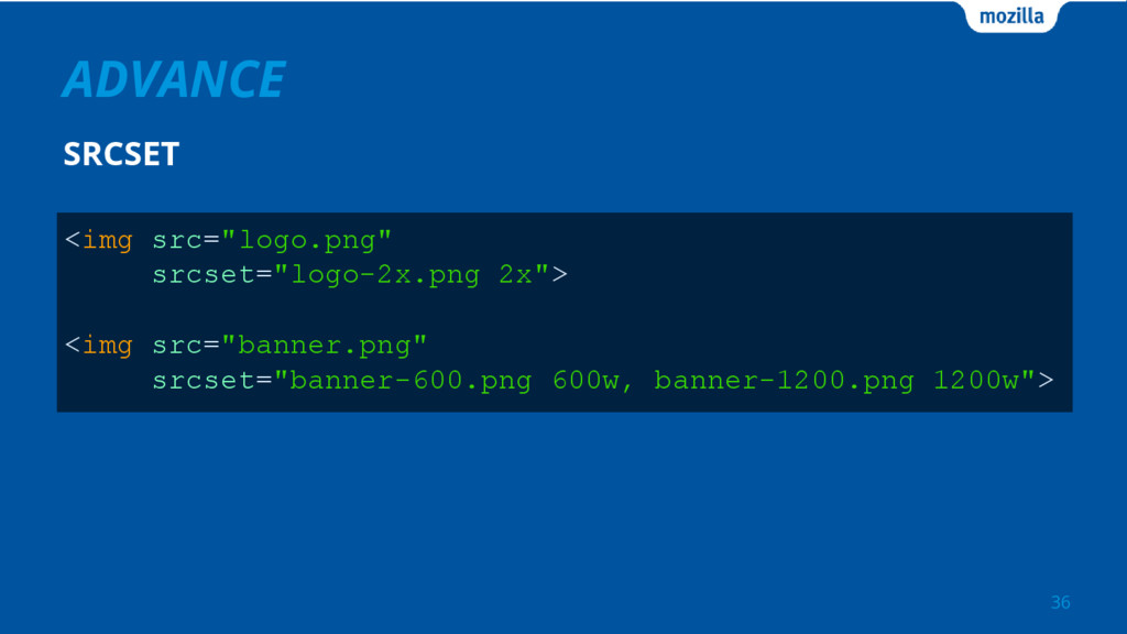
ADVANCE 36 SRCSET <img src="logo.png" srcset="logo-2x.png 2x"> <img src="banner.png" srcset="banner-600.png
600w, banner-1200.png 1200w">
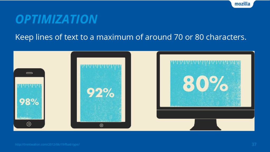
OPTIMIZATION Keep lines of text to a maximum of around
70 or 80 characters. 37 http://trentwalton.com/2012/06/19/fluid-type/
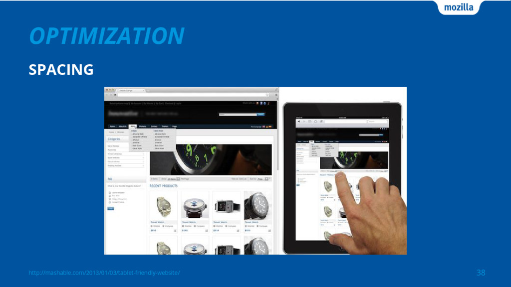
http://mashable.com/2013/01/03/tablet-friendly-website/ OPTIMIZATION 38 SPACING
https://github.com/twbs/bootstrap/issues/9235 OPTIMIZATION 39 BUTTON SIZE
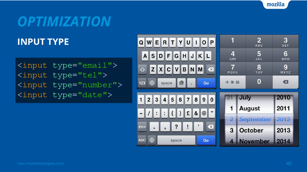
http://mobileinputtypes.com/ OPTIMIZATION 40 INPUT TYPE <input type="email"> <input type="tel"> <input
type="number"> <input type="date">
OPTIMIZATION - Hover effect - Touch event - Browser support
- Performance - RESS: Responsive Design + Server Side Components http://www.slideshare.net/adamp3wang/pinkoi 41
CONCLUSION 42 - Core content - Be flexible - User
experience http://imgur.com/yQuXuMa
REFERENCE 43 https://developers.google.com/web/fundamentals/design-and-ui/responsive/ https://developers.google.com/webmasters/mobile-sites/mobile-seo/responsive-design http://design.google.com/resizer/ http://mediaqueri.es/ FRAMEWORKS http://getbootstrap.com/ http://foundation.zurb.com/ http://susy.oddbird.net/
44 https://www.pinterest.com/pin/574490496187451796/
 jostw
jostw
 kamechi7222222
 goodpatch
 kenichiota0711
 tararira
 hypebeans
 kumanoayumi
 gfht1
gfht1
 shinn
shinn
 lw
lw
 lynteo
 satosio
 takaikanako
 sabderemane
 katarinadahlin
 smashingmag
 livdayseo
 tenderlove
 techseoconnect
 greggifford
 samanthasiow
 helmedeiros
 morganepeng
 ryanjones
 hatefulcrawdad
![ABOUT ME JOSEPH YEH 2 [email protected] https://github.com/jostw https://www.linkedin.com/in/josyeh MOZILLA Software](https://files.speakerdeck.com/presentations/950fdc1a2713406f816cdf3b86fdfea0/slide_1.jpg)