Upgrade to Pro — share decks privately, control downloads, hide ads and more …

Seminar #43 - Cohort Analysis Part 2 - Retention / Churn Analysis with Survival Curve

Seminar #43 - Cohort Analysis Part 2 - Retention / Churn Analysis with Survival Curve

If you care about customer retention this chart is one of the most important charts. It shows a series of retention rates over time by cohorts of when the customers have converted. By visualizing the trend you can spot where the retention problems are and understand the health of your business.

But you will hit a few hurdles when you try to calculate such data manually, which is the foundation of the above cohort chart.

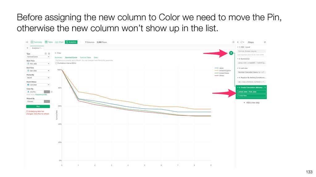
That's where the survival analysis algorithm 'Kaplan-Meier' comes in rescue.

Kan has presented what the survival analysis algorithm is and how can it be used to analyze your customer retention better, and how you can do it quickly in Exploratory.

Subscribe ↓
https://www.youtube.com/channel/UCOVfLaSQBvMRwZCyiccq4Iw

Twitter ↓
https://twitter.com/ExploratoryData

UI Tool: Exploratory(https://exploratory.io/)
Exploratory Online Seminar: https://exploratory.io/online-seminar

Kan Nishida

May 05, 2021
Tweet

More Decks by Kan Nishida

Other Decks in Technology

Transcript

  1. Kan Nishida CEO/co-founder Exploratory Summary In Spring 2016, launched Exploratory,

    Inc. to democratize Data Science. Prior to Exploratory, Kan was a director of product development at Oracle leading teams to build various Data Science products in areas including Machine Learning, BI, Data Visualization, Mobile Analytics, Big Data, etc. While at Oracle, Kan also provided training and consulting services to help organizations transform with data. @KanAugust Speaker
  2. 3 Data Science is not just for Engineers and Statisticians.

    Exploratory makes it possible for Everyone to do Data Science. The Third Wave
  3. 4 Questions Communication Data Access Data Wrangling Visualization Analytics (Statistics

    / Machine Learning) Data Analysis Data Science Workflow
  4. 5 Questions Communication (Dashboard, Note, Slides) Data Access Data Wrangling

    Visualization Analytics (Statistics / Machine Learning) Data Analysis ExploratoryɹModern & Simple UI
  5. 7 Agenda • Survival Curve - Understand Customer Retention /

    Churn Better • Survival Rate - How to Calculate? • Cohort Analysis - Compare Customer Retention among Groups
  6. 8 Let’s say our business’s MRR is growing as below.

    Jan Feb Mar Apr May Jun Jul Aug Sep Oct Nov Dec
  7. By dividing the MRR by the cohort of when the

    users converted, you can see how efficiently your business is growing and can grow further. 9 Month Ago 8 Month Ago 7 Month Ago 6 Month Ago 5 Month Ago 4 Month Ago 3 Month Ago 2 Month Ago 1 Month Ago
  8. Layer Cake chart helps you understand how efficient your MRR

    is growing by visualizing the net revenue retention for each cohort of customers based on when they converted. Ideally, you want to have each cohort to expand, not shrink, in terms of the revenue.
  9. Now, the Net Revenue Retention is the result of Retention

    / Churn. But if you want to see how your customers are churning or if your customer retention is getting better or not, you want to see the retention rates over time and compare them among various cohorts (groups) of customers.
  10. Over the customer lifetime when do the customers churn the

    most, at the first month, or in the first few months? Does the churn stabilize after a certain time period? Or, would the retention rates keep dropping until everybody churn? If the retention becomes stable, when is it? And what is the retention rate when it becomes stable? Example Questions
  11. 13 We can calculate the retention rates through the customer

    lifetime and draw a curve like below. Passing Month 35% 100% 40% 32% 60% 48%
  12. 14 Each retention rate on this chart indicate the rate

    of customers who would retain through a given period. 48% 48% of Customers would retain through 2nd month. Month 35% 100% 40% 32% 60%
  13. 15 1st Month 100% 60% 40% 32% 48% 35% By

    visualizing the retention rate over the customer lifetime, we can spot where the retention drops more significantly. In general, the steeper the curve is the more attention you want to pay.
  14. In the world of Data Science / Statistics, this curve

    is called ‘Survival Curve’ and each ‘retention rate’ is called ‘Survival Rate’. 16
  15. Survival Rate of Each Period 0.75 1 0.75 1 Survival

    Rate through the period 1*0.75 Jessica Tien Nancy Victor
  16. Survival Rate of Each Period 0.5 0.75 1 0.66 0.75

    1 Survival Rate through the period 1*0.75 0.75*0.66 Jessica Tien Nancy Victor
  17. Survival Rate of Each Period 0.5 0.5 0.75 1 1

    0.66 0.75 1 Survival Rate through the period 1*0.75 0.75*0.66 0.5*1 Jessica Tien Nancy Victor
  18. 4th Month 3rd Month 2nd Month 1st Month Jessica Tien

    Nancy Victor Jane Align all customers based on how many months they are in.
  19. ? ? ? ? 4th Month 3rd Month 2nd Month

    1st Month We don’t know if the recently joined customers will quit or not. Jessica Tien Nancy Victor Jane
  20. 4th Month 3rd Month 2nd Month 1st Month Label them

    as Censored. Jessica Tien Nancy Victor Jane
  21. 1 0.66 0.75 1 0.5 0.5 0.75 1 Survival Rate

    through the period 1*0.75 0.75*0.66 0.5*1 Survival Rate of Each Period Jessica Tien Nancy Victor Jane
  22. 32 0.5 0.5 0.75 1 Survival Rate through 4th Month

    3rd Month 2nd Month 1st Month Survival Curve!
  23. 33 There is an algorithm called ‘Kaplan-Meier estimator’, which calculate

    the survival rate though the lifetime taking into an account for the censored data.
  24. • One row represents one observation. • Each observation needs

    to have the following information. • Start Time • End Time • Event Status: e.g. Cancelled, Quit, Died, etc. Input data for Survival Analysis
  25. Search with ‘Cohort’ and click the Import button for ‘Sample

    Data for Cohort Analysis - Survival Curve’.
  26. In reality though, most likely your data don’t look like

    this! Rather, you might have the data that is more like a payment data where each row represents each payment of a given user or each access of a given user. If so, you need to transform the data to the expected format. Take a look at this blog post for more details on how to prepare the data. Appendix:
  27. 51 We have about 30% of the customer who churned

    by the end of the first month.
  28. 52 But after that, the slope of the curve becomes

    stable, which indicates that the churn seems to settle.
  29. • Time - (e.g. Days since sign up) In survival

    data, one row represents one point of time. • Observations - Number of observations whom the event hans’t happened to yet at a given time. • Events - Number of observations whom the event happened at a given time. • Censored - Number of observations censored at a given time. • Survival Rate - Survival Rate through this point of time. These are the values visualized as Survival Curve • Std Error - Standard error for the estimates • Conf Low - Lower limit of the confidence interval for the estimate • Conf High - Upper limit of the confidence interval for estimate Survival Analysis Data
  30. Day 1 Day 2 Day 3 Observations Events Censored Survival

    Rate Day 1 10 1 Day 2 8 2 Day 3 4 1
  31. Day 1 Day 2 Day 3 Observations Events Censored Survival

    Rate Day 1 10 1 1 Day 2 8 2 2 Day 3 4 1 1
  32. Day 1 Day 2 Day 3 Observations Events Censored Survival

    Rate Day 1 10 1 1 0.9 Day 2 8 2 2 0.675 Day 3 4 1 1 0.5025 Survival Rates through the day
  33. 61

  34. • The team was originated from epidemiology. • Analysis of

    the Survival Rates of multiple groups. • Each group is called Cohort. Cohort Analysis
  35. 64 We can draw the survival curves by cohorts (groups).

    Here, I’ve created two cohorts of customers based on what device they use. PC Users Mobile Users
  36. 65 The survival rates for the Mobile users are better

    than the ones for the PC users. The slower the drop of survival rates is better. PC Users Mobile Users
  37. 66 It could be because the experience for the Mobile

    users is better or there are specific values that only Mobile users are getting out of it. PC Users Mobile Users
  38. 67 On the other hand, there seems be some problems

    for PC users. PC Users Mobile Users
  39. 69 We’ll investigate if there is a difference between Mac

    users and Windows users in terms of the survival curve.
  40. 74 Beginning of 1st Month End of 1st Month 70%

    If we had 3 out of 10 customers churned the survival rate becomes 70%.
  41. But, if 1 of the 3 churned customers decided not

    to churn in the last minute, the survival rate would become 80%. 76 80% Beginning of 1st Month End of 1st Month
  42. In the opposite scenario, what if one of the retained

    customers decided to churn at the last minute? The survival rate would become 60%. 78 60% Beginning of 1st Month End of 1st Month
  43. In this case, the survival rate of the Mac customers

    would go down and become worse than the Windows customers. 79 60%
  44. 80 Just a few customers’ churn can influence the survival

    rates a lot. And that can make the Mac customers’ survival rates better or worse than the Windows customers.
  45. 82 70% If we had 30 out of 100 customers

    churned the survival rate becomes 70%. Beginning of 1st Month End of 1st Month
  46. 83 71% If one of the churned customers decided to

    not churn at the last minute, the survival rate becomes 71%. Beginning of 1st Month End of 1st Month
  47. 2݄ 85 1݄ 69% In the opposite scenario, if one

    of the retained customers decided to churn at the last minute, the survival rate becomes 69%.
  48. When we have many customers then the difference caused by

    a few customers won’t make much of the difference on the survival curve. 87
  49. 88 The survival rates vary, and whether a few customers

    churn or not can make the survival rates different. The difference is depending on how many customers we have. So we can’t conclude that they’re different just because a given pair of the survival curves are different. How can we compare the two and conclude if there is a meaningful difference or not?
  50. We want to show a range for the survival curve

    so that we can say the ‘True’ survival curve will reside within this range. Then we can compare the two survival curves with such ranges and see if one is really better than the other. 89 Confidence Interval!
  51. 95 True Mean 95% of these confidence intervals should include

    the true mean of the population. }Sample
  52. 96

  53. 97 We happen to be looking at one of the

    sample and its mean and its confidence interval. } True Mean Sample
  54. 100

  55. 105 So we can conclude that there is no much

    difference between the two after the 4th month.
  56. This time, we’ll keep only the 3 most frequent countries

    and put all the other countries in a group called ‘Others’. 111
  57. 112 When you assign a column with many unique values

    it will automatically create ‘Other’ group. You can click the green text to adjust the setting.
  58. Now we have the survival curves for the top 3

    countries and ‘other’ group. 114
  59. Given that they don’t overlap up through the 2nd month

    there is a significant difference between United Kingdom and Others. 118
  60. 120 One of the things we wanted to know is

    whether the customer retention is getting better or worse over time. Are the recent customers tend to churn more or less compared to the older customers?
  61. In SaaS / Subscription business, ‘Cohort Analysis’ generally means analyzing

    the survival curves by the cohort of the converted month (or year). 123
  62. 124 If the survival curves of the recently converted customers

    are getting better (less steep) that is a sign of your service or product is improving for the customers.
  63. 125 On the other hand, if the survival curves of

    the recently converted customers are getting worse (steeper) than the older ones that’s a sign of problems for your product, customer service, user experience, etc.
  64. 127 We want to assign the ‘first_date’ column to color

    to create cohorts based on the converted month, but…
  65. 128 We can’t find the column in the dropdown because

    it is already assigned to the Start Date.
  66. 132 Now we have a new column ‘joined_date’ which has

    the same value as the last_date column.
  67. 133 Before assigning the new column to Color we need

    to move the Pin, otherwise the new column won’t show up in the list.
  68. 136 Now we have the survival curves drawn up by

    the cohorts based on the converted month.
  69. 139 For Subscription businesses, it’s important to know how much

    you can make as revenue from your customers so that you can calculate how much you can spend to acquire the customers.
  70. But, calculating the Customer Lifetime Value is not as simple

    as multiplying the monthly (or yearly) payment by the number of payment periods. 140 Jan $10 Feb Mar Total … Apr $120? ച੾ $10 $10 $10
  71. We can use the survival rates to calculate the CLV

    (Customer Lifetime Value) more accurately. 142