Upgrade to Pro — share decks privately, control downloads, hide ads and more …

Exploratory v6.3 - Introducing New Features

Exploratory v6.3 - Introducing New Features

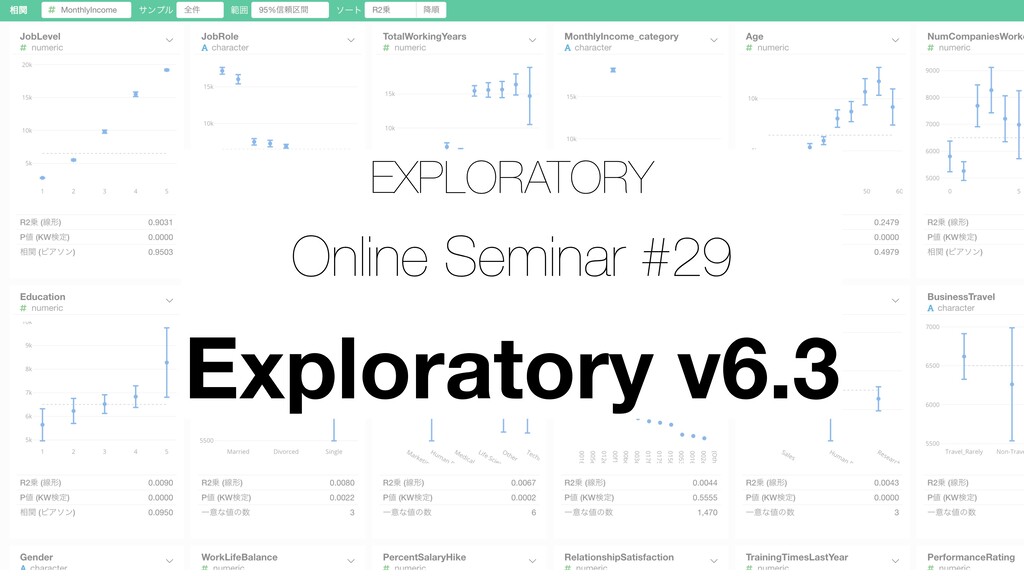
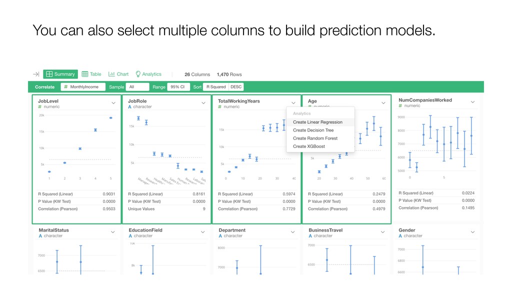
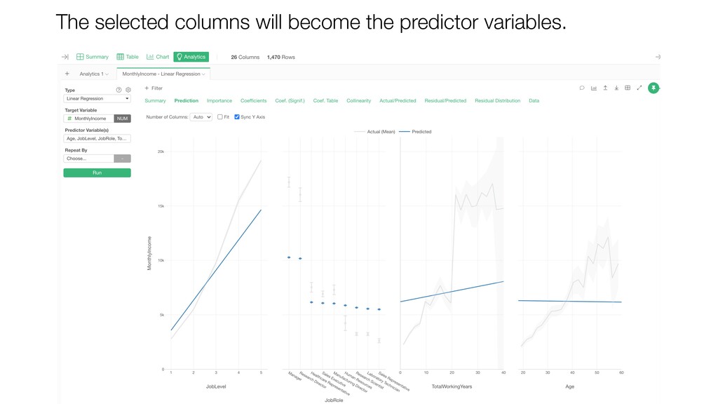
In this seminar, I'm going to introduce some of the new features of Exploratory v6.3.

- Performance improvements
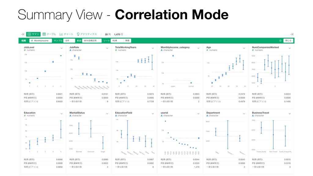
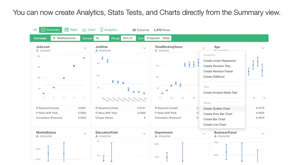
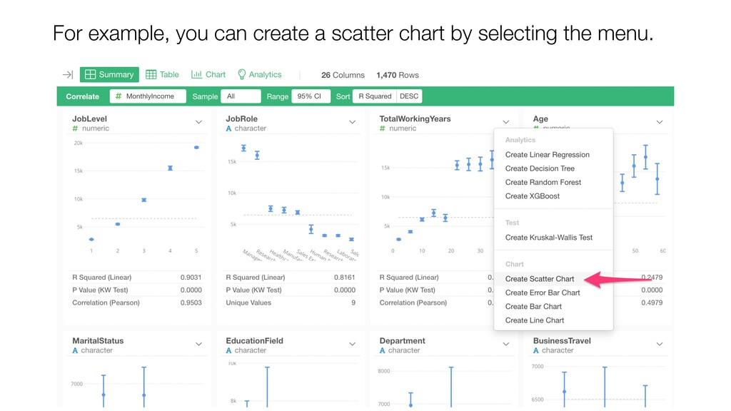
- Summary View Enhancements
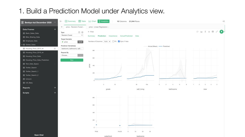
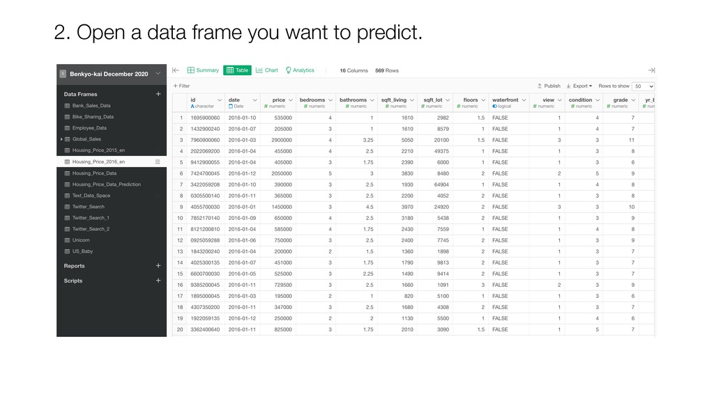
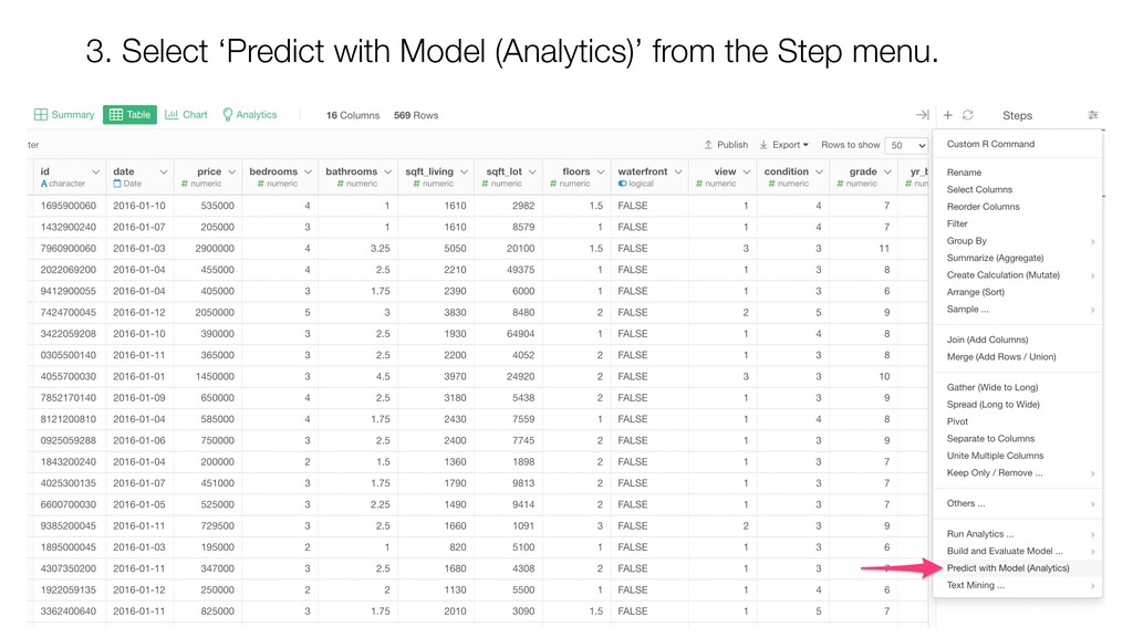
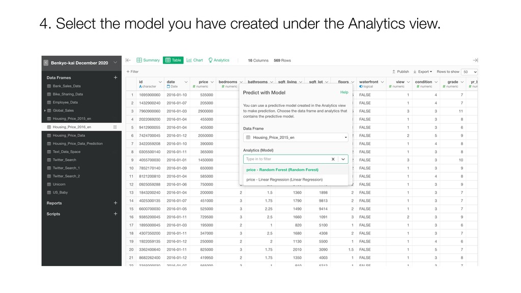
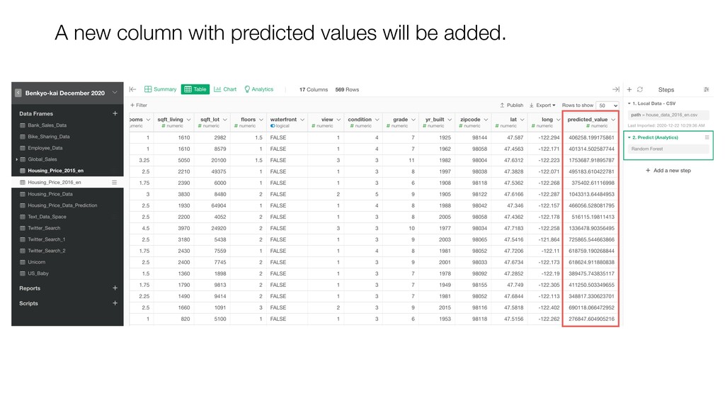
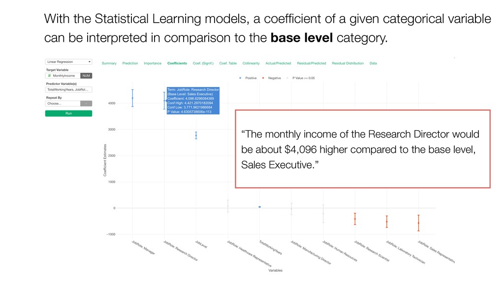
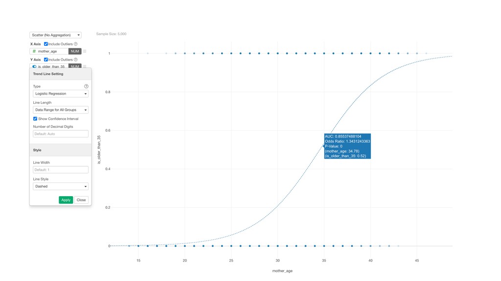
- Analytics - Prediction
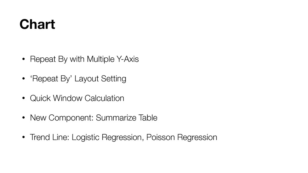
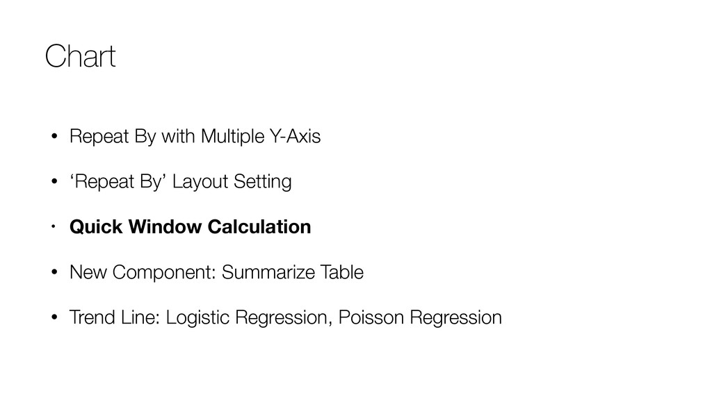
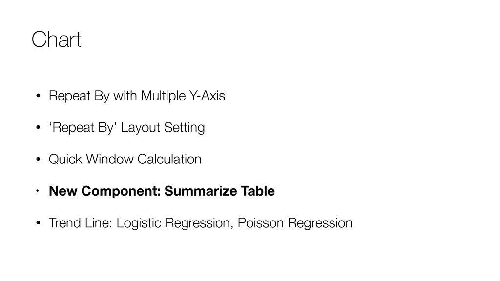
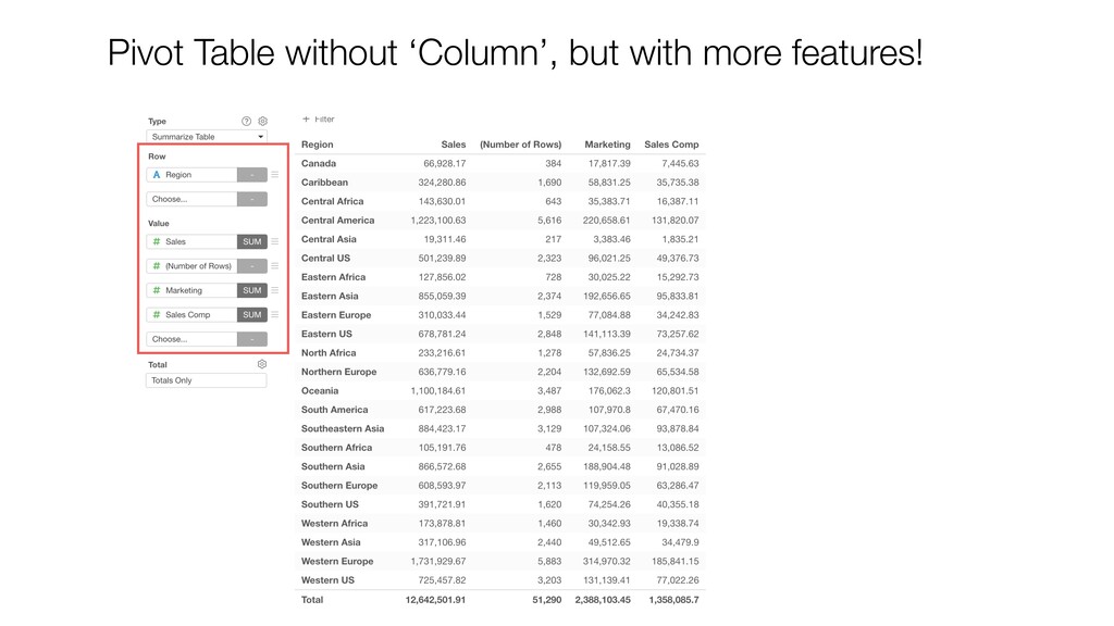
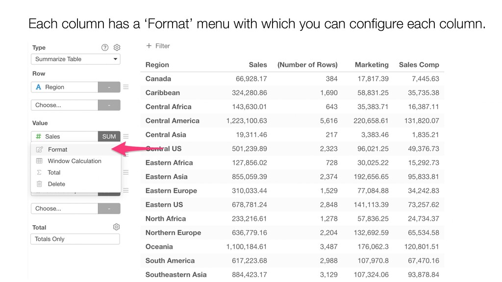
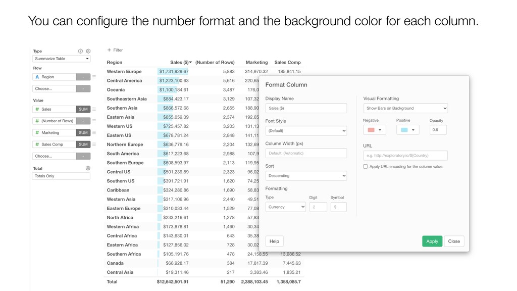
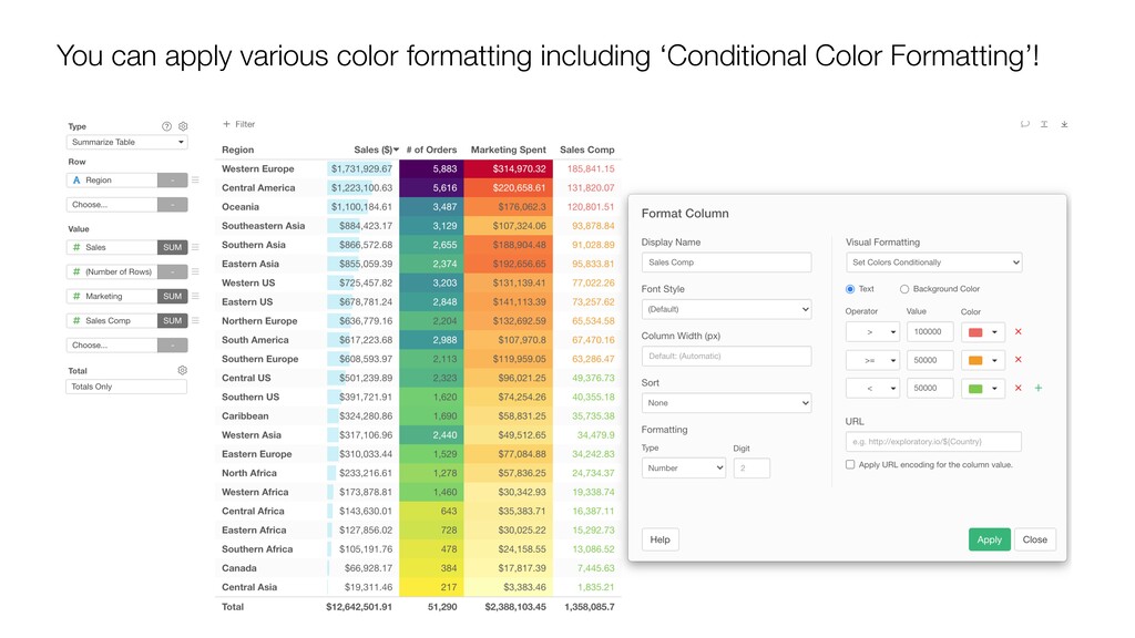
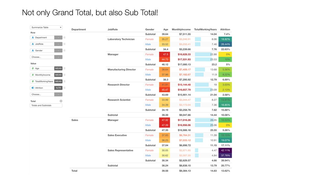
- Chart - Summary Table
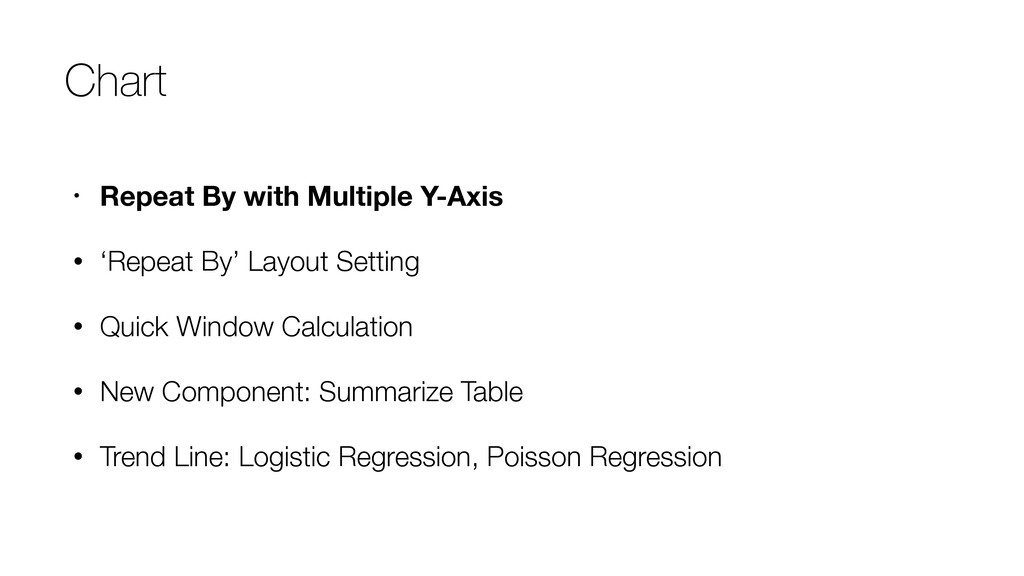
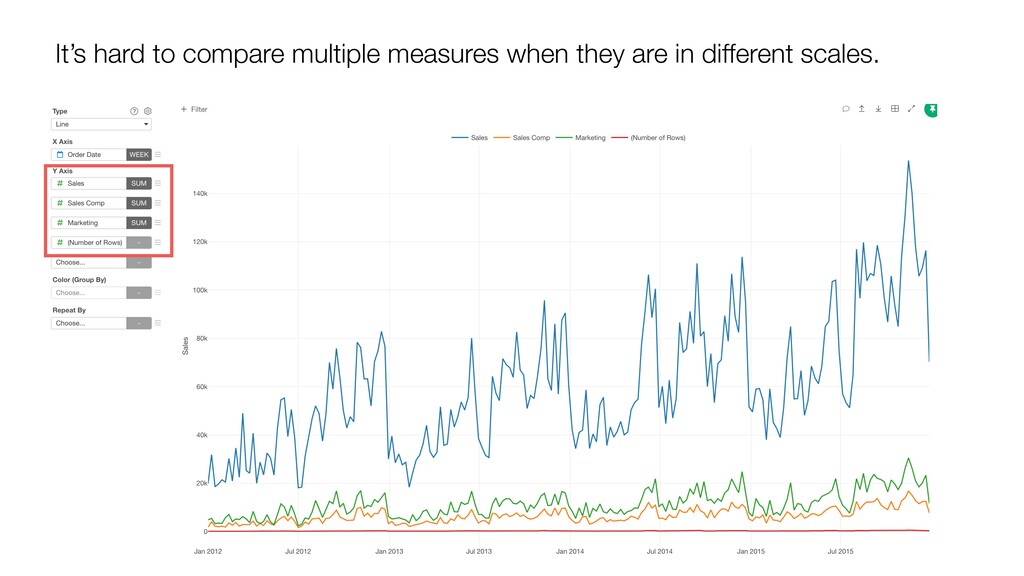
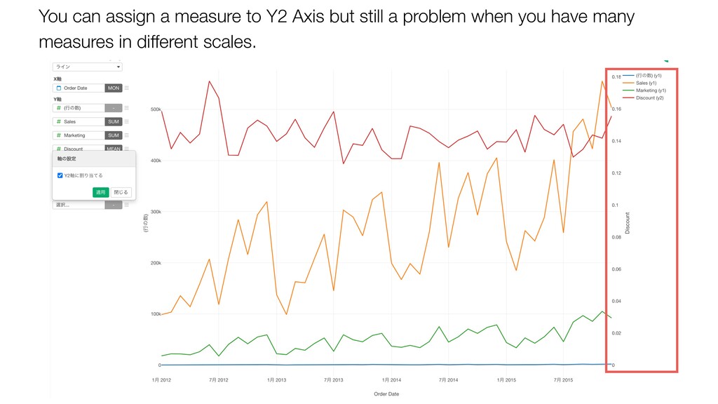
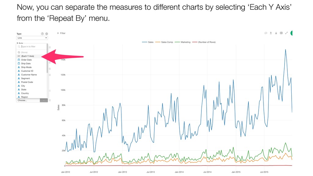
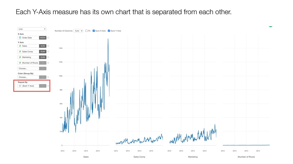
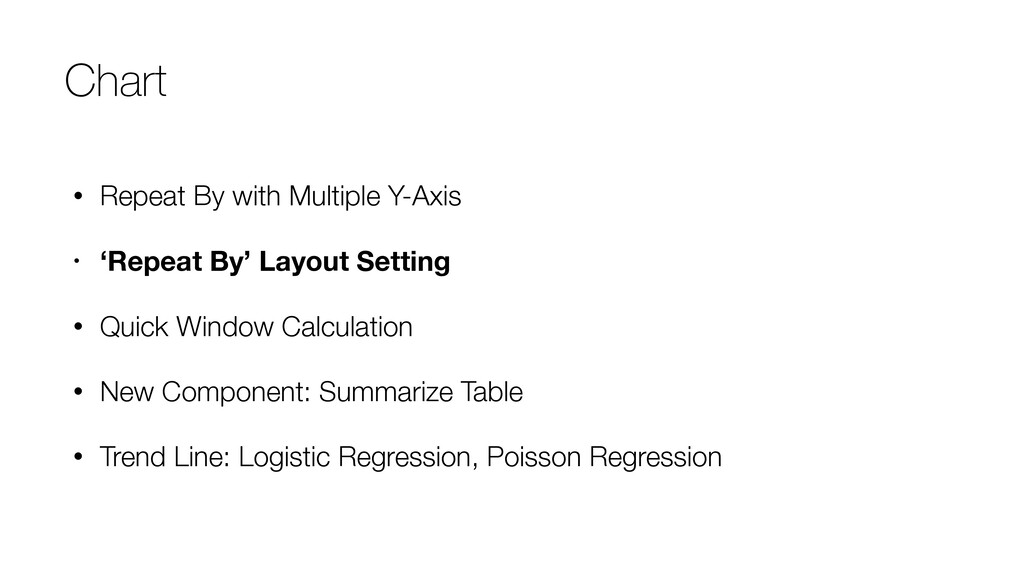
- Chart - Repeat By with Multiple Y-Axis
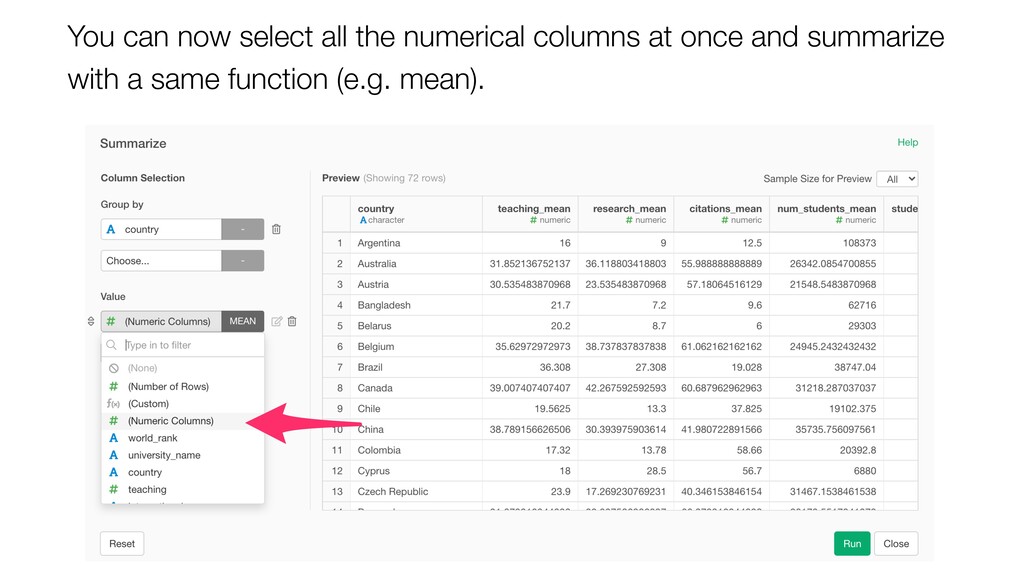
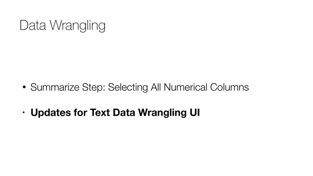
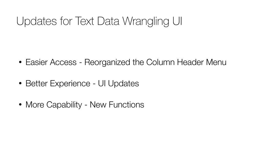
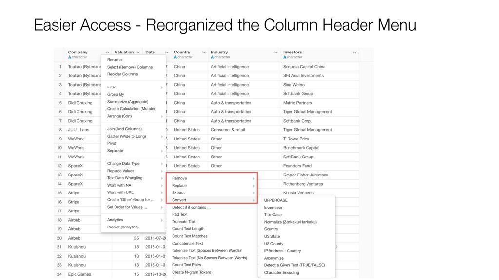
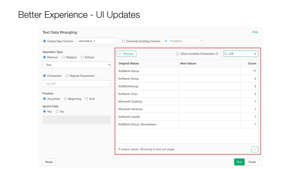
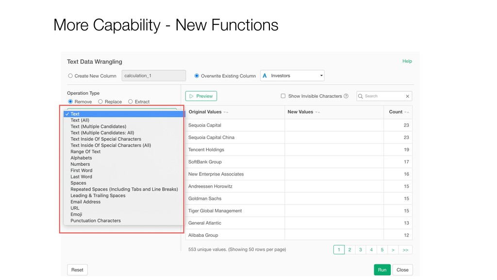
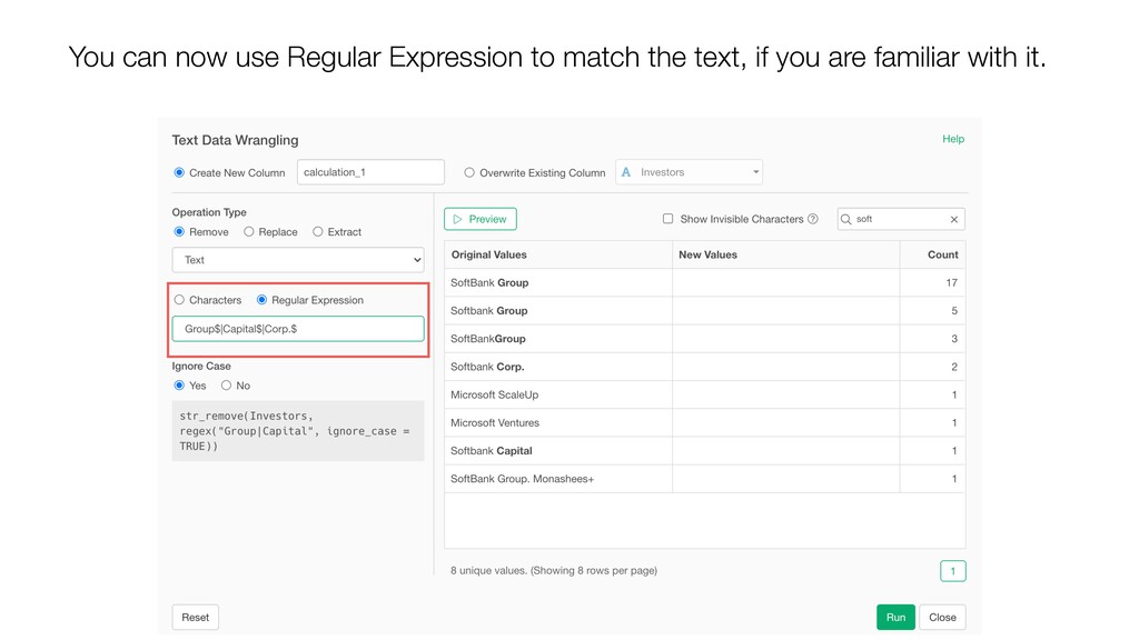
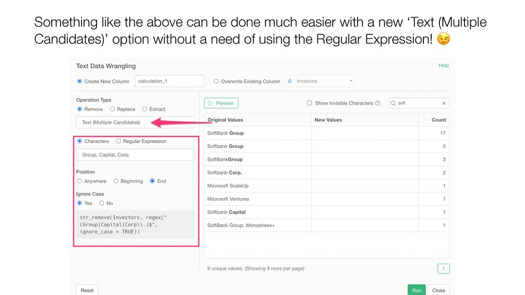
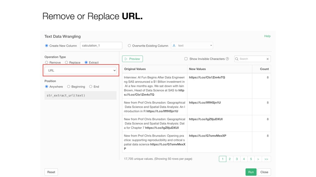
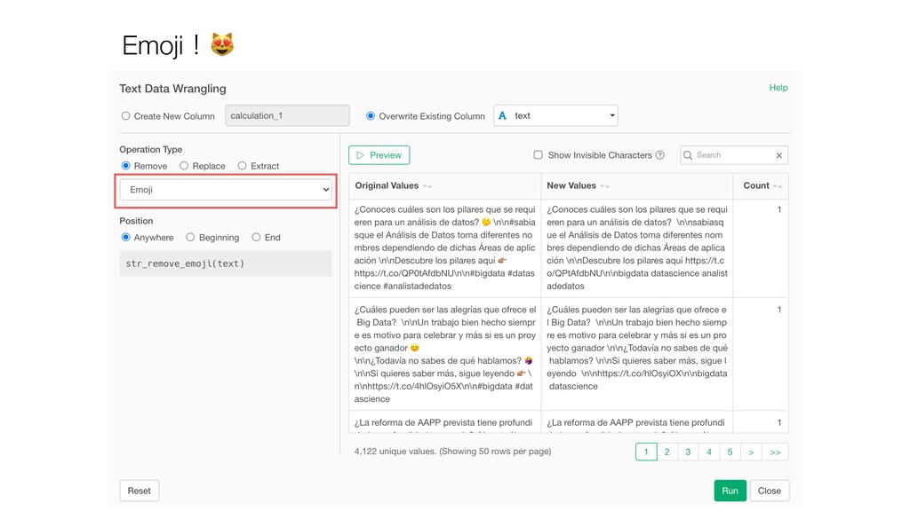
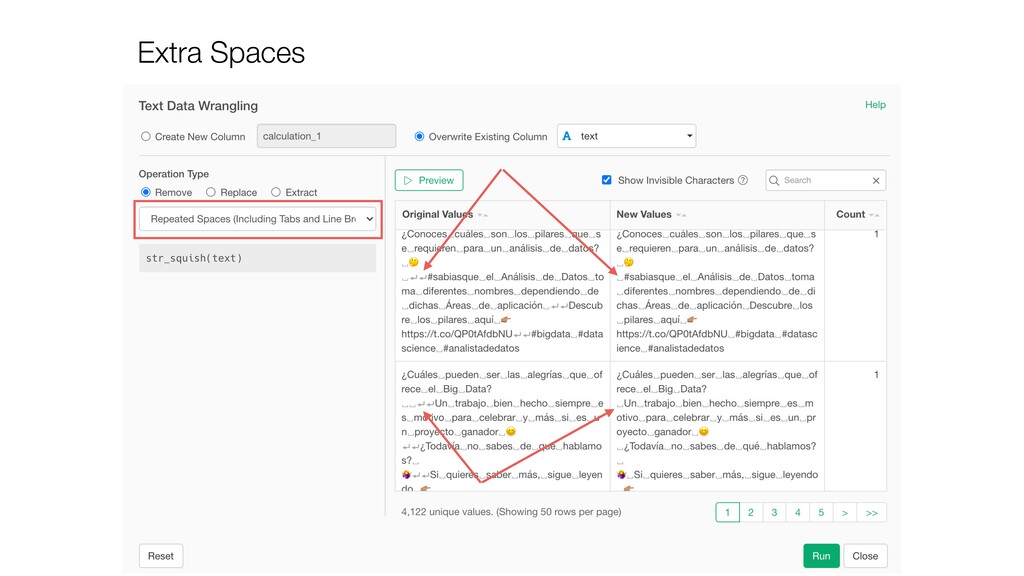
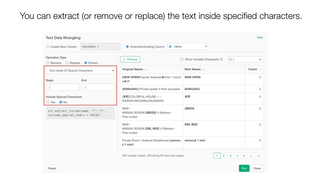
- Data Wrangling - Text Wrangling UI Enhancements

Kan Nishida

January 13, 2021
Tweet

More Decks by Kan Nishida

Other Decks in Technology

Transcript

  1. Kan Nishida CEO/co-founder Exploratory Summary In Spring 2016, launched Exploratory,

    Inc. to democratize Data Science. Prior to Exploratory, Kan was a director of product development at Oracle leading teams to build various Data Science products in areas including Machine Learning, BI, Data Visualization, Mobile Analytics, Big Data, etc. While at Oracle, Kan also provided training and consulting services to help organizations transform with data. @KanAugust Speaker
  2. 3 Data Science is not just for Engineers and Statisticians.

    Exploratory makes it possible for Everyone to do Data Science. The Third Wave
  3. 4 Questions Communication Data Access Data Wrangling Visualization Analytics (Statistics

    / Machine Learning) Data Analysis Data Science Workflow
  4. 5 Questions Communication (Dashboard, Note, Slides) Data Access Data Wrangling

    Visualization Analytics (Statistics / Machine Learning) Data Analysis ExploratoryɹModern & Simple UI
  5. • Switching between Summary / Table / Chart / Analytics

    views • Switching between Data Frames • Moving between the Data Wrangling Steps • Rendering of the Chart graphics • Opening and Closing Projects Performance Improvements in UI Rendering:
  6. Create directly from the Summary View’s Correlation Mode. • Charts

    • Prediction Models • Statistical Tests Summary View - Correlation Mode
  7. • Prediction with Another Data • Setup Base Level •

    Hypothesis Test - Probability Distribution • Test Mode & Summary Metrics for Cox Regression & Survival Forest Analytics
  8. Now, you can use the models you have built under

    Analytics view and predict with another data frame! Prediction!
  9. • Prediction with Another Data • Setup for Base Level

    • Hypothesis Test - Probability Distribution • Test Mode & Summary Metrics for Cox Regression & Survival Forest Analytics
  10. With the Statistical Learning models, a coefficient of a given

    categorical variable can be interpreted in comparison to the base level category. “The monthly income of the Research Director would be about $4,096 higher compared to the base level, Sales Executive.”
  11. The most frequent value becomes the base level by default,

    but you can change this quickly inside the Analytics view now.
  12. Now, the coefficients for Job Role variable are interpreted in

    comparison to ‘Manager.’ “The monthly income of the Healthcare Rep. would be about $4,119 lower compared to Manager (base level).”
  13. • Prediction with Another Data • Setup for Base Level

    • Hypothesis Test - Probability Distribution • Test Mode & Summary Metrics for Cox Regression & Survival Forest Analytics
  14. You can use the statistical tests to see if there

    is a significant difference in your data. For example, ’t Test’ evaluates if a given difference between the means (average) of two groups is significant or due to a chance.
  15. A probability of getting the t Value (or more extreme

    values) under the ‘null hypothesis’ that assumes no difference in Monthly Income between Male and Female. What is P Value?
  16. t Value You can now visualize where the given t

    value resides in the underlying ’t distribution’ (Probability distribution) curve.
  17. Can you spot if any of the Job Role has

    the t value that is inside the ‘significant’ area?
  18. • Repeat By with Multiple Y-Axis • ‘Repeat By’ Layout

    Setting • Quick Window Calculation • New Component: Summarize Table • Trend Line: Logistic Regression, Poisson Regression Chart
  19. • Repeat By with Multiple Y-Axis • ‘Repeat By’ Layout

    Setting • Quick Window Calculation • New Component: Summarize Table • Trend Line: Logistic Regression, Poisson Regression Chart
  20. You can assign a measure to Y2 Axis but still

    a problem when you have many measures in different scales.
  21. Now, you can separate the measures to different charts by

    selecting ‘Each Y Axis’ from the ‘Repeat By’ menu.
  22. • Repeat By with Multiple Y-Axis • ‘Repeat By’ Layout

    Setting • Quick Window Calculation • New Component: Summarize Table • Trend Line: Logistic Regression, Poisson Regression Chart
  23. You can change the layout directly inside the chart area.

    You no longer need to open a separate configuration dialog!
  24. You can apply a different Window Calculation to each Y-Axis

    chart. When you are looking at the ratio it’s convenient to see the actual values along.
  25. • Repeat By with Multiple Y-Axis • ‘Repeat By’ Layout

    Setting • Quick Window Calculation • New Component: Summarize Table • Trend Line: Logistic Regression, Poisson Regression Chart
  26. • Repeat By with Multiple Y-Axis • ‘Repeat By’ Layout

    Setting • Quick Window Calculation • New Component: Summarize Table • Trend Line: Logistic Regression, Poisson Regression Chart
  27. • You can’t apply a different number format (currency, percent,

    etc.) for each column. • You can’t apply a different Color Setting for each column. • The format option is basic. • Only Grand Total is supported, Sub-total is not supported. Limitations with Pivot Table
  28. These limitations are mainly due to the fact that the

    Pivot table is designed to support assigning a column to ‘Column’ so that each value of the assigned column becomes its own column of the output.
  29. • Repeat By with Multiple Y-Axis • ‘Repeat By’ Layout

    Setting • Quick Window Calculation • New Component: Summarize Table • Trend Line: Logistic Regression, Poisson Regression Chart
  30. You can now select all the numerical columns at once

    and summarize with a same function (e.g. mean).
  31. Updates for Text Data Wrangling UI • Easier Access -

    Reorganized the Column Header Menu • Better Experience - UI Updates • More Capability - New Functions
  32. It shows you the original values in an aggregated format

    so that you can see how many rows there are for each value.
  33. Once you click on the Preview button you can check

    if it’s working as expected or not.
  34. Something like the above can be done much easier with

    a new ‘Text (Multiple Candidates)’ option without a need of using the Regular Expression!