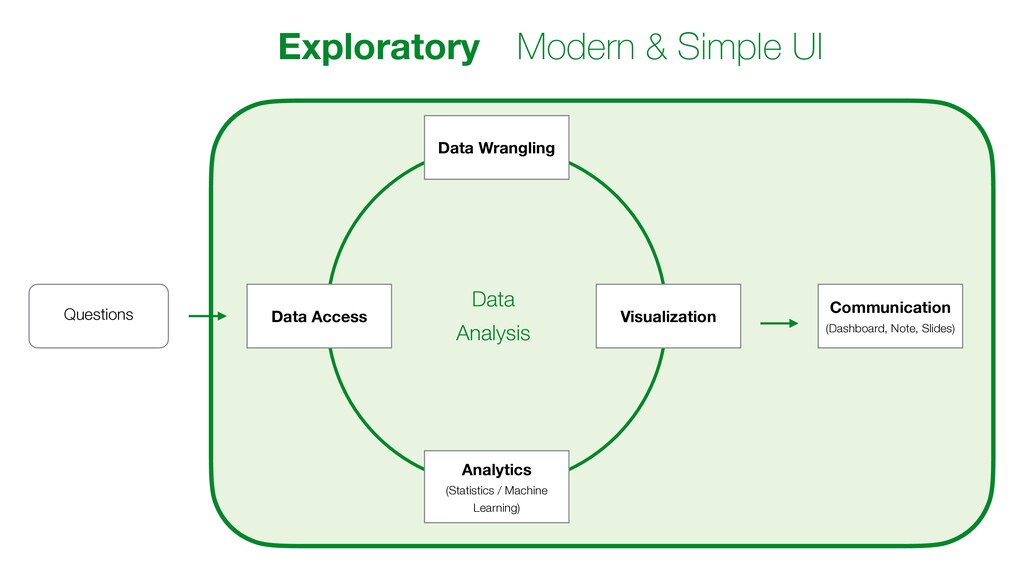
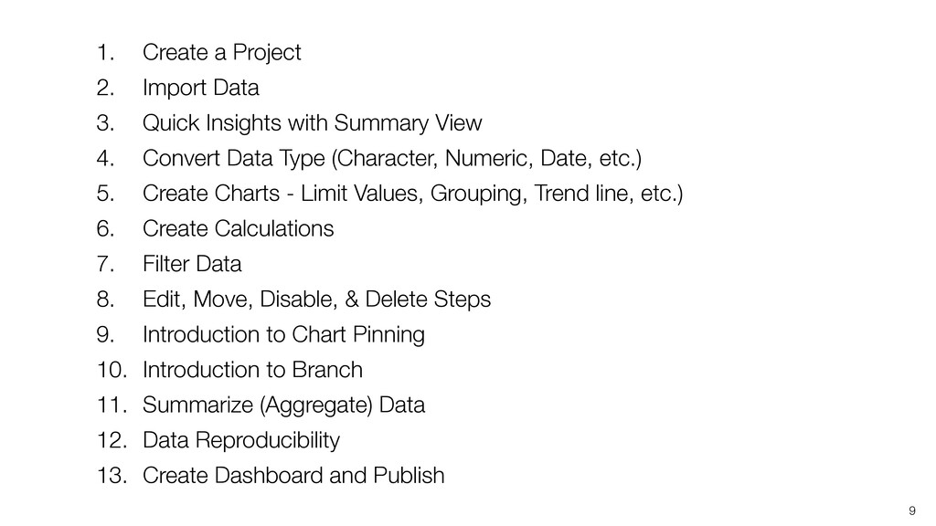
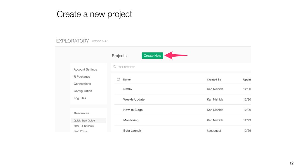
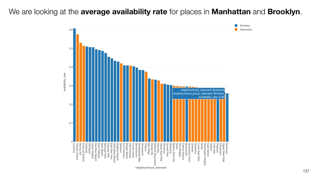
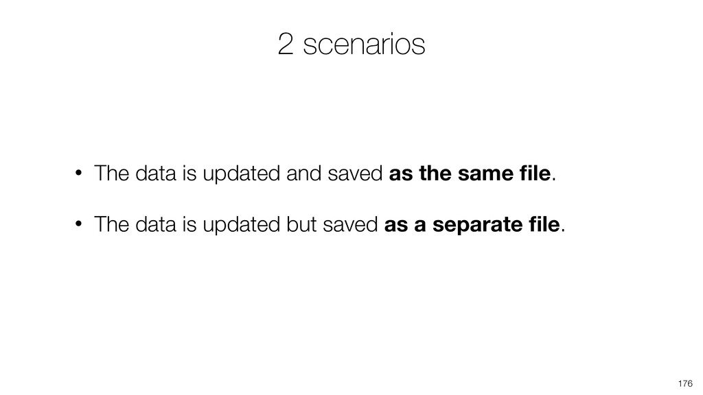
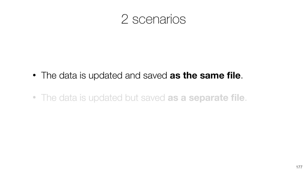
This is a walk through of 'how to use Exploratory' covering the following topics.
- Working with Chart, Time Series, Pin
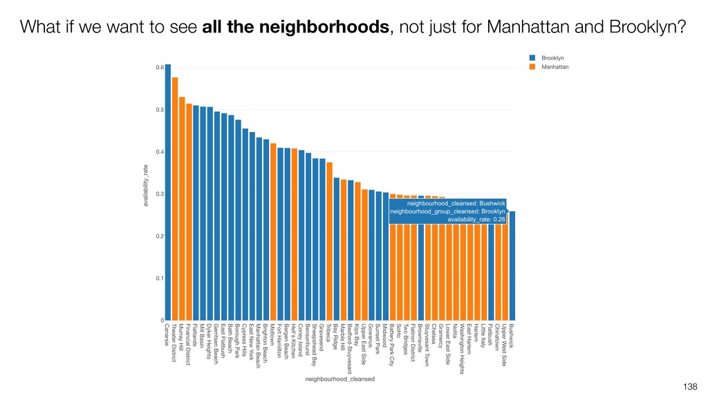
- Data Wrangling Introduction
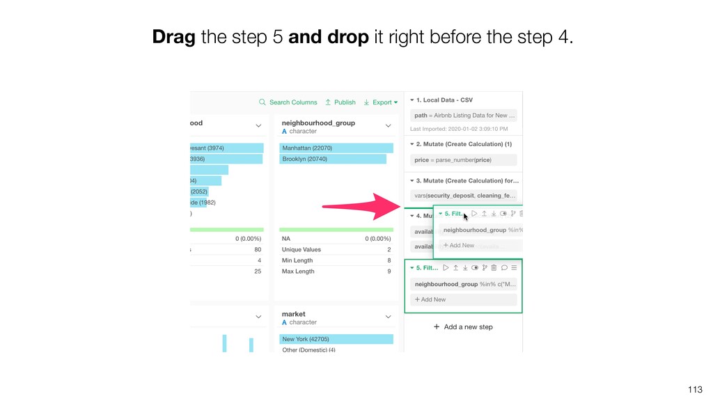
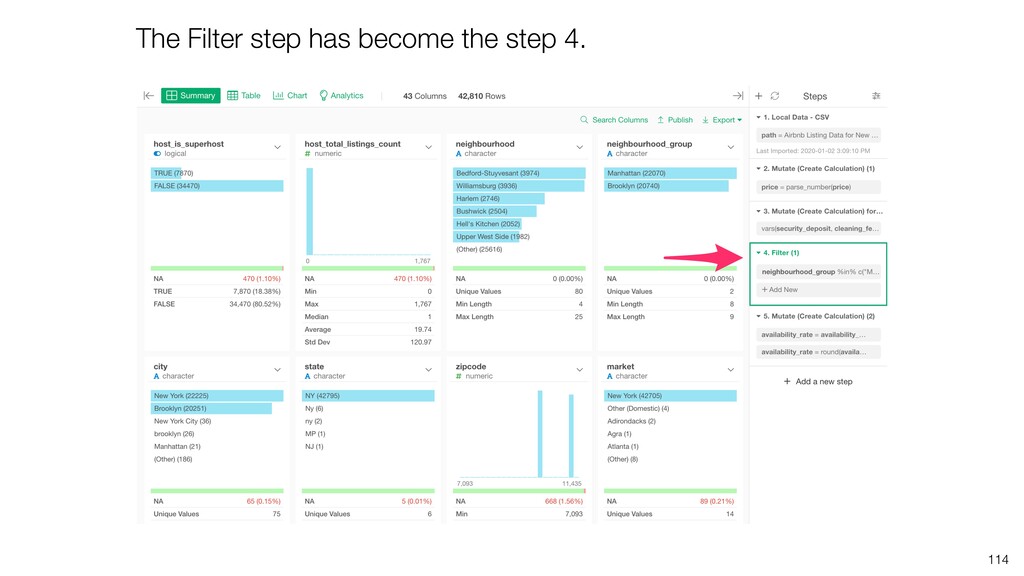
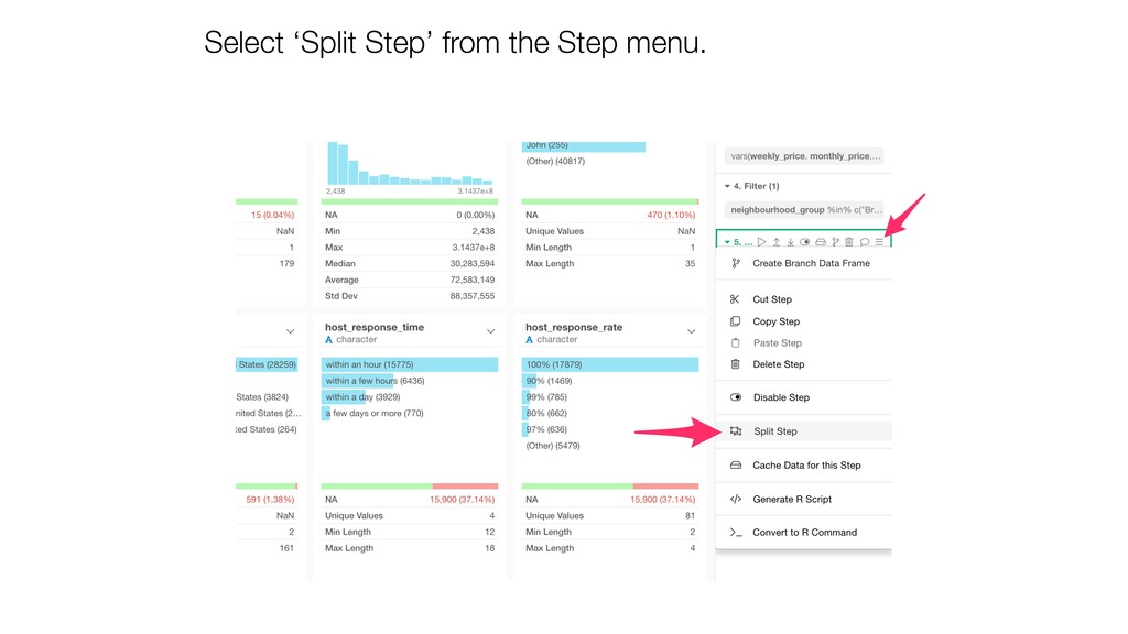
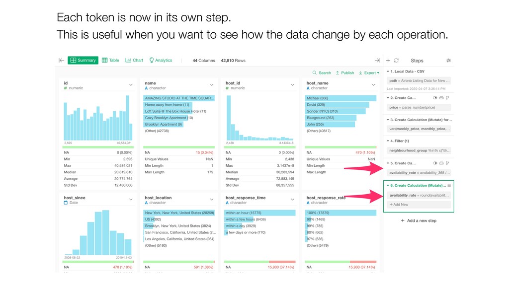
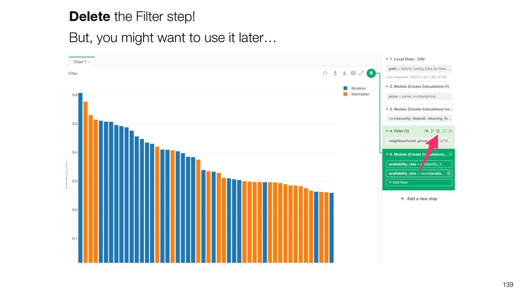
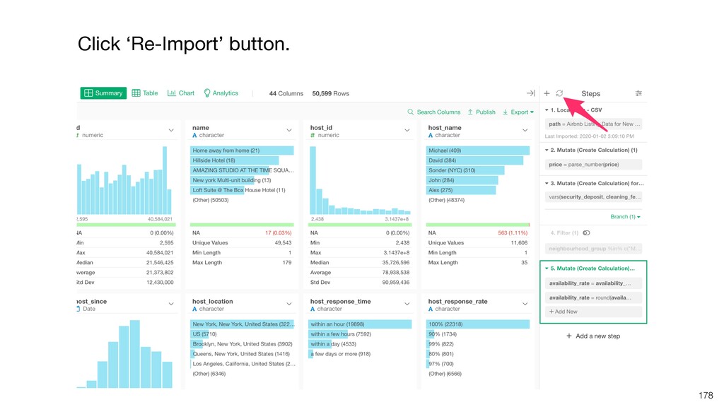
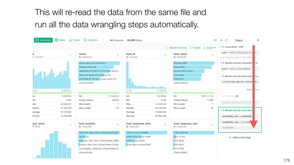
- How to Use the Step
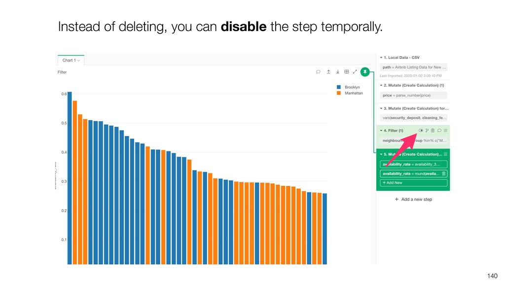
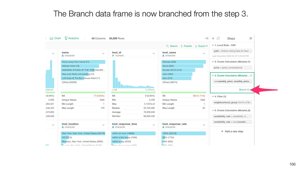
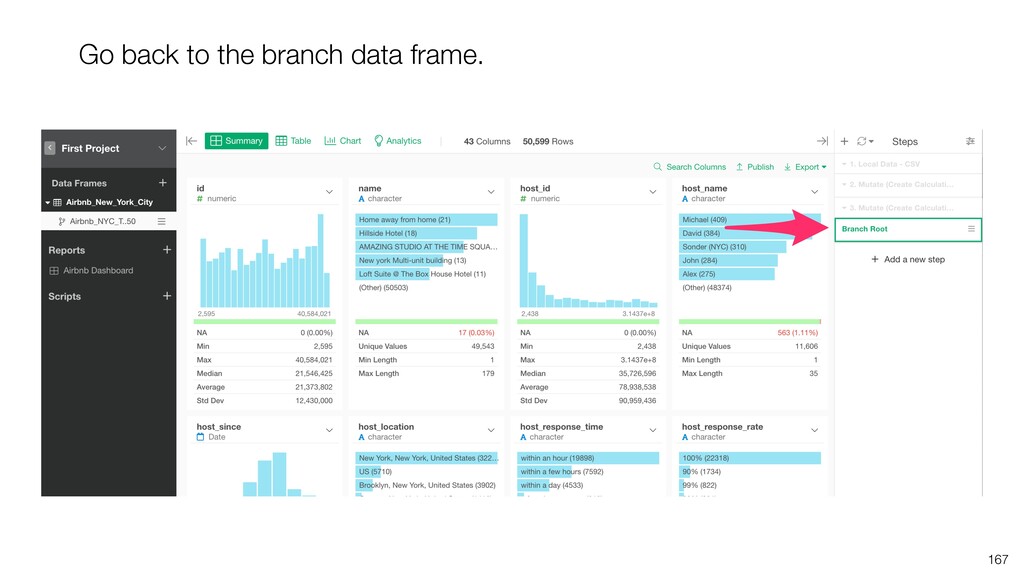
- Branch Data Frame
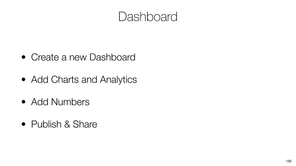
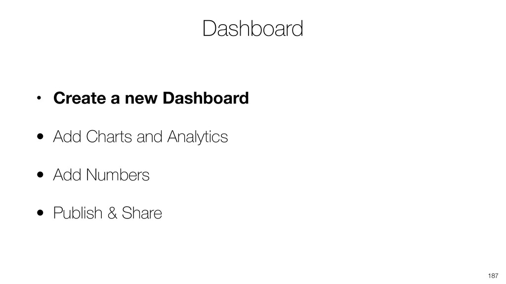
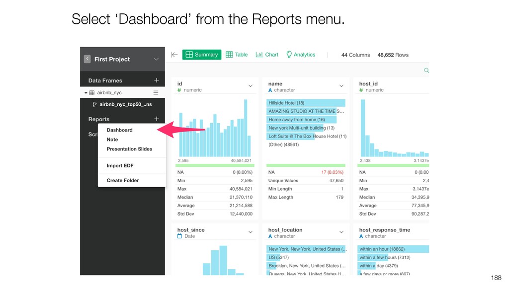
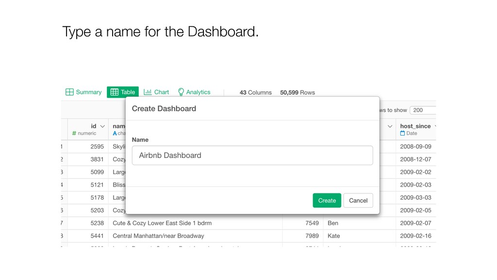
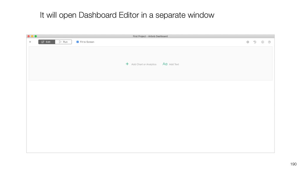
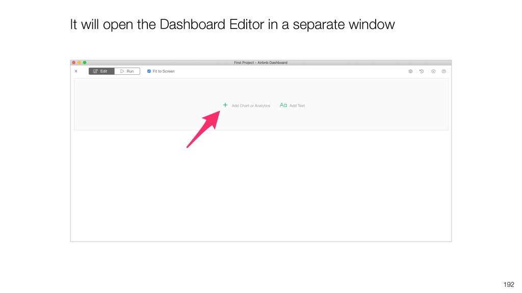
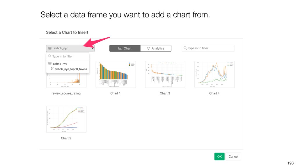
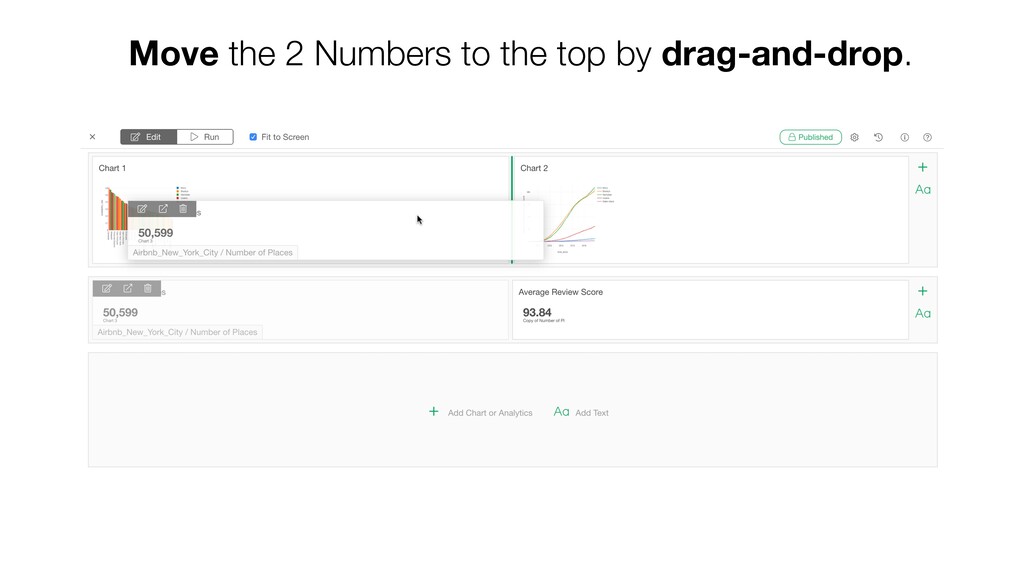
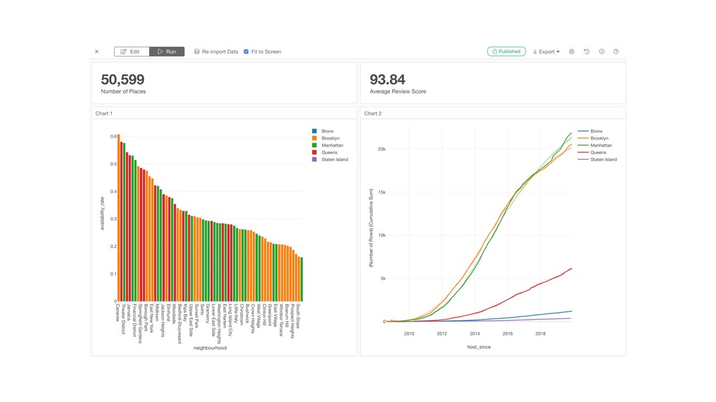
- Creating Dashboard and Note
I have collected the features that are useful and would make your data analysis work much more efficient and productive.
![Information Email [email protected] Website https://exploratory.io Twitter @KanAugust Training https://exploratory.io/training](https://files.speakerdeck.com/presentations/d00dca21796d4fa8b39ca32e15db968f/slide_228.jpg)