Lock in $30 Savings on PRO—Offer Ends Soon! ⏳

Styled Components for React - Style Your Websit...

Styled Components for React - Style Your Websites and Web Applications Without Stress

Avatar for Efereyan Karen Simisola

Efereyan Karen Simisola

March 04, 2021
Tweet

More Decks by Efereyan Karen Simisola

Other Decks in Programming

Transcript

  1. BY KAREN SIMISOLA EFEREYAN STYLED COMPONENTS FOR REACT - STYLE

    YOUR WEBSITES AND WEB APPLICATIONS WITHOUT STRESS
  2. Even then.. We couldn’t use css in javascript because we

    were always told to separate concerns.
  3. Why? Because React Components Were Written in Javascript And React

    Components Should Be Self Sufficient Amd Reusable
  4. UNIQUE CLASSNAMES Get rid of unnecessary divs that cause unnecessary

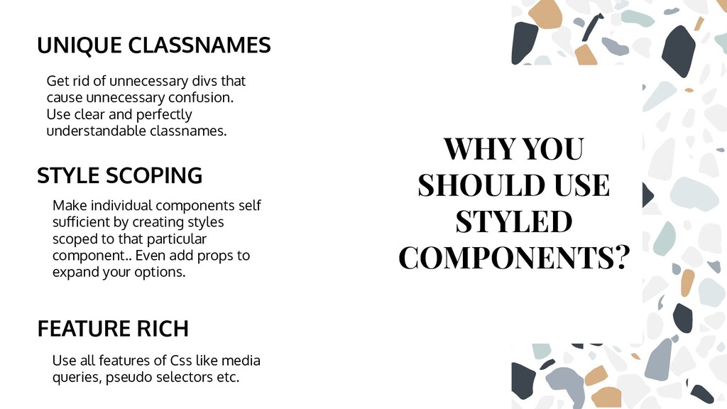
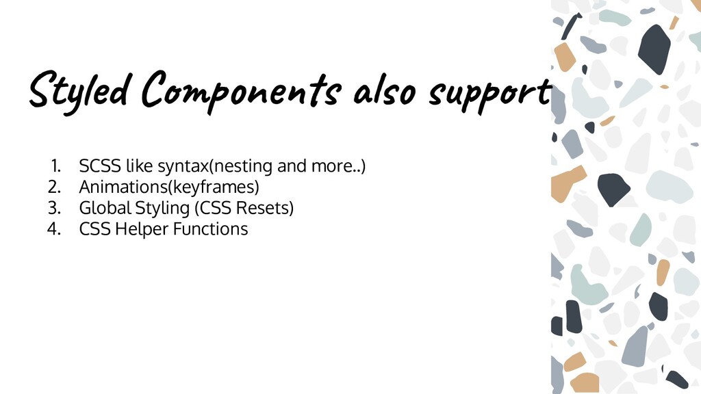
    confusion. Use clear and perfectly understandable classnames. Make individual components self sufficient by creating styles scoped to that particular component.. Even add props to expand your options. FEATURE RICH Use all features of Css like media queries, pseudo selectors etc. WHY YOU SHOULD USE STYLED COMPONENTS? STYLE SCOPING
  5. INSTALLATION • Npm install --save styled-components(as a development dependency) •

    Yarn add styled-components • Npm install styled-components
  6. Styled Component Syntax Import styled from ‘styled-components’ Const MyStyledButton =

    styled.button` Background:transparent; Color:hotpink; Border: 2px solid hotpink; ` Function MyComponent(){ Return <MyStyledButton>I’m a Reusable Button Component</MyStyledButton> }
  7. Import styled from ‘styled-components’ Const MyStyledButton = styled.button` Background:transparent; Color:hotpink;

    Border: 2px solid hotpink; Padding: ${props => props.size === “big” ? “10px 20px” : “5px 10px” ` Function MyComponent(){ Return ( <React.Fragment> <MyStyledButton size = “big” type = “button”>I am a big sized button</MyStyledButton> <MyStyledButton size = “medium” type = “button”>I am a medium sized button</MyStyledButton> </React.Fragment> ) }
  8. Import styled from ‘styled-components’ Const BigPaddedContained = styled.section` Width: 100%;

    Max-width:1024px; Margin:0 auto; Padding: 10px 50px; ` Const SmallPaddedContainer = styled.section ` Width: 100%; Max-width: 1024px; Margin: 0 auto; Padding: 10px 20px; `
  9. import styled from ‘styled-components’; Const BigPaddedContainer = styled.section` Width: 100%;

    Max-width:1024px; Margin:0 auto; Padding: 10px 50px; ` Const SmallPaddedContainer = styled(BigPaddedContainer)` Padding: 10px 20px; ` Function Home(){ Return ( <BigPaddedContainer> <h1>The padding around me is great</h1> </BigPaddedContainer> ) Function Contact(){ Return ( <SmallPaddedContainer><h1>The paddng around me is smaller</h1></SmallPaddedContainer>) }
  10. Use the ‘AS’ polymorphic prop to update the end element

    that is dynamically styled using the ‘styled’ utility function styled components provides.
  11. Function Contact(){ Return ( <SmallPaddedContainer as = “div”> <h1>I am

    in a div element with a smaller padding as opposed to the component from which I was cloned which is a section with a larger padding</h1> </SmallPaddedContainer> ) }
  12. Function Contact(){ Return ( <SmallPaddedContainer as = {BigPaddedContainer}> <h1>This small

    padded container is also of the end type of BigPaddedContainer which is a section element</h1> </SmallPaddedContainer> ) }
  13. Styled Components also support 1. SCSS like syntax(nesting and more..)

    2. Animations(keyframes) 3. Global Styling (CSS Resets) 4. CSS Helper Functions
  14. Further Reading ❖ Styled Components Documentation ❖ How to Use

    Styled Components in React ❖ Styled Components: Enforcing Best Practices in Component Based Systems