there are people from the future or another planet, they're all wearing the same outfit. Somehow they all decided, 'All right, that's enough. From now on, this is going to be our outfit: one-piece sil ver jumpsuit with a V-stripe on the chest and boots. That's it. We're going to start visiting other planets and we w ant to look like a team.'" - Jerry Seinfeld
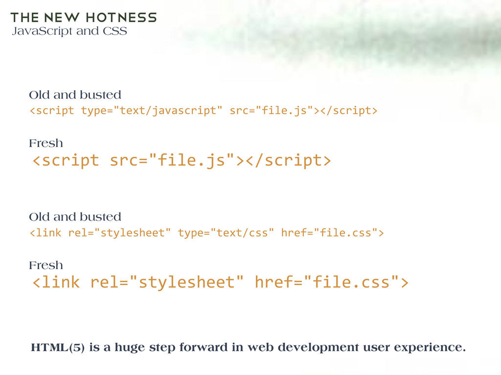
src="file.js"></script> Old and busted Fresh HTML(5) is a huge step forward in web development user experience. <link rel="stylesheet" type="text/css" href="file.css"> <link rel="stylesheet" href="file.css"> Old and busted Fresh
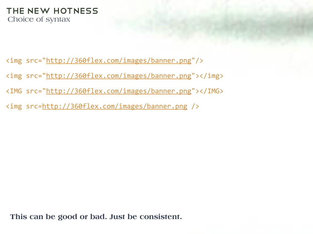
or bad. Just be consistent. <img src="http://360flex.com/images/banner.png"/> <img src="http://360flex.com/images/banner.png"></img> <IMG src="http://360flex.com/images/banner.png"></IMG> <img src=http://360flex.com/images/banner.png />
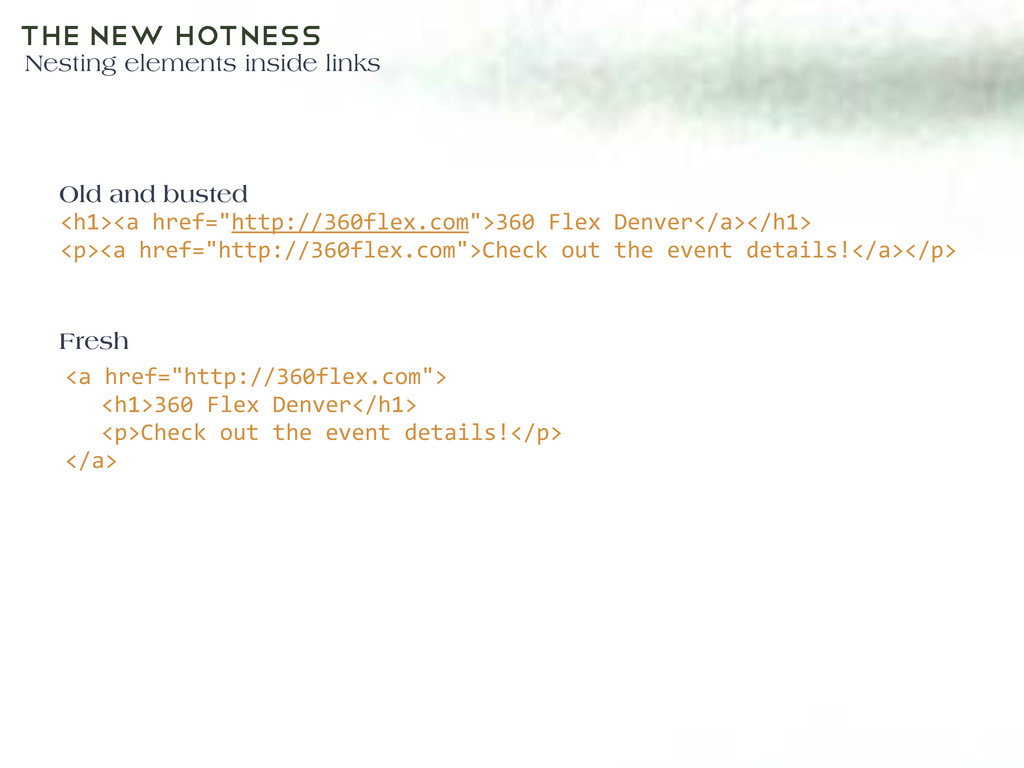
Denver</a></h1> <p><a href="http://360flex.com">Check out the event details!</a></p> <a href="http://360flex.com"> <h1>360 Flex Denver</h1> <p>Check out the event details!</p> </a> Old and busted Fresh
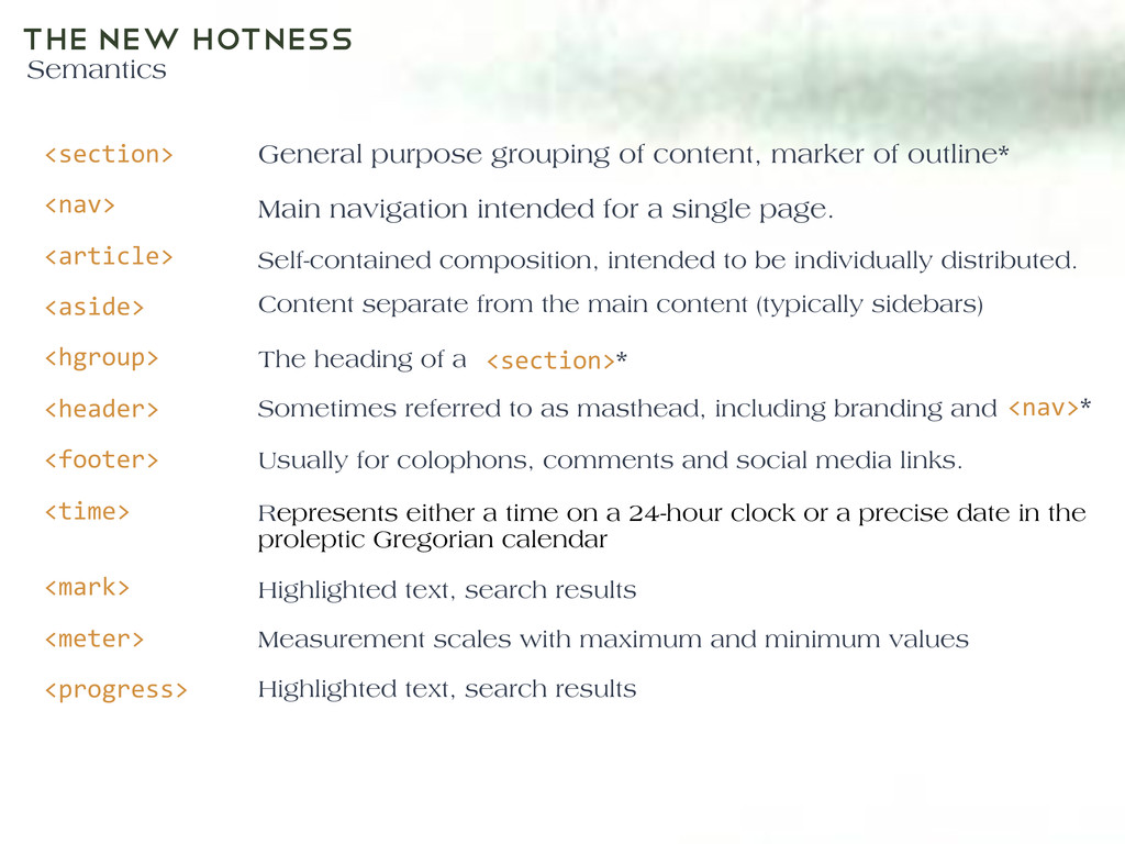
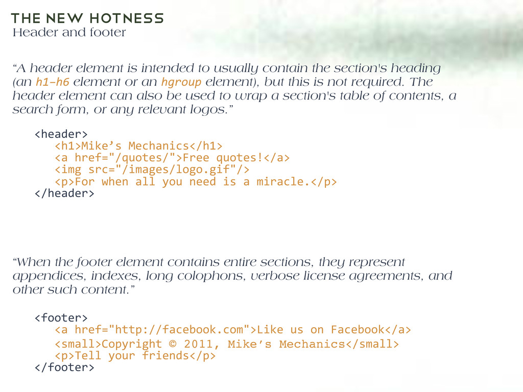
<footer> <time> <mark> <meter> <progress> General purpose grouping of content, marker of outline* Main navigation intended for a single page. Self-contained composition, intended to be individually distributed. Content separate from the main content (typically sidebars) The heading of a Text <section>* <nav>* Sometimes referred to as masthead, including branding and Usually for colophons, comments and social media links. Represents either a time on a 24-hour clock or a precise date in the proleptic Gregorian calendar Highlighted text, search results Measurement scales with maximum and minimum values Highlighted text, search results
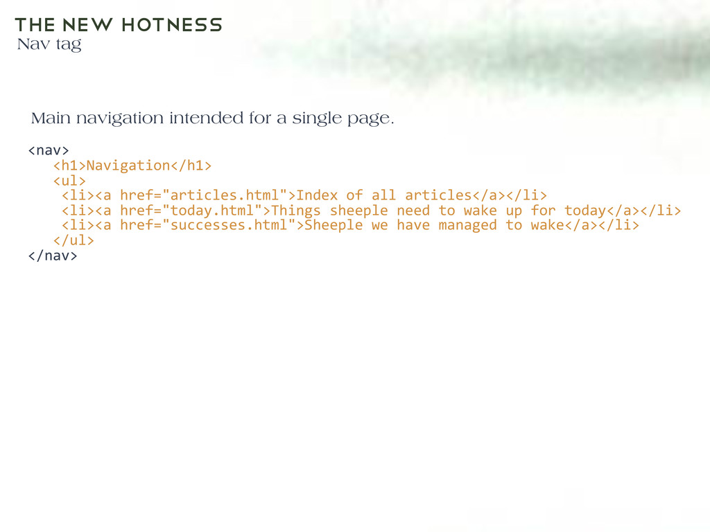
<ul> <li><a href="articles.html">Index of all articles</a></li> <li><a href="today.html">Things sheeple need to wake up for today</a></li> <li><a href="successes.html">Sheeple we have managed to wake</a></li> </ul> </nav> Main navigation intended for a single page.
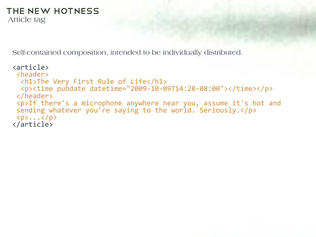
Very First Rule of Life</h1> <p><time pubdate datetime="2009-‐10-‐09T14:28-‐08:00"></time></p> </header> <p>If there's a microphone anywhere near you, assume it's hot and sending whatever you're saying to the world. Seriously.</p> <p>...</p> </article> Self-contained composition, intended to be individually distributed.
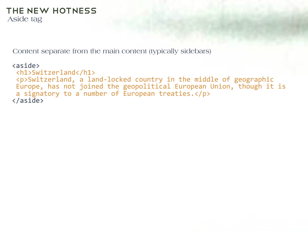
land-‐locked country in the middle of geographic Europe, has not joined the geopolitical European Union, though it is a signatory to a number of European treaties.</p> </aside> Content separate from the main content (typically sidebars)
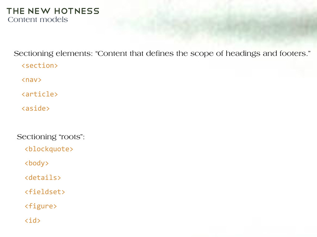
de nes the scope of headings and footers.” Sectioning “roots”: <section> <nav> <article> <aside> <blockquote> <body> <details> <fieldset> <figure> <id>
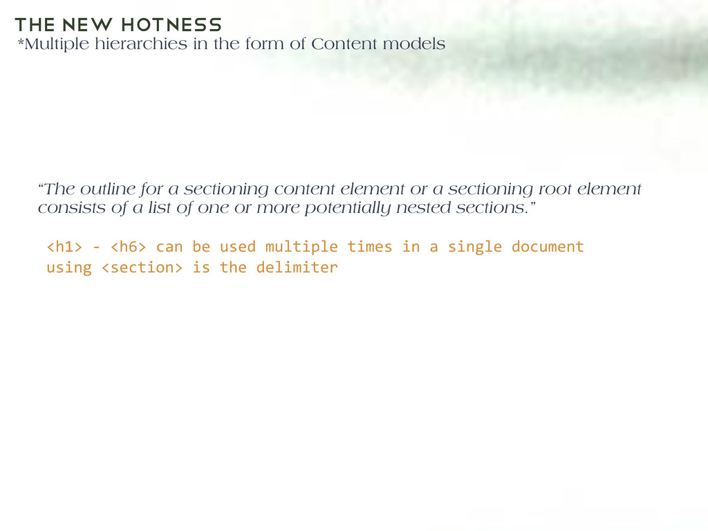
models Text <h1> -‐ <h6> can be used multiple times in a single document using <section> is the delimiter “The outline for a sectioning content element or a sectioning root element consists of a list of one or more potentially nested sections.”
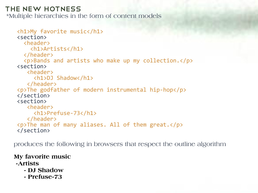
models Text produces the following in browsers that respect the outline algorithm <h1>My favorite music</h1> <section> <header> <h1>Artists</h1> </header> <p>Bands and artists who make up my collection.</p> <section> <header> <h1>DJ Shadow</h1> </header> <p>The godfather of modern instrumental hip-‐hop</p> </section> <section> <header> <h1>Prefuse-‐73</h1> </header> <p>The man of many aliases. All of them great.</p> </section> My favorite music -Artists - DJ Shadow - Prefuse-73
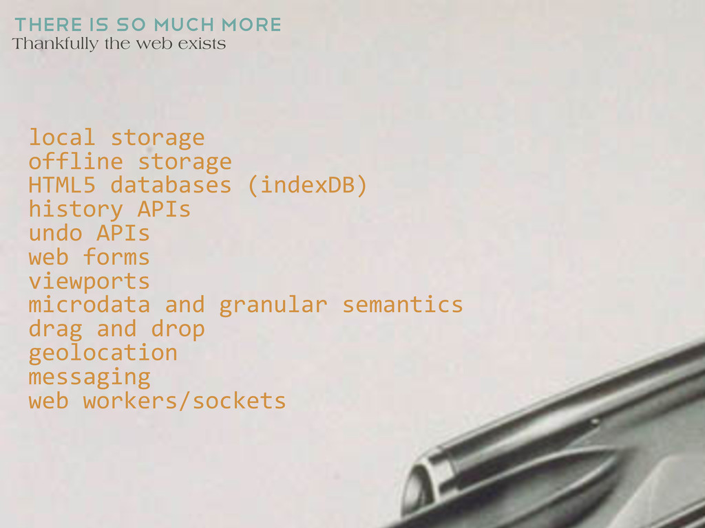
storage offline storage HTML5 databases (indexDB) history APIs undo APIs web forms viewports microdata and granular semantics drag and drop geolocation messaging web workers/sockets
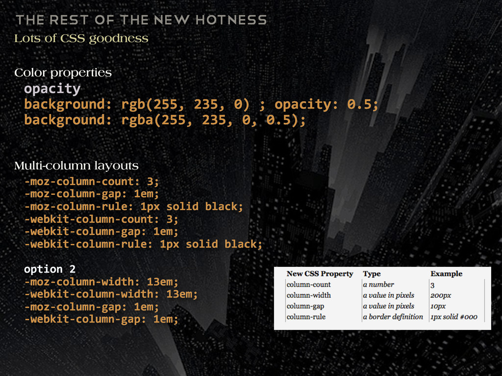
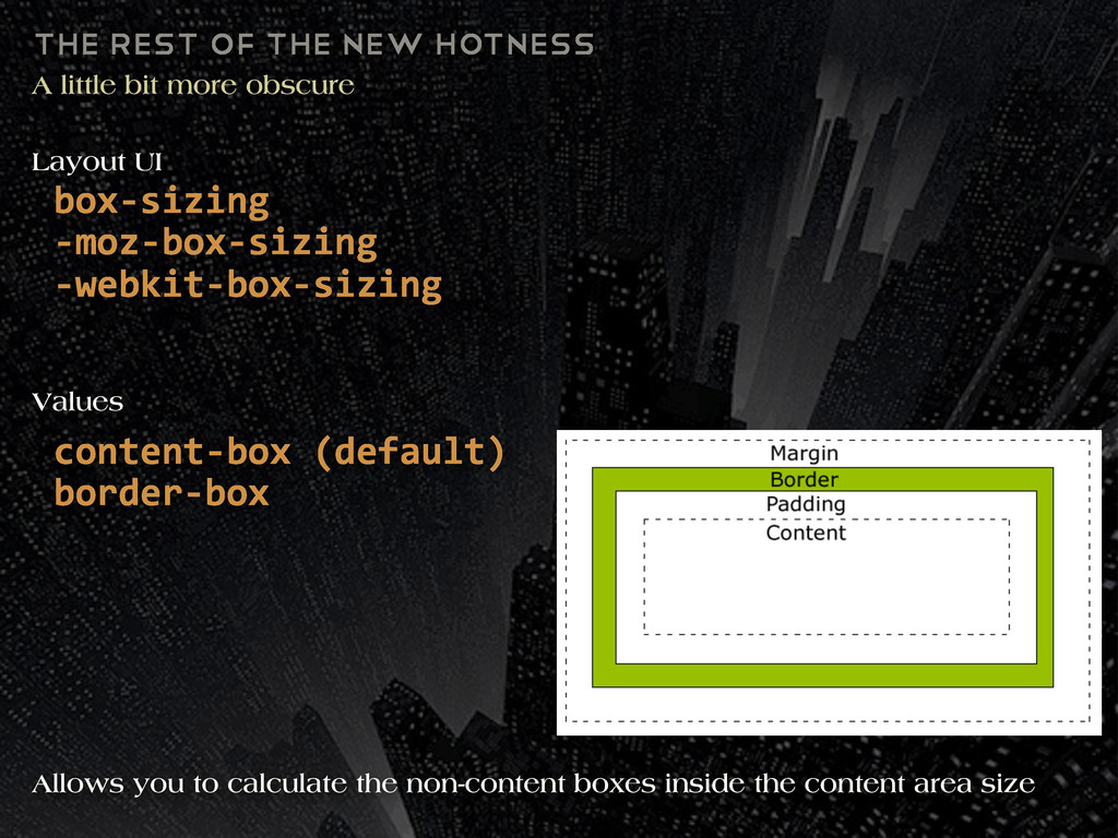
obscure box-‐sizing -‐moz-‐box-‐sizing -‐webkit-‐box-‐sizing Layout UI content-‐box (default) border-‐box Allows you to calculate the non-content boxes inside the content area size Values
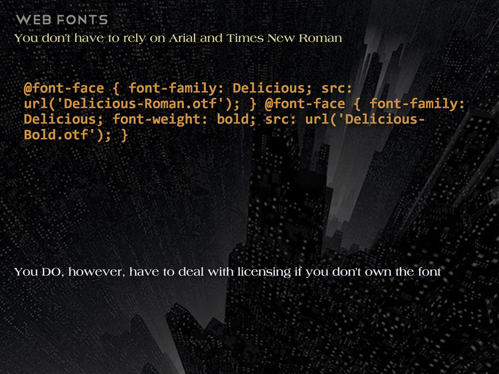
Times New Roman @font-‐face { font-‐family: Delicious; src: url('Delicious-‐Roman.otf'); } @font-‐face { font-‐family: Delicious; font-‐weight: bold; src: url('Delicious-‐ Bold.otf'); } You DO, however, have to deal with licensing if you don’t own the font
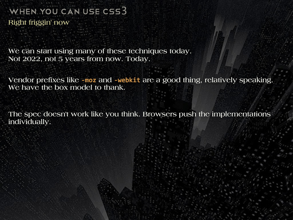
start using many of these techniques today. Not 2022, not 5 years from now. Today. Vendor pre xes like -‐moz and -‐webkit are a good thing, relatively speaking. We have the box model to thank. The spec doesn’t work like you think. Browsers push the implementations individually.
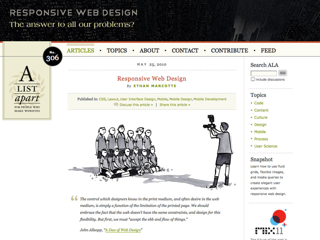
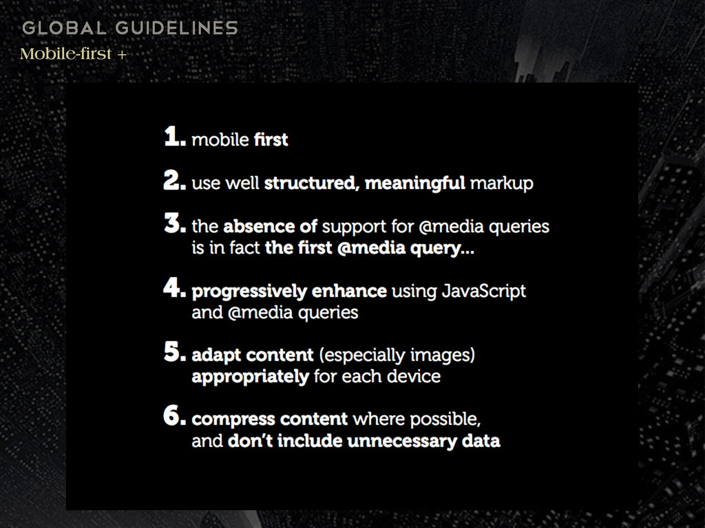
Media queries were not introduced in CSS3 Ethan Marcotte (@beep) is credited as popularizing this technique of dealing with varying screen sizes. /* Smartphones (portrait and landscape) -‐-‐-‐-‐-‐-‐-‐-‐-‐-‐-‐ */ @media only screen and (min-‐device-‐width : 320px) and (max-‐device-‐width : 480px) { /* Styles */ } /* Smartphones (landscape) -‐-‐-‐-‐-‐-‐-‐-‐-‐-‐-‐ */ @media only screen and (min-‐width : 321px) { /* Styles */ } /* Smartphones (portrait) -‐-‐-‐-‐-‐-‐-‐-‐-‐-‐-‐ */ @media only screen and (max-‐width : 320px) { /* Styles */
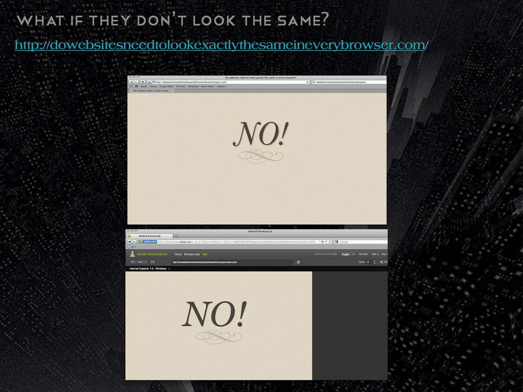
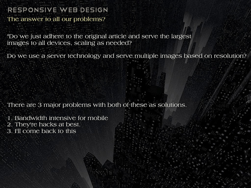
we just adhere to the original article and serve the largest images to all devices, scaling as needed? Do we use a server technology and serve multiple images based on resolution? There are 3 major problems with both of these as solutions. 1. Bandwidth intensive for mobile 2. They're hacks at best. 3. I'll come back to this
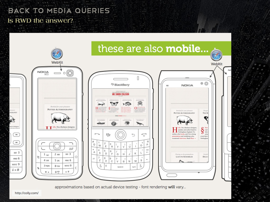
are 2 sides: those who believe there should be separate sites and domains for each context and the RWD "one web" group who believe there is no such thing as "mobile web" anymore.
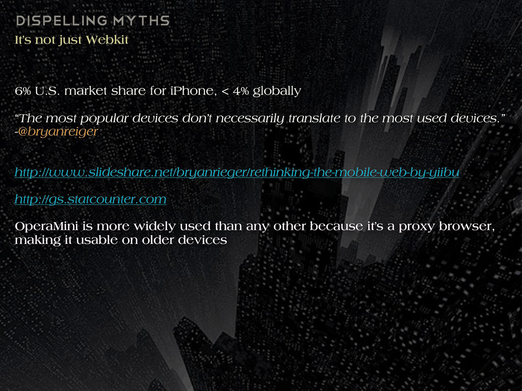
for iPhone, < 4% globally “The most popular devices don’t necessarily translate to the most used devices.” -@bryanreiger http://www.slideshare.net/bryanrieger/rethinking-the-mobile-web-by-yiibu http://gs.statcounter.com OperaMini is more widely used than any other because it’s a proxy browser, making it usable on older devices
for iPhone, < 4% globally “The most popular devices don’t necessarily translate to the most used devices.” -@bryanreiger http://www.slideshare.net/bryanrieger/rethinking-the-mobile-web-by-yiibu http://gs.statcounter.com OperaMini is more widely used than any other because it’s a proxy browser, making it usable on older devices
what they were meant to do. Keep things performant, limit HTTP requests. Check your analytics, do user research. By this new frontier of web design, web language professionals can push the limits of creativity and work with browser vendors in tandem, helping the new era of web design evolve.
 kevinsuttle
.jpg) rwang05
rwang05
 keroyama
 saki822
 lynteo
 sony
sony
 mottox2
 kenichiota0711
 securecat
 baasie
 keita_yoshikawa
 seto
seto
 nttcom
 oripsolob
 brad_frost
 gurzu
gurzu
 portentint
 sarafernandez
 orderedlist
 aleyda
 bethany
 cassininazir
 morganepeng
 axbom
axbom
![HTML5shim a.k.a “HTML5shiv” <!-‐-‐[if lt IE 9]> <script src="http://html5shim.googlecode.com/ svn/trunk/html5.js"></script>](https://files.speakerdeck.com/presentations/c70362b0277a01307429123138195085/slide_36.jpg)
![attribute Selectors Lookout regex and jQuery p[title*="bout"] {background: blue;} <p](https://files.speakerdeck.com/presentations/c70362b0277a01307429123138195085/slide_50.jpg)