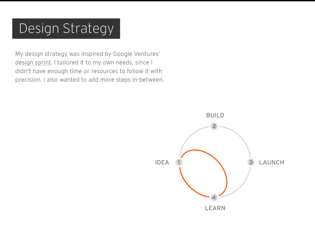
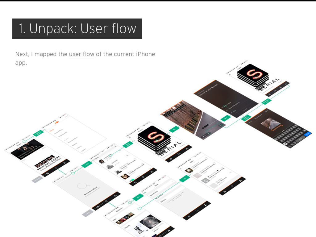
My design strategy was inspired by Google Ventures’ design sprint. I tailored it to my own needs, since I didn't have enough time or resources to follow it with precision. I also wanted to add more steps in-between.
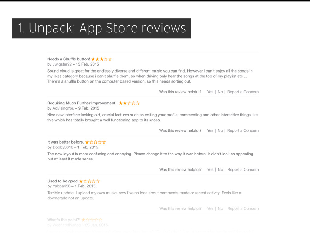
know. In fact, I knew very little, and that made it hard to come up with an informed design decision. I had no access to any internal data whatsoever, so I checked what the Internet had to say about the existing SoundCloud app. I surfed TNW, The Verge, FastCompany, Wired and WSJ for thoughts on general reception, as well as the App Store to collect insights from users.
be able to browse my detailed listening stats on the move from an app.” “As nice as the new SoundCloud looks, it's missing several features that today's users have come to expect. The new app has no comments or buttons for seeing who has liked or reposted a song, and no feed of who has recently followed you. There's not even a Repeat button if you want to hear your new jam over and over.” “But while the recording feature may be dead, other missing features will find their way back into SoundCloud's iPhone app once its designers find the most elegant way to include them. Playlist creation, comments, and offline caching are reportedly toward the top of that list.”
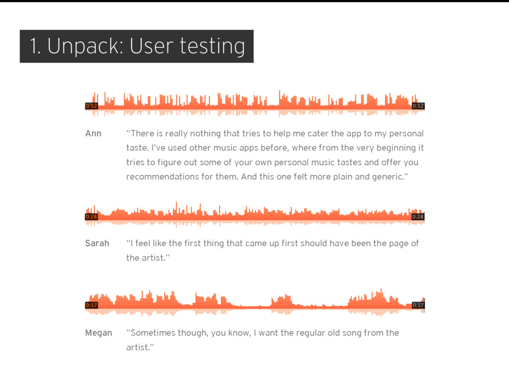
to help me cater the app to my personal taste. I’ve used other music apps before, where from the very beginning it tries to figure out some of your own personal music tastes and offer you recommendations for them. And this one felt more plain and generic.” Ann “I feel like the first thing that came up first should have been the page of the artist.” Sarah “Sometimes though, you know, I want the regular old song from the artist.” Megan
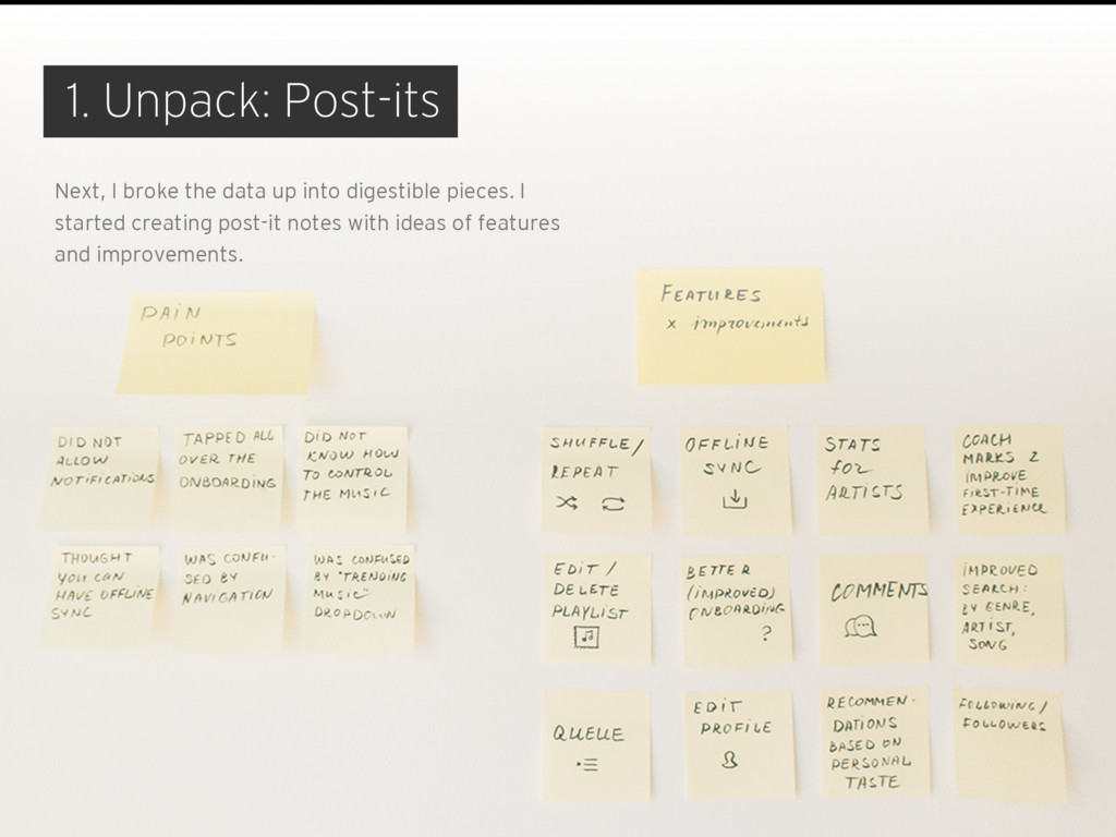
for the listener’s utmost enjoyment. With its beautiful player, it’s supposed to provide a seamless listening experience. Unfortunately, it doesn’t work for everyone. There is no way to queue sounds. There is no offline mode. And although playlists found their way back to the app, there is no option to edit or delete them. Lastly, I feel like the app doesn’t give me a personalised experience. 1. Unpack: Processing
But I realised it wouldn’t work without re-architecting a whole bunch of screens. Luckily, I had a plan B. The feedback Ann (one of the testers) gave, resonated with me most. So I decided to go with making the app less generic by adding recommendations to the user onboarding flow. 3. Decide
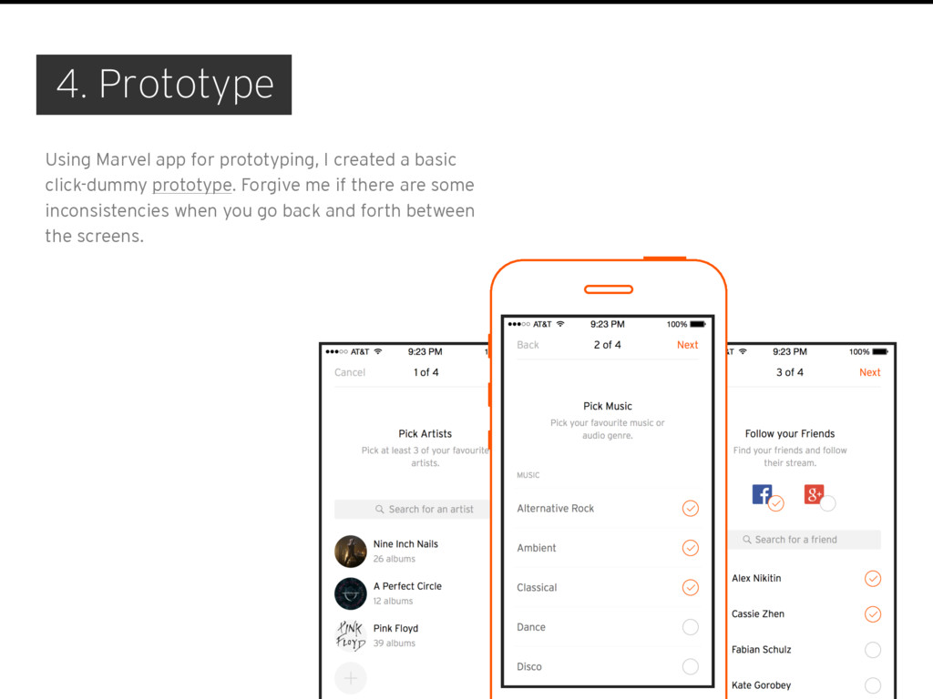
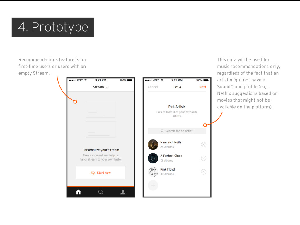
empty Stream. This data will be used for music recommendations only, regardless of the fact that an artist might not have a SoundCloud profile (e.g. Netflix suggestions based on movies that might not be available on the platform). 4. Prototype
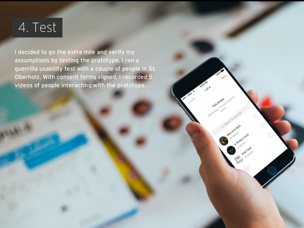
verify my assumptions by testing the prototype. I ran a guerrilla usability test with a couple of people in St. Oberholz. With consent forms signed, I recorded 5 videos of people interacting with the prototype.
new sounds and artists can easily share them with listeners. But the app is no longer a place to upload audio files — it’s all about listening. As pretty as it is, it’s missing some of the features users need. I am pretty sure you’re working on these improvements already. In the meantime, I tried to enhance a listening experience by making a music stream more personalised. I believe it can make the app more engaging and thus fit within the goals of the company’s business strategy. Clearly, this is a first take on the idea, and next steps would be to iterate on prototype, test, and repeat. Final thoughts
![I’d love to hear from you! [email protected] killnicole.github.io twitter.com/killnicole linkedin.com/in/victorianikitina](https://files.speakerdeck.com/presentations/85c139d478404a1790b8fb398177ba4b/slide_17.jpg)