Upgrade to Pro — share decks privately, control downloads, hide ads and more …

Audience Access to Film Festivals

Audience Access to Film Festivals

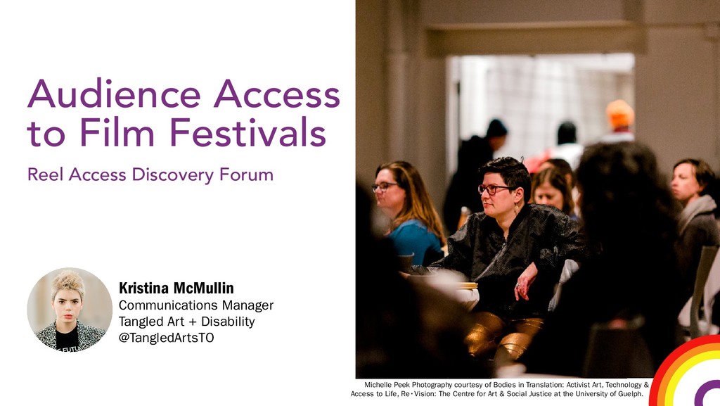
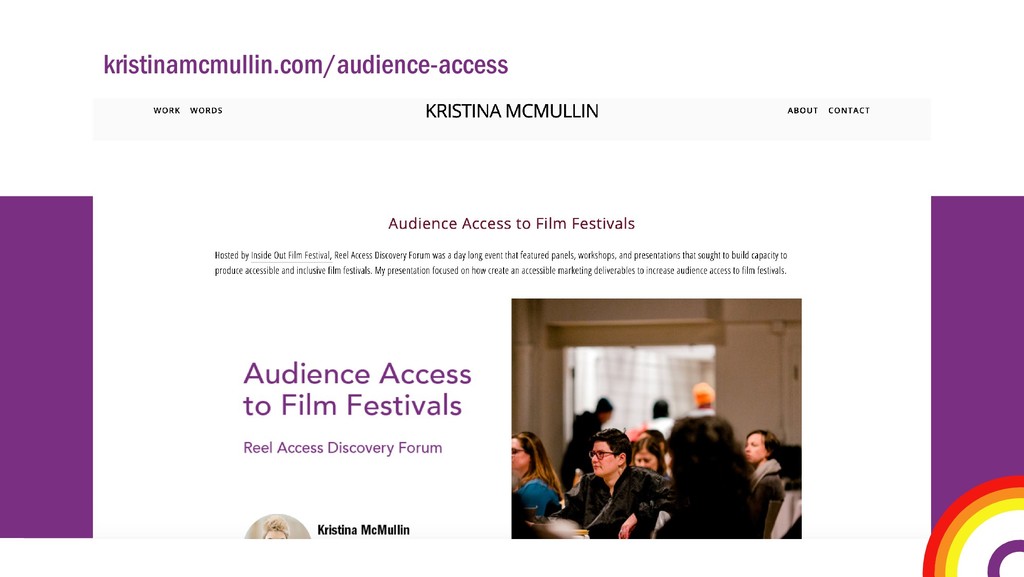
Hosted by Inside Out Film Festival, Reel Access Discovery Forum was a day long event that featured panels, workshops, and presentations that sought to build capacity to produce accessible and inclusive film festivals.
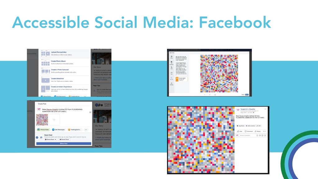
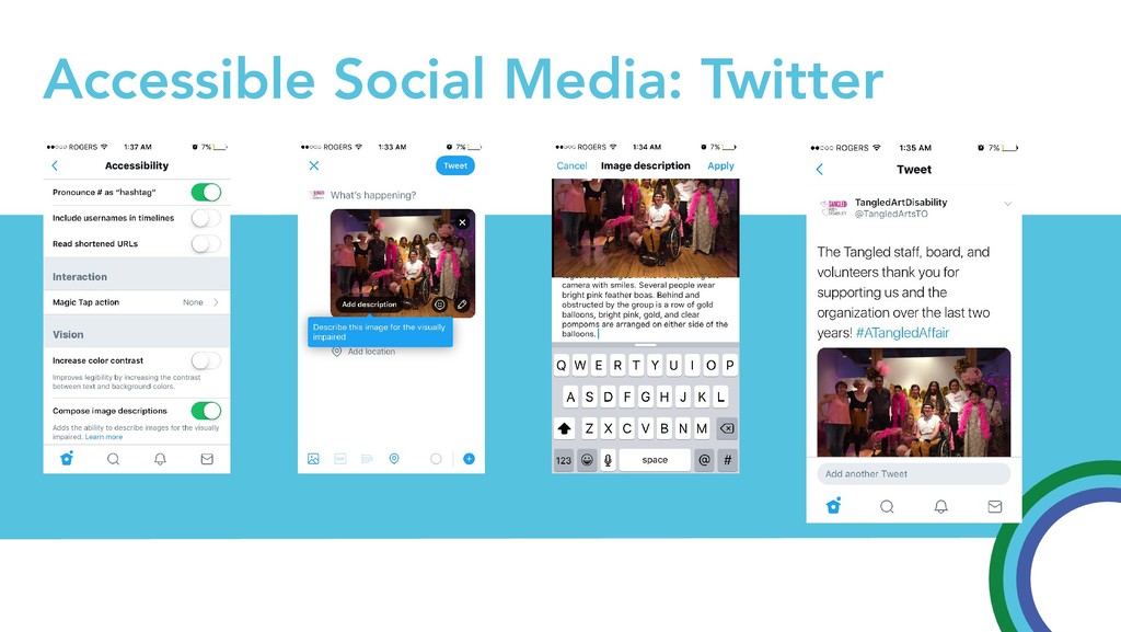
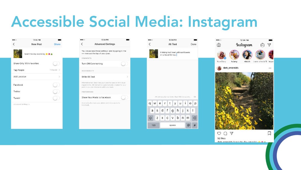
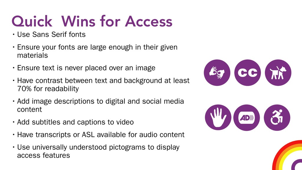
This presentation focused on how create an accessible marketing deliverables to increase audience access to film festivals.

Kristina McMullin

May 23, 2019
Tweet

More Decks by Kristina McMullin

Other Decks in Education

Transcript

  1. Audience Access to Film Festivals Reel Access Discovery Forum Kristina

    McMullin Communications Manager Tangled Art + Disability @TangledArtsTO Michelle Peek Photography courtesy of Bodies in Translation: Activist Art, Technology & Access to Life, Re•Vision: The Centre for Art & Social Justice at the University of Guelph.
  2. COMING UP ... PART 1 Accessible Language PART 2 Accessible

    Design PART 3 Accessible Outreach PART 4 Quick Wins for Access
  3. Plain Language • Logical organization with the reader in mind

    • “You” and other pronouns • Active voice • Short sentences • Common, everyday words • Easy-to-read No one technique defines plain language. Rather, plain language is defined by results— it is easy to read, understand, and use.
  4. Accessible/Non-Ableist Language • Deaf/ Hard of Hearing NOT Hearing Impaired

    • Wheelchair user NOT Wheelchair bound • Blind/ Low Vision NOT Visually Impaired * • Disabled or Disability Identified NOT Handicapped • Has …. NOT is a victim of or suffers from …. Ableist language is ever evolving, and led by the community, if you aren’t sure what words to use, it’s best to ask a member or members of that community.
  5. Accessible Typographic Elements CHARACTER HEIGHT Distance Height X 2.5 While

    14pt font is appropriate for printed material, size needs to increase depedent on how far the viewer is from the text. A calculation to use is distance of viewer divided by 2.5 as the hieght in inches on the text. A 8" 19' A 4" 10' A 2" 5' A 1" 2'6" CHARACTER HEIGHT GUIDE
  6. Accessible Graphic Elements • Can be used to add visual

    weight for more important information • Can be used to divide information into sections • Should not be used ‘just because’ as not to detract from information • Used to provide additional information • Background of fonts should be consistent for overlaid text
  7. PROPER DESCRIPTIONS: Ex #1: A square image filled with pixelated

    colours ranging in colour. The colours are randomly placed, making each stand out. The colours of the pixels are approximately half reds, pinks, oranges, and yellows and about half shades of blue and grey ranging in shades from dark blue and moving into an almost white. IMPROPER DESCRIPTIONS: Ex #1: A colourful image made up of multiple squares. The first square is light blue, then light grey, then a salmon, then a light grey, then a medium grey, then a dark grey, then a bright light blue, then a midtone grey blue, then a medium grey, then a light grey, then a bright pink, then a bright red, then a white, then a mid tone blue, then a dark blue... Ex #2 IMG_4064.JPG Ex #2 A multicoloured image made up of colourful squre pixels.
  8. TARGETED OUTREACH: Reaching your existing community Already engage with your

    organization or events Don’t need to be educated on organization but informed on upcoming events Want updates on access policies and event locations, if applicable TARGETED OUTREACH:
  9. UNTARGETED OUTREACH: Potentially reaching communities that are not currently engaging

    with your organization Need to be educated on what your organization does as well as about upcoming events Need information on access policies, event locations to be comfortable attending an event for the first time May need an incentive or specific reasons to get involved
  10. TARGETED OUTREACH: UNTARGETED OUTREACH: Website Newsletter Invites Facebook Twitter Instagram

    Advertising Event Postings Facebook Website Twitter Instagram
  11. Quick Wins for Access • Use Sans Serif fonts •

    Ensure your fonts are large enough in their given materials • Ensure text is never placed over an image • Have contrast between text and background at least 70% for readability • Add image descriptions to digital and social media content • Add subtitles and captions to video • Have transcripts or ASL available for audio content • Use universally understood pictograms to display access features