Repo: https://github.com/ksivamuthu/ng-storybook-demo
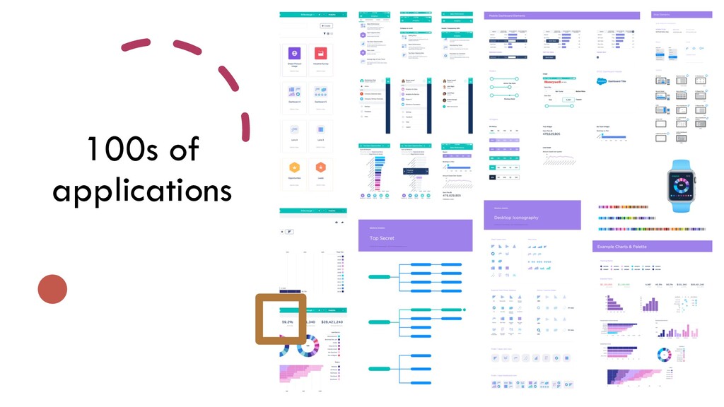
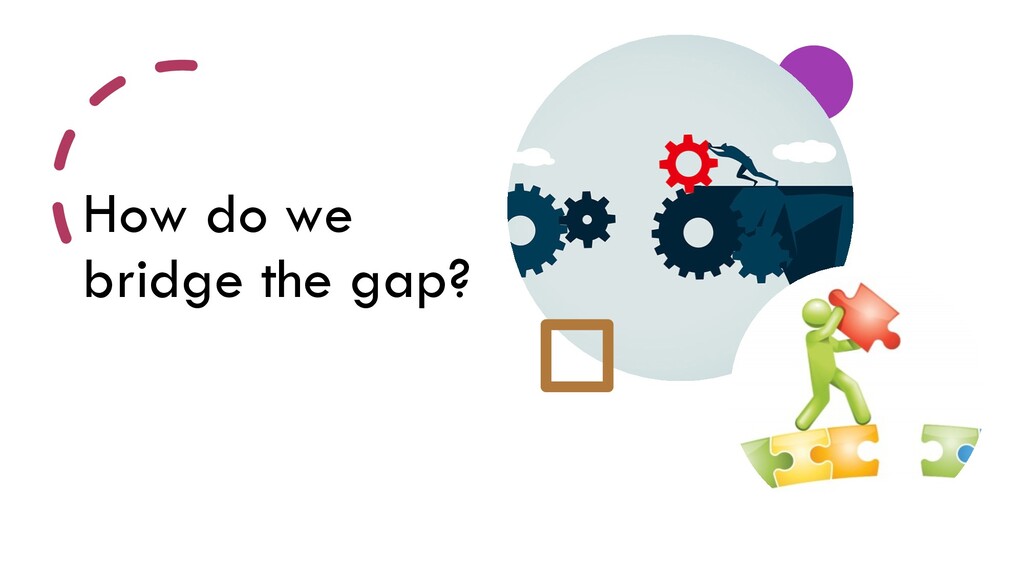
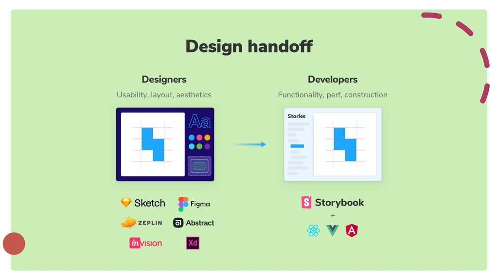
The gap between the design and the developers' world is real. Teams are solving this problem with the style guide/design system built or exported from design systems. The style guide behavior is different from the actual components developed in Angular and duplicate the efforts and becomes tough to maintain the living style guide. Creating a reusable, testable shared component development is more challenging, especially when the 100s of angular apps developed across the teams are using the shared components.
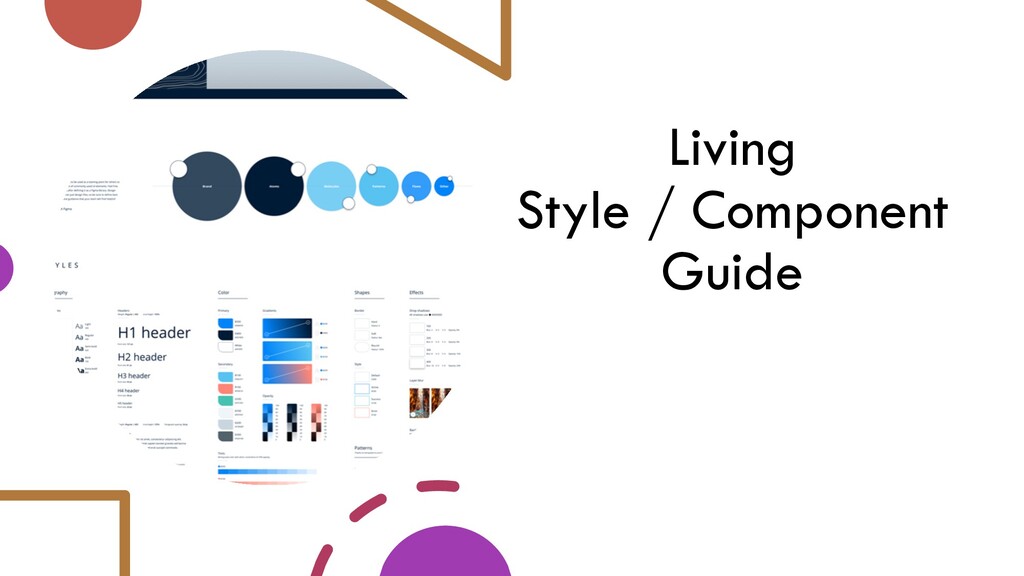
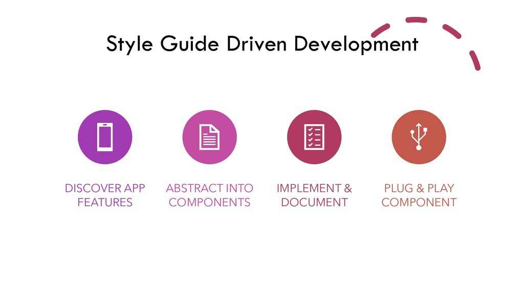
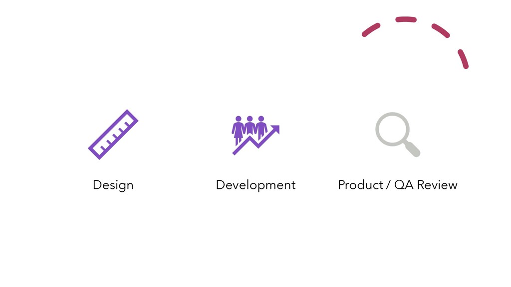
Storybook provides a sandbox to build UI components in isolation so you can develop hard-to-reach states and edge cases. In this session, let us discuss the use cases of developing components in isolation and supercharge your workflows with different storybook addons and testing the interactions of components. And also, this session explains in detail how the living style guide documentation prepared for shared angular components created and used across the enterprise teams with the demo.
 ksivamuthu
 maroon8021
 flatt_security
 taddy_919
 ry0_ka
 shift_evolve
 fossamagna
 nealle
 moznion
 sbspsy
 pokohide
 taka_aki
 mtoyoda
 tammyeverts
 addyosmani
 oripsolob
 axbom
axbom
 sugarenia
 jonoalderson
 varn
varn
 wayneb77
 twada
twada
 brad_frost
 soysaucechin
 greggifford