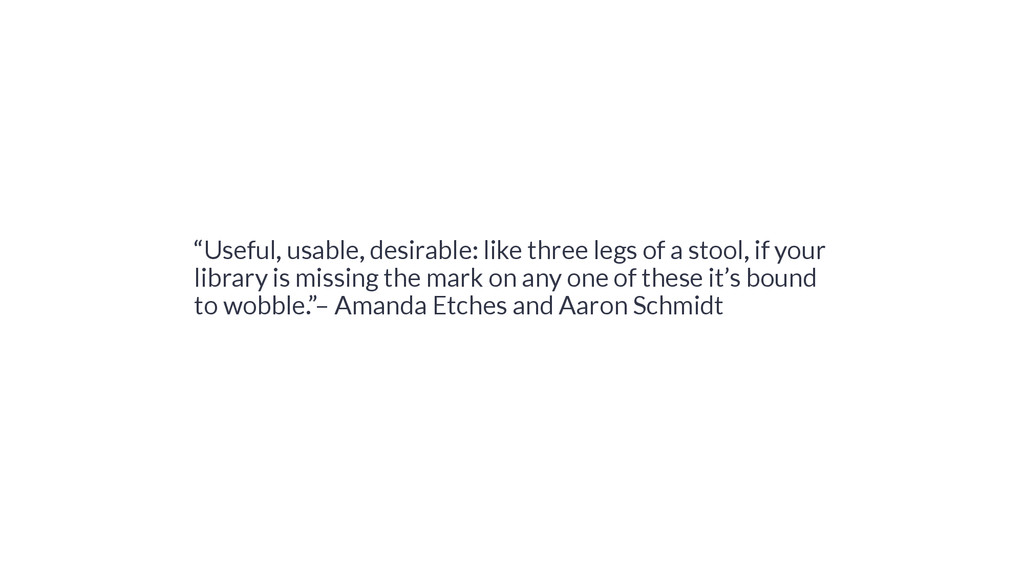
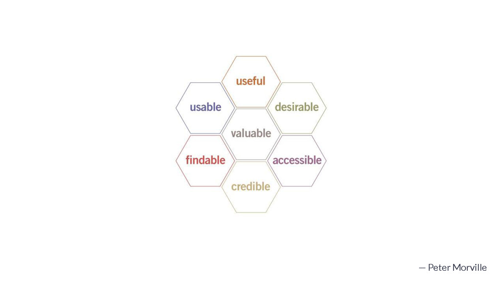
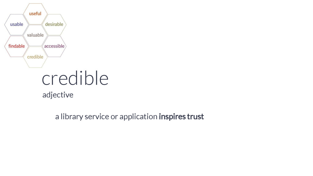
understand the need to define priorities. Is it more important for your [service] to be desirable or accessible? How about usable or credible? The truth is, it depends on your unique balance of context, content, and users, and the required tradeoffs are better made explicitly than unconsciously.” — Peter Morville
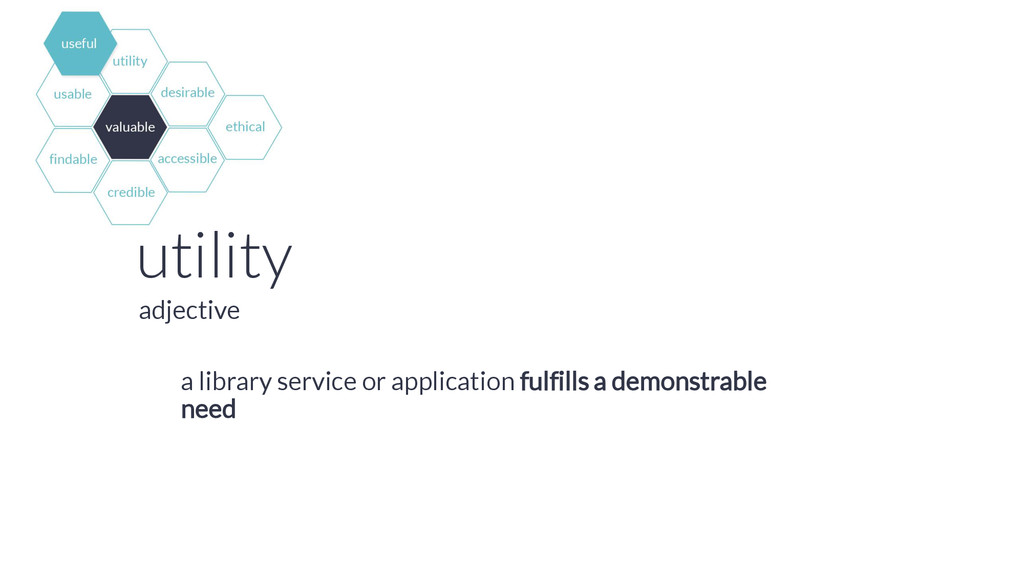
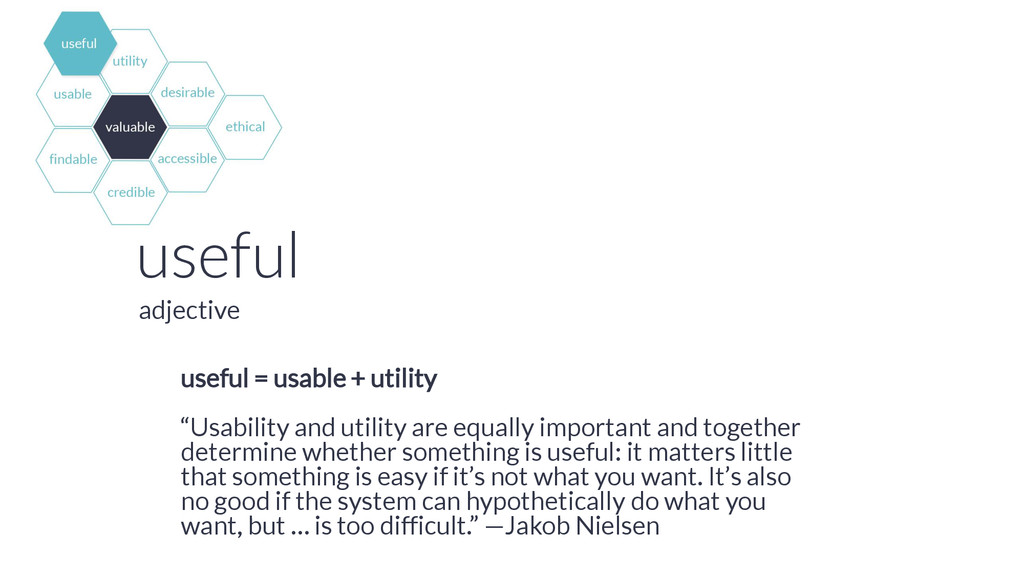
equally important and together determine whether something is useful: it matters little that something is easy if it’s not what you want. It’s also no good if the system can hypothetically do what you want, but … is too difficult.” —Jakob Nielsen adjective
we advertise our websites in the right way, or create the right sort of graphic, or make the visual design more attractive, people will begin to use our content. This is pure fantasy.” —Aaron Schmidt
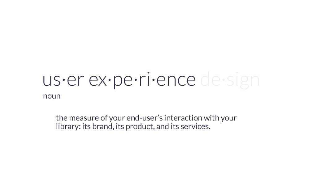
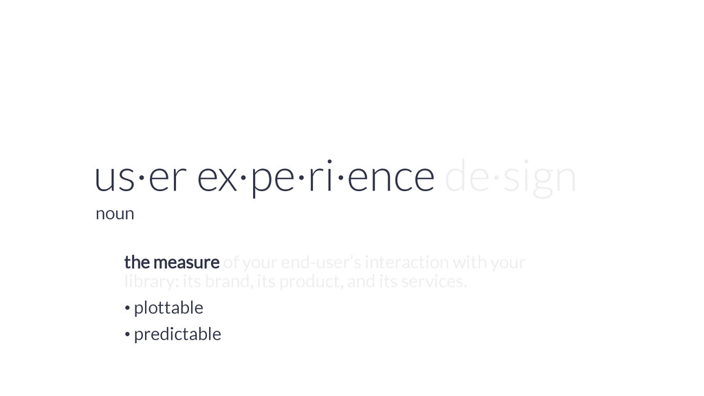
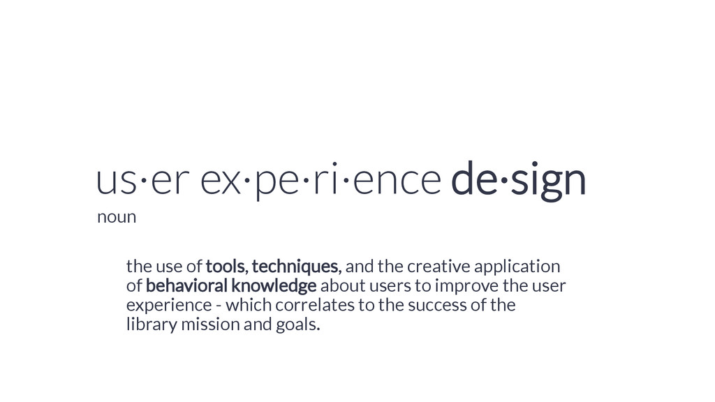
creative application of behavioral knowledge about users to improve the user experience - which correlates to the success of the library mission and goals. noun
• 6.9 seconds (average) from desktop • 10.2 seconds (average) from phone • 65% increase in bounce for every 1 second of load time • 74% of users will abandon a website on mobile if it takes more than 4 seconds to load
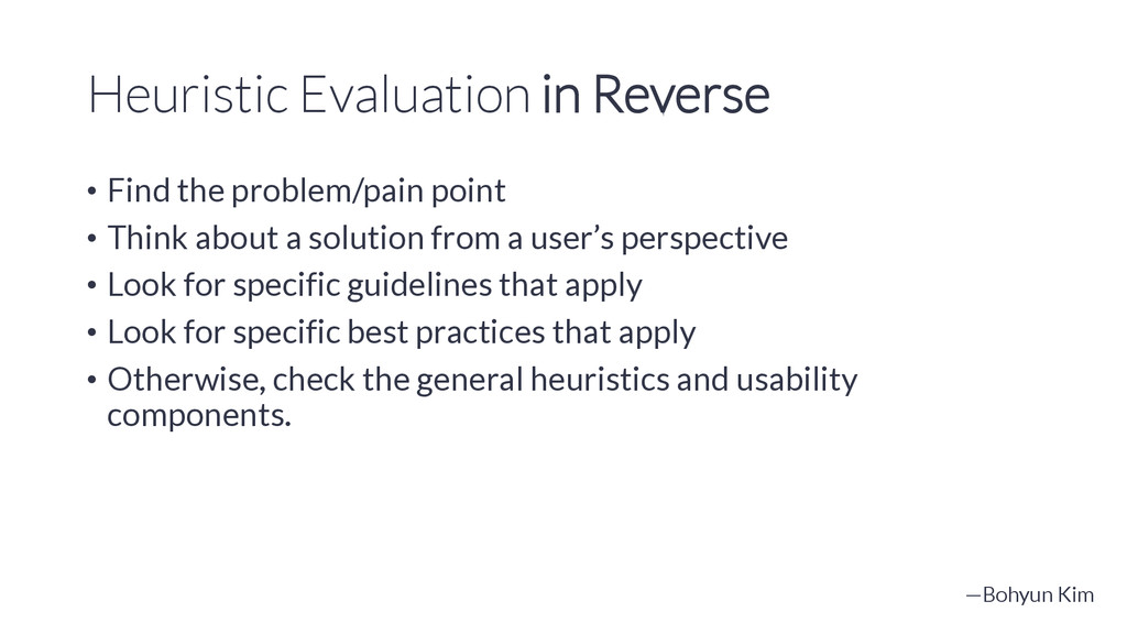
Think about a solution from a user’s perspective • Look for specific guidelines that apply • Look for specific best practices that apply • Otherwise, check the general heuristics and usability components. —Bohyun Kim
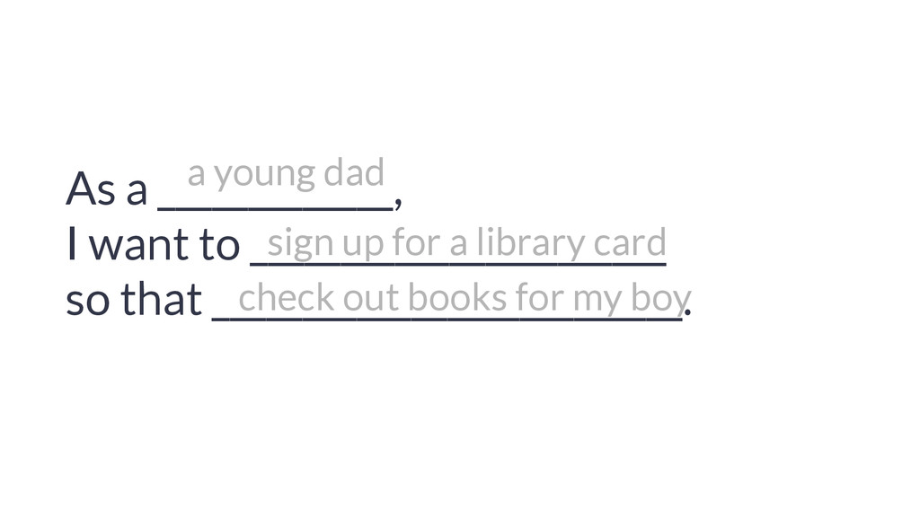
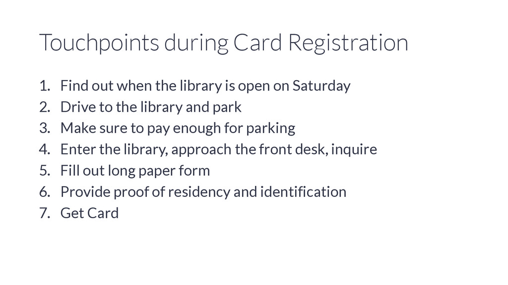
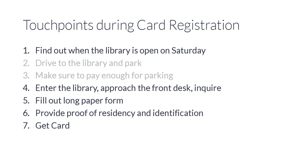
is open on Saturday 2. Drive to the library and park 3. Make sure to pay enough for parking 4. Enter the library, approach the front desk, inquire 5. Fill out long paper form 6. Provide proof of residency and identification 7. Get Card
is open on Saturday 2. Drive to the library and park 3. Make sure to pay enough for parking 4. Enter the library, approach the front desk, inquire 5. Fill out long paper form 6. Provide proof of residency and identification 7. Get Card
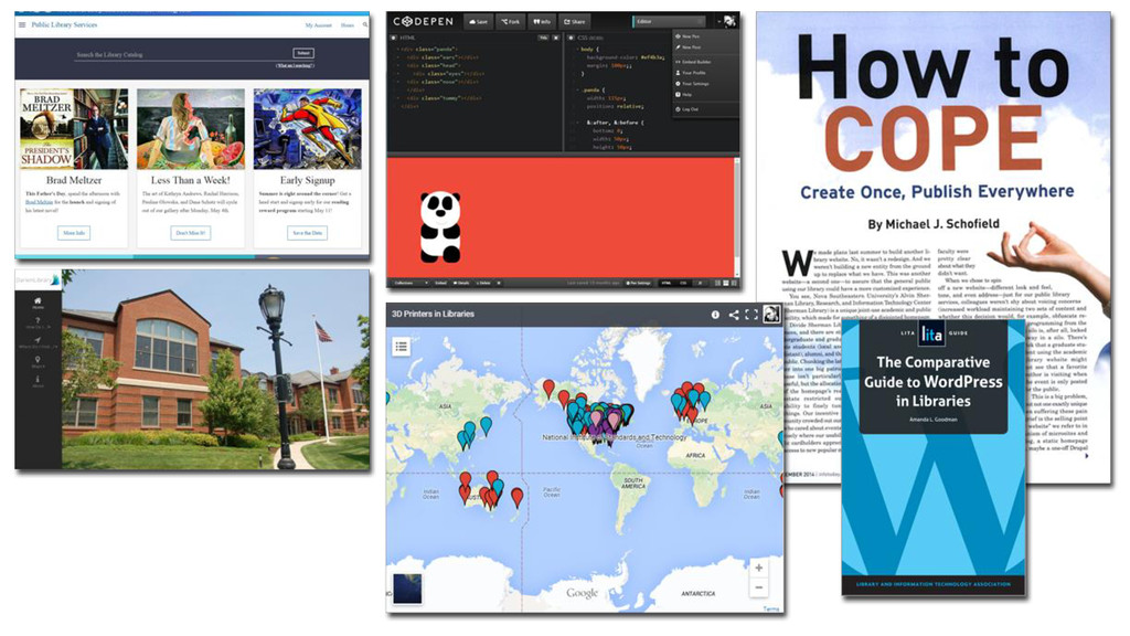
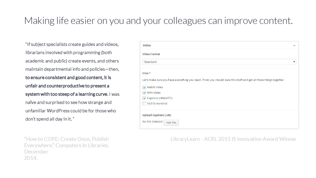
content. “If subject specialists create guides and videos, librarians involved with programming (both academic and public) create events, and others maintain departmental info and policies—then, to ensure consistent and good content, it is unfair and counterproductive to present a system with too steep of a learning curve. I was naïve and surprised to see how strange and unfamiliar WordPress could be for those who don’t spend all day in it. “ LibraryLearn - ACRL 2015 IS Innovation Award Winner “How to COPE: Create Once, Publish Everywhere.” Computers in Libraries. December 2014.
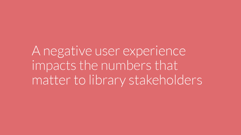
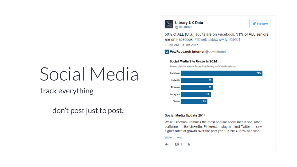
library, but for channels like Facebook that highlight popular or relevant content, posts that bomb negatively impact the overall visibility of your brand.
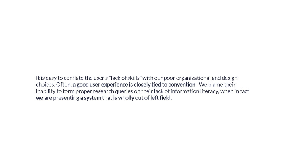
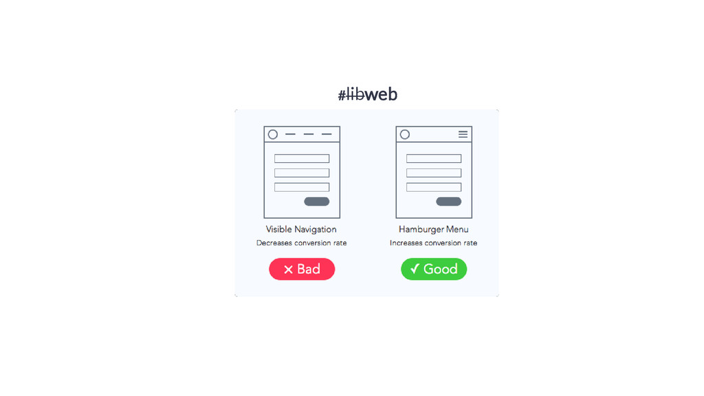
with our poor organizational and design choices. Often, a good user experience is closely tied to convention. We blame their inability to form proper research queries on their lack of information literacy, when in fact we are presenting a system that is wholly out of left field.