hero/MBSU Recommendation create your own new script refer to provided code only if needed avoid copy pasting or running the code directly from script ggplot is also hosted on github https://github.com/hadley/ggplot2
Exercise 1 grammar of graphics more advanced plots Available plot elements and when to use them Exercise 2 saving a plot fine tuning your plot themes we help you plot your data
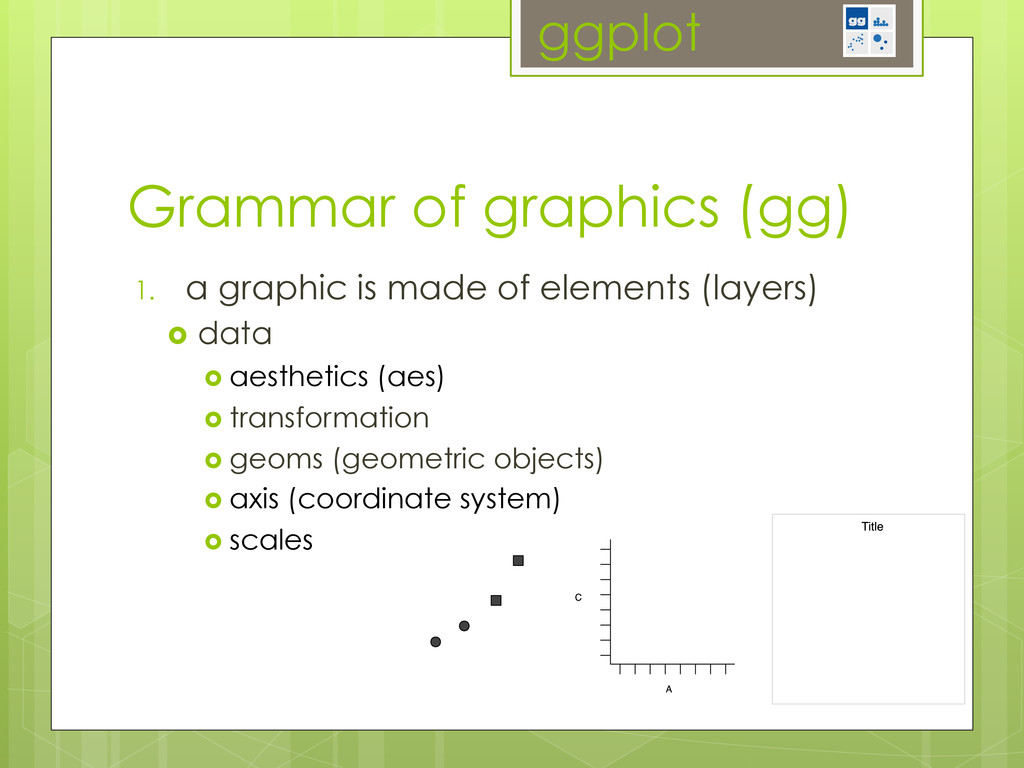
left to right): geometric objects, scales and coordinate system, plot annotations. ggplot 1. a graphic is made of elements (layers) data aesthetics (aes) transformation geoms (geometric objects) axis (coordinate system) scales Grammar of graphics (gg)
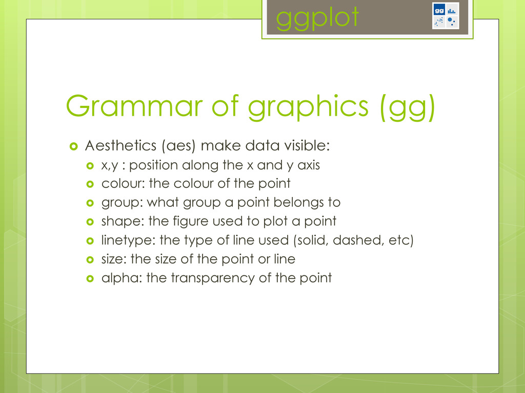
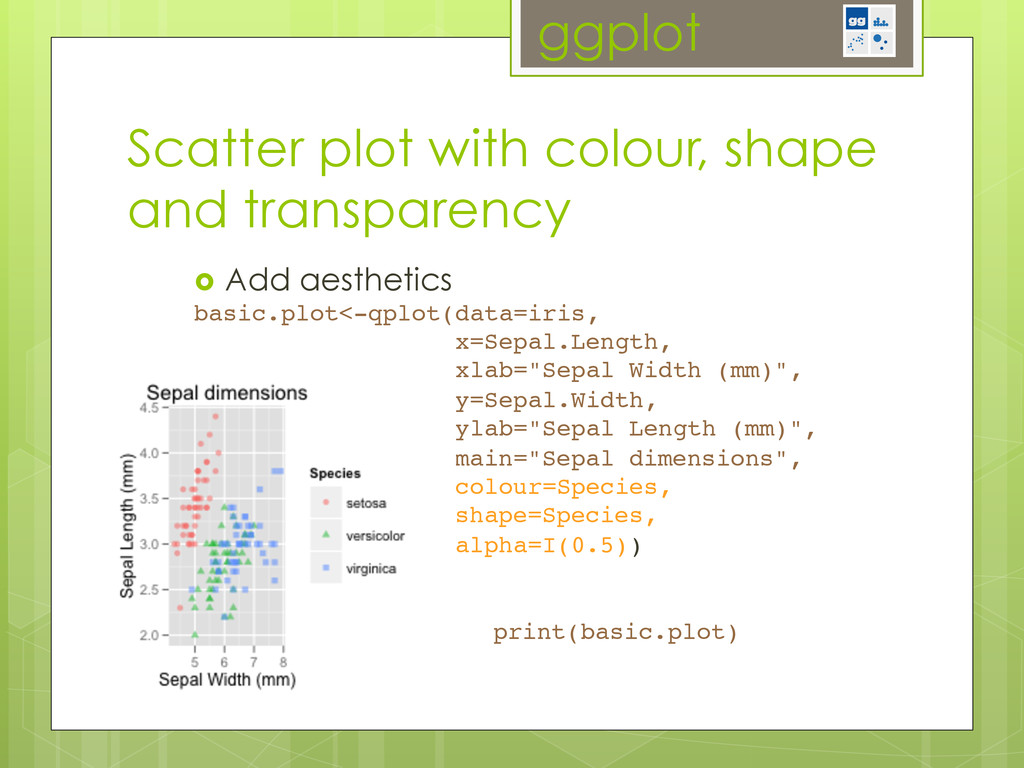
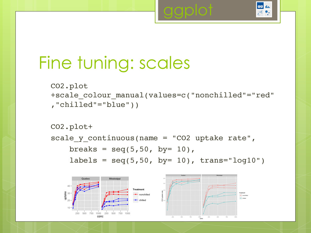
position along the x and y axis colour: the colour of the point group: what group a point belongs to shape: the figure used to plot a point linetype: the type of line used (solid, dashed, etc) size: the size of the point or line alpha: the transparency of the point Grammar of graphics (gg)
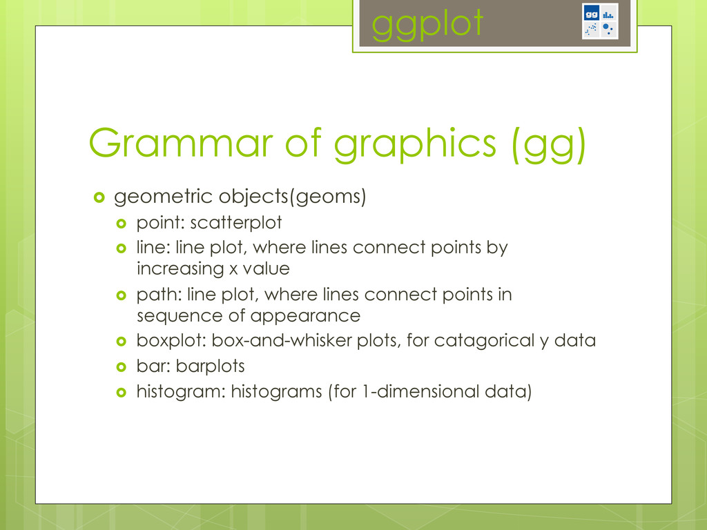
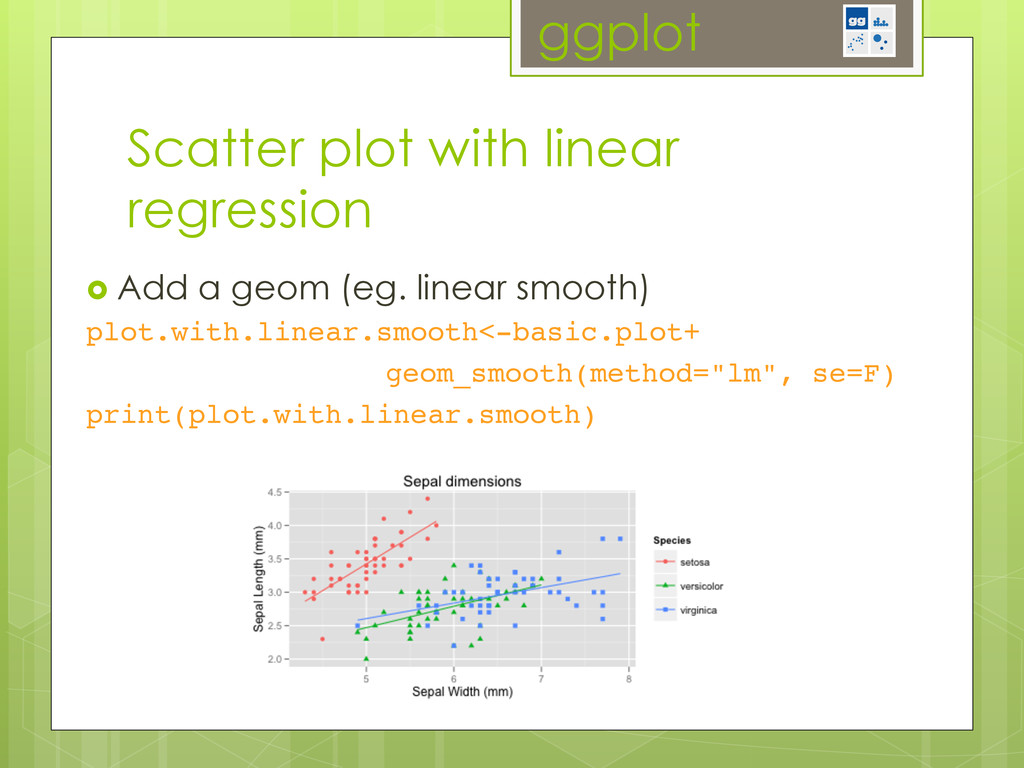
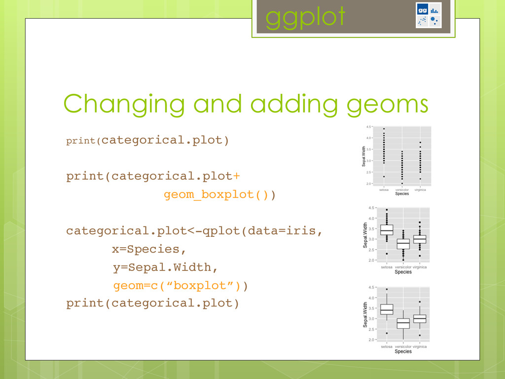
plot, where lines connect points by increasing x value path: line plot, where lines connect points in sequence of appearance boxplot: box-and-whisker plots, for catagorical y data bar: barplots histogram: histograms (for 1-dimensional data) Grammar of graphics (gg)
position along the x and y axis colour: the colour of the point group: what group a point belongs to shape: the figure used to plot a point linetype: the type of line used (solid, dashed, etc) size: the size of the point or line alpha: the transparency of the point Grammar of graphics (gg)
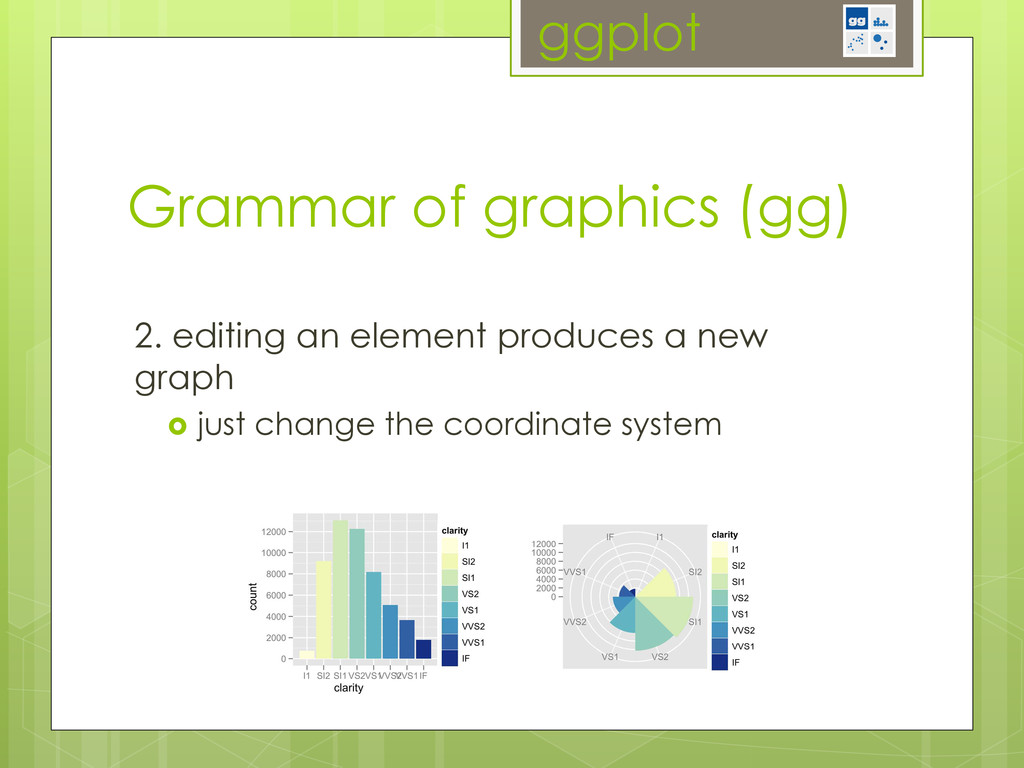
just change the coordinate system! Grammar of graphics (gg) A LAYERED GRAMMAR OF GRAPHICS 23 Figure 16. Bar chart (left) and equivalent Coxcomb plot (right) of clarity distribution. The Coxcomb plot is a bar chart in polar coordinates. Note that the categories abut in the Coxcomb, but are separated in the bar chart: this is an example of a graphical convention that differs in different coordinate systems.
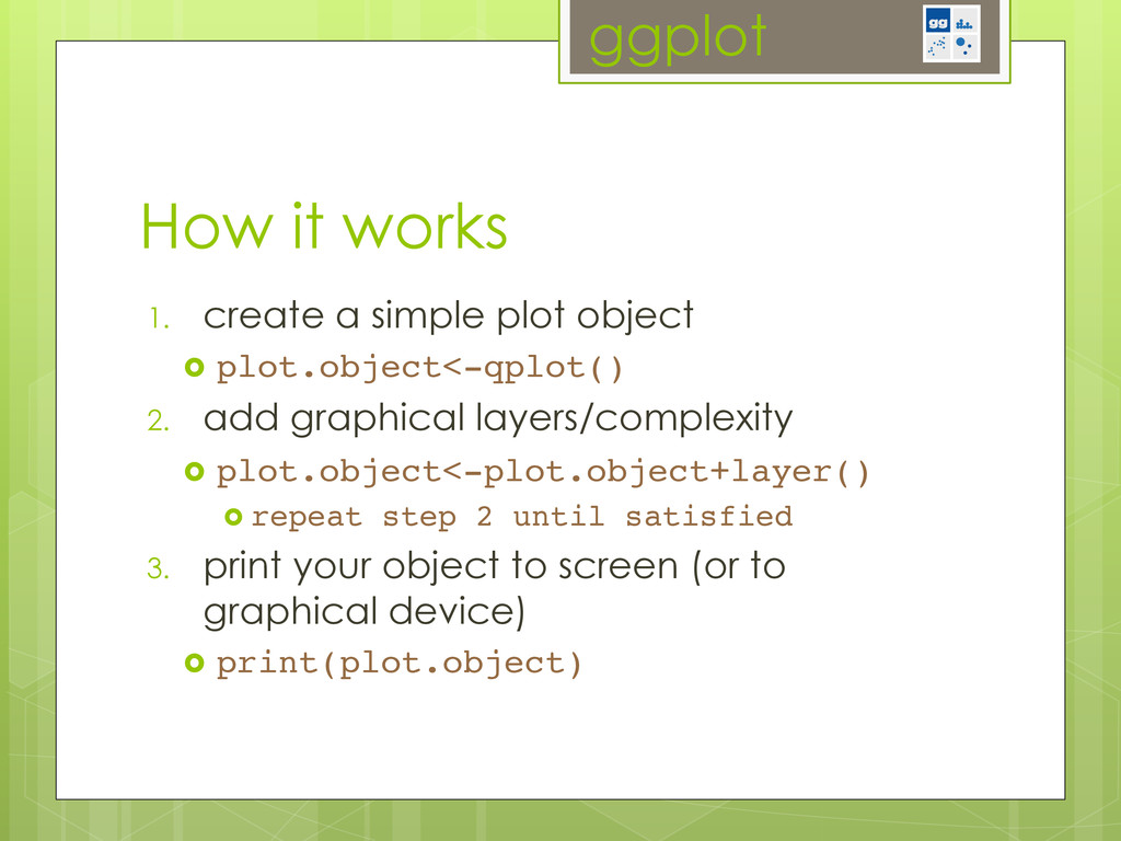
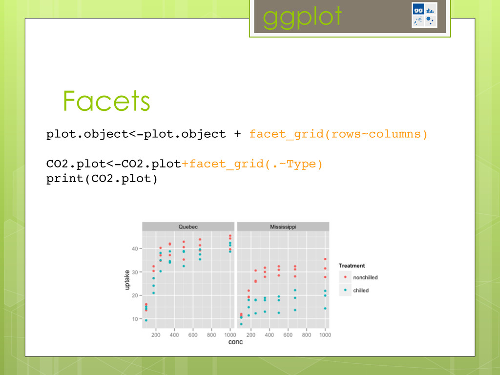
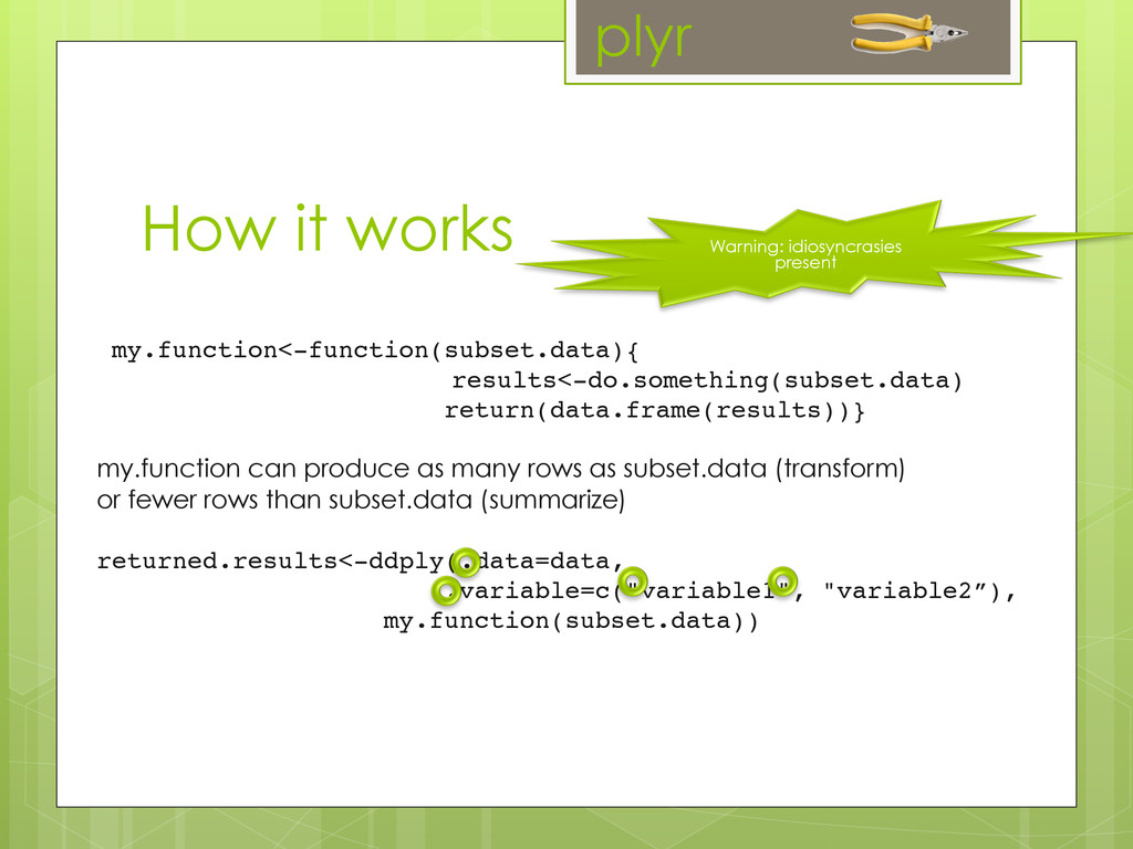
add graphical layers/complexity plot.object<-plot.object+layer()! repeat step 2 until satisfied! 3. print your object to screen (or to graphical device) print(plot.object)! How it works
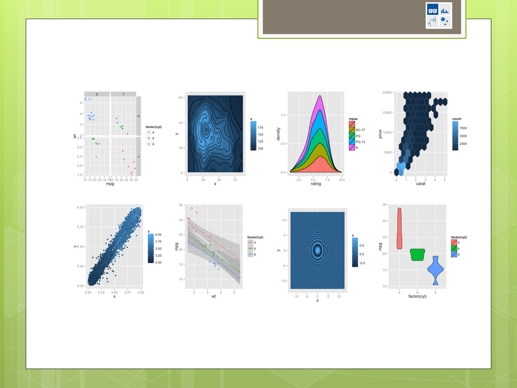
the type of plot you will produce. geom_abline Line specified by slope and intercept. geom_area Area plot. geom_bar Bars, rectangles with bases on x-axis geom_bin2d Add heatmap of 2d bin counts. geom_blank Blank, draws nothing. geom_boxplot Box and whiskers plot. geom_contour Display contours of a 3d surface in 2d. geom_crossbar Hollow bar with middle indicated by horizontal line. geom_density Display a smooth density estimate. geom_density2d Contours from a 2d density estimate. geom_dotplot Dot plot geom_errorbar Error bars. geom_errorbarh Horizontal error bars geom_freqpoly Frequency polygon. geom_hex Hexagon bining. geom_histogram Histogram geom_hline Horizontal line. geom_jitter Points, jittered to reduce overplotting. geom_line Connect observations, ordered by x value. geom_linerange An interval represented by a vertical line. geom_map Polygons from a reference map. geom_path Connect observations in original order geom_point Points, as for a scatterplot geom_pointrange Depends: stats, methods Imports: plyr, digest, grid, gtable, reshape2, scales, proto, MASS Suggests: quantreg, Hmisc, mapproj, maps, hexbin, maptools, multcomp, nlme, testthat Extends: http://docs.ggplot2.org! ! for even more! help(package=ggplot2)!
way ?plot has many defaults for different object types similar to qplot plot(iris) lm.SR <- lm(sr ~ pop15 + pop75 + dpi + ddpi, data = LifeCycleSavings) plot(lm.SR)
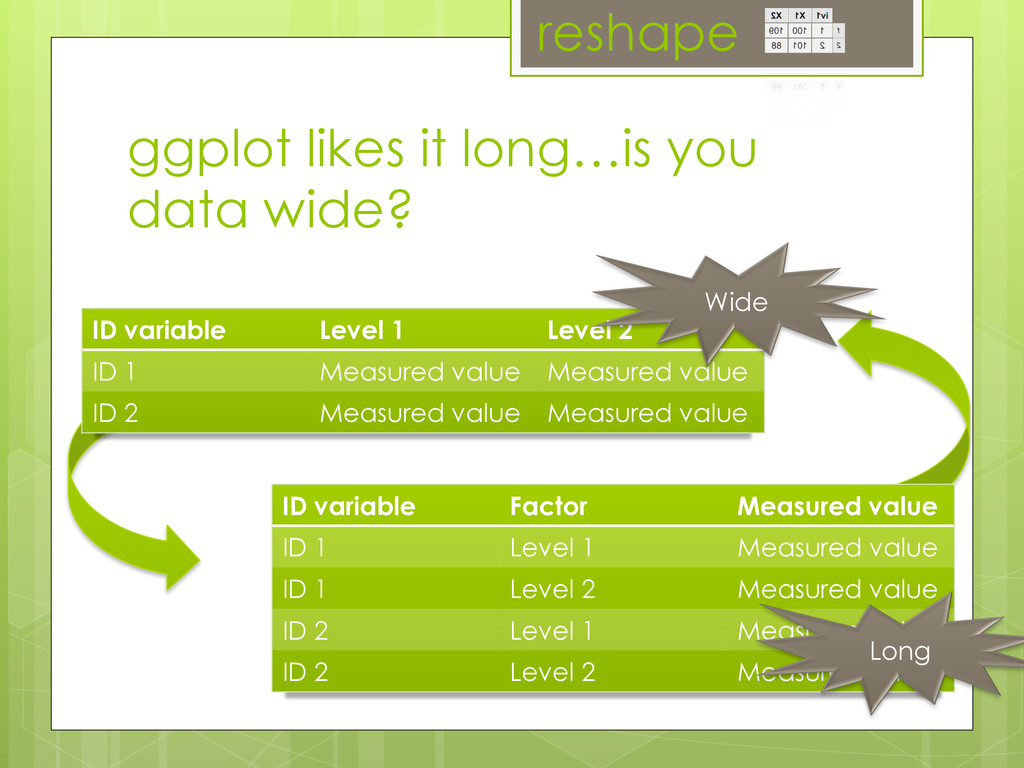
value ID 1 Level 2 Measured value ID 2 Level 1 Measured value ID 2 Level 2 Measured value ID variable Level 1 Level 2 ID 1 Measured value Measured value ID 2 Measured value Measured value Wide Long reshape ggplot likes it long…is you data wide?
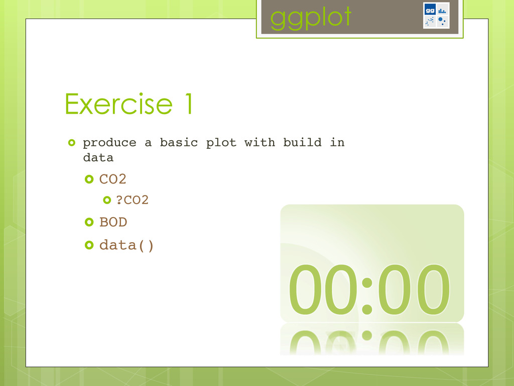
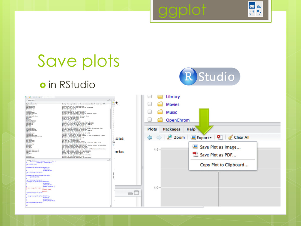
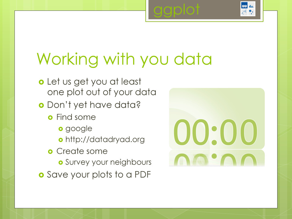
at least one plot out of your data Don’t yet have data? Find some google http://datadryad.org Create some Survey your neighbours Save your plots to a PDF
(Excel, SPSS, …) Split Define a subset of your data Apply Do anything to this subset calculation, modeling, simulations, plotting Combine Repeat this for all subsets collect the results Journal of Statistical Software 7 2 1 1 2 1,2 Figure 1: The three ways to split up a 2d matrix, labelled above by the dimensions that they slice. Original matrix shown at top left, with dimensions labelled. A single piece under each splitting scheme is colored blue. 3 2 1 1 2 3 1,2 1,3 2,3 1,2,3 Figure 2: The seven ways to split up a 3d array, labelled above by the dimensions that they slice up. Original array shown at top left, with dimensions labelled. Blue indicates a single piece of the output. m*ply() takes a matrix, list-array, or data frame, splits it up by rows and calls the processing function supplying each piece as its parameters. Figure 3 shows how you might use this to draw random numbers from normal distributions with varying parameters. Input: Data frame (d*ply) When operating on a data frame, you usually want to split it up into groups based on com- binations of variables in the data set. For d*ply you specify which variables (or functions of variables) to use. These variables are specified in a special way to highlight that they are Split plyr
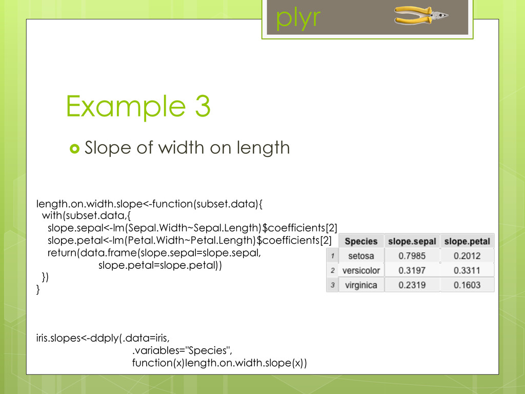
as many rows as subset.data (transform) or fewer rows than subset.data (summarize) ! returned.results<-ddply(.data=data,! .variable=c("variable1", "variable2”),! ! ! my.function(subset.data))! ! ! How it works Warning: idiosyncrasies present plyr
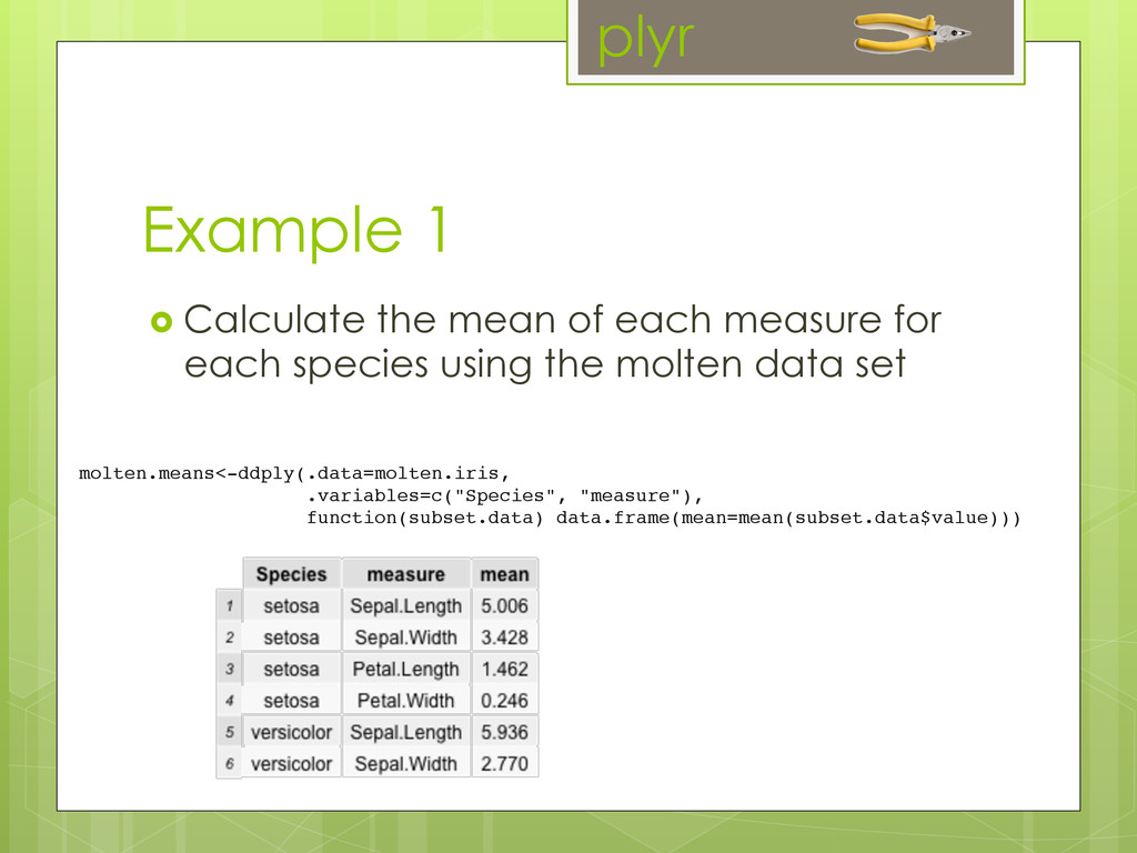
each species using the molten data set molten.means<-ddply(.data=molten.iris,! !.variables=c("Species", "measure"),! function(subset.data) data.frame(mean=mean(subset.data$value))) plyr
still need to find it easy to plot in R? to have fun using R? Please comment on our website on the MBSU page http://zerotorhero.wordpress.com/ 2012/12/14/mbsu/
you on GitHub by: Hadley Wickham had.co.nz Wickham, H. (2011). "The split-apply- combine strategy for data analysis." Journal of Statis. Wickham, H. (2010). "A layered grammar of graphics." Journal of Computational and Graphical Statistics 19(1): 3-28.