Upgrade to Pro — share decks privately, control downloads, hide ads and more …

Grammar of Graphics in Python

Grammar of Graphics in Python

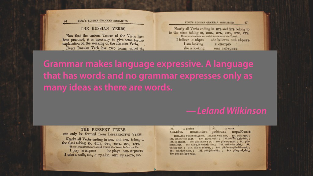
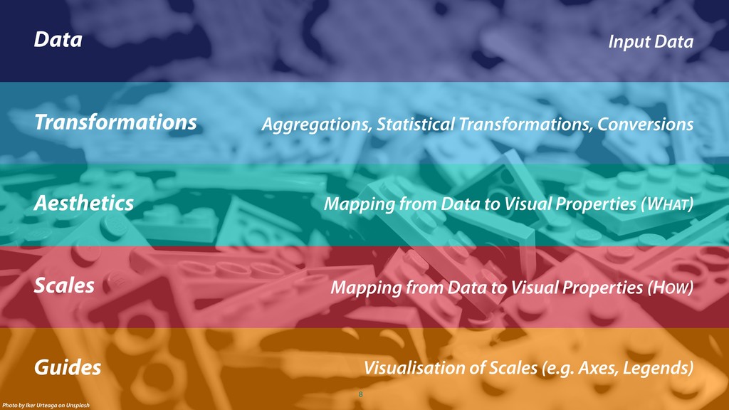
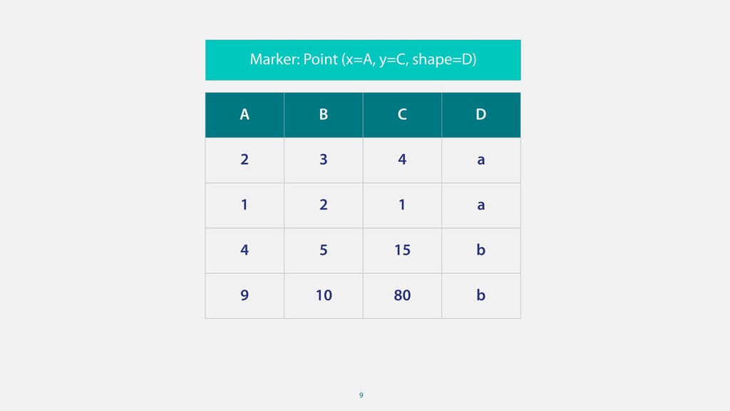
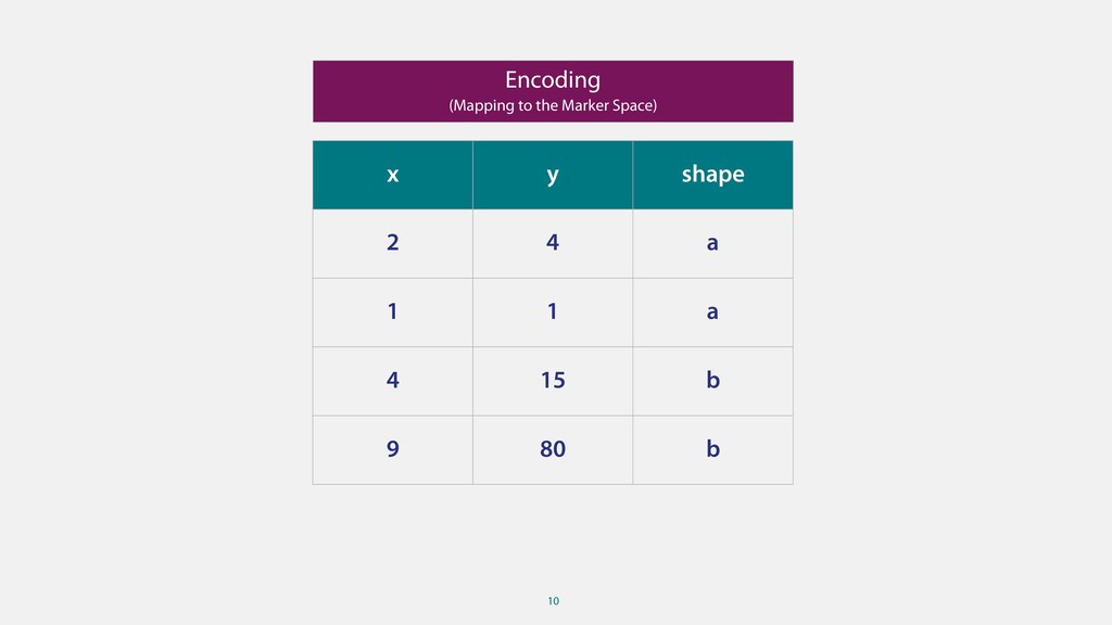
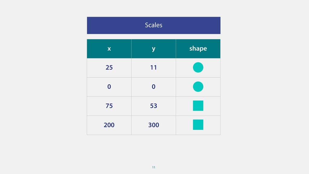
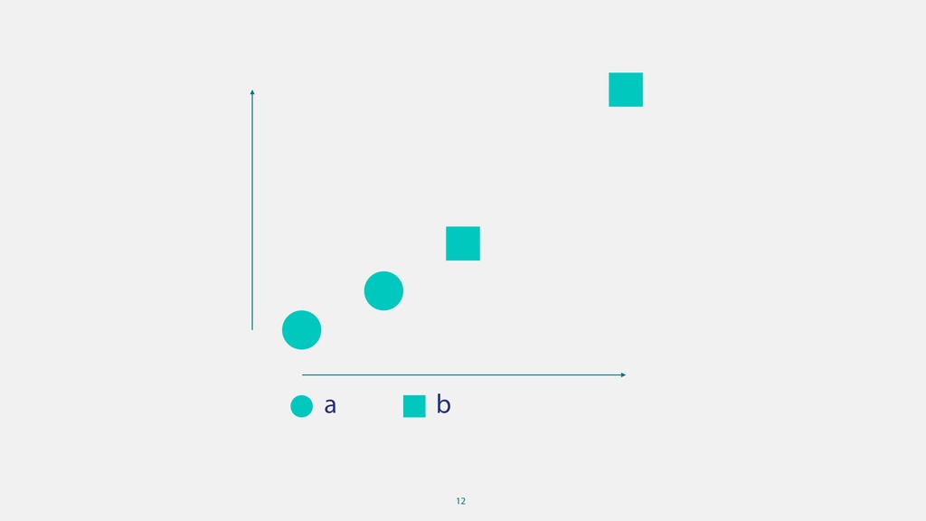
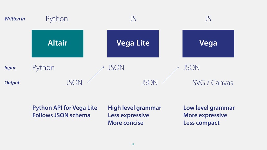
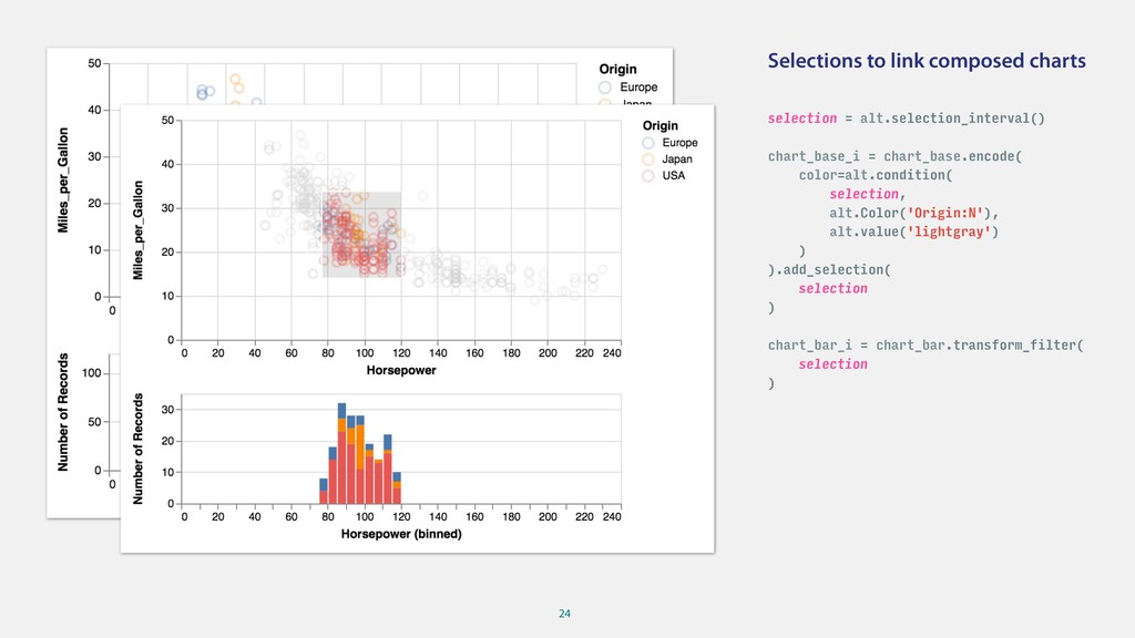
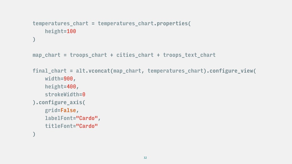
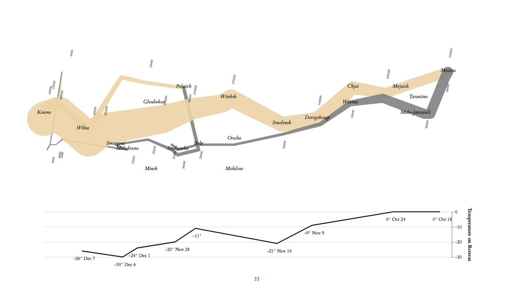
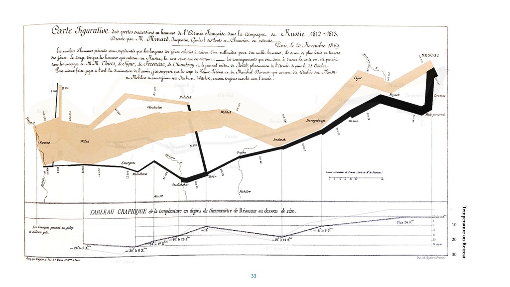
A grammar is, according to Wikipedia, the set of structural rules governing the composition of clauses, phrases, and words in any given natural language. A grammar of graphics is then the set of structural rules governing the composition of visual elements. Transforming data into visual representations using composition is quite powerful and allows to create complex visualisations with simple building blocks.

While the ideas behind the grammar of graphics date back well into the 80s, as a Python developer it is only quite recently that we can make use of it. Altair, backed by the vega specification, is one of the few plotting libraries in Python that provide such a declarative and compositional API.

In this talk I will give an introduction to the core concepts behind the grammar of graphics as well as practical examples how to use altair API in Python to create vega plots.

Malte Harder

October 26, 2018
Tweet

Other Decks in Technology

Transcript

  1. 1 Grammar of Graphics in Python Malte Harder (@mahrz24) Karlsruhe

    – 26.10.2018 Photo by David Clode on Unsplash
  2. No Affiliation • Not affiliated with any of the to

    be mentioned libraries • Just an interested user with a passion for data viz I work at Blue Yonder • Mostly doing data engineering these days • Used to do more visualisations at work In an Earlier Life • Prototyped a GoG for Haskell • Wrote a plotting library for ruby 14 years ago 2 My Motivation Published by C.F. Cheffins, Lith, Southhampton Buildings, London, England, 1854 in Snow, John. On the Mode of Communication of Cholera
  3. 3

  4. 4

  5. 5

  6. 6 Grammar makes language expressive. A language that has words

    and no grammar expresses only as many ideas as there are words.  — Leland Wilkinson
  7. 8 Data Transformations Aesthetics Scales Photo by Iker Urteaga on

    Unsplash Guides Input Data Aggregations, Statistical Transformations, Conversions Mapping from Data to Visual Properties (WHAT) Mapping from Data to Visual Properties (HOW) Visualisation of Scales (e.g. Axes, Legends)
  8. 9 A B C D 2 3 4 a 1

    2 1 a 4 5 15 b 9 10 80 b
  9. 9 A B C D 2 3 4 a 1

    2 1 a 4 5 15 b 9 10 80 b Marker: Point (x=A, y=C, shape=D)
  10. 10 x y shape 2 4 a 1 1 a

    4 15 b 9 80 b Encoding (Mapping to the Marker Space)
  11. 12

  12. 12

  13. 14 Vega Vega Lite Altair Python JS JS Written in

    Python JSON JSON Input JSON JSON SVG / Canvas Output Low level grammar More expressive Less compact High level grammar Less expressive More concise Python API for Vega Lite Follows JSON schema
  14. 16 { "mark": { "type": "circle", "size": 60 }, "encoding":

    { "color": { "type": "nominal", "field": "Origin" }, "x": { "type": "quantitative", "field": "Horsepower" }, "y": { "type": "quantitative", "field": "Miles_per_Gallon" } } }
  15. 17 { "$schema": "https://vega.github.io/schema/vega/v4.json", "autosize": "pad", "padding": 5, "width": 400,

    "height": 300, "style": "cell", "marks": [ { "name": "marks", "type": "symbol", "style": ["circle"], "from": {"data": "data_0"}, "encode": { "update": { "opacity": {"value": 0.7}, "size": {"value": 60}, "fill": [ { "test": "datum[\"Horsepower\"] === null || isNaN(datum[\"Horsepower\"]) || datum[\"Miles_per_Gallon\"] === null || isNaN(datum[\"Miles_per_Gallon\"])", "value": null }, {"scale": "color", "field": "Origin"} ], "tooltip": { "signal": "{\"Name\": ''+datum[\"Name\"], \"Origin\": ''+datum[\"Origin\"], \"Horsepower\": format(datum[\"Horsepower\"], \"\"), \"Miles_per_Gallon\": format(datum[\"Miles_per_Gallon\"], \"\")}" }, "x": {"scale": "x", "field": "Horsepower"}, "y": {"scale": "y", "field": "Miles_per_Gallon"}, "shape": {"value": "circle"} } } } ], "scales": [ { "name": "x", "type": "linear", "domain": {"data": "data_0", "field": "Horsepower"}, "range": [0, {"signal": "width"}], "nice": true, "zero": true }, { "name": "y", "type": "linear", "domain": {"data": "data_0", "field": "Miles_per_Gallon"}, "range": [{"signal": "height"}, 0], "nice": true, "zero": true }, { "name": "color", "type": "ordinal", "domain": {"data": "data_0", "field": "Origin", "sort": true}, "range": "category" } ], "axes": [ { "scale": "x", "orient": "bottom", "grid": false, "title": "Horsepower", "labelFlush": true, "labelOverlap": true, "tickCount": {"signal": "ceil(width/40)"}, "zindex": 1 }, { "scale": "x", "orient": "bottom", "gridScale": "y", "grid": true, "tickCount": {"signal": "ceil(width/40)"}, "domain": false, "labels": false, "maxExtent": 0, "minExtent": 0, "ticks": false, "zindex": 0 }, { "scale": "y", "orient": "left", "grid": false,
  16. 18 { ... "scales": [ { "name": "x", "type": "linear",

    "domain": {"data": "data_0", "field": "Horsepower"}, "range": [0, {"signal": "width"}], "nice": true, "zero": true }, ... { "name": "color", "type": "ordinal", "domain": {"data": "data_0", "field": "Origin", "sort": true}, "range": "category" } ], "axes": [ { "scale": "x", "orient": "bottom", "grid": false, "title": "Horsepower", "labelFlush": true, "labelOverlap": true, "tickCount": {"signal": "ceil(width/40)"}, "zindex": 1 }, ... }
  17. 20 chart_base = alt.Chart(cars).mark_point( size=60, opacity=0.25 ).encode( x='Horsepower', y='Miles_per_Gallon', color='Origin',

    ) chart_binned = alt.Chart(cars).mark_line().encode( x=alt.X('Horsepower:Q', bin=True), y='mean(Miles_per_Gallon)', color='Origin' )
  18. 22 Faceting Repetition chart_base.facet(column='Origin:N') alt.Chart(cars).mark_line().encode( alt.X(alt.repeat("column"), bin=True, type='quantitative'), alt.Y(alt.repeat("row"), aggregate='mean',

    type='quantitative'), color='Origin', ).repeat( row=['Miles_per_Gallon', 'Weight_in_lbs'], column=['Horsepower', 'Displacement'] )
  19. 24 Selections to link composed charts selection = alt.selection_interval() chart_base_i

    = chart_base.encode( color=alt.condition( selection, alt.Color('Origin:N'), alt.value('lightgray') ) ).add_selection( selection ) chart_bar_i = chart_bar.transform_filter( selection )
  20. 24 Selections to link composed charts selection = alt.selection_interval() chart_base_i

    = chart_base.encode( color=alt.condition( selection, alt.Color('Origin:N'), alt.value('lightgray') ) ).add_selection( selection ) chart_bar_i = chart_bar.transform_filter( selection )
  21. 26 lon lat survivors direction division 45 24.0 55.2 22000

    A 3 46 24.5 55.3 22000 A 3 lon temp days day label 0 37.6 0 6 Oct-18 0° Oct 18 1 36.0 0 6 Oct-24 0° Oct 24 lon lat city 0 24.0 55.0 Kowno 1 25.3 54.7 Wilna troops = pd.read_csv("minard_troops.txt", sep=" ") temperatures = pd.read_csv("minard_temperature.txt", sep=" “) cities = pd.read_csv("minard_cities.txt", sep=" ")
  22. 28 troops_chart = alt.Chart(troops).mark_trail().encode( longitude='lon:Q', latitude='lat:Q', size=alt.Size( 'survivors', scale=alt.Scale(range=[1, 75]),

    legend=None ), detail='division', color=alt.Color( 'direction', scale=alt.Scale( domain=['A', 'R'], range=['#EBD2A8', '#888888'] ), legend=None ), ).project( type="mercator" )
  23. 28 troops_chart = alt.Chart(troops).mark_trail().encode( longitude='lon:Q', latitude='lat:Q', size=alt.Size( 'survivors', scale=alt.Scale(range=[1, 75]),

    legend=None ), detail='division', color=alt.Color( 'direction', scale=alt.Scale( domain=['A', 'R'], range=['#EBD2A8', '#888888'] ), legend=None ), ).project( type="mercator" )
  24. 31 x_encode = alt.X( 'lon:Q', scale=alt.Scale( domain=[cities["lon"].min(), cities["lon"].max()] ), axis=None

    ) y_encode = alt.Y( 'temp', axis=alt.Axis( title="Temperature on Retreat", grid=True, orient='right' ) ) temperatures_chart = alt.Chart(temperatures).mark_line( color="#888888" ).encode( x=x_encode, y=y_encode ) + alt.Chart(temperatures).mark_text( dx=5, dy=20, font='Cardo', fontSize=10 ).encode( x=x_encode, y=y_encode, text='label' )
  25. 31 x_encode = alt.X( 'lon:Q', scale=alt.Scale( domain=[cities["lon"].min(), cities["lon"].max()] ), axis=None

    ) y_encode = alt.Y( 'temp', axis=alt.Axis( title="Temperature on Retreat", grid=True, orient='right' ) ) temperatures_chart = alt.Chart(temperatures).mark_line( color="#888888" ).encode( x=x_encode, y=y_encode ) + alt.Chart(temperatures).mark_text( dx=5, dy=20, font='Cardo', fontSize=10 ).encode( x=x_encode, y=y_encode, text='label' )
  26. 32 temperatures_chart = temperatures_chart.properties( height=100 ) map_chart = troops_chart +

    cities_chart + troops_text_chart final_chart = alt.vconcat(map_chart, temperatures_chart).configure_view( width=900, height=400, strokeWidth=0 ).configure_axis( grid=False, labelFont="Cardo", titleFont="Cardo" )
  27. 33

  28. 33

  29. 34 Thank you! Body Level One Body Level Two Body

    Level Three Body Level Four Body Level Five If you think of data science, then join us! Do you think of bamboo when you hear Pandas? Join the Market Leader in Retail AI. www.blueyonder.ai/en/careers