The realities of responsive design: Does more responsive mean less design?
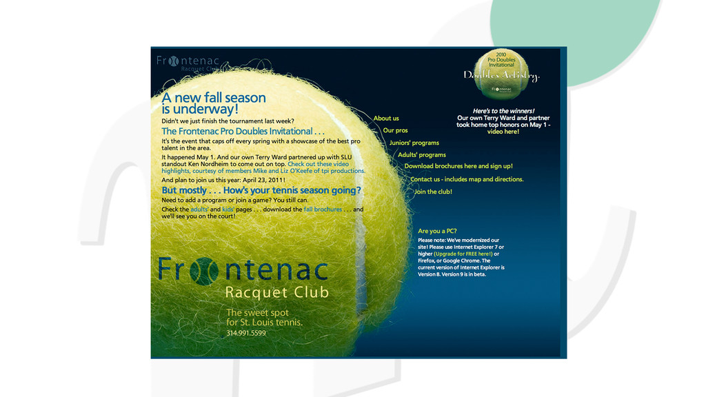
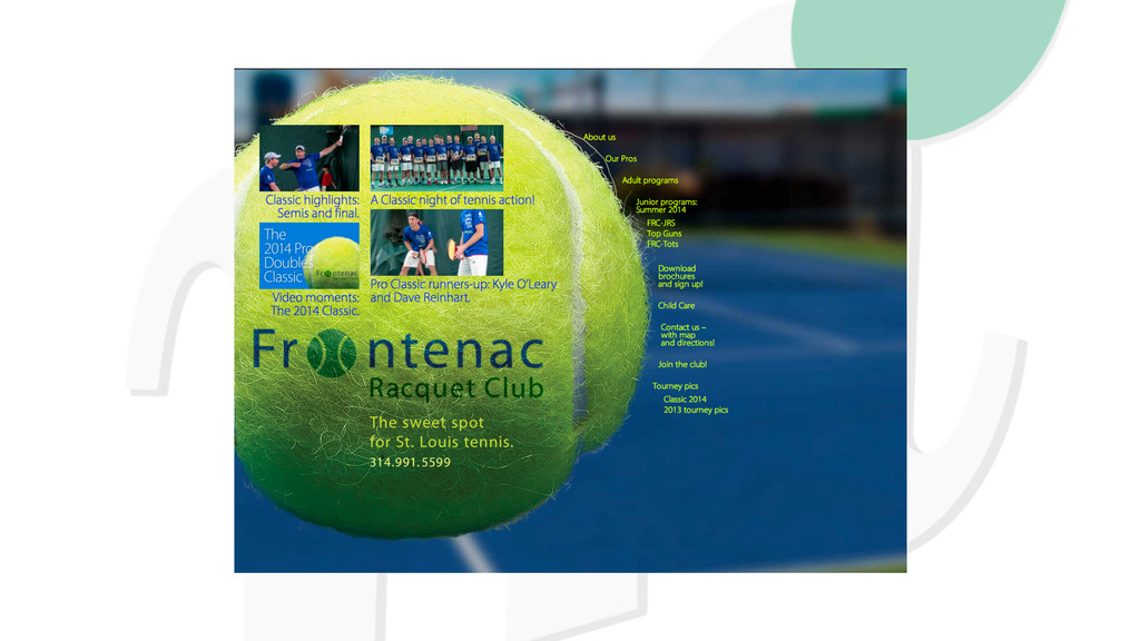
Responsive WordPress design gets knocked in two ways. People claim WordPress sites all look alike - and that responsive sites look alike. True or false? And if true, how can we make it false?
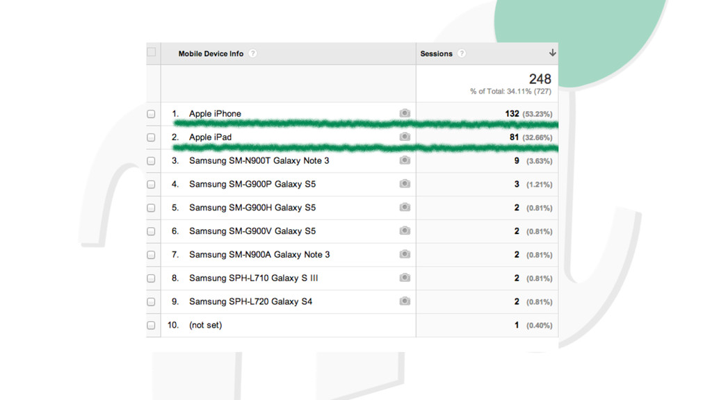
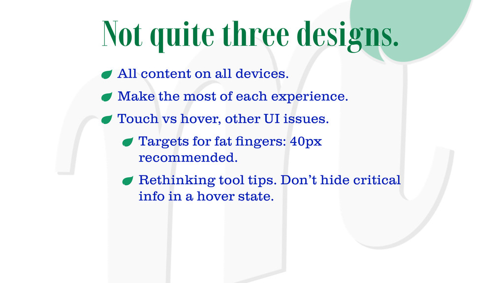
the most of each experience. Touch vs hover, other UI issues. Targets for fat fingers: 40px recommended. Rethinking tool tips. Don’t hide critical info in a hover state.
 marybaum
 garyuten
 yuri_ohashi
 sevendex
 centou
 sony
sony
 kspace
 teba_eleven
 signull
 moco1013
 klemens
 ncdc
ncdc
 andyhume
 axbom
axbom
 chriscoyier
 akosma
 katarinadahlin
.png) helenjbeal
helenjbeal
 tanoku
 stephaniewalter
 marcelosomers
 seathinner
 gurzu
gurzu
 jonrohan