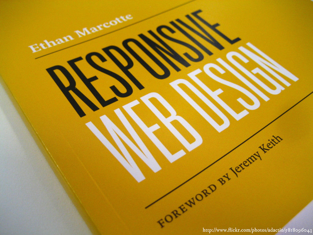
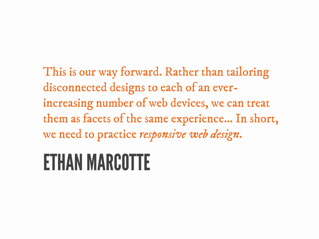
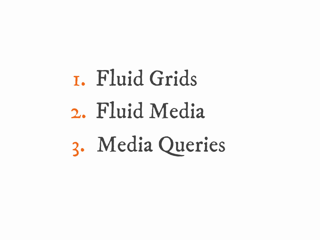
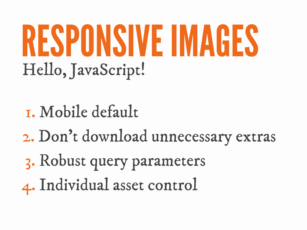
You may have heard about this this 'Responsive Web Design' thing that's taking the web by storm. Fluid grids and media queries are helping websites adapt their layouts to better suit screen widths, but there's also a host of performance optimization techniques that, when used in conjunction with content- and mobile-first design, allow responsive web design to help us create truly universal yet mobile-optimized web experiences. In this talk, Matt will blitz through an overview of basic responsive web development, before diving a little deeper into some of the trickier techniques that will help you develop outstanding, mobile-performant universal web products.
 menzer
 you
you
 ritou
ritou
 shift_evolve
 chanyou0311
 nagatsu
 z63d
z63d
 freshdaz
 tamaiyutaro
 kentarofujii
 seafay
 laysakura
 appleboy
 addyosmani
 eileencodes
 yeseniaperezcruz
 colly
colly
 rkaga
rkaga
 rkendrick25
 jonoalderson
 marketingsoph
 takai
takai
 hannesfritz
 joshbly
 jnunemaker