Upgrade to Pro — share decks privately, control downloads, hide ads and more …

AmebaのDesign SystemとCompose

AmebaのDesign SystemとCompose

Atsuhiro Iino

August 18, 2022
Tweet

Other Decks in Programming

Transcript

  1. Compose導入にあたって 1.5.10 -> 1.6.10 1.1.1 Composeのバージョン選定 ・勉強会 ・新卒1年目の人とCompose推進 チームへの浸透 ・Remote

    Configでの制御 ・規模が大きいアプリのため段階公開を した 運用 ・コーディング規約 ・Activity, Fragment, GroupieのItem, XML単位での実装例 ドキュメント作り
  2. Spindle Color SpindleColorPaletteを定義 ColorChartにprimitiveな色を指定 実際にプロダクトで扱うのは ColorChart外にあるものを使いま す。 object SpindleColorPalette {

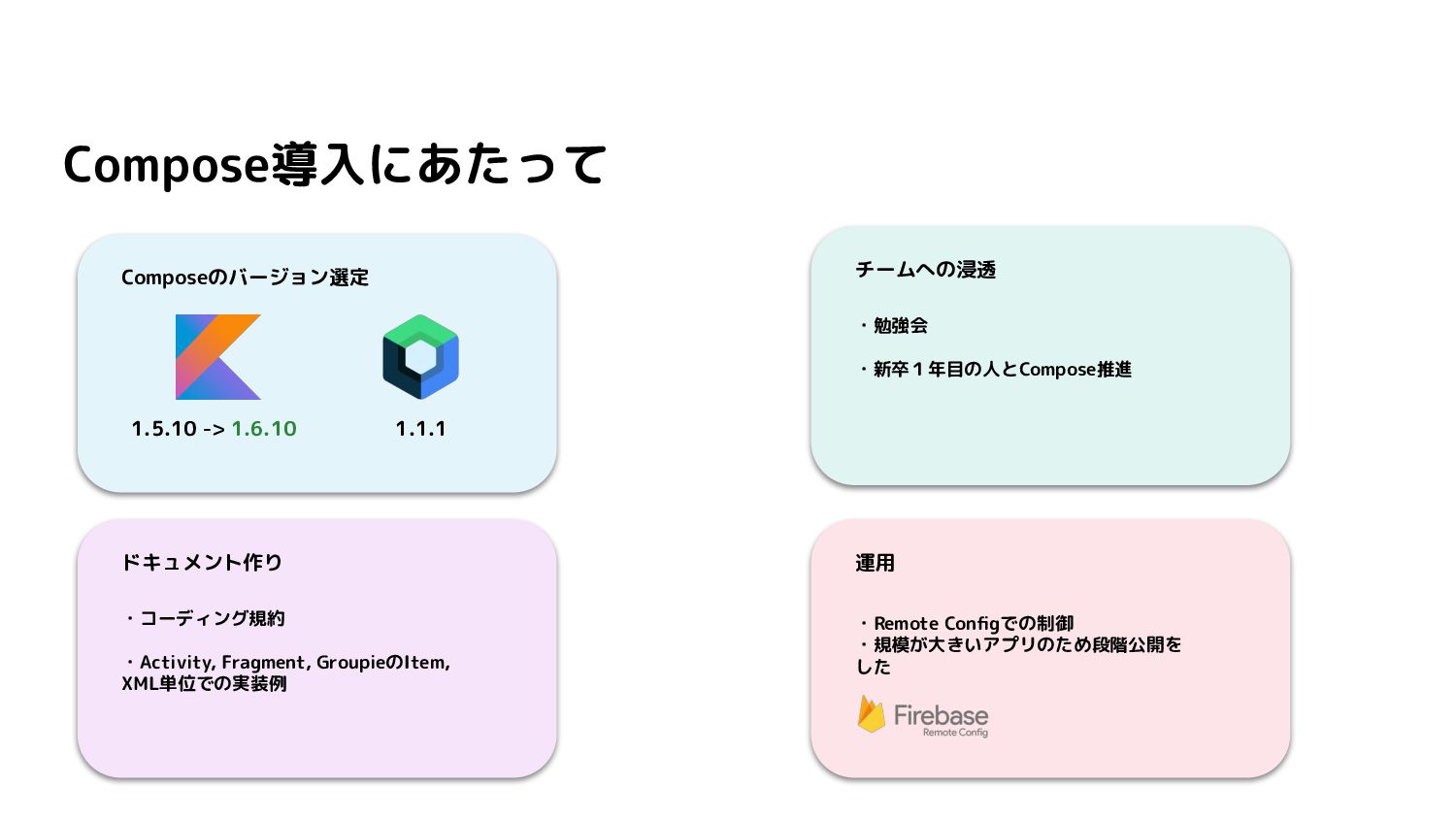
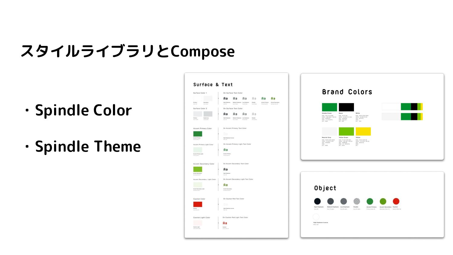
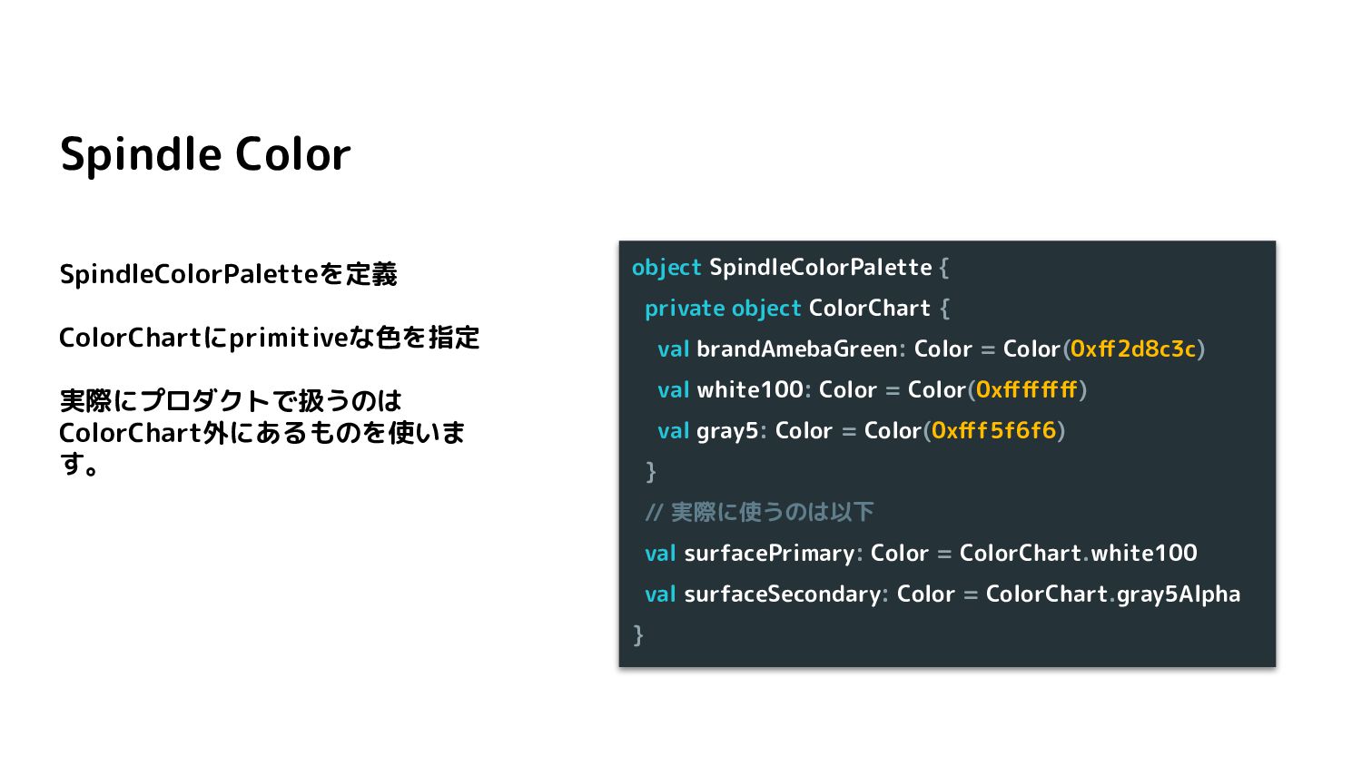
    private object ColorChart { val brandAmebaGreen: Color = Color(0xff2d8c3c) val white100: Color = Color(0xffffffff) val gray5: Color = Color(0xfff5f6f6) } // 実際に使うのは以下 val surfacePrimary: Color = ColorChart.white100 val surfaceSecondary: Color = ColorChart.gray5Alpha }
  3. Spindle Theme 独自のComposition Localを作成 Amebaアプリではダークテーマが存在し ないため、CompositoinLocackに設定さ れた値が変わる可能性が低いため、 今回はstaticCompositionLocalOfを利用 SpindlThemeの中にcolorsを定義する private

    val LocalSpindleColorPalette = staticCompositionLocalOf<SpindleColorPalette> { error("No spindle color palette is provided!") } object SpindleTheme { val colors: SpindleColorPalette @Composable @ReadOnlyComposable get() = LocalSpindleColorPalette.current }
  4. Spindle Theme SpindleThemeを定義し、 CompositionLocalProviderに設 定する。 @Composable fun SpindleTheme(content: @Composable ()

    -> Unit) { MaterialTheme { CompositionLocalProvider( LocalSpindleColorPalette provides SpindleColorPalette, content = content ) } }
  5. 構成 Box |-Button |-Row |-Icon |-Spacer |-Text @Composable fun SpindleButton(

    text: String, buttonSize: SpindleButtonSize, buttonStyle: SpindleButtonStyle, onClick: () -> Unit, icon: Painter? = null ) { CompositionLocalProvider(LocalRippleTheme provides SpindleButtonRippleTheme(buttonStyle)) { Box(/*...*/) { Button(/*...*/) {} Row(/*...*/) { Icon(/*...*/) Spacer(/*...*/) Text(/*...*/) } } } }
  6. @Composable fun SpindleButton( text: String, buttonSize: SpindleButtonSize, buttonStyle: SpindleButtonStyle, onClick:

    () -> Unit, icon: Painter? = null ) { CompositionLocalProvider(LocalRippleTheme provides SpindleButtonRippleTheme(buttonStyle)) { Box(/*...*/) { Button(/*...*/) {} Row(/*...*/) { Icon(/*...*/) Spacer(/*...*/) Text(/*...*/) } } } } ボタンのサイズとスタイルを渡します
  7. ButtonのSize ・enumで定義 ・Textや幅の最大値、最小値 enum class SpindleButtonSize( val height: Dp, val

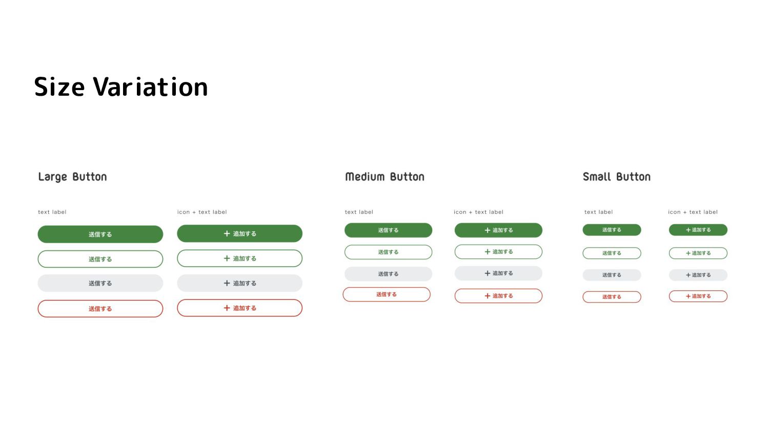
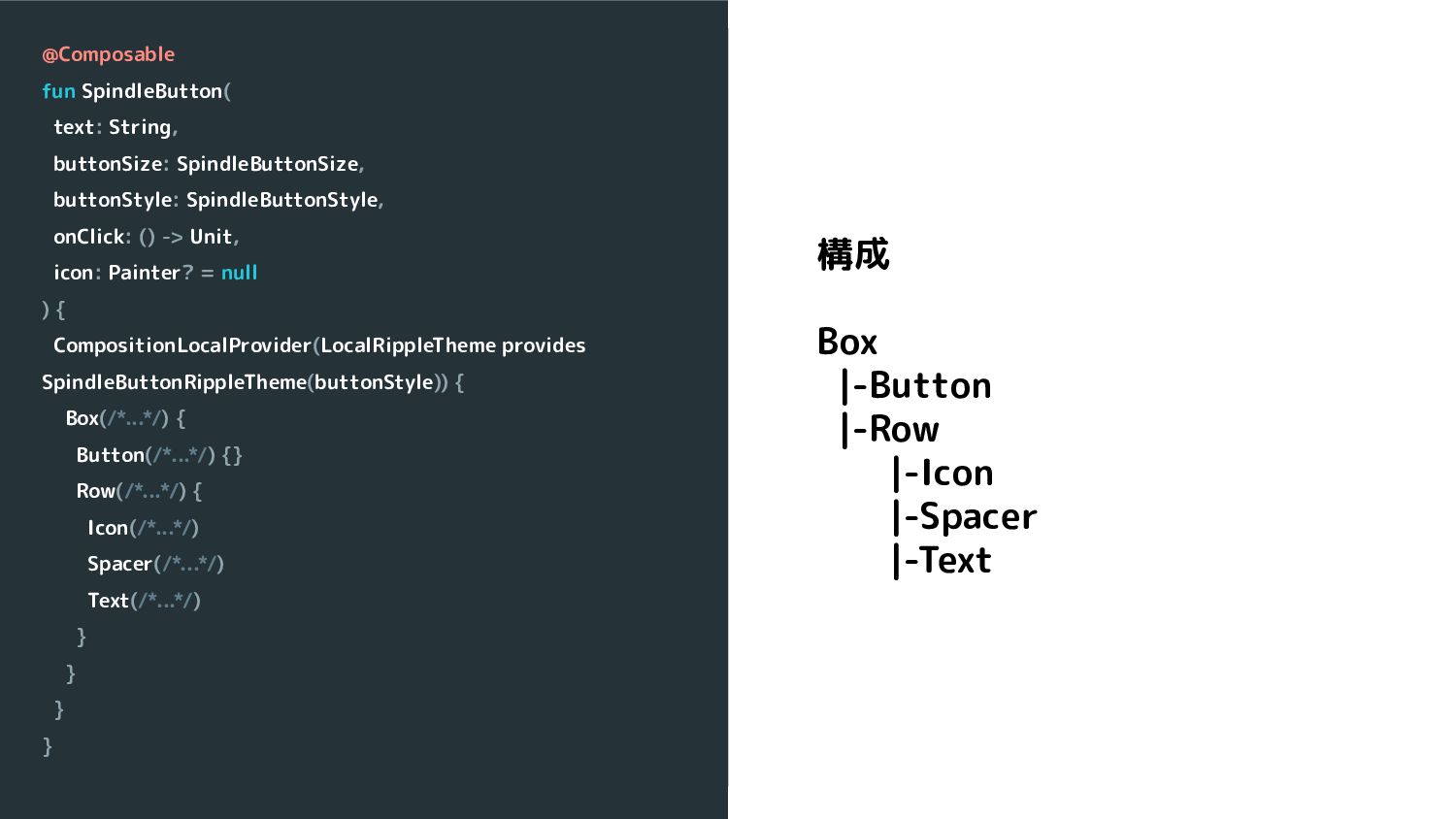
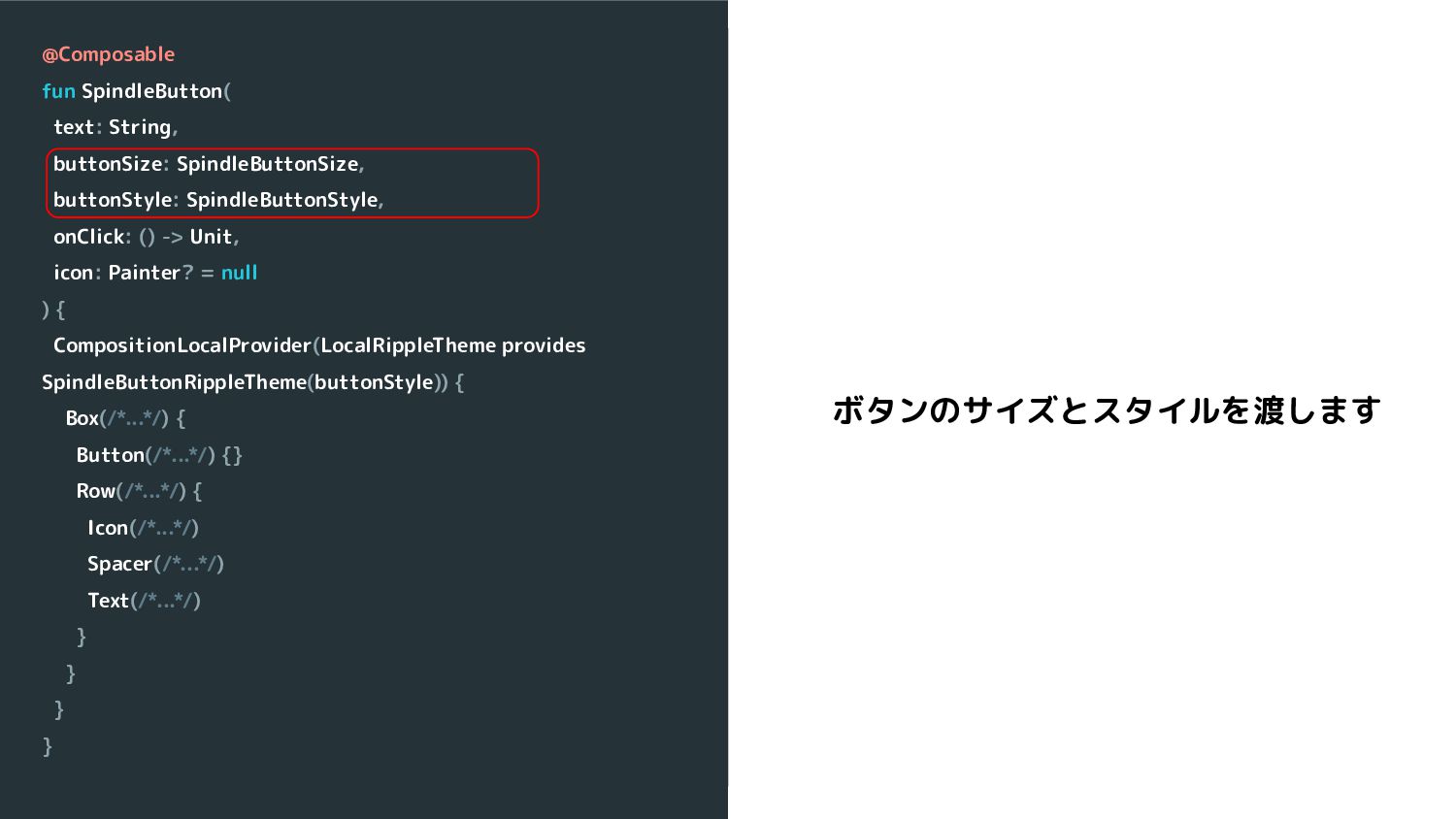
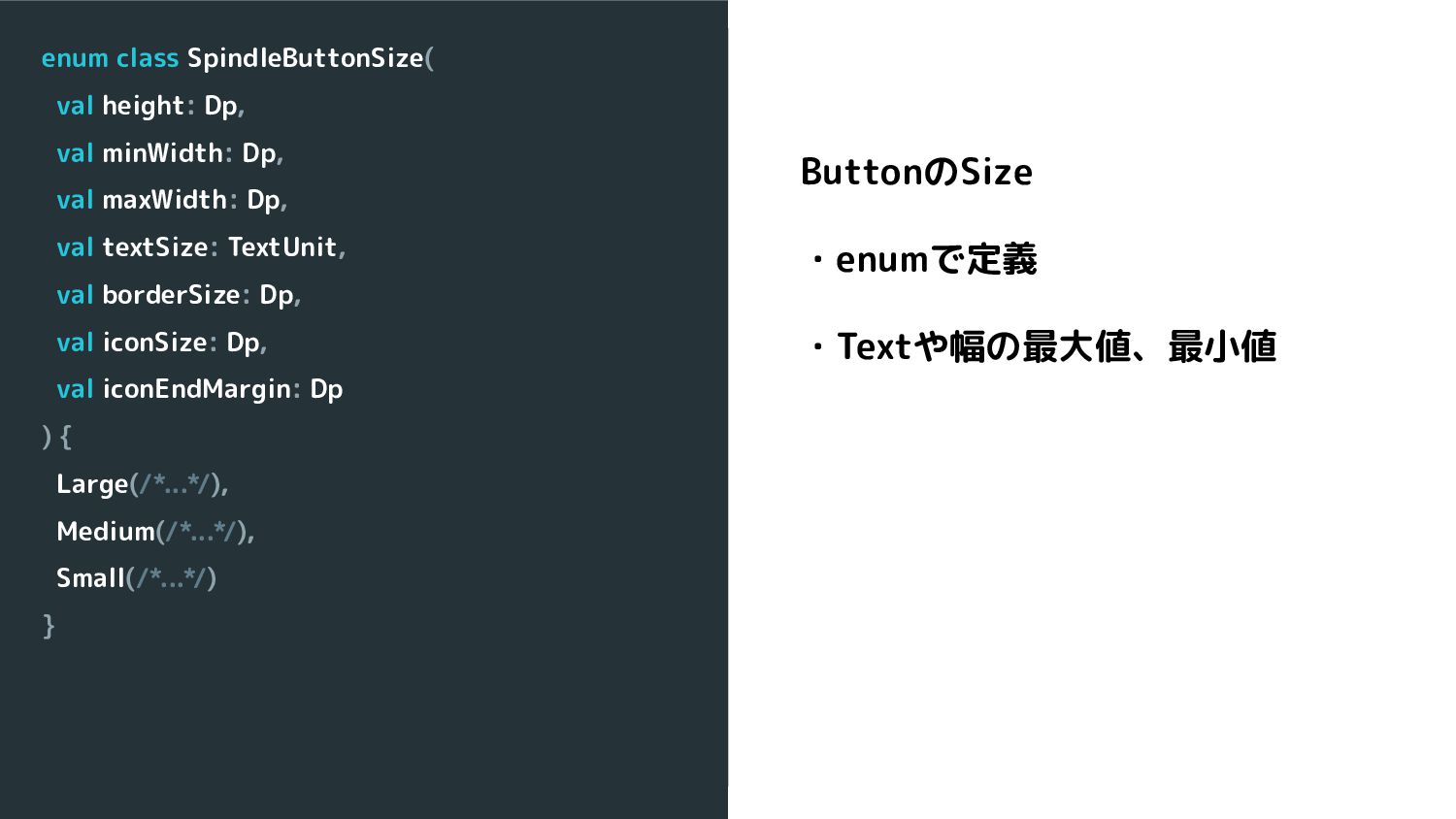
    minWidth: Dp, val maxWidth: Dp, val textSize: TextUnit, val borderSize: Dp, val iconSize: Dp, val iconEndMargin: Dp ) { Large(/*...*/), Medium(/*...*/), Small(/*...*/) }
  8. enum class SpindleButtonStyle( val backgroundColor: Int, val textColor: Int, val

    iconColor: Int, val rippleColor: Int, val rippleAlpha: Float, val borderColor: Int? = null ) { Contained(/*...*/), Outlined(/*...*/), Danger(/*...*/), Neutral(/*...*/), Lighted(/*...*/), Contained(/*...*/) } ButtonのStyle ・enumで定義 ・色、リップル、border
  9. @Composable fun SpindleButton( text: String, buttonSize: SpindleButtonSize, buttonStyle: SpindleButtonStyle, onClick:

    () -> Unit, icon: Painter? = null ) { CompositionLocalProvider(LocalRippleTheme provides SpindleButtonRippleTheme(buttonStyle)) { Box(/*...*/) { Button(/*...*/) {} Row(/*...*/) { Icon(/*...*/) Spacer(/*...*/) Text(/*...*/) } } } } リップルの設定
  10. class SpindleButtonRippleTheme( private val styleType: SpindleButtonStyle ) : RippleTheme {

    @Composable override fun defaultColor(): Color { return colorResource(id = styleType.rippleColor) } @Composable override fun rippleAlpha(): RippleAlpha { return RippleAlpha( draggedAlpha = 0f, focusedAlpha = 0f, hoveredAlpha = 0f, pressedAlpha = styleType.rippleAlpha ) } } ・Buttonの種類によってRipple のAlpha,Colorが違う ・先ほど定義した SpindleButtonStyleを渡してあ げる
  11. @Composable fun SpindleButton( text: String, buttonSize: SpindleButtonSize, buttonStyle: SpindleButtonStyle, onClick:

    () -> Unit, icon: Painter? = null ) { CompositionLocalProvider(LocalRippleTheme provides SpindleButtonRippleTheme(buttonStyle)) { Box(/*...*/) { Button(/*...*/) {} Row(/*...*/) { Icon(/*...*/) Spacer(/*...*/) Text(/*...*/) } } } } Boxで括る
  12. @Composable fun SpindleButton( text: String, buttonSize: SpindleButtonSize, buttonStyle: SpindleButtonStyle, onClick:

    () -> Unit, icon: Painter? = null ) { CompositionLocalProvider(LocalRippleTheme provides SpindleButtonRippleTheme(buttonStyle)) { Button(/*...*/) { Row(/*...*/) { Icon(/*...*/) Spacer(/*...*/) Text(/*...*/) } } } } ・Boxを使わずにButtonのcontentの中 に書くこともできた ・Spindleではボタンをタップした際に リップルは文字の下にくるように定義さ れている ・Rippleが文字にもかかってしまう
  13. @Composable fun SpindleButton( text: String, buttonSize: SpindleButtonSize, buttonStyle: SpindleButtonStyle, onClick:

    () -> Unit, icon: Painter? = null ) { CompositionLocalProvider(LocalRippleTheme provides SpindleButtonRippleTheme(buttonStyle)) { Box(/*...*/) { Button(/*...*/) {} Row(/*...*/) { Icon(/*...*/) Spacer(/*...*/) Text(/*...*/) } } } } ・Boxで括ることで、レイヤー分 けとButtonの上にText、Iconの レイヤーがくるようにした
  14. SpindleButton( text = "Button", buttonSize = SpindleButtonSize.Large, buttonStyle = SpindleButtonStyle.Contained,

    onClick = { /*...*/ }, iconRes = painterResource(id = R.drawable.plus) ) 実際の使い方
  15. @Composable fun SpindleButton( text: String, buttonSize: SpindleButtonSize, buttonStyle: SpindleButtonStyle, onClick:

    () -> Unit, icon: Painter? = null ) { CompositionLocalProvider(LocalRippleTheme provides SpindleButtonRippleTheme(buttonStyle)) { Box(/*...*/) { Button(/*...*/) {} Row(/*...*/) { Icon(/*...*/) Spacer(/*...*/) Text(/*...*/) } } } } Stringを直接渡してるが、 Composable関数で渡した方が汎用的 ではないか?
  16. enum class SpindleButtonStyle( val backgroundColor: Int, val textColor: Int, val

    iconColor: Int, val rippleColor: Int, val rippleAlpha: Float, val borderColor: Int? = null ) { Contained(/*...*/), Outlined(/*...*/), Danger(/*...*/), Neutral(/*...*/), Lighted(/*...*/), Contained(/*...*/) } Styleをenumで渡してるがborderColor 不要の時にnullと余分なものを定義する ことになるけど良いのか?
  17. @Composable fun SpindleButton( text: String, buttonSize: SpindleButtonSize, onClick: () ->

    Unit, modifier: Modifier = Modifier, textColor: Color = SpindleTheme.colors.textHighEmphasisInverse, backgroundColor: Color = SpindleTheme.colors.surfaceAccentPrimary, rippleColor: Int = R.color.contained_button_ripple, rippleAlpha: Float = 0.2f, icon: Painter? = null, iconColor: Color = SpindleTheme.colors.objectHighEmphasisInverse ) { CompositionLocalProvider(/*...*/) { Box(/*...*/) { Button(/*...*/) { } SpindleButtonIconText(/*...*/) } } } Buttonで作成
  18. @Composable fun SpindleOutlinedButton( text: String, buttonSize: SpindleButtonSize, onClick: () ->

    Unit, modifier: Modifier = Modifier, textColor: Color = SpindleTheme.colors.textAccentPrimary, borderColor: Color = SpindleTheme.colors.borderAccentPrimary, rippleColor: Int = R.color.outlined_button_ripple, rippleAlpha: Float = 1f, icon: Painter? = null, iconColor: Color = SpindleTheme.colors.objectAccentPrimary ) { CompositionLocalProvider(/*...*/) { Box(/*...*/) { OutlinedButton(/*...*/) {} SpindleButtonIconText(/*...*/) } } } OutlinedButtonで作成
  19. @Composable fun SpindleNeutralButton( text: String, buttonSize: SpindleButtonSize, onClick: () ->

    Unit, modifier: Modifier = Modifier, icon: Painter? = null ) = SpindleButton( modifier = modifier, text = text, buttonSize = buttonSize, textColor = SpindleTheme.colors.textMediumEmphasis, backgroundColor = SpindleTheme.colors.surfaceTertiary, rippleColor = R.color.neutral_button_ripple, rippleAlpha = 0.1f, iconRes = iconRes, iconColor = SpindleTheme.colors.objectMediumEmphasis, onClick = onClick ) ・NeutralButtonの色などここで指定しま す。 NeutralButton
  20. @Composable fun SpindleDangerButton( text: String, buttonSize: SpindleButtonSize, onClick: () ->

    Unit, modifier: Modifier = Modifier, icon: Painter? = null ) = SpindleOutlinedButton( modifier = modifier, text = text, buttonSize = buttonSize, textColor = SpindleTheme.colors.textCaution, borderColor = SpindleTheme.colors.borderCaution, rippleColor = R.color.danger_button_ripple, rippleAlpha = 0.05f, iconColor = SpindleTheme.colors.objectCaution, onClick = onClick, iconRes = iconRes ) ・SpindleOutlinedButtonを利用 ・Dangerの色やborderColorの指定する DangerButton
  21. SpindleContainedButton( text = "Button", buttonSize = SpindleButtonSize.Large, onClick = {

    /*...*/ }, icon = painterResource(id = R.drawable.plus) ) 最終的な 実際の使い方
  22. class SpindleButton @JvmOverloads constructor( context: Context, attrs: AttributeSet? = null,

    defStyleAttr: Int = R.attr.buttonStyle ) : AppCompatButton(context, attrs, defStyleAttr) { /*...*/ // Textの左にDrawableを描画する. private fun drawIconDrawable(canvas: Canvas) { canvas.withSave {/*...*/} } } ・Custom Viewを使い実装していた ・canvasなどを使って頑張っていた ・利用時にxmlでstyleを渡していた Before(Android View)
  23. @Composable private fun SpindleButtonLabel(/*...*/) { Row(/*...*/) { Icon(/*...*/) Spacer(/*...*/) Text(/*...*/)

    } } ・直感的にかける ・イメージが湧きやすい ・Spindleの定義に沿った表現ができやす くなった After(Compose)