and Requirements ......................................................................................... 3-4 Decide the Target Audience and Purpose................................................................................................................ 5 Decide the Topic and Write a Working Thesis ........................................................................................................... 6-8 Find Statistical Data ....................................................................................................................................................... 9 Identify the Data Story ................................................................................................................................................... 10 Focus Your Data Story ................................................................................................................................................... 11 Create the Textual Outline .......................................................................................................................................... 12-18 Create the Wireframe ................................................................................................................................................... 19-21 Create the Right Type of Chart(s) ................................................................................................................... 22 Decide the Isotype You Will Create ................................................................................................................. 23-27 Decide What Number(s) You Will Visualize ..................................................................................................... 28 Decide How You Will Create the Infographic (what tool(s) you will use) ............................................................. 29 About Templates and How to Avoid Plagiarism ....................................................................................................... 30-31 Submitting Your Infographic ......................................................................................................................................... 32
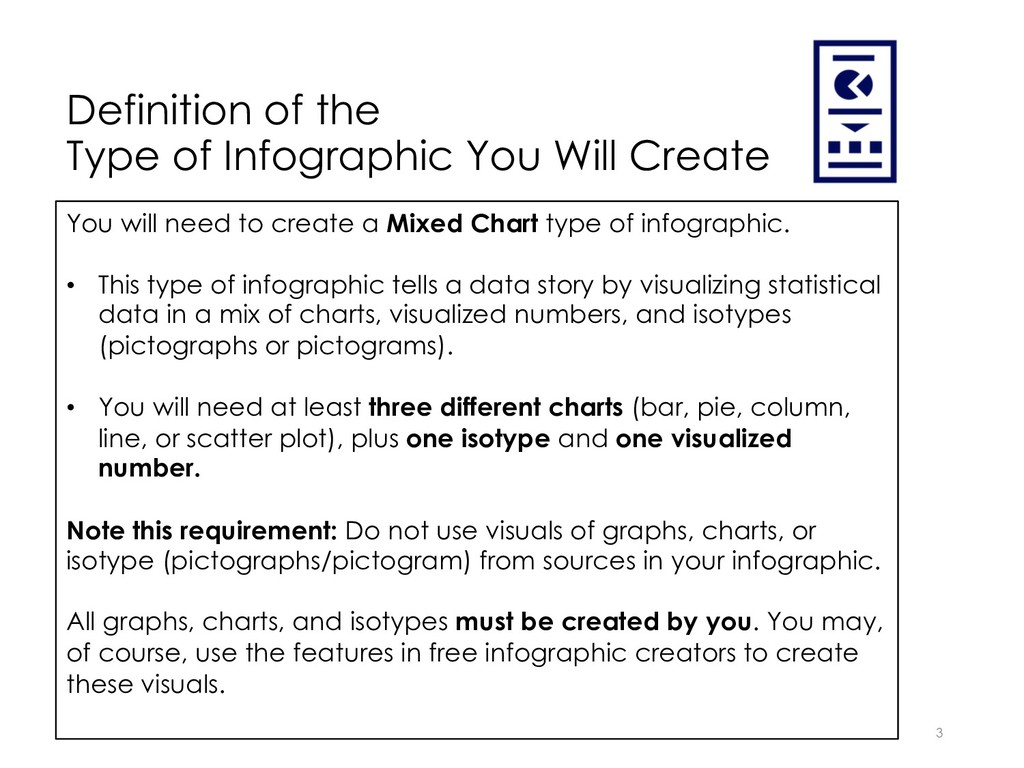
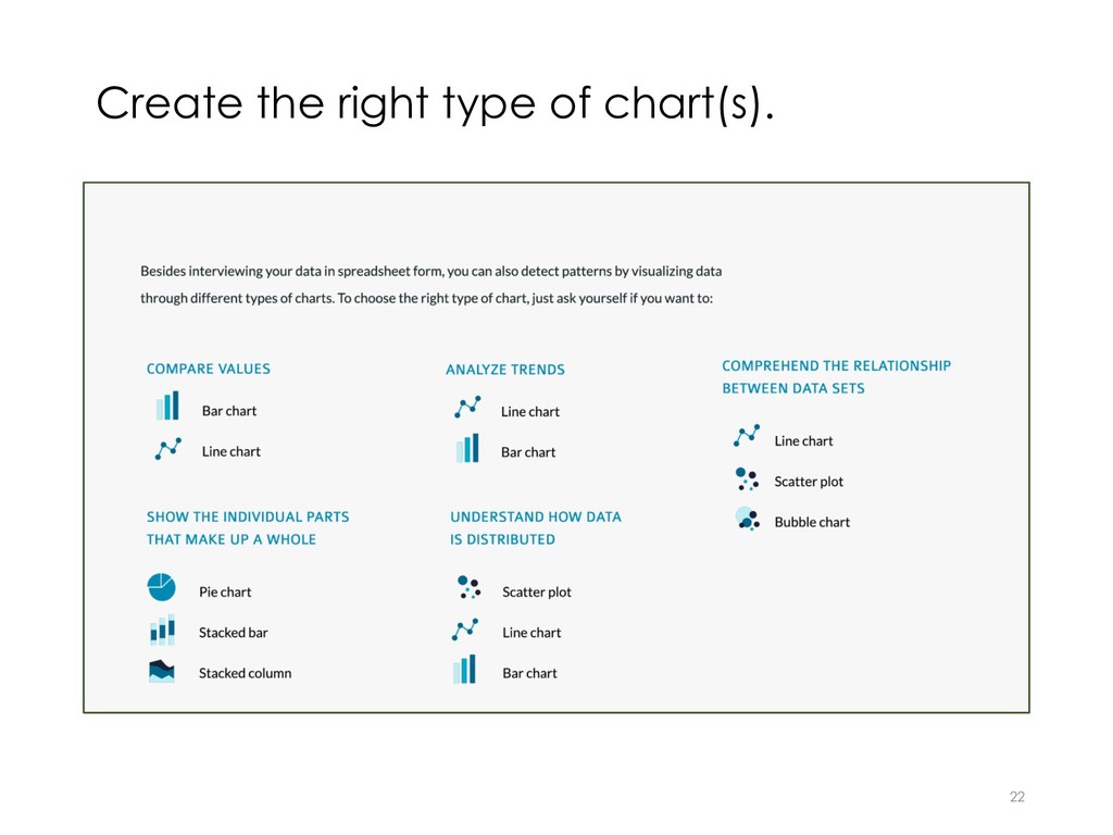
You will need to create a Mixed Chart type of infographic. • This type of infographic tells a data story by visualizing statistical data in a mix of charts, visualized numbers, and isotypes (pictographs or pictograms). • You will need at least three different charts (bar, pie, column, line, or scatter plot), plus one isotype and one visualized number. Note this requirement: Do not use visuals of graphs, charts, or isotype (pictographs/pictogram) from sources in your infographic. All graphs, charts, and isotypes must be created by you. You may, of course, use the features in free infographic creators to create these visuals.
non-specialized (i.e. a lay audience), but you will need to narrow the focus to target a specific lay audience. For example, if you chose parents of a child recently diagnosed with autism as your audience, your infographic purpose could be to educate by presenting statistical facts about autism. Identify your infographic's purpose with a verb. • to Persuade? • to Educate? • to Inform? 5
telling a data story on a topic that is in your field of study. But, you may choose any topic as long as it is not a trivial subject. • Just as in writing a paper, your topic needs to be developed into a working thesis (one you may decide to change later). For now, answer this question: • What is the thesis (main point) you plan to support with the data you will visualize?
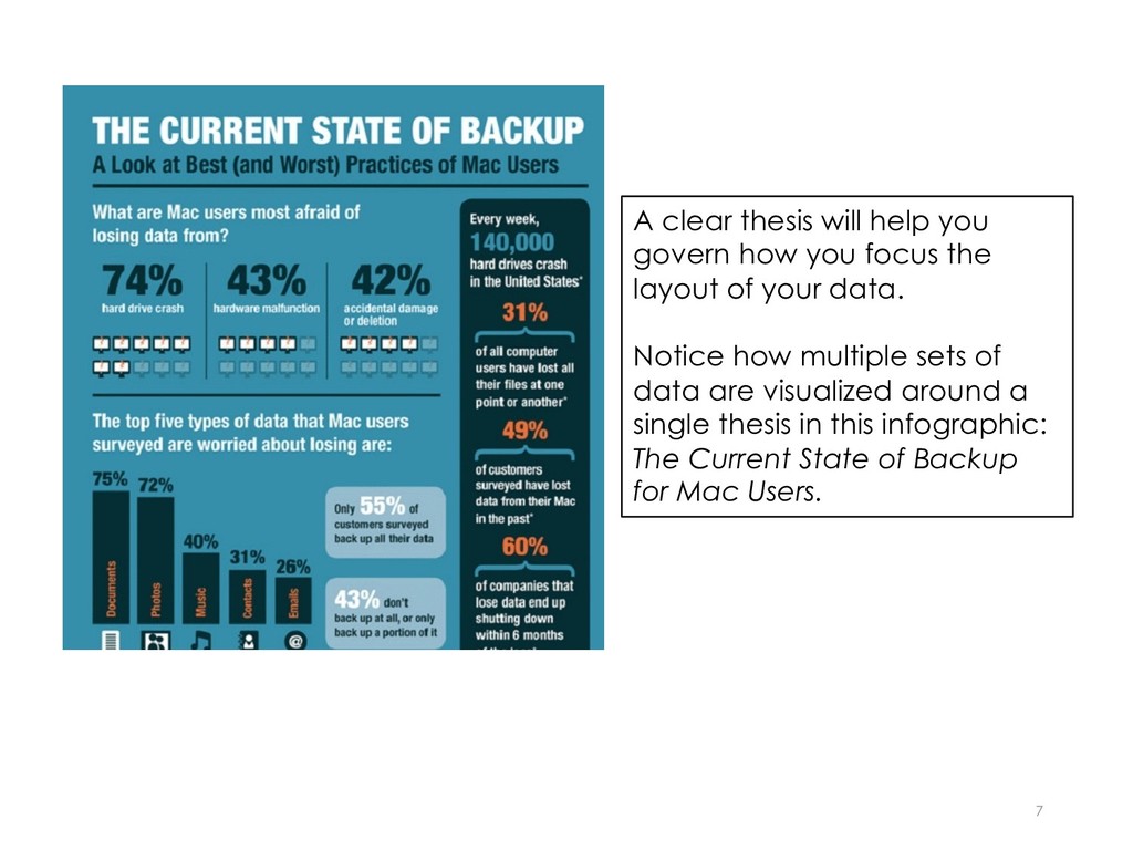
focus the layout of your data. Notice how multiple sets of data are visualized around a single thesis in this infographic: The Current State of Backup for Mac Users.
audience, purpose, thesis, and found statistical data, you will need to analyze it to identify what aspects of the data will best support the story you want to tell. To do that, it’s best to gather the data into one place such as cutting and pasting into a word file or downloading into an Excel spread sheet. • Look for changes over time. • Differences or similarities between items. • Identify parts of a whole. • Identify the relationship between two or more variables. 10
you must decide how much content you will need to support your thesis. Focus on identifying key points from the data that you want to present visually in your story to support your thesis. Work recursively. This means, that although you have already made some decisions, allow yourself room to make adjustments as you process the data and focus the story. 11
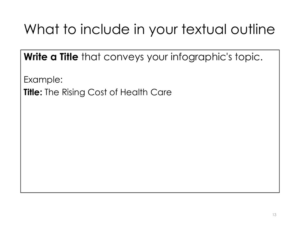
some copy (i.e. text) for your infographic. Writing a textual outline before you begin designing the infographic will help you consider what data that you have gathered will be best for the required mix of different charts; the isotype; and visualized visualized number. A textual outline conveys the main ideas and supporting points but does so with a minimal amount of text.
1 or 2 lines. Work on composing engaging copy. Example: Title: The Rising Cost of Health Care (topic) Introduction: Your Health Care May be Eating Up More of Your Wallet Than You Think (thesis) 14
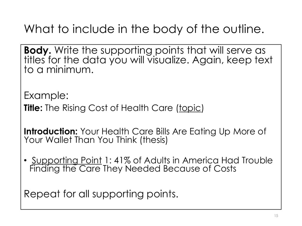
Write the supporting points that will serve as titles for the data you will visualize. Again, keep text to a minimum. Example: Title: The Rising Cost of Health Care (topic) Introduction: Your Health Care Bills Are Eating Up More of Your Wallet Than You Think (thesis) • Supporting Point 1: 41% of Adults in America Had Trouble Finding the Care They Needed Because of Costs Repeat for all supporting points. 15
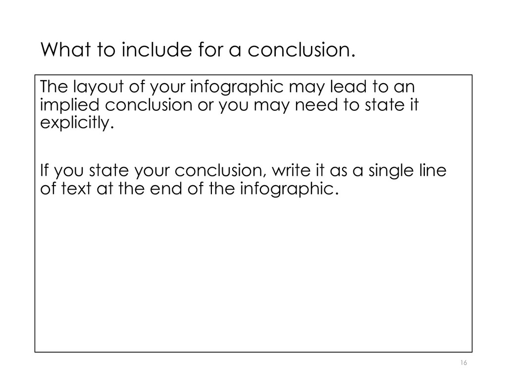
infographic may lead to an implied conclusion or you may need to state it explicitly. If you state your conclusion, write it as a single line of text at the end of the infographic. 16
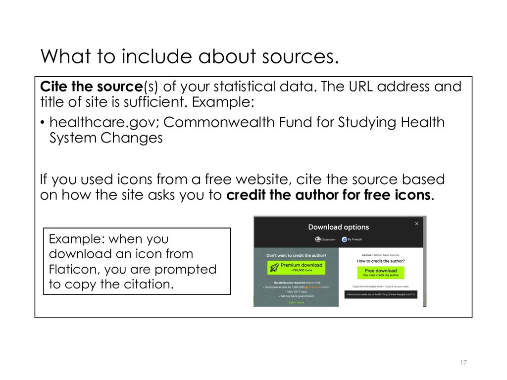
statistical data. The URL address and title of site is sufficient. Example: • healthcare.gov; Commonwealth Fund for Studying Health System Changes If you used icons from a free website, cite the source based on how the site asks you to credit the author for free icons. 17 Example: when you download an icon from Flaticon, you are prompted to copy the citation.
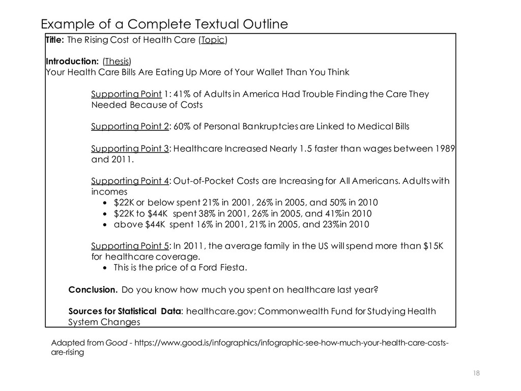
Cost of Health Care (Topic) Introduction: (Thesis) Your Health Care Bills Are Eating Up More of Your Wallet Than You Think Supporting Point 1: 41% of Adults in America Had Trouble Finding the Care They Needed Because of Costs Supporting Point 2: 60% of Personal Bankruptcies are Linked to Medical Bills Supporting Point 3: Healthcare Increased Nearly 1.5 faster than wages between 1989 and 2011. Supporting Point 4: Out-of-Pocket Costs are Increasing for All Americans. Adults with incomes • $22K or below spent 21% in 2001, 26% in 2005, and 50% in 2010 • $22K to $44K spent 38% in 2001, 26% in 2005, and 41%in 2010 • above $44K spent 16% in 2001, 21% in 2005, and 23%in 2010 Supporting Point 5: In 2011, the average family in the US will spend more than $15K for healthcare coverage. • This is the price of a Ford Fiesta. Conclusion. Do you know how much you spent on healthcare last year? Sources for Statistical Data: healthcare.gov; Commonwealth Fund for Studying Health System Changes Adapted from Good - https://www.good.is/infographics/infographic-see-how-much-your-health-care-costs- are-rising
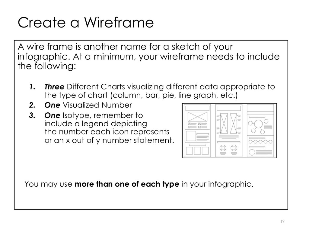
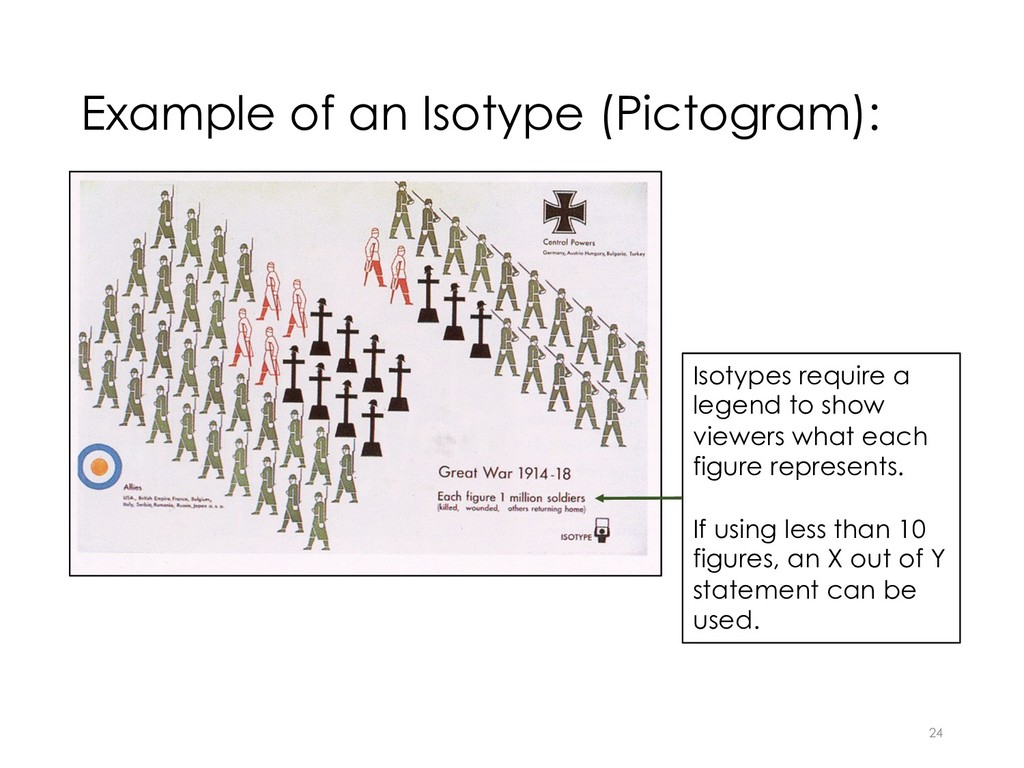
for a sketch of your infographic. At a minimum, your wireframe needs to include the following: 1. Three Different Charts visualizing different data appropriate to the type of chart (column, bar, pie, line graph, etc.) 2. One Visualized Number 3. One Isotype, remember to include a legend depicting the number each icon represents or an x out of y number statement. You may use more than one of each type in your infographic.
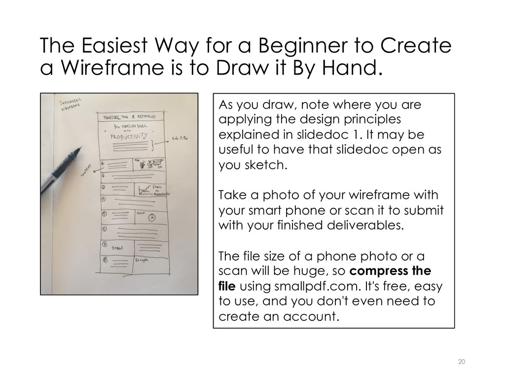
is to Draw it By Hand. 20 As you draw, note where you are applying the design principles explained in slidedoc 1. It may be useful to have that slidedoc open as you sketch. Take a photo of your wireframe with your smart phone or scan it to submit with your finished deliverables. The file size of a phone photo or a scan will be huge, so compress the file using smallpdf.com. It's free, easy to use, and you don't even need to create an account.
titles, subtitles, and introduction, • Placement of visualized numbers, • Rough sketches of the charts you will create, • Rough sketches of the icons in the isotype (pictograph, pictogram) you will create. Note this requirement: no source visuals may be used to create the infographic except for icons.
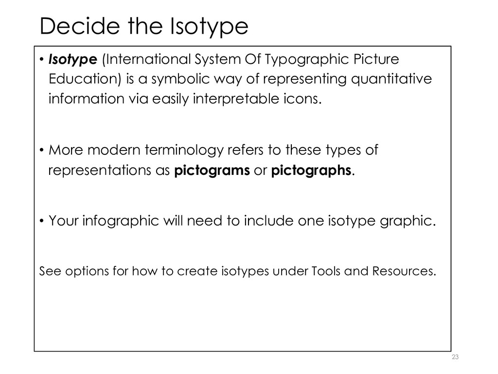
Education) is a symbolic way of representing quantitative information via easily interpretable icons. • More modern terminology refers to these types of representations as pictograms or pictographs. • Your infographic will need to include one isotype graphic. See options for how to create isotypes under Tools and Resources. 23
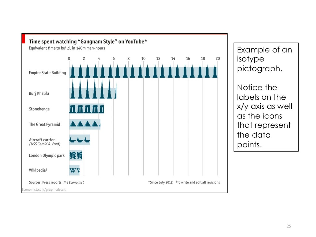
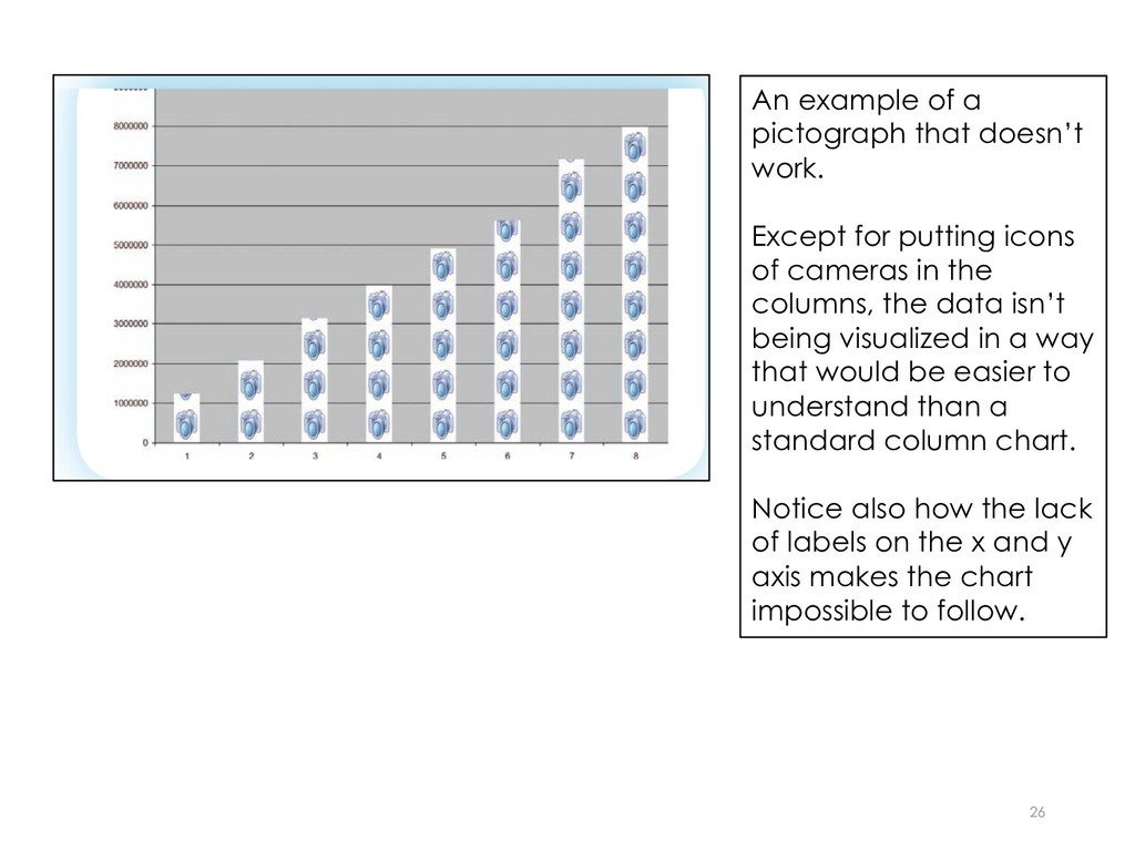
for putting icons of cameras in the columns, the data isn’t being visualized in a way that would be easier to understand than a standard column chart. Notice also how the lack of labels on the x and y axis makes the chart impossible to follow.
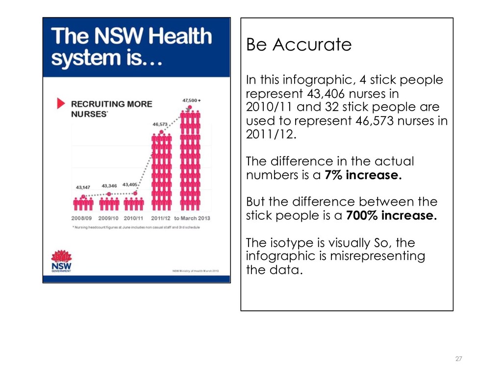
nurses in 2010/11 and 32 stick people are used to represent 46,573 nurses in 2011/12. The difference in the actual numbers is a 7% increase. But the difference between the stick people is a 700% increase. The isotype is visually So, the infographic is misrepresenting the data. 27
one of the numbers, but you may want to emphasize more than one. NOTE: this example is provided just to show you how numbers can be visualized, but it is not meeting the three chart requirement.
Free Infographic Creator Tool. See a list of these under tools and resources on the project page. Canva and Visme are popular tools. • Use Word or a single slide in PowerPoint. You will need to adjust the page size. • Use Microsoft Publisher. PC users will have access to this software, but it is not available for Mac users. • If you are familiar with using more sophisticated graphic design tools such as Adobe Photoshop or Illustrator, Gimp, etc., feel free to use whatever works best for you. See Tools and Resources for more information about these options. 29
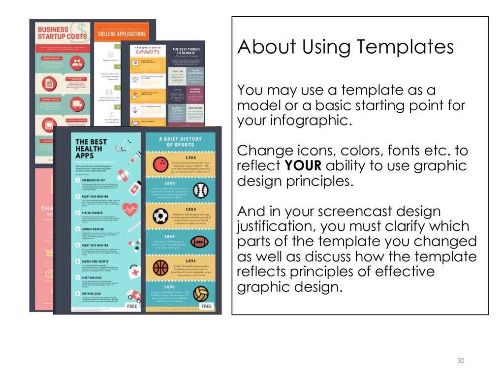
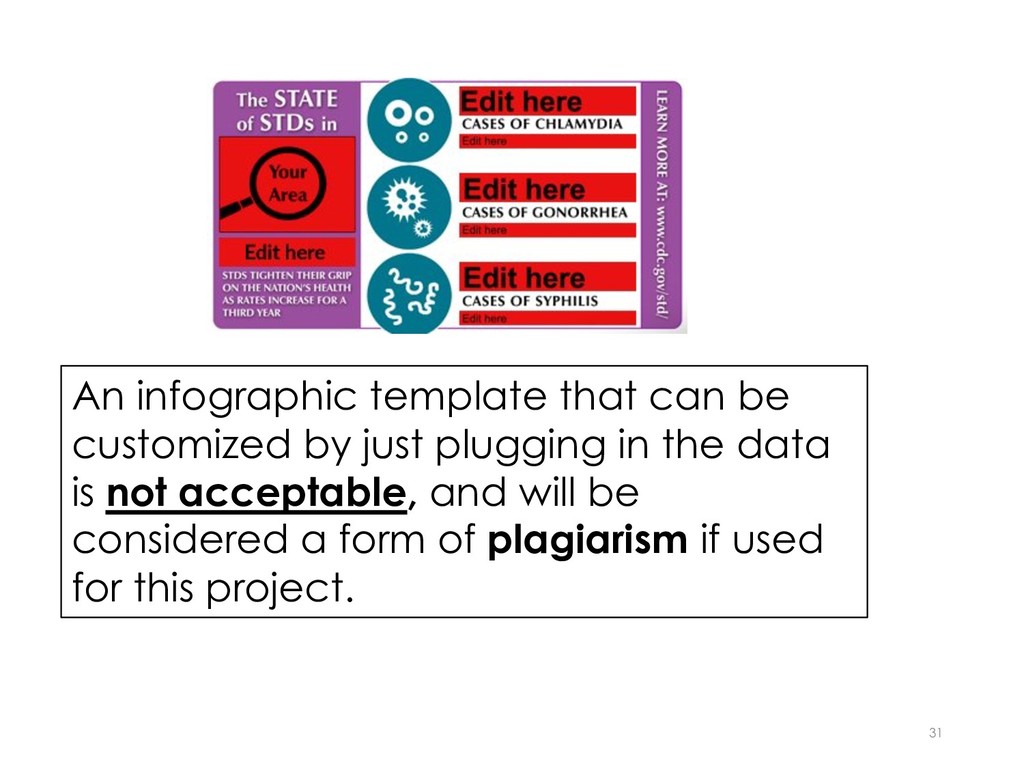
model or a basic starting point for your infographic. Change icons, colors, fonts etc. to reflect YOUR ability to use graphic design principles. And in your screencast design justification, you must clarify which parts of the template you changed as well as discuss how the template reflects principles of effective graphic design. 30
an image file (jpeg, png etc.), a document file (Word, PPT, PPX, PDF). or the URL to where your file is hosted if you created it in a free infographic creator. • NOTE: if you create your infographic using Publisher, please save and submit it as a PDF because I use a Mac and cannot view Publisher files. 32
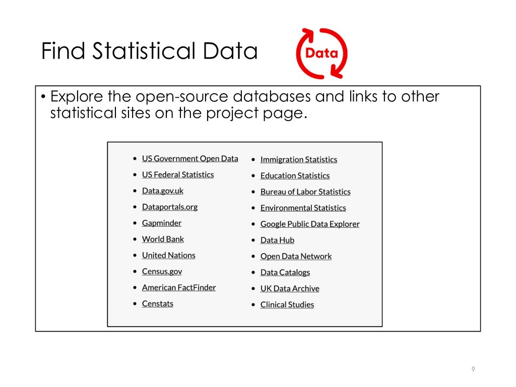