Upgrade to Pro — share decks privately, control downloads, hide ads and more …

English 335 Project 3 Slidedoc 1 Graphic Design Principles for Non-Designers

TechProf
February 10, 2019

English 335 Project 3 Slidedoc 1 Graphic Design Principles for Non-Designers

TechProf

February 10, 2019
Tweet

More Decks by TechProf

Other Decks in Education

Transcript

  1. 2 Table of Contents Introduction .................................................................................................................................................................................. 3 Gestalt Theories of

    Visual Perception ................................................................................................................................... 4 Gestalt Principle 1: Proximity ....................................................................................................................................... 5 Visual Hierarchy................................................................................................................................................... 6 Focal Points........................................................................................................................................................... 7 Alignment ............................................................................................................................................................. 8-13 Gestalt Principle 2: Closure.......................................................................................................................................... 14 Icons and Closure .............................................................................................................................................. 15 Principle 3: Similarity/Anomaly ................................................................................................................................... 16 Color Theory ................................................................................................................................................................................. 17 Color Harmony ................................................................................................................................................................ 18 Color Wheel.......................................................................................................................................................... 19 Monochromatic Color Scheme ..................................................................................................................... 20 Analogous Color Scheme................................................................................................................................ 21 Complementary Color Scheme .................................................................................................................... 22 Rules for Using Complementary Colors ........................................................................................... 23-24 Contrast ................................................................................................................................................................. 25-27 How to Combine Font Styles ................................................................................................................................................... 28-33
  2. Job ads frequently contain a line like this one: •

    Able to collaborate with visual and interaction designers. In today's workplace, no matter what field you are in, it is likely that you will find yourself on a project team where you are expected to collaborate with designers. So, learning some basic principles of design and gaining practice in applying them by creating an infographic will help you be better prepared to communicate design needs on the job. You have already learned and been practicing the crap principles, but in this slidedoc, you'll get a bit more background as to WHY THOSE principles work because they are based on Gestalt theories of visual perception. 3 INTRODUCTION
  3. About Gestalt Theories of Visual Perception • Gestalt means "unified

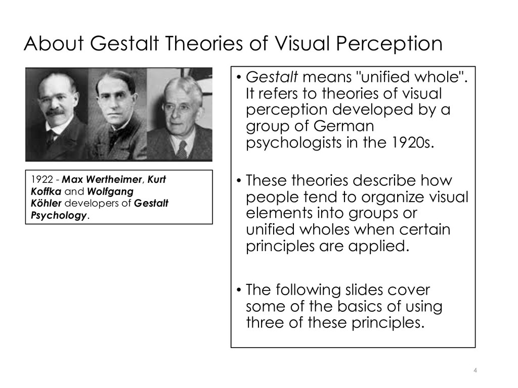
    whole". It refers to theories of visual perception developed by a group of German psychologists in the 1920s. • These theories describe how people tend to organize visual elements into groups or unified wholes when certain principles are applied. • The following slides cover some of the basics of using three of these principles. 4 1922 - Max Wertheimer, Kurt Koffka and Wolfgang Köhler developers of Gestalt Psychology.
  4. Principle 1: Proximity and Alignment Definition: proximity means grouping related

    design elements together. We perceive such grouped elements as belonging to one visual "information" unit or topic. 5
  5. Closely Related to Proximity is Visual Hierarchy 6 Definition: visual

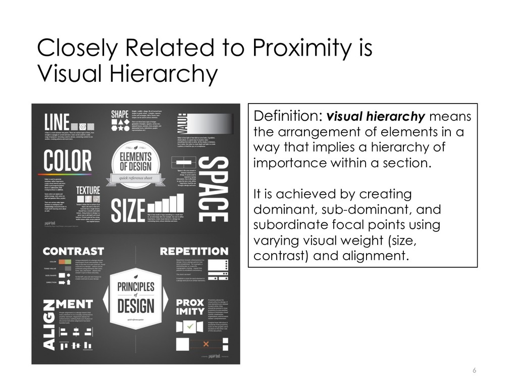
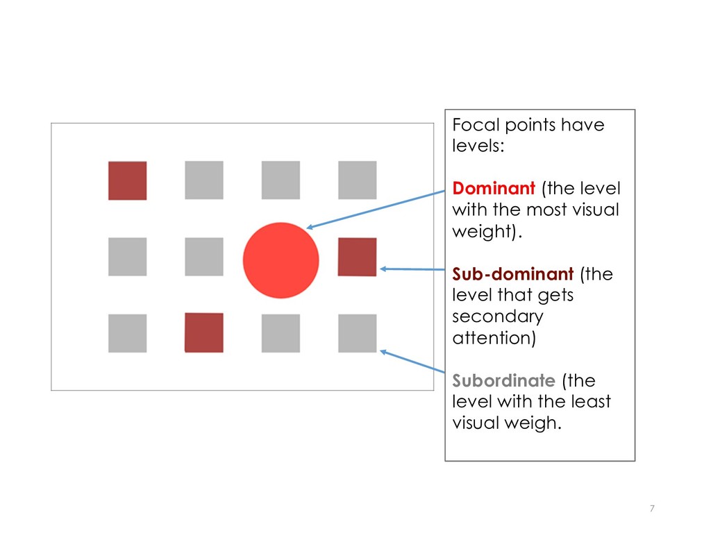
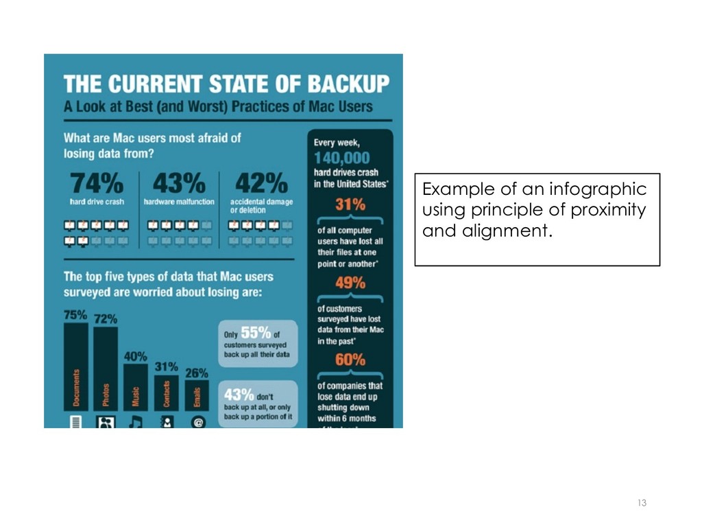
    hierarchy means the arrangement of elements in a way that implies a hierarchy of importance within a section. It is achieved by creating dominant, sub-dominant, and subordinate focal points using varying visual weight (size, contrast) and alignment.
  6. 7 Focal points have levels: Dominant (the level with the

    most visual weight). Sub-dominant (the level that gets secondary attention) Subordinate (the level with the least visual weigh.
  7. Alignment Definition: alignment means that elements are not scattered on

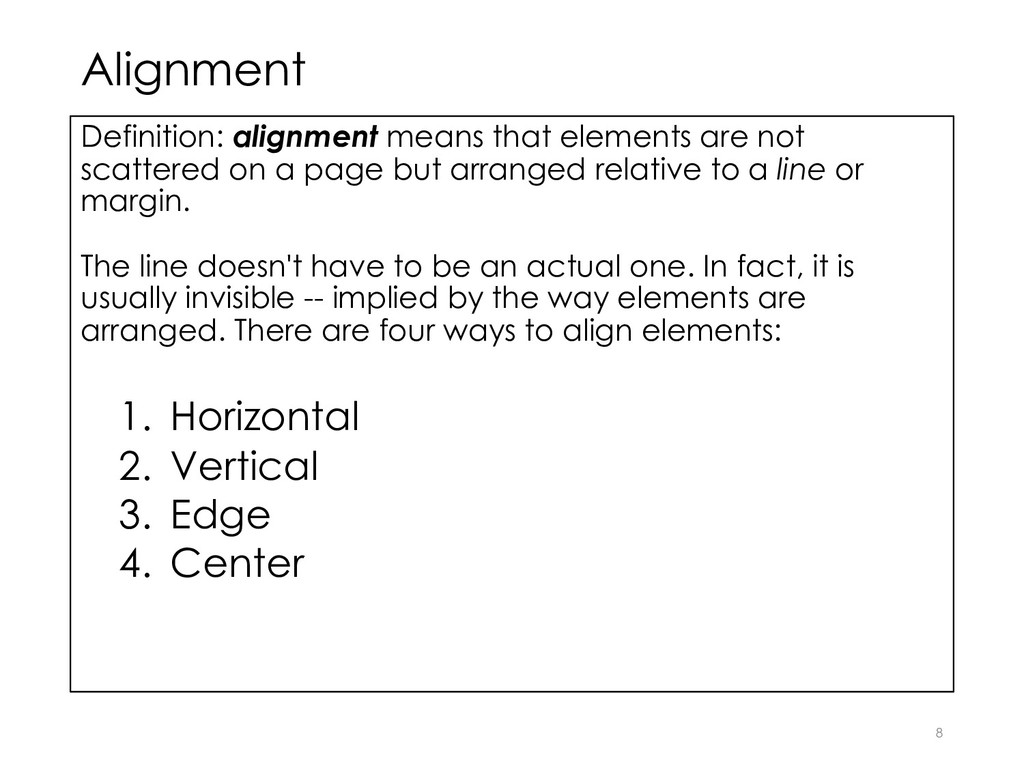
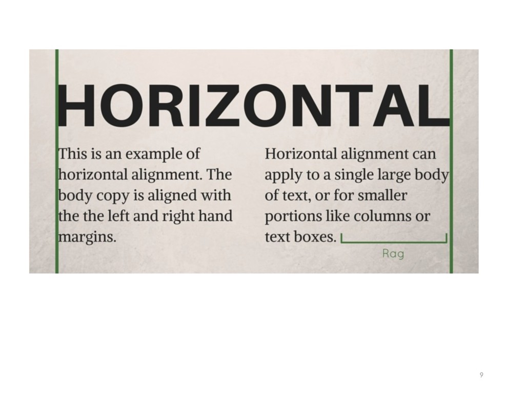
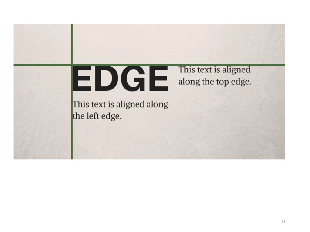
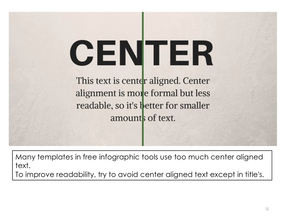
    a page but arranged relative to a line or margin. The line doesn't have to be an actual one. In fact, it is usually invisible -- implied by the way elements are arranged. There are four ways to align elements: 1. Horizontal 2. Vertical 3. Edge 4. Center 8
  8. 9

  9. 10 This type of alignment is sometimes hard to understand.

    Notice how the text is contained (aligned) between the two green lines and also how the text below the word vertical is fully justified (aligned left and no ragged right edge).
  10. 11

  11. 12 Many templates in free infographic tools use too much

    center aligned text. To improve readability, try to avoid center aligned text except in title's.
  12. Principle 2: Closure Definition: closure means what happens when we

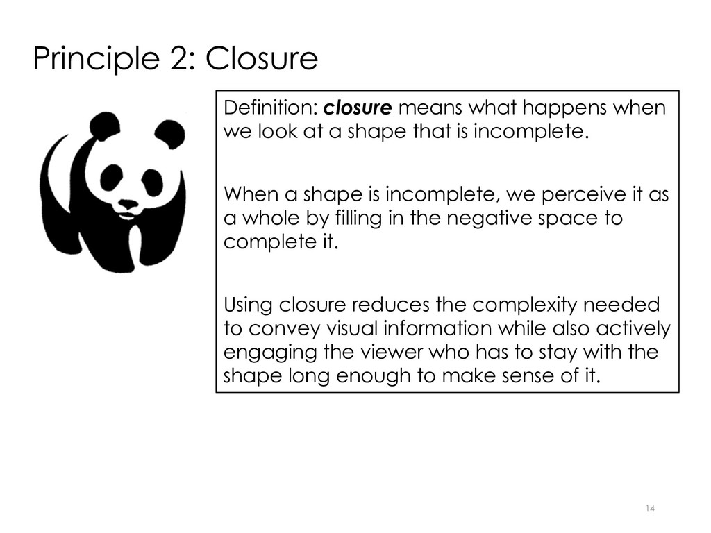
    look at a shape that is incomplete. When a shape is incomplete, we perceive it as a whole by filling in the negative space to complete it. Using closure reduces the complexity needed to convey visual information while also actively engaging the viewer who has to stay with the shape long enough to make sense of it. 14
  13. Icons • Many icons use the principle of closure effectively.

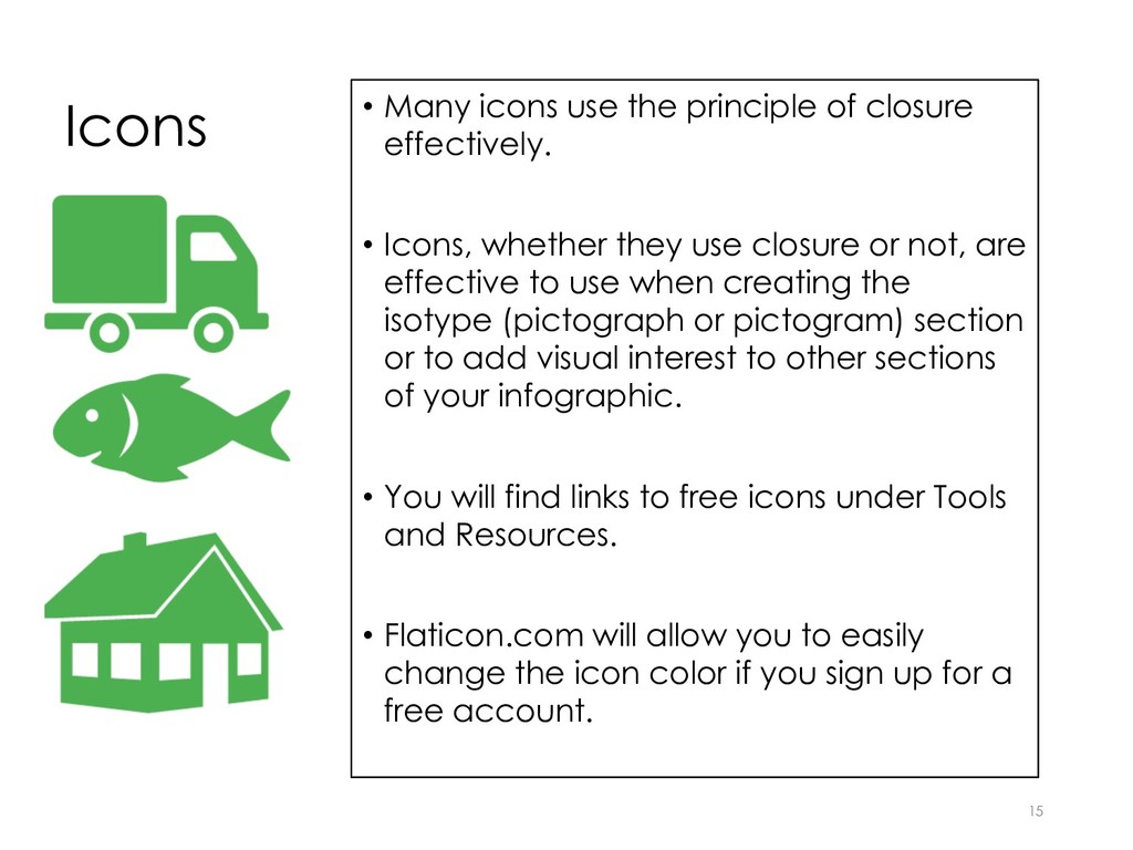
    • Icons, whether they use closure or not, are effective to use when creating the isotype (pictograph or pictogram) section or to add visual interest to other sections of your infographic. • You will find links to free icons under Tools and Resources. • Flaticon.com will allow you to easily change the icon color if you sign up for a free account. 15
  14. Principle 3: Similarity/Anomaly Definition: similarity/anomaly means what happens when we

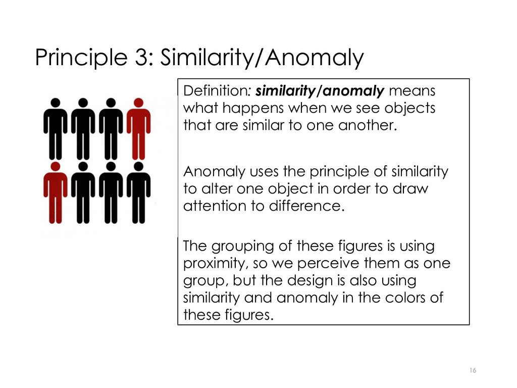
    see objects that are similar to one another. Anomaly uses the principle of similarity to alter one object in order to draw attention to difference. The grouping of these figures is using proximity, so we perceive them as one group, but the design is also using similarity and anomaly in the colors of these figures. 16
  15. Color Harmony 18 Definition: color harmony means the visual is

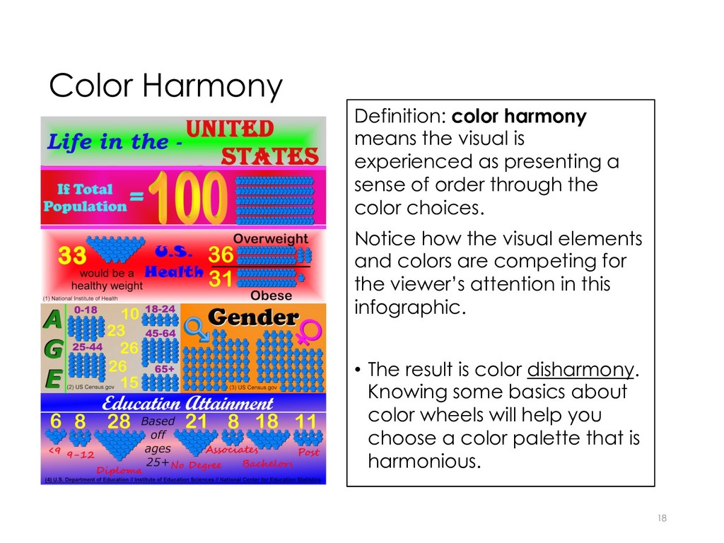
    experienced as presenting a sense of order through the color choices. Notice how the visual elements and colors are competing for the viewer’s attention in this infographic. • The result is color disharmony. Knowing some basics about color wheels will help you choose a color palette that is harmonious.
  16. Color Wheels • A color wheel is a tool for

    combining colors. • The following slides provide some basic approaches for choosing a color scheme based on a color wheel. 19
  17. Monochromatic Color Scheme • This color scheme uses one color

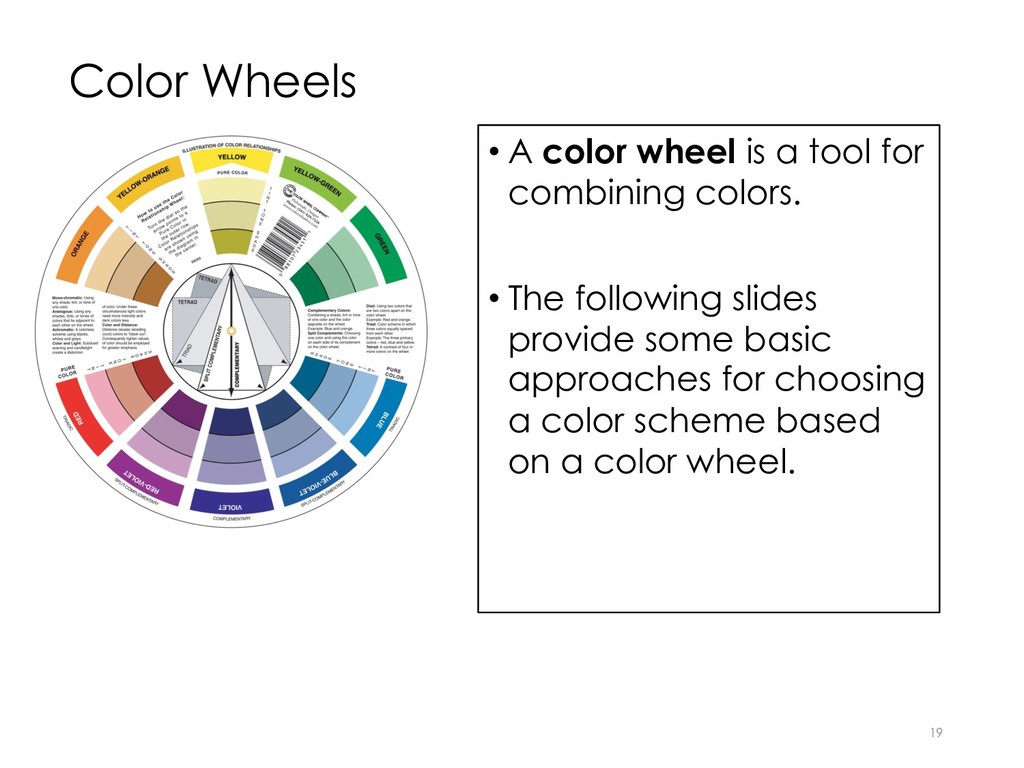
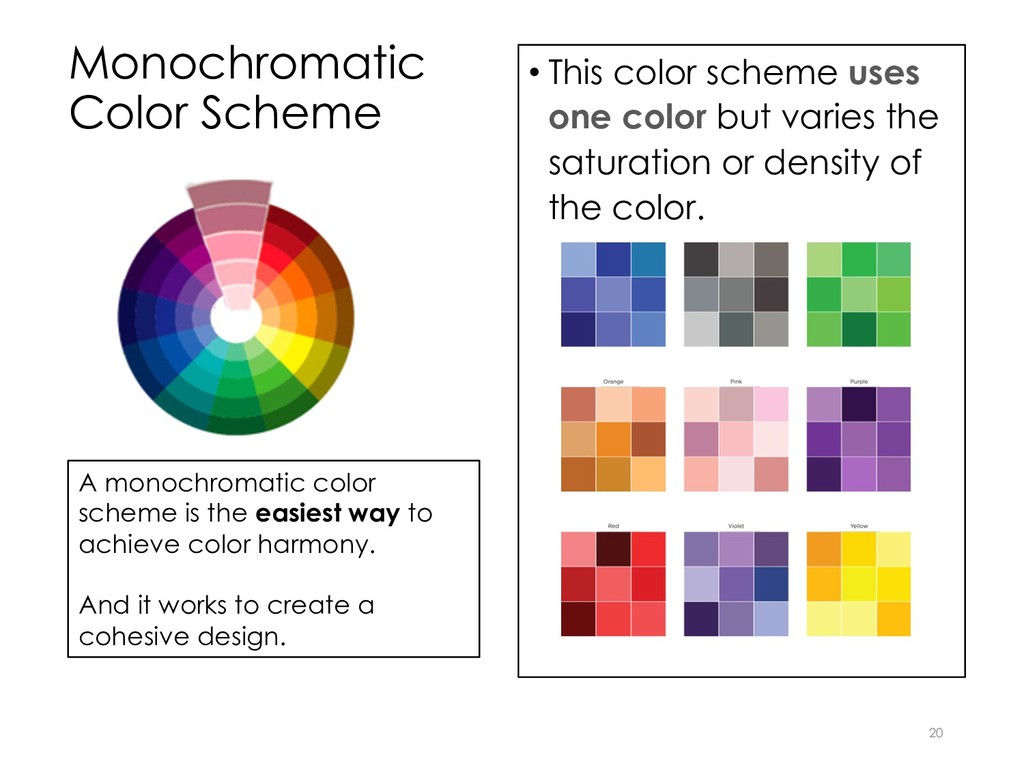
    but varies the saturation or density of the color. 20 A monochromatic color scheme is the easiest way to achieve color harmony. And it works to create a cohesive design.
  18. Analogous Colors • These are any three colors next to

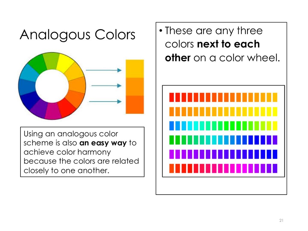
    each other on a color wheel. 21 Using an analogous color scheme is also an easy way to achieve color harmony because the colors are related closely to one another.
  19. Complementary Colors 22 These are colors that are opposite one

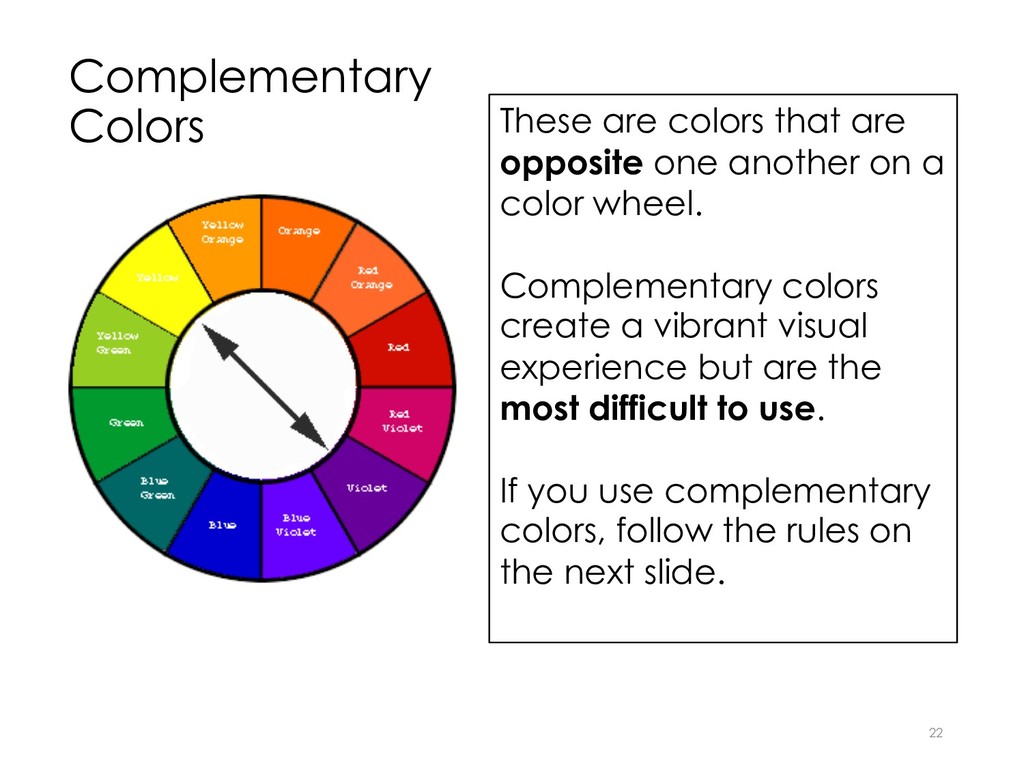
    another on a color wheel. Complementary colors create a vibrant visual experience but are the most difficult to use. If you use complementary colors, follow the rules on the next slide.
  20. Rules for Using Complementary Colors 23 Use no more than

    THREE different colors and apply the 60-30-10 rule. 1. Primary Color – 60% 2. Secondary Color – 30% 3. Accent Color -10%
  21. 24 Example of an infographic using the 60-30-10 rule for

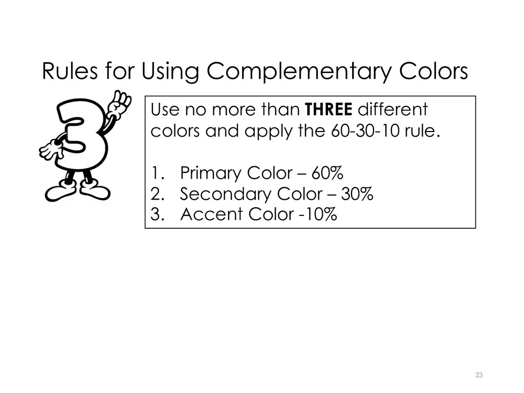
    complementary colors. 60% of the space is the primary color (turquoise). 30% of the space is the secondary color (cream or beige). 10% of the space is the accent color (orange). Black is also used, but it is not considered a color nor is white.
  22. Contrast Definition: contrast is the difference in visual weight (saturation)

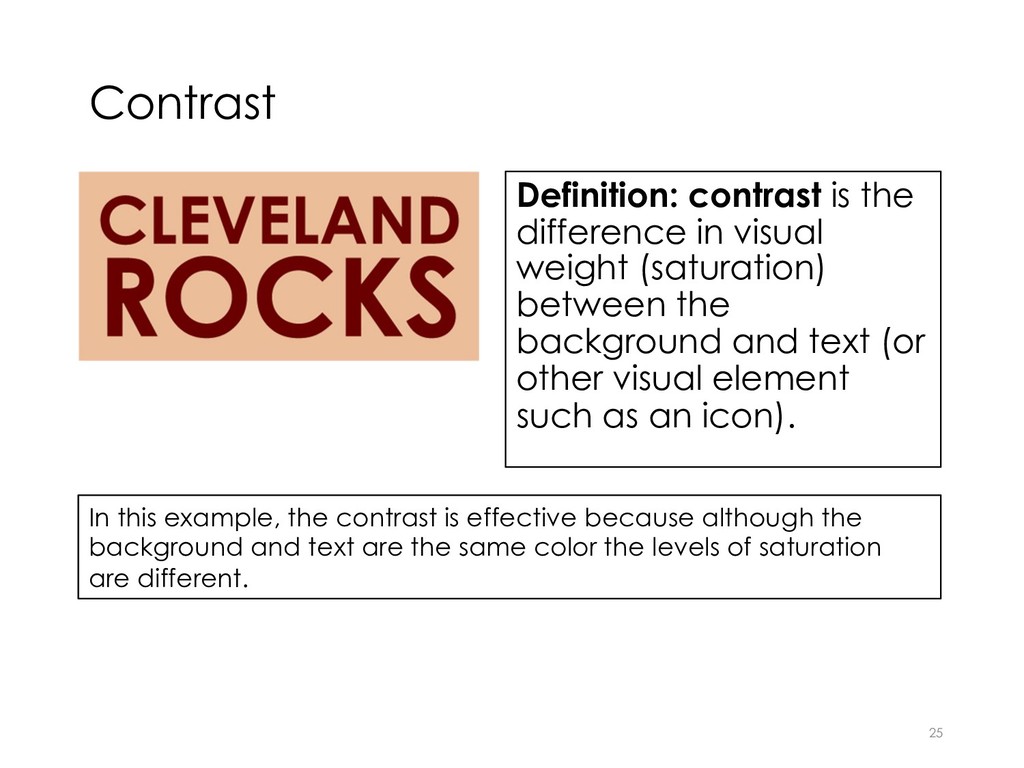
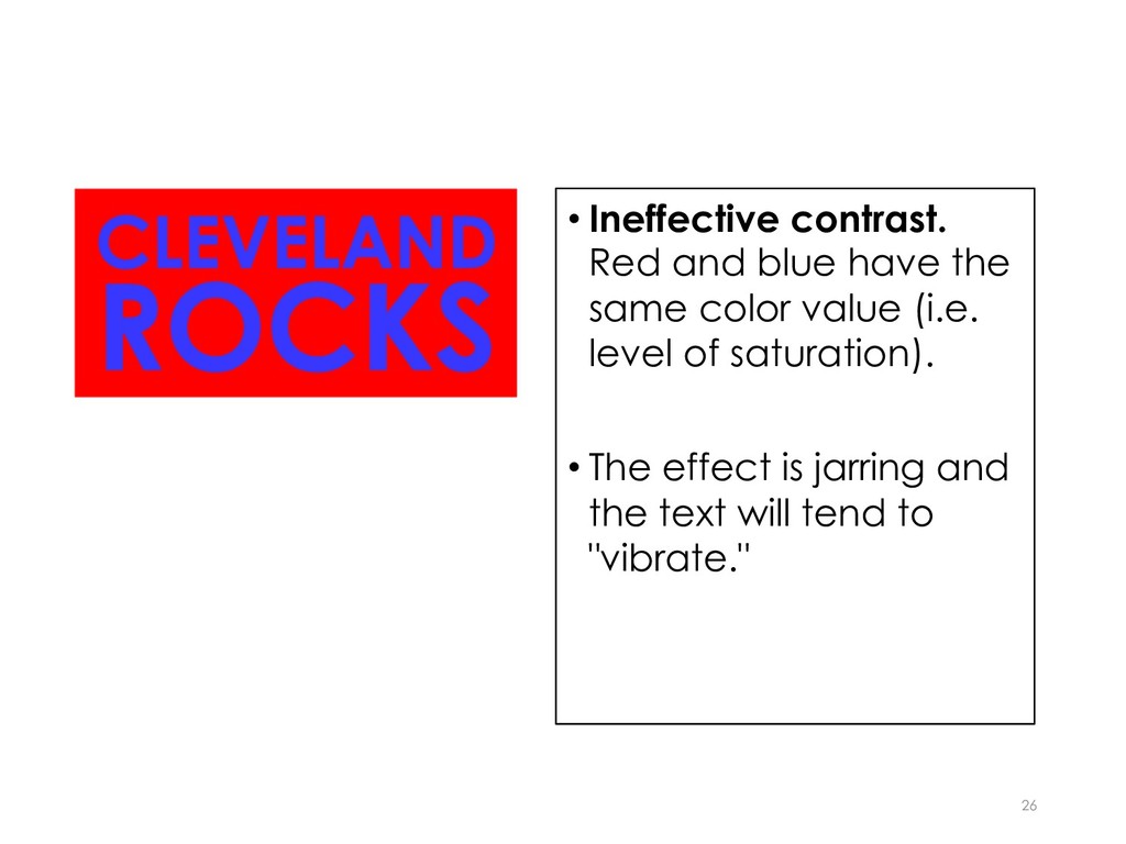
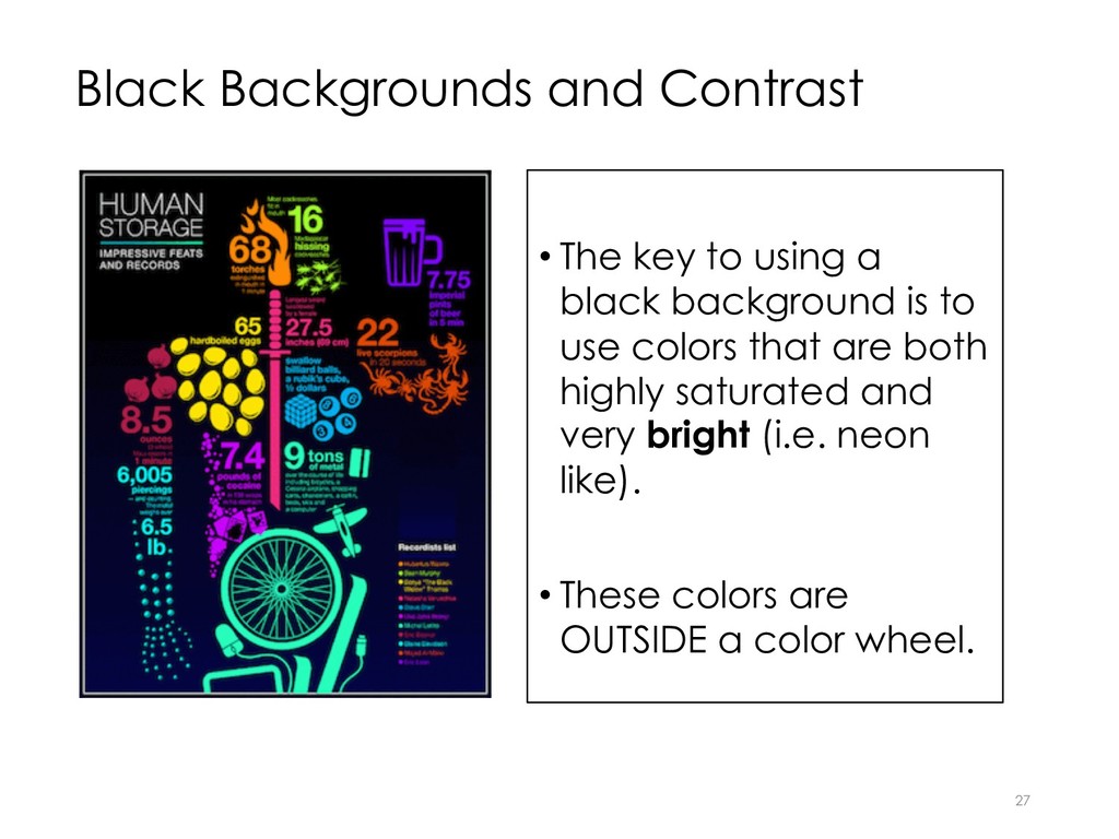
    between the background and text (or other visual element such as an icon). 25 In this example, the contrast is effective because although the background and text are the same color the levels of saturation are different.
  23. • Ineffective contrast. Red and blue have the same color

    value (i.e. level of saturation). • The effect is jarring and the text will tend to "vibrate." 26
  24. Black Backgrounds and Contrast • The key to using a

    black background is to use colors that are both highly saturated and very bright (i.e. neon like). • These colors are OUTSIDE a color wheel. 27
  25. 30

  26. 31

  27. 32

  28. 33