Started profitable media property ‘03-’08 Programmer & Tech Lead 2008 Learned I’m not a user Who is this guy? I’ve been doing this for a long time. I’ve worked in every part of the delivery chain. In 2008 I did my first user tests of an application for AHA. A lightbulb went off for me about how important the interface is in peoples’ lives.
you need to cook fish in there? What about the clock? Somebody decided that the off button needed to be more prominent than the start button. This is full of features we don’t really need. The design on the right is a microwave MVP. This fits with how people reheat their leftovers. 30 seconds, stick your finger in it, add more time.
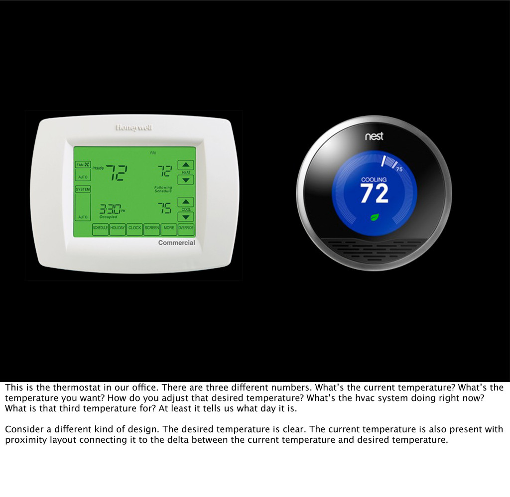
different numbers. What’s the current temperature? What’s the temperature you want? How do you adjust that desired temperature? What’s the hvac system doing right now? What is that third temperature for? At least it tells us what day it is. Consider a different kind of design. The desired temperature is clear. The current temperature is also present with proximity layout connecting it to the delta between the current temperature and desired temperature.
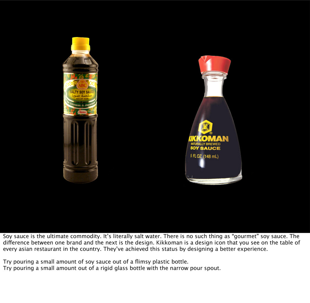
There is no such thing as “gourmet” soy sauce. The difference between one brand and the next is the design. Kikkoman is a design icon that you see on the table of every asian restaurant in the country. They’ve achieved this status by designing a better experience. Try pouring a small amount of soy sauce out of a flimsy plastic bottle. Try pouring a small amount out of a rigid glass bottle with the narrow pour spout.
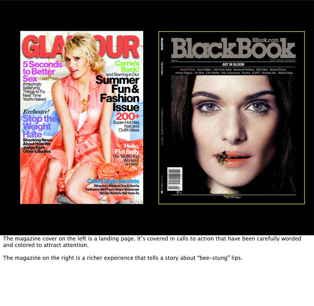
It’s covered in calls to action that have been carefully worded and colored to attract attention. The magazine on the right is a richer experience that tells a story about “bee-stung” lips.
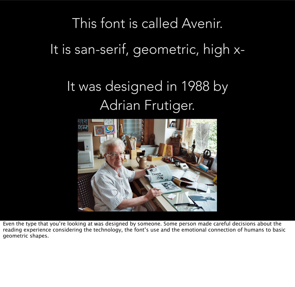
x- It was designed in 1988 by Adrian Frutiger. Even the type that you’re looking at was designed by someone. Some person made careful decisions about the reading experience considering the technology, the font’s use and the emotional connection of humans to basic geometric shapes.
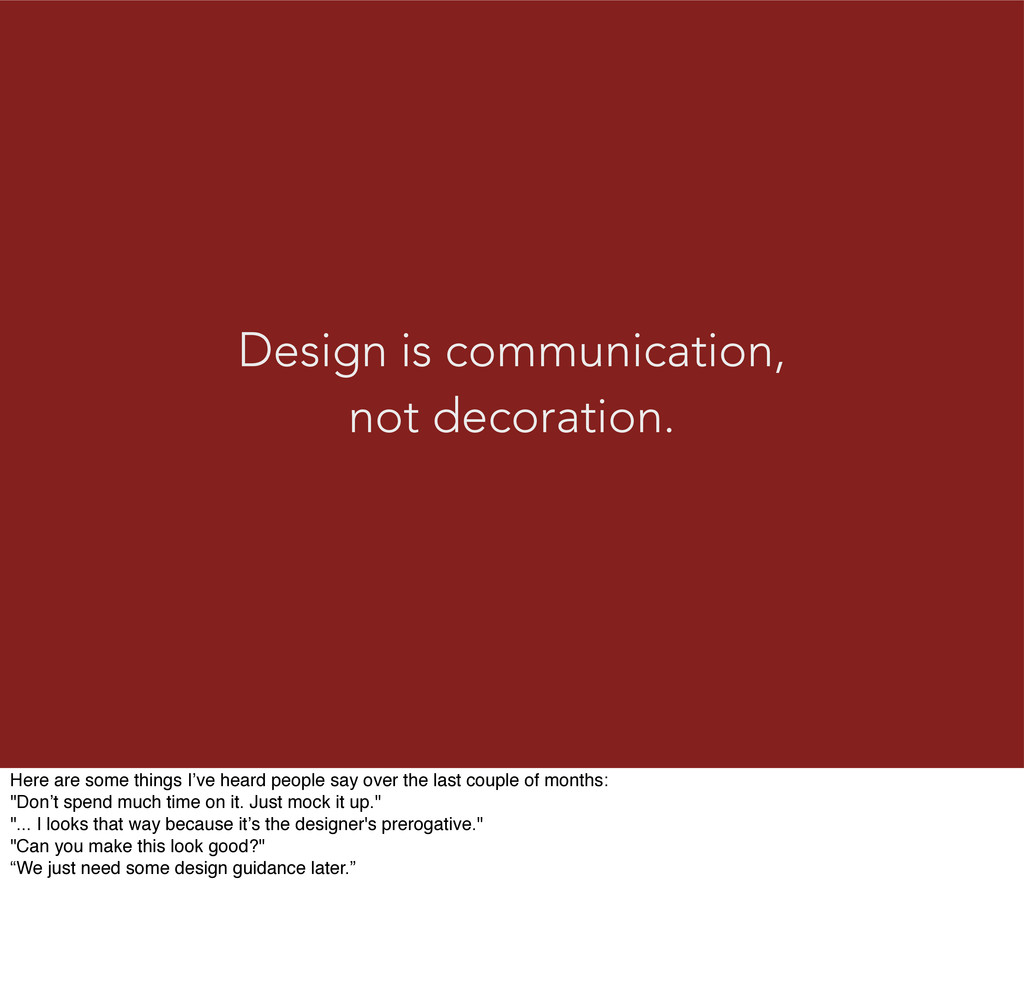
heard people say over the last couple of months: "Don’t spend much time on it. Just mock it up." "... I looks that way because it’s the designer's prerogative." "Can you make this look good?" “We just need some design guidance later.”
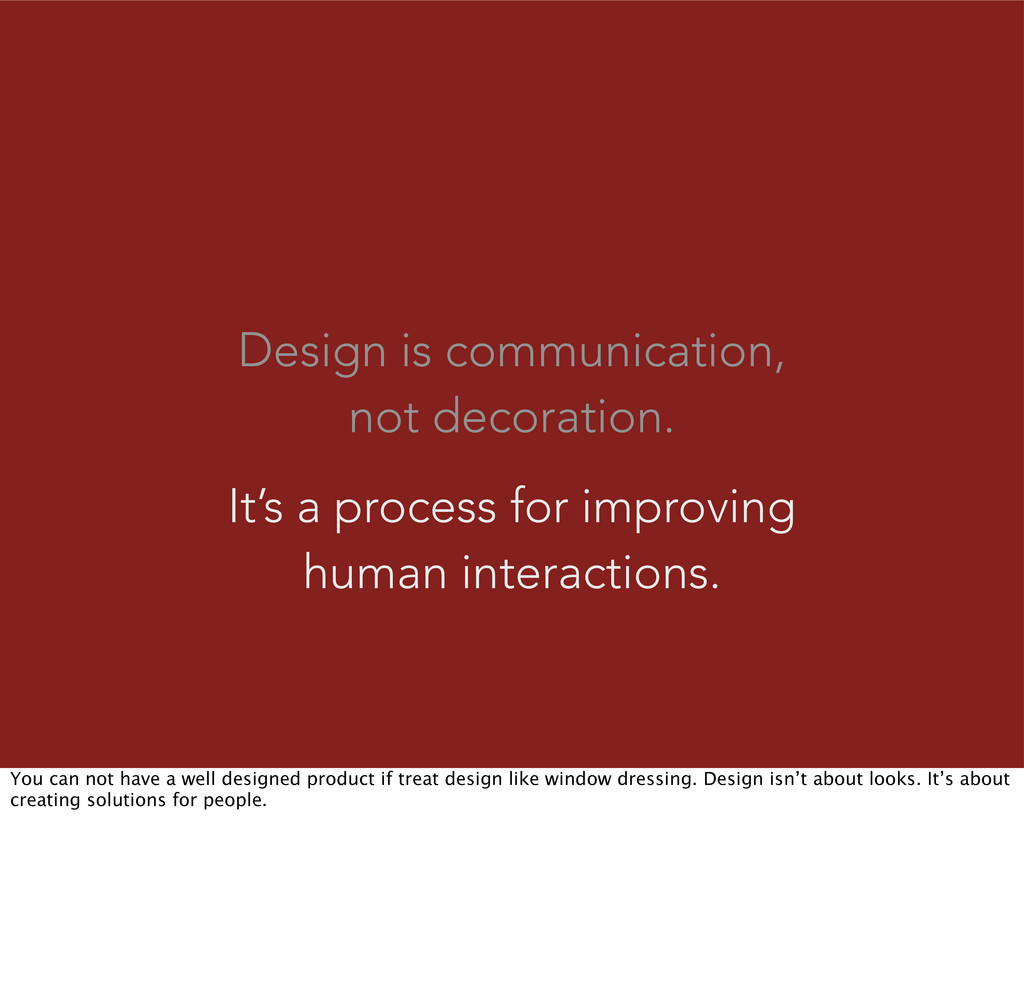
human interactions. You can not have a well designed product if treat design like window dressing. Design isn’t about looks. It’s about creating solutions for people.
problems. People will pay you to make their problems and their pain go away. People are solution agnostic and will use whatever works. This can be a competitive advantage.
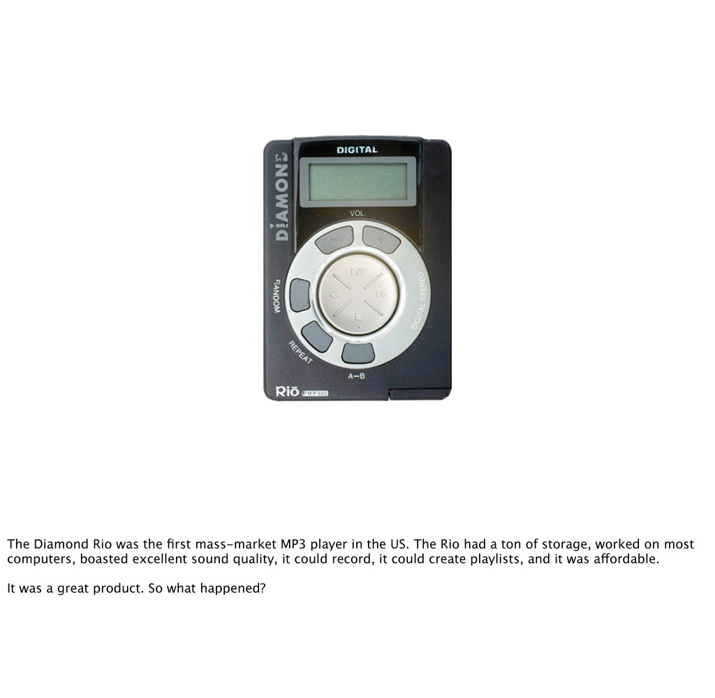
the US. The Rio had a ton of storage, worked on most computers, boasted excellent sound quality, it could record, it could create playlists, and it was affordable. It was a great product. So what happened?
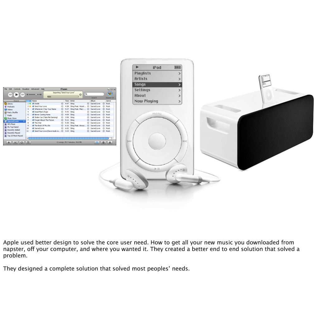
How to get all your new music you downloaded from napster, off your computer, and where you wanted it. They created a better end to end solution that solved a problem. They designed a complete solution that solved most peoples’ needs.
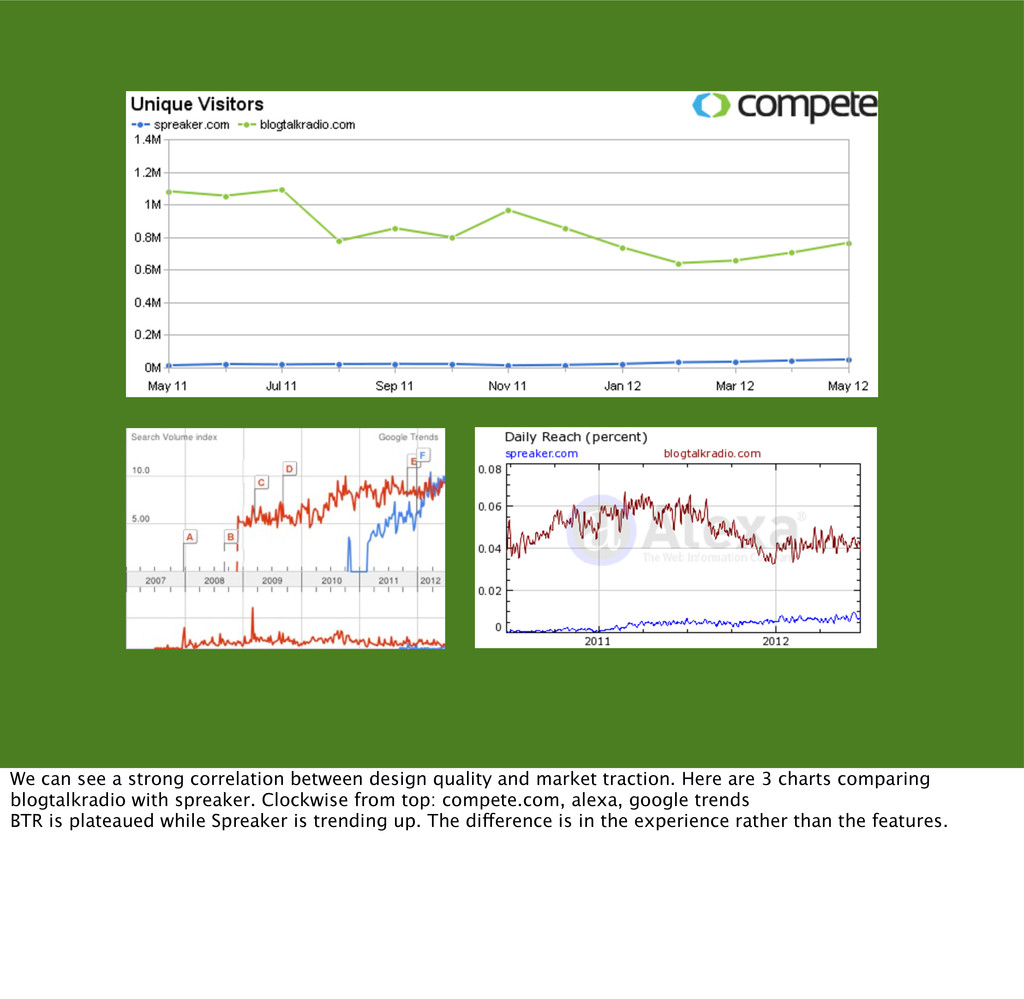
market traction. Here are 3 charts comparing blogtalkradio with spreaker. Clockwise from top: compete.com, alexa, google trends BTR is plateaued while Spreaker is trending up. The difference is in the experience rather than the features.
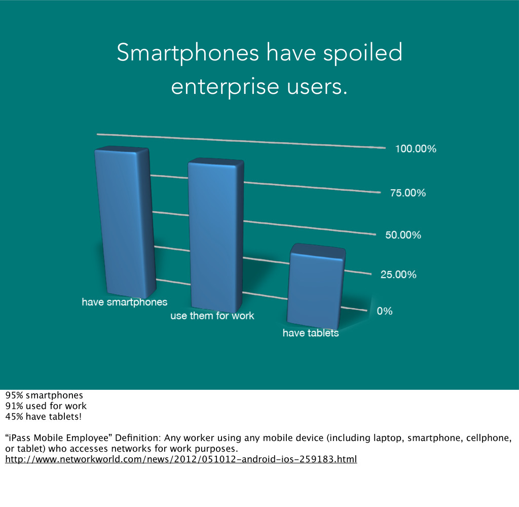
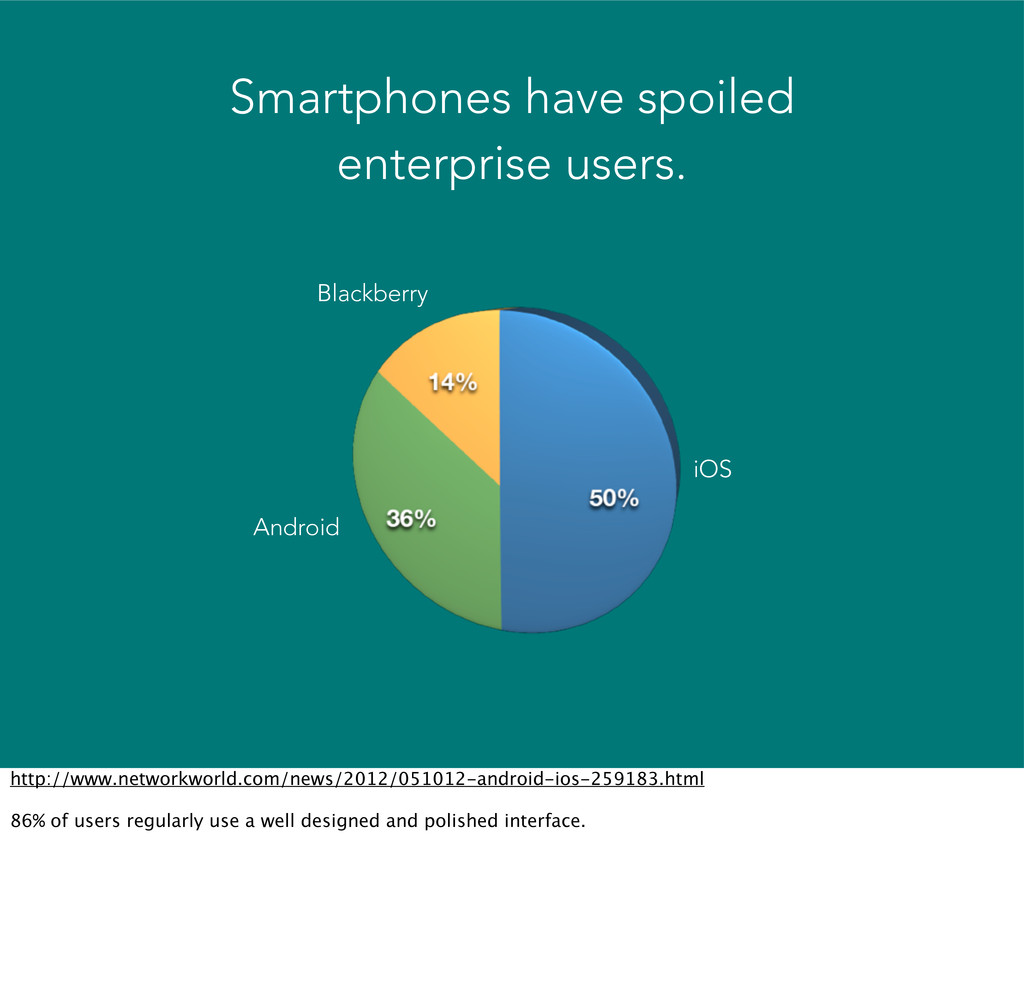
tell a story of users in enterprises who’ve used elegant interfaces in iOS and Android and won’t settle for substandard experiences. The trends of BYOD and paying out of pocket for consumer SASSes indicates that design is a differentiator for enterprise users.
work 45% have tablets! “iPass Mobile Employee” Definition: Any worker using any mobile device (including laptop, smartphone, cellphone, or tablet) who accesses networks for work purposes. http://www.networkworld.com/news/2012/051012-android-ios-259183.html
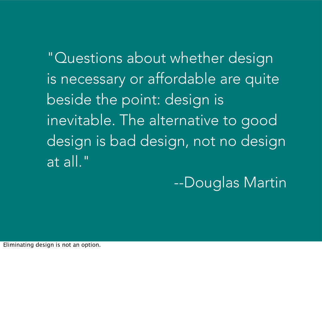
beside the point: design is inevitable. The alternative to good design is bad design, not no design at all." --Douglas Martin Eliminating design is not an option.
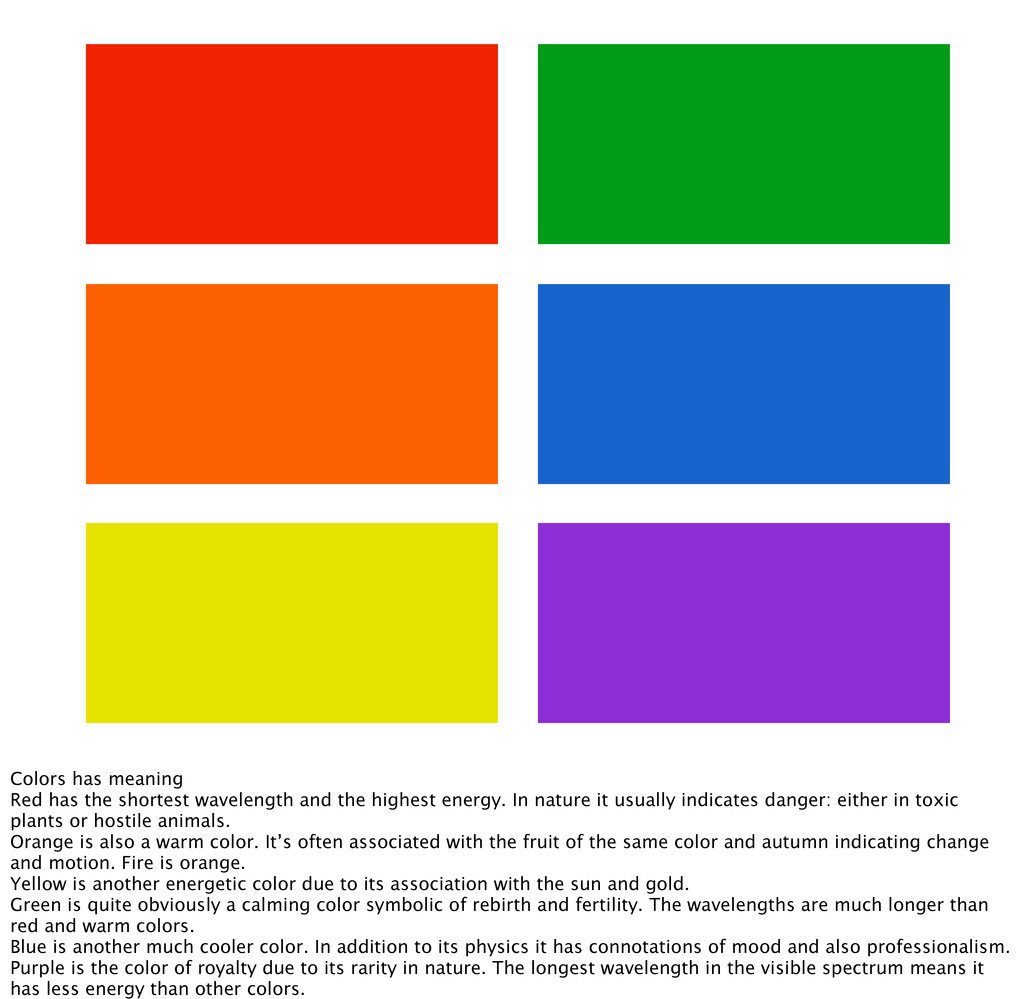
highest energy. In nature it usually indicates danger: either in toxic plants or hostile animals. Orange is also a warm color. It’s often associated with the fruit of the same color and autumn indicating change and motion. Fire is orange. Yellow is another energetic color due to its association with the sun and gold. Green is quite obviously a calming color symbolic of rebirth and fertility. The wavelengths are much longer than red and warm colors. Blue is another much cooler color. In addition to its physics it has connotations of mood and also professionalism. Purple is the color of royalty due to its rarity in nature. The longest wavelength in the visible spectrum means it has less energy than other colors.
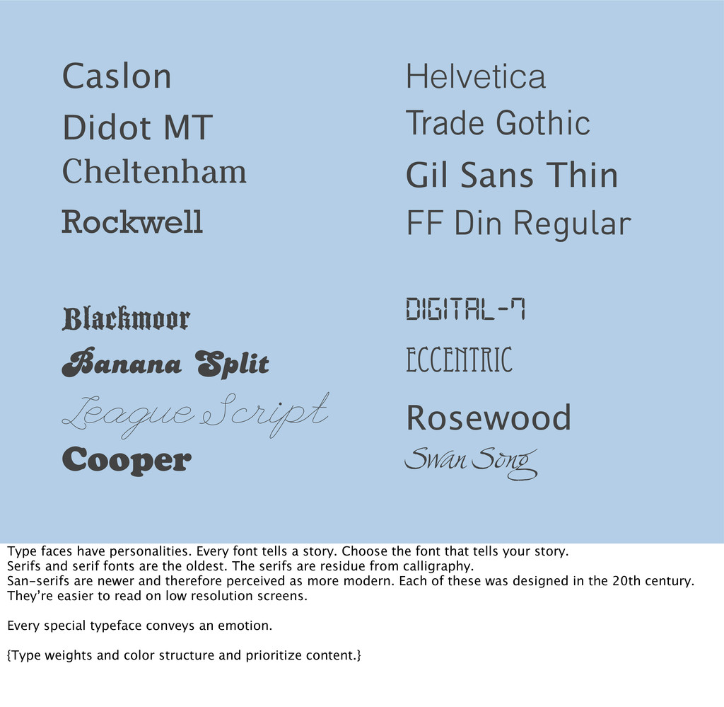
FF Din Regular Cheltenham Blackmoor Banana Split League Script Digital-7 Eccentric Rosewood Cooper Swan Song Type faces have personalities. Every font tells a story. Choose the font that tells your story. Serifs and serif fonts are the oldest. The serifs are residue from calligraphy. San-serifs are newer and therefore perceived as more modern. Each of these was designed in the 20th century. They’re easier to read on low resolution screens. Every special typeface conveys an emotion. {Type weights and color structure and prioritize content.}
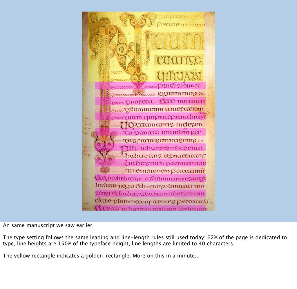
the same leading and line-length rules still used today: 62% of the page is dedicated to type, line heights are 150% of the typeface height, line lengths are limited to 40 characters. The yellow rectangle indicates a golden-rectangle. More on this in a minute...
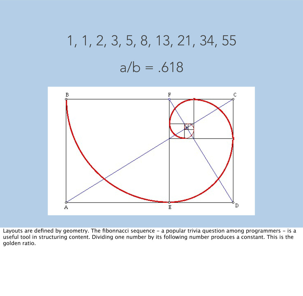
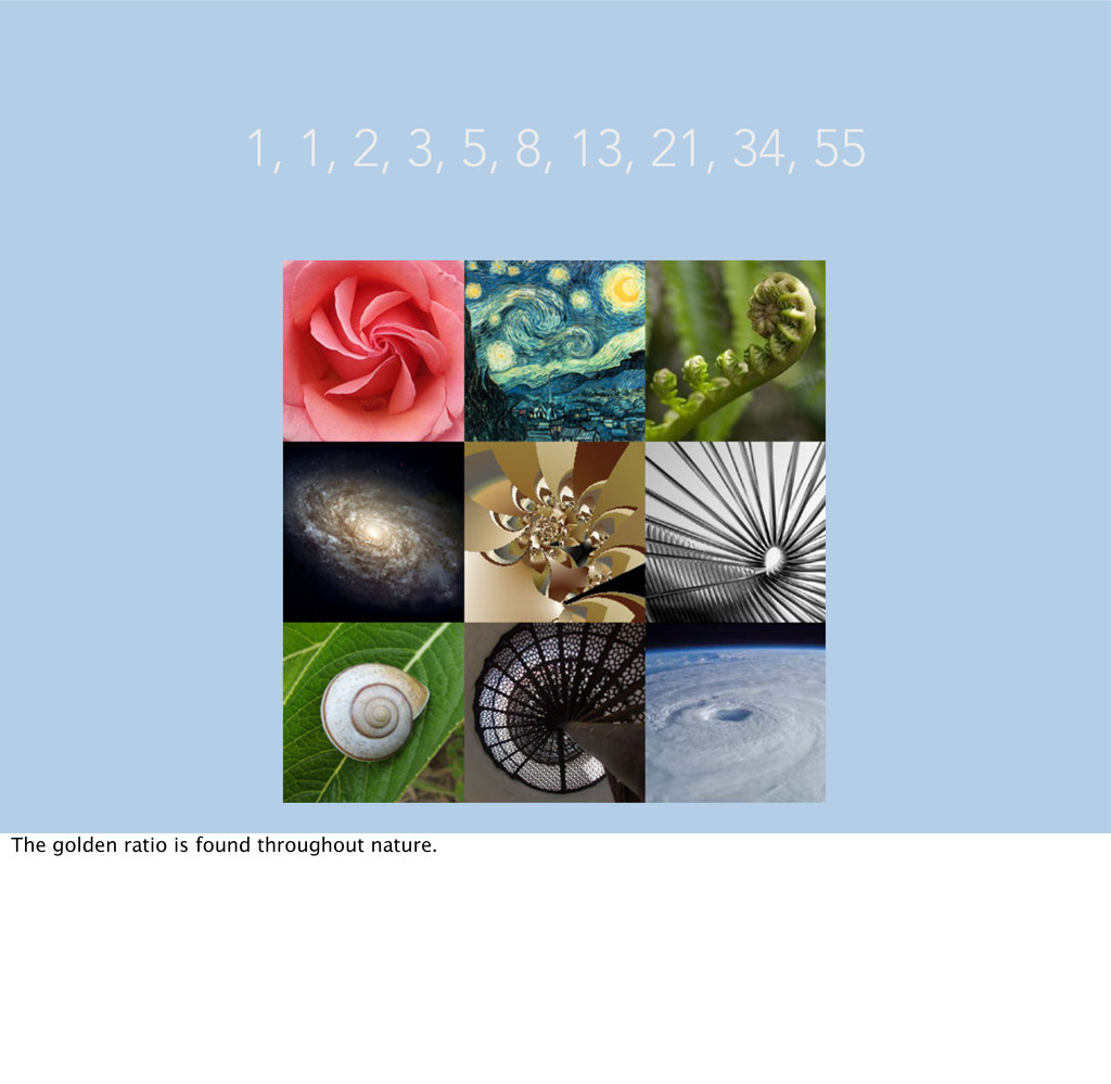
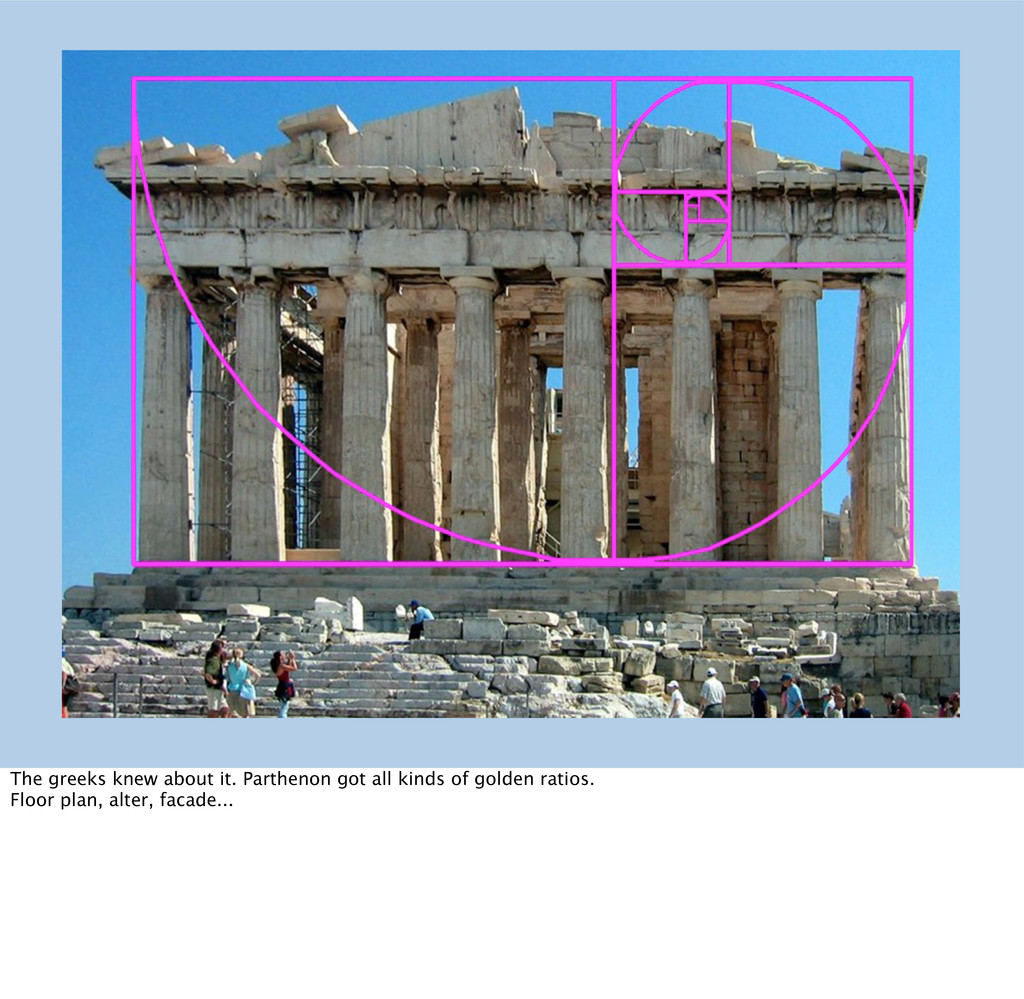
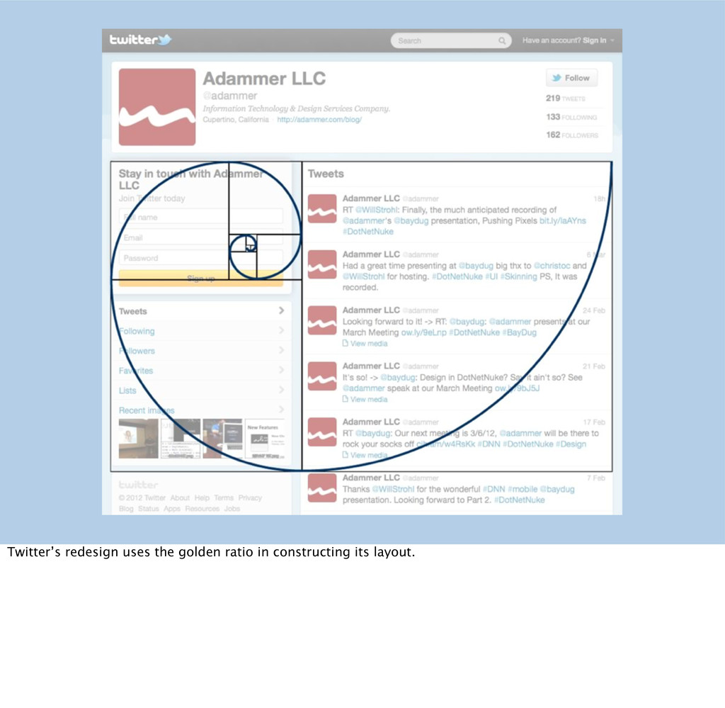
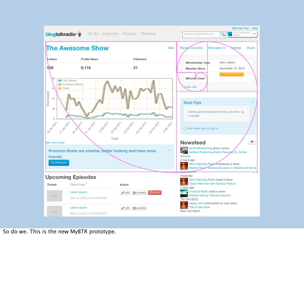
a/b = .618 Layouts are defined by geometry. The fibonnacci sequence - a popular trivia question among programmers - is a useful tool in structuring content. Dividing one number by its following number produces a constant. This is the golden ratio.
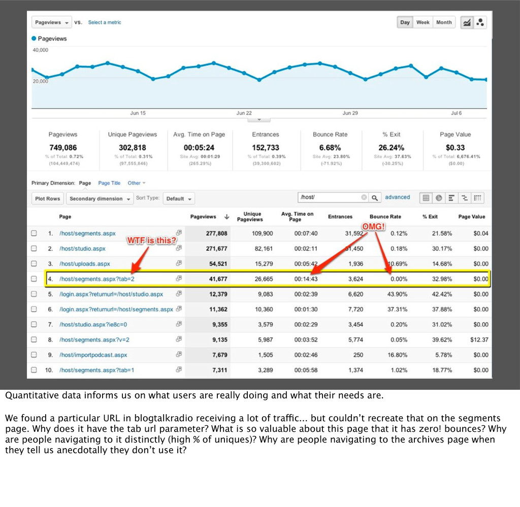
and what their needs are. We found a particular URL in blogtalkradio receiving a lot of traffic... but couldn’t recreate that on the segments page. Why does it have the tab url parameter? What is so valuable about this page that it has zero! bounces? Why are people navigating to it distinctly (high % of uniques)? Why are people navigating to the archives page when they tell us anecdotally they don’t use it?
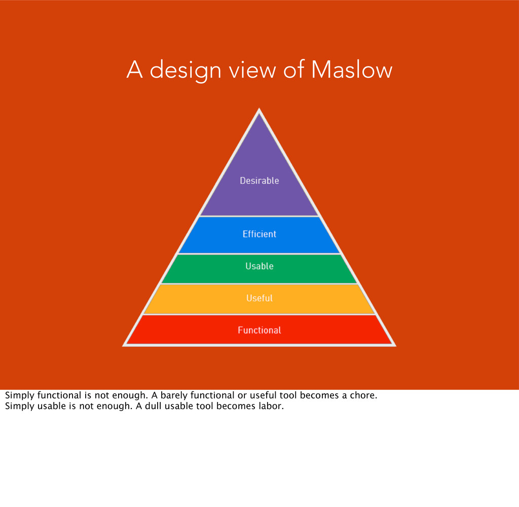
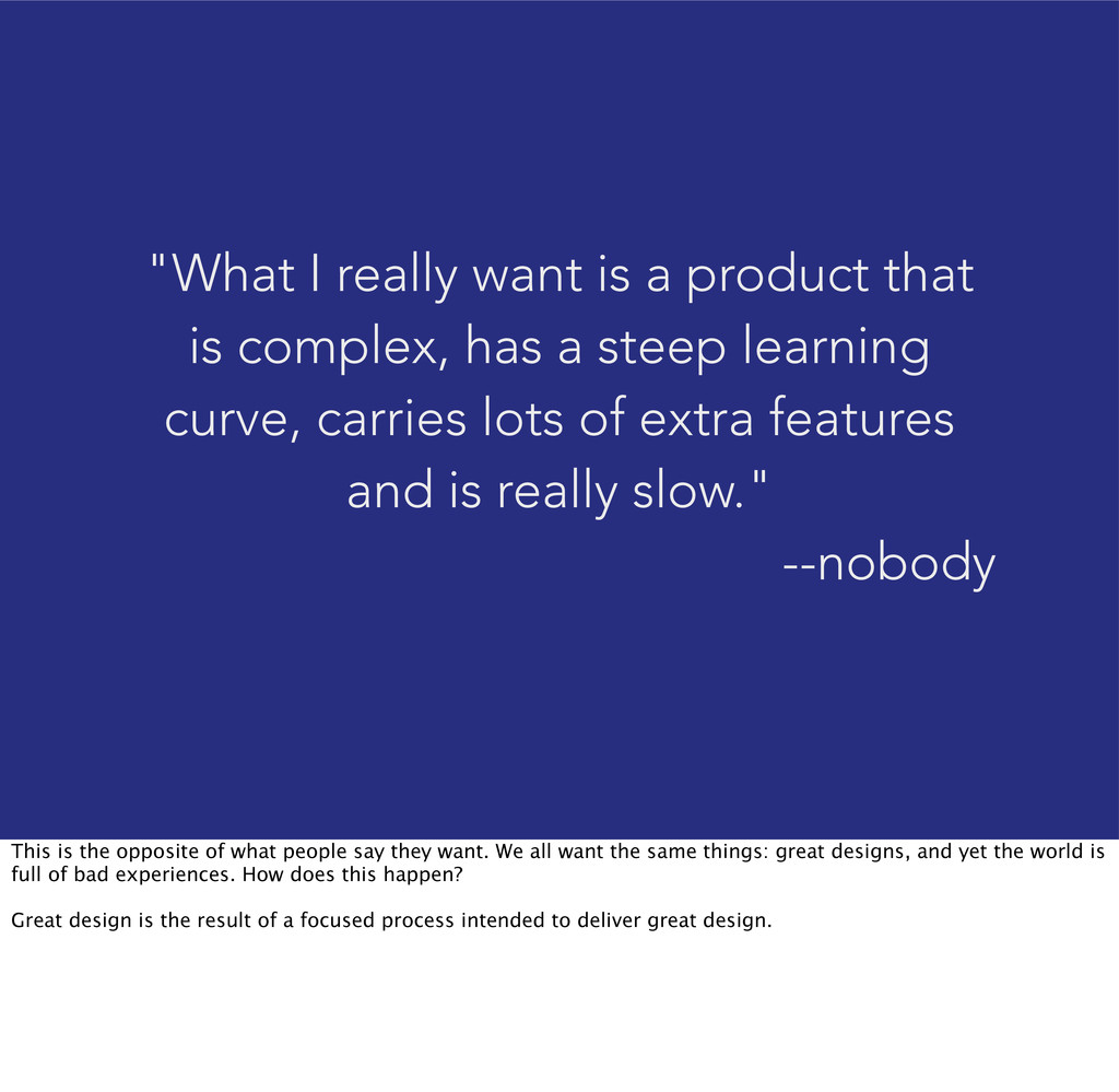
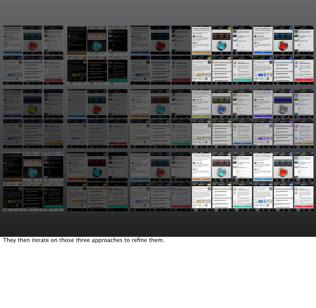
has a steep learning curve, carries lots of extra features and is really slow." --nobody This is the opposite of what people say they want. We all want the same things: great designs, and yet the world is full of bad experiences. How does this happen? Great design is the result of a focused process intended to deliver great design.
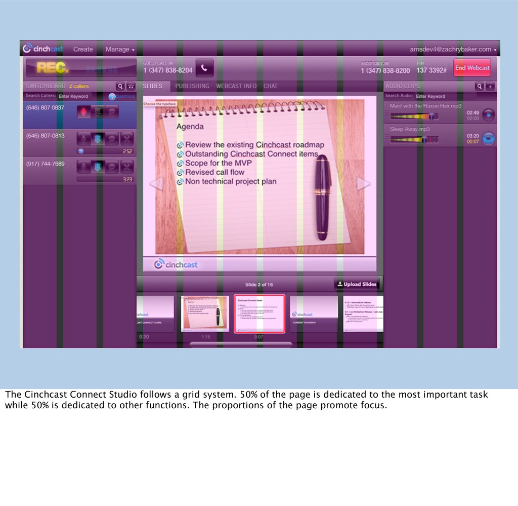
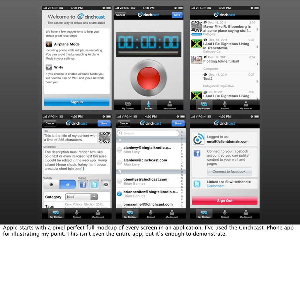
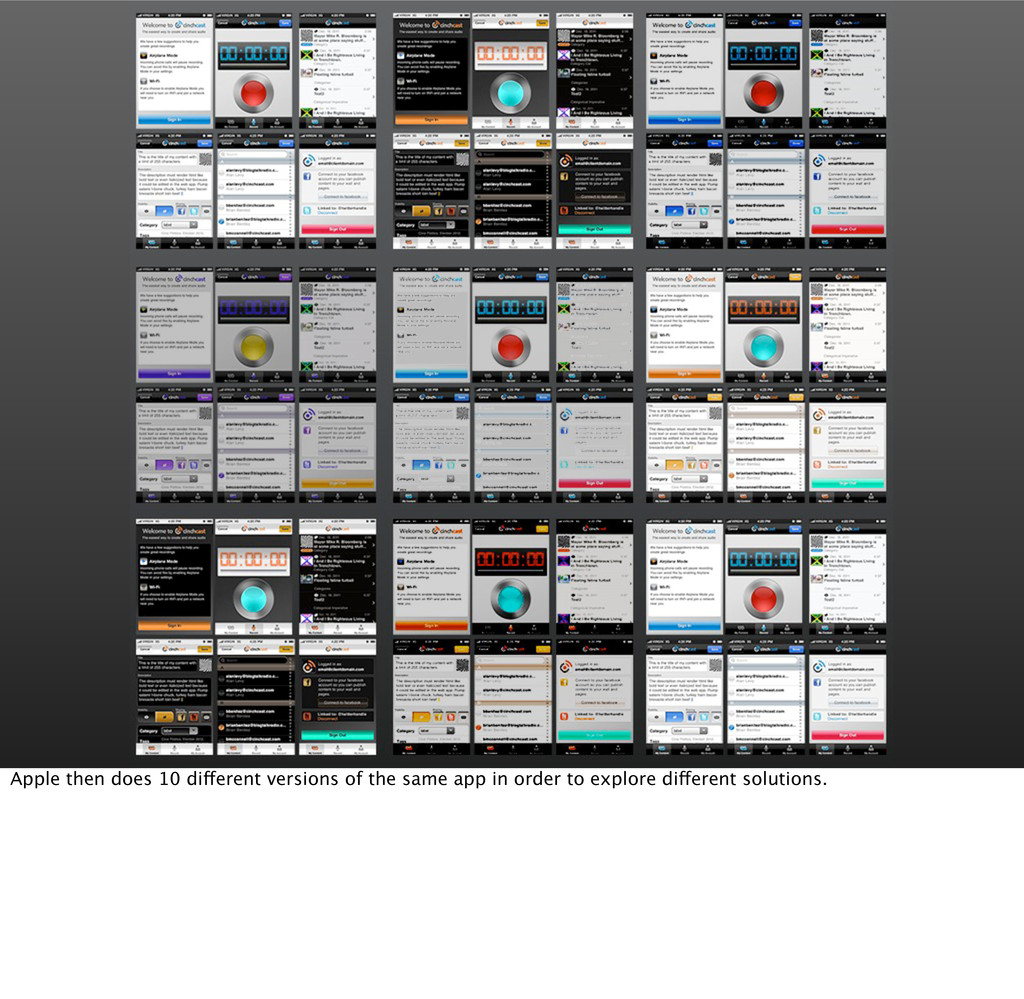
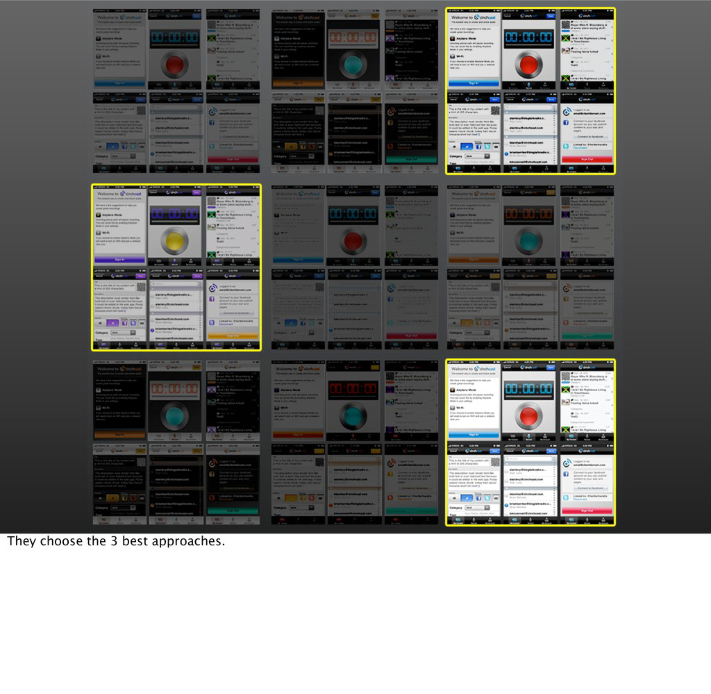
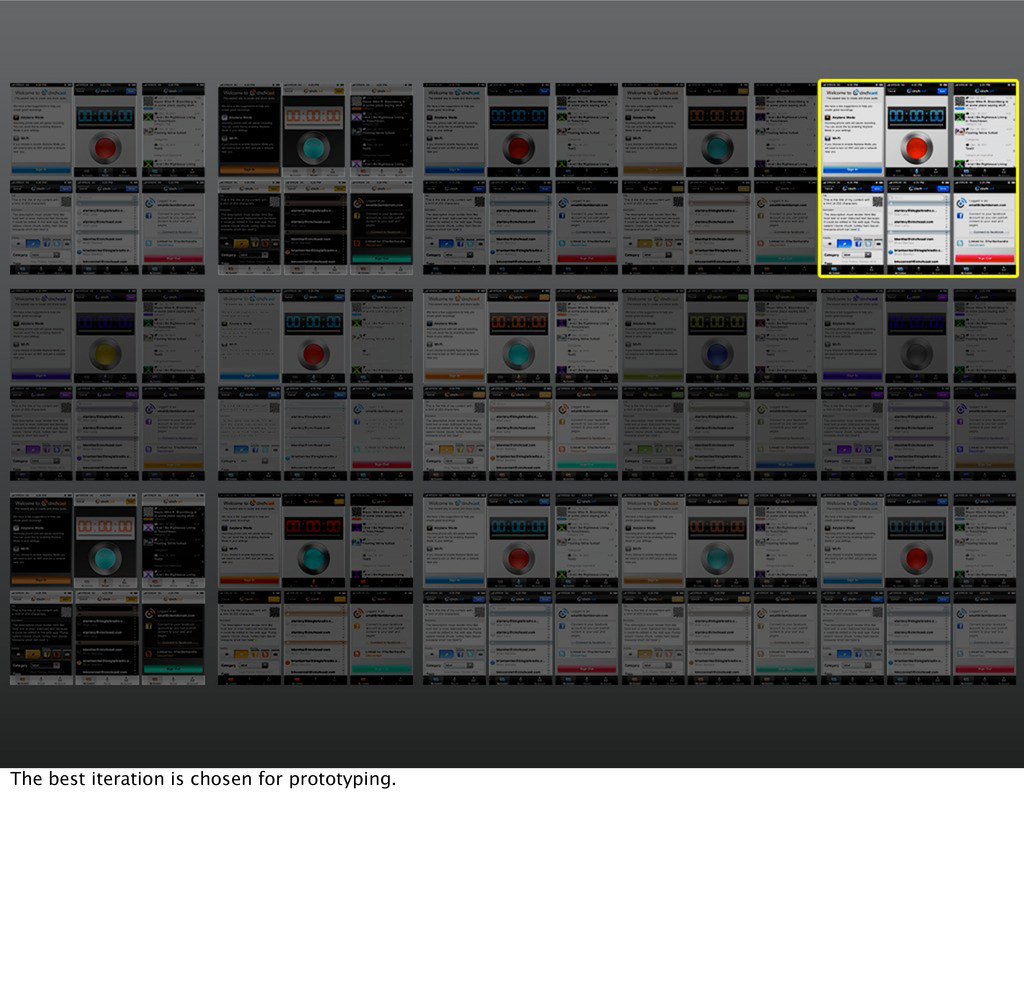
screen in an application. I’ve used the Cinchcast iPhone app for illustrating my point. This isn’t even the entire app, but it’s enough to demonstrate.
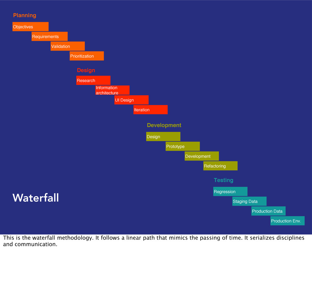
Development Refactoring Planning Objectives Requirements Validation Prioritization Testing Regression Staging Data Production Data Production Env. Waterfall This is the waterfall methodology. It follows a linear path that mimics the passing of time. It serializes disciplines and communication.
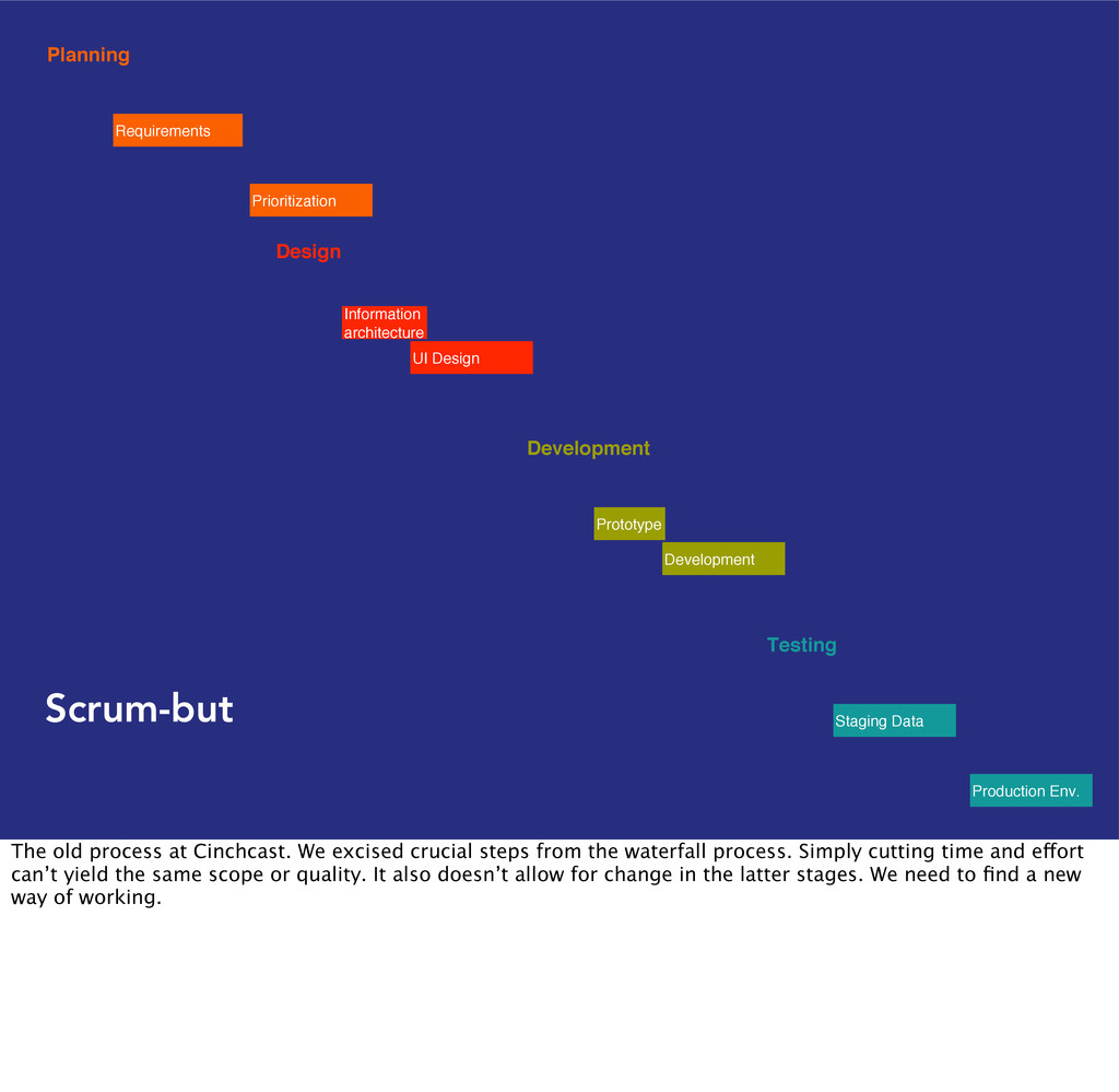
Prioritization Testing Staging Data Production Env. Scrum-but The old process at Cinchcast. We excised crucial steps from the waterfall process. Simply cutting time and effort can’t yield the same scope or quality. It also doesn’t allow for change in the latter stages. We need to find a new way of working.
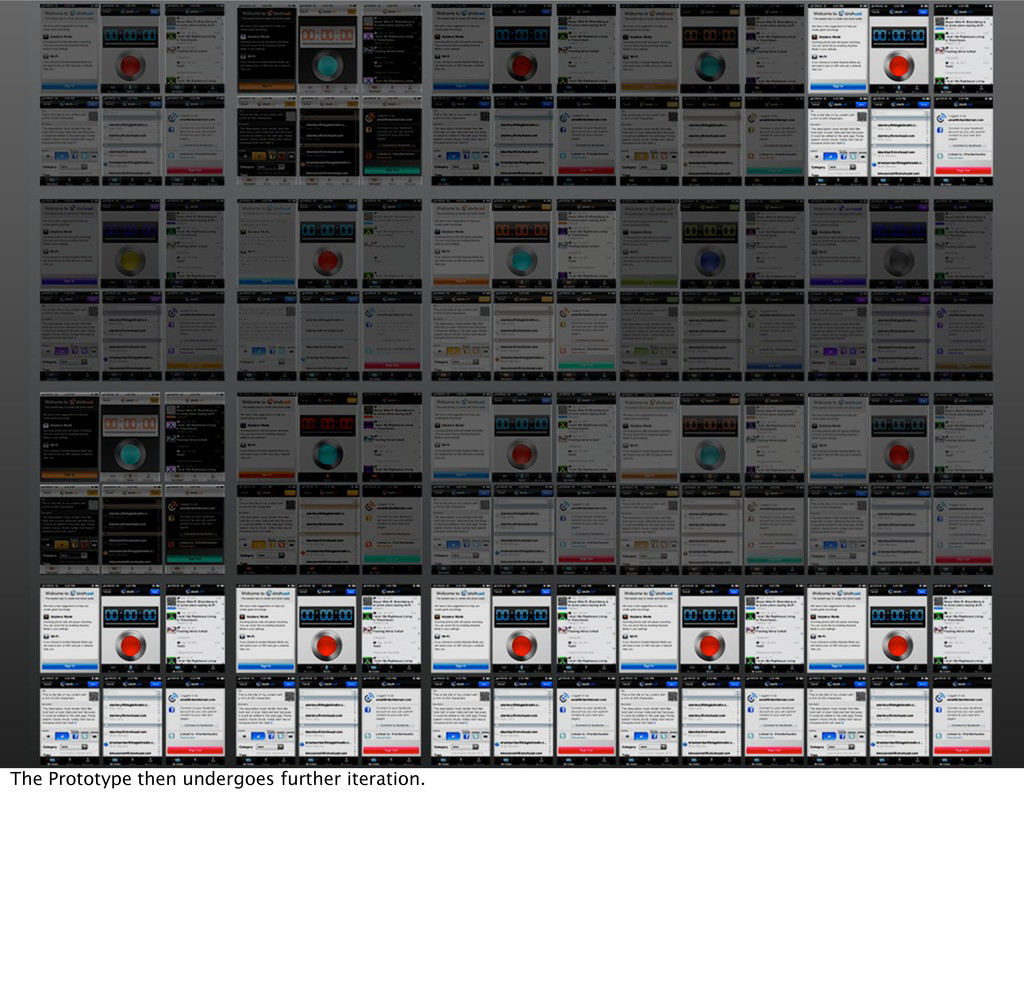
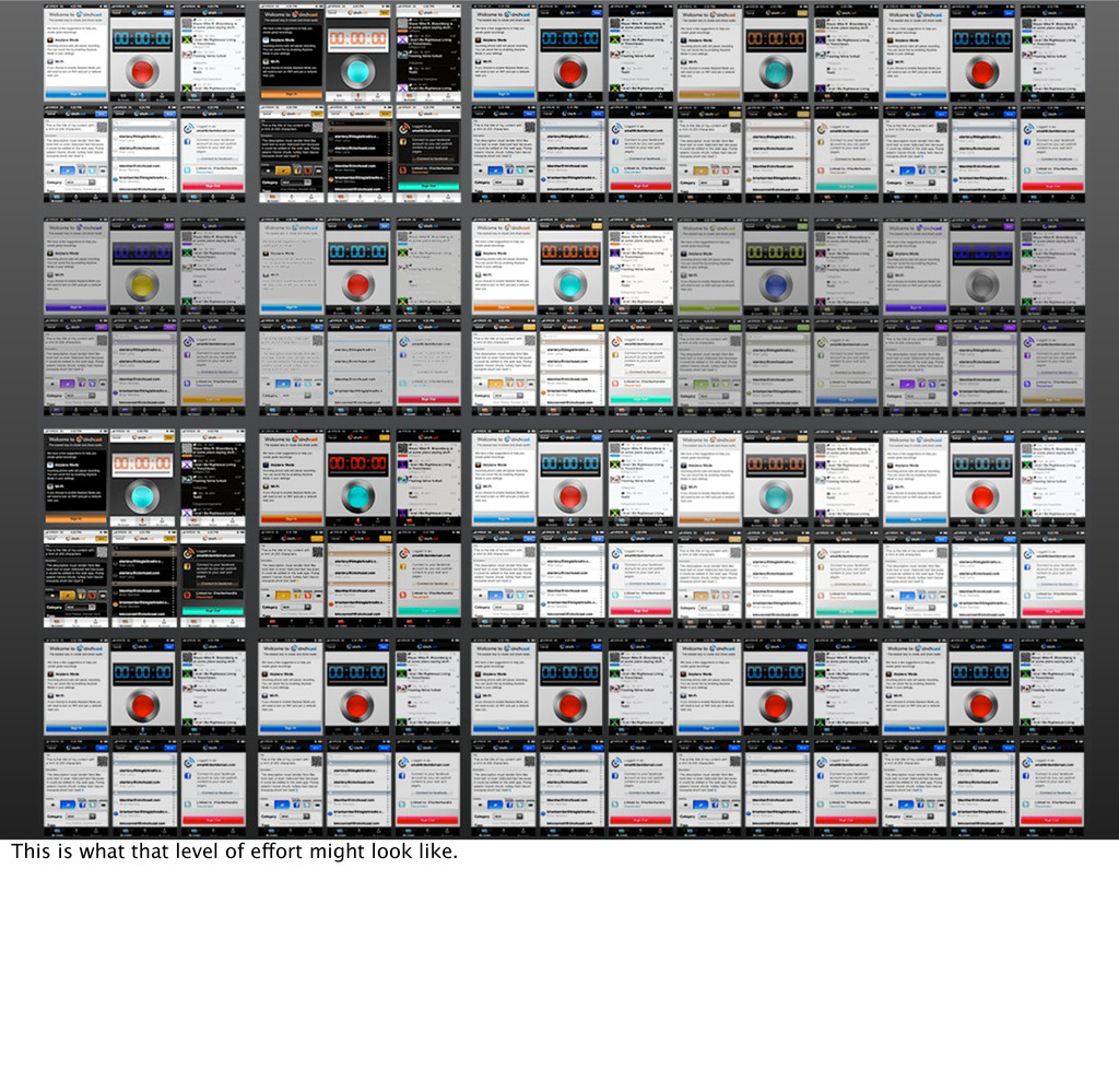
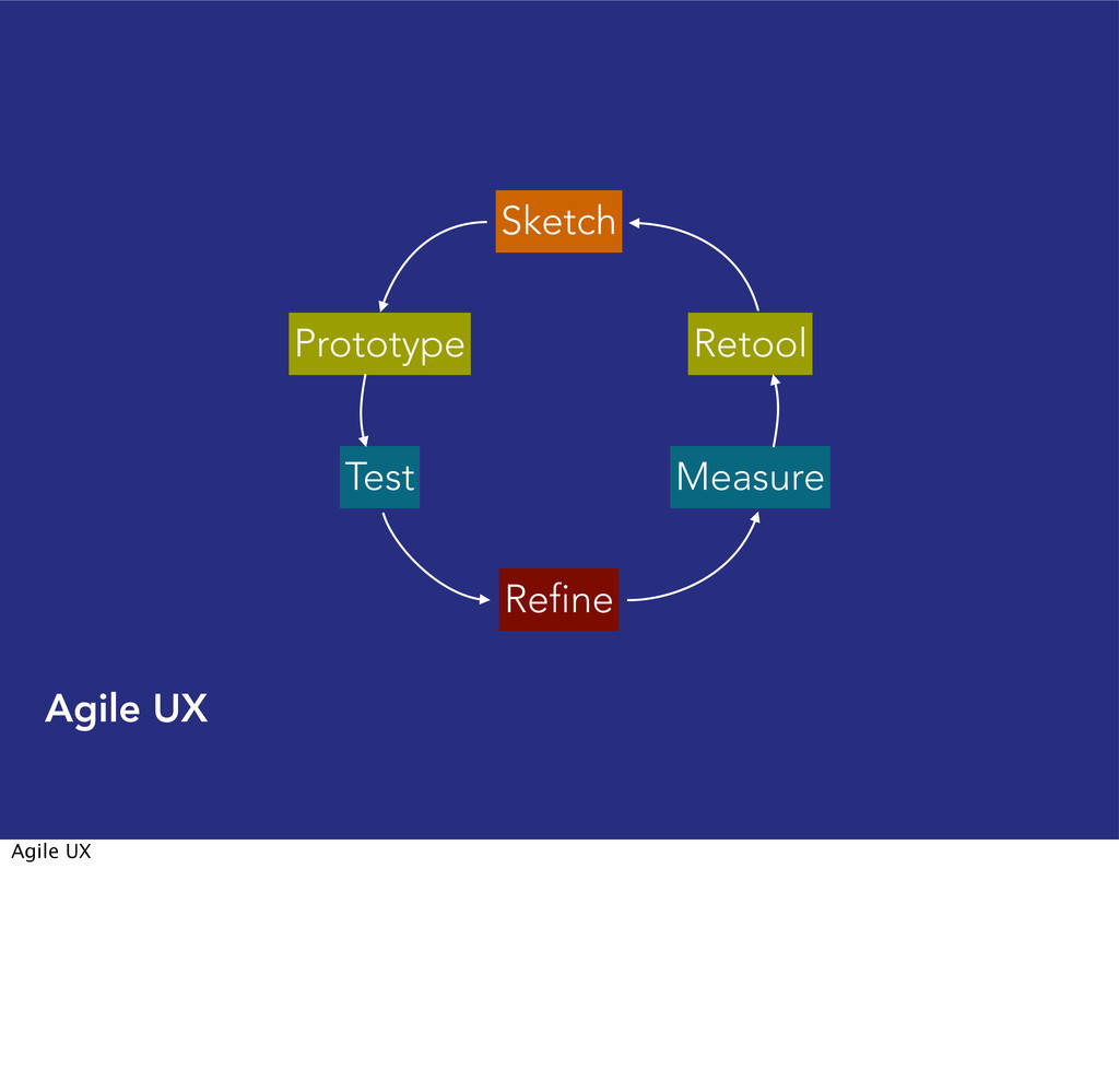
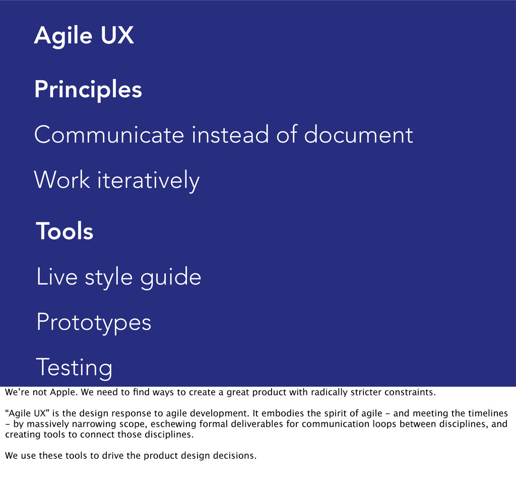
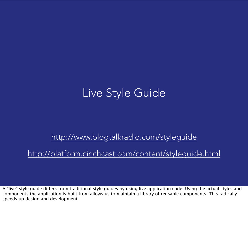
Live style guide Prototypes Testing We’re not Apple. We need to find ways to create a great product with radically stricter constraints. “Agile UX” is the design response to agile development. It embodies the spirit of agile - and meeting the timelines - by massively narrowing scope, eschewing formal deliverables for communication loops between disciplines, and creating tools to connect those disciplines. We use these tools to drive the product design decisions.
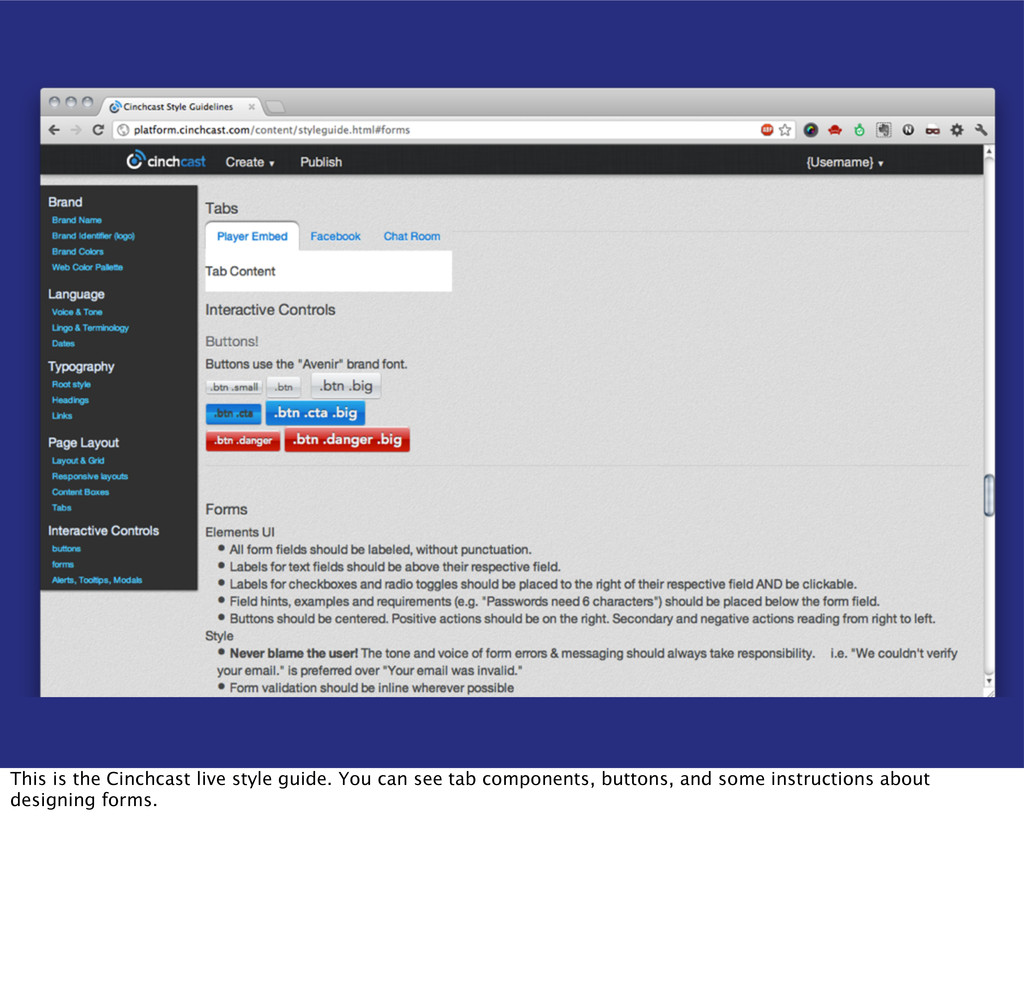
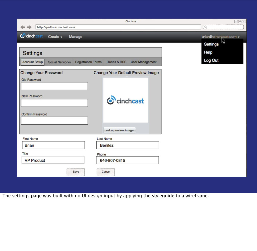
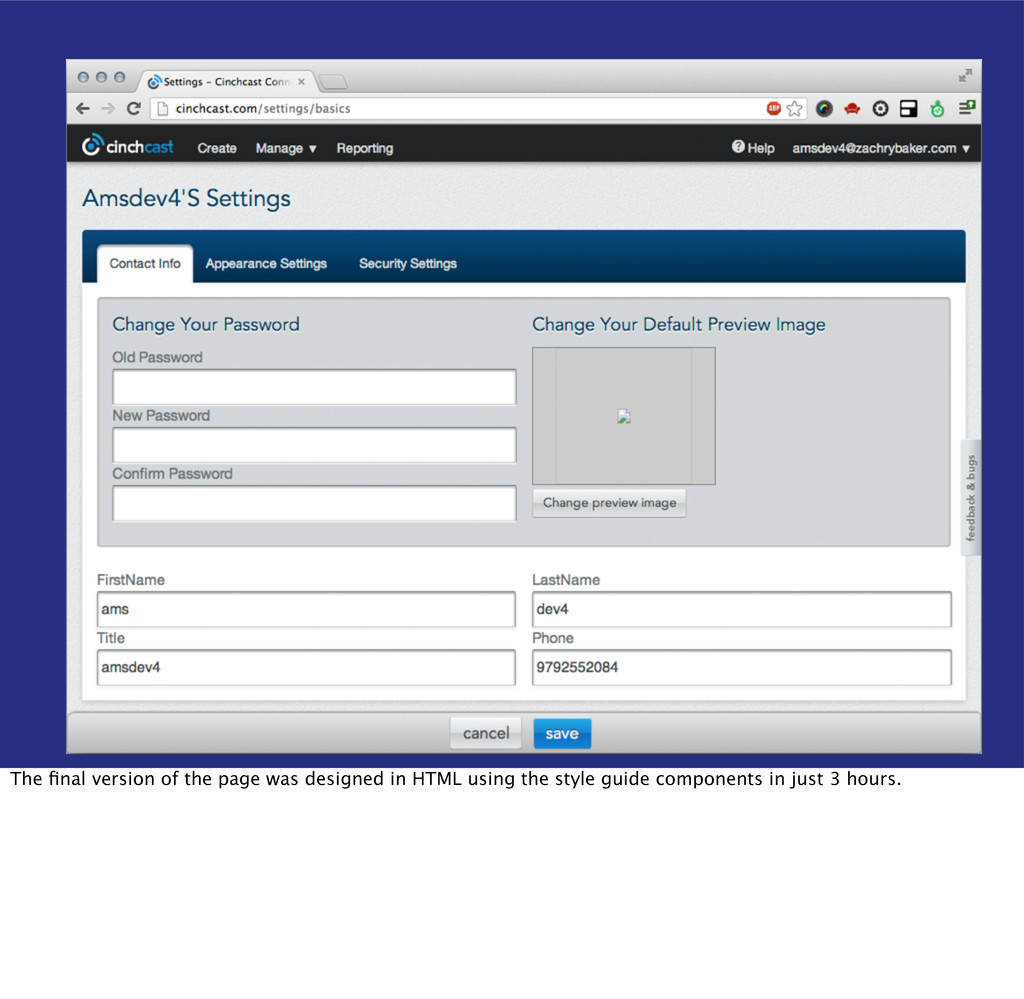
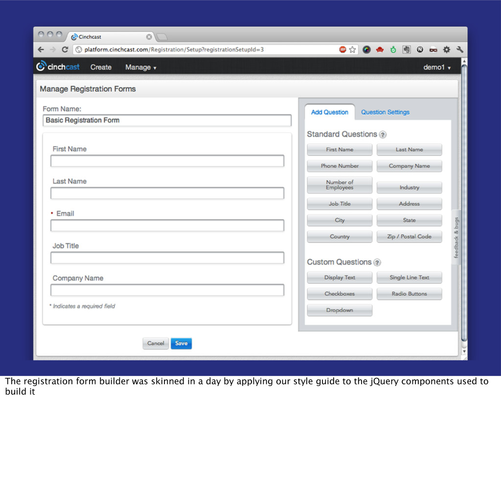
from traditional style guides by using live application code. Using the actual styles and components the application is built from allows us to maintain a library of reusable components. This radically speeds up design and development.
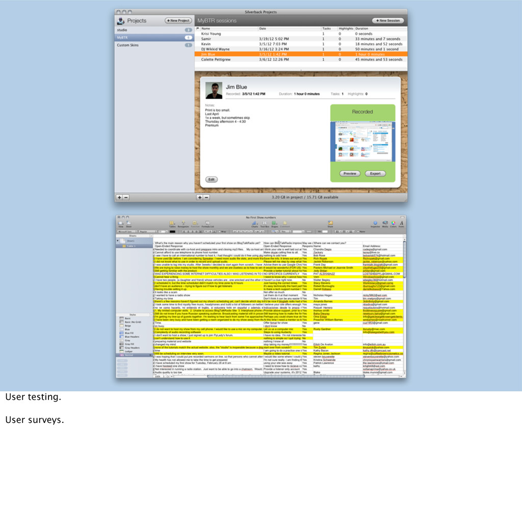
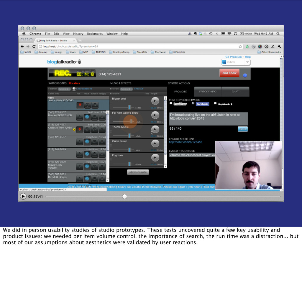
tests uncovered quite a few key usability and product issues: we needed per item volume control, the importance of search, the run time was a distraction... but most of our assumptions about aesthetics were validated by user reactions.
how power users work around limitations in the platform’s navigation and reporting tools as well as highlight friction points in the scheduling process. It also allowed us to interact with responsive breakpoints.