Upgrade to Pro — share decks privately, control downloads, hide ads and more …

Advanced Sass & Compass

Avatar for Adam Onishi Adam Onishi
February 25, 2014

Advanced Sass & Compass

My talk on Advanced Sass and Compass techniques from Hey!Stac in Leeds

Avatar for Adam Onishi

Adam Onishi

February 25, 2014
Tweet

More Decks by Adam Onishi

Other Decks in Programming

Transcript

  1. @onishiweb # Require any additional compass plugins here. # Set

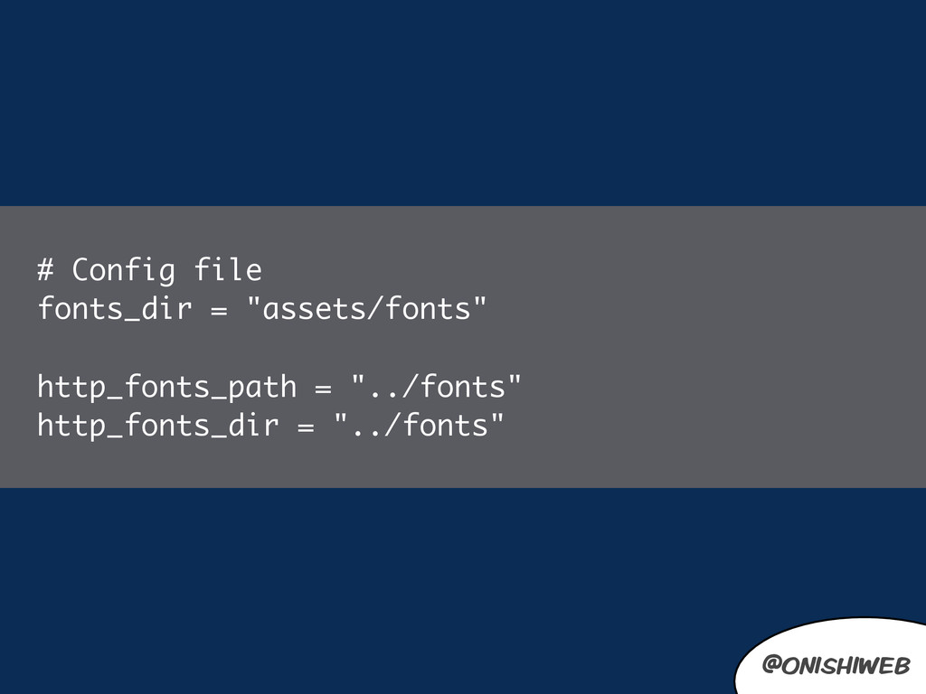
    this to the root of your project when deployed: http_path = "/" css_dir = "stylesheets" sass_dir = "sass" images_dir = "images" javascripts_dir = "javascripts" # You can select your preferred output style here (can be overridden via the command line): # output_style = :expanded or :nested or :compact or :compressed # To enable relative paths to assets via compass helper functions. Uncomment: # relative_assets = true # To disable debugging comments that display the original location of your selectors. Uncomment: # line_comments = false @onishiweb
  2. @onishiweb sass input.scss output.css compass watch & .button { display:inline-block;

    border-radius:5px; box-shadow:0 0 5px rgba(0,0,0,0.5); } .article .button { background-color:green; } .product .button { background-color:blue; }
  3. @onishiweb .button { display:inline-block; border-radius:5px; box-shadow:0 0 5px rgba(0,0,0,0.5); }

    .article .button { background-color:green; } .product .button { background-color:blue; } .foo { @extend .button; } @onishiweb
  4. @onishiweb sass input.scss output.css compass watch & .button, .foo {

    display: block; border-radius: 5px; box-shadow: 0 0 5px rgba(0, 0, 0, 0.5); } .article .button, .article .foo { background-color: green; } .product .button, .product .foo { background-color: blue; }
  5. @onishiweb sass input.scss output.css compass watch & %button { display:inline-block;

    border-radius:5px; box-shadow:0 0 5px rgba(0,0,0,0.5); }
  6. @onishiweb sass input.scss output.css compass watch & .button { display:inline-block;

    border-radius:5px; box-shadow:0 0 5px rgba(0,0,0,0.5); } .article .button { background-color:green; } .product .button { background-color:blue; }
  7. @onishiweb .button, %button { display:inline-block; border-radius:5px; box-shadow:0 0 5px rgba(0,0,0,0.5);

    } .article .button { background-color:green; } .product .button { background-color:blue; } .foo { @extend %button; } @onishiweb Extending Silent Classes in Sass: http://bit.ly/1dT2K9x
  8. @onishiweb sass input.scss output.css compass watch & .button, .foo {

    display: block; border-radius: 5px; box-shadow: 0 0 5px rgba(0, 0, 0, 0.5); } .article .button { background-color: green; } .product .button { background-color: blue; }
  9. @onishiweb .button, %button { display:inline-block; border-radius:5px; box-shadow:0 0 5px rgba(0,0,0,0.5);

    } .article .button { background-color:green; } .product .button { background-color:blue; } .foo { @extend %button; } @onishiweb
  10. @onishiweb %clearfix { zoom:1; &:before, &:after { content: "\0020"; display:

    block; height: 0; overflow: hidden; } &:after { clear: both; } } %hide-text { display:block; text-indent:100%; white-space:nowrap; overflow:hidden; } @onishiweb
  11. @onishiweb @onishiweb @mixin rem($property, $px-values, $baseline-px: $base-font-size) { // Convert

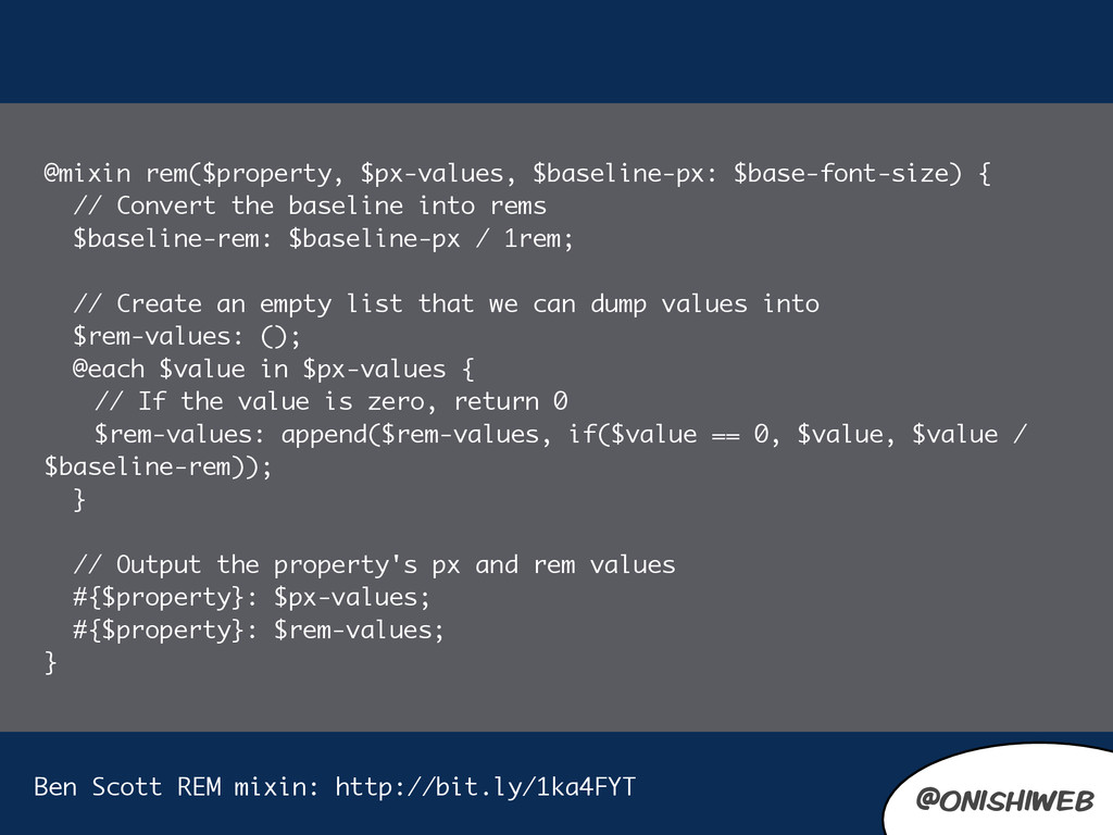
    the baseline into rems $baseline-rem: $baseline-px / 1rem; // Create an empty list that we can dump values into $rem-values: (); @each $value in $px-values { // If the value is zero, return 0 $rem-values: append($rem-values, if($value == 0, $value, $value / $baseline-rem)); } // Output the property's px and rem values #{$property}: $px-values; #{$property}: $rem-values; } Ben Scott REM mixin: http://bit.ly/1ka4FYT
  12. @onishiweb @onishiweb @mixin content-mixin( $arg ) { @content; } //

    usage @include content-mixin( true ) { h1 { color:pink; } }
  13. @onishiweb @onishiweb @function get-list-value($haystack, $needle) { @each $haystack-item in $haystack

    { @if $needle == nth($haystack-item, 1) { @return nth($haystack-item, 2); } } @return false; } Ben Scott Breakup: https://github.com/bpscott/breakup
  14. @onishiweb @onishiweb nth( $list, 1 ); length( $list ); index(

    $list, $item ); append( $list, $item, $separator );
  15. @onishiweb @onishiweb $cols: 4; @for $i from 1 through $cols

    { .cols-#{$i} { width: ((100 / $columns) * $i) * 1%; } }
  16. @onishiweb @onishiweb $cols: 4; @for $i from 1 to $cols

    { .cols-#{$i} { width: ((100 / $columns) * $i) * 1%; } }
  17. @onishiweb @onishiweb $cols: 4; @while $cols > 0 { .cols-#{$cols}

    { width: 10px * $cols; } $cols: $cols - 2; }
  18. @onishiweb @onishiweb $icons: success error warning; @each $icon in $icons

    { .icon-#{$icon} { background-image: url(/images/icons/ #{$icon}.png); } }
  19. @onishiweb @onishiweb .button { @include border-radius(8px); @include box-shadow(0 0 5px

    rgba(#000, 0.5)); @include text-shadow(#ccc 1px 1px 0); @include transition(color 0.3s ease-out); }
  20. @onishiweb @onishiweb .site-icons-sprite, .site-icons-delete, .site-icons-edit, .site-icons-new, .site-icons-save { background: url('/images/site-

    icons-s34fe0604ab.png') no-repeat; } .site-icons-delete { background-position: 0 0; } .site-icons-edit { background-position: 0 -32px; } .site-icons-new { background-position: 0 -64px; } .site-icons-save { background-position: 0 -96px; }
  21. @onishiweb @onishiweb .site-icons-sprite, .site-icons-delete, .site-icons-edit, .site-icons-new, .site-icons-save { background: url('/images/site-

    icons-s34fe0604ab.png') no-repeat; } .site-icons-delete { background-position: 0 0; } .site-icons-edit { background-position: 0 -32px; } .site-icons-new { background-position: 0 -64px; } .site-icons-save { background-position: 0 -96px; }
  22. @onishiweb @onishiweb @import "site-icons/*.png"; .actions { .new { @include site-icons-sprite(new);

    } .edit { @include site-icons-sprite(edit); } .save { @include site-icons-sprite(save); } .delete { @include site-icons-sprite(delete); } }
  23. @onishiweb @onishiweb .site-icons-sprite, .site-icons-delete, .site-icons-edit, .site-icons-new, .site-icons-save { background: url('/images/site-

    icons-s34fe0604ab.png') no-repeat; } .site-icons-delete { background-position: 0 0; } .site-icons-edit { background-position: 0 -32px; } .site-icons-new { background-position: 0 -64px; } .site-icons-save { background-position: 0 -96px; }
  24. @onishiweb @mixin breakpoint($point) { // Get the width of the

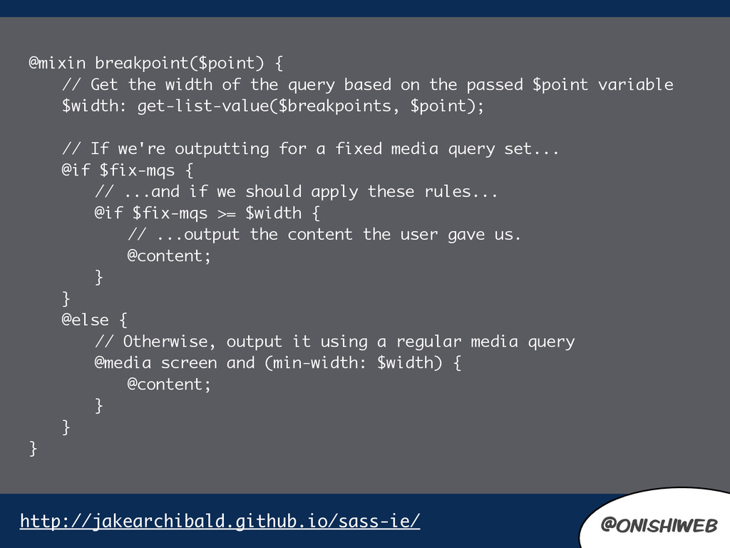
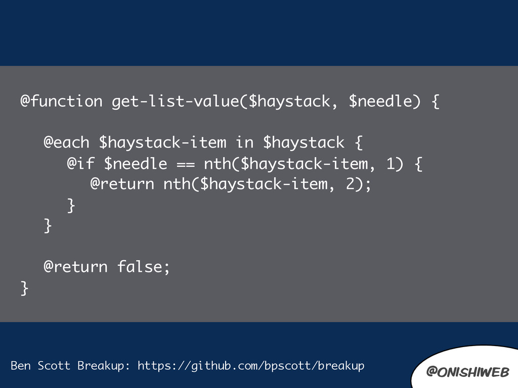
    query based on the passed $point variable $width: get-list-value($breakpoints, $point); // If we're outputting for a fixed media query set... @if $fix-mqs { // ...and if we should apply these rules... @if $fix-mqs >= $width { // ...output the content the user gave us. @content; } } @else { // Otherwise, output it using a regular media query @media screen and (min-width: $width) { @content; } } } @onishiweb http://jakearchibald.github.io/sass-ie/
  25. @onishiweb @onishiweb @function get-list-value($haystack, $needle) { @each $haystack-item in $haystack

    { @if $needle == nth($haystack-item, 1) { @return nth($haystack-item, 2); } } @return false; } Ben Scott Breakup: https://github.com/bpscott/breakup
  26. @onishiweb .content-container { margin-top:50px; // was causing bug on mobile

    devices @include breakpoint(large) { max-width:90em; // 1440px (because the padding is included in box-sizing) 71.25em; margin-top:0; padding:0; padding-left:300px; position:relative; } @include old-ie { width:1000px; padding-left:0; margin-left:300px; } } @onishiweb
  27. @onishiweb @onishiweb // style.css .content-container { margin-top: 50px; } @media

    screen and (min-width: 62.5em) { .content-container { max-width: 90em; margin-top: 0; padding: 0; padding-left: 300px; position: relative; } }
  28. @onishiweb @onishiweb // ie.css .content-container { margin-top: 50px; max-width: 90em;

    margin-top: 0; padding: 0; padding-left: 300px; position: relative; width: 1000px; padding-left: 0; margin-left: 300px; }
  29. @onishiweb # Require any additional compass plugins here. # Set

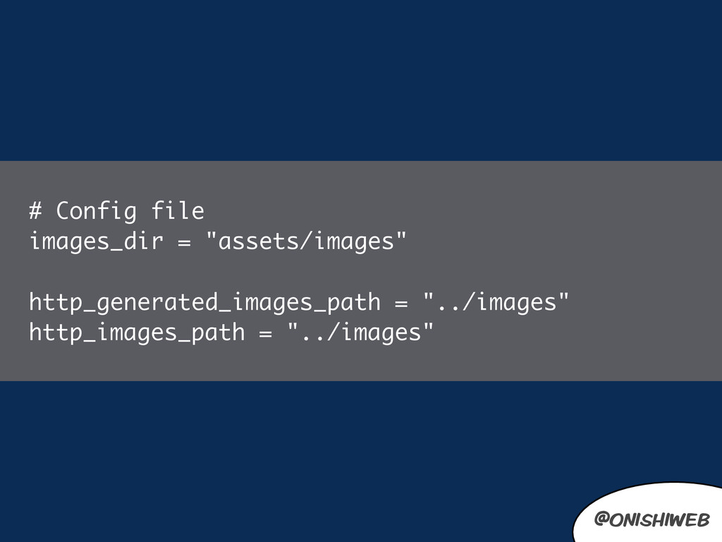
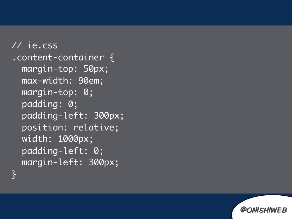
    this to the root of your project when deployed: http_path = "/" css_dir = "public/wp-content/themes/persil" sass_dir = "build/scss/core" images_dir = "public/wp-content/themes/persil/images" javascripts_dir = "build/js" http_generated_images_path = "images" http_images_path = "images" # You can select your preferred output style here (can be overridden via the command line): output_style = (environment == :production) ? :compressed : :expanded #output_style = :compressed :expanded or :nested or :compact or :compressed # To enable relative paths to assets via compass helper functions. Uncomment: # relative_assets = true # To disable debugging comments that display the original location of your selectors. Uncomment: line_comments = false @onishiweb
  30. @onishiweb li.menu-item-pink { &.current-menu-item a, &.current-menu-parent a { color:$clr-pink; background-

    color:transparent; } a:hover, &.current-menu-item > a:hover, &.current-menu-parent > a:hover, &.active > a { color:#fff; background-color:$clr-pink; } .sub-menu li a { border-top-color:$clr-pink; background-color:$clr-pink-hover; &:hover { background-color:$clr-pink-hover; } } } @onishiweb
  31. @onishiweb $navigation-items: ( 'menu-item-pink' $clr-pink, 'menu-item-green' $clr-green, 'menu-item-orange' $clr-orange, );

    @each $item in $navigation-items { $menu-class: nth($item, 1); $color: nth($item, 2); .#{$menu-class} { &.current-menu-item a { color: $color; } a:hover { color: shade($color, 10%); } } } @onishiweb